Each of us dreams of realizing all of our ideas while working on interior design. Properly selecting color combinations in a room’s interior is especially important as they affect our emotions, which can have an impact on our mental and physical well-being. Psychologists recommend leveraging colors for our benefit. Scientific evidence shows that colors can affect not just our emotional state and mood, but also our overall bodily functions, influencing individual life support systems. People even use this discovery for therapeutic purposes. As such, you should choose trendy interior colors for 2022 carefully, considering expert advice and recommendations. Each space serves a specific purpose, and you should select colors that create a harmonious living environment accordingly.
Color combinations in interior design for 2022
The entire color palette is conventionally divided into three groups of tones: warm, cool, and neutral. However, there are situations where one color can evoke either a warm or cool feeling. Only two colors do not lend themselves to such transformation – cool blue and warm orange. Blue tones are associated with icebergs, while orange warmth is associated with the sun. Changing color combinations can completely transform a space.
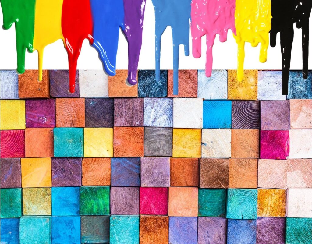
Kitchen
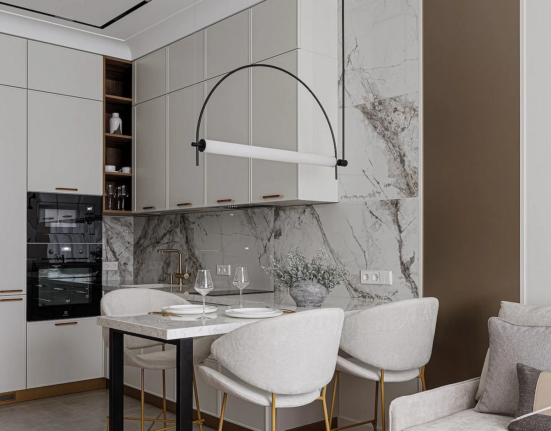
Choosing a trendy color combination for the interior of your kitchen in 2022 is much easier. Since this space is intended for cooking and consuming food, the color scheme should lift your mood and improve your appetite.
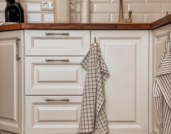
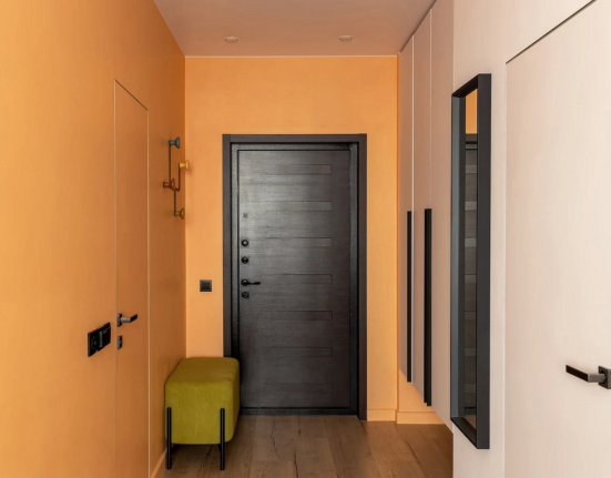
When decorating the interior of your kitchen in 2022, consider using the following colors: yellow, green, gray, beige, and orange. You can combine them with light blue, red, and other colors. It’s important to create a cozy atmosphere.
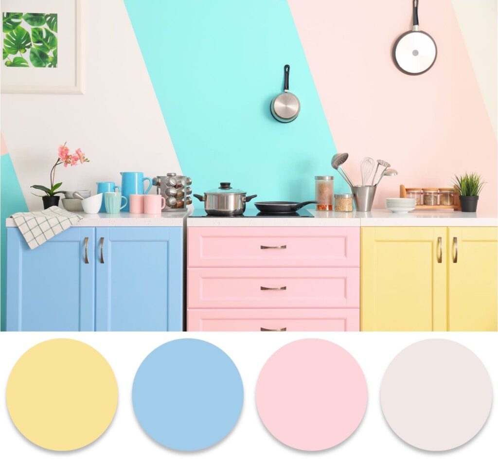
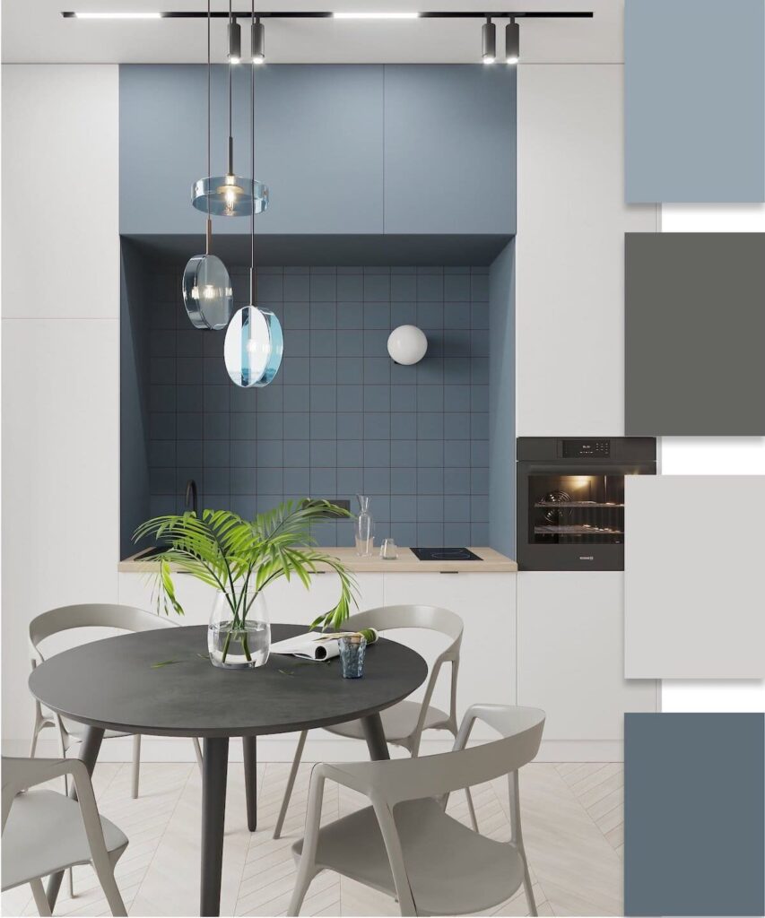
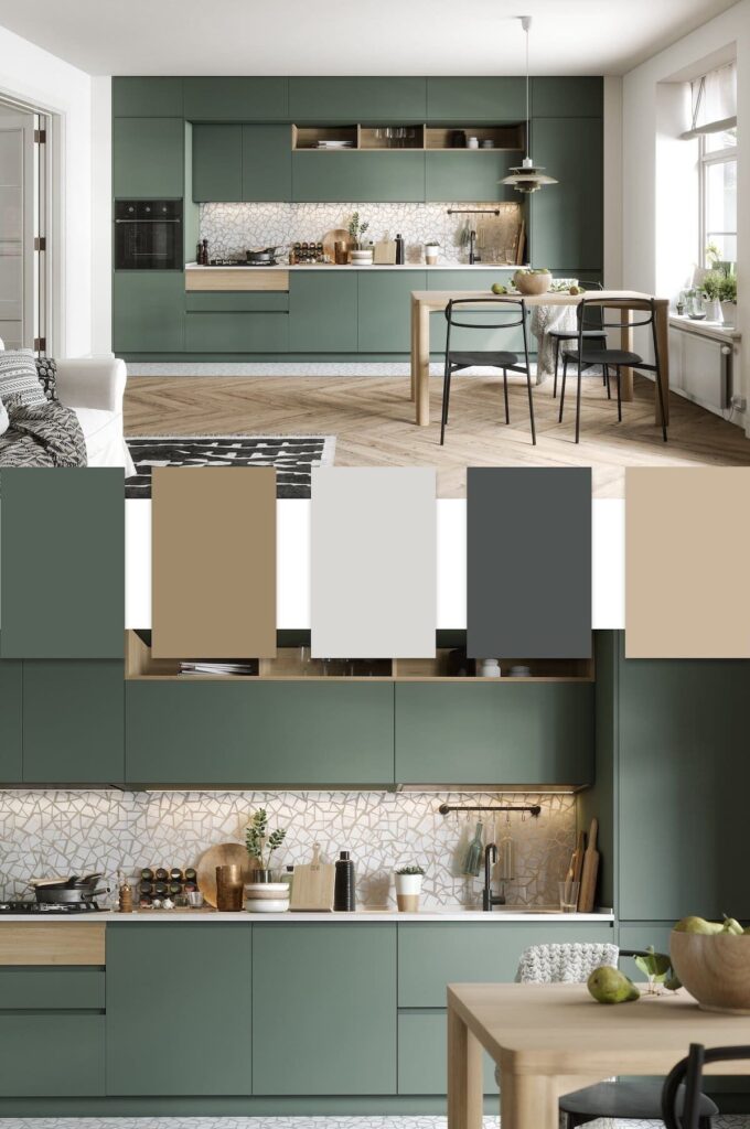
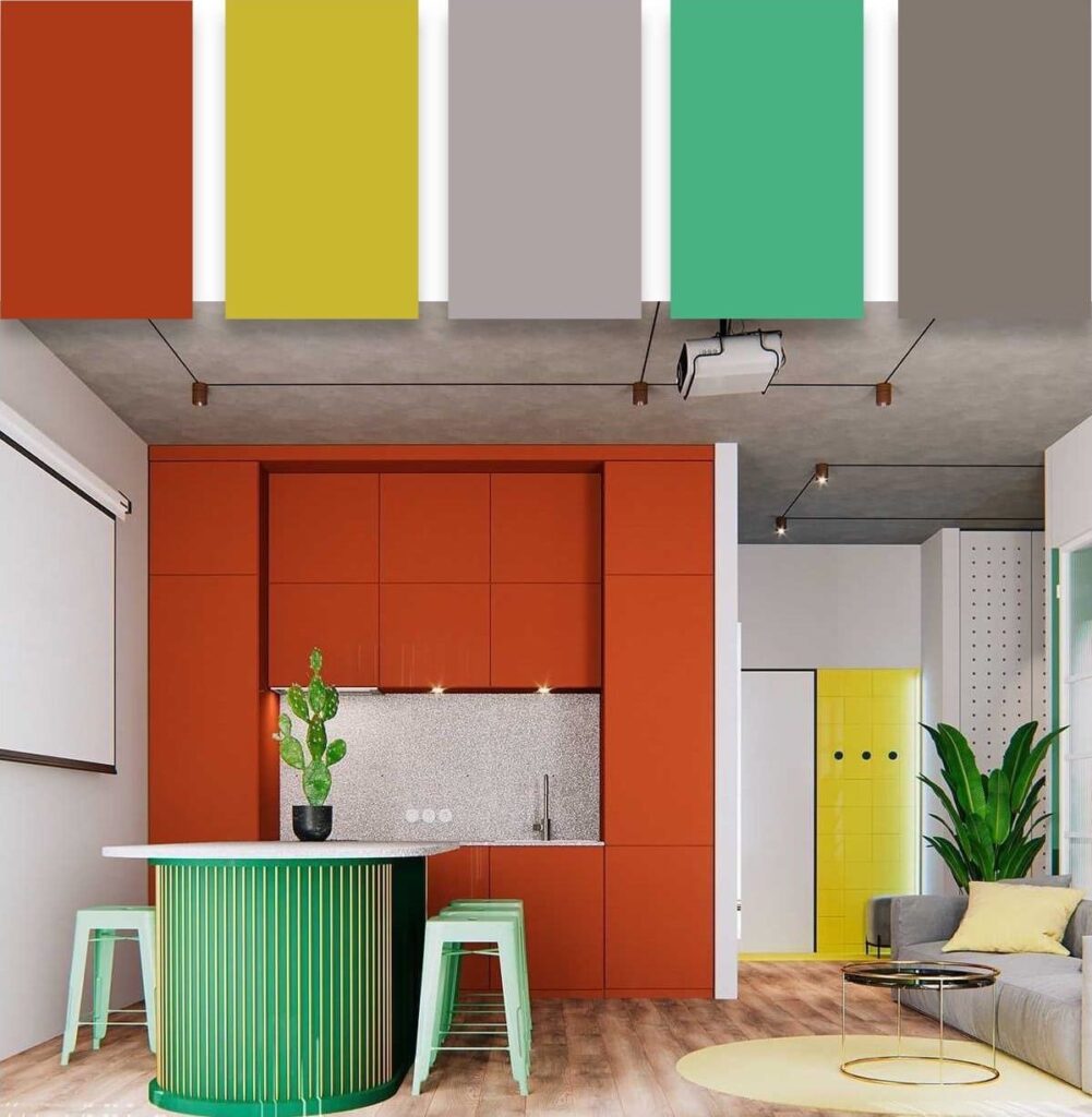
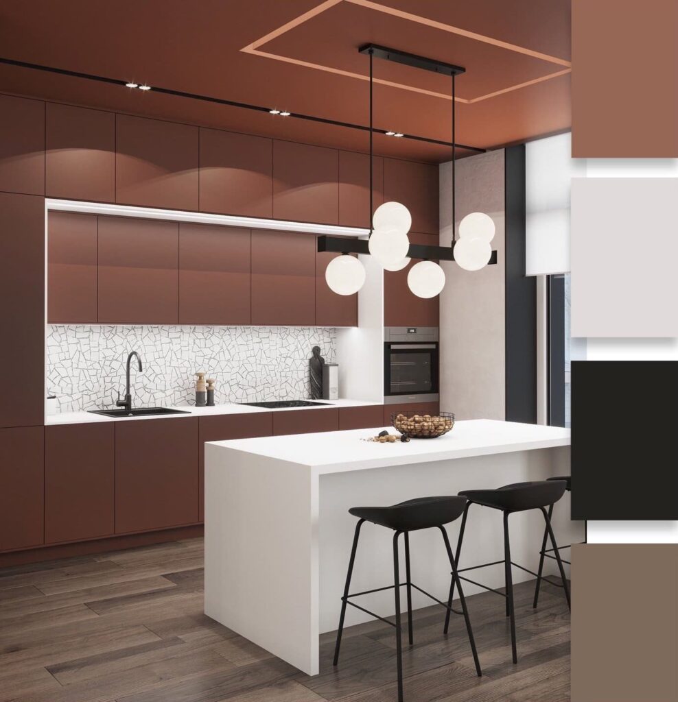
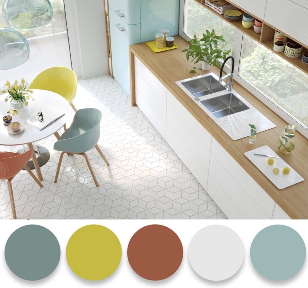
Too bright and saturated colors in the kitchen can have a negative impact on digestion and even decrease appetite. Therefore, use color accents carefully. However, everyone perceives colors differently, so follow your own preferences.
Note that there are many nuances to consider when choosing the 2022 color palette. The same color may look different in different parts of the room – brighter in one area and less saturated in another.
Living Room
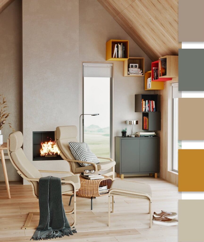
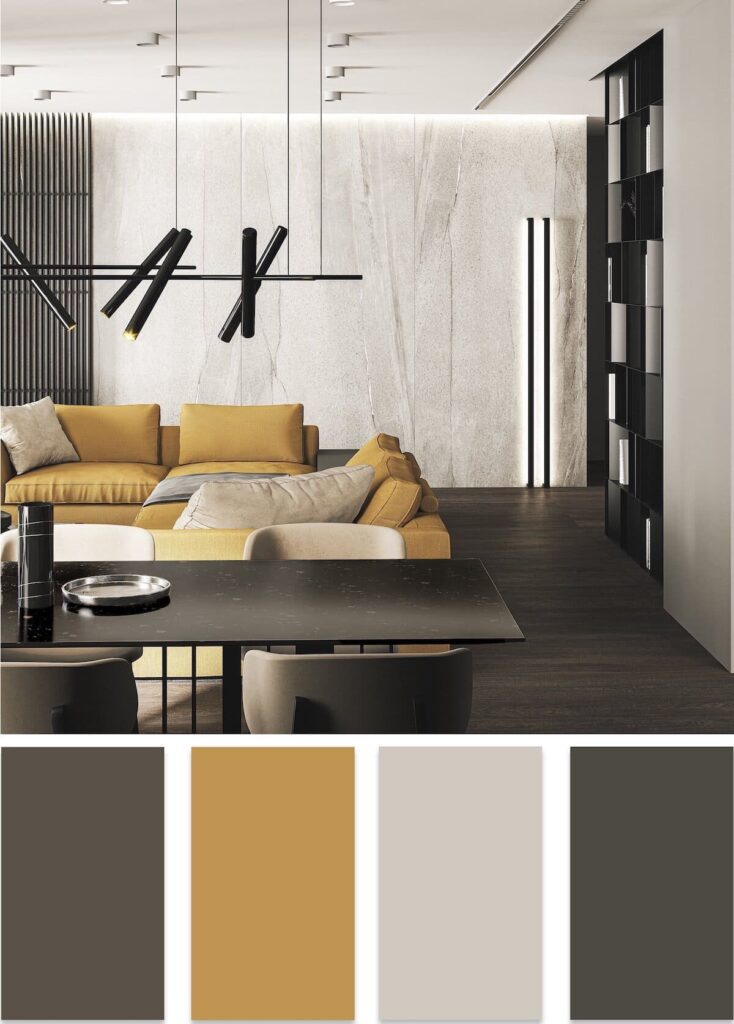
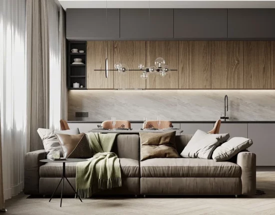
The living room is intended for receiving guests and simply relaxing with family, so it’s important to be very careful when choosing a color scheme. Not everyone will feel comfortable in a dark or overly colorful room.
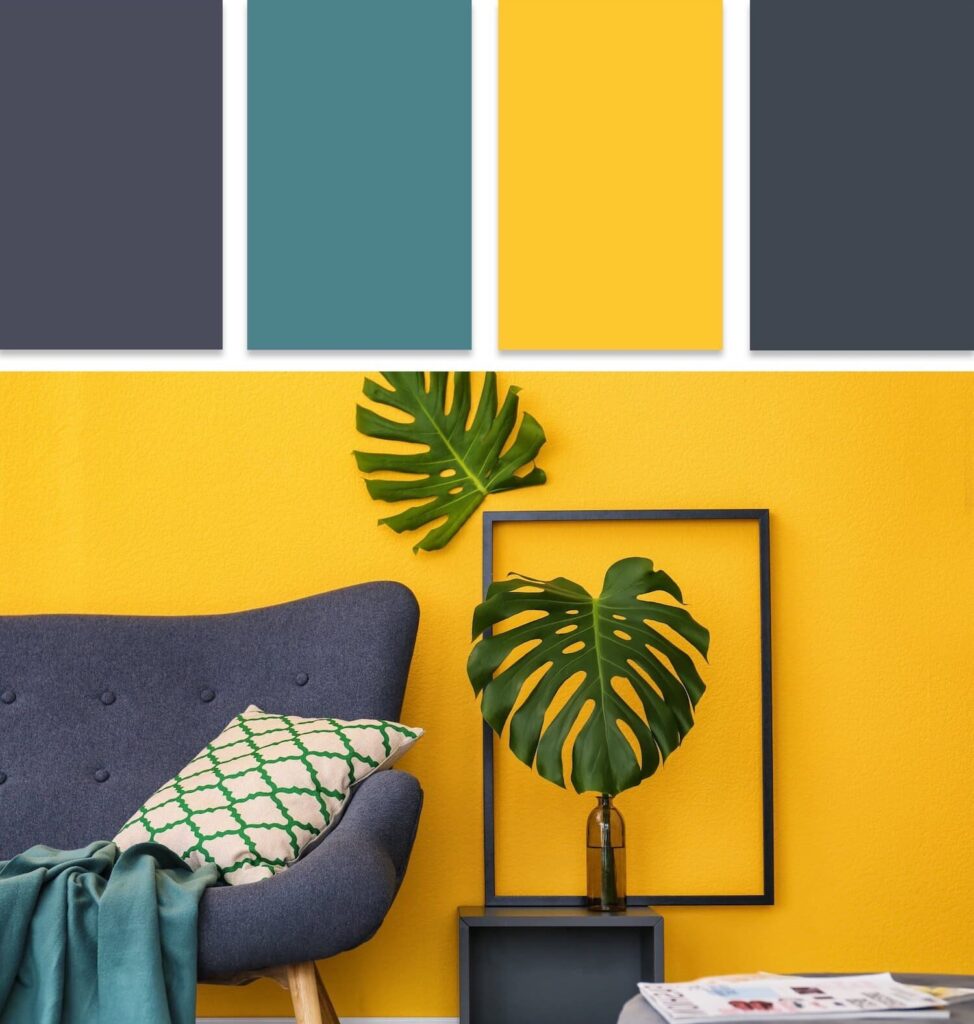
Choose neutral shades that won’t cause irritation. Make the background light and soft, while adding bright accents or details. If there are not enough accents, it will be difficult to achieve the desired liveliness of the interior.
Bedroom
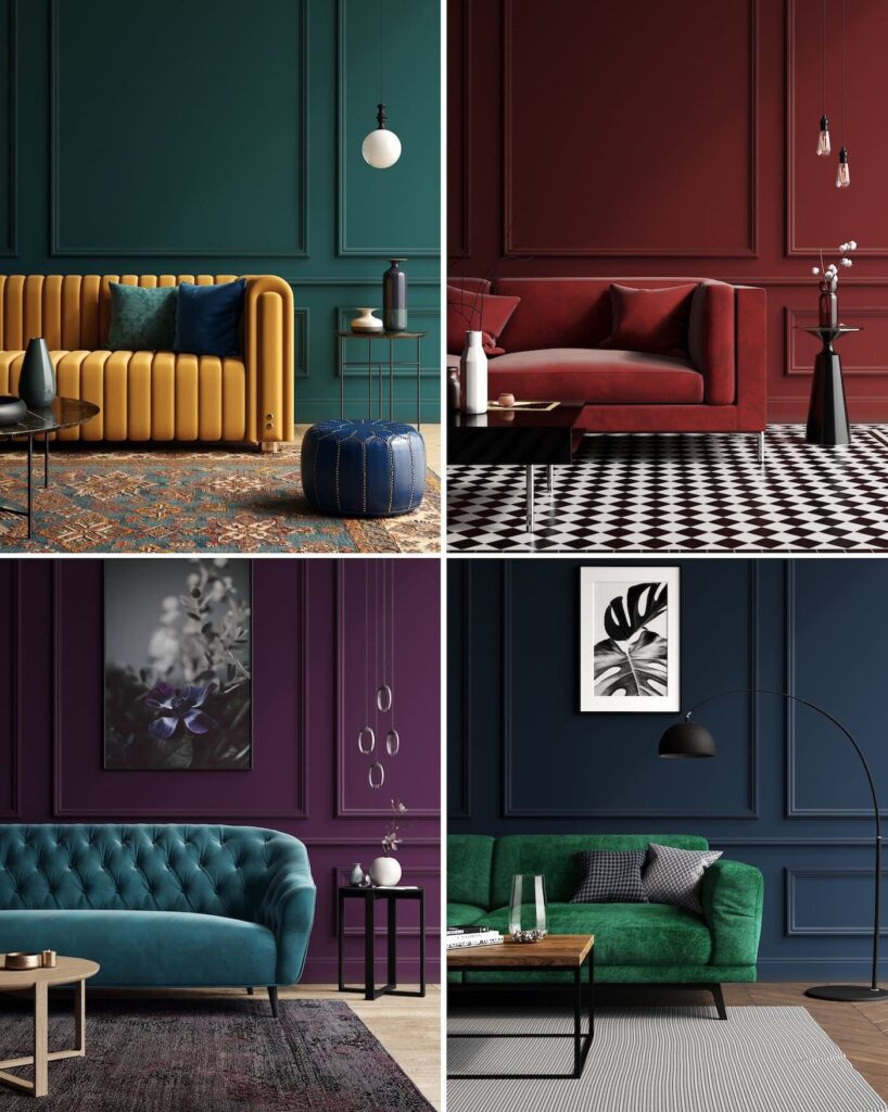
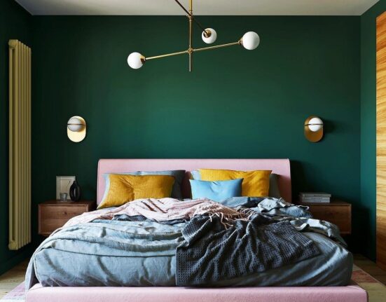
Moving on to the design of the bedroom. Since this space is a personal territory, you can do whatever you want here, taking into account only your own tastes and preferences. The 2022 color palette for the bedroom can range from black to red shades. The main thing is personal comfort. But since the bedroom is a place of rest, there are certain recommendations for choosing colors. For a more comfortable sleep, it’s preferable to use pastel shades in the bedroom design. A purple shade works very well in a bedroom, creating a soft and calm atmosphere that envelops with peace and comfort. The space should be associated with cleanliness, which can be achieved by using white in combination with blue.
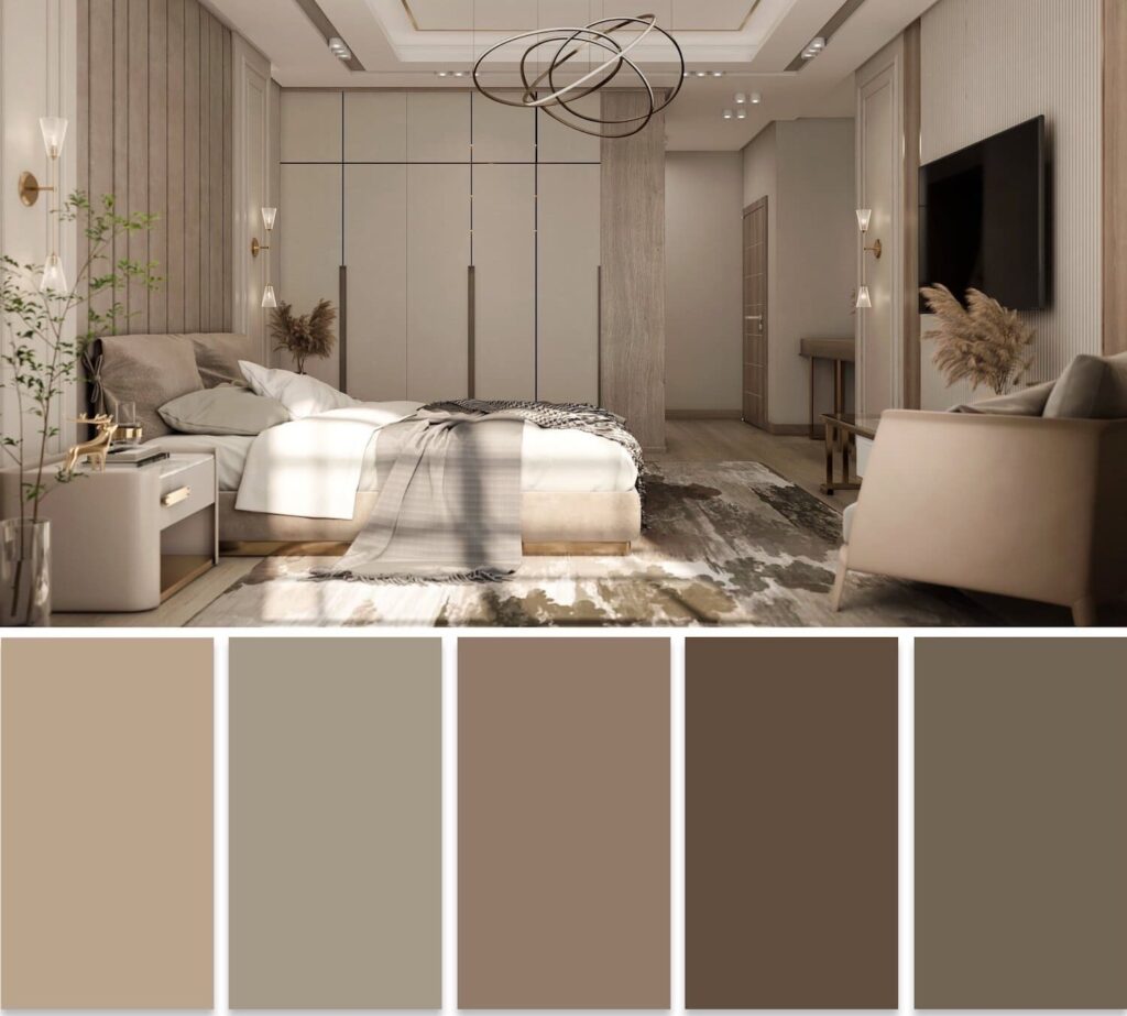
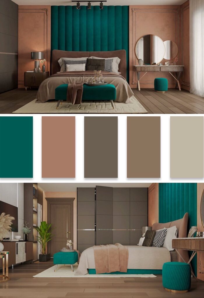
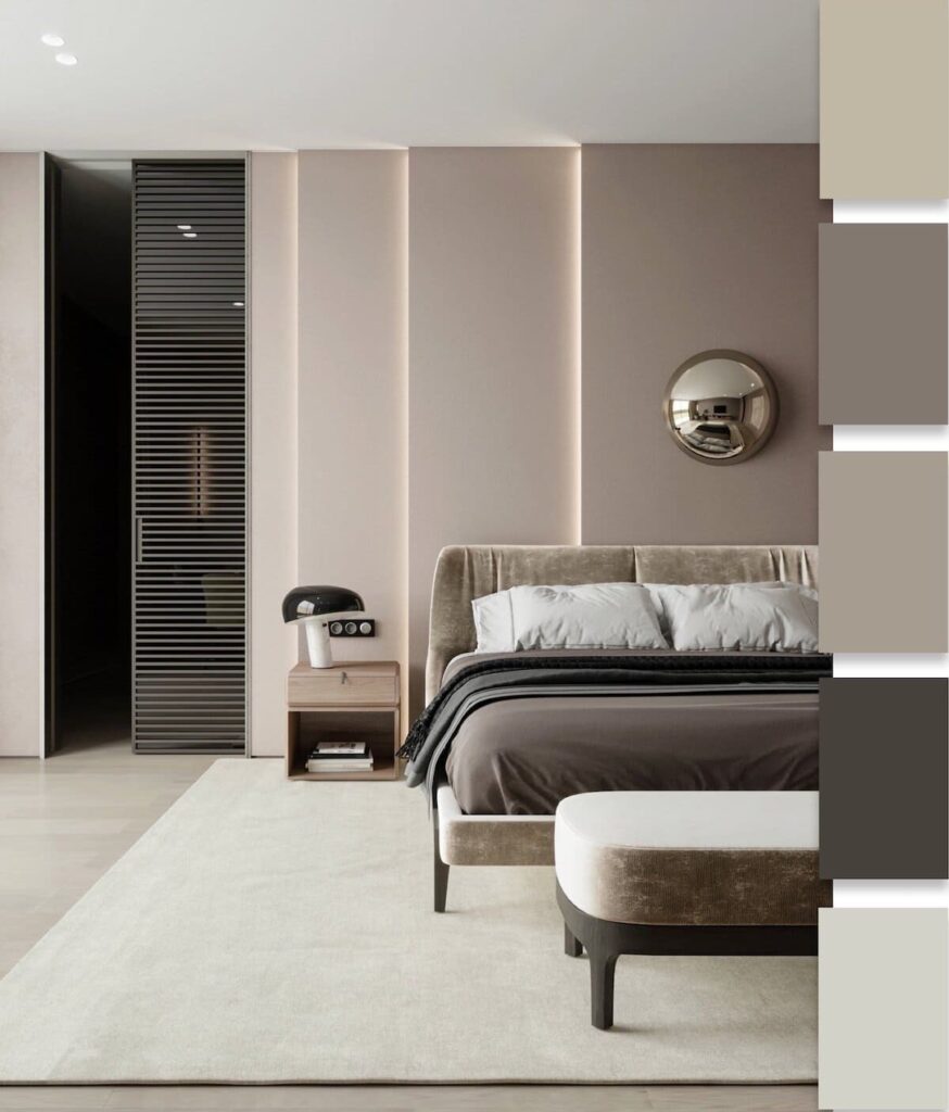
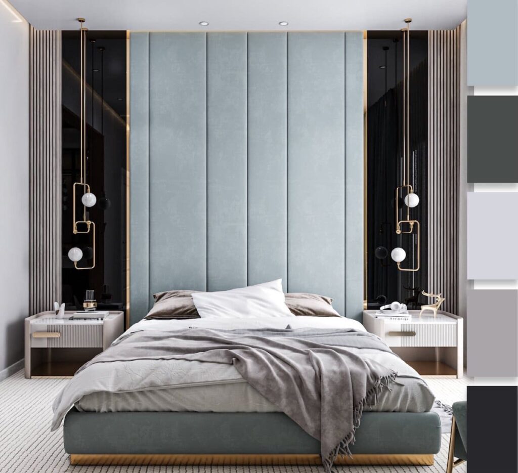
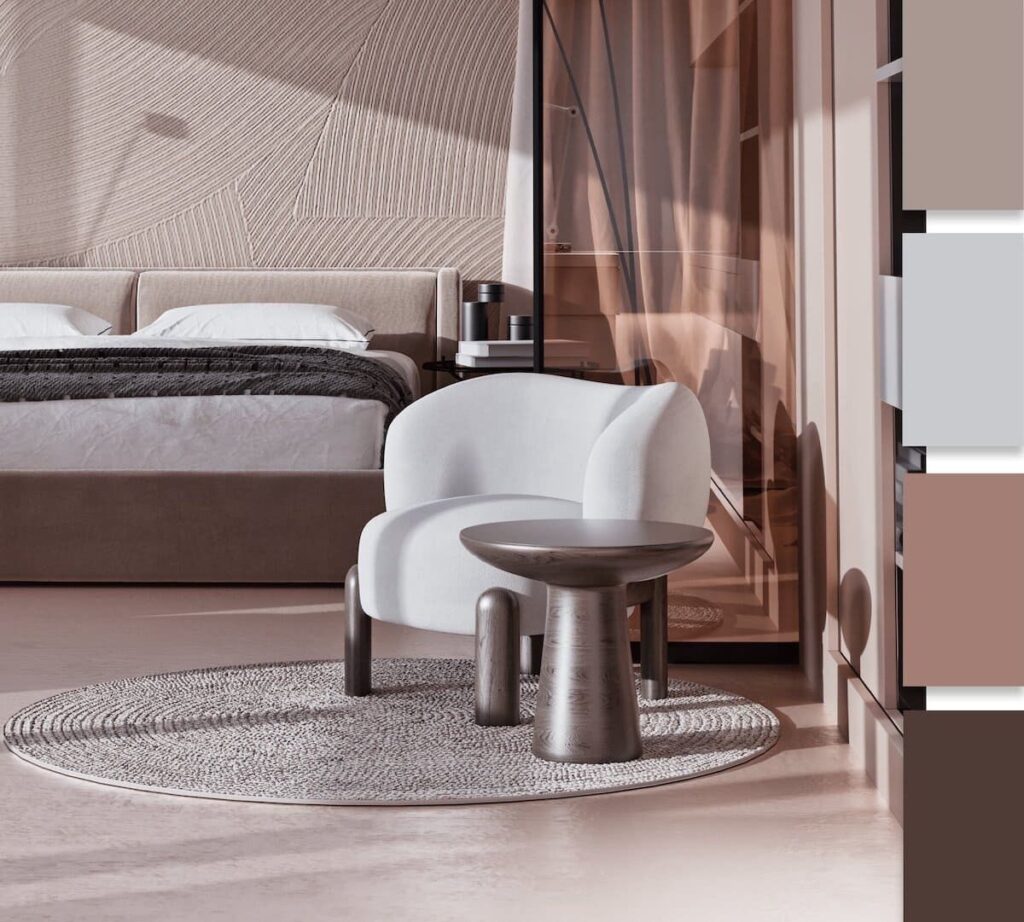
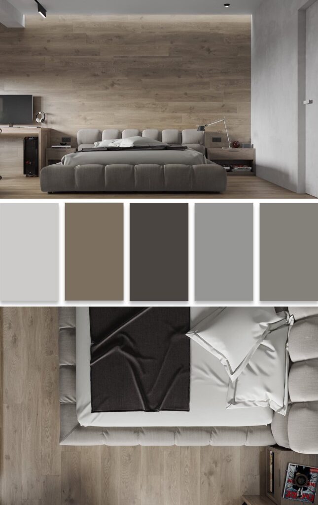
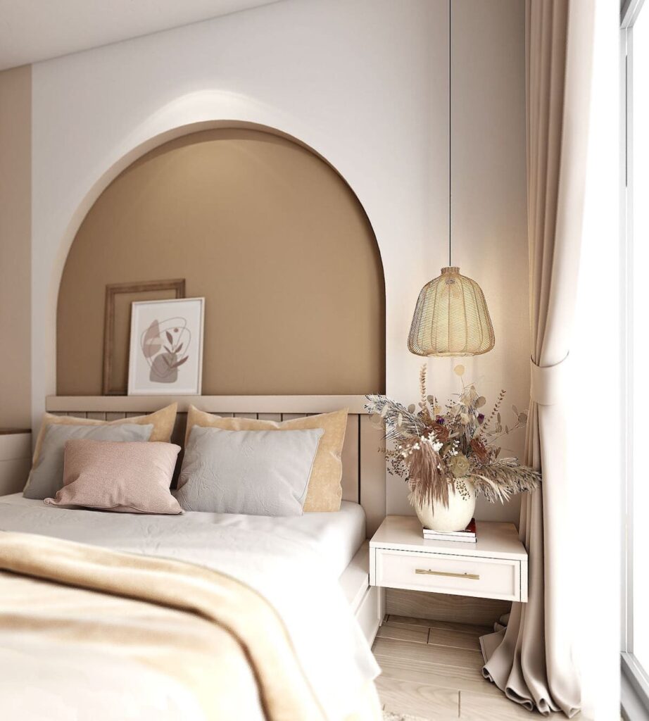
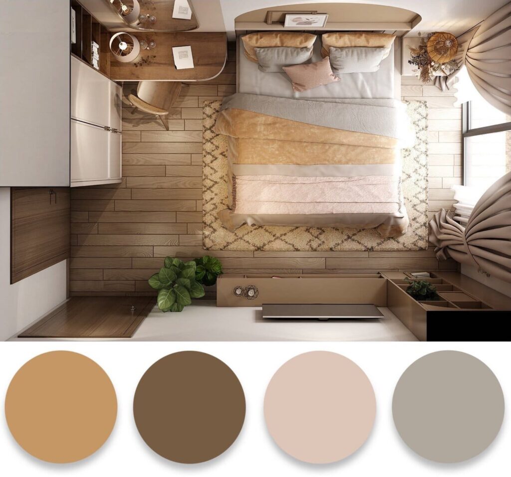
When choosing trendy colors for your interior in 2022, in addition to the functional purpose of the room, it’s important to consider the room size. A large, spacious room can be filled with light and comfort using warm tones. They evoke positive emotions and create a positive mood.
Tip!
To visually enlarge a small room, you can use cool light tones. Remember the simple truth: dark colors decrease space, while light colors increase it.
Children’s Room
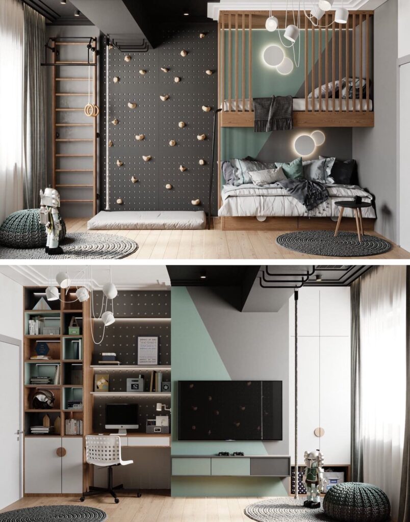
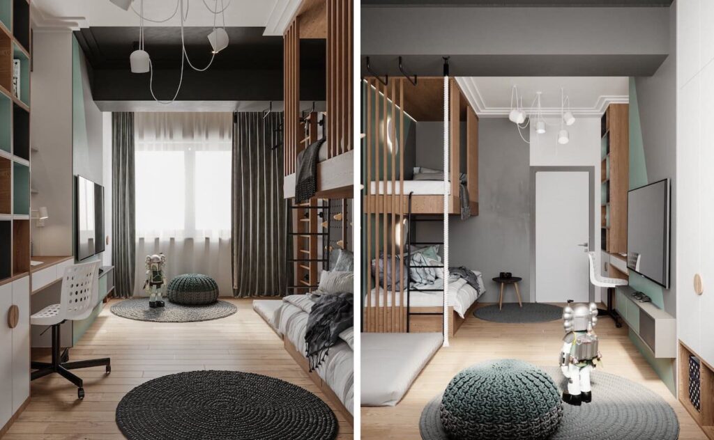
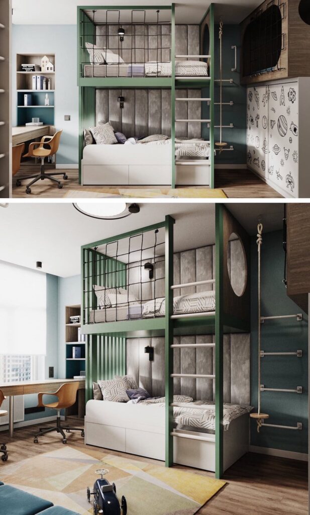
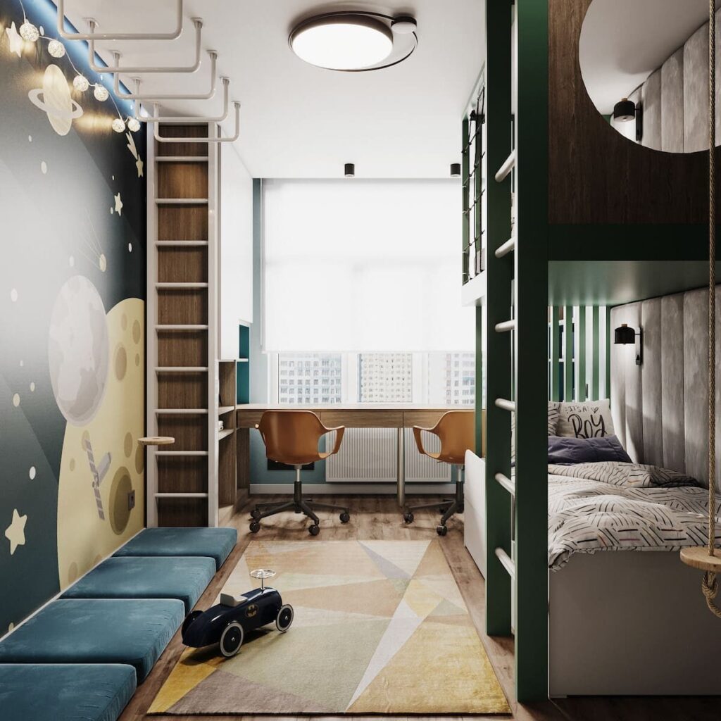
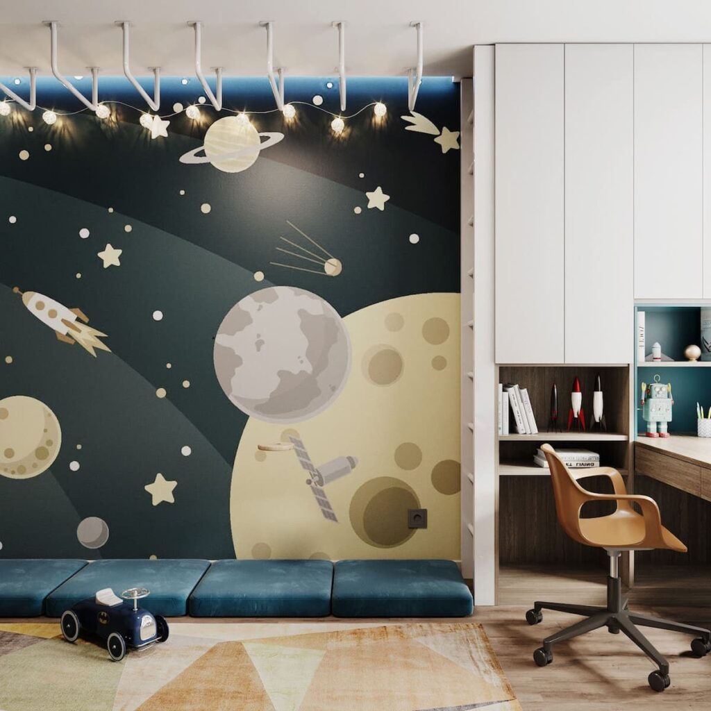
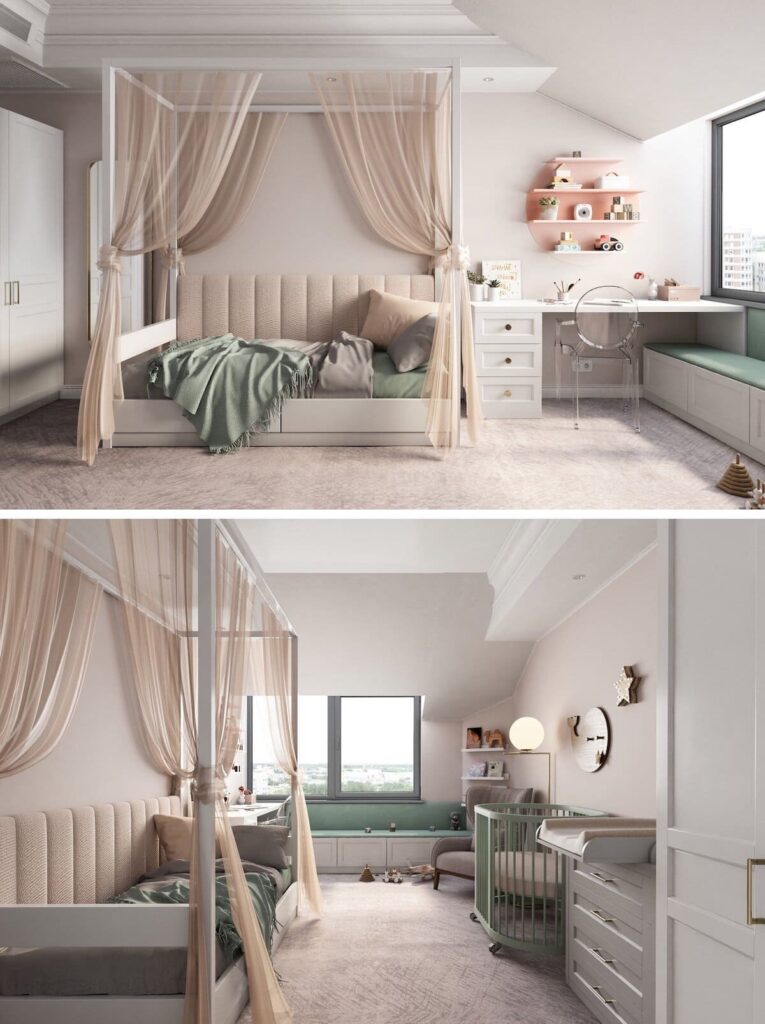
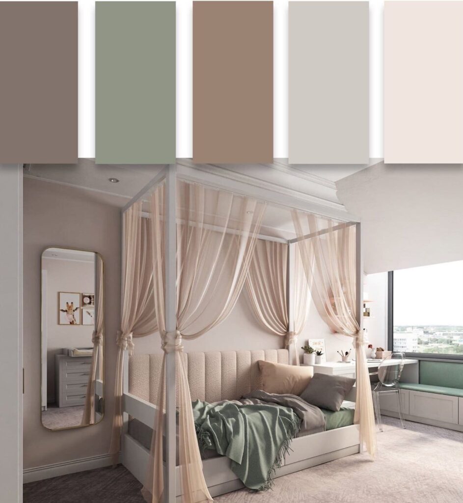
Initially, it’s important to determine the functional purpose of the living space before choosing colors. For example, psychologists have proven that it’s preferable to decorate a child’s room in calm, soft tones.
Yellow color affects attention and enhances a child’s creative abilities. Red shades in the interior will awaken the child’s energy and activity, but an excess of emotions can prevent them from falling asleep peacefully.
Fashionable color trends for 2022
You can create an atmosphere of comfort and coziness by using trendy colors in 2022 and various combinations of contrasting shades. The background can be made in calm or bright tones. Then add colors of a different tonality to this background. For example, pale yellow, warm orange, and beige colors will harmonize well with red. Decorative elements can have a variety of color solutions. Avoid using all the colors of the rainbow at once.
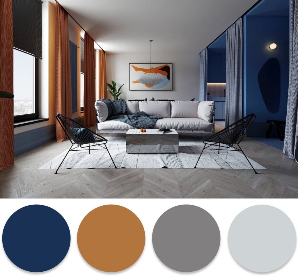
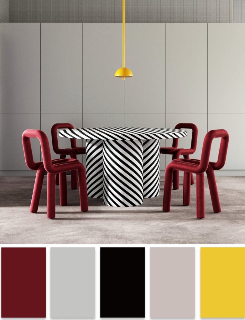
Another approach to decorating a space is to use contrasting colors. Each primary color has its opposite. By arranging such combinations, you can achieve very good results.
There are shades that do not go well together. When decorating a stylish interior in 2022, it’s not recommended to use warm, dark and cool light tones simultaneously. The same goes for combining light warm colors with dark cool colors.
Scientists have proven that such combinations have a negative impact on a person’s psychological state. However, in the modern world, it’s common to mix incompatible colors, and sometimes these subtleties are not taken into account. But now you understand the importance of skillfully combining shades and can easily implement any color solution.
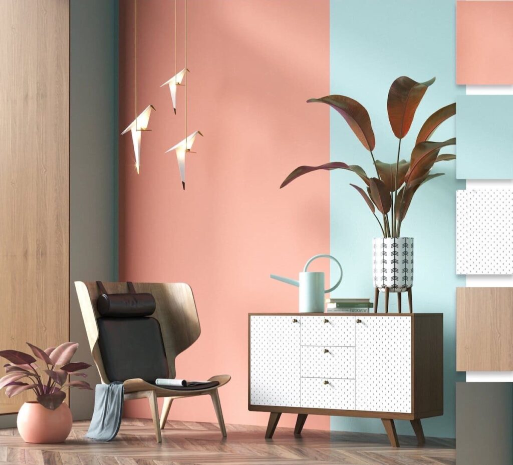
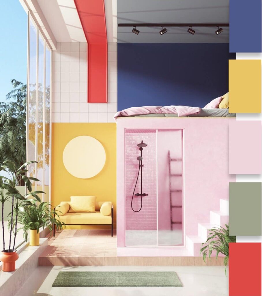
What colors will be in demand in 2022 – advice from a colorist
People are used to interiors decorated in calm and perfectly matching tones. The best option is considered to be an interior executed in a single color scheme, where things differ from each other only in shades. But there is also a completely different perception. Due to the lack of certain knowledge, ordinary people are not always able to choose the perfectly suitable shades, although internally they may understand what they want. After all, they have definitely combed the entire city in search of perfectly matching shades, have acquired various catalogs of paint and varnish materials and have applied them to the walls and floor of their home a hundred times. In such moments, a specialist in the field of color solutions – a colorist – can help.
It may seem that the difficult thing in the profession of a colorist is simply to memorize which color matches best with which, and which ones cannot be used together under any circumstances. But if it were all that simple, we would all be colorists.
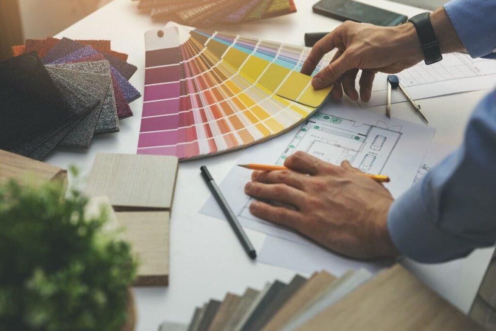
Colorists, who are experts in color and have skills in interior space design, decoration, and art, can provide professional advice on color selection. You can even find such experts in some building supply stores. To ensure your interior design features skillfully coordinated and trendy shades for 2022, you could consult these professionals.
It would be helpful to introduce the colorist to the items and accessories that are most dear to your heart. This way, they will have an idea of your taste preferences and the style of the future space. It could be anything, even a rug you cannot part with, a beloved couch, or curtains. This is invaluable information for a colorist.
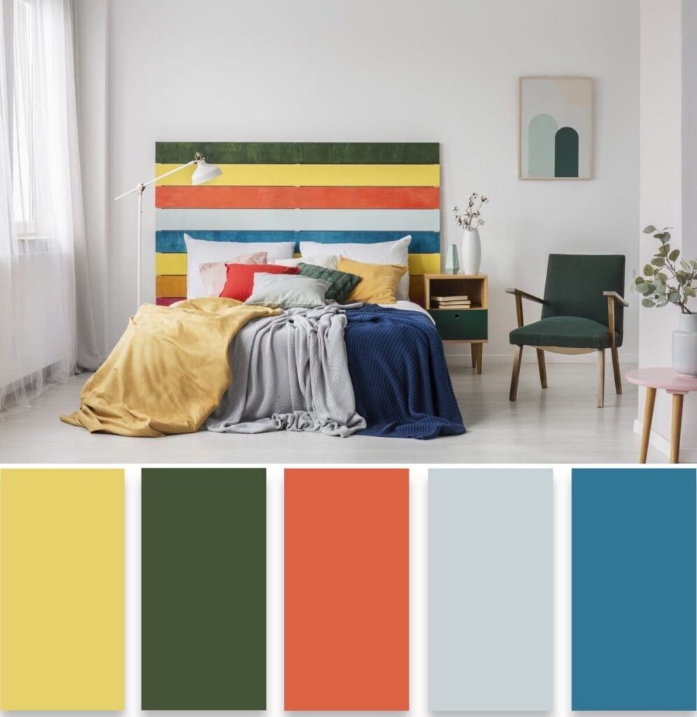
Another tip can be to show photos of interiors that you like the most, cut out from design magazines or taken from the internet. This is especially true for owners of new buildings, where there is nothing but bare walls yet. Since there is no starting point, photos of appealing interiors will come in handy.
Of course, you shouldn’t rely on the color choice entirely on the colorist. You need to decide on the color scheme of the room yourself since you will be living in it, not the colorist. Their task is to guide you in the right direction. In addition, they are aware of the latest trends and will select shades taking into account the proposed models.
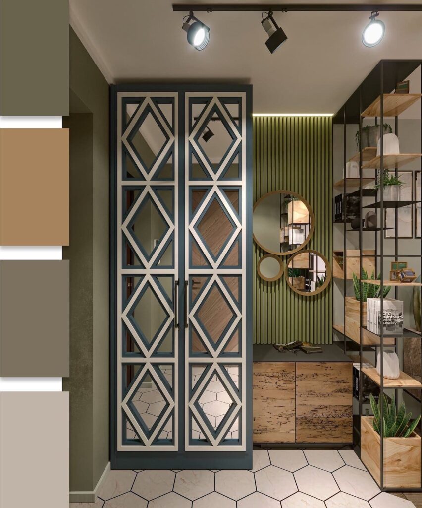
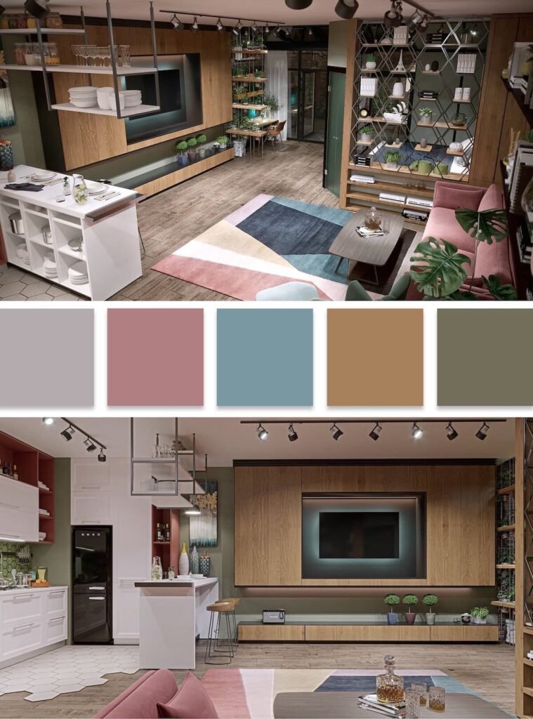
Don’t forget that choosing a color is only half the battle. You need to find relevant shades for the next few years. This is especially important for a child’s room, as the room grows with the child and bright colors that are suitable for a young child may not work for a teenager. In this case, a color specialist can advise on the most optimal color combinations for any age of the child.
It may also happen that in the end, you choose shades that you didn’t even consider at first or didn’t like at all. This is why the help of a color specialist is necessary to show you all possible combinations of colors. They can help you choose the boldest color duets that will fit perfectly into your future interior.
Ideally, for the whole house, it’s best to choose a single color scheme for the decor. This means that all doors, cabinets, moldings, locks, baseboards should connect the interior throughout the house. You can deviate from this principle only in some rooms.
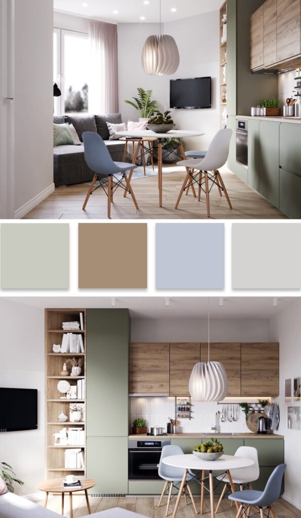
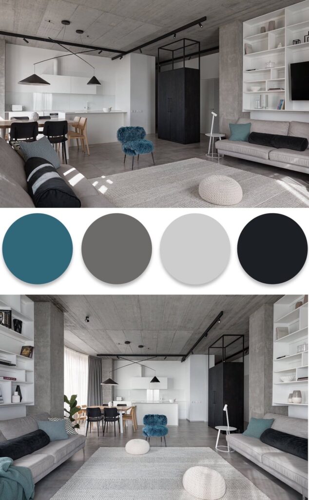
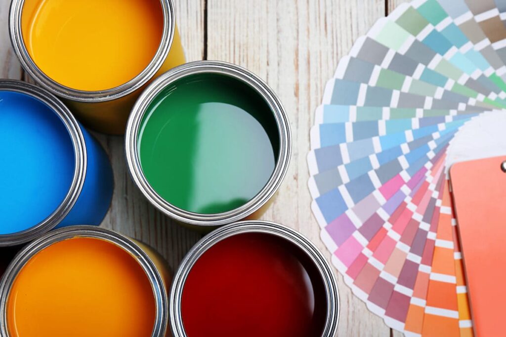
Paint and coating materials have the feature of different absorption levels on different surfaces, which can affect their saturation. This should be taken into account when choosing finishing materials. This is especially true for the facade of a building – the painted area is large, and it would be disappointing if the paint changes its color dramatically after drying. The color of the paint on a paper catalog may not accurately reflect its real color on different materials such as wood, plastic, stucco, or brick. In all cases, the paint will look different.
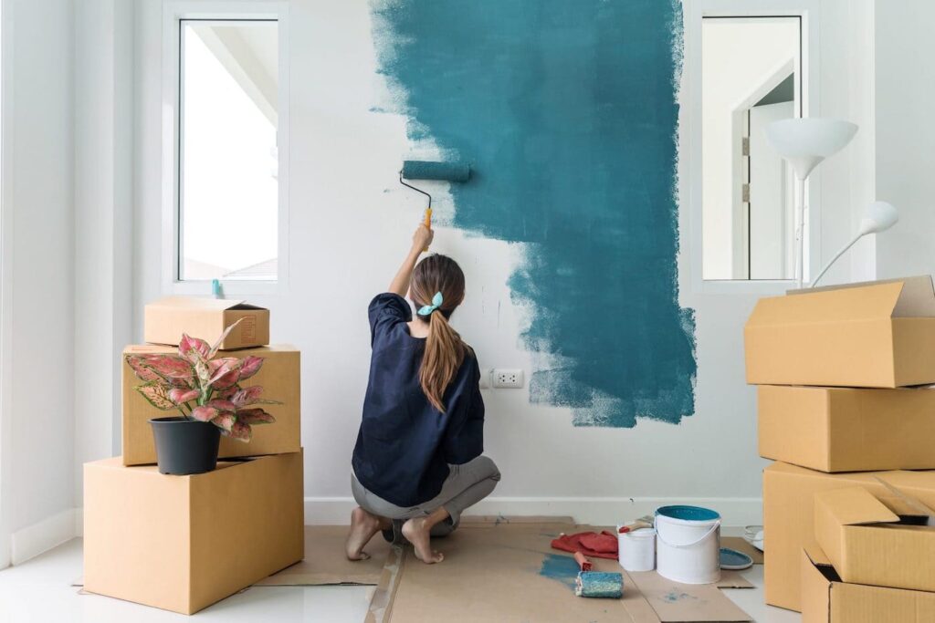
To help with this, painting a small section of the facade with the chosen paint color can be helpful. Wait for it to dry and then finalize your decision on the color scheme. Also, do not forget about the lighting, which reflects differently on each surface.
How to choose good paint for walls
On every paint or varnish package, you can find a special set of numbers and letters. First of all, what are paint and varnish materials? These are compositions in the form of powders or liquids that create a film texture or color on surfaces. Paint and varnish materials can include various priming mixtures, enamels, paints, varnishes, antiseptics, and putties.
We can use varnishes to create a transparent film, especially for indoor work. These materials often act as a foundation for the upcoming paint layer. The main task of these varnishes is to prepare and even out the surface. To protect the surface, we apply antiseptic solutions.
Useful to know!
In order to understand the specific properties of a particular paint or primer, manufacturers typically apply a special labeling system using letters and numbers. By decoding this labeling, you can obtain information about the product you need.

Leave feedback about this