Orange in interior design might seem too intense and lively to be appealing. However, once you get to know it better, it’s clear that this sunny hue fits into any room and various styles. Today, we’ll highlight which shades of orange to focus on, how to use them in different room interiors, and what to pair them with, using photos of real projects as examples.
Characteristics of the Color
Orange is a warm, vibrant color, transitioning from yellow to red, thus combining their characteristics. It evokes positive associations like fruits, the South, autumn leaves, and spices, as well as fire, the sun, optimism, joy, and vital energy. It is also linked to spiritual growth—no wonder Buddhist monks wear robes of this color.
Orange stimulates the appetite, brain function, and generally has an exciting effect on the psyche. Therefore, when choosing color combinations with orange in the interior, it should always be balanced with neutral, calming shades. Use it cautiously in bedrooms and children’s rooms: in large amounts, it can be tiring and even cause anxiety.
It is also important to note that it does not suit all styles. For example, orange is rarely used in classic, rococo, empire, and high-tech styles. However, it thrives in modern and minimalist interiors, country, and eco. It is often used as an accent in Scandinavian design, but in a subdued version.
Shades
The perception of orange depends on whether its undertone leans towards yellow or red.

The closer to red, the richer and more aggressive the shade. Leaning towards yellow gives a sense of coziness and sun, creating the illusion of increased temperature in the room. But not all citrus shades have to be bright and concentrated—there are nearly pastel variations that do not actively impact the psyche. There are many shades worth noting.
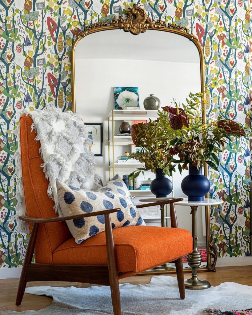
Citrus—orange, tangerine, grapefruit. These are the juiciest tones, exuding vitality just from their names. In the overall palette, they should serve as a color accent, balanced by neutral shades.
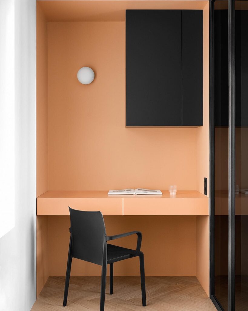
Peach, apricot—contrasting with the previous bright fruits, these tones, diluted with white and beige, lean towards a pastel palette. They can be used in any room, not just in decor but also in furniture or finishes. They refresh the environment but do not overwhelm the psyche, making them often used in bedrooms and nurseries.
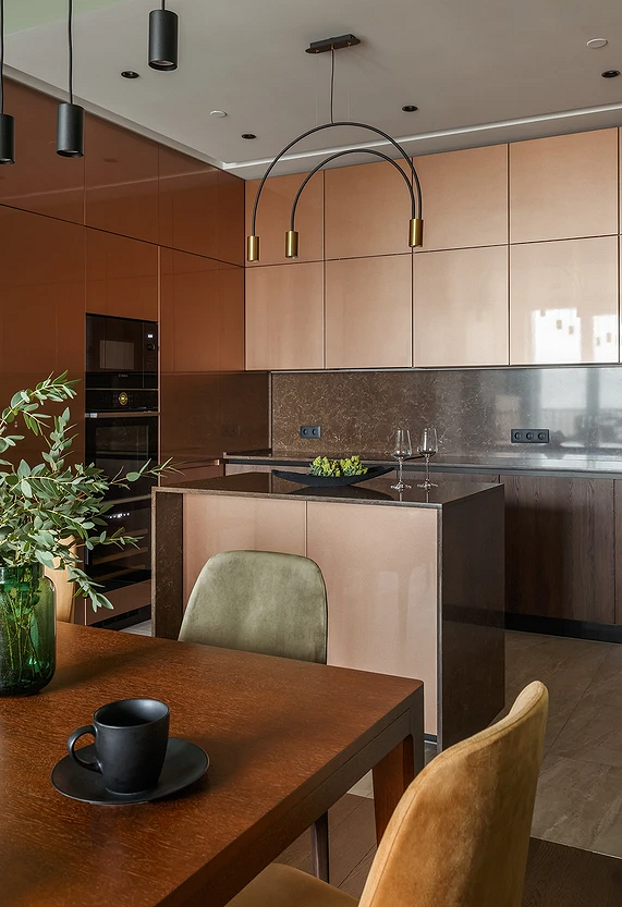
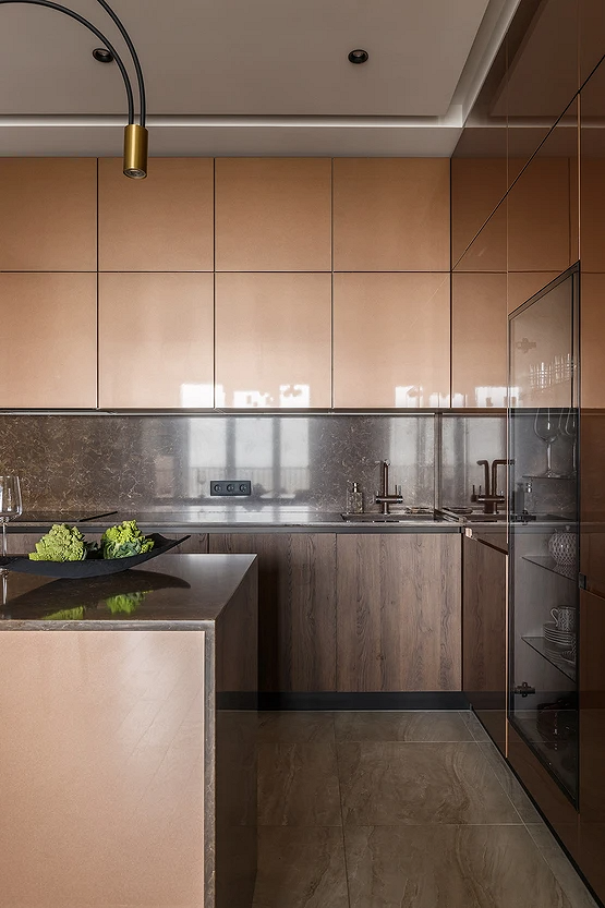
Amber—a darker and deeper tone, associated with autumn warmth. It can be lighter with a yellow tinge or lean towards brown. It can be used in finishes, but it’s better to choose a diluted variant. Or, apply it not
on all surfaces, but to highlight an accent wall.
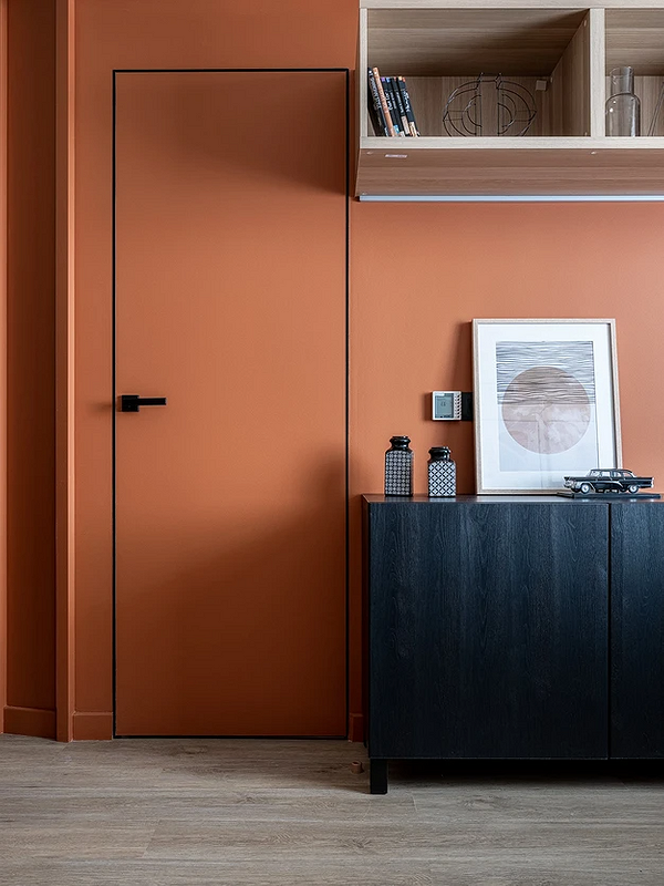
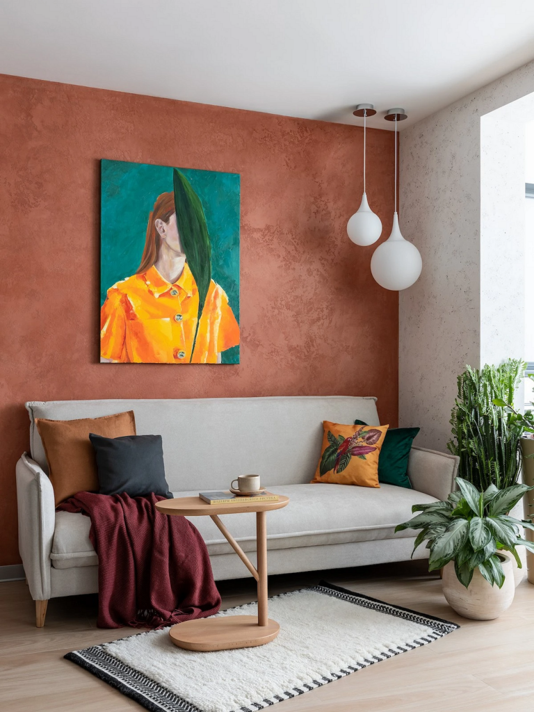
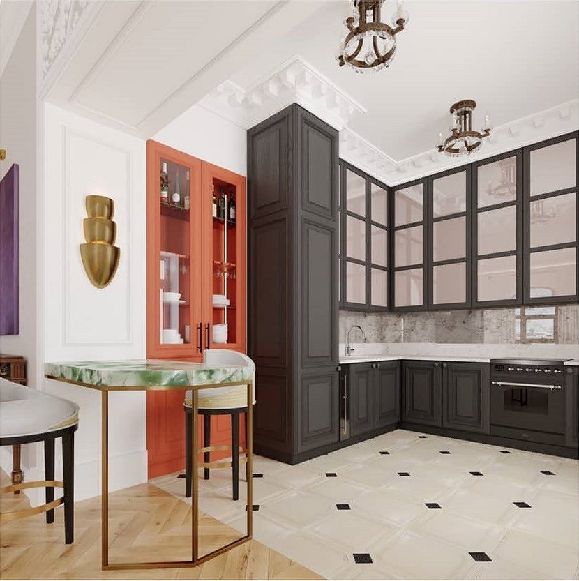
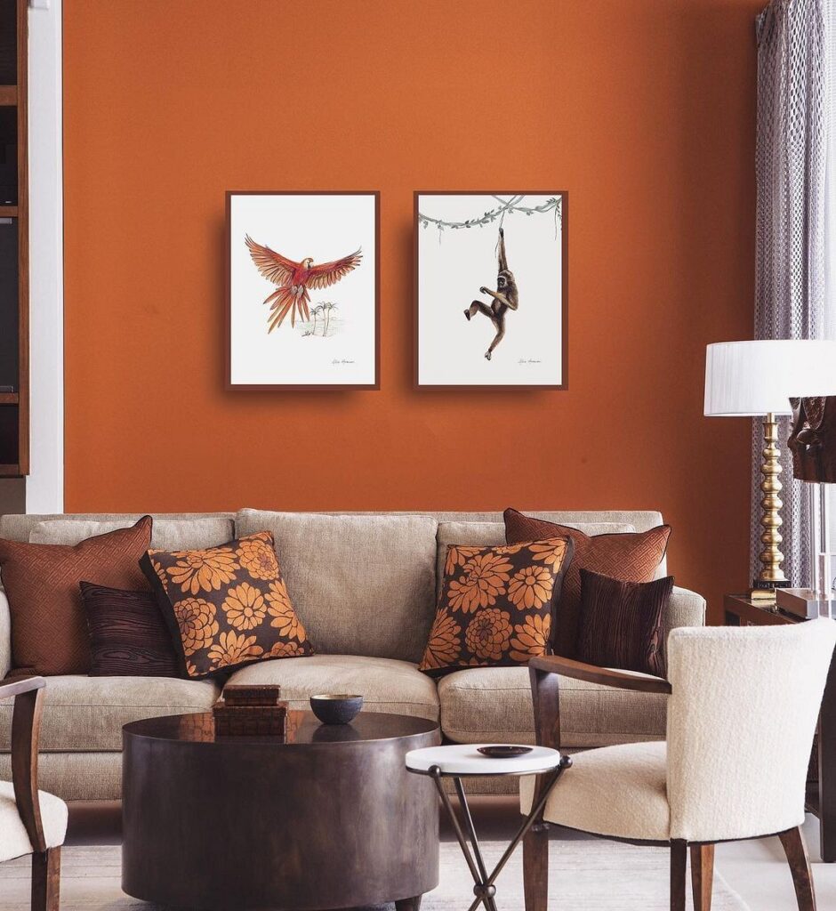
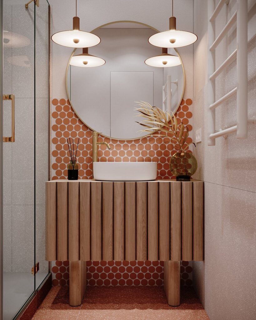
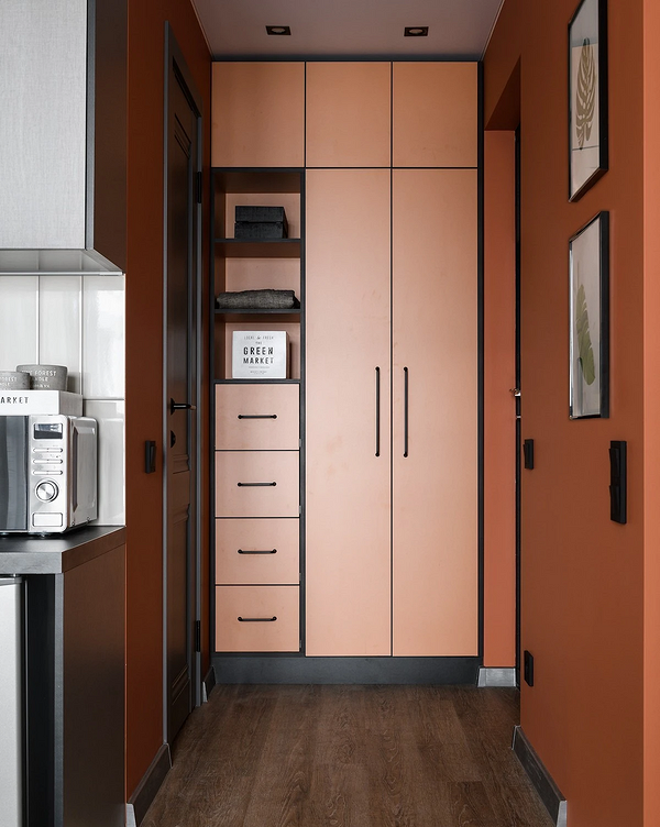
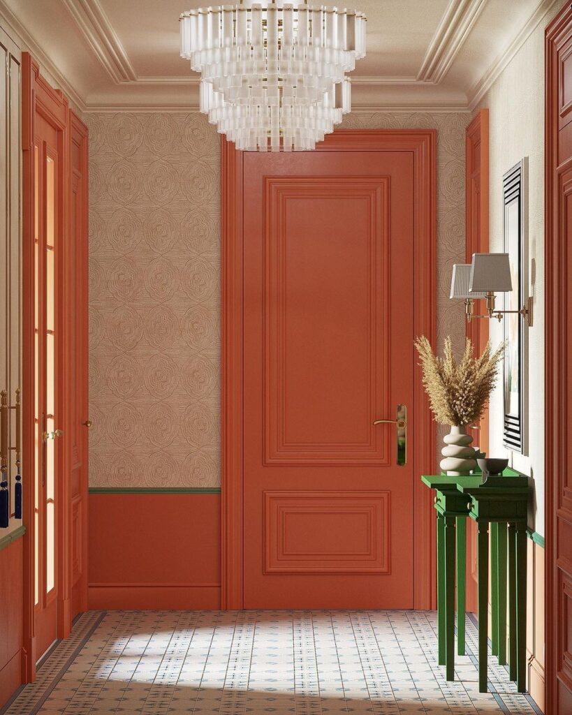
Terracotta—the darkest of the popular shades, closest to red. It makes the space elegant and cozy, beautifully combining with any natural textures, whether stone or wood. It can be used in any room. Whether to use terracotta as a base or an accent depends on the saturation of the tone.
What to Pair With Orange
Let’s consider the most successful combinations with orange in interior design.
Gray
Gray gets along with all shades of orange, from dark ochre to juicy tangerine. In this case, the achromatic color serves as the base of the palette, while orange can be used either as a bright accent or as an additional color. The intensity can vary, and gray looks equally good in both light and dark variations.
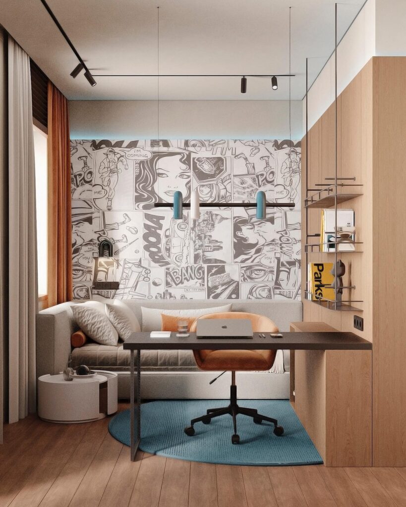
Black and White
Without a doubt, both achromats successfully combine with anything, including vibrant warm colors.

Orange adds notes of warmth and energy to a restrained achromatic palette and instantly livens up the interior. Conversely, black and white can balance a palette created using an active color. The combination looks graphic and thereby striking.
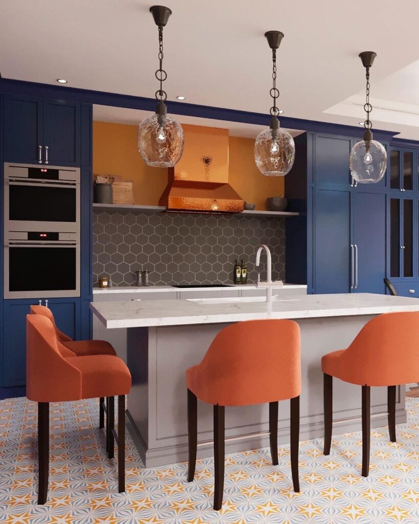
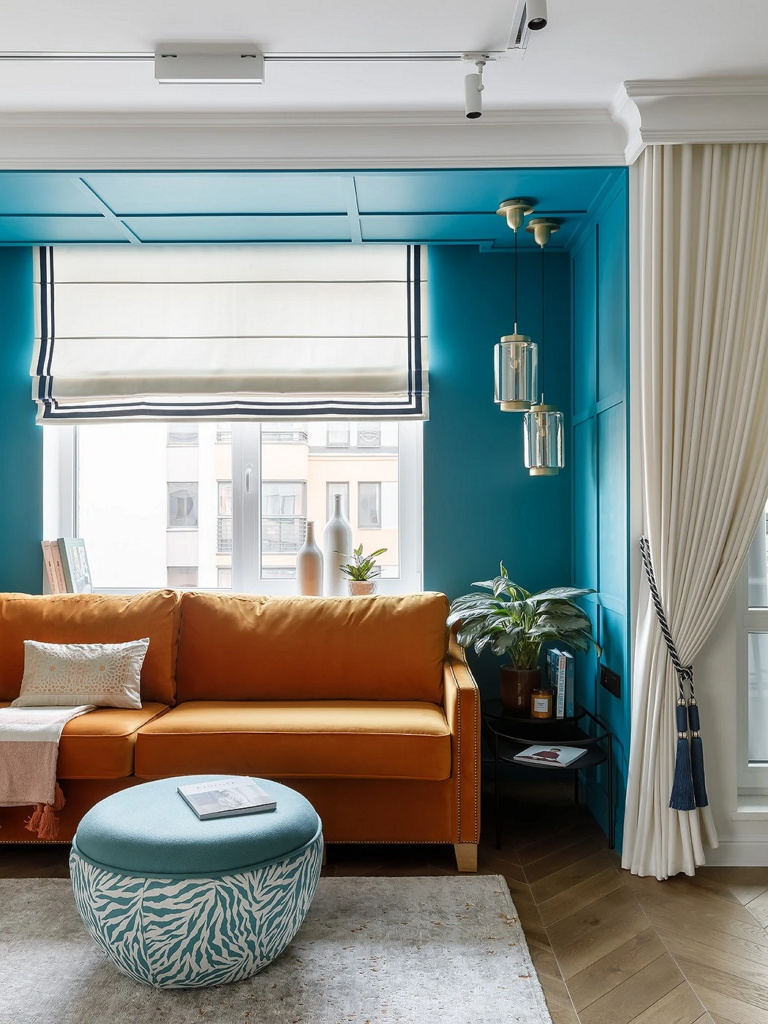
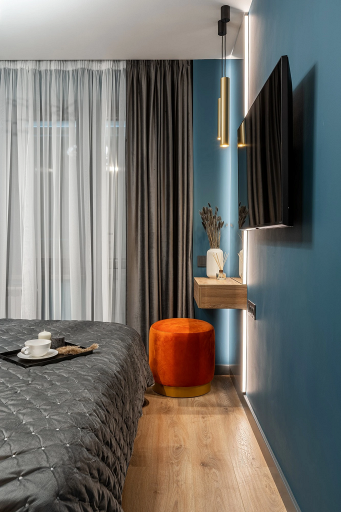
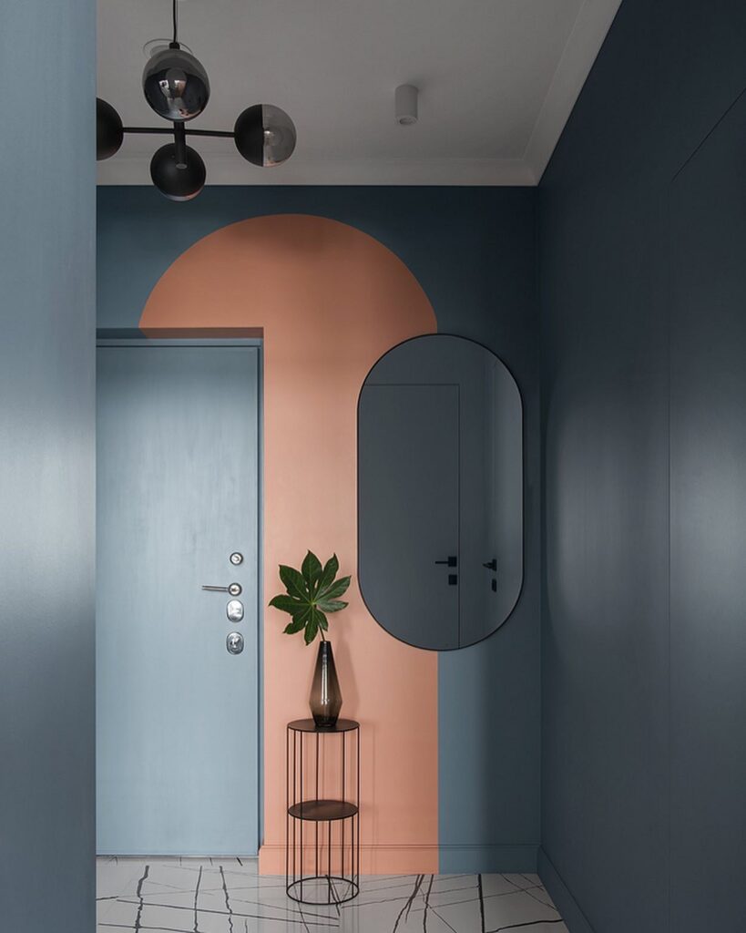
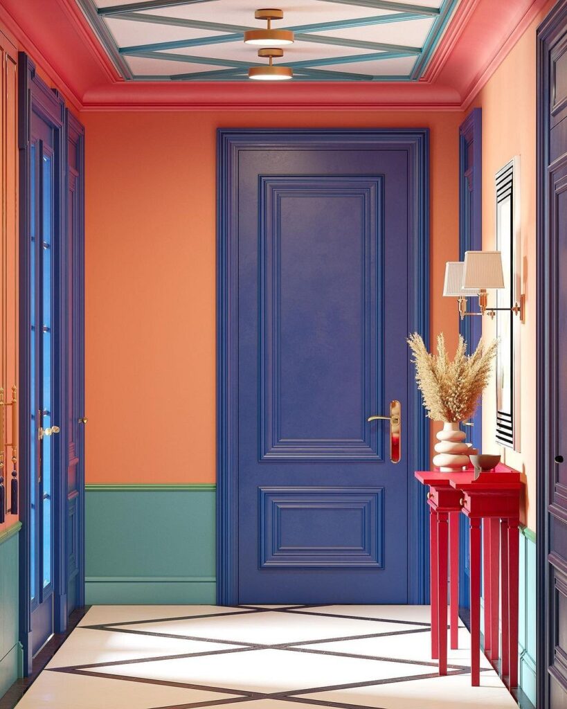
Blue
A bright and striking combination that harmoniously contrasts in warmth and coolness.
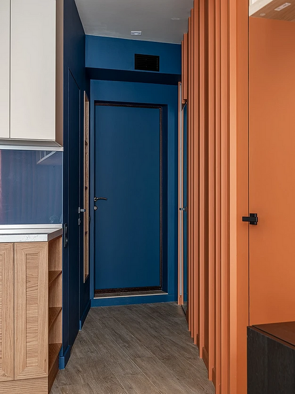
The blue of the sea naturally neighbors warm sand or sun-heated earth, so this combination always works. If you want to use these two colors as the main ones, it’s better to choose deeper and muted variations: indigo, gray-blue, ochre, amber, terracotta, etc.
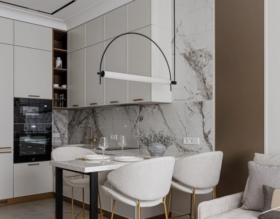
Beige
The orange-beige pairing adds brightness and expressiveness to the space, without making it overly gaudy.
Choose shades that are close in tonality. For a softer palette, pastel tones work well, for a richer palette—vivid orange and dense beige. Also, complement the color scheme with other colors: for example, white, gray, or brown. A warm pair effectively contrasts with cool colors like deep blue, pine green, black.
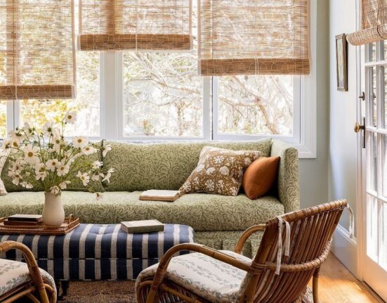
Green
This combination is truly energetic, juicy, and optimistic. It transforms even the darkest room.
The unique feature of green is that it is both active and relaxing. It can be used both as an accent and as a fairly calm, even basic background for brighter orange shades. The main thing is to choose the right shades. Warm greens like pistachio, olive, grassy fit well with orange. However, emerald, sea green, or absinthe might not look as successful next to orange.
Pastel Tones
Citrus can harmoniously coexist with any pastel tones: mint, pearlescent pink, lilac, blue.

In this case, it’s better if the shade is also muted, diluted with white or beige. Thanks to the reduction in brightness, a harmonious and equally intense combination of colors in the interior with orange is achieved. This combination is suitable for any room, from the kitchen or bathroom to the nursery.
Ideas for Different Rooms
Let’s explore how to use orange in the kitchen and other rooms.
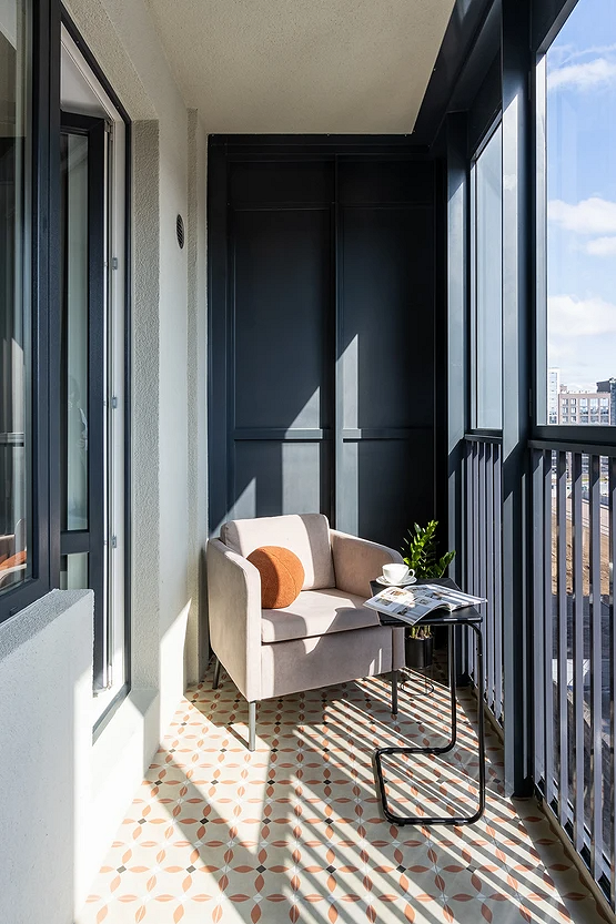
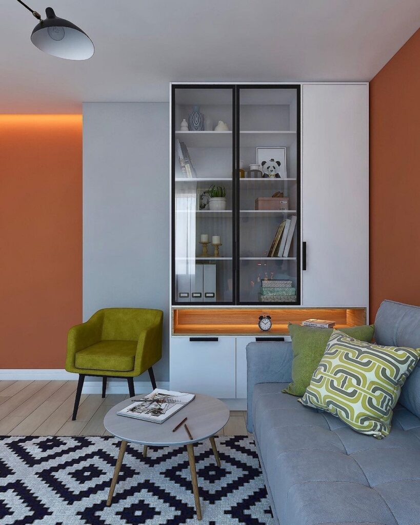
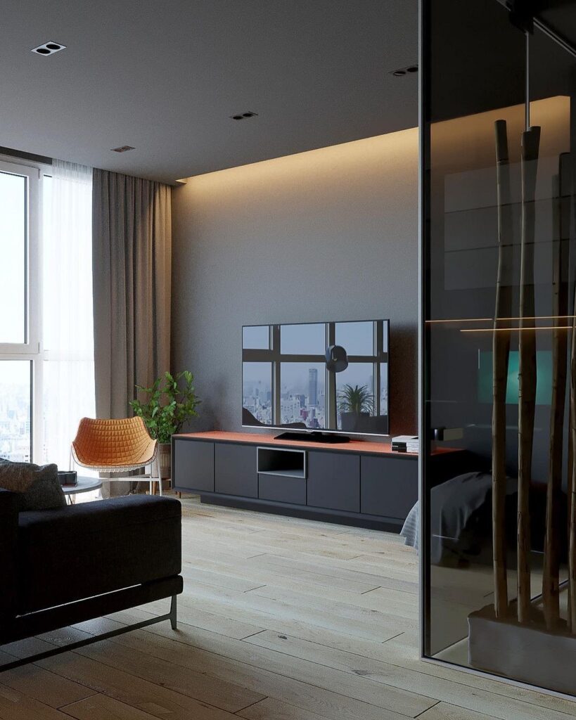
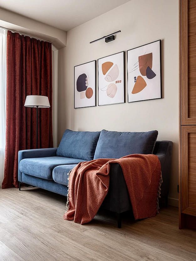
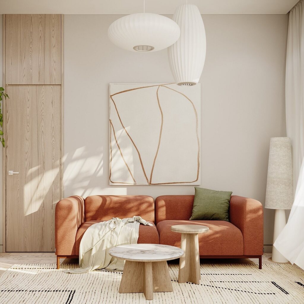
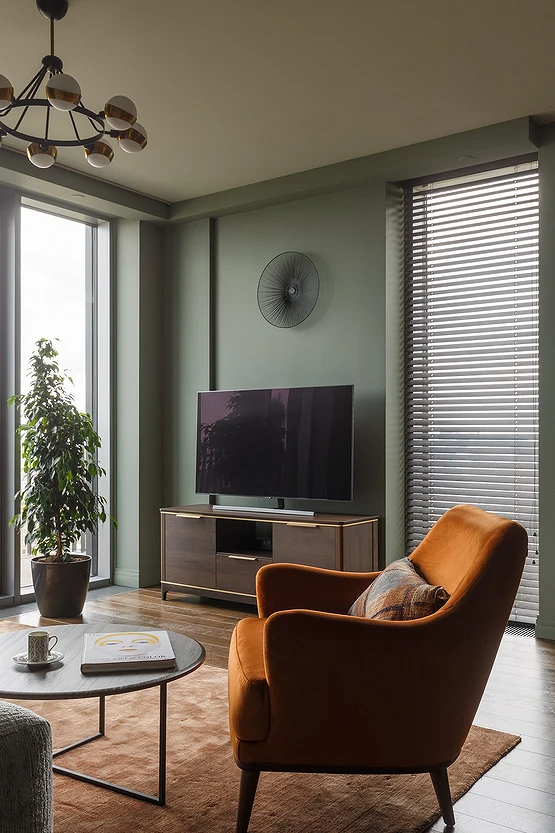
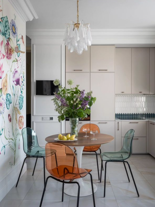
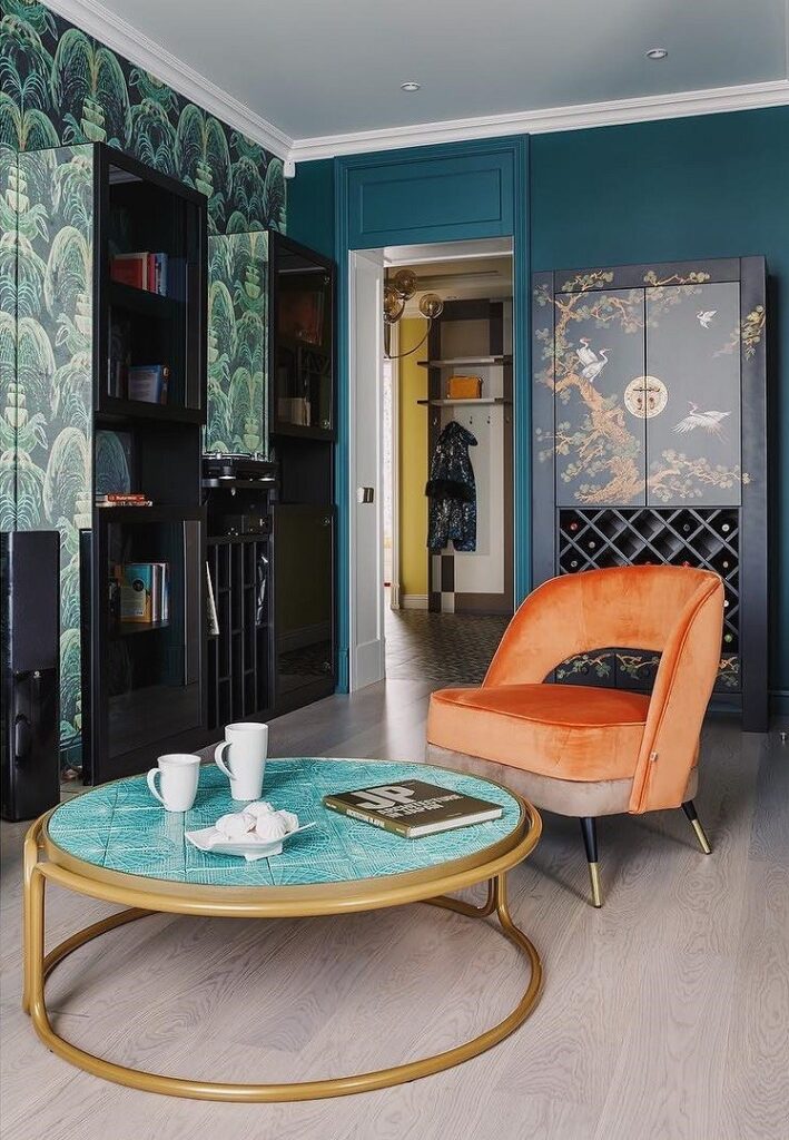
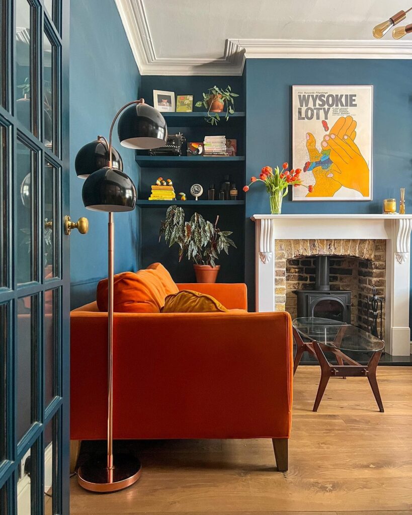
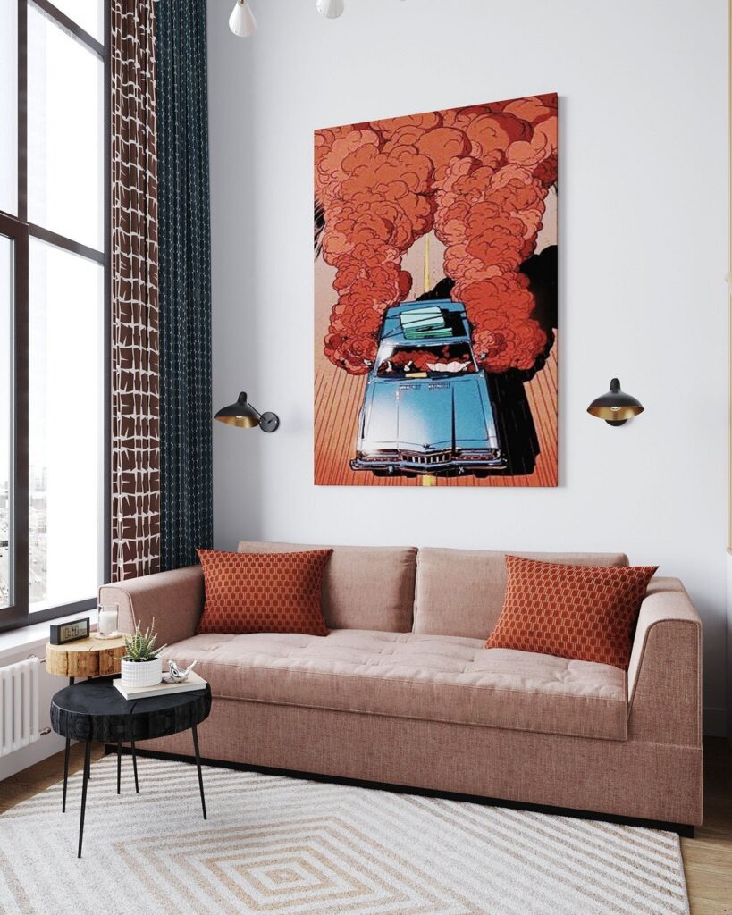
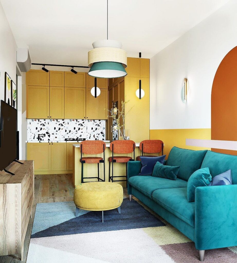
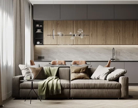
Living Room
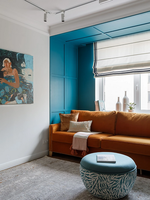
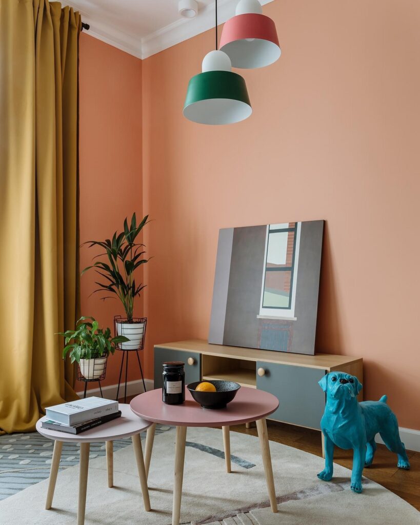
In the living room, orange creates a cozy atmosphere and sets the mood for heartfelt conversations with loved ones. To avoid turning the room into a huge orange, it’s better to use the color as an accent: for furniture or decor. A popular technique is a living room in nude tones with a single bright element. This could be an ottoman, chair, or sofa.
If the room lacks natural light, you can visually “warm” it up using finishes. In this case, it’s better to choose a subdued shade (peach, ochre, amber) and use it in combination with a neutral base. Alternatively, paint one accent wall orange. Such finishes will go well with a wooden floor and a light ceiling.
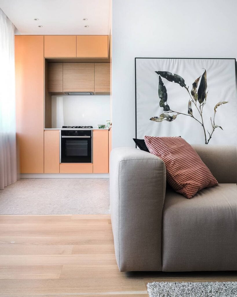
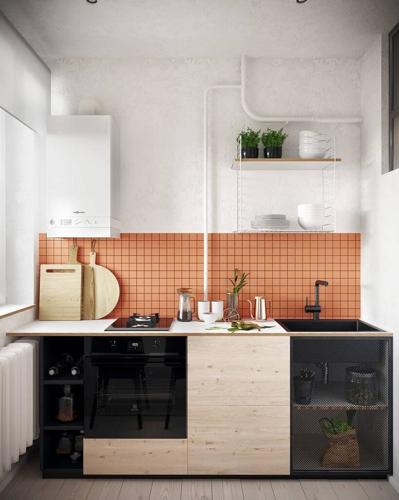
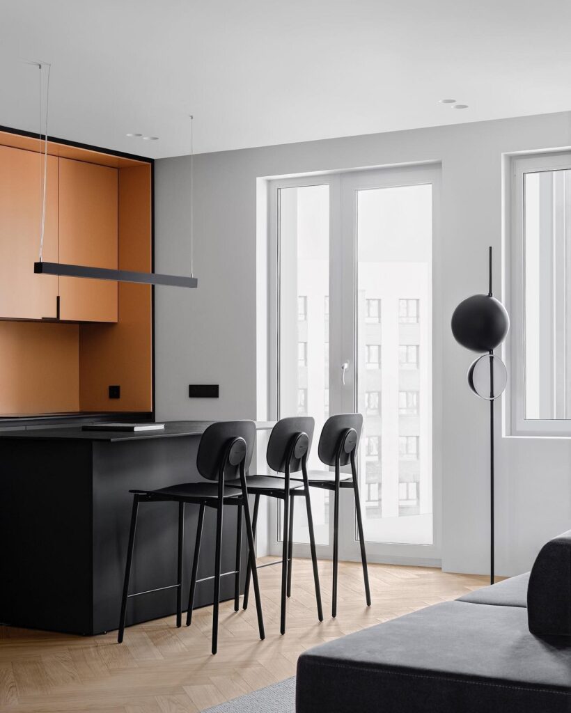
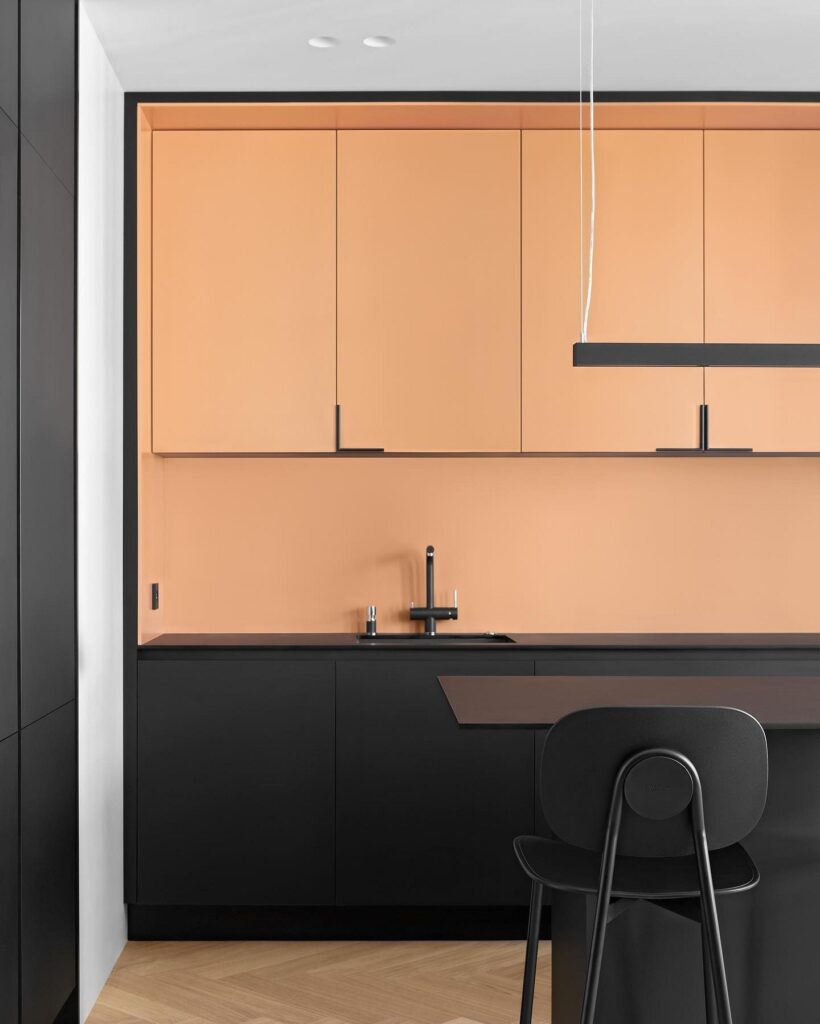
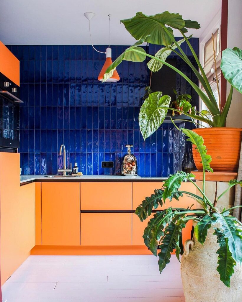
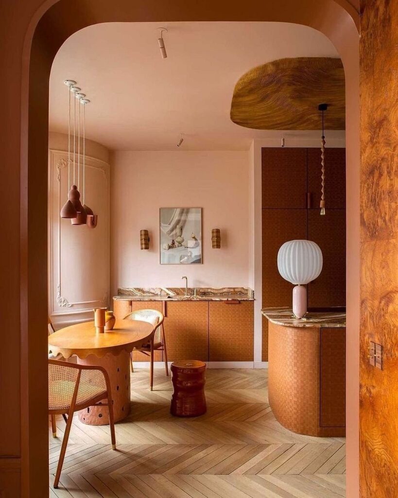
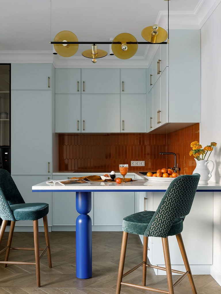
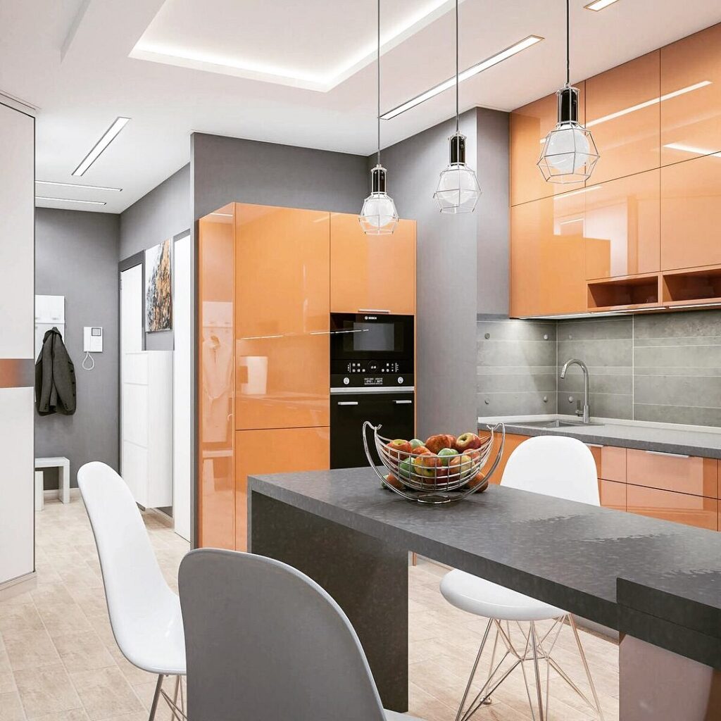
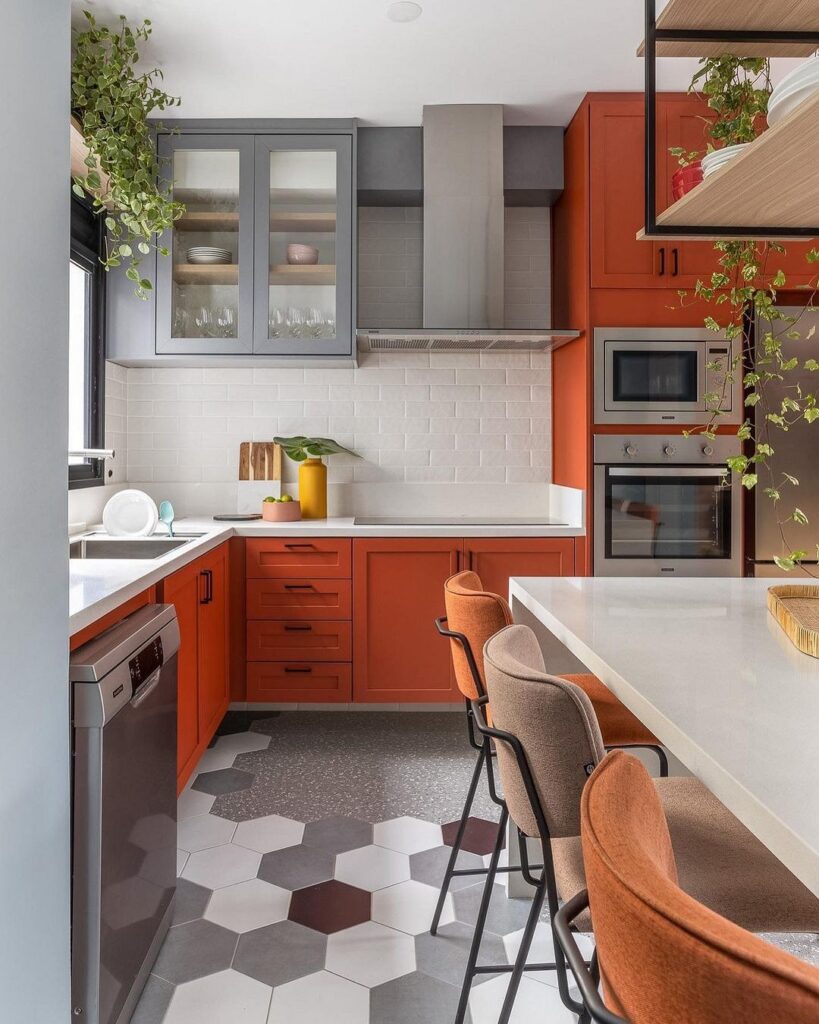
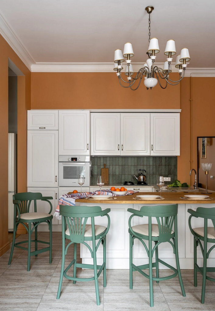
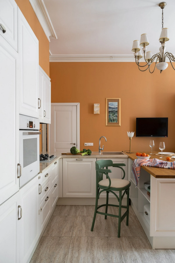
Orange Kitchen
Be cautious with citrus notes in the kitchen. Orange significantly increases appetite, and a room in such warm tones appears hotter — something to consider when designing the cooking area.
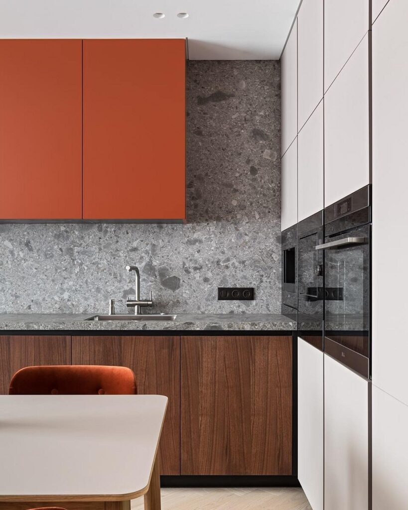
How to use without overdoing it:
- In decor and accessories.
- In textiles — for example, choose an orange tablecloth or terracotta curtains.
- As an accent — chairs, some appliances, part of a wall.
- Choose deep dark or diluted light tones for finishes if the kitchen is dark and uncomfortable.
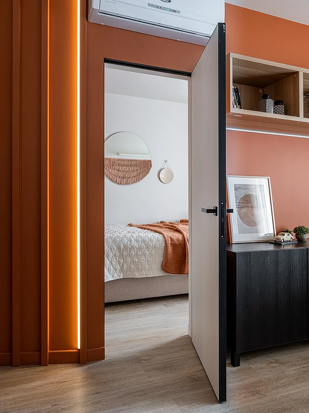
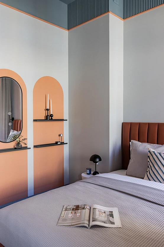
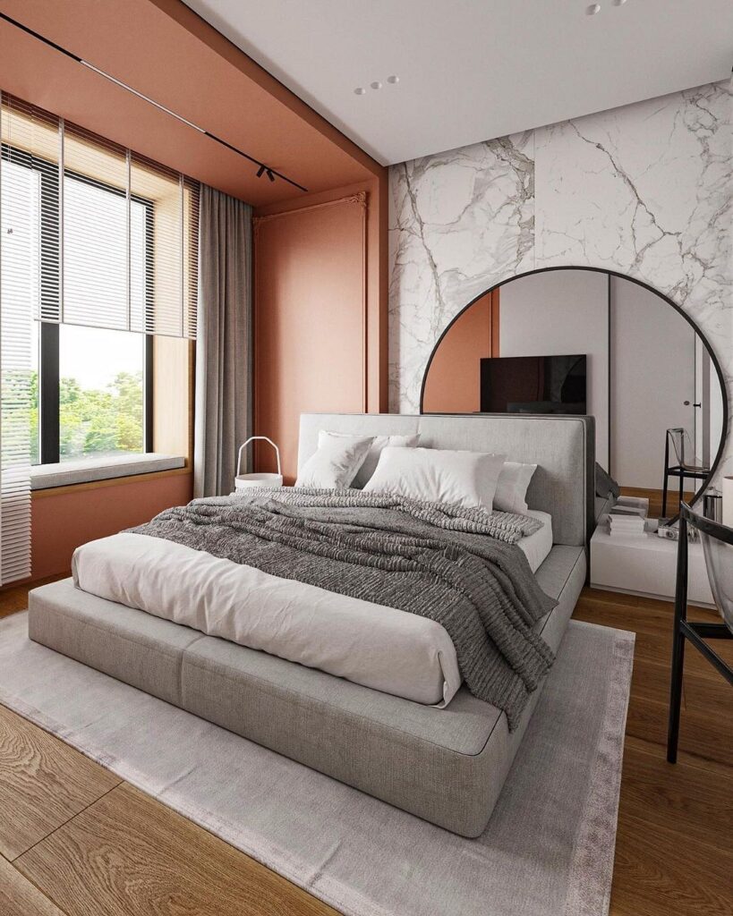
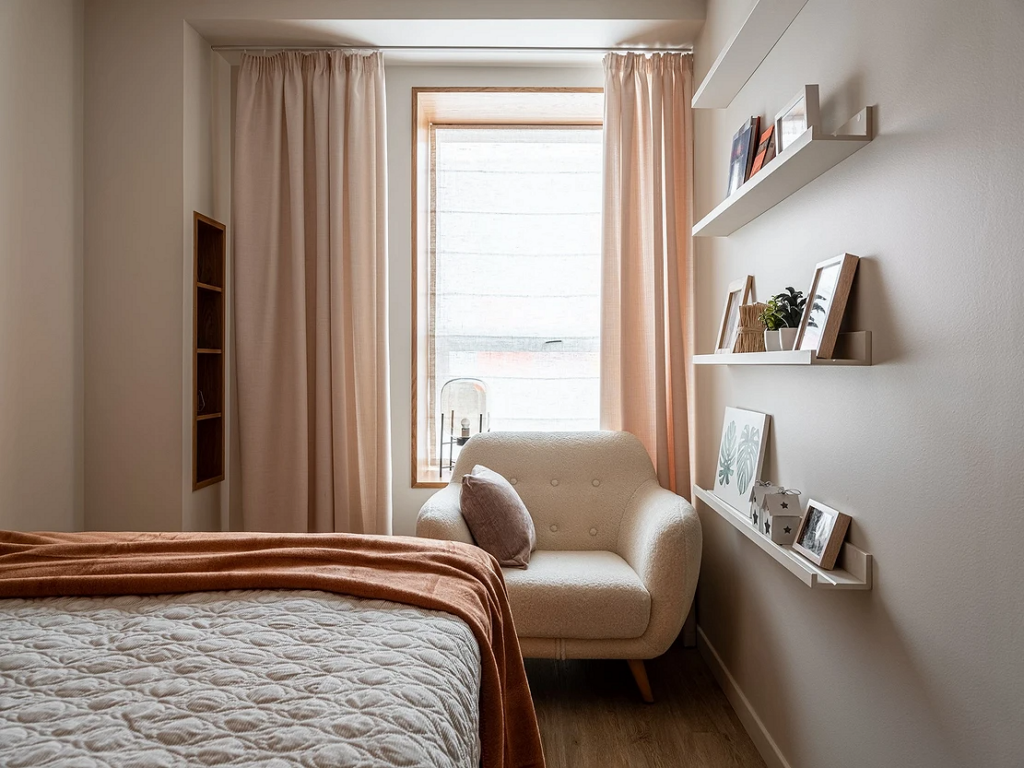
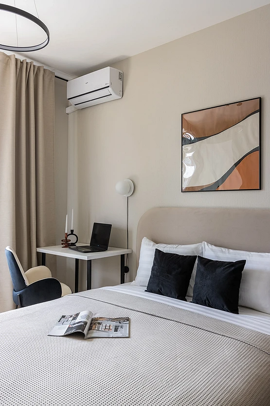
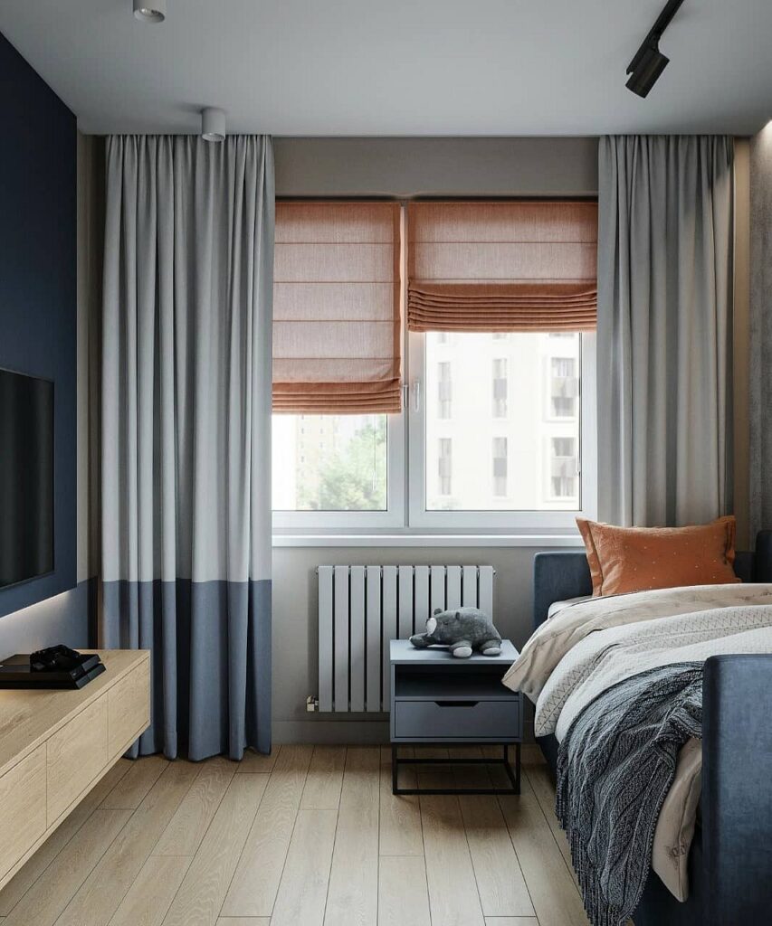
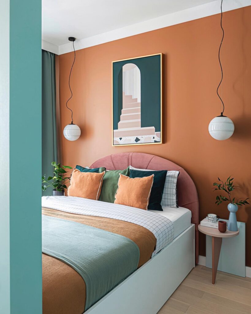
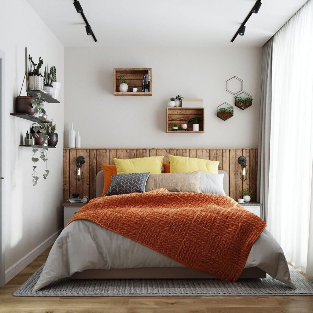
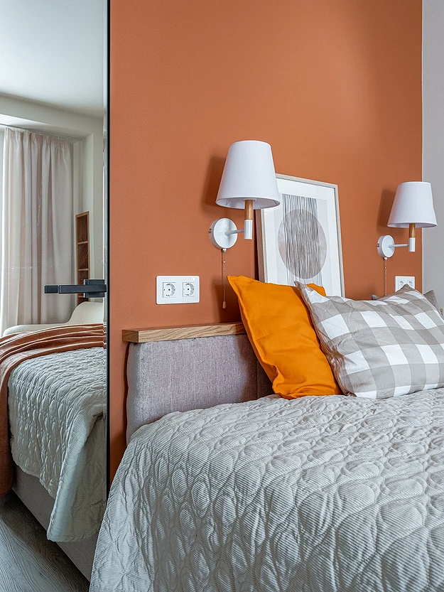
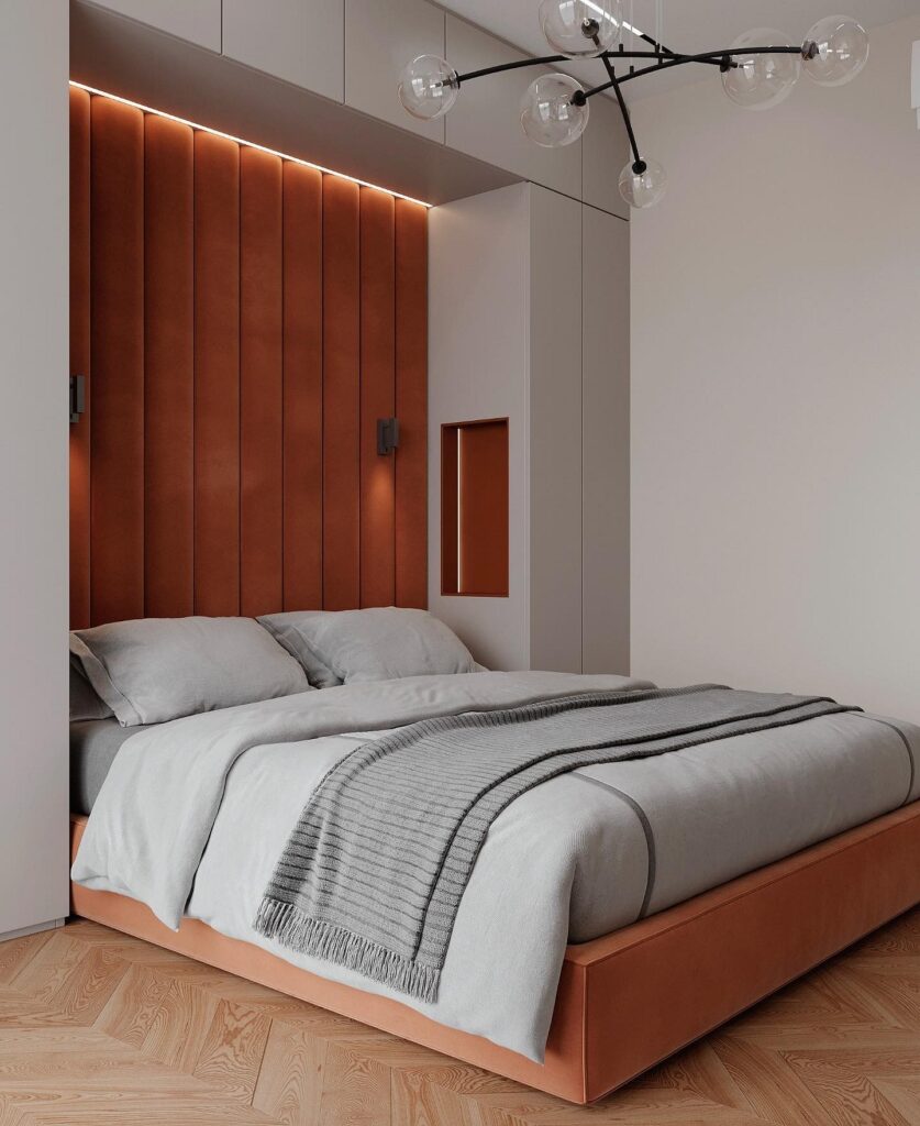
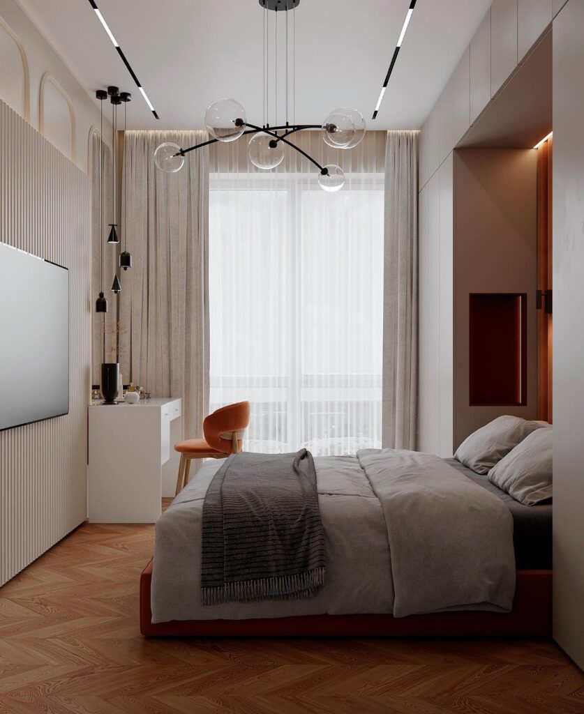
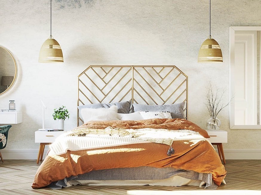
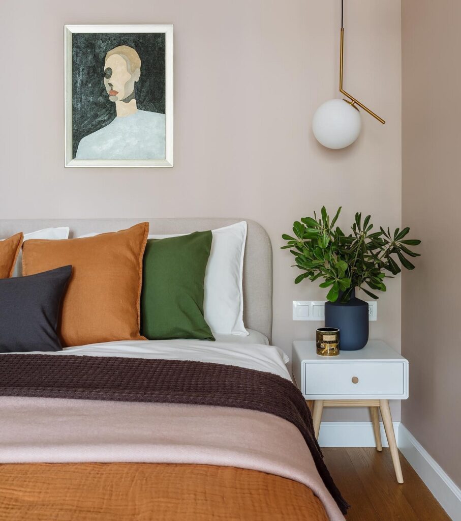
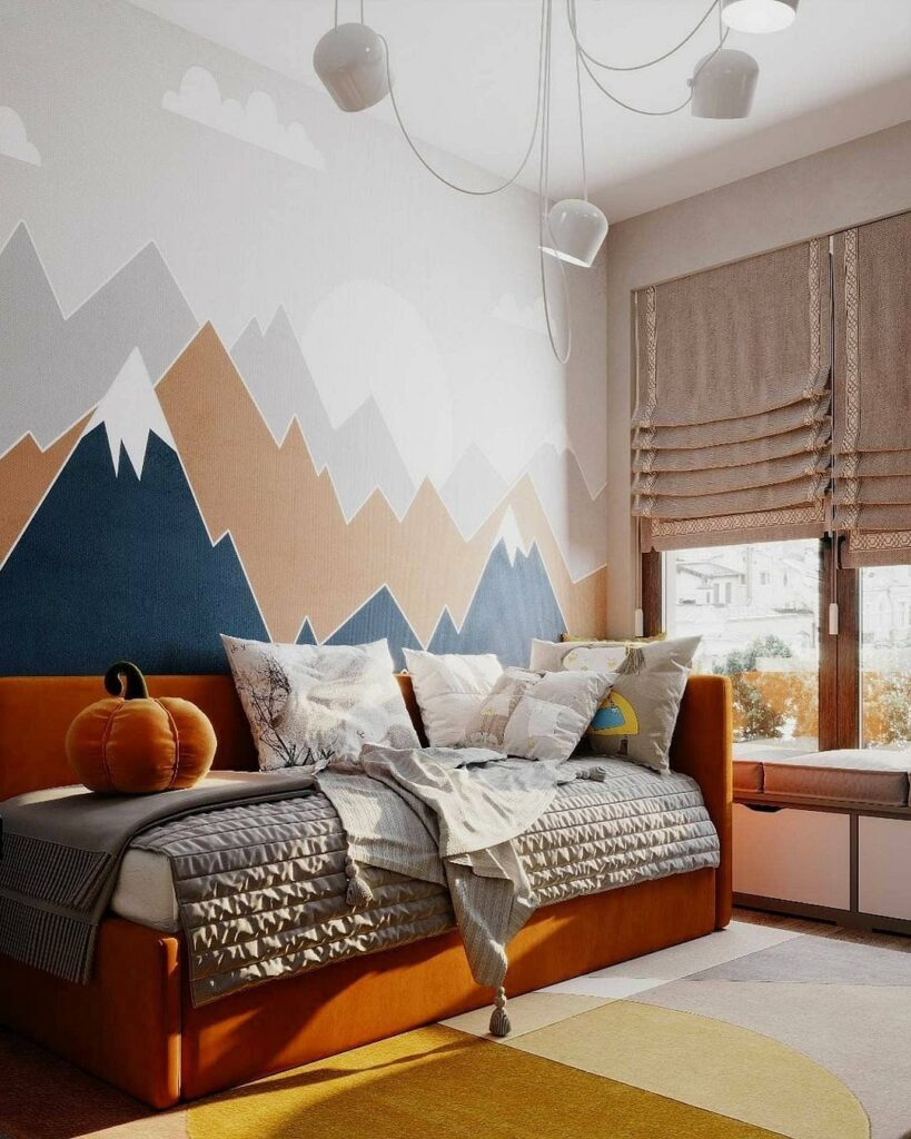
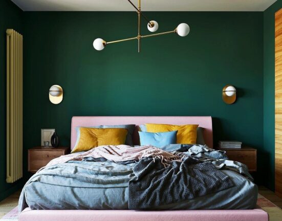
Bedroom
In the rest area, it’s better to avoid saturated fruit shades in favor of calmer variations.

A cozy atmosphere is created with darkened deep tones: terracotta, amber, ochre, copper. They will look good with chocolate, dark blue, emerald, and gray. If you need an energy boost in the mornings, consider apricot, grapefruit, or peach — in this case, definitely combine the orange color in the interior with a pastel or nude base.
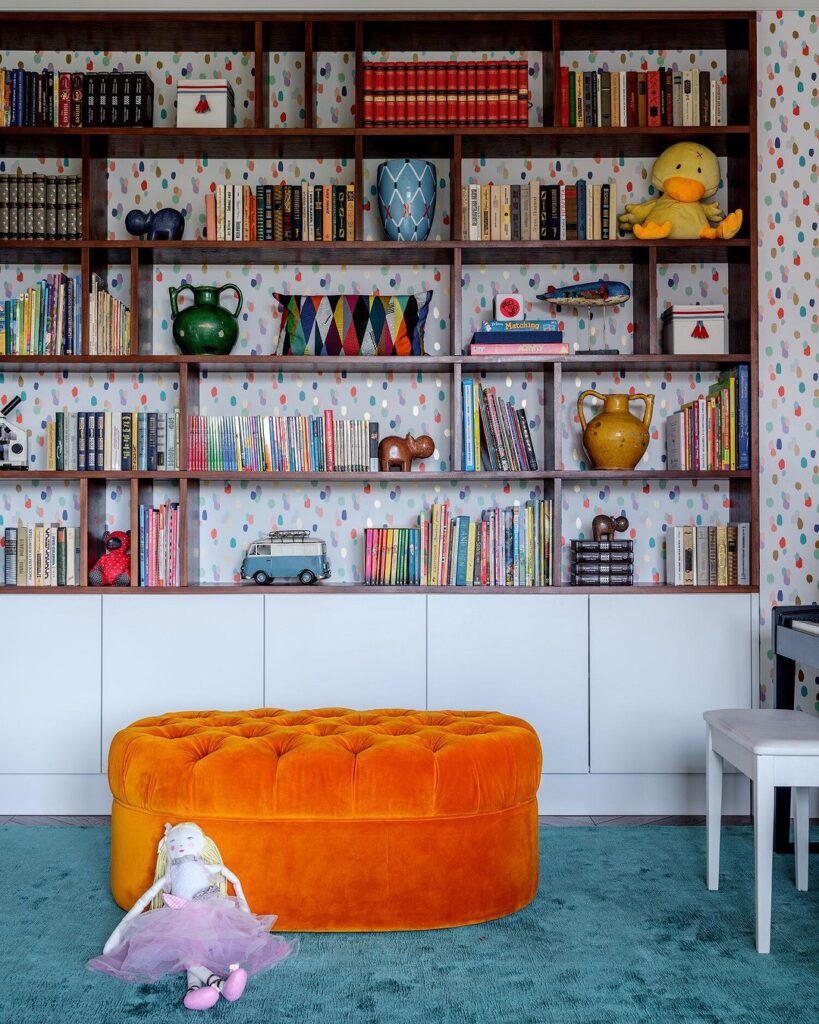
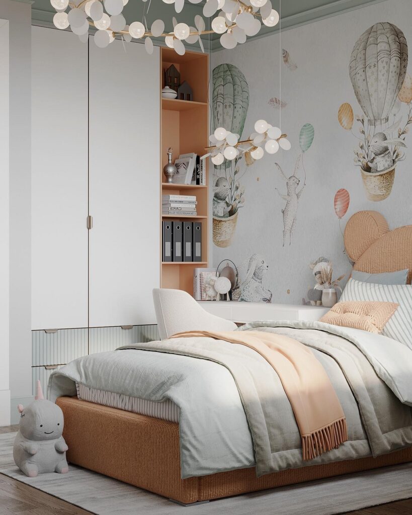
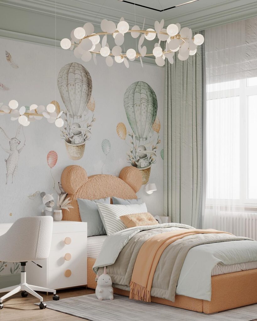
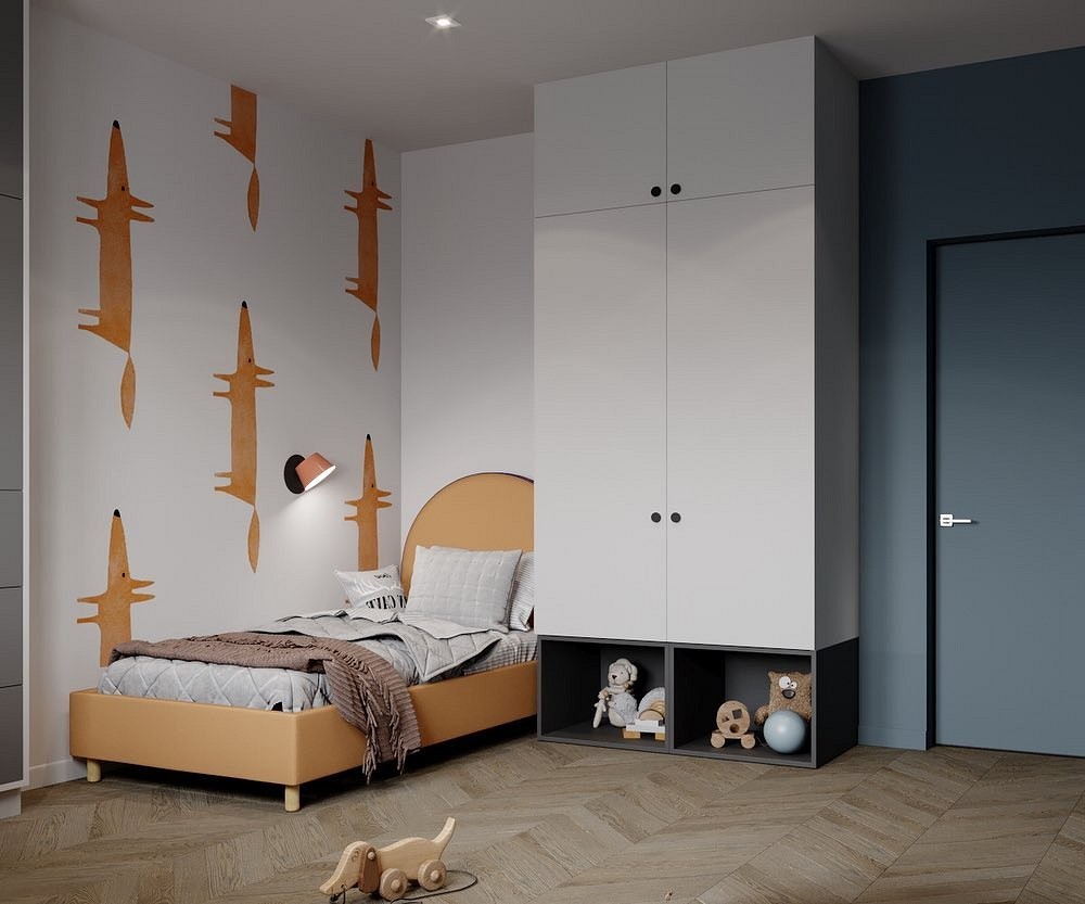
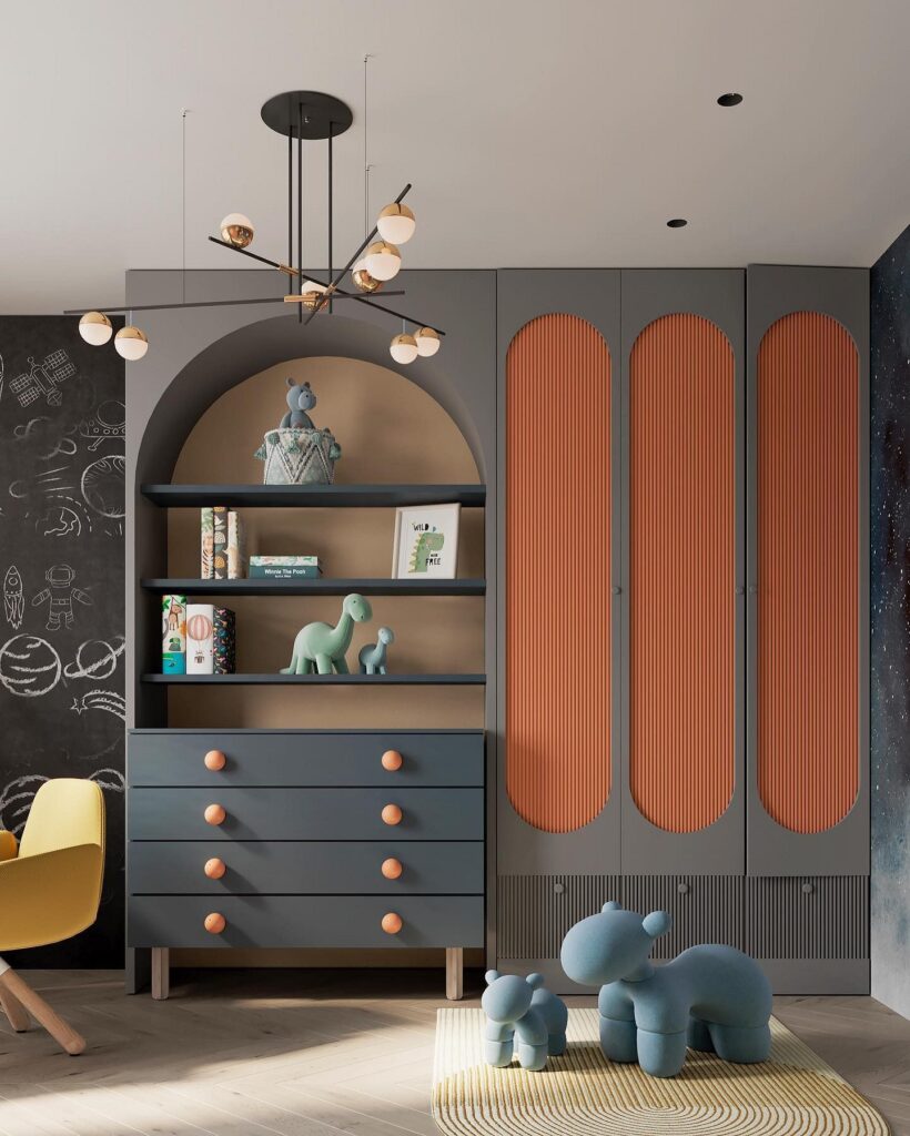
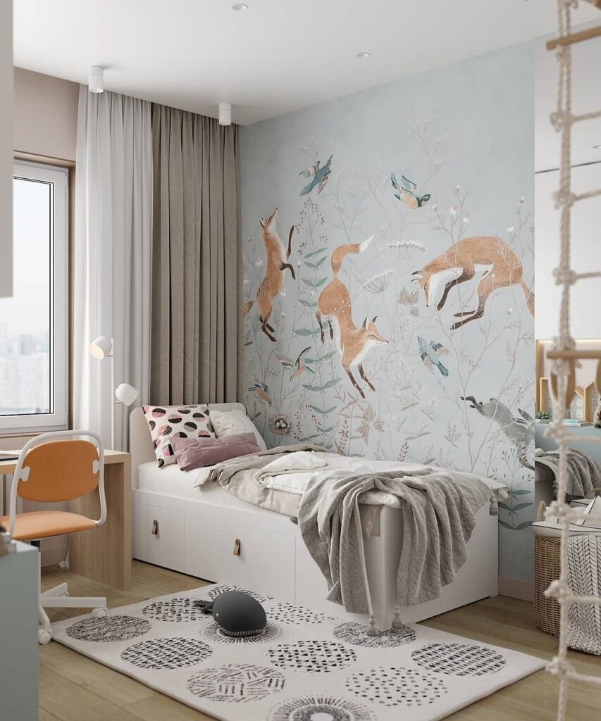
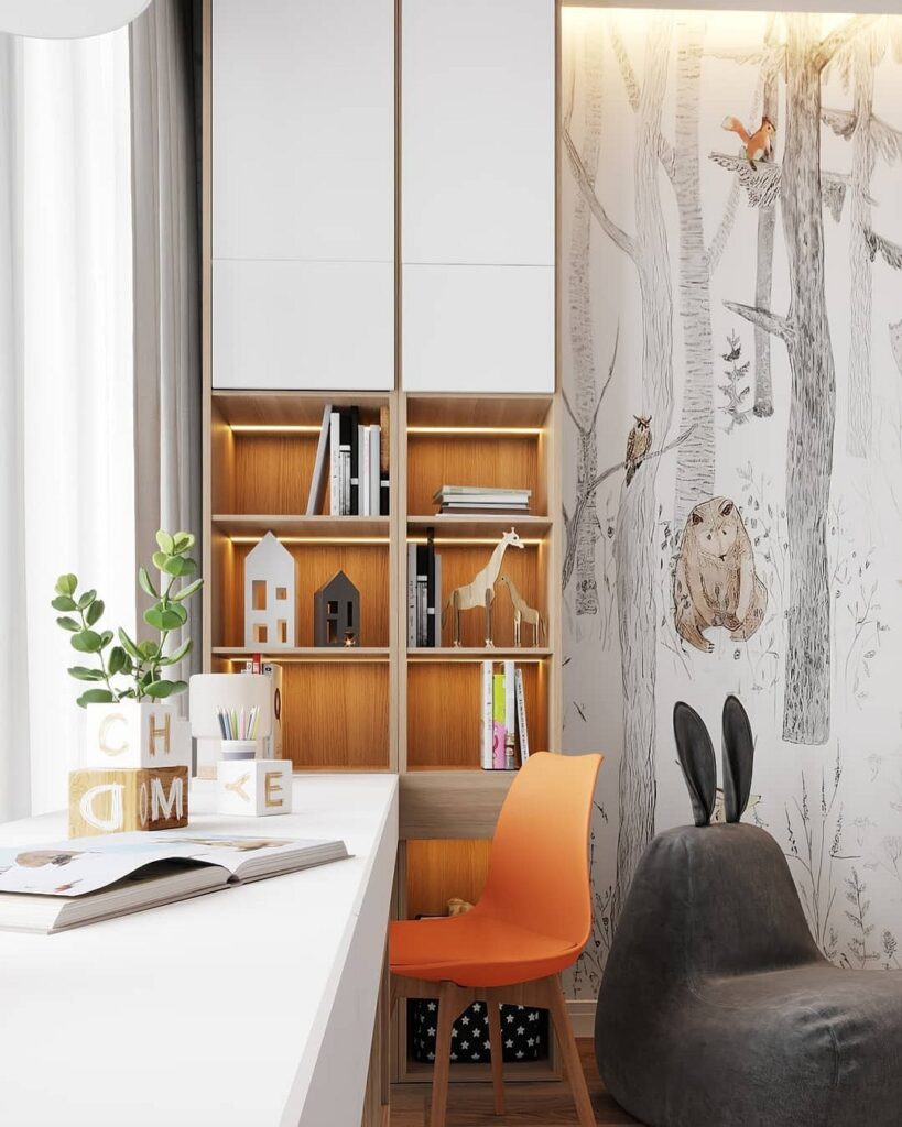
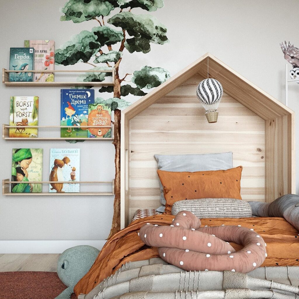
Nursery
The design of a nursery should be joyful yet calm enough for a child’s excitable psyche.
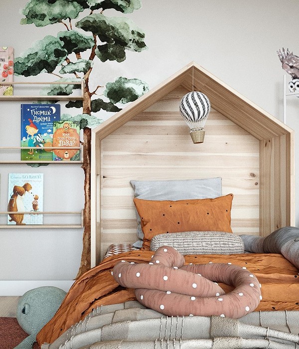
In a toddler’s bedroom, it’s better to use orange as a local bright accent or as part of the decor: for example, it can be used in a wallpaper pattern. The main advantage of orange here is its gender and age neutrality. It’s appealing to both boys and girls and won’t become tiresome after a few years.
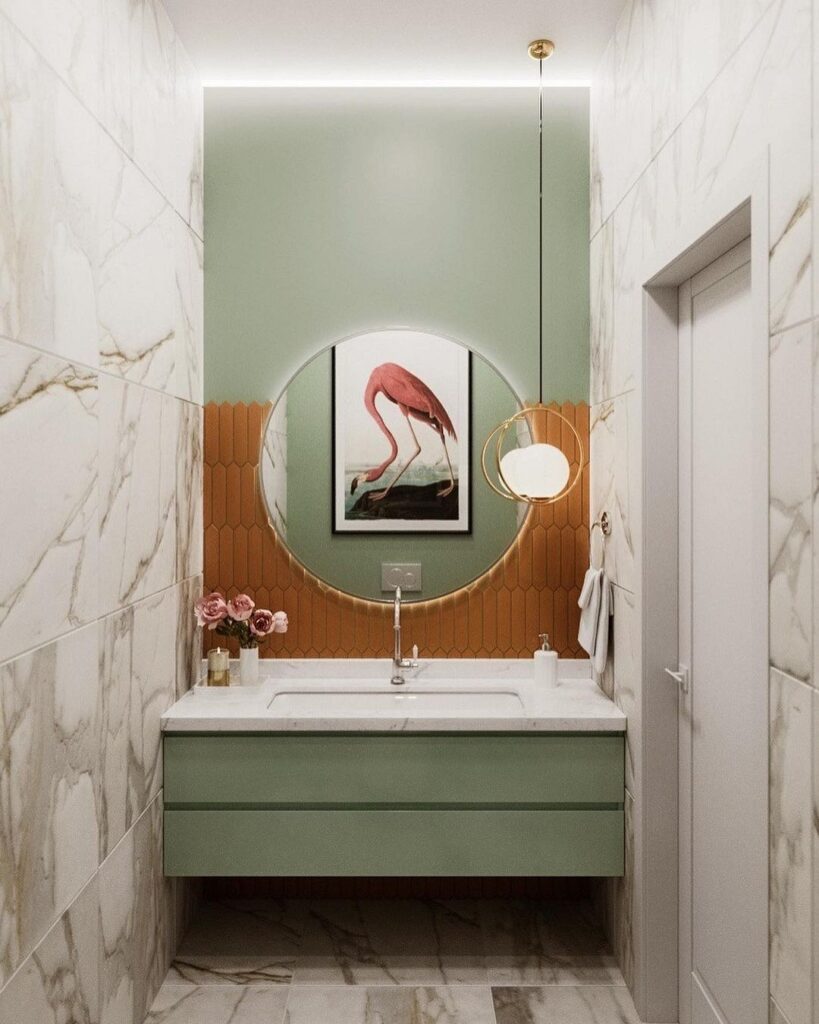
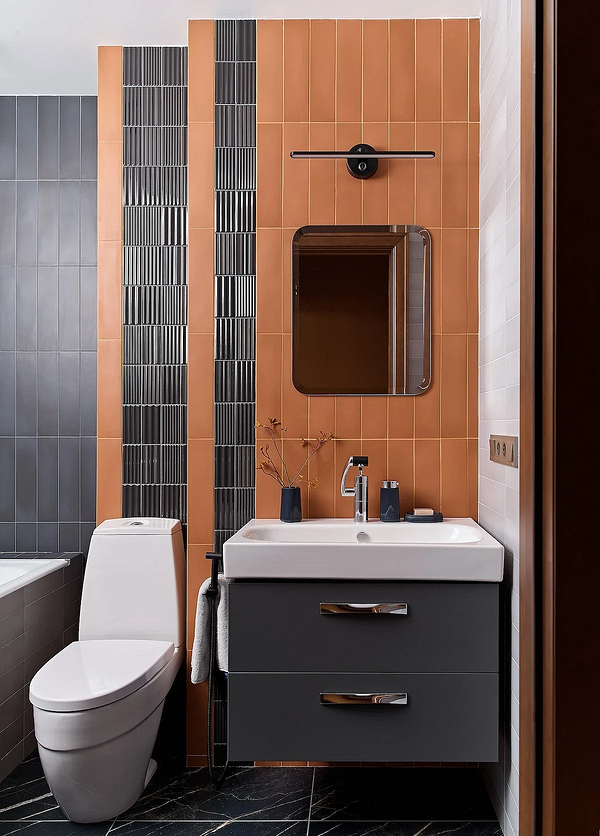
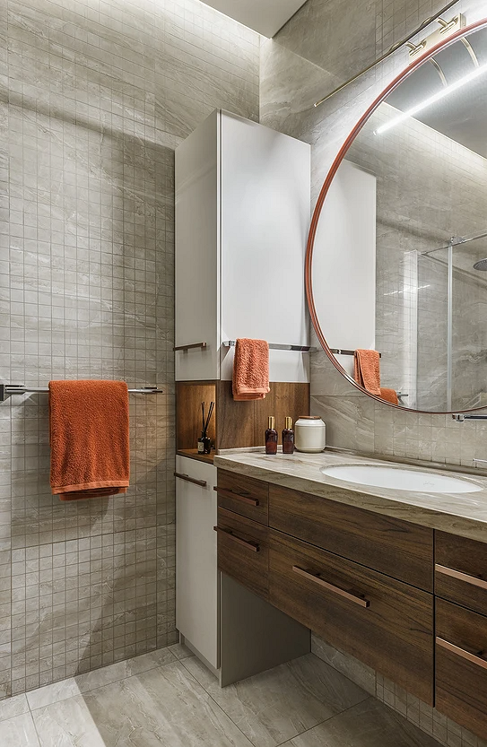
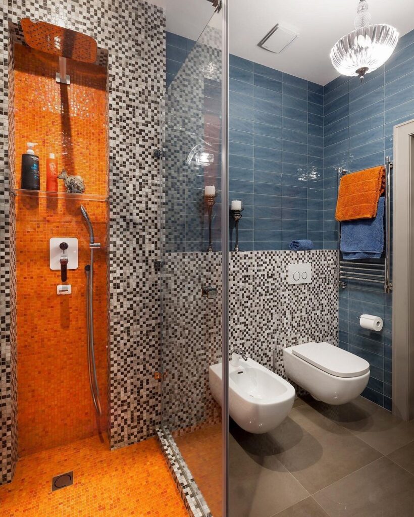
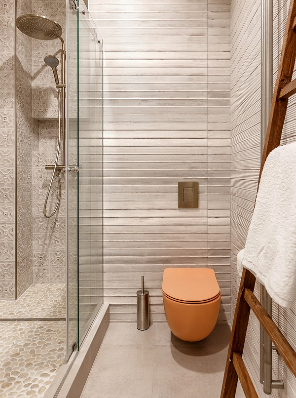
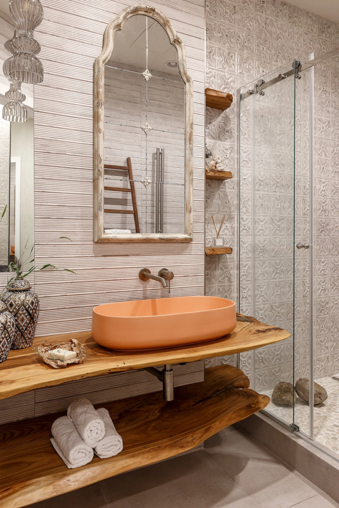
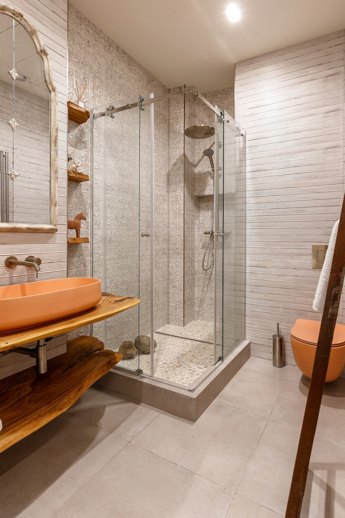
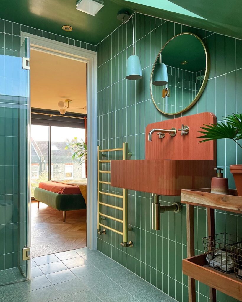
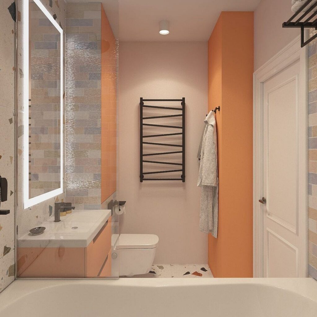
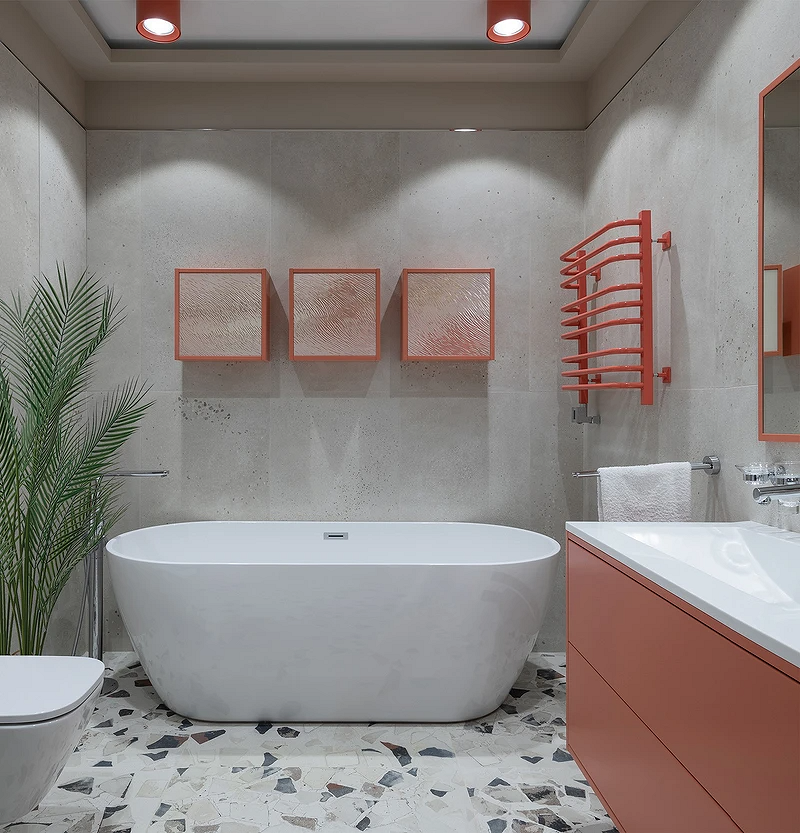
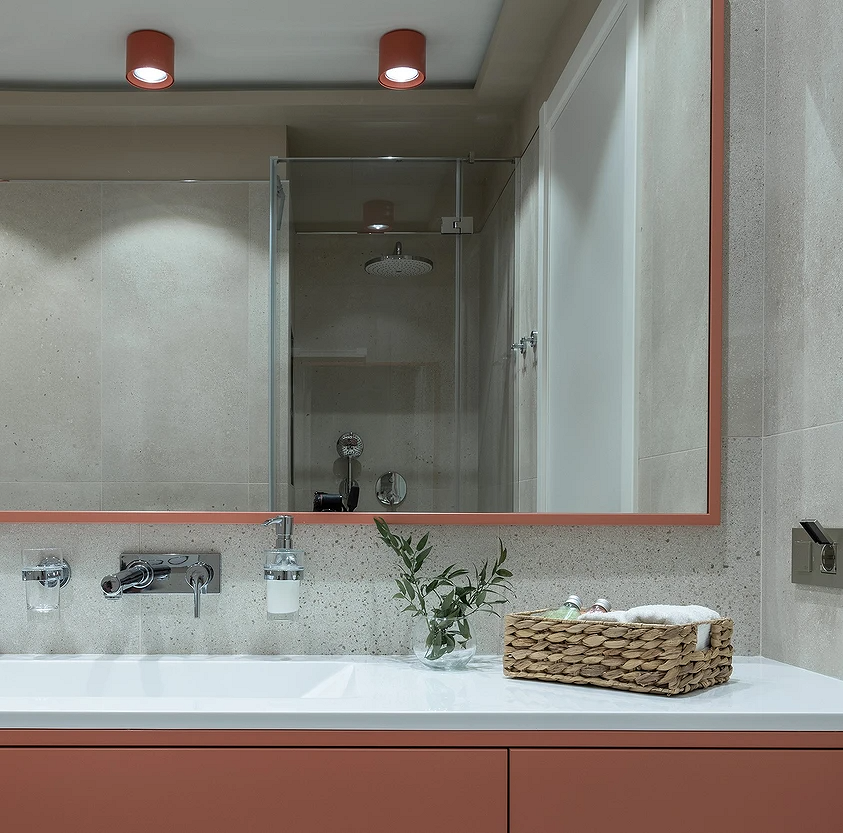
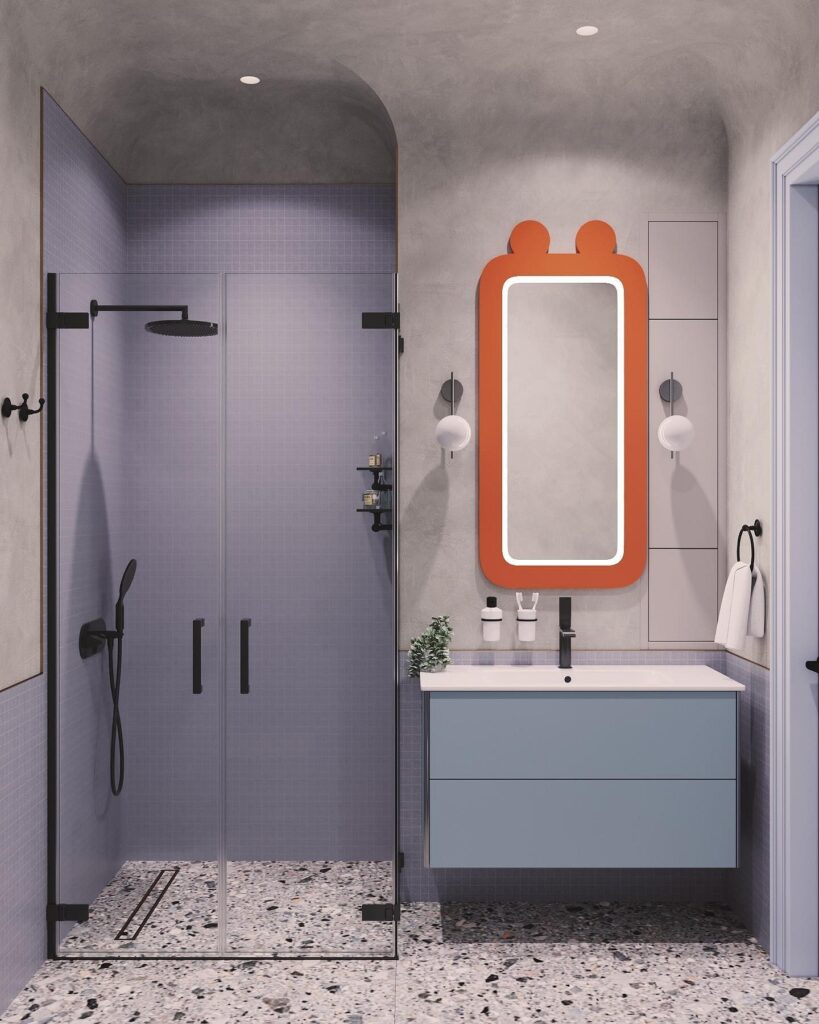
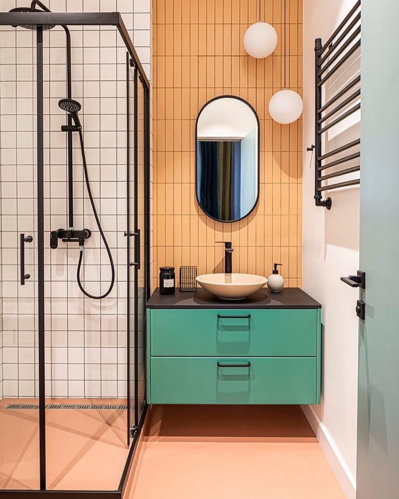
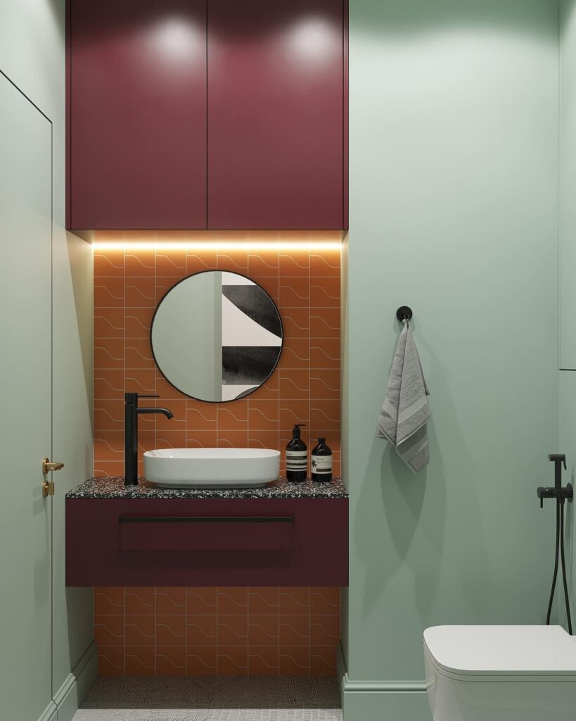
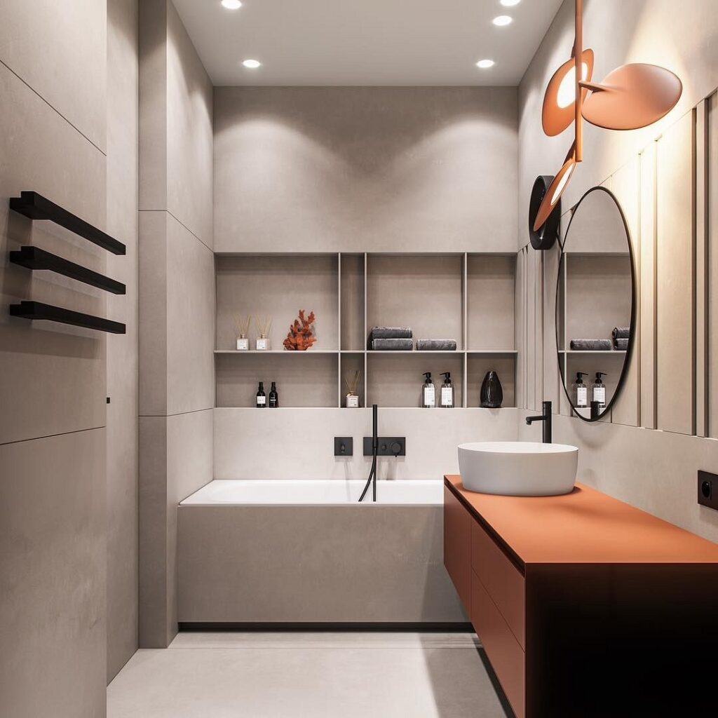
Bathroom
In a non-residential space without natural light, you can boldly experiment with the palette.
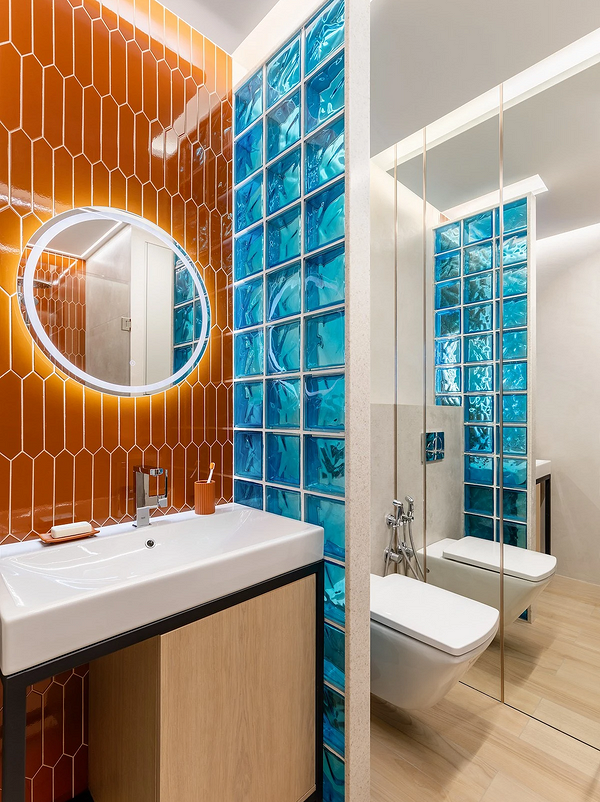
On one hand, we visit it every day, multiple times, but on the other, we don’t stay there too long. Any approach works here—complete finishes, decor, accent pieces. Especially in the bathroom, you can opt for a juicy carrot or orange hue without worrying that it will be irritating.
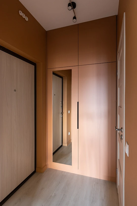
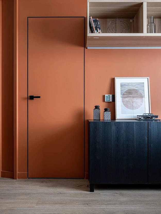
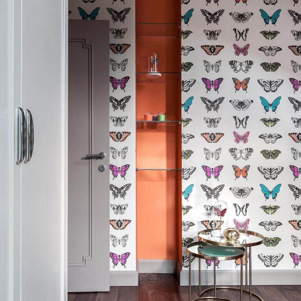
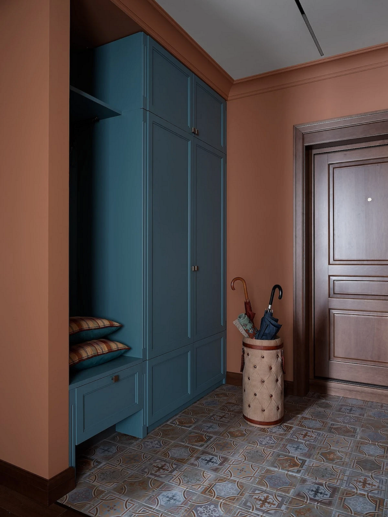
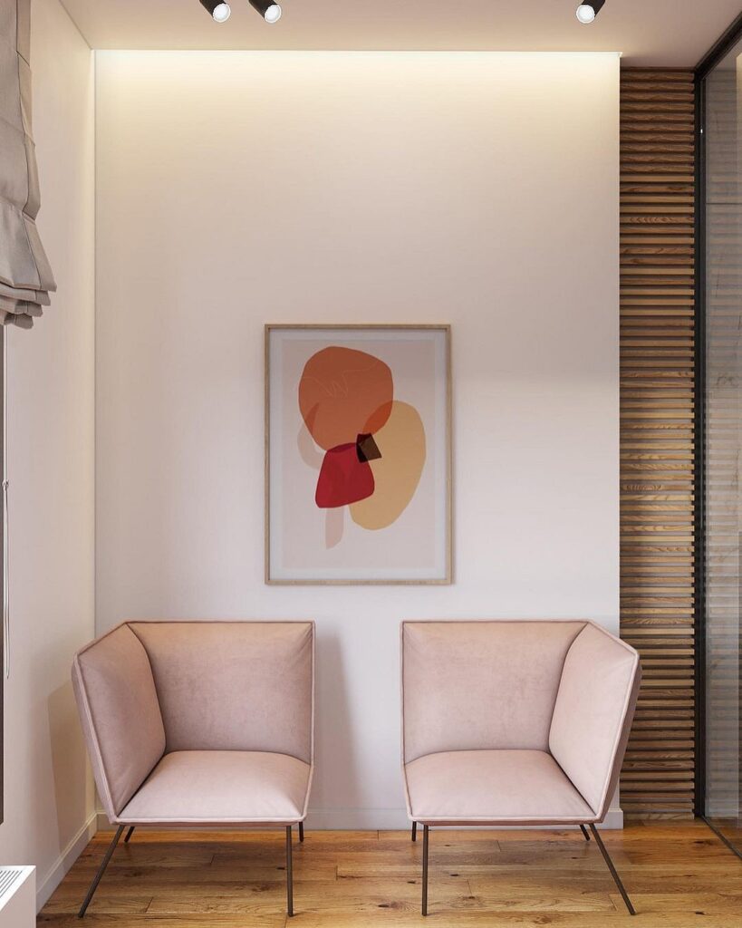
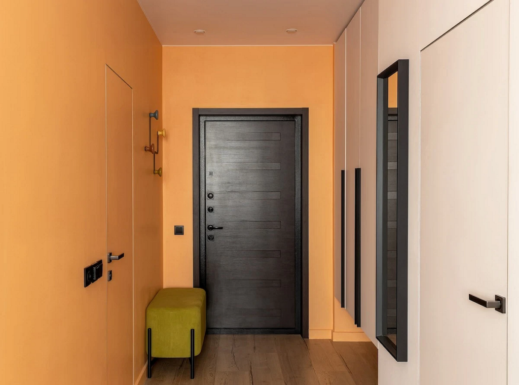
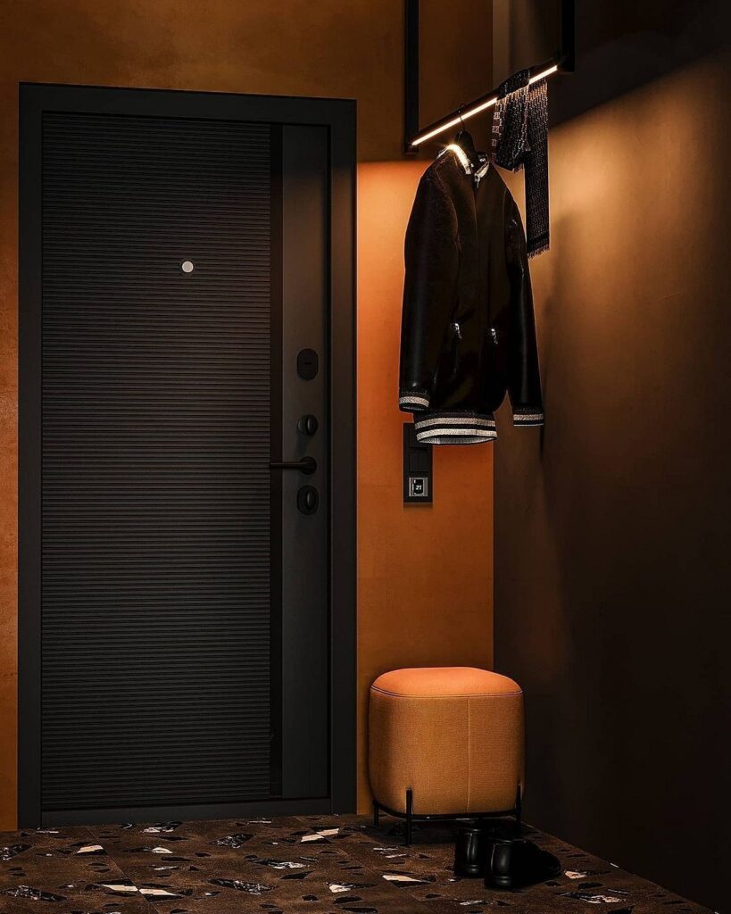
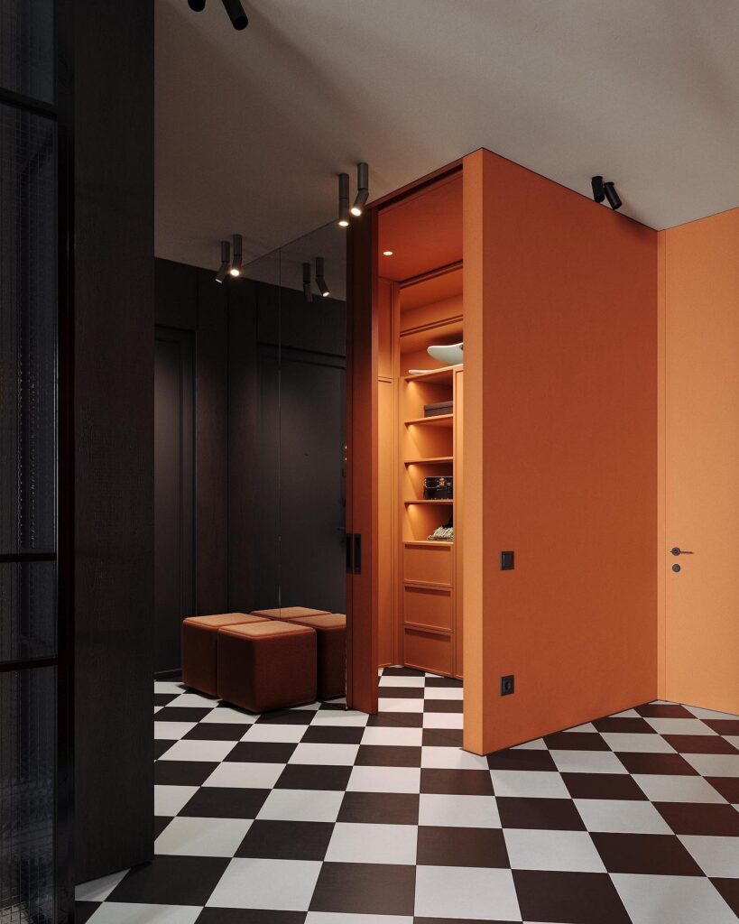
Entryway
The orange palette will enliven the entrance area, which, like the bathroom, often suffers from a lack of windows.
A foolproof approach is 1-2 colorful spots against a generally calm background. This could be an ottoman, a painting, or a coat rack. If you choose a dark shade of orange, plan the lighting system in advance to ensure the color looks appealing and vibrant, rather than dirty and rusty. A subdued pastel option (like peach or terracotta) can be used for all wall finishes. This makes a windowless space feel sunnier.
Leave feedback about this