Choosing the right color scheme establishes the overall room atmosphere, independent of its style direction. An optimal blend of shades can create a comprehensive spatial solution, enabling zoning and even hiding layout flaws.
Combining Colors in Interior Design – it is a kind of art, the main task of which is to find the most successful compromise in color combinations to create the interior.
The Influence of Color Shades on Interior Design
Traditionally, the main colors that are most commonly used for interior decoration are divided into three basic groups:
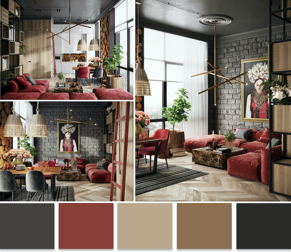
- Warm shades. Associated with the sun, bright fire. Rooms decorated in this way are perceived as the most comfortable and cozy. This group includes shades of purple, as well as red, orange, and yellow.
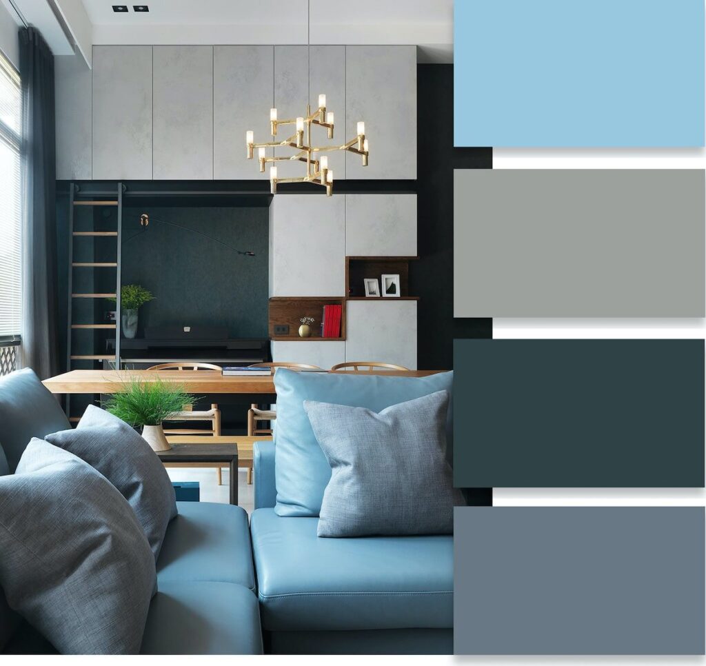
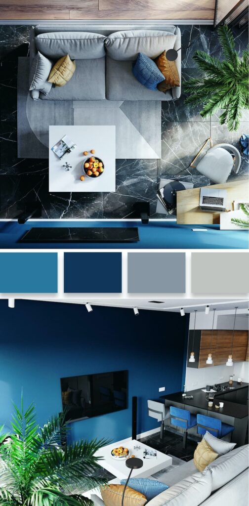
- Cool shades. When this spectrum predominates, it creates a feeling of freshness, coolness, and cleanliness. This group includes blue colors of varying degrees of saturation.
- Neutral shades. Designers conditionally distinguish another variety of subdued brown and beige tones. They are often used as a dominant background, against which juicy color elements stand out advantageously.
Color Depending on the Functionality of Rooms
The color palette is selected not only based on personal preferences but also on the functionality of the designed rooms:
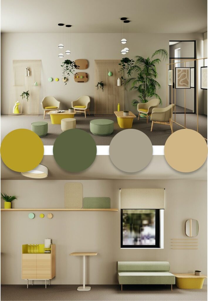
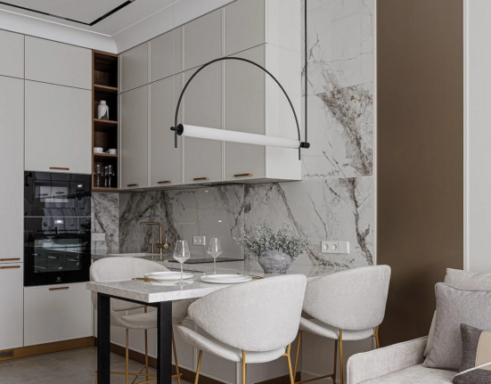
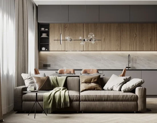
- Kitchen. To create a working mood and provide comfort when organizing a dining area in this room, it is recommended to give preference to calm, balancing, soft shades (beige, silver, green).
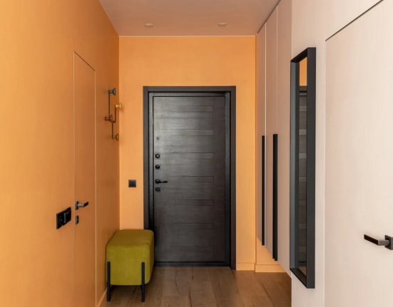
- Hallway. Even with a small area, this room serves as a business card for the entire living space, demonstrating the artistic taste of the owners. Turquoise and yellow shades are appropriate in the hallway.
- Living room. There are many options for the main room of any house. Preference is given to neutral tones that complement bright accents.
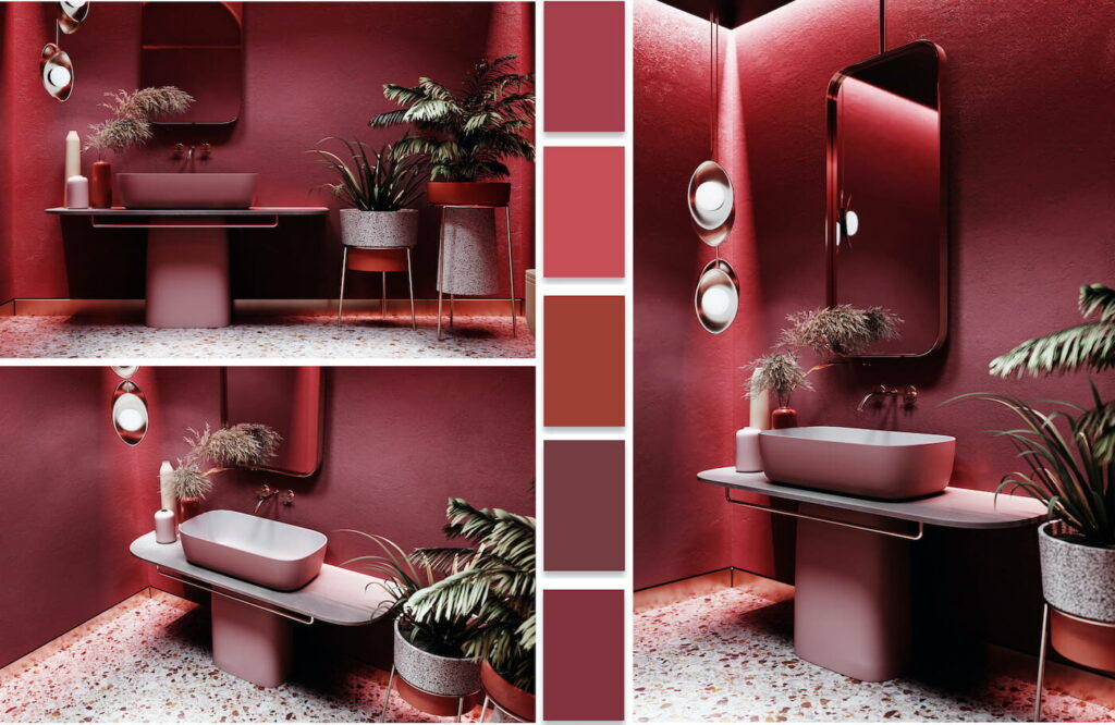
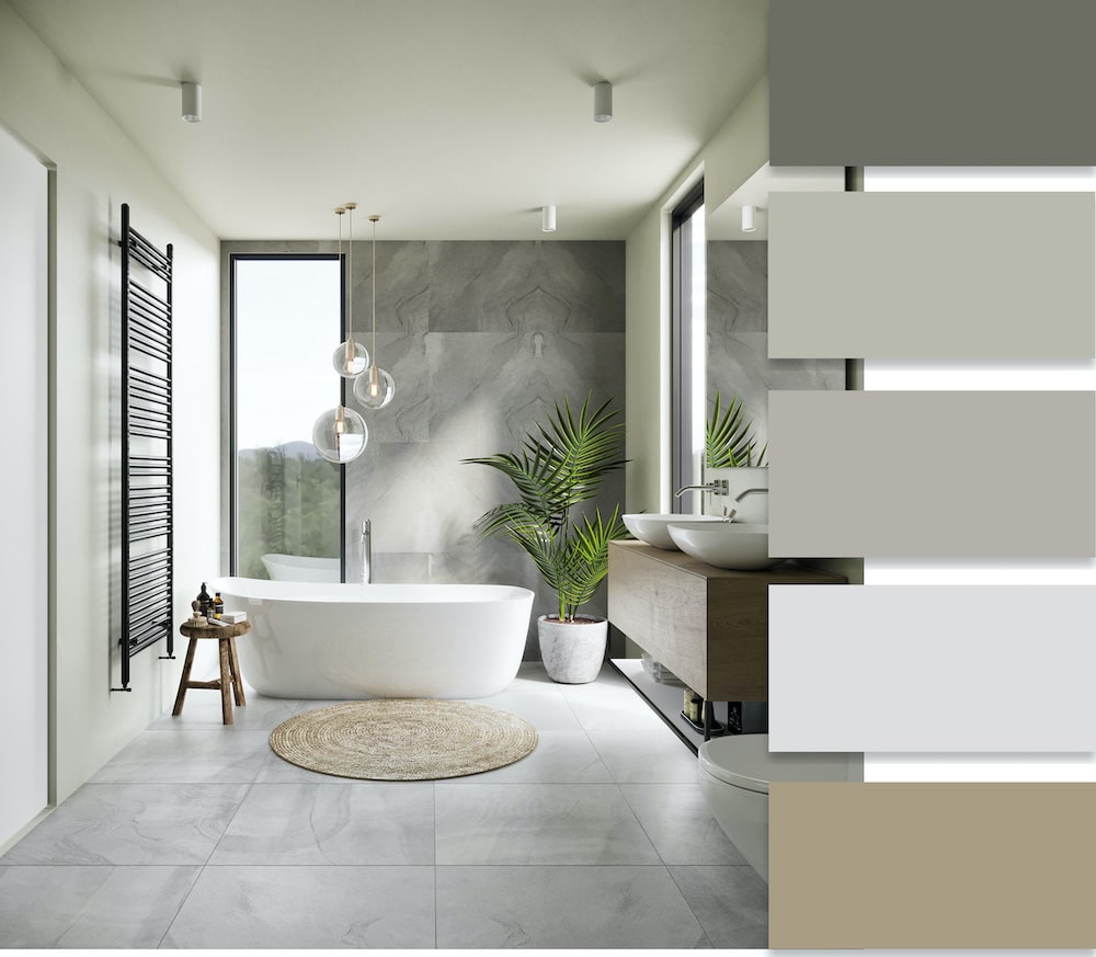
- Bathroom. To provide a visual sense of space even in a limited volume, light-colored walls with a bluish tint are used. This design looks fresh and airy. Sandy tones are popular, associated with comfort and warmth.
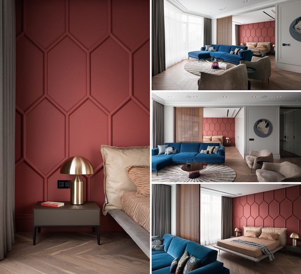
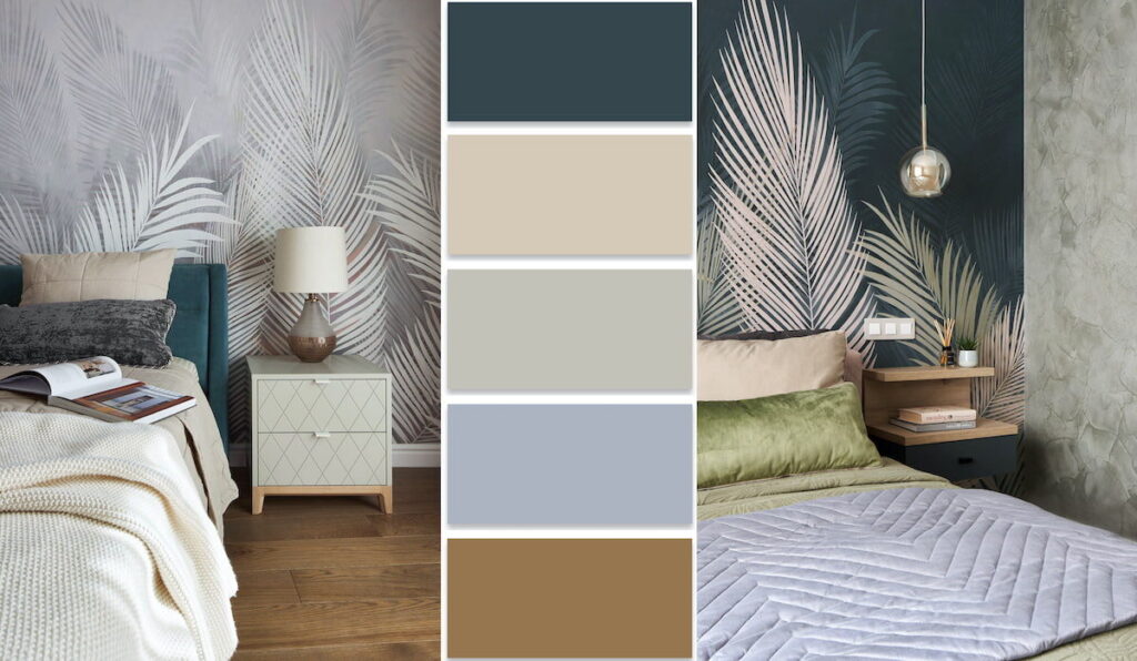
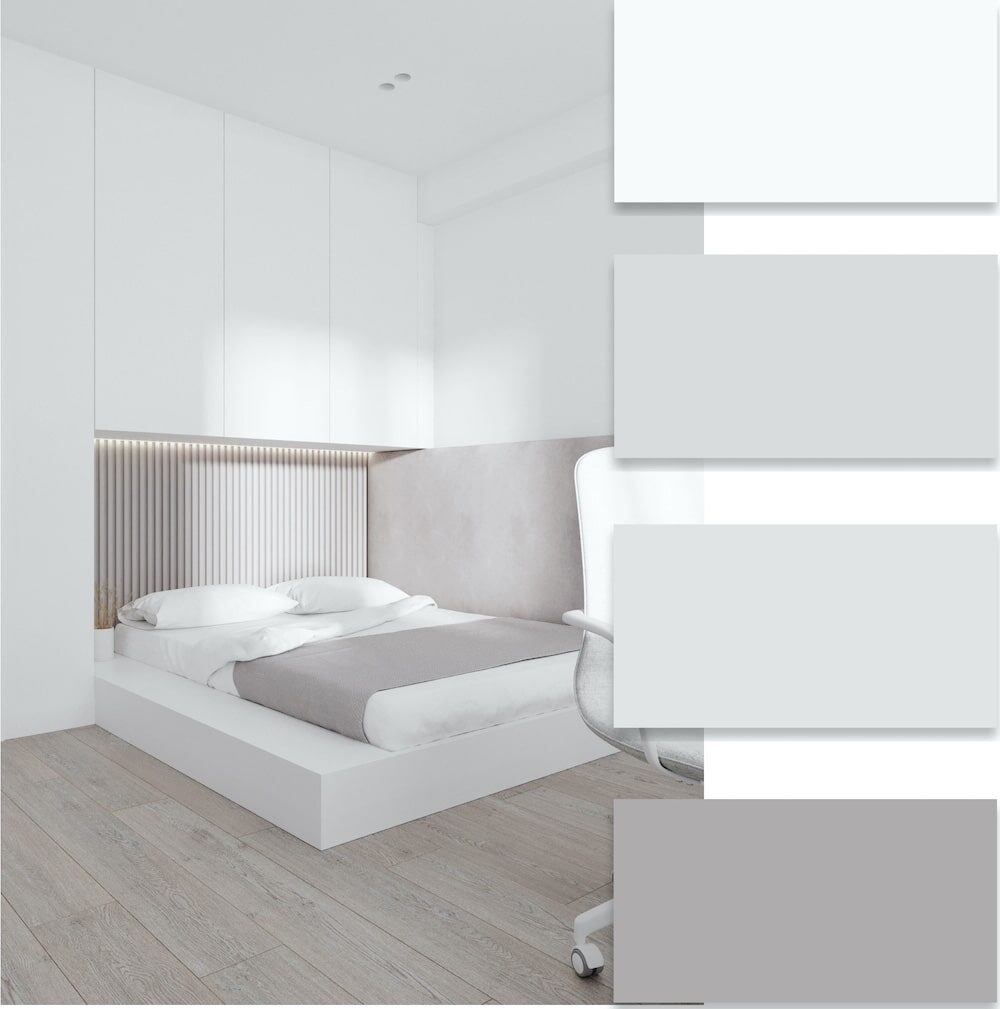
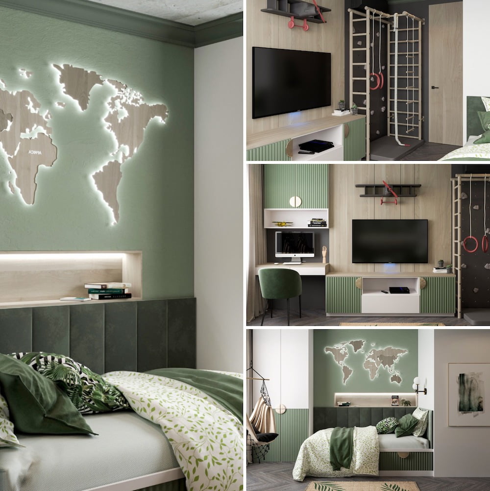
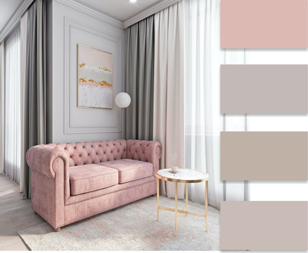
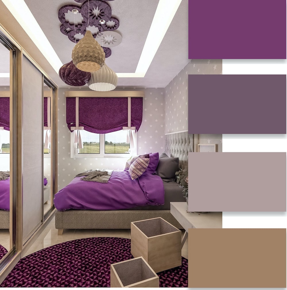
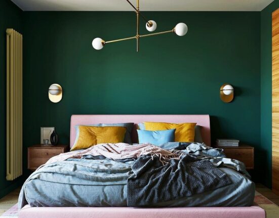
- Bedroom. The organization of a personal delicate space requires a thoughtful approach. Orange, purple, and red tones are not used as the predominant color in such a room. Pastel varieties are preferred.
Color Palette Based on the Interior Style
It is not always easy to accurately determine the most harmonious combination of shades when decorating a room on your own. It is essential to consider the main style of the room, which implies the presence of a specific color:
- Classic. Light noble shades dominate such an interior. White is considered mandatory.
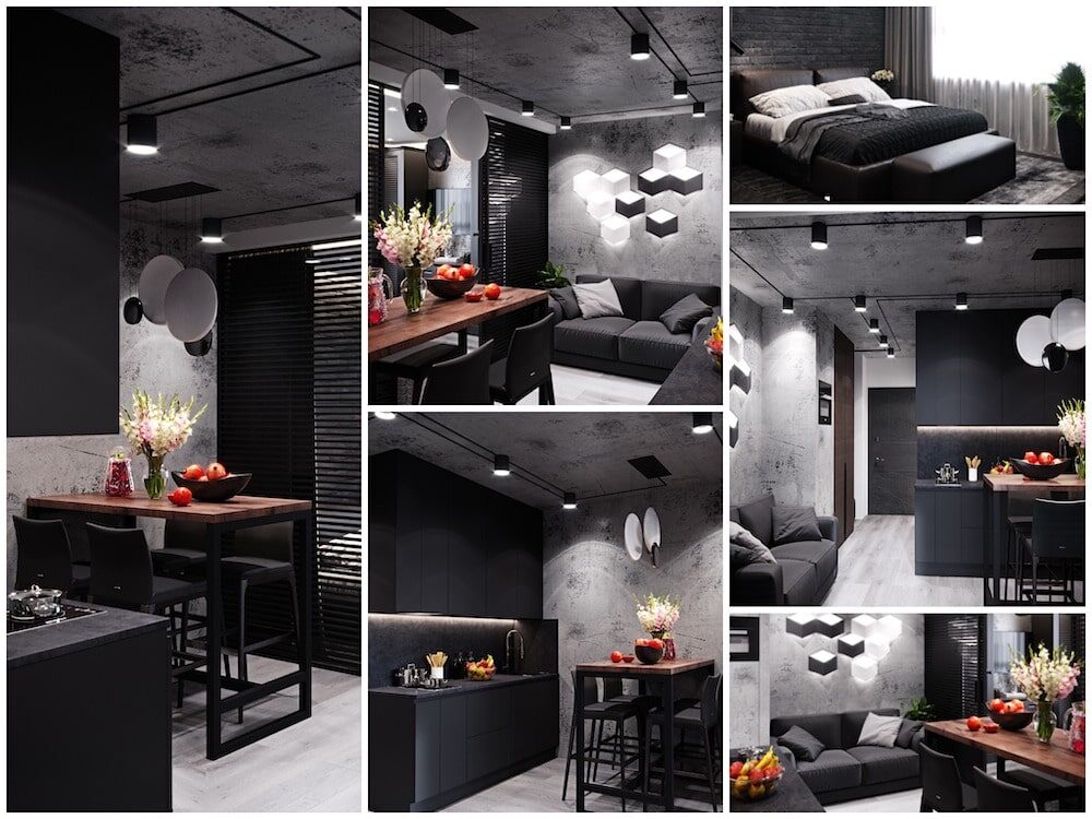
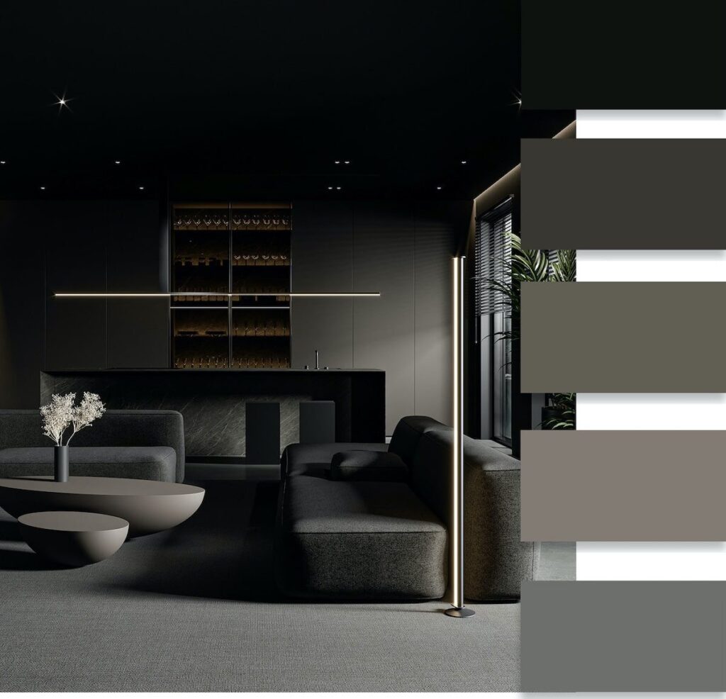
- High-tech. Involves the presence of black, metallic, and white tones.
- Provence. Mainly use blue, milky, pink, and beige shades.
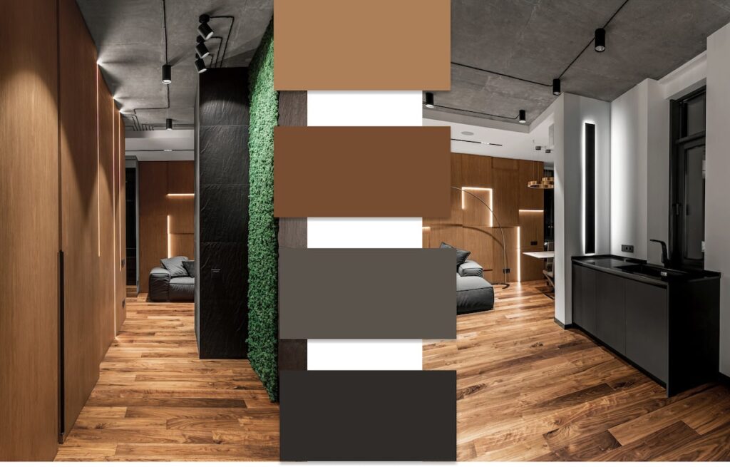
- Country. Characteristic differences are yellow, brown, and sandy tones.
- Minimalism. Based on achromatic universal colors – white and black.
- Modern. Characterized by the presence of light brown, beige, green, and various shades of blue.
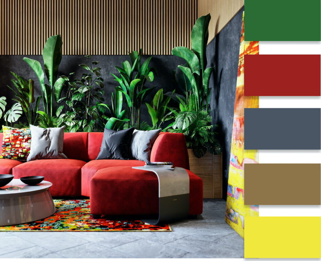
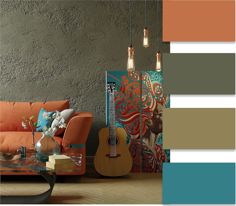
- Loft. Differentiated by the use of red, orange, brick, deep blue, as well as green tones.
- Eco-style. Most often, a natural color is used – brown, greenish.

The art of color design in interior decoration is based on proportionality, harmony, and visual comfort.
How to Combine Colors in Interior Design
When you decorate a room, you can comfortably combine 3-4 shades. You have the freedom to select different combinations. Universally, the combination of shades of one color always lends a feeling of comfort and coziness to the room.
Using a similar combination, you would pick 2-3 shades that sit next to each other on the color wheel. For a more complex combination, you would use a classic shade (gray, beige, white) as the basic background. You have the option to combine these if you wish, and by adding saturated accents, you create a complete and harmonious interior.
For those who prefer bold and dynamic interiors, opt for a complementary combination of contrasting tones, positioned directly across from each other on the color wheel. The combination of yellow and violet continues to be highly popular. Pairing green and red creates an interesting effect. A separate-complementary solution in room decoration lets you achieve an unexpected and original effect. In this approach, you maintain contrast, but select the second tone from a color adjacent to the base color located on the opposite side.
Selecting a combination of colors based on the organic integration of four shades can be challenging. In this case, you establish the primary color first, then select two supplementary shades to complement it. The fourth color serves to highlight accents. This approach creates dynamic and unconventional effects, appealing to young individuals and those who lead a fast-paced lifestyle.
A modern fashionable interior design is a gradient. This option is based on a smooth, uniform, almost imperceptible transition of one color from a darker shade to a lighter one. The direction is chosen depending on the purpose, vertically, horizontally, or diagonally. In any case, the gradient provides a new and charming freshness to the room.

Options for decorating different surfaces
When planning the color scheme for any room, it is important to consider the finish of all surfaces. Designers use various options:
- Dynamic contrast. In this situation, with a white ceiling and bright colored walls, the flooring is made dark. This visually transforms the overall space of the room, highlighting the most favorable areas and concealing flaws.
- Modern gradient. A gradual transition from dark flooring to lighter walls and a snow-white ceiling is chosen. This harmonious decoration is suitable for rooms of any size.
Tip!
You can visually expand a small space by making the floor dark and the ceiling and walls light.
- In rooms with low ceilings, the effect of expanding the volume is achieved by making the ceiling and floor light, while the walls are decorated in dark saturated tones. Conversely, high ceilings can be leveled by decorating the ceiling and floor in dark shades while keeping the walls light.
The psychology of color perception for humans
When selecting color combinations for room decoration, the effects of different shades on human psychology are taken into account.
Beige
Belongs to the range of color shades that harmoniously combine with almost all colors. This refined hue has a calming effect thanks to its subtle notes, and possesses a quiet, balancing energy.


White
Considered the color of successful and confident individuals. Symbolizes focus, purity, and serenity. White space can energize, but an excess of it can also make a person feel empty, so it’s important to combine this color with other shades. It’s often used in small spaces as it visually expands them, and it complements all other colors.
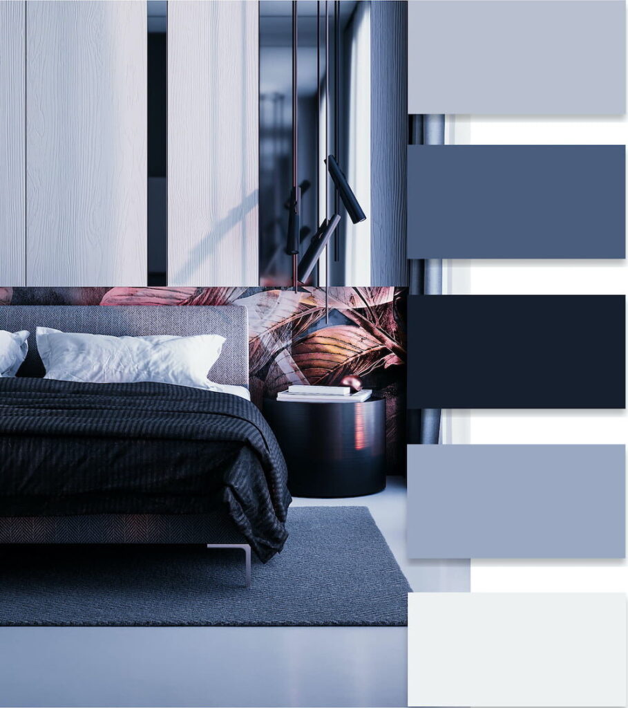
Blue
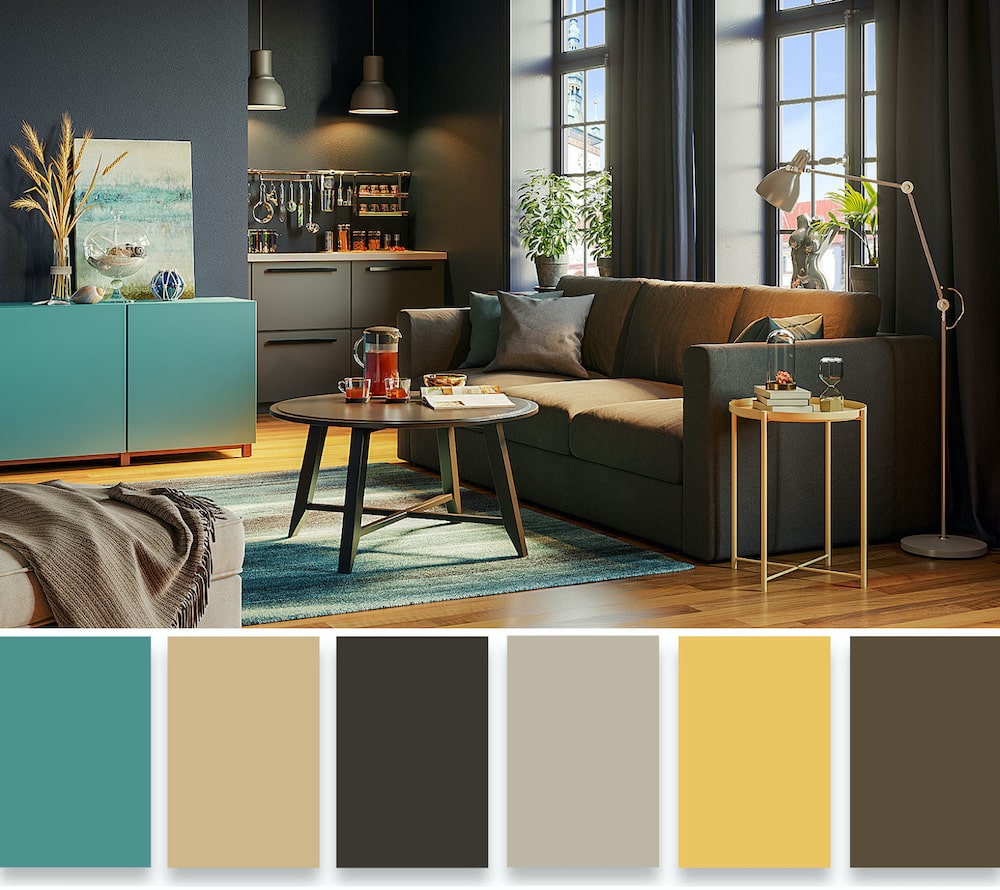
When used as the main background color in interior design, this shade creates a feeling of lightness and freshness. The blue color symbolizes purity, calmness, and tranquility. It is relaxing, making it an excellent choice for rooms where people want to unwind. Blue is often used in combination with soft violet, muted orange, chestnut, or red when decorating a bedroom.

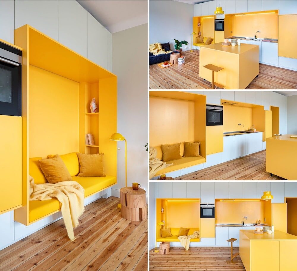
Yellow
Because of its brightness, designers typically don’t use yellow as the dominant color in interior design. Regarded as an intellectual color, yellow resonates with creative individuals, symbolizing knowledge, optimism, and warmth. It assists in restoring the energy balance and blends well with various hues.
In interior design, yellow aids in concentrating attention, so it frequently appears in home offices, living rooms, or kitchens. It also makes a great accent in a child’s room. Yellow beautifully combines with chestnut, green, and gold tones.

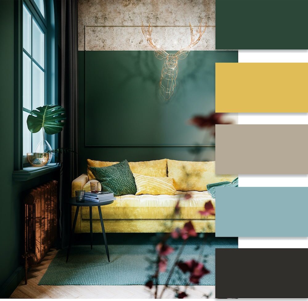
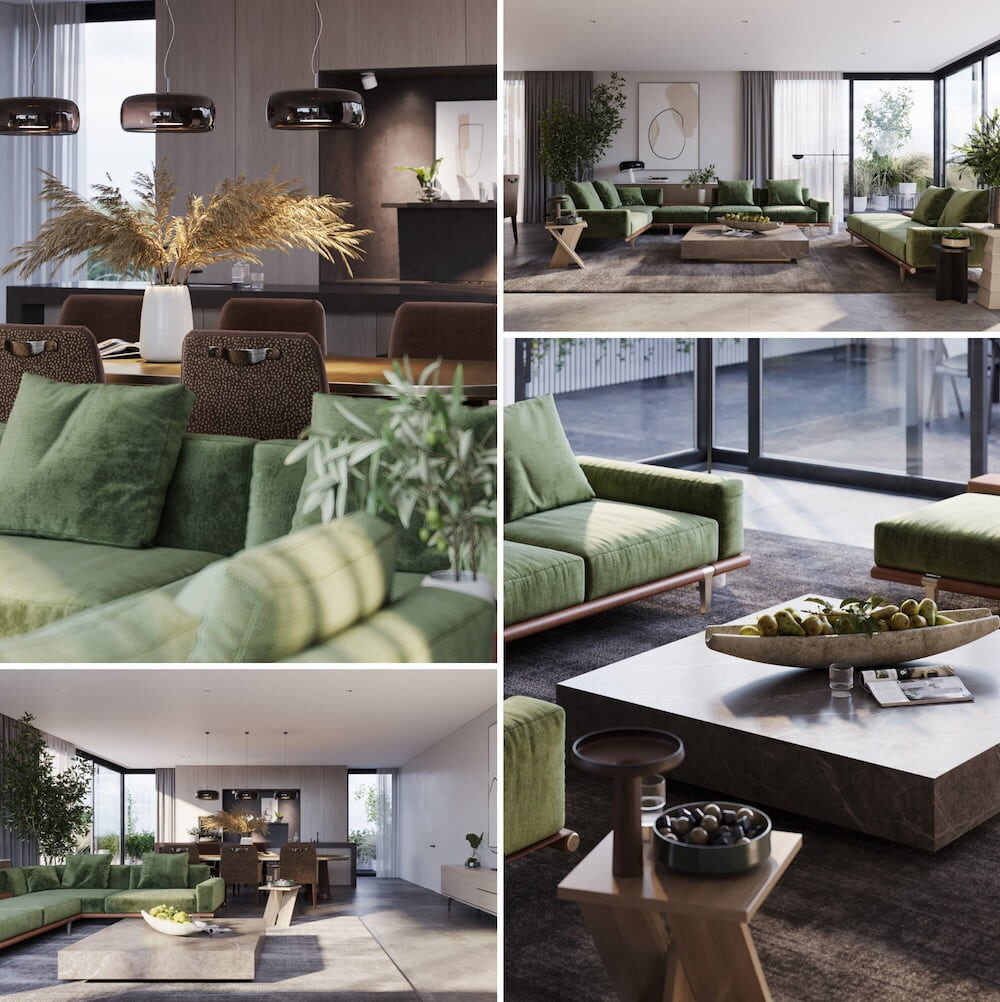
Green
Belongs to the category of universal shades. Symbolizes harmony, nature, and naturalness. This color balances, calms, and at the same time creates a working atmosphere. Implementing this color works well in rooms of various functionalities. Harmonious pairings include yellow, white, orange, and black shades. For an unusual twist, consider combining it with red.

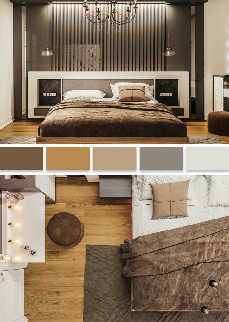
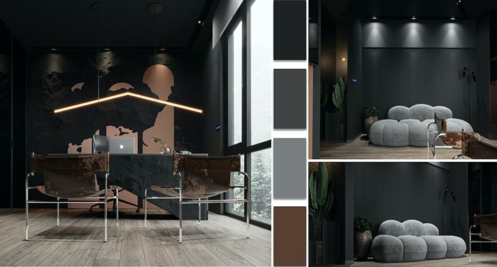
Brown
People often choose this practical, solid, and elegant color to infuse a room with a sense of respectability, luxury, comfort, and coziness. The noble and velvety light brown tone assists in focusing and can be the dominant color in various rooms.
Designers recommend using dark brown shades only as small accents. It blends harmoniously with greenish-blue, silver, and golden tones.

Red
Red, a bright and fiery color, often gets a label as aggressive, so people don’t typically use it as the primary backdrop. However, when you place red accents strategically, they can enhance mood, impart energy, optimism, and confidence. Designers often recommend adding this color to the decoration of an entrance hall or kitchen, ideally combined with a golden-yellow, blue, green, or silver background.
Orange
This cheerful, invigorating, sunny and extravagant color brings warmth, comfort, and optimism to the interior. For maintaining a festive and fresh energy, incorporate orange as an additional decorative tone. It pairs well with green, blue, brown, purple, pink, and white colors.

Pink
When you use this romantic and delicate hue in your interior design, it creates a relaxing atmosphere that helps you to unwind and let go of anxiety and negative thoughts. Pair it equally with beige, cream, or white hues for the best effect. For accentuating, brown, burgundy, or gray colors pair well with it.

Gray
Creating an elegant, stylish, and noble atmosphere in a room for relaxation and unwinding can be achieved by skillfully selecting the right shade of neutral gray color. Being versatile, gray enhances any color paired with it, making it a color symbolic of contemplation and intellect.


Blue
This calming and fresh shade, symbolizing lightness, slowness, and tranquility, can add a soothing touch to your interior design. It helps eliminate anxiety, creates a sense of serenity, offers a sense of coolness, and visually expands space. Bathrooms and children’s rooms are perfect places to use blue in various combinations. In the living room, it pairs perfectly with a bold yellow color. Other potential combinations include red, golden, burgundy, and silver tones.

Purple
Mystical, mysterious, and majestic, the color purple embodies nobility, wisdom, and inspiration. It can have both a calming and energizing effect. Purple is not used as the main background color in interior design. It blends well with green, golden-yellow, and orange tones.
Black
This sophisticated, proud, and solid color can play a key role when the accents are properly chosen. Black background in a bold interior can serve as a background for practically all colors. It is mainly used in spacious rooms.
How to properly combine colors and shades in interior design?
When studying the peculiarities of color impact, it is important to consider that women perceive color shades more accurately. They often prefer calming deep blue and natural soothing green tones. Favorites include mysterious purple, lovely turquoise, gentle pink, and romantic lilac shades.
Men are less sensitive when it comes to determining color shades. They prefer pure colors and favor a cool color palette. Children are attracted to brightness up until their teenage years. Then their perception often shifts towards subdued pastel shades.
Designers recommend selecting two dominant colors when deciding on all interior details. You should decorate the walls with a light shade of the first color and design the furniture facades in the second color. Both basic shades should be reflected in the patterns of curtains and furniture upholstery.
However, it’s not advisable to experiment with colors that are difficult to harmonize. For example, the following combinations should be avoided:
- pink and chestnut;
- pink and blue;
- red and purple;
- brown and red;
- brown and lilac;
- yellow and burgundy;
- yellow and pink;
- dark purple and light blue;
- brick and purple;
- blue and green.
Modern color trends in interior design often feature extravagance, but there are still certain rules to follow:
- Red is often seen as a festive color but many are hesitant to use it. However, subdued red accents are allowed even in classic designs.
- A gray interior may seem dull and unappealing to some, but well-placed accents can instantly transform the space, making it noble and refined.
- Blue remains a favorite among people as incorporating lighter tones of blue creates a feeling of incredible freshness.
- The calming pink tone is often considered a feminine or childlike option, but more and more people of different ages are falling under its charm.
- The sunny yellow hue not only adds a feeling of warmth but also stimulates the appetite, which is why it’s increasingly being used in kitchen design.
A skillfully chosen color combination when decorating any room allows you to create a certain atmosphere. You should consider many factors such as personal preferences, the function of the room, and how a particular shade affects mood and human energy.
Leave feedback about this