Color solutions, just like composition in interior design, are one of the most important aspects of decorative finishes, as each style has its own palette that characterizes the chosen direction, whether it be Baroque, Rococo, Hi-Tech, Neoclassicism, or Modern Loft. With well-chosen shades, you can create unmatched artistic images that make each room in the house special.
Types of Color Compositions: 4 Main Solutions
Interior design is a field with wide boundaries that includes a significant set of techniques for creating a harmonious space inside a house or apartment. One of the important aspects of decorating a room is the proper use of colors, which can be done in a uniform or diverse range. A high standard of taste and professionalism is achieved when all rooms are decorated in the same style and therefore, in a similar color scheme.
It may seem very simple: to take one color as a basis and introduce it into all individual areas. Of course, it is possible to do so, but most likely it will look awkward. However, if some rules of color theory are taken into account, according to which nuances should be combined, it is possible to do it without the services of a designer.
Here are the 4 main types of color compositions used in decoration and design:
- Monochromatic – one color is chosen as the dominant one, and several additional colors are selected to match it according to certain color theory principles.
- Two-color – two main colors are used, which together form a non-contrasting combination, and auxiliary shades are also added.
- Polar – the basic palette consists of contrasting shades that radically differ from each other.
- Multicolored – several colors can be used at the same time, and the most popular solution is to choose three colors in the interior, called a triad.
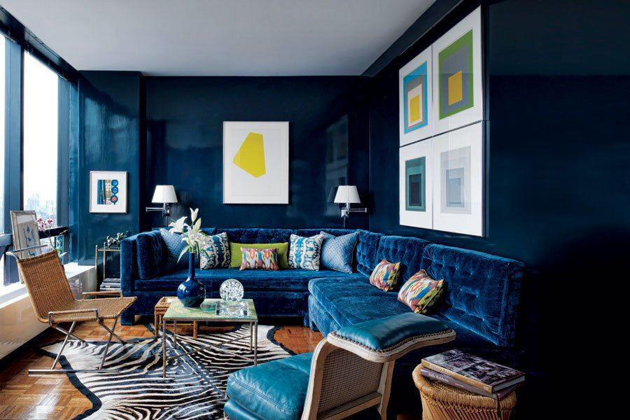

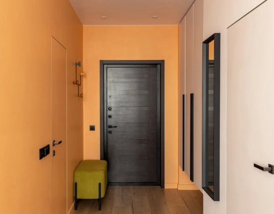
An example of a polar design for the living room interior would be using red and blue tones
Note that the primary tool in color theory is considered to be Johannes Itten’s color wheel, which was developed by a scientist based on color theory and resulted in a template for the correct combination of different hues.
Rules for Color Combinations in Interior Design: Strategy from Professionals
To ensure a successful interior design, the color scheme of the decorative finish must follow specific rules for color combinations. These rules are especially important for small apartments, where everything catches the eye at once: the style, texture, and, of course, the color composition, which is crucial for the space. With the help of a color palette, you can adjust the space well: visually make it more spacious, increase the height of the ceilings, improve proportions, and more.
Recommendation! It is generally believed that light colors create volume. This is true, so if the apartment is very small or designed as a studio, then white, light pastel, and muted tones will be an excellent solution for modern design.
Professionals suggest that no more than three color nuances should be used in the finish, proposing the following strategy:
- Base color – that is, the main or leading color. Its main purpose is to make it immediately visible which shade dominates the room. Usually, it can be seen on large objects such as walls and most of the furniture.
- Additional nuance serves to support the base color. It manifests itself on an accent wall, certain parts of the furniture, or textiles in the room. It can be contrasting or, conversely, similar to the leading or close to it.
- Auxiliary – has a minor but still noticeable role. It can be bright and saturated but occupy a small area in the pattern of curtains or in the details of accessories, or be an ornament on wallpaper or a soft chair with butterflies.
Note! A harmonious composition in the ideal format should take the form of the following formula: base color – 60%, additional – 30%, auxiliary – 10%.
Interior Design and 5 Color Mistakes
As a rule, people who are not familiar with artistic images find it difficult to create a good design project on their own without certain skills, and therefore they make some mistakes in color composition. To help avoid mistakes, you need to familiarize yourself with the most common ones.
5 color mistakes:
- Too much white will make the room boring and featureless. And if this may be an acceptable solution for a small room, for spacious rooms, it risks becoming a disaster. However, if the use of snow-white is a highlight of the designer’s carefully crafted style, then it is a different matter.
This minimalist interior design in white is a good creative idea but not for everyone.
- Playing with contrast often ends badly: the room becomes like a child’s bedroom or playroom. Especially when combining red and green in a rich base. Again, if such nuances are the highlight of the style, for example, pop art, kitsch, or pin-up, then this is not related to the topic.
The proposed interior design in the kitsch style is well thought out but may not be suitable for everyone.
- Uniform color design of the interior, devoid of even minimal contrast, is not the best solution for creative people. Even if you want to use your favorite shade to the fullest, it is still better to adhere to basic rules.
Too uniform design in the minimalist style decorated only in white, making it look completely achromatic and featureless.
- Incorrect lighting is also an enemy of color that loves good illumination. When decorating a room, do not forget that the time of day is changeable, and with it, the ambiance.
Proper lighting in interior design works wonders, especially if you choose good lighting fixtures.
- The introduction of bright or acidic shades can have a negative effect on well-being. Psychology is not on the side of using screaming tones as a basic element in the house. They can be present, but only in “blurred” versions, and even better – as small details.
Interior design in acidic tones is not recommended for people with an unstable nervous system.
Choosing Color in Interior Design: Overview of Key Palette Nuances
White
Elegant, restrained, and neutral, yet cold, impractical, and boring. White is very gallant and suits both cool and warm tones. It visually expands the space and can be a good companion to most styles. It requires careful handling and cannot tolerate loneliness, but it works great in pairs.
Design in white and gray in a bedroom with a city panorama leaves a good impression.
Red
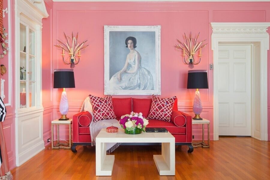
Its strengths are energy, ripeness, and emotionalism. Weaknesses – anger, obtrusiveness, and inappropriateness. The shade itself is gorgeous but not suitable for all interiors. It looks best in its subdued shades such as burgundy or wine, or diluted with light colors. It suits avant-garde and modern styles.

If you incorporate the color red in a toned-down version, as shown in this photo, it will create a dignified rather than garish look
Green
Always appropriate everywhere. This is the best way to describe it. Associated with growth and fertility. Calm, unobtrusive, and special. It has many beautiful shades: emerald, olive, mint, lettuce, forest, and others, which differ radically from each other, but are appropriate in most decorative finishes.
Blue
A calming color with the icy character of the boundless sea or endless sky. No matter what additives are added to it, it will still look cold. But if you choose the right partner (and there aren’t many of them), you can create a magical designer option. It behaves well next to white and gray, creates interesting combinations with green and yellow.
Yellow
The palette of sunny shades carries a joyful mood. Warm peculiar shades blend well with many colors: green, blue, lavender, purple, and almost all others. But warm relatives such as red and orange can create too bright a composition that will distract from everything else.
Brown
Often embodied in “wooden” and plant shades, for example: wenge, oak, walnut, etc. It blends perfectly with all colors, even the most capricious: mustard, ochre, dirty yellow, gray-green, etc. Thanks to its neutrality, it can be a great companion to any interior style. It most often manifests monumentally: on the floor, doors, frames of antique furniture.
Purple
Truly mystical color. For some reason, psychologists consider it depressing, although many artists love to use it in their projects. And really unusual ideas come out of it. It is ideal next to white, muted yellow, and mustard, but only if the latter two are expressed as a pair of details, no more.

Lilac
A shade of cool spring. Bright, full and unusual color. It combines perfectly with achromatic palette, and surprisingly, it looks best paired with itself, only in a different saturation. If you want to use lilac, you have to give this shade its due and make everything suitable for it, otherwise there is a risk of losing the balance.

Pink
It and all its derivative shades are not suitable for every artistic design. Pink by itself is not bad, but in most cases, it is used for children’s rooms. However, some interior design solutions cannot do without it, for example, Provence or other provincial styles, but only as pastel variations or very unsaturated, so as not to detract from the concept.
Black
A color that is hard to imagine an interior without. As a base color, it’s not very good because it saturates the atmosphere with something heavy and gloomy, but as an additional or auxiliary color, it will be appropriate. Especially harmonious in styles such as minimalism, hi-tech, modern, neoclassicism, or gothic.
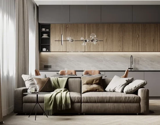
Living Room
The living room is usually the largest room in a house or apartment. Therefore, the choice of color nuances here is much wider, if not all-encompassing. It can be decorated in strict, bright, or very saturated tones, but without going overboard unless it is a special designer project. The living room can have achromatic combinations, which are favorable for many classical styles, as well as contrasting combinations based on relatively sharp transitions.
Tip! If you really like acidic colors such as bright lemon, saturated lime, or sharp orange, then you can suggest reproducing them in a unique way without support: as a color for an extraordinary sofa and armchair. Let it be an exotic spot with a non-standard character.

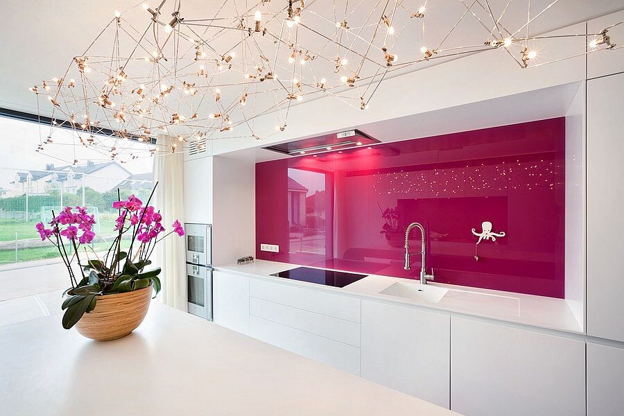
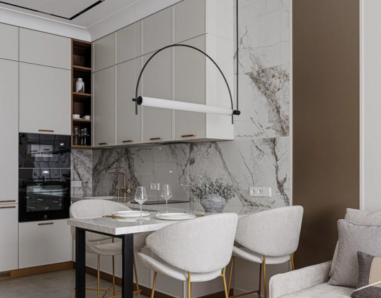
Kitchen
There are countless shades of kitchens: from bright to achromatic to pastel. The diversity of artistic projects in the modern world dictates its own rules. It’s hard to say which color combinations will be the most appropriate for this room, as the most important thing here is not the purpose of the room, but its individual characteristics: size, isolation from the living room, bedroom, etc. You can experiment with colors in the kitchen.
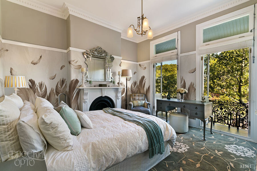
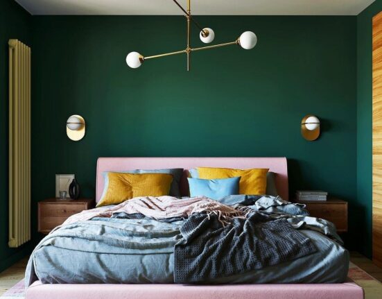
Bedroom
Since this area is primarily for the passive phase of life, it is best to choose not too contrasting colors in the interior. It is practical to decorate the bedroom in a calm palette without flashy elements. Both cool and warm colors will be appropriate, you just need to take into account details such as the direction of light, climatic conditions, and size.
Note! In bedrooms facing the north and northwest, it is better to use a warm color palette, and in those facing south or southeast – a cool palette.
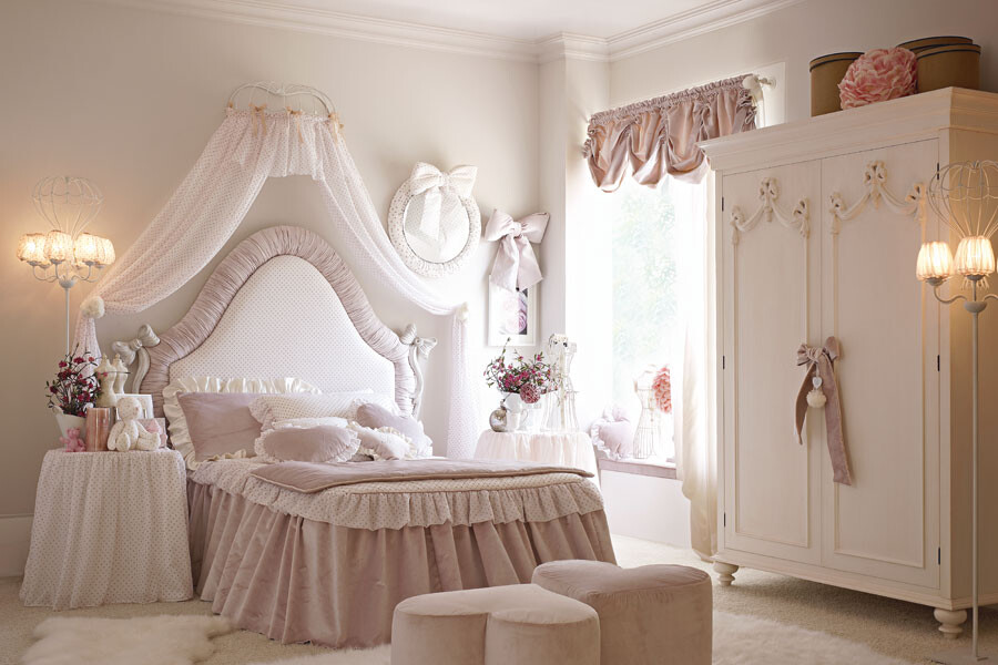
Children’s room
Everyone knows that young children need to develop, so it is a good idea to fill the room with bright colors, but not too harsh, so that the little ones do not get overwhelmed. A nuanced composition of green, blue, and pink colors can be made. For older children, on the other hand, it is important to focus on educational activities, so a combination of brown, beige, cream, or milk colors would be a good option for their room.
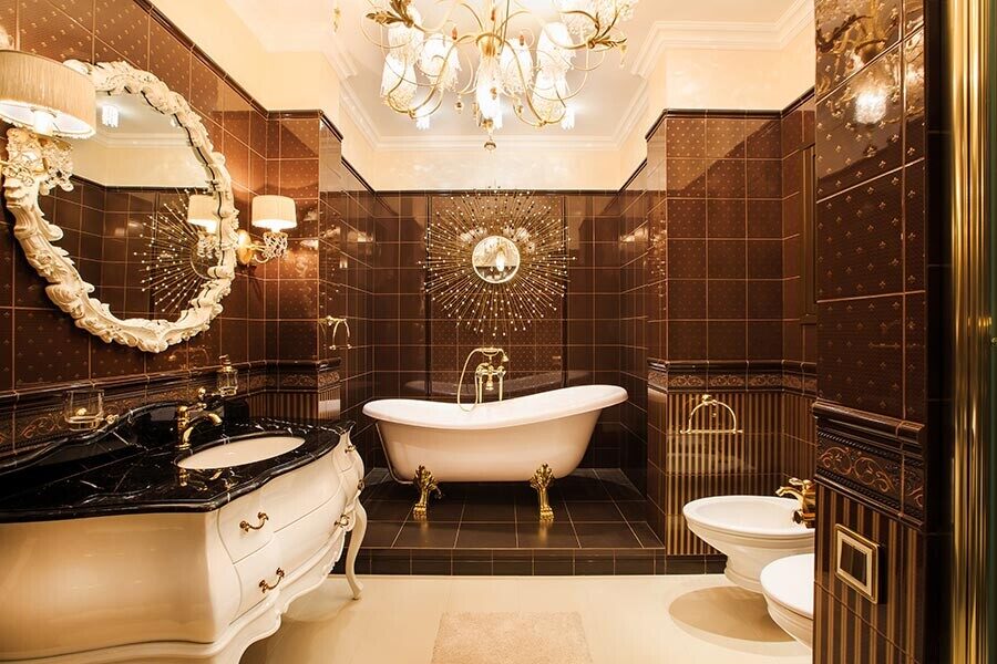
Bathroom
In bathrooms, white color often prevails due to the homogeneous tone of the plumbing fixtures. But since this color goes well with everything, you can choose any shade to pair with it. If the bathroom is not very spacious, it’s not recommended to use dark shades to decorate it. However, bright marine or forest colors are always welcome. Even red and white can help create a very elegant composition in this room.

Leave feedback about this