Everyone approaches kitchen design differently: some prefer warm, bright shades while others opt for a more subdued design that keeps the focus on the cooking process. A black and white kitchen suits many, from minimalism enthusiasts and classic style adherents to fans of cozy Scandinavian aesthetics. It all depends on how you play with these colors and what you add to them. This article will discuss and show various ways to use an achromatic palette.
Pros and Cons
Pros
The combination of black and white is a true classic beloved for many reasons. Here are some key benefits:
- Easy to implement. If you’re unsure about what colors you want in your kitchen or fear making a mistake with the palette, you won’t have this problem with achromatics. And you can complement them with any shades, from basic to bright, according to your taste.
- Versatility. This color scheme fits all interior styles, whether Art Deco, Eco, or High-tech—it all depends on the textures, furniture shapes, and decor. And of course, both achromats blend perfectly not only with each other but with any other colors.
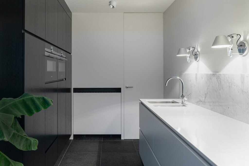
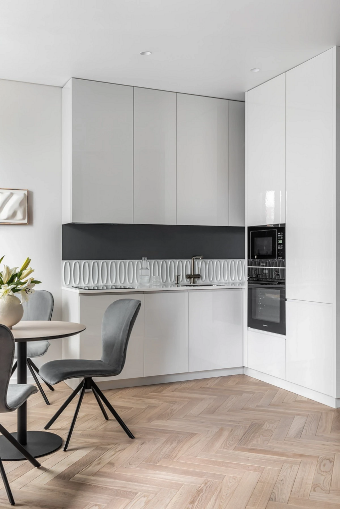
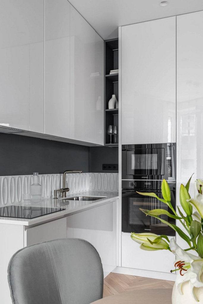
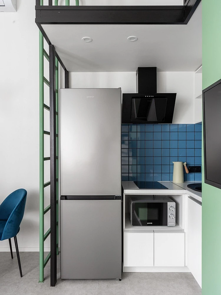
- White visually expands the space, especially when combined with glossy surfaces. It’s the best choice for a small kitchen. Black, in small doses, provides necessary contrast.
- With these two different colors, you can easily zone the space without complex solutions like partitions or bulky furniture.
- Easy to match appliances. White and black are the two most popular colors, and models are available from all manufacturers without disrupting the interior’s overall look.
Cons
This color pair also has its drawbacks:
- Excessive contrast. Black and white are opposite ends of the
achromatic spectrum. Using only these can make the space look too stark, even somewhat harsh. The solution is to use mid-tones, different shades of gray, beige, and brown to soften the transition. Also, choose one dominant shade over the other, like snow white or ivory for finishing and large furniture, with black for details.
- Simplicity of the palette. To some, this classic combination may seem too plain and obvious. To avoid this feeling, use various active textures and boldly complement the achromatics with any shades: pastel, natural, bright.
- Limited range of decorative approaches. Since the combination is already contrast-rich, you need to be cautious with space decorating. Furthermore, not all textures and patterns will fit, ultimately leaving a rather narrow choice.
Color Schemes
In photos, black and white kitchens vary: some are striking and contrast-rich, others softer and cozier. It all depends on the proportions of achromatics used and how they’re combined. Here are a few popular schemes.
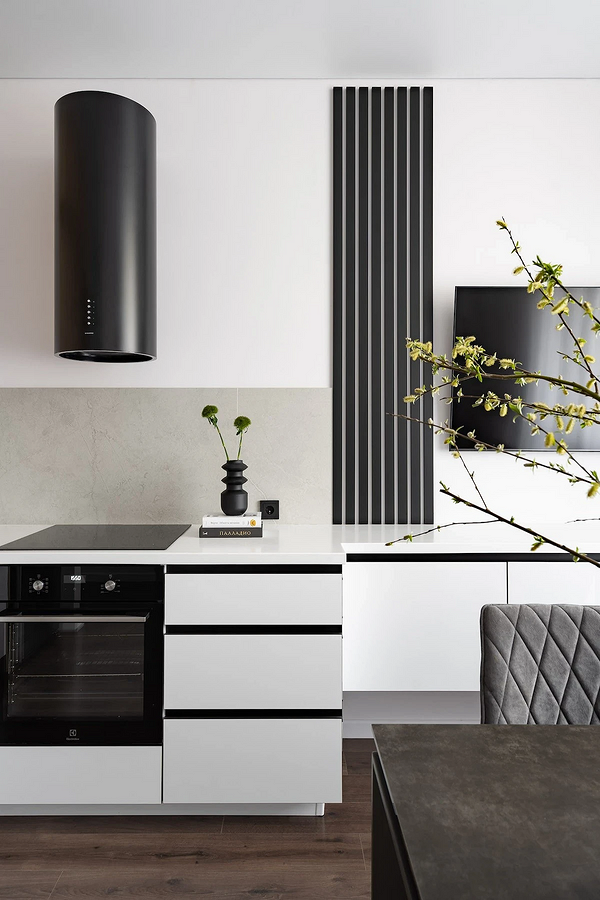
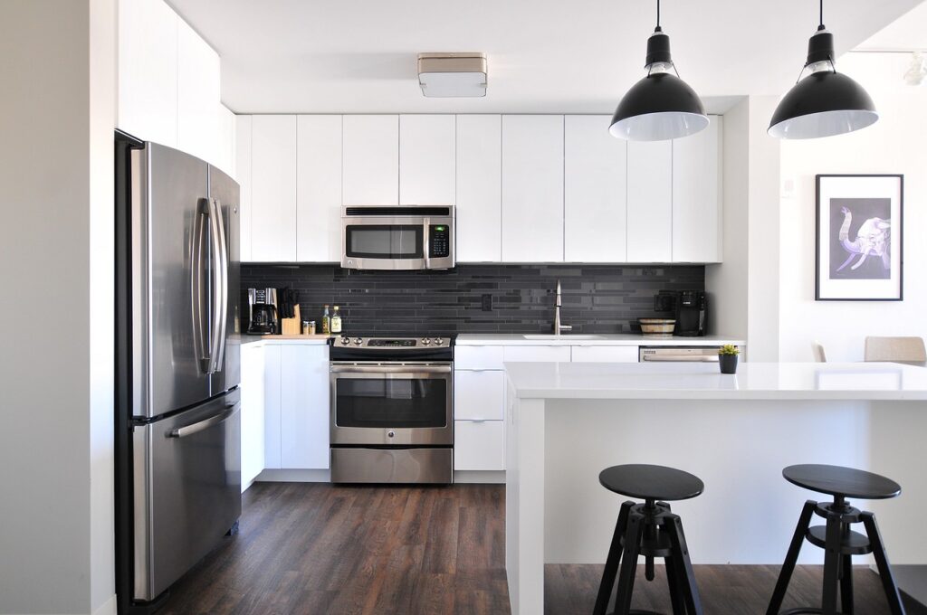
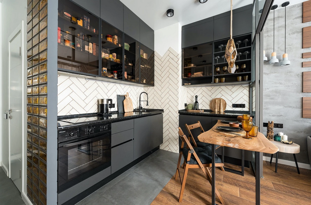
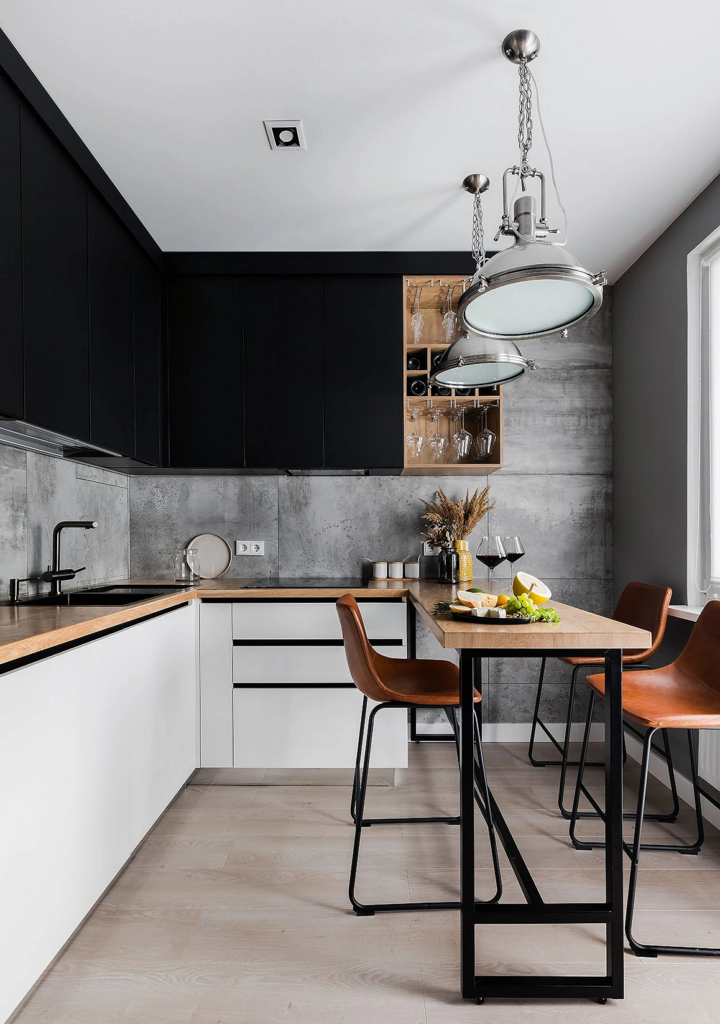
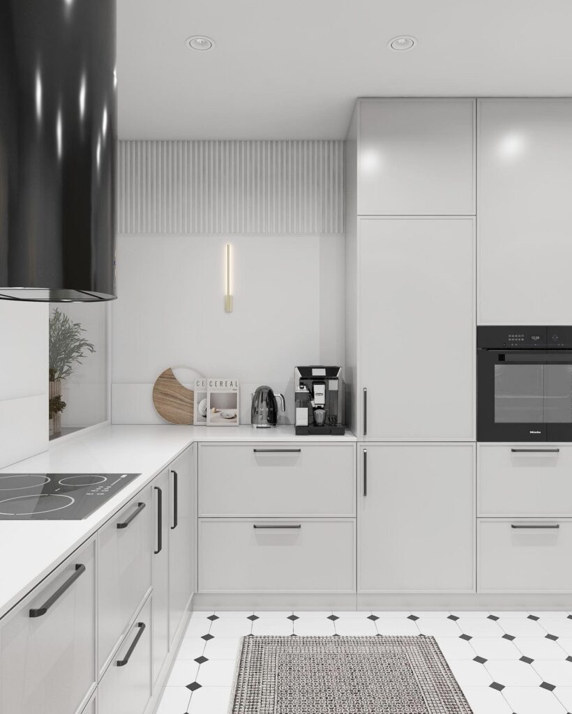
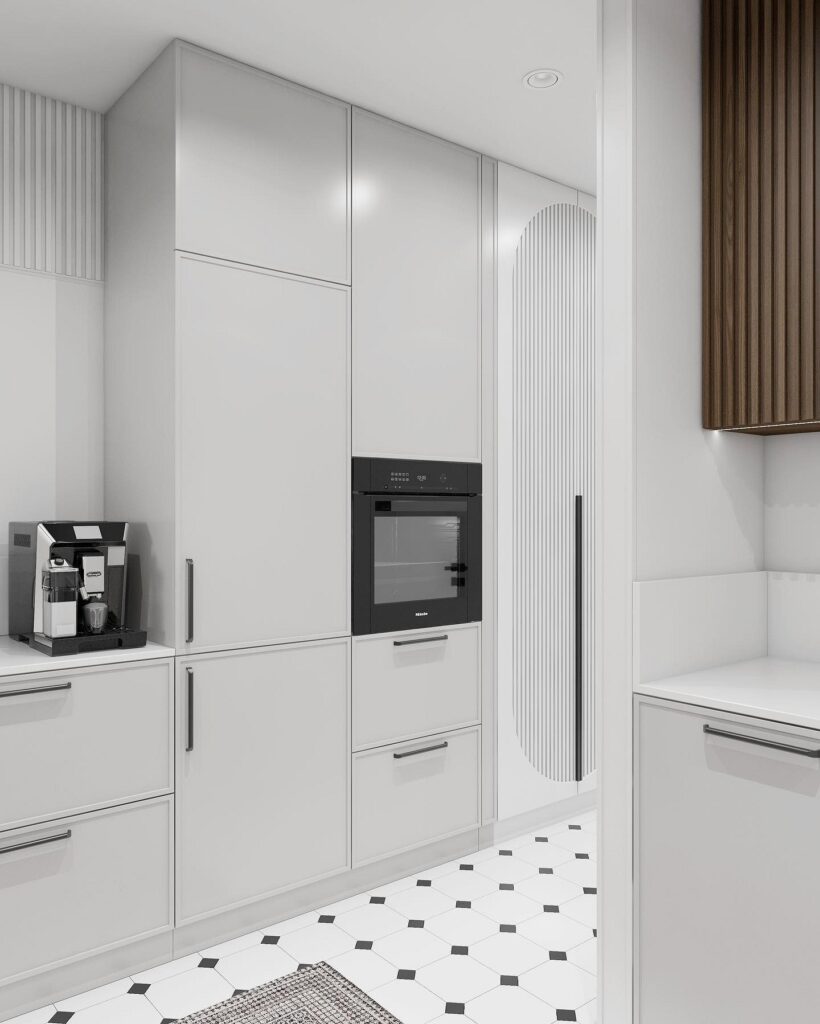
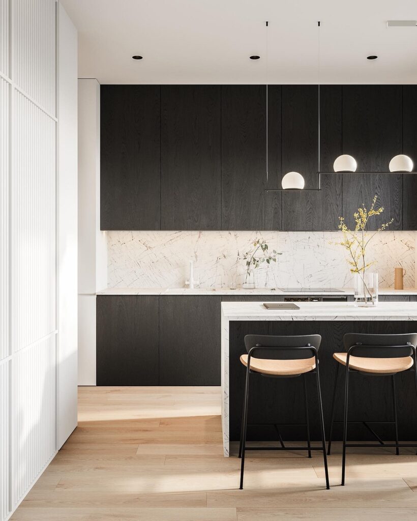
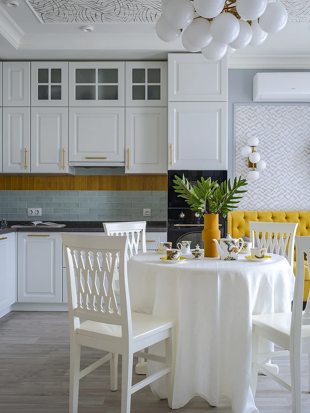
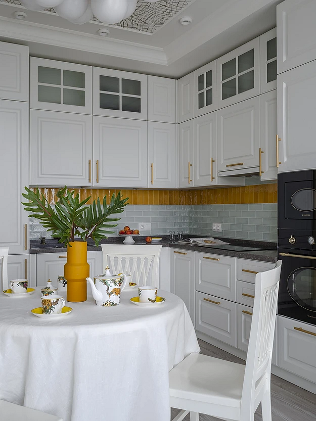
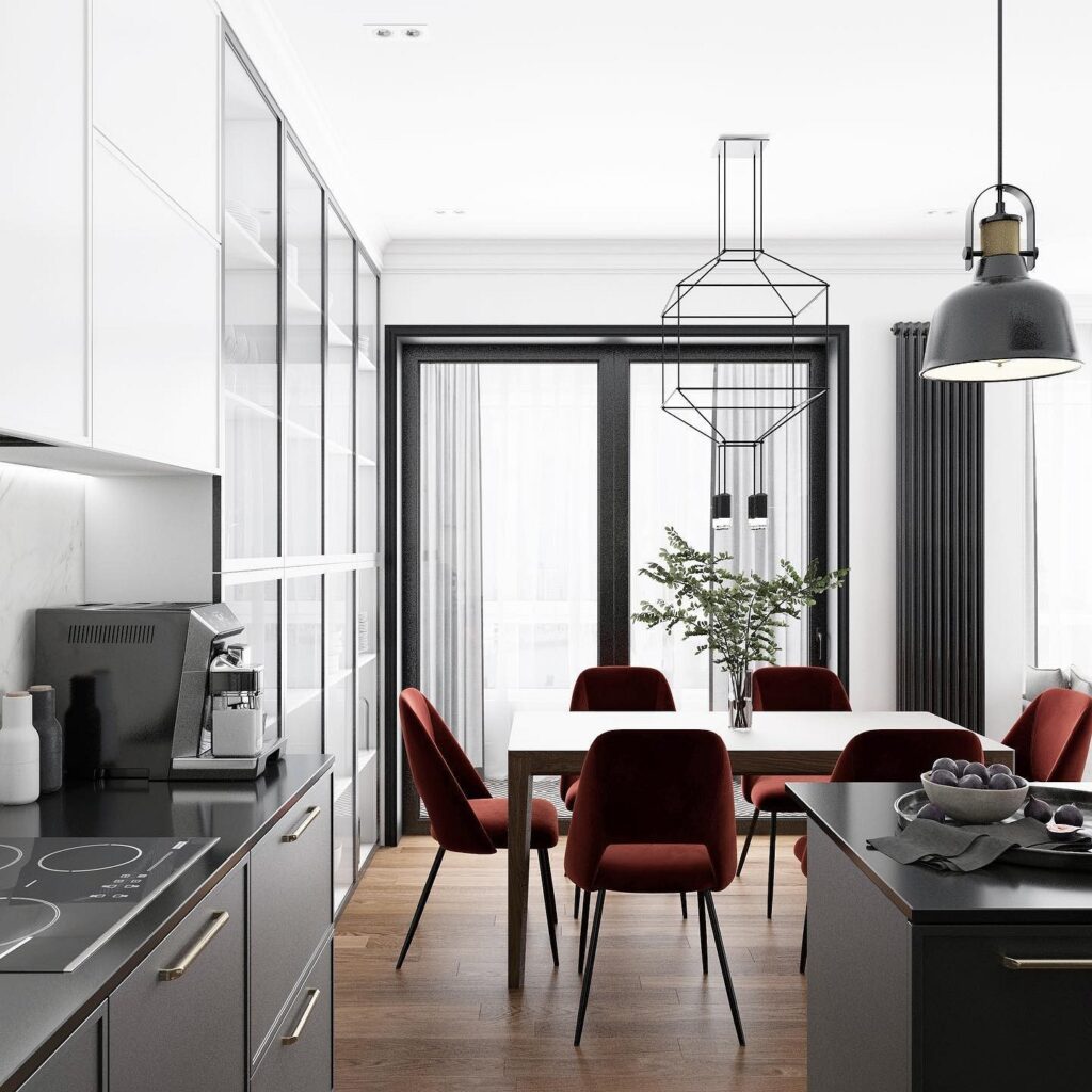
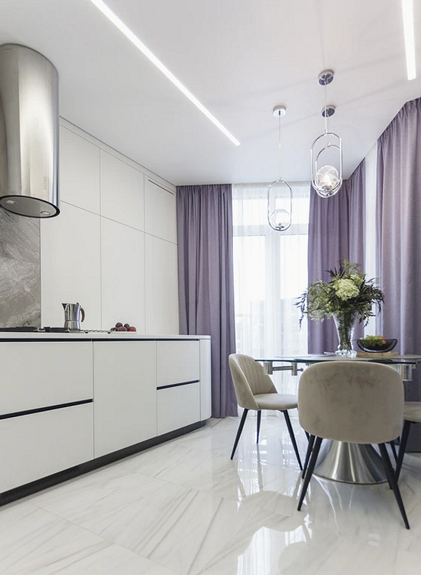
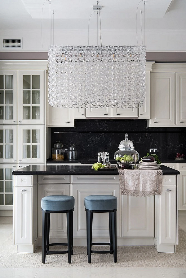
Light finishes, dark furniture
Cooking areas often occupy a small space, so light tones are usually chosen for finishes. Furniture, however, can be made to contrast with the walls and ceiling—including black. But it’s important that such combinations don’t look two-dimensional, so always add transitional shades (gray, brown, beige). If all the furniture is dark, choose a light countertop, glass cabinet doors, or other contrasting elements to prevent it from looking too bulky. You can also add a few bright color accents to make the palette more interesting.
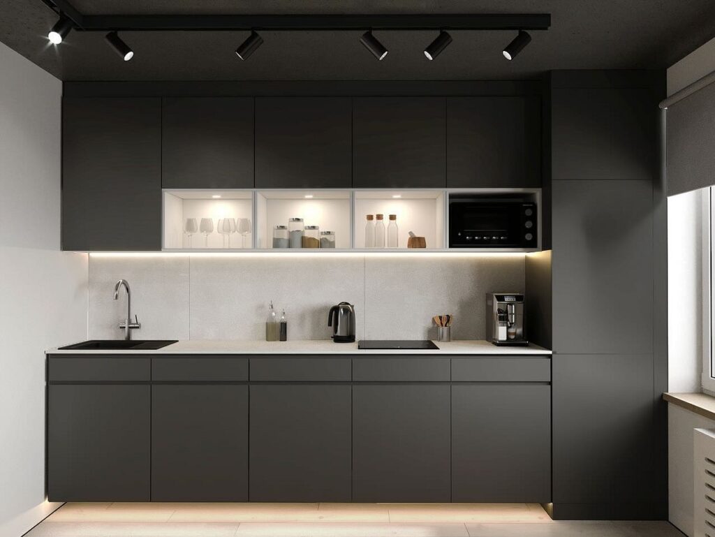

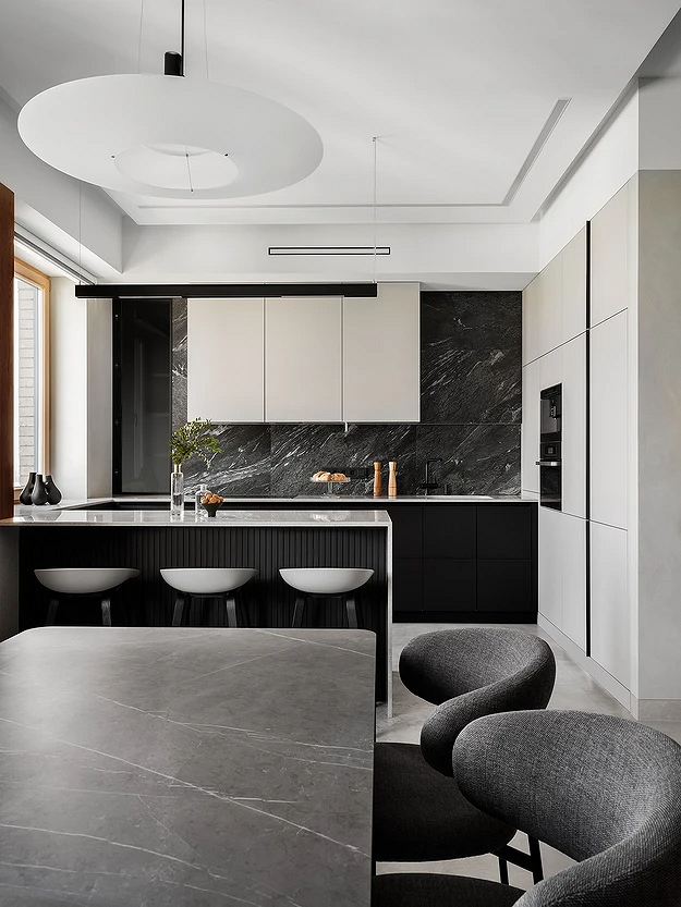
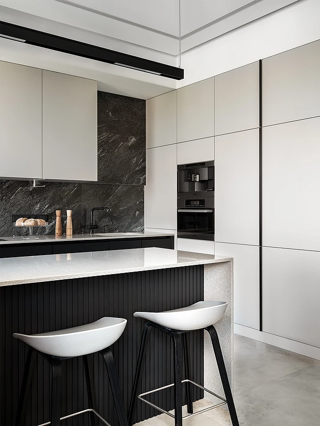
Light Finishes, Mixed Furniture
This palette option resembles the previous one but is even more neutral—when large kitchen and dining furniture isn’t entirely black. This could be a set with different front panels or a combination of dark cabinets with a lighter dining set (or vice versa). Such combinations work well with several shades of gray, as well as marble, wood, and concrete textures.
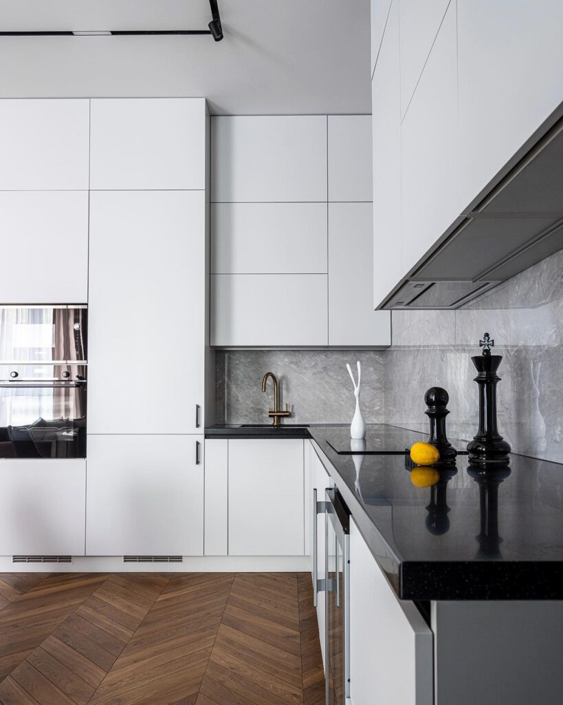
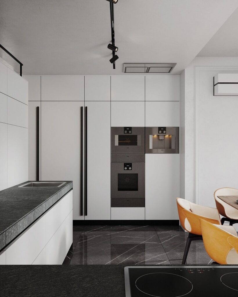
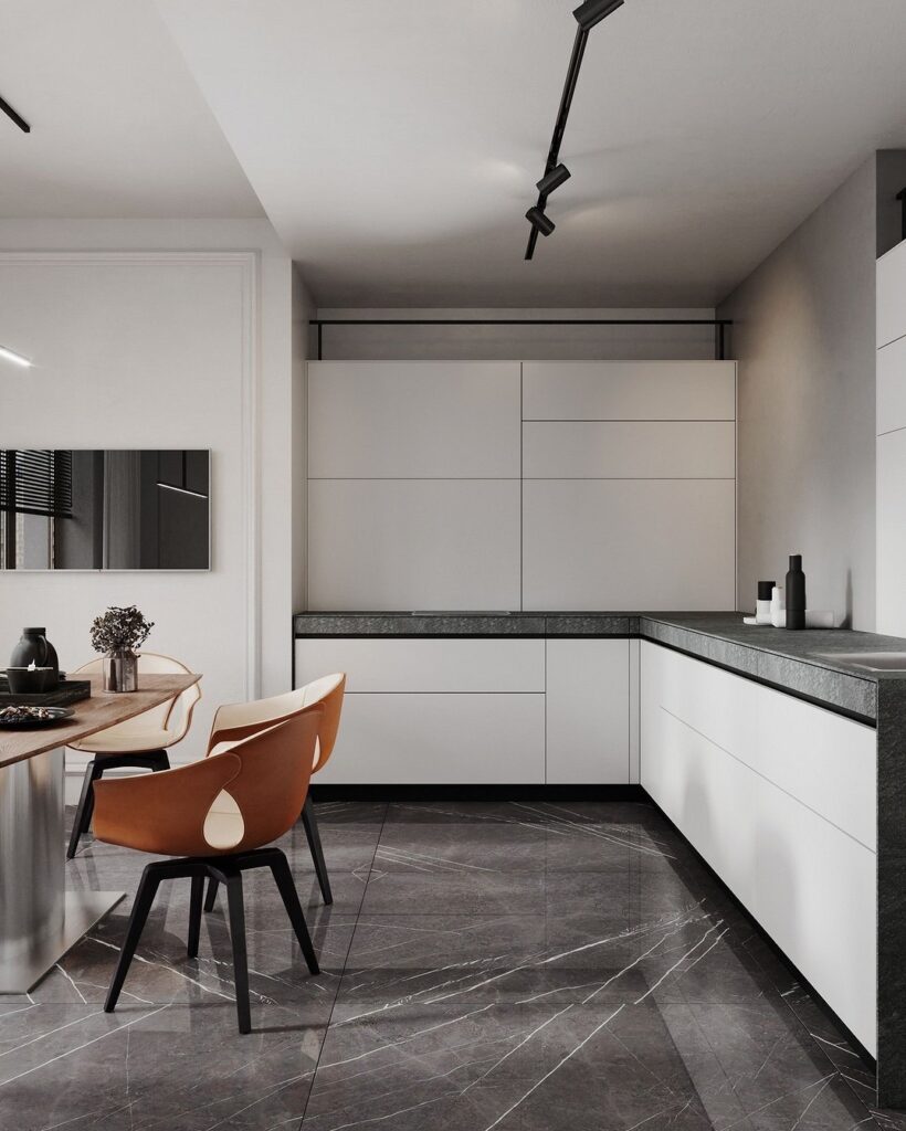
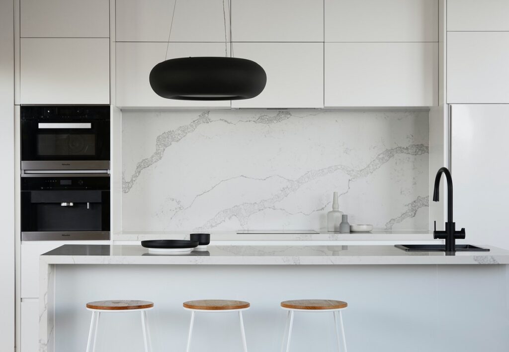
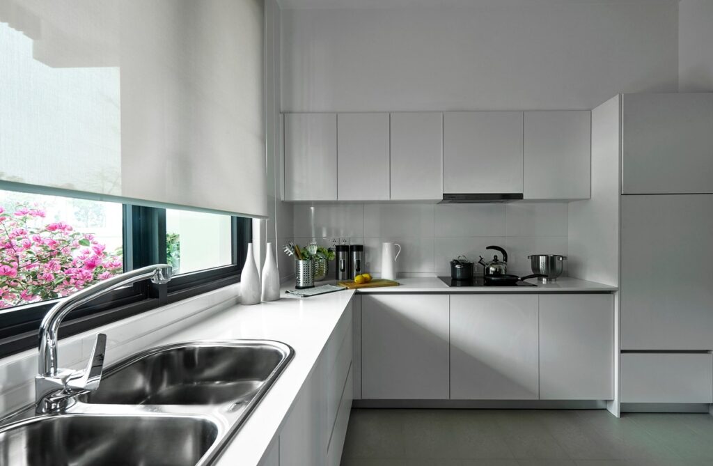
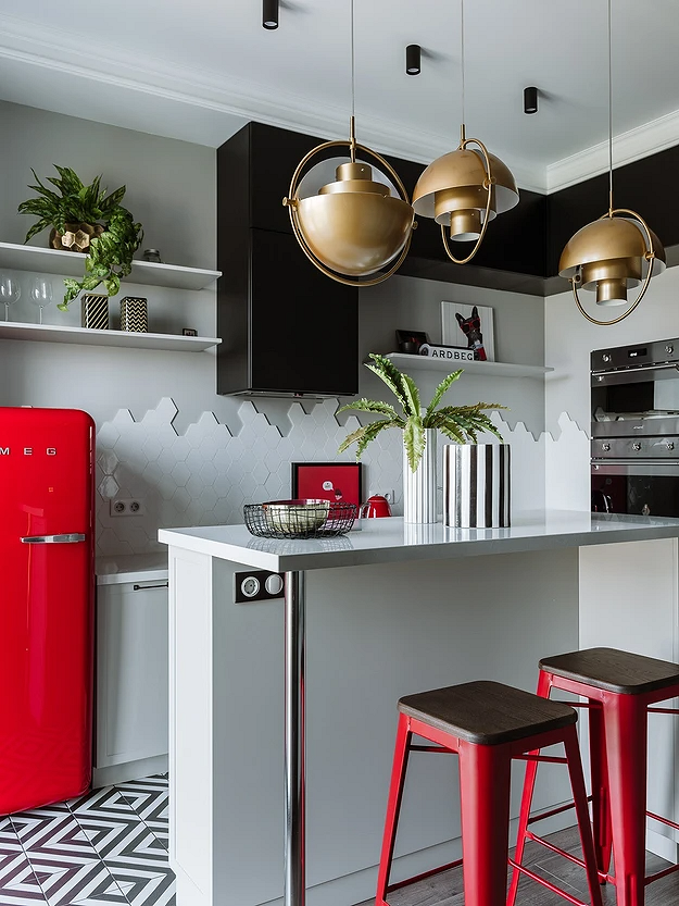
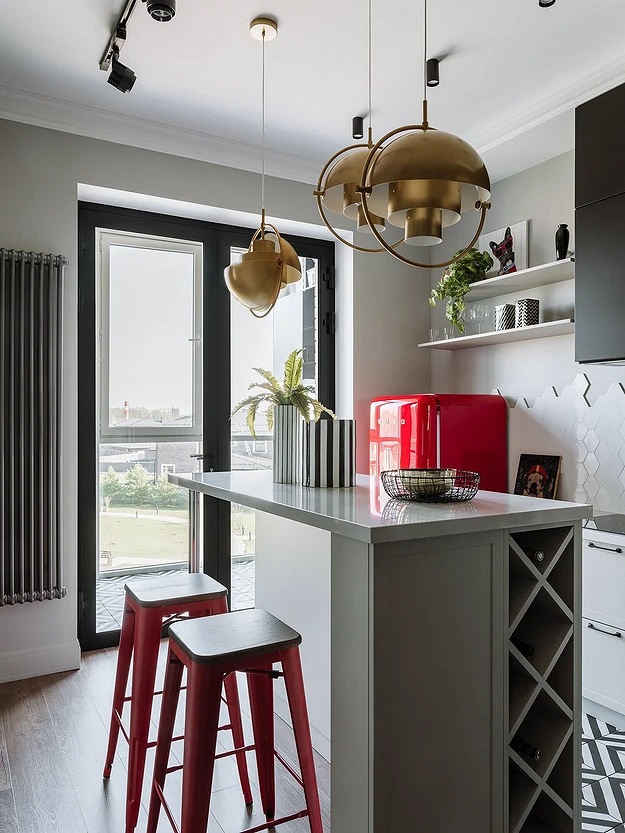
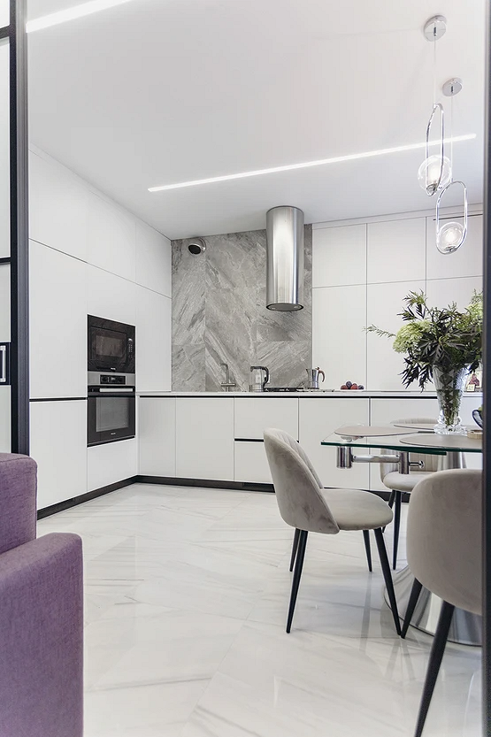
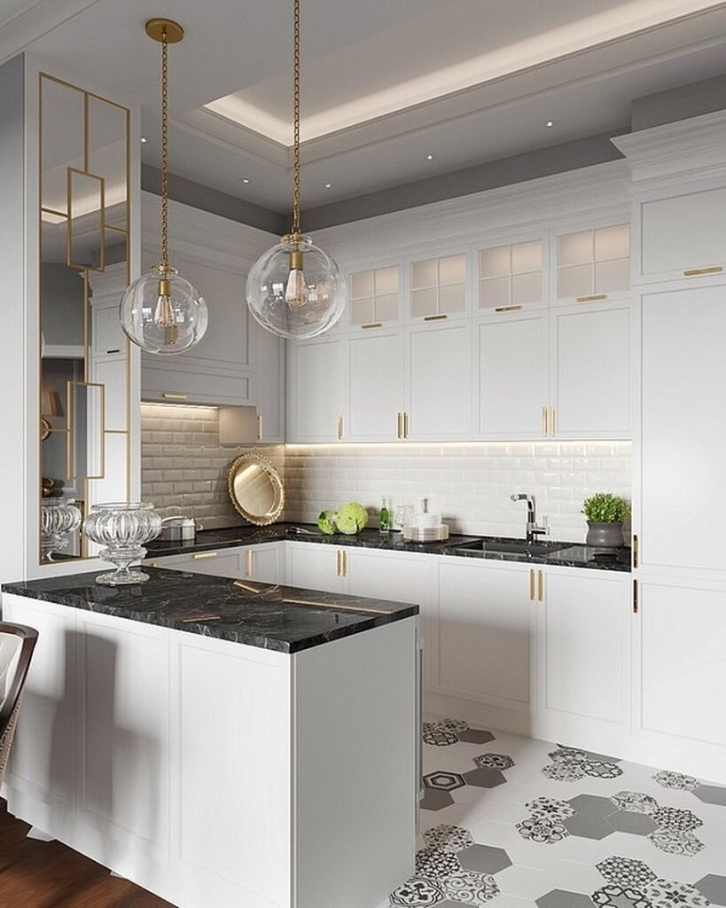
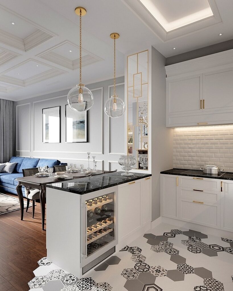
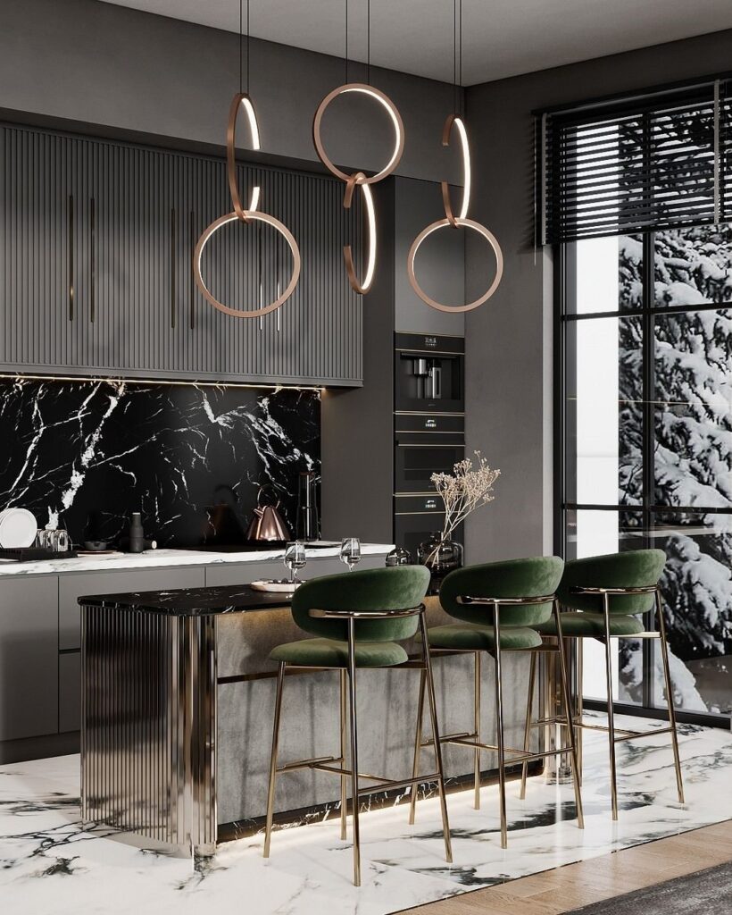
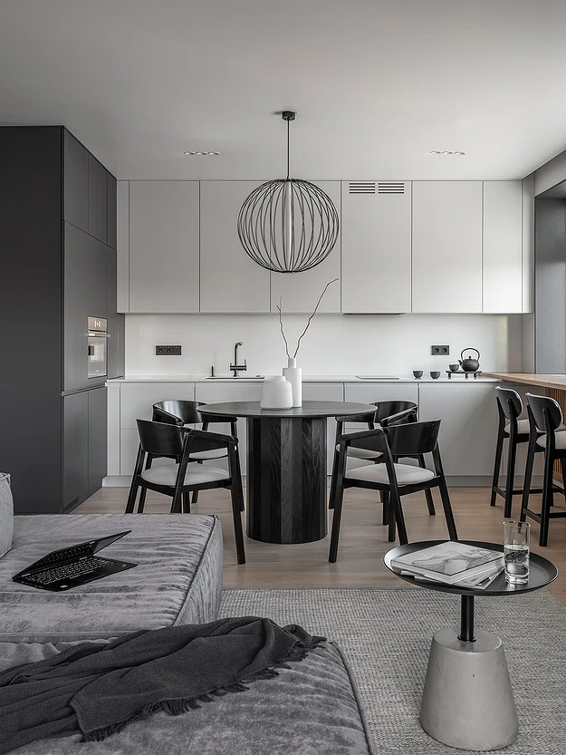
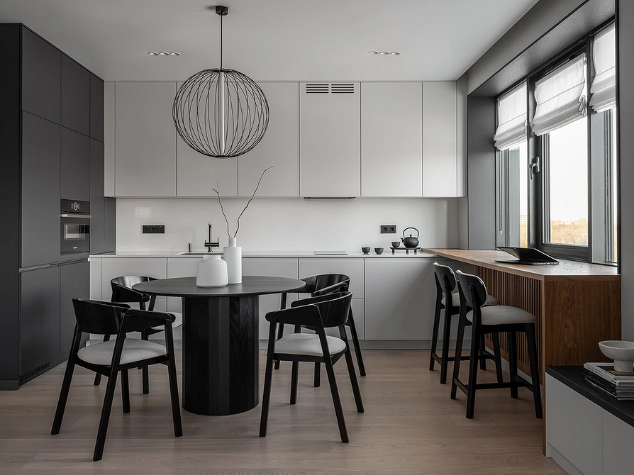
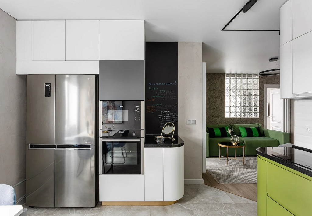
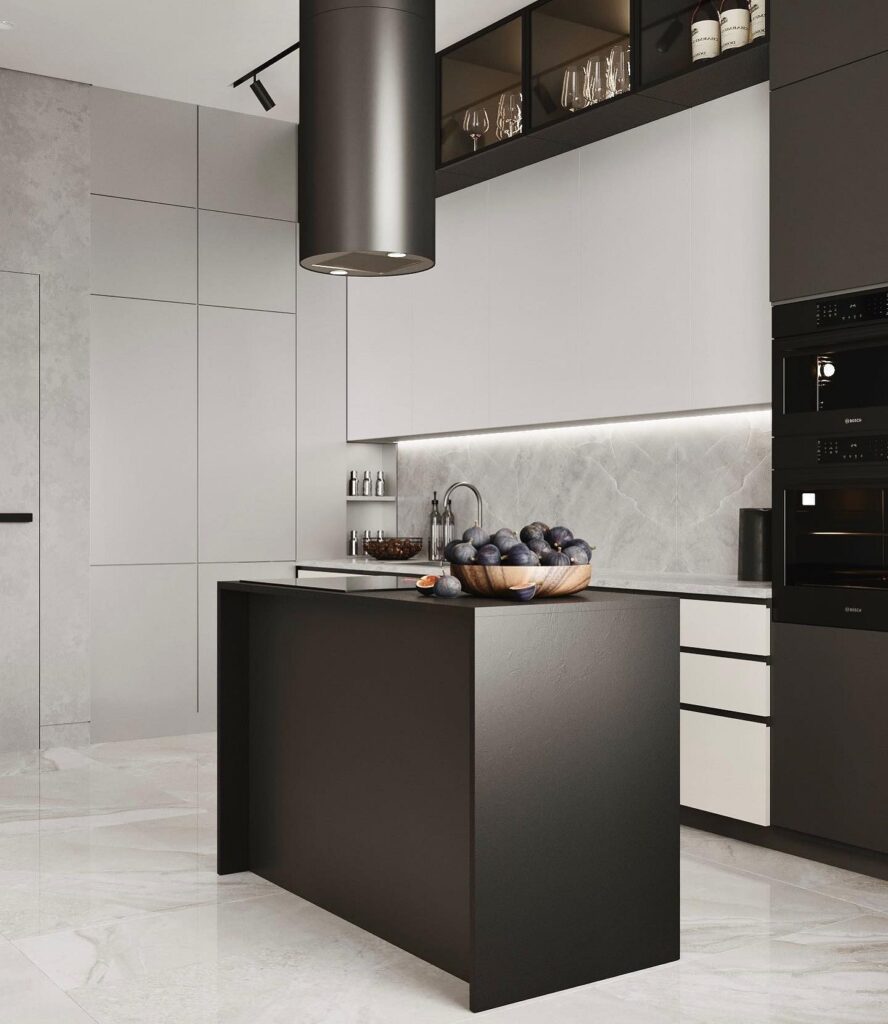
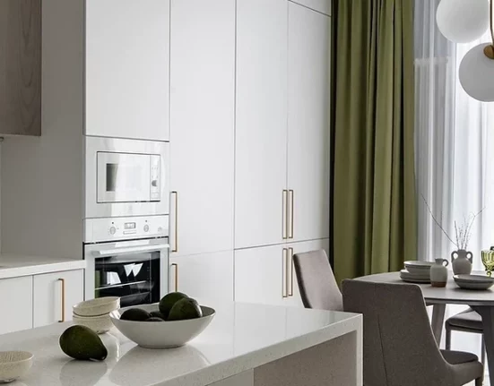
White as Dominant, Black as Accent
For small spaces, a palette almost entirely achromatic with a dominant white color is often chosen. In this case, walls, ceilings, all major furniture, and sometimes even floors (e.g., marble-like porcelain or water-resistant laminate resembling bleached oak) are light. However, the problem with such an “airy” interior is its excessive sterility. Contrasting inclusions help avoid this, for instance, an entirely white kitchen with a black countertop or choosing accents in hardware, appliances, exhaust hoods, and furniture details.
Also, consider the following techniques:
- Instead of cold snow-white, choose a shade with an undertone (ivory, smoky, milky).
- Add warm textures (wooden surfaces, textiles).
- Place several accents using decor.
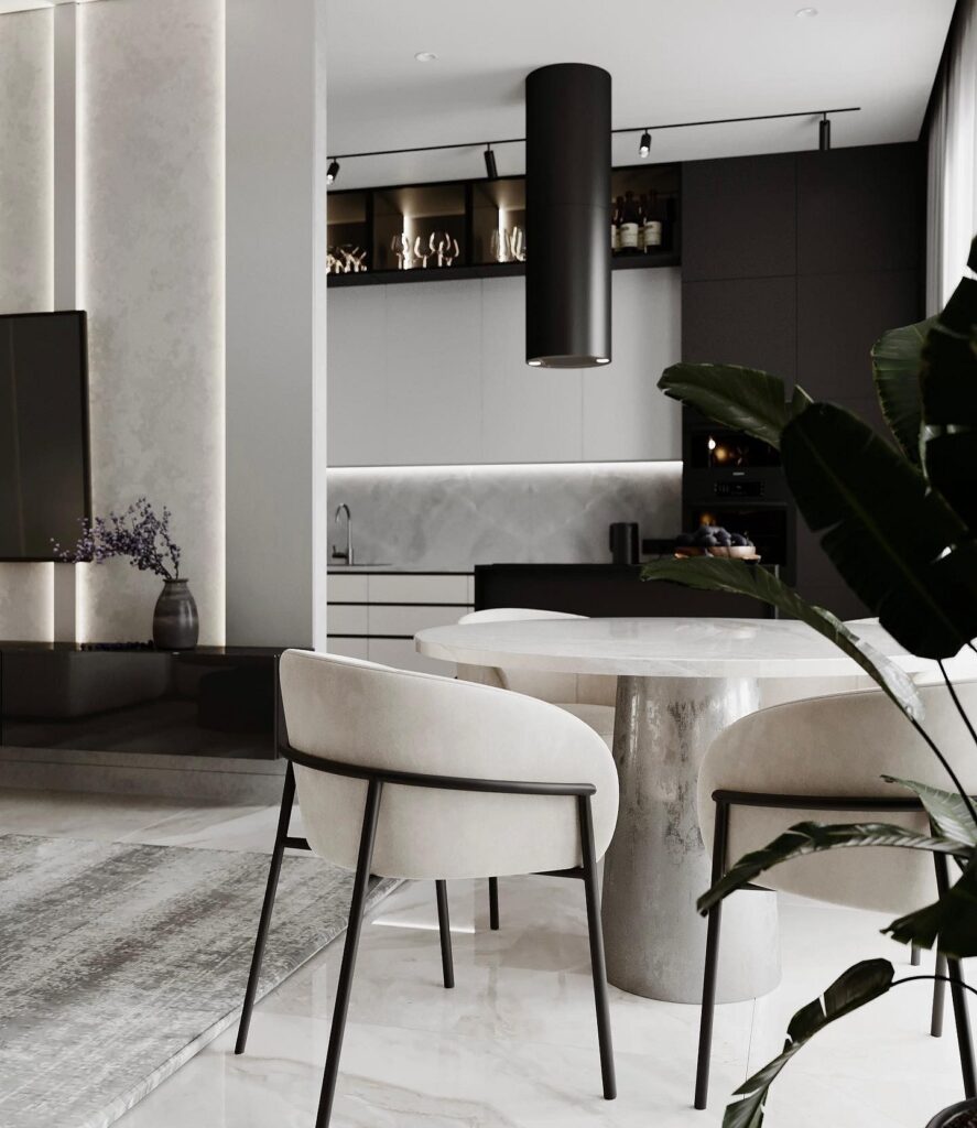
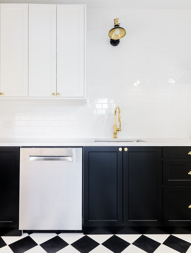
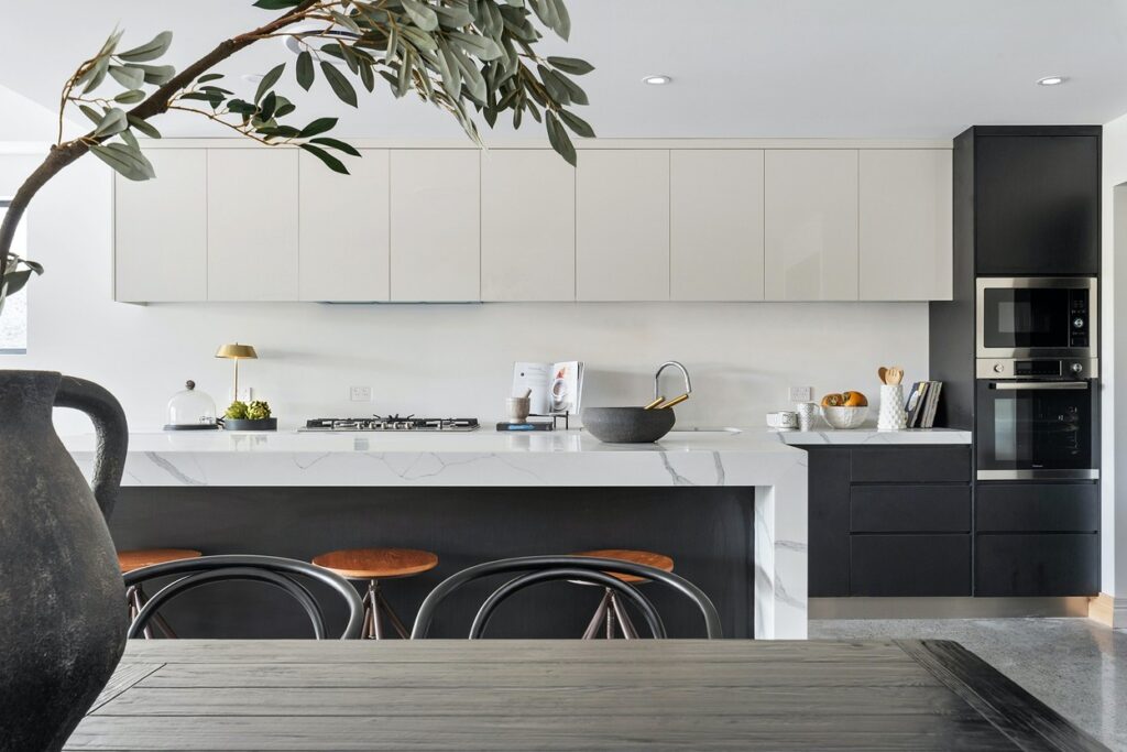
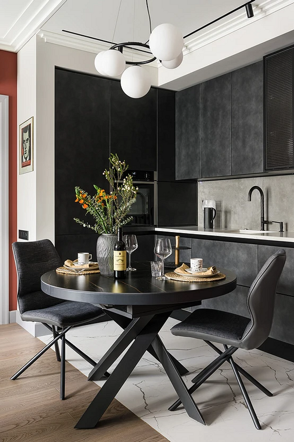
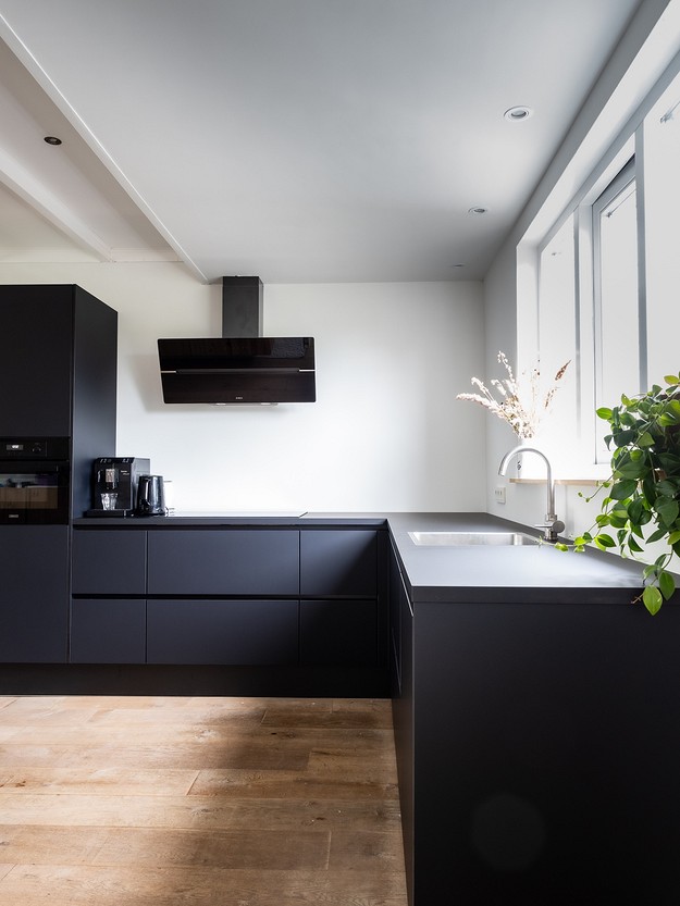
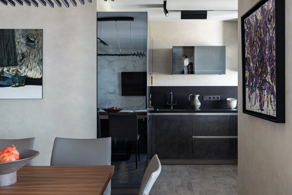
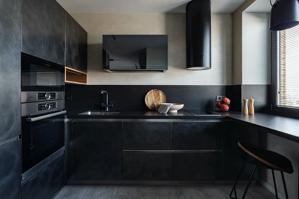
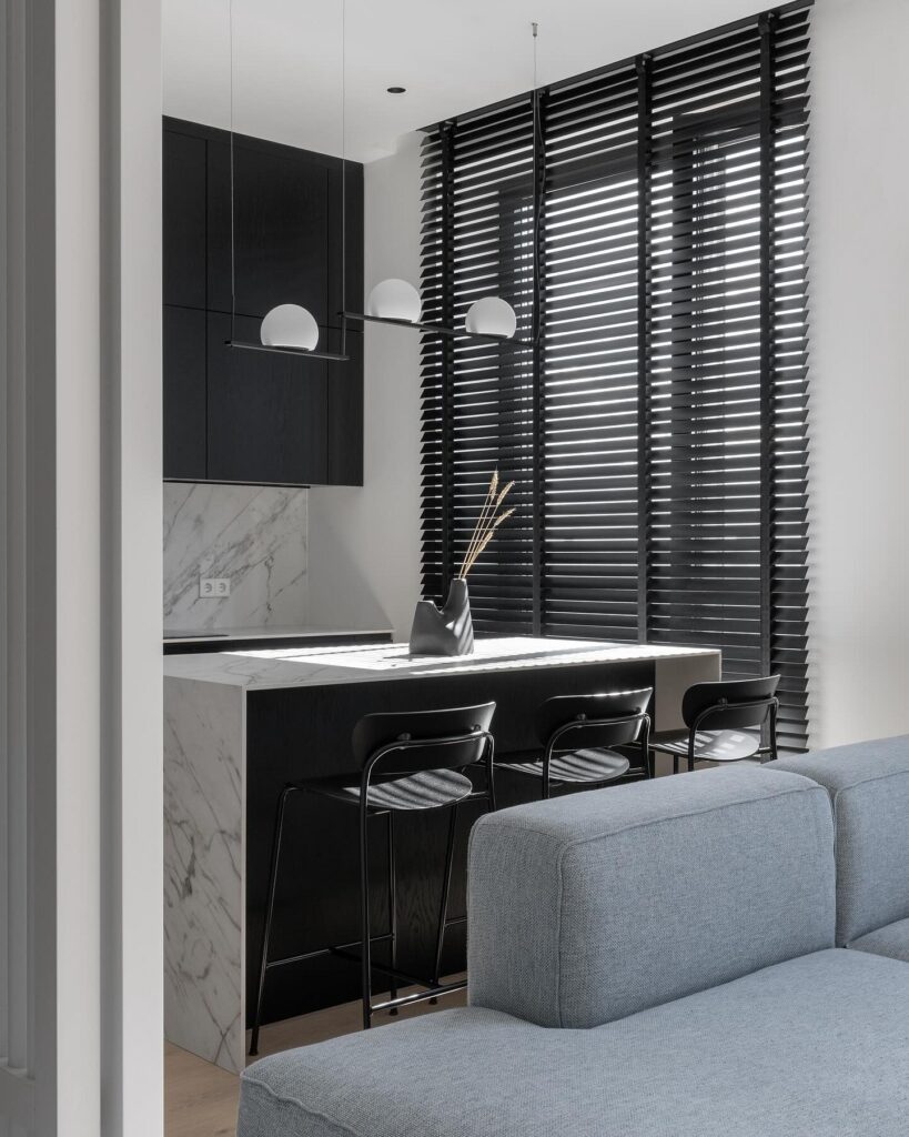
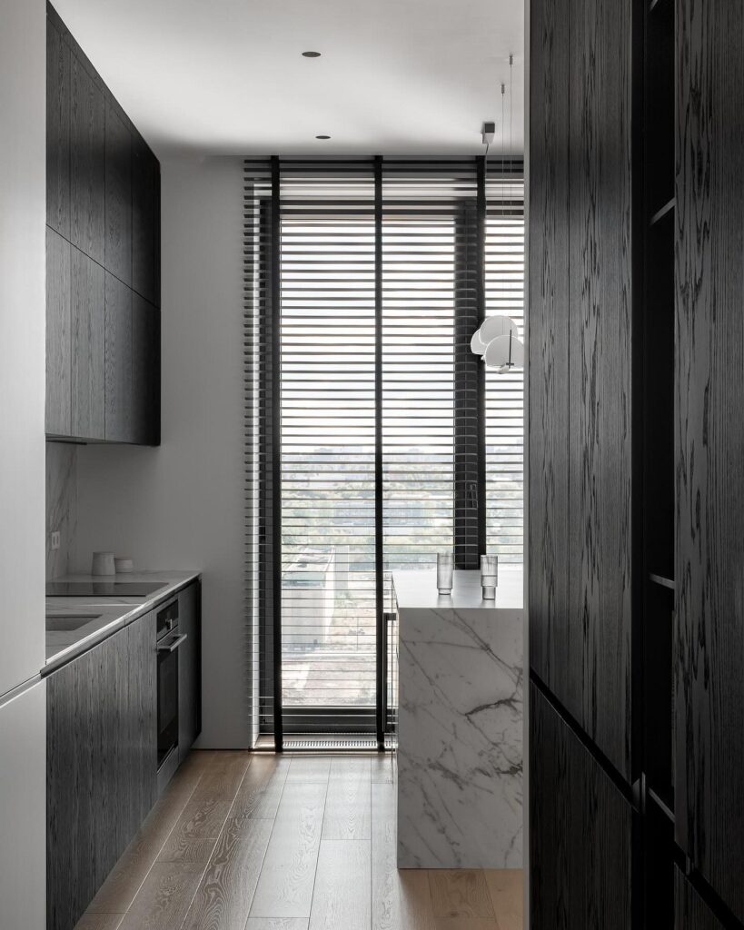
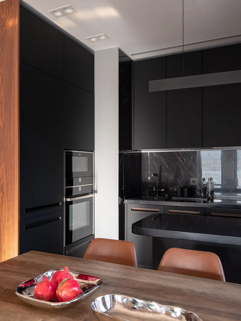
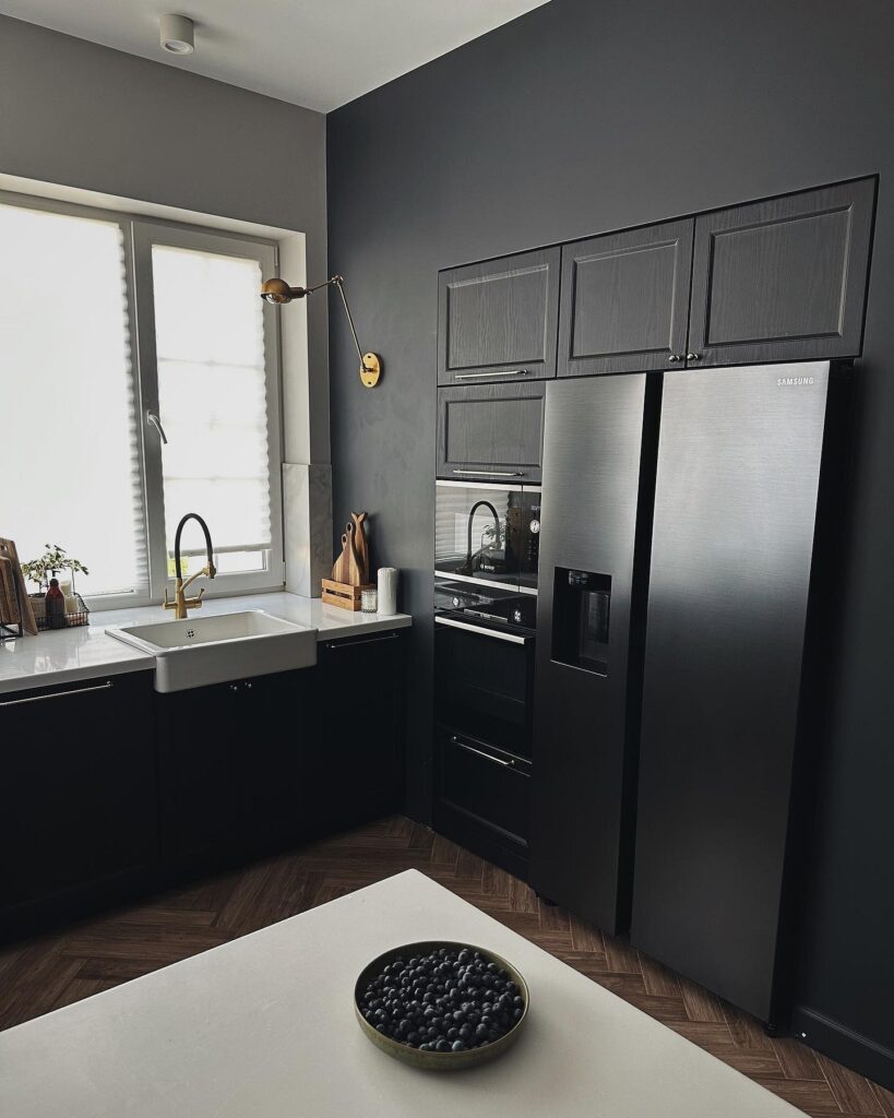
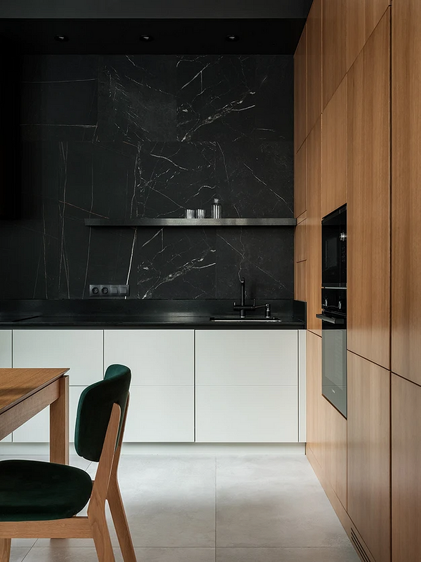
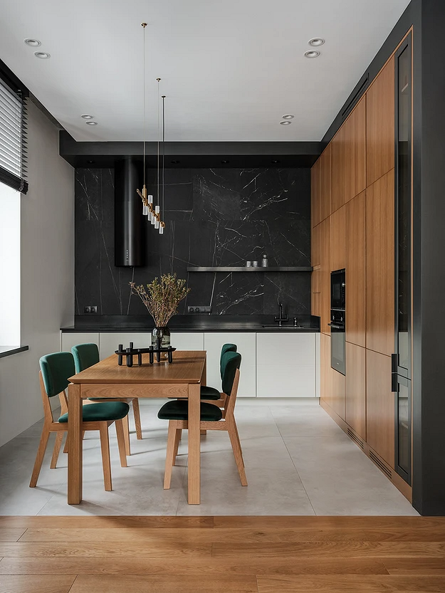
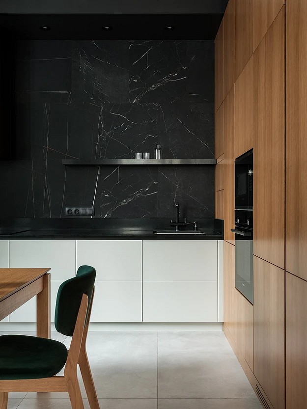
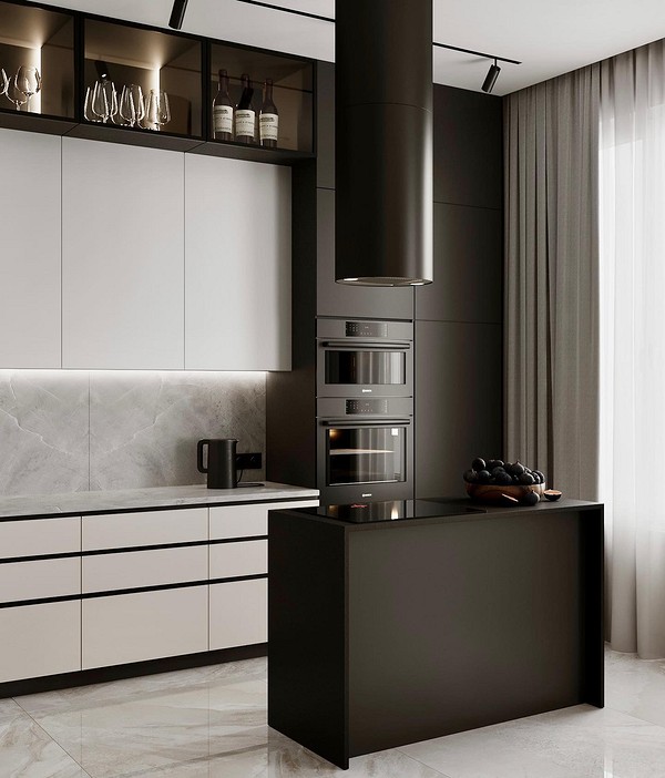
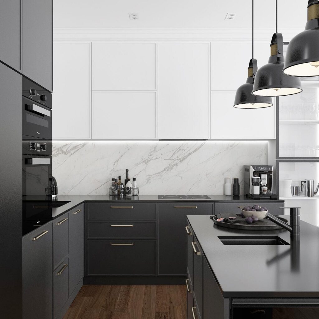
Black as Dominant, White as Accent
This scheme is much bolder and more complex to implement. Traditionally, a dark palette is used in larger spaces, though there are exceptions, such as if you want to create a box-like effect or if the room has large windows and a lot of natural light.
To implement this scheme, it’s important to carefully consider all components of the palette. For example, a black set of furniture and the same-colored walls is a bad idea. Use differing tones for finishes, though they should be deep enough: graphite or asphalt gray, chocolate, dark brown, deep blue, etc. It’s better to keep the ceiling traditionally light.
Then add white accents. These could be small details like furniture handles, faucets, decorative dishes, or textiles, as well as individual pieces of furniture or even part of the finish. It’s important that light elements are evenly distributed—this creates dynamics, makes the interior interesting to look at, and avoids an oppressive feeling.
How to Complement the Palette
Fully achromatic kitchens are rare—other colors invariably appear in any interior. And any combinations with black and white will be successful.
Neutrals
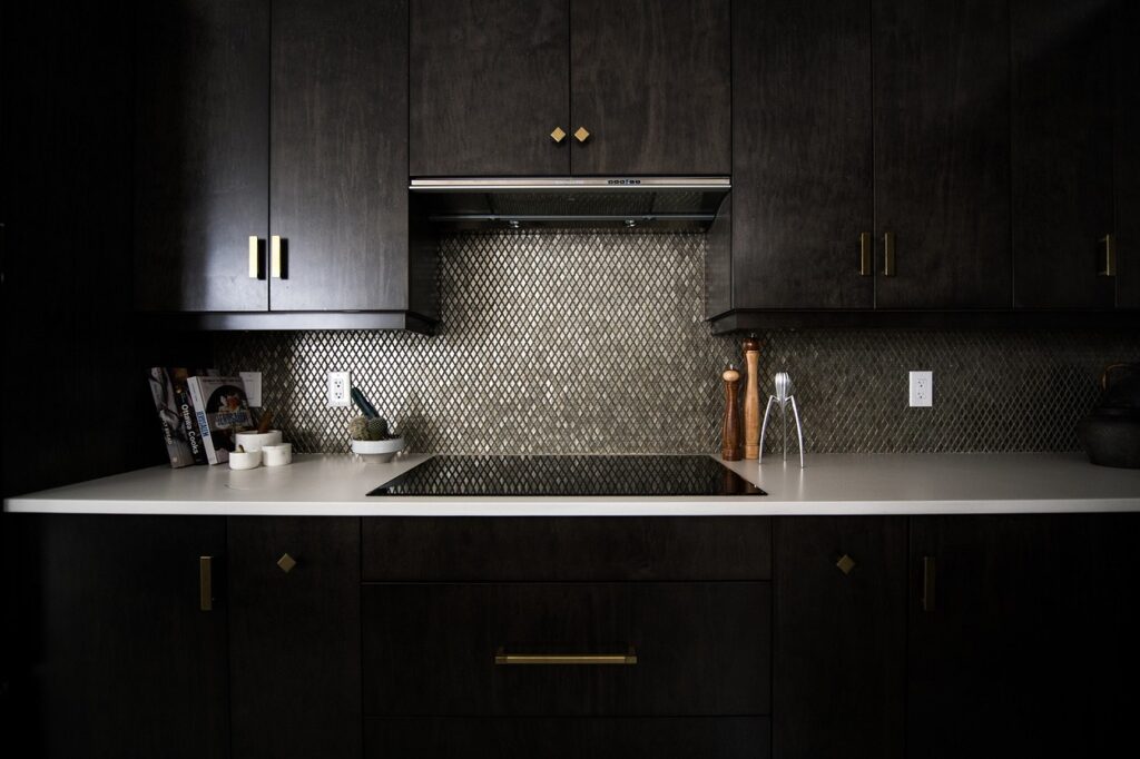
Beige and brown are classic companions for almost any palette. In the kitchen, they appear in various elements: finishes, furniture, and decor. Warm shades, especially on natural wood textures, soften the stark contrast of black and white and bring a sense of coziness to the interior. They can be used sparingly or more expansively (for example, in flooring across the entire cooking area).
And of course, the third achromatic color—gray—belongs to the group of neutral colors. Its shades complement the black-and-white decor perfectly, smooth the gradation between light and dark, add softness while remaining within a relatively cool palette.

Bright Colors
Vivid colors are a great way to add life to a rather neutral and in some ways colorless kitchen.
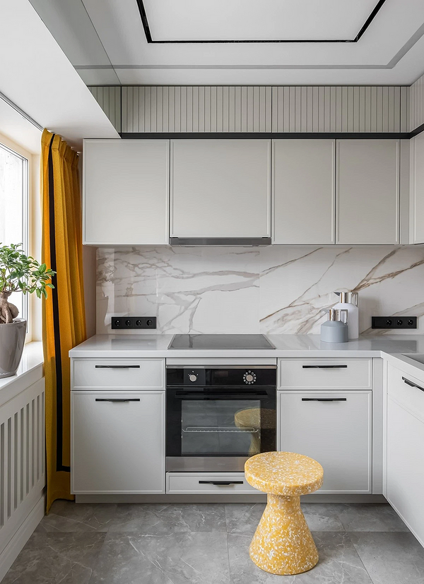
Any colors that you like are suitable, from sunny yellow or tomato red to blue or olive green. Adding accent elements through small details like decor and textiles makes the palette very “flexible”: you can update the decorations at any moment to suit your mood or season. The feel of the space will constantly change, and you will definitely never tire of it.
The only rule is to avoid overly simple, pure shades. Choose deeper, more complex tones of your favorite color to make the kitchen interior look more sophisticated and interesting.
Pastels
If you find the basic palette too simple, but you don’t like (or just don’t want to use) saturated shades, the perfect compromise is a pastel range.
This range includes all muted shades of blue, yellow, pink, orange, green, and purple. They are all light, airy, and blend excellently with a white background, while black accents will complement and diversify the delicate yet vibrant kitchen.
Styling a Black and White Kitchen in Various Styles
Photos of black and white kitchens in different styles reveal patterns for each direction. Follow these when planning your decor.
Classic
Traditional directions, besides the pure classic style, include Neo-, American, and French classics, Empire, Art Deco. They all share the use of expensive natural materials, noble shades, symmetrical compositions, and certain decorative techniques (molding, art, pairs of lamps).
It doesn’t matter which of the achromatics is dominant, although light neutral tones are often the base. Avoid overly bright, pure contrasts; opt for diluted shades (like milky instead of stark white) and pay attention to textures. A wenge veneer cabinet would look great with a light stone countertop or backsplash. Appliances can be built-in and hidden or chosen to match the style.
Modern
Modern directions include dozens of styles: contemporary, minimalism, loft, Scandi, eco, wabi-sabi, high-tech, and others.
Unlike the classics, modern design does not adhere to strict canons, and each stylistic has its own visual markers. For instance, loft features rough textures, large windows, and spaciousness; minimalism emphasizes furniture and finish simplicity, closed storage systems, and minimal decor; Scandi opts for practical materials, wooden and clay accessories, and a natural palette.
Choose color schemes based on this. Also consider the characteristic textures, shapes, and decorative techniques for each style. For example, patina cabinet fronts wouldn’t suit minimalism, while an abundance of chrome and metal, which would look great in a high-tech kitchen, wouldn’t fit the eco-style.

Leave feedback about this