The blue bedroom is considered a timeless classic, proven for centuries – in this color, relaxation spaces were decorated even in royal palaces. Today, it remains an equally popular choice. However, a completely azure or sky-blue room looks ordinary, so it is considered good taste to combine these shades with other tones. We’ll talk about how to best decorate a room in this palette and what nuances to consider in the article.
Color Features
What do you feel when you gaze at the endless summer sky? Tranquility, calmness, serenity – many will answer. Indeed, sky-blue shades bring the mind into a state of harmony and relaxation. They are capable of reducing stress and eliminating nervous tension, and some tones even improve sleep and can combat insomnia. Therefore, it is not surprising that a light blue color scheme is often used to decorate the bedroom area.
A blue bedroom interior can soften strong emotions, mitigate conflicts, and dispel sad thoughts. However, this applies only to pastel, non-vibrant colors without a grayish tinge, which are associated with purity and tenderness. At the same time, overly intense tones can have the opposite effect: a saturated azure or turquoise can be stimulating and invigorating.
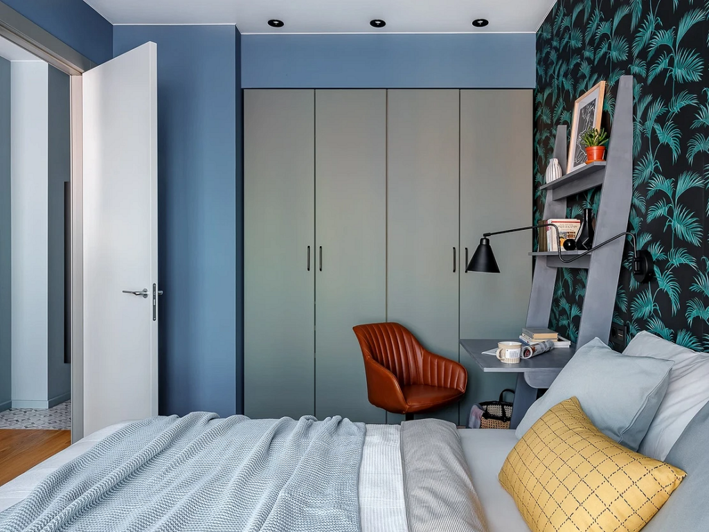
On the other hand, a gray-blue bedroom may turn out to be too relaxing and dull emotions. In it, you will not only stop worrying about troubles but also lose the ability to enjoy good events. In other words, a steel undertone leads to indifference and fatigue. This can be corrected by choosing lighter variations or by mixing the environment with a more cheerful and positive palette – pink, lavender, beige, or simply adding more white.

Advantages
- Since this color balances and soothes, it is perfect for the bedroom: in such an environment, it will be easier to forget about daily worries and fall asleep.
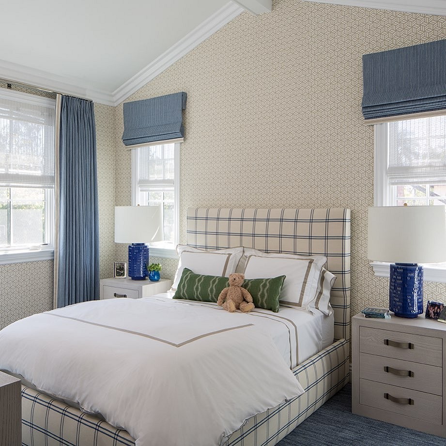
- The sky-blue palette visually enlarges the space, and the room will seem larger than it actually is.
- Light blue tones create a feeling of freshness and coolness, which is particularly relevant if the windows face south and the room tends to get too warm and stuffy.
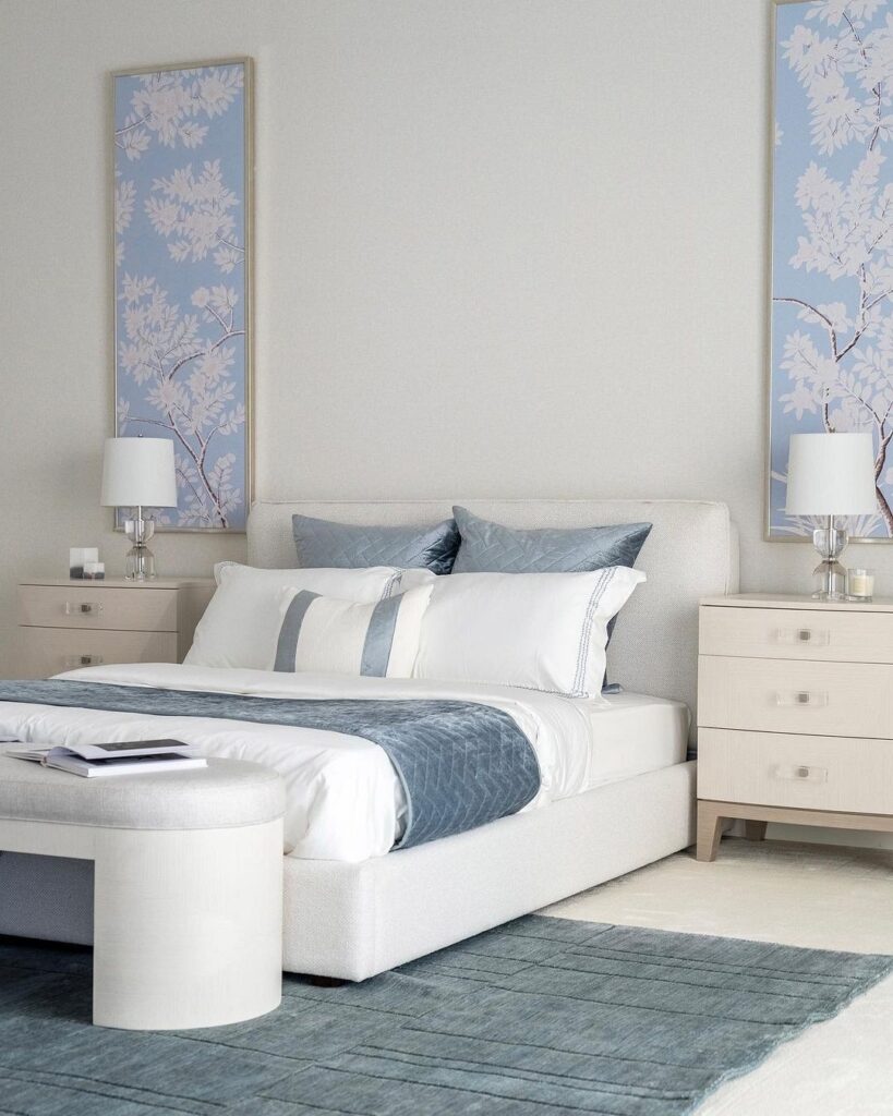
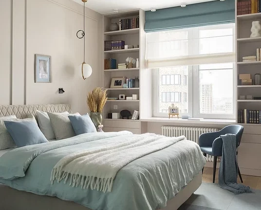
- The blue color scheme is versatile and can fit into any interior as long as the shade is chosen correctly. Moreover, it will give the room lightness and elegance.
- Light blue tones create a sense of cleanliness and neatness: the bedroom will look well-groomed even if you haven’t had time to make the bed.

Drawbacks
- Most of the light blue palette is cool, which should be taken into account when choosing these shades for room decoration. If you feel uncomfortable in the surroundings of such colors, opt for warmer options like aquamarine, azure, or turquoise.
- In large spaces, this part of the spectrum can have a too relaxing effect: it will be difficult to wake up and start a new day actively. To avoid this, you can use another, more energetic color for some of the finishing touches.
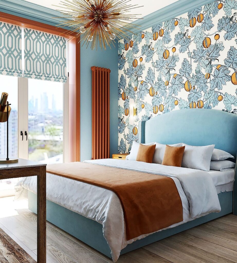
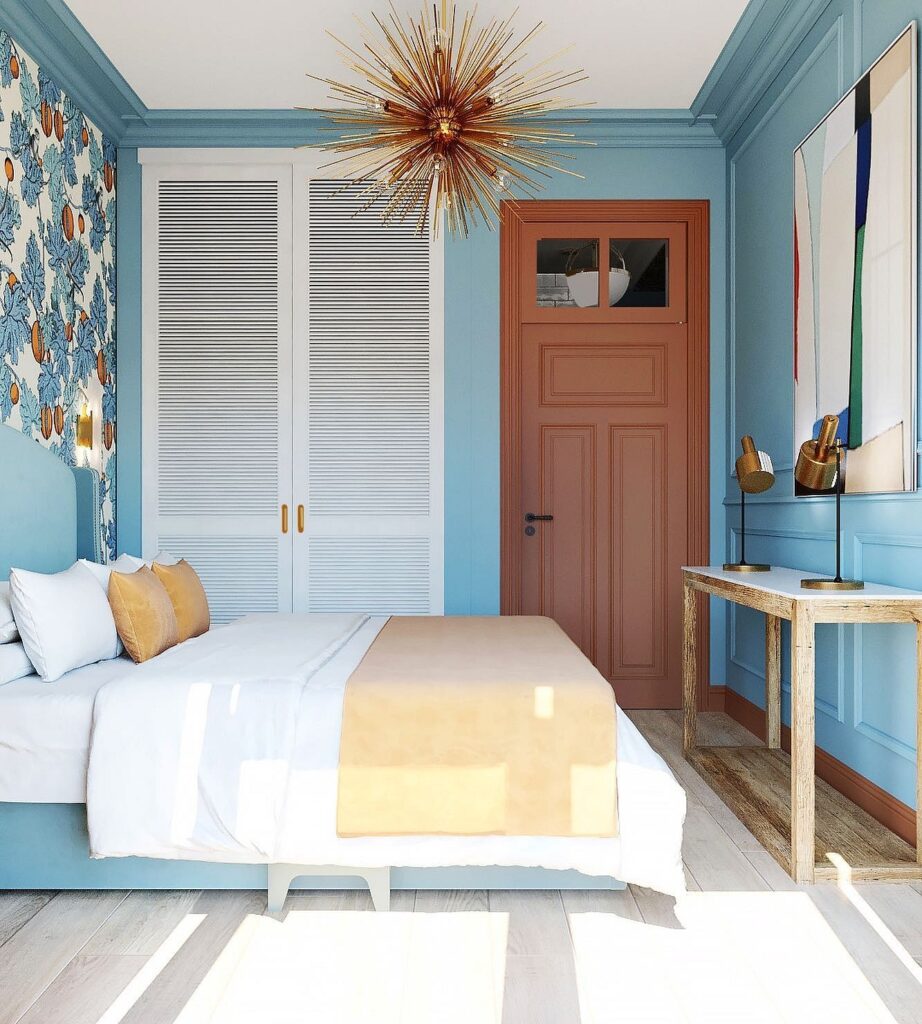
- A gray-blue bedroom interior with an improperly chosen shade can become gloomy and even bleak. This can be corrected by using warm-toned lighting or accessories in cheerful colors such as lemon, peach, or orange.
- This color does not go well with black in the bedroom: while such a combination may look stylish and original in the living room, it can be depressing here.
Rules for Decorating a Blue Bedroom
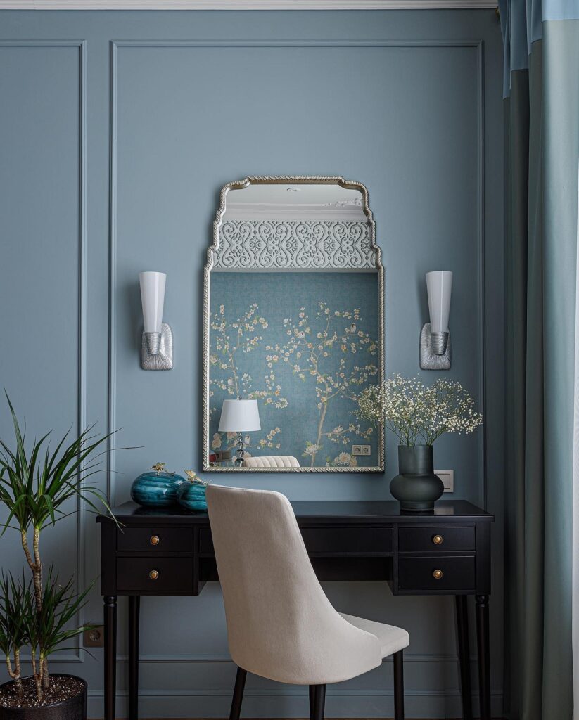
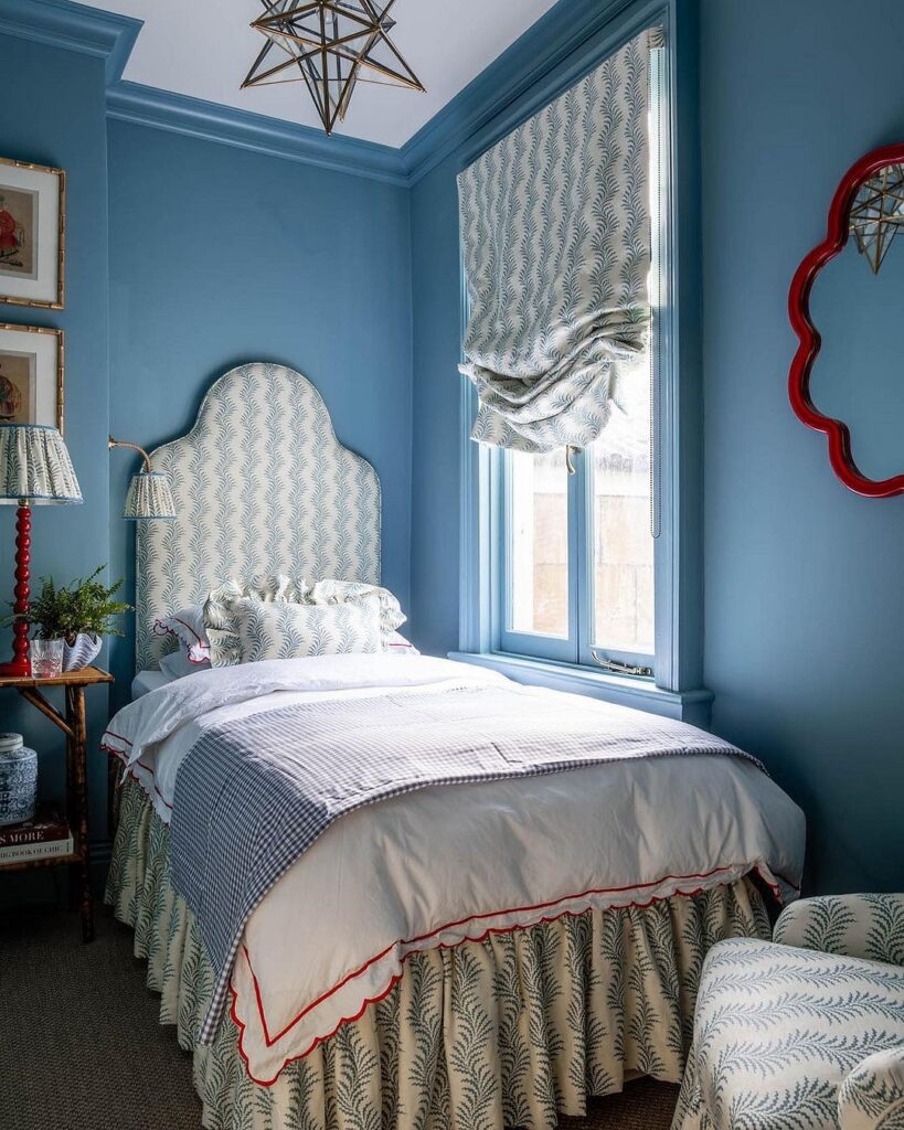
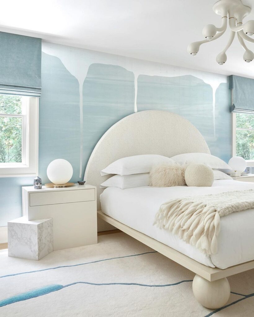
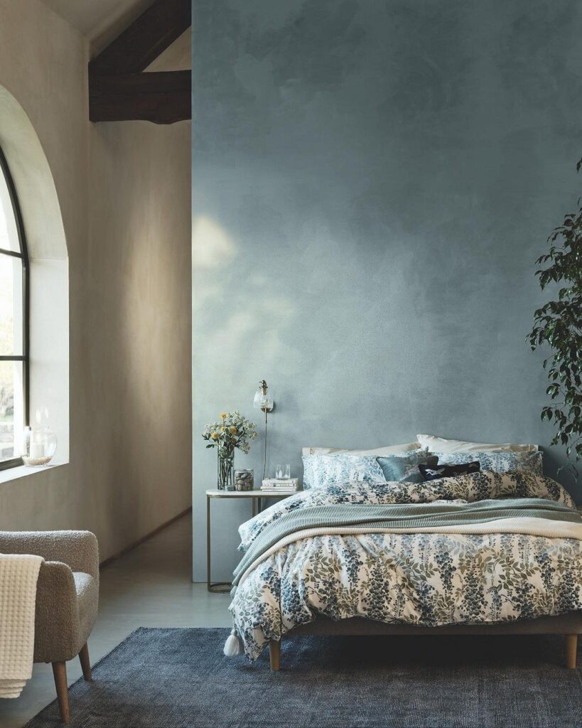
If you find that there is too much blue and it becomes burdensome, you can mix it with a large fluffy rug in a different color or place a contrasting bedspread on the bed. Note that if you want to paint the ceiling in this palette, you should prefer the lightest and most subtle colors, as dark ones will create a sense of oppression and visually shrink the space.
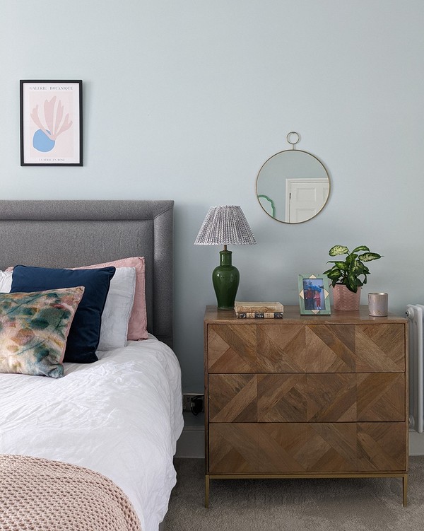
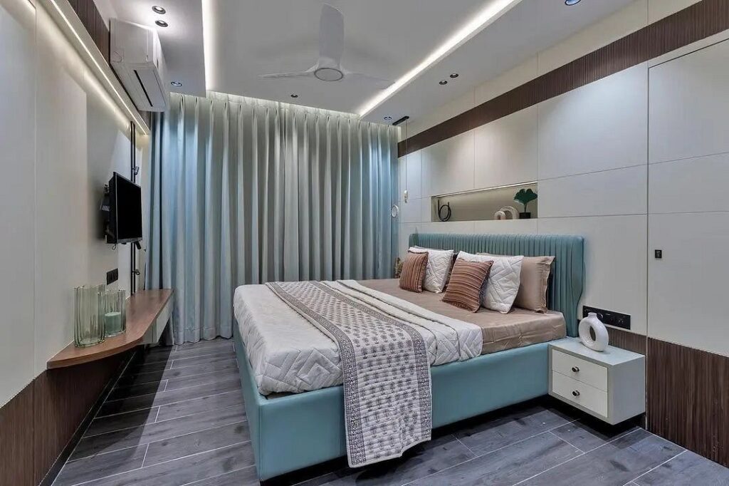
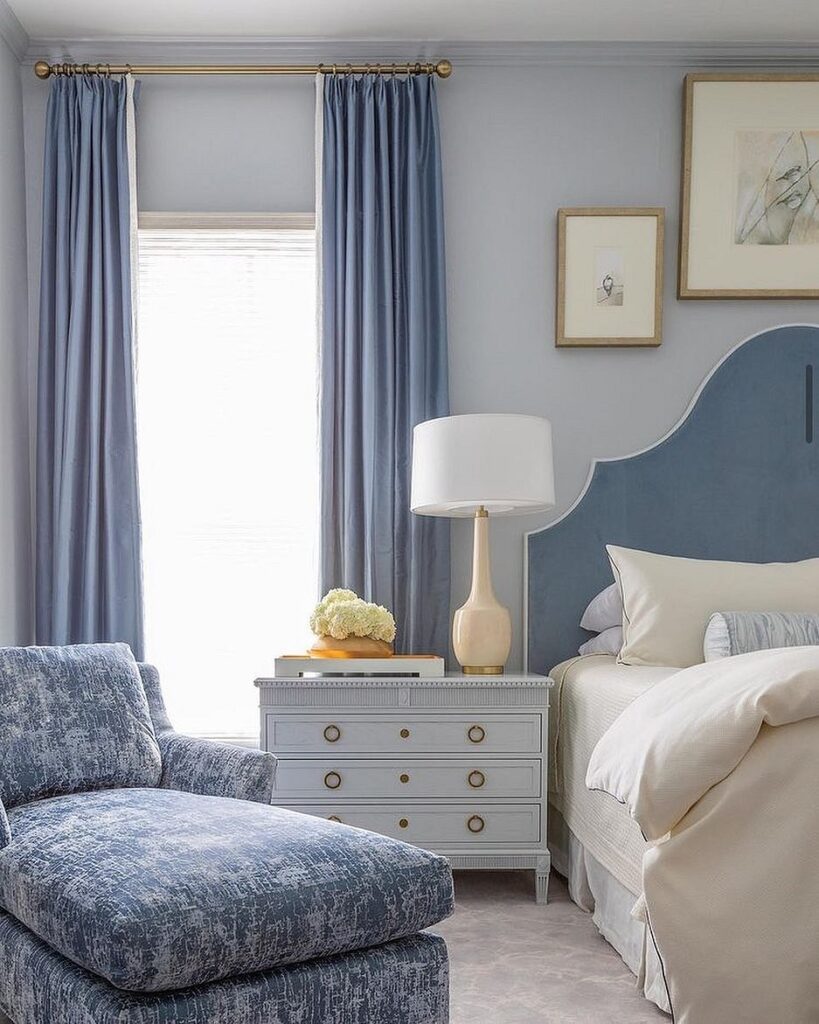
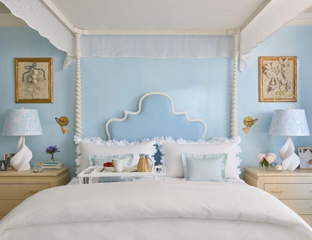
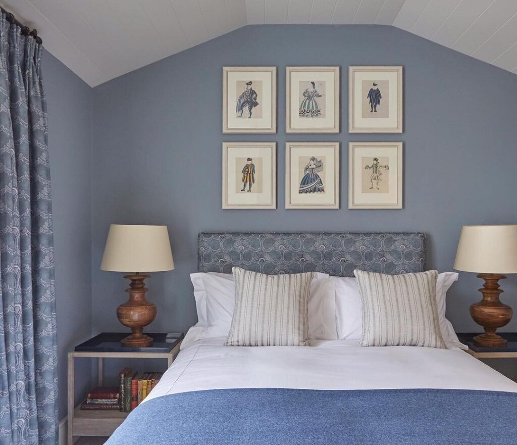
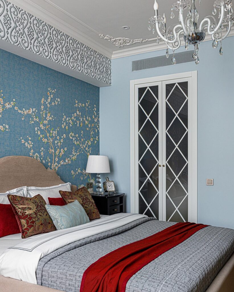
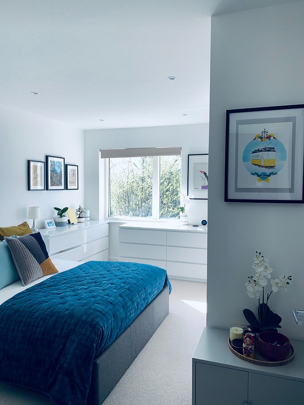
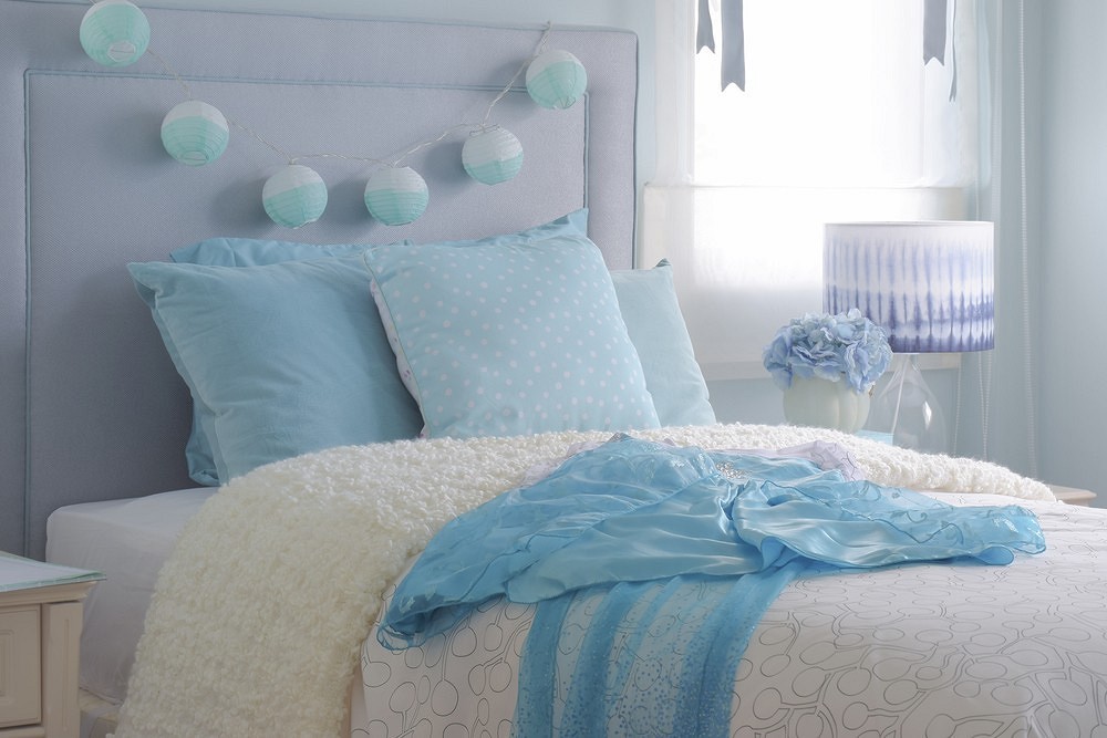
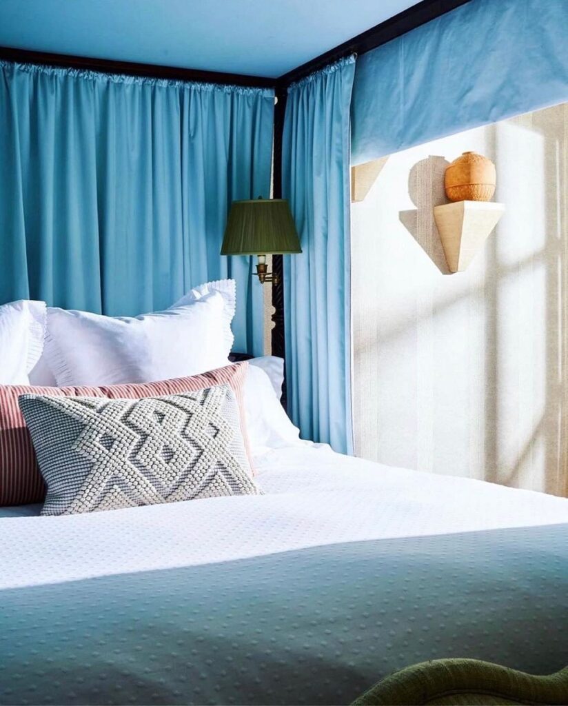
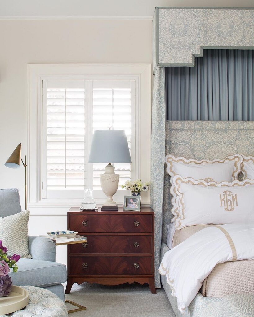
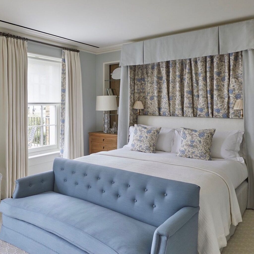
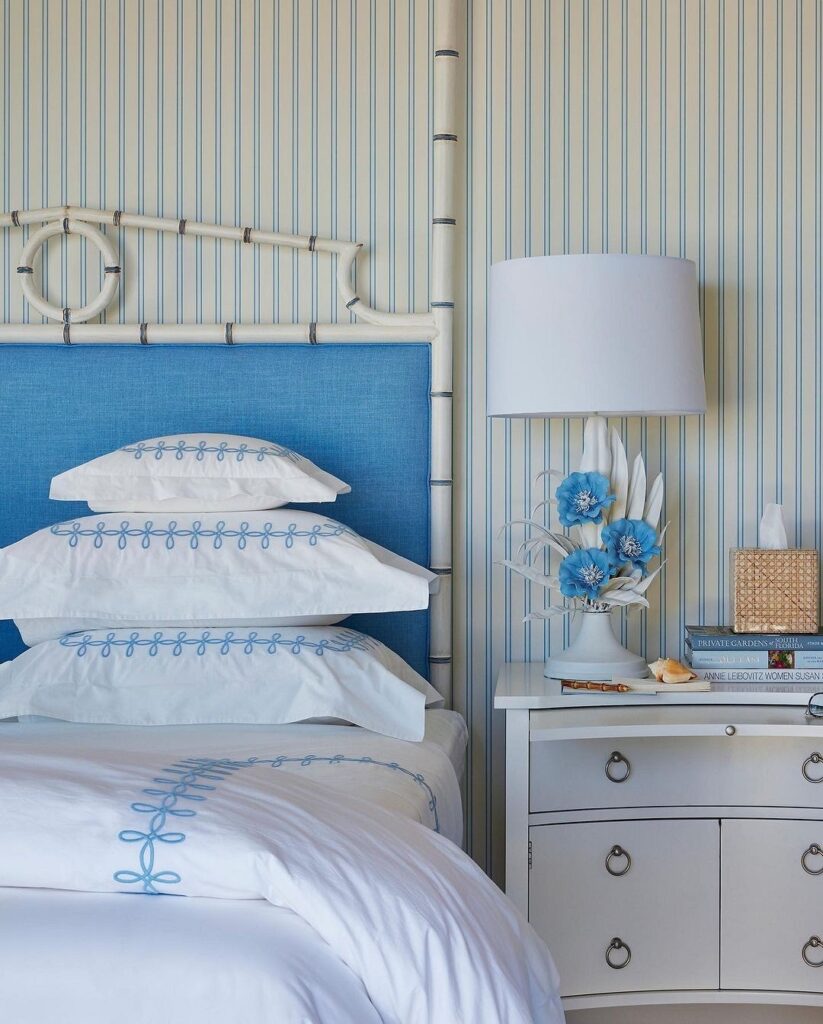
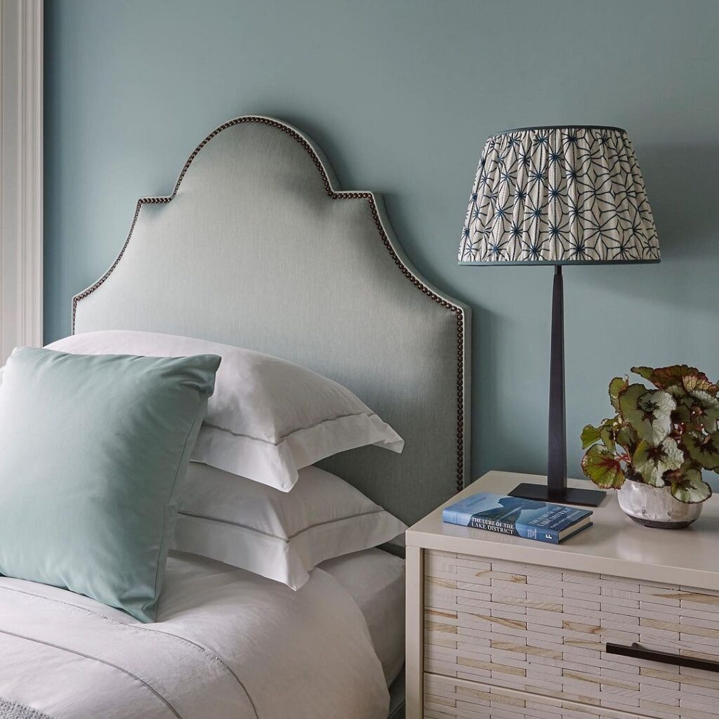
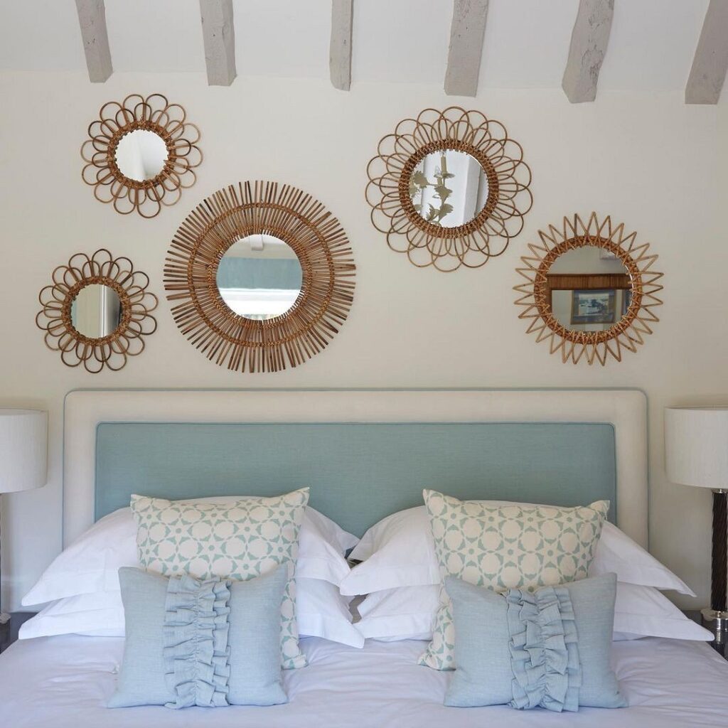
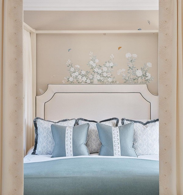
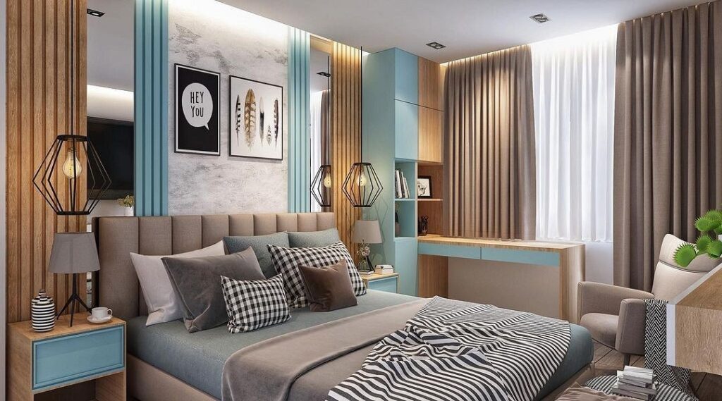
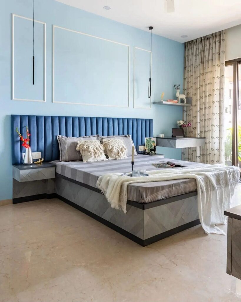
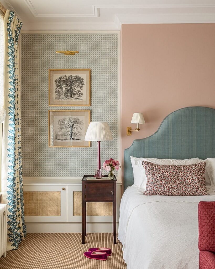
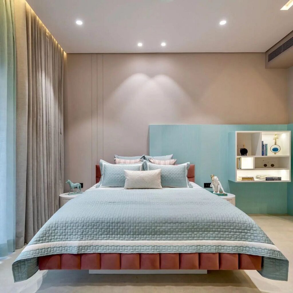
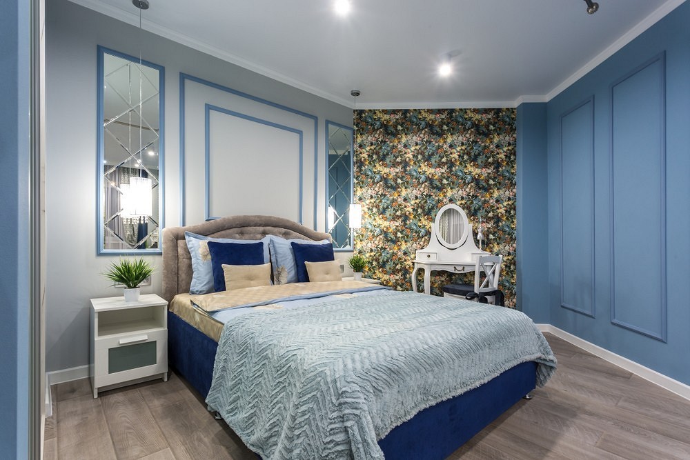
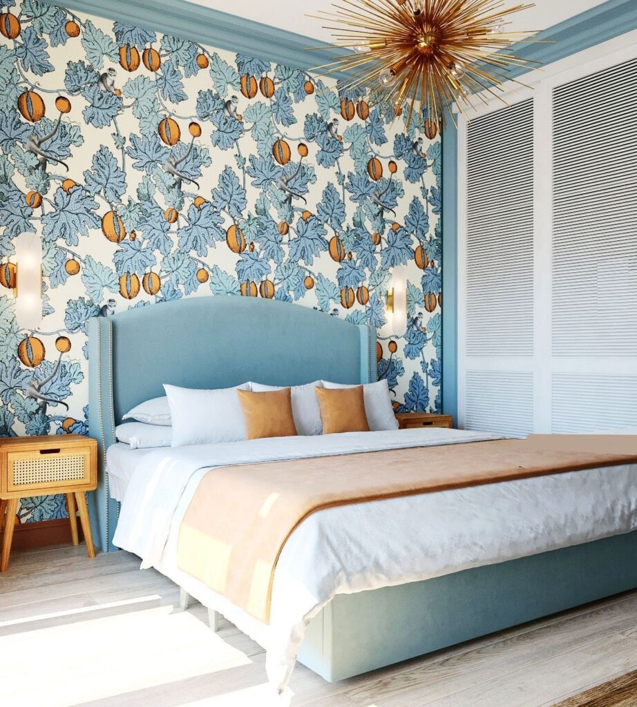
Designers recommend decorating only a part of the room in a light blue palette, such as walls and furniture. Alternatively, it could be curtains and other textiles made from the same fabric, or the headboard of the bed in a matching tone. Accessories play a huge role: sometimes it’s easier to add expressiveness to a room with decor items than completely repainting the walls. A canopy over the bed, an aquamarine lamp, or a turquoise pouf on a neutral white or beige background can set the right accents without overwhelming the space. It’s also worth noting that with this approach, you can use much brighter, more vibrant color variations.
Tip:
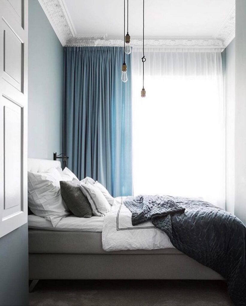
Light blue curtains in the bedroom let in light and may not provide complete darkness at night, so supplement them with thick dark-blue curtains or blackout roller blinds.
Successful Combinations
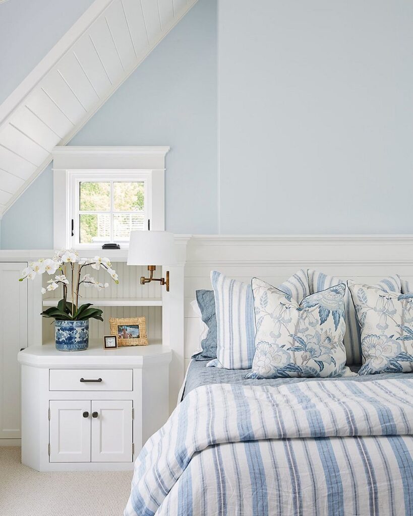
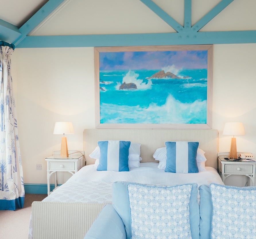
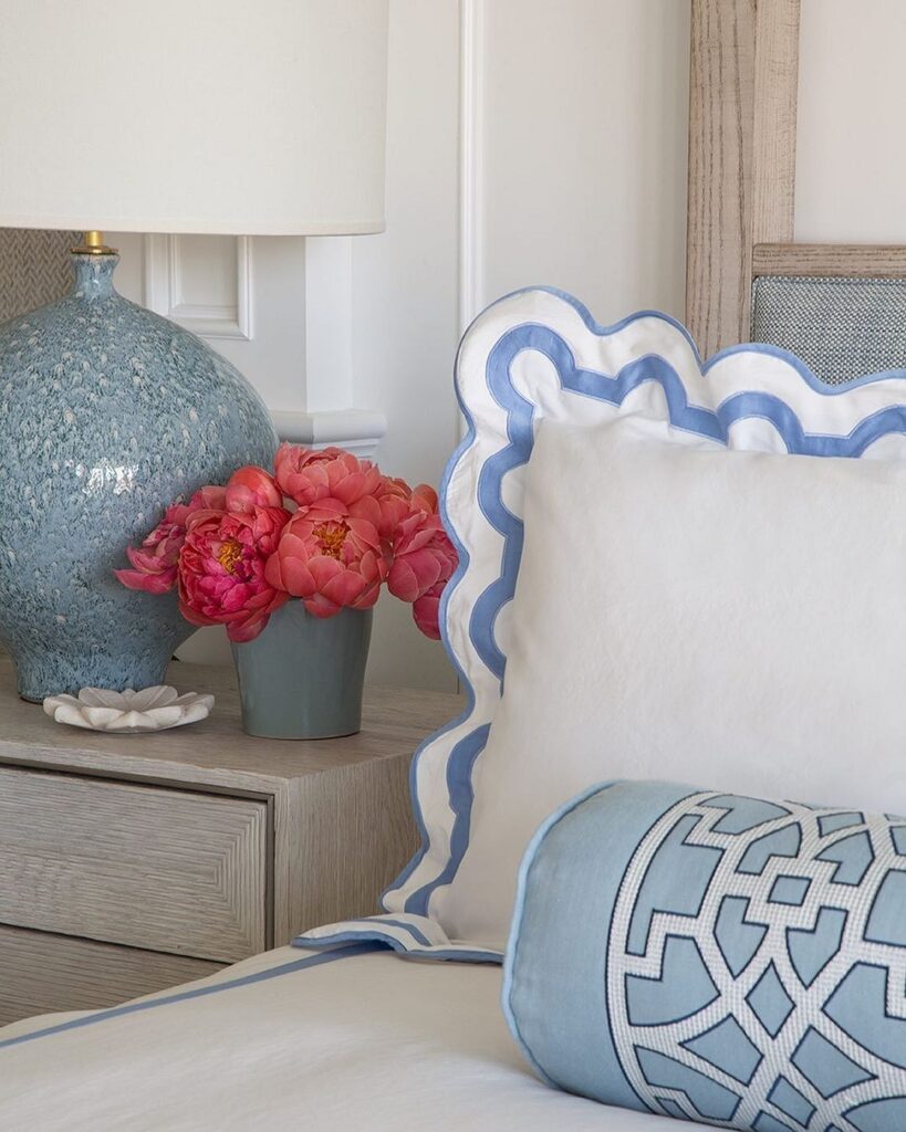
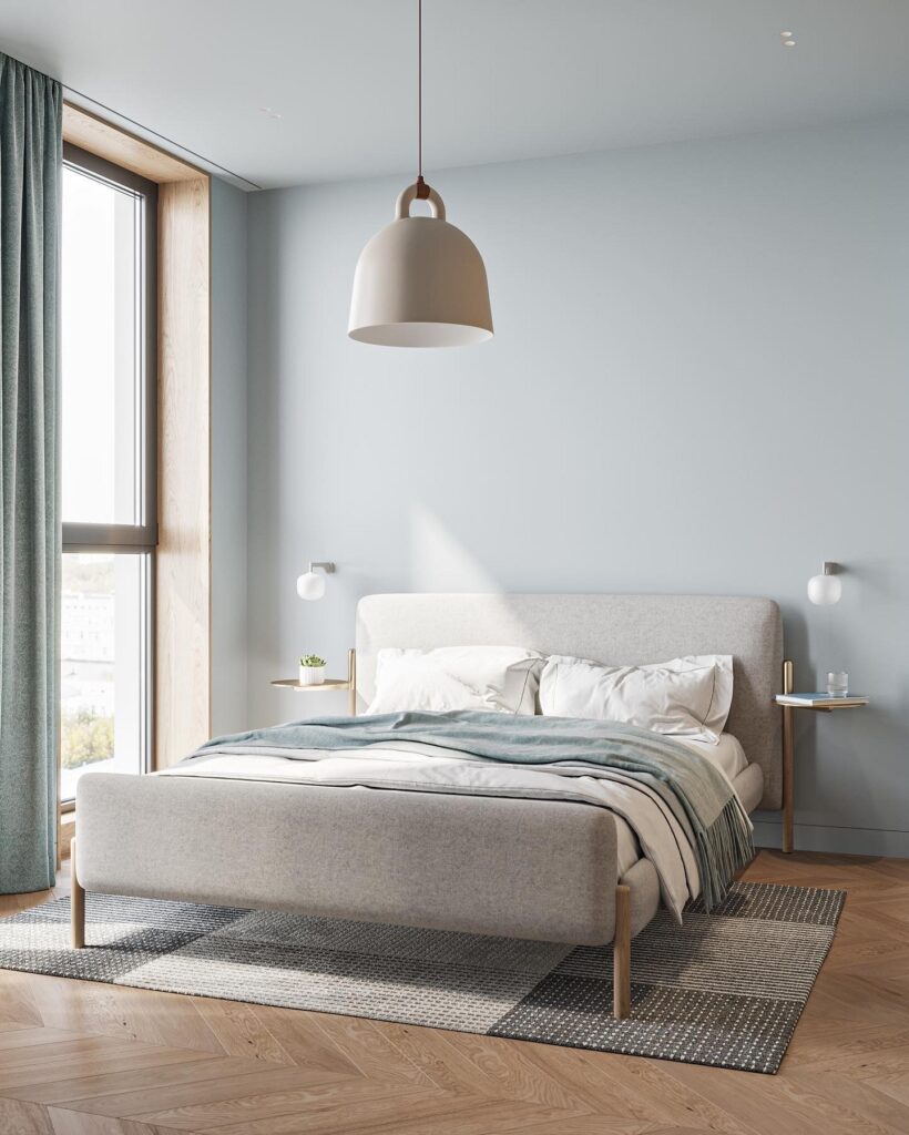
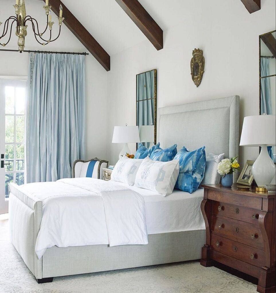
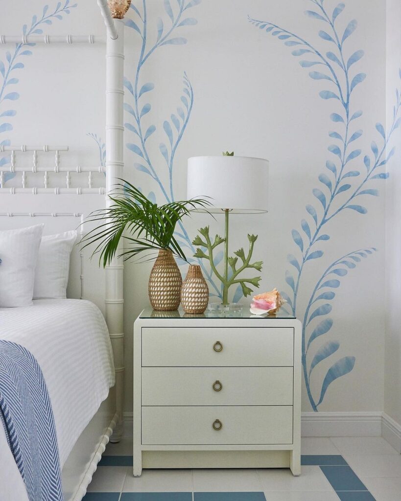
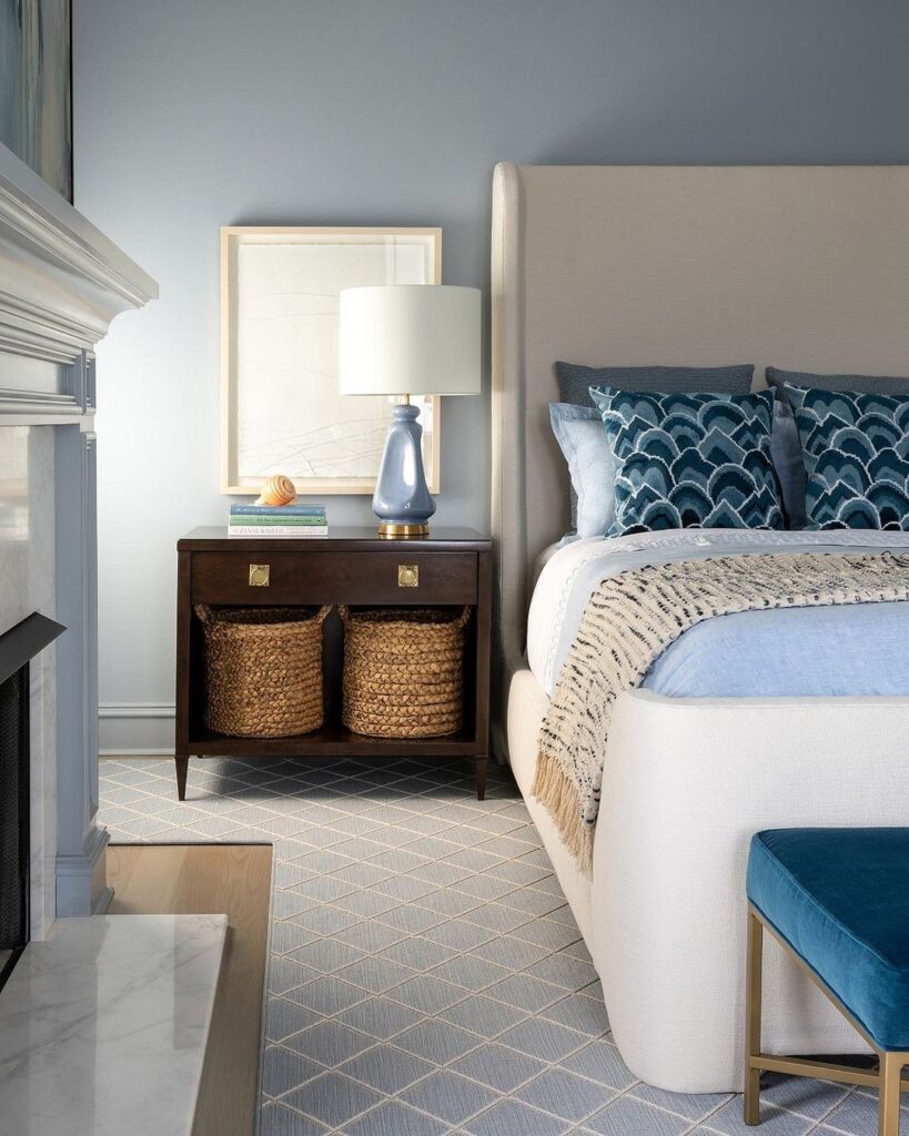
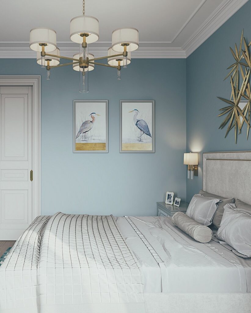
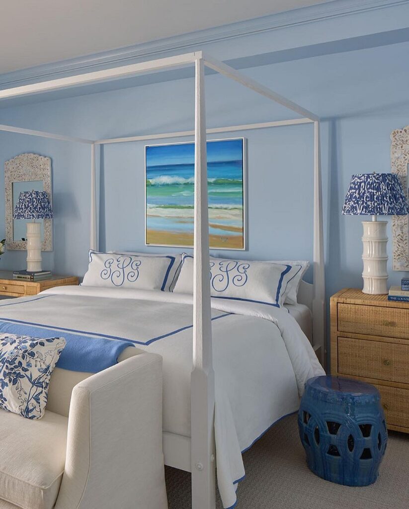
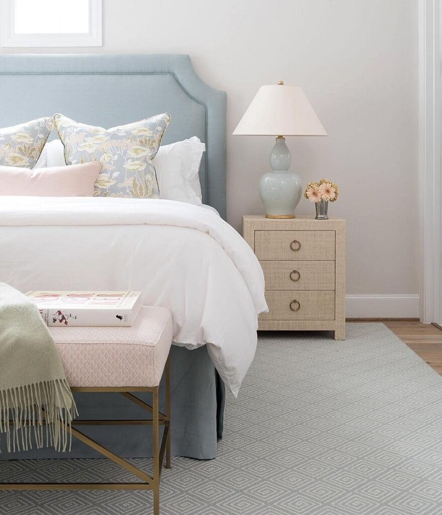
With White
A white and light blue bedroom is perfect. Looking at it, warm summer days come to mind when light clouds float across the clear sky. It’s hard to imagine a more pleasant and relaxing picture. Therefore, such a color combination is considered classic for bedrooms.

When choosing shades, avoid extremes: overly bright tones will sharply contrast with white, which can be irritating. Very pale shades can make the room look dull and unexpressive. However, if you really want to, both options can be implemented, but some nuances should be considered. Use bold, saturated blue as a small pattern so that it does not overload the attention and tire the eyes. On the other hand, a very pale ambiance can easily be enhanced with clear and noticeable accents.
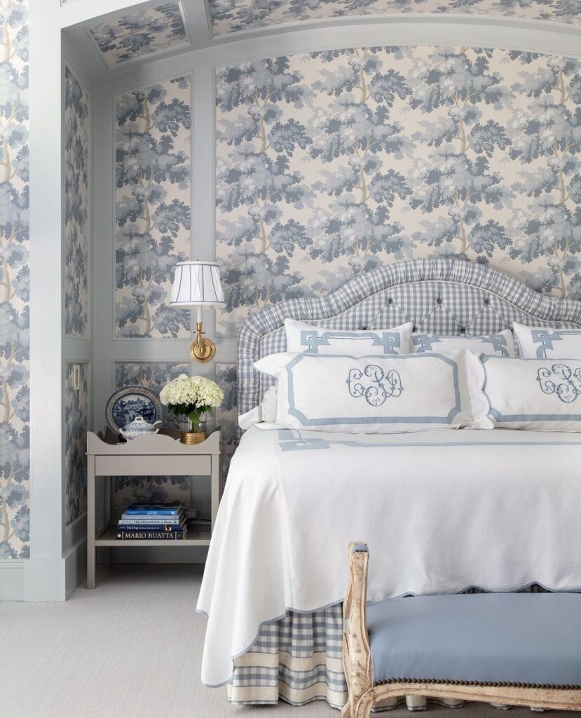
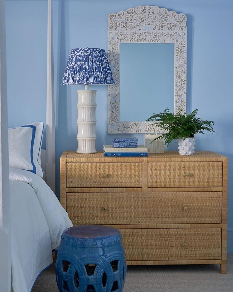
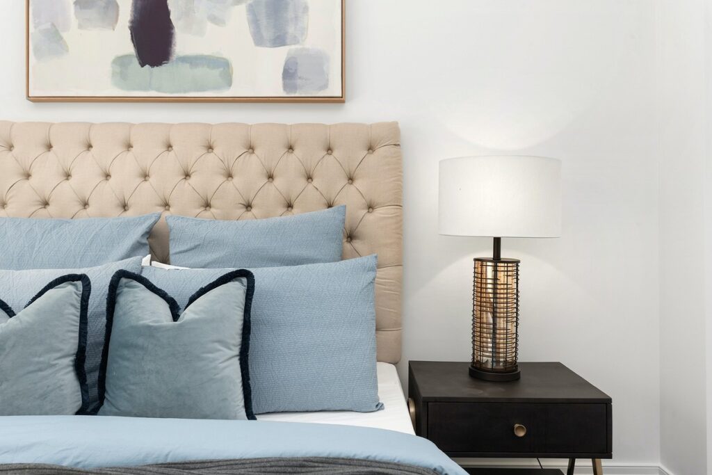
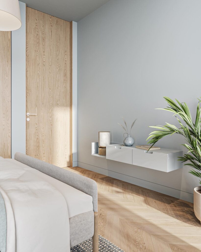
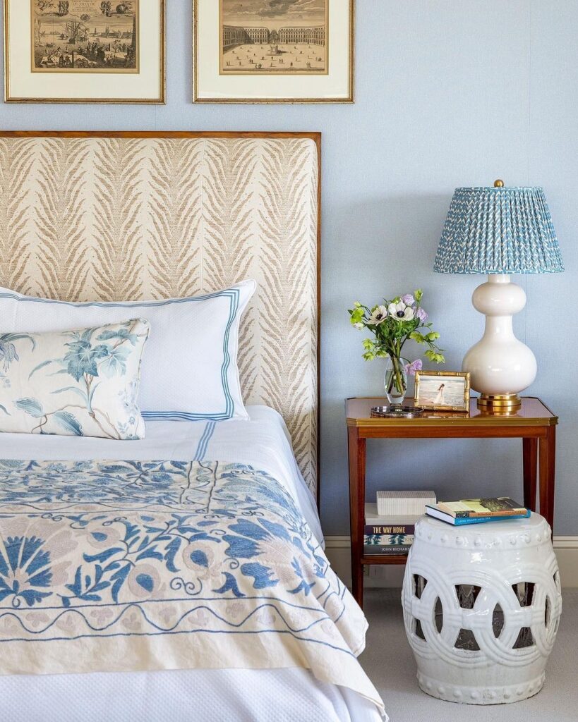
With Beige
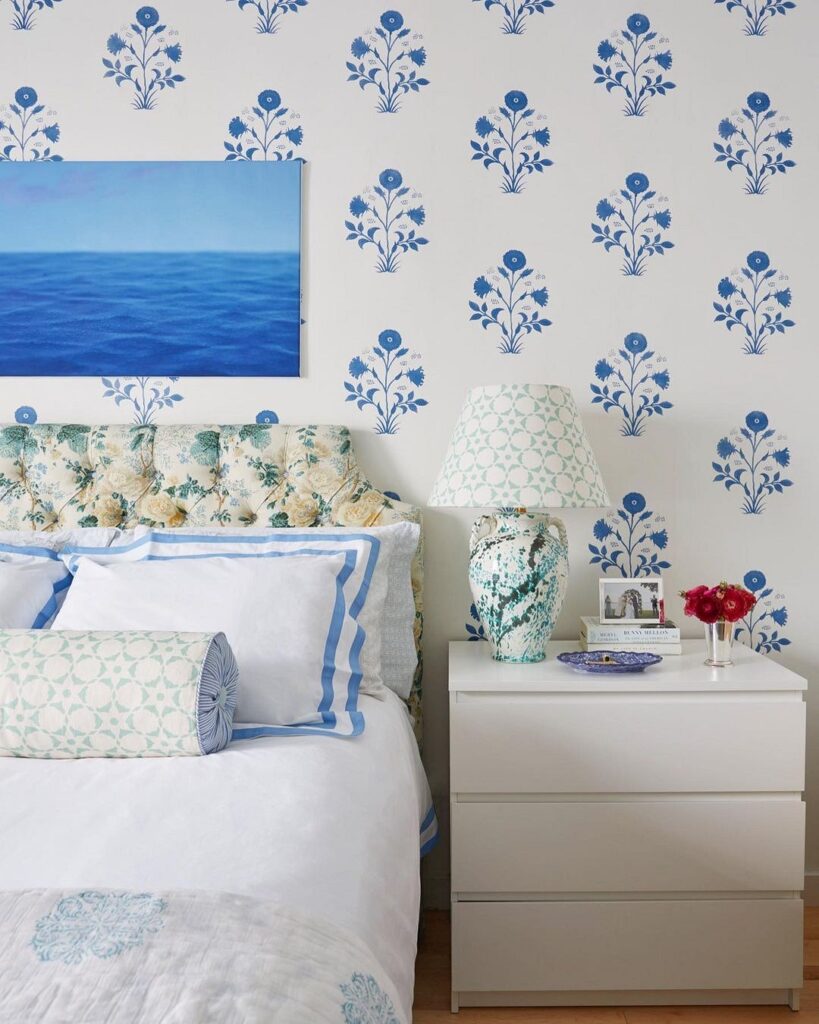
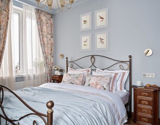
Another combination that rightfully can be considered classic is light blue and beige.
Blue wallpapers in the bedroom pair well with hardwood floors and wooden furniture. Most shades from these two palettes harmonize with each other, but use dark beige cautiously: it can be too somber and severe, even when combined with such bright and positive tones like cyan and turquoise.
Tip: To make the color duo successful, avoid mixing warm shades with cool ones – it’s quite hard to make them look good together. Stick to proven combinations: turquoise and caramel, sand and slate gray, azure and cream, etc.
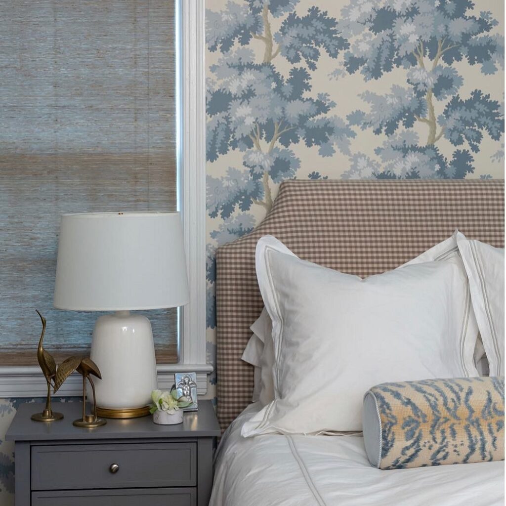
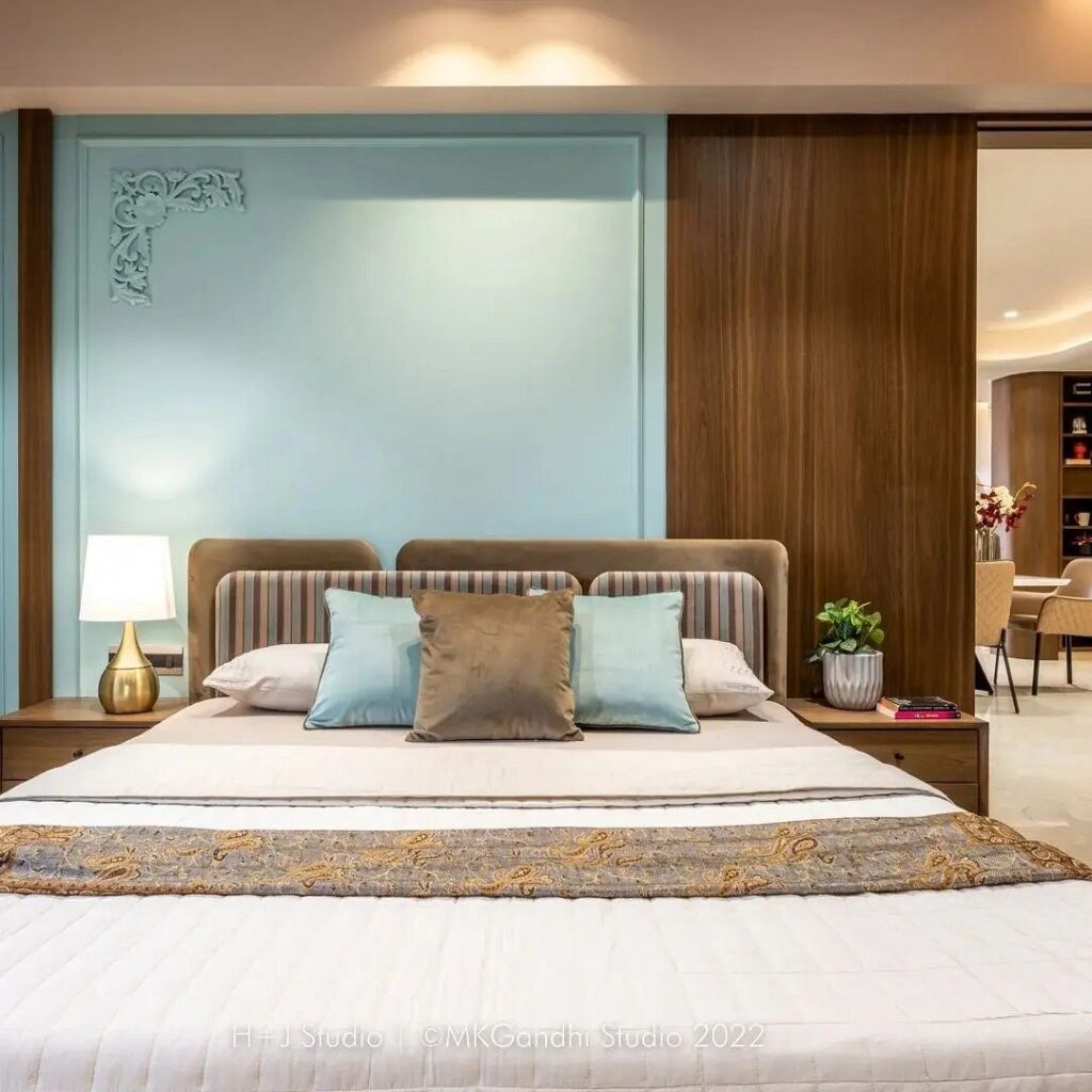
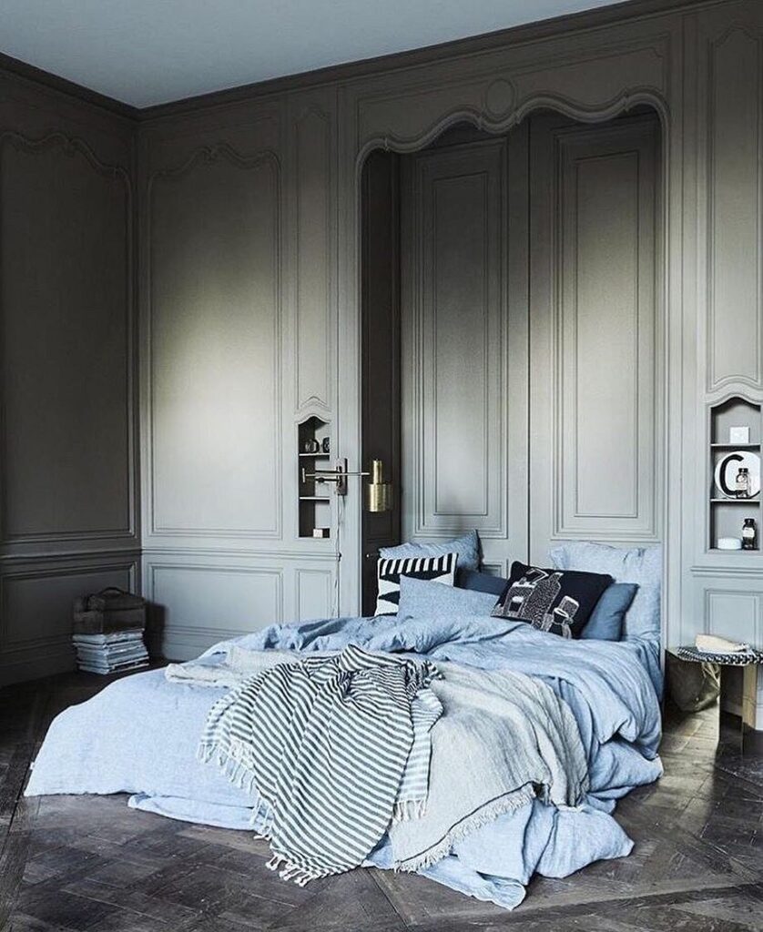
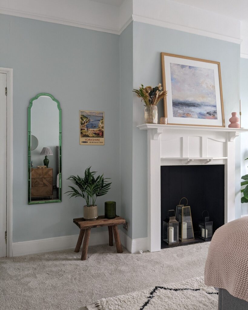
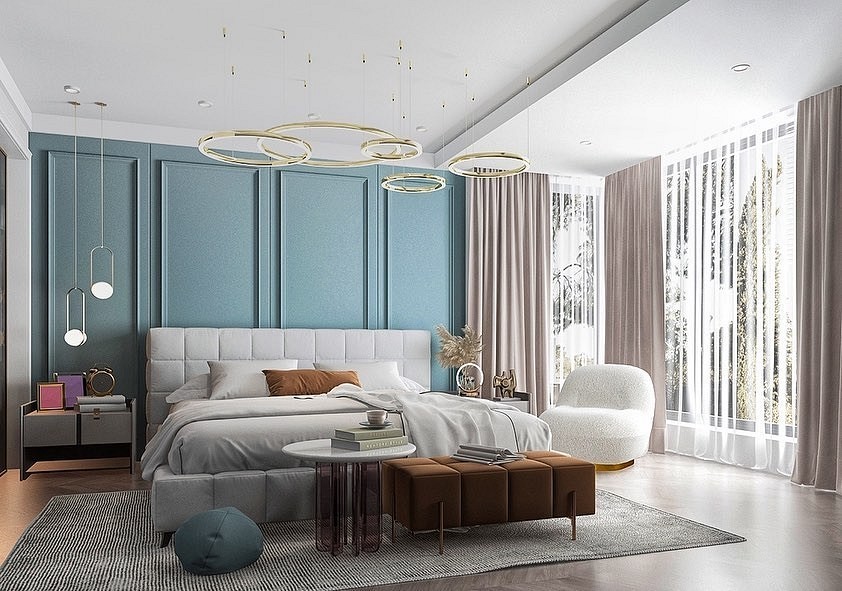
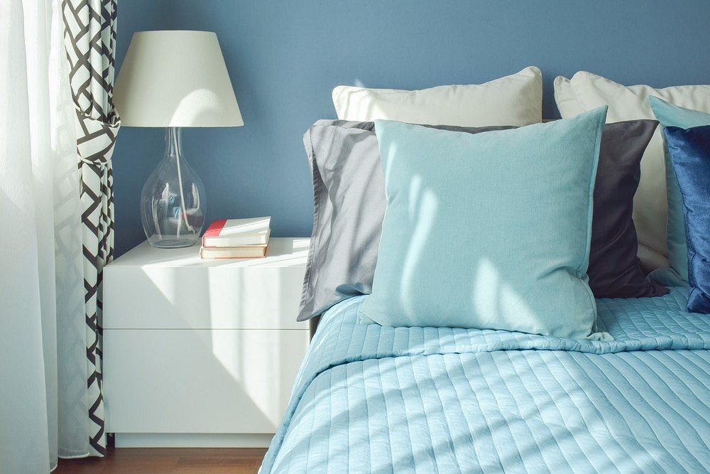
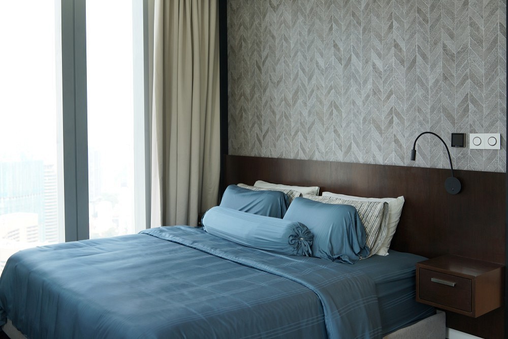
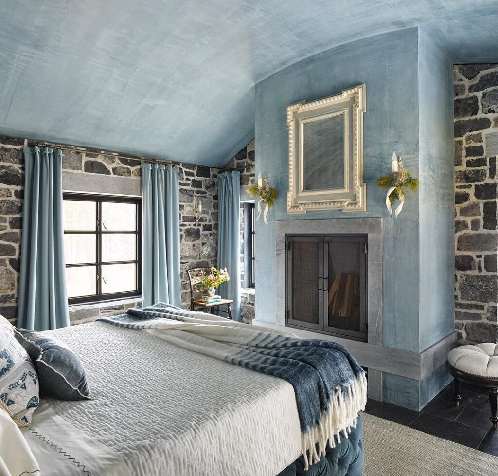
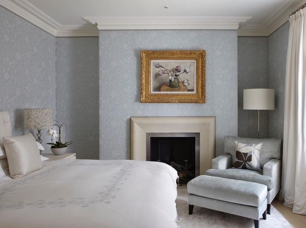
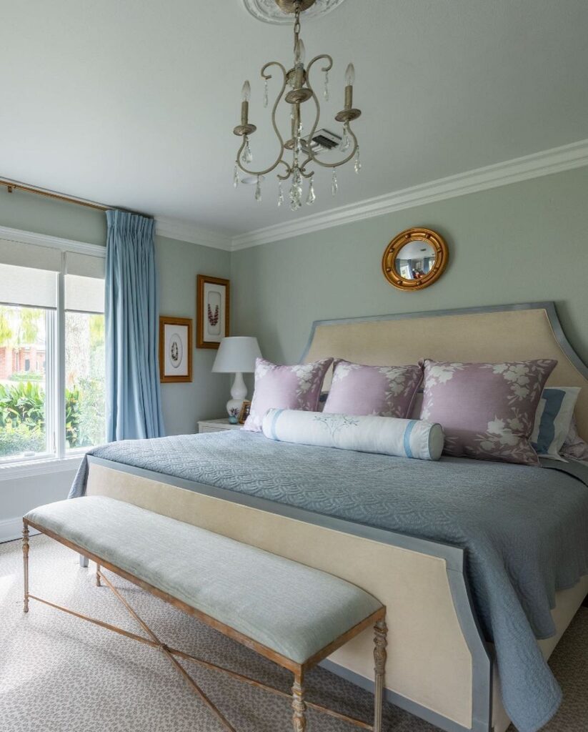
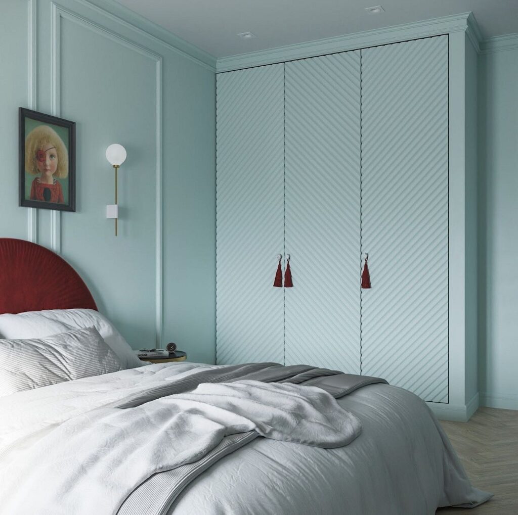
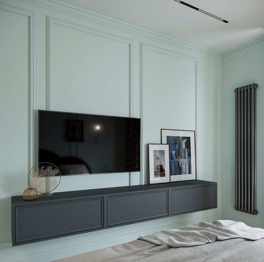
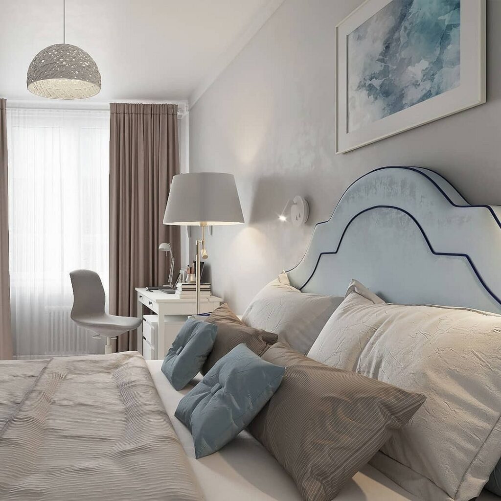
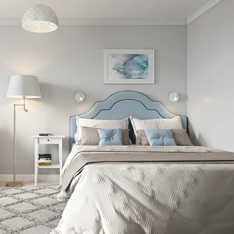
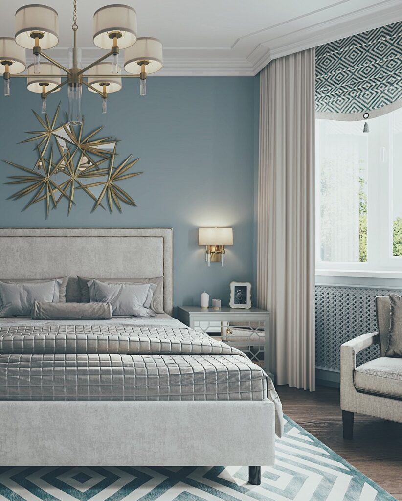
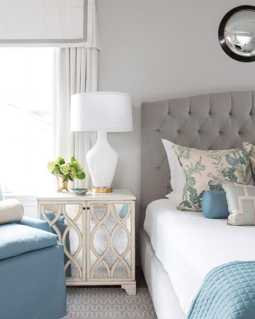
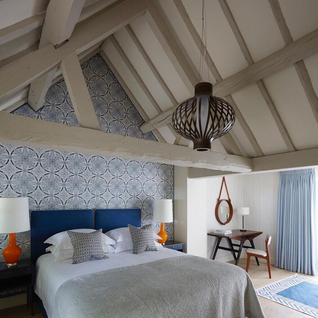
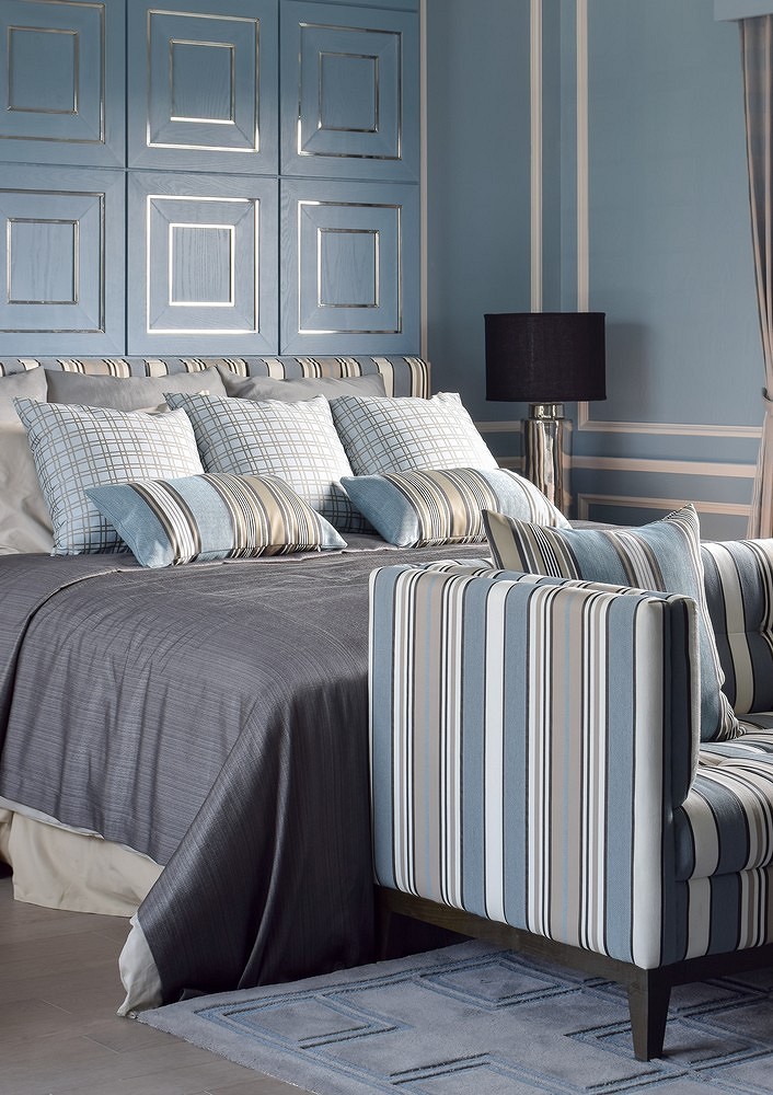
With Gray
A bedroom in blue, complemented by gray tones, is maximally relaxing and promotes more restful sleep.
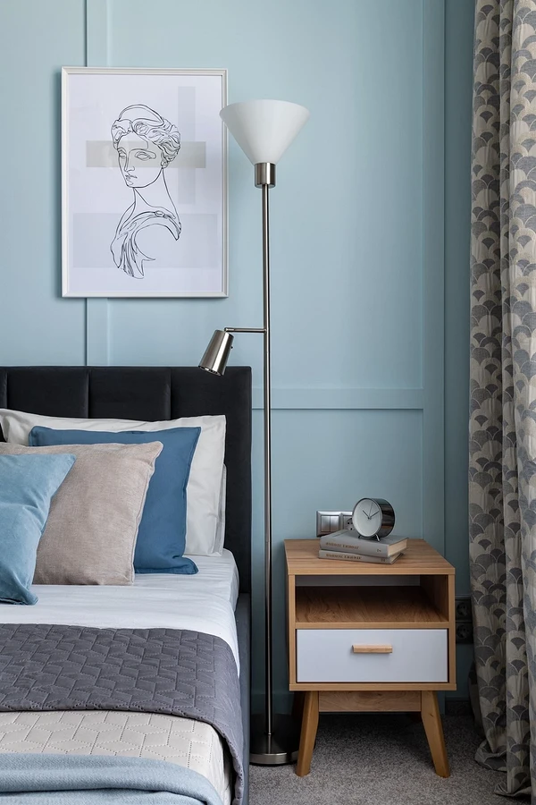
This combination suits people who value a stress-relieving and calming environment: the neutral achromatic anchors the excess romance and carefreeness of light blue hues. In turn, sky colors dilute the coldness and severity of gray, making the room cozier.
A good idea is to enhance the combination of these palettes with rich, yet not loud, shades. Suitable are restrained blue, deep pine green, and even black (in small amounts), as well as accessories in silver metal or with a ‘matte gold’ effect.
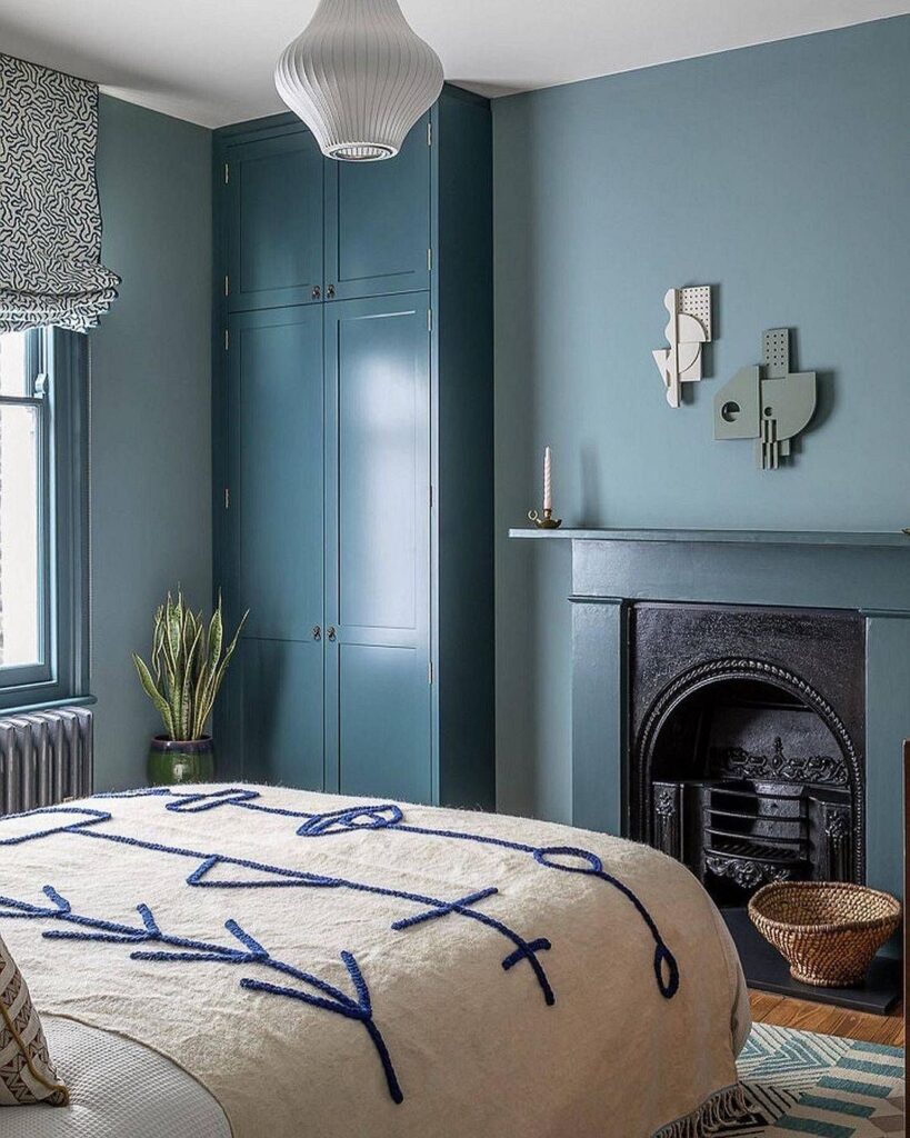
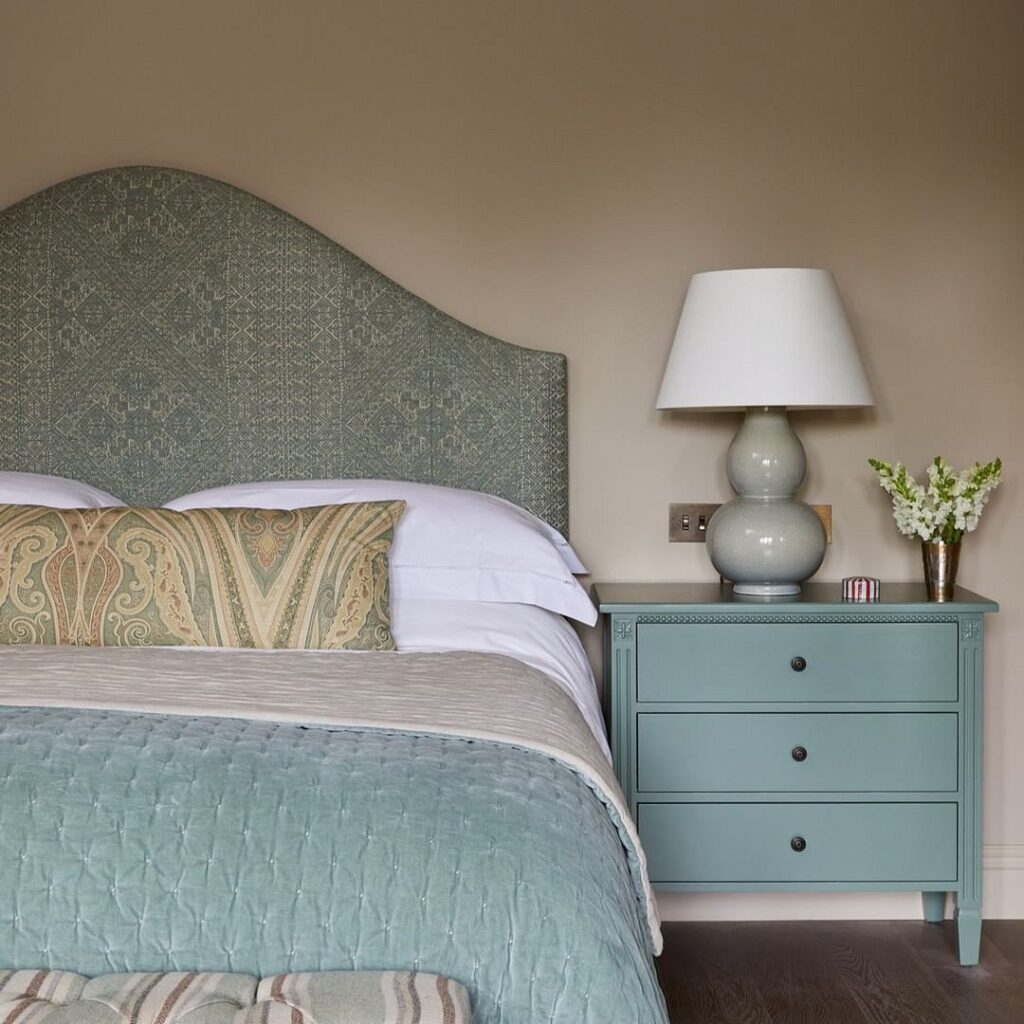
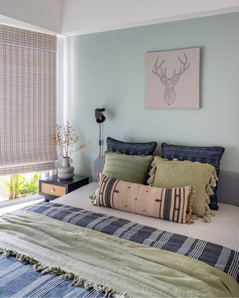
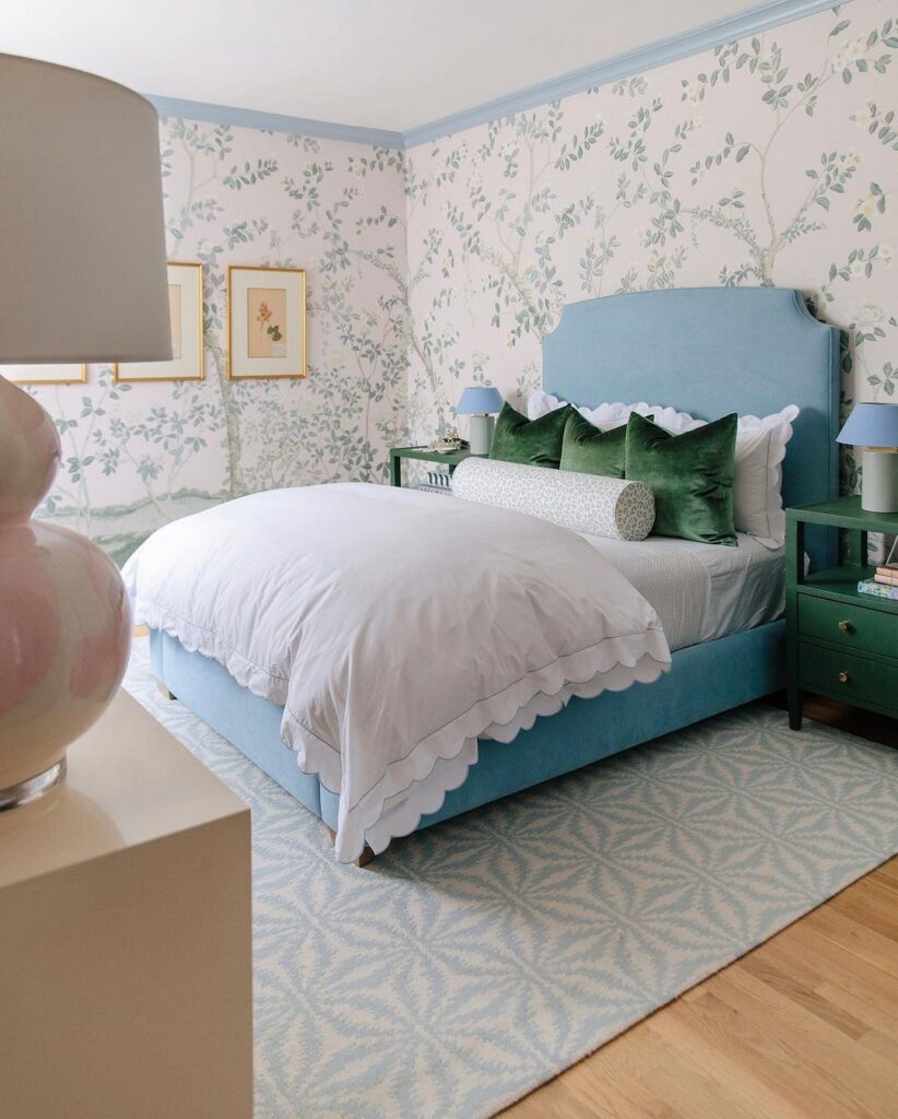
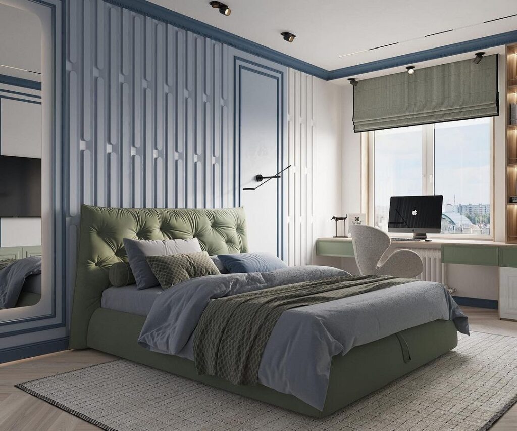
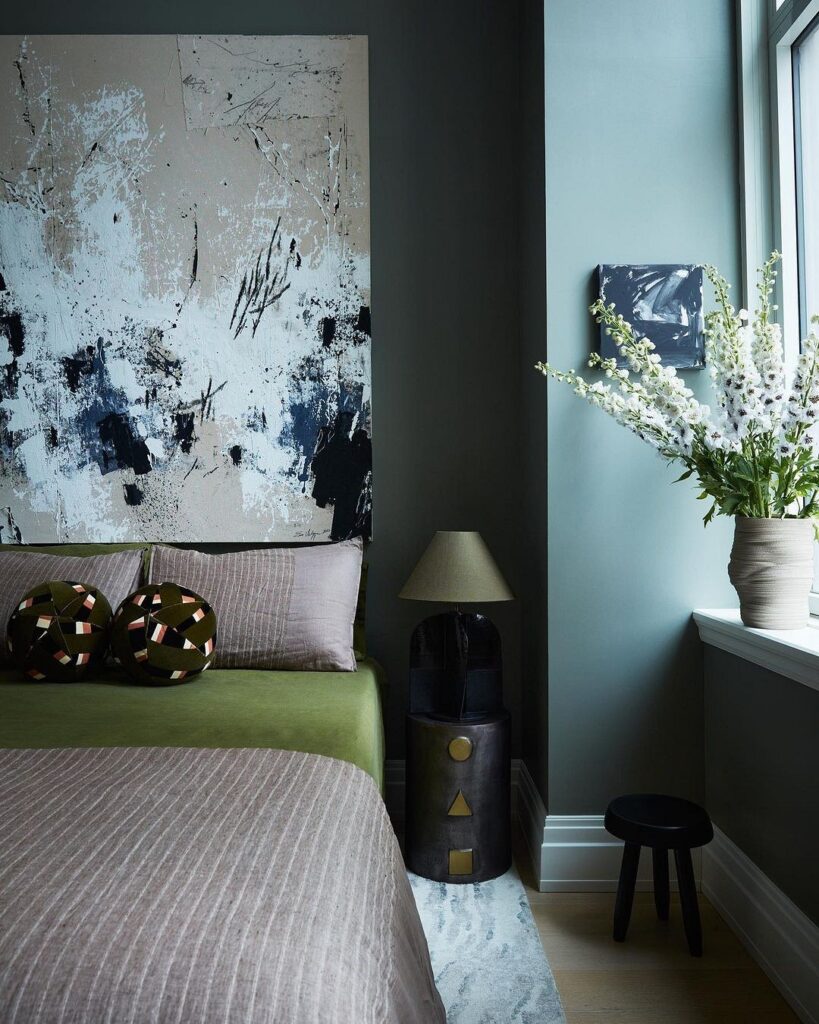
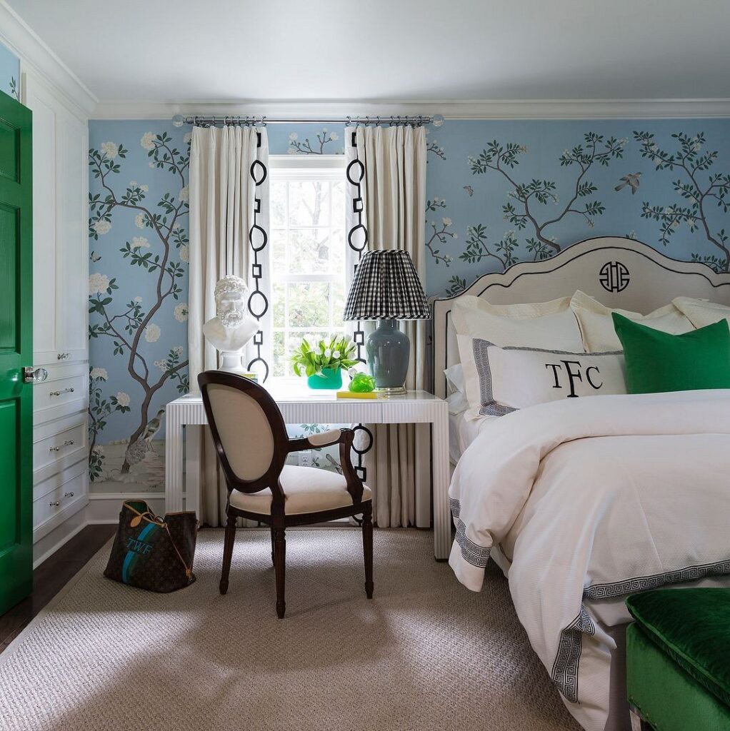
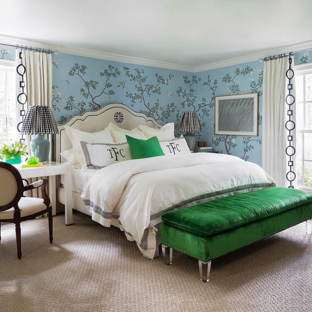
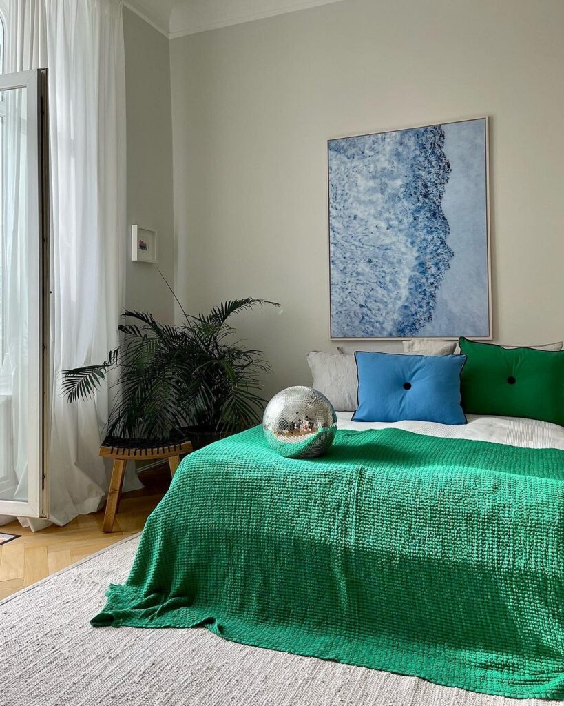
With Green
Photos of blue bedrooms, complemented by green tones, look serene, relaxing, and soothing.
These two palettes are kin to each other, so any of their shades will harmoniously look together. With green, you can choose any shade – in the company of sky colors, all its shades will look appropriate.
Pastel azure, tinted with pistachio, will make the room delicate and airy. A more saturated light blue tone combined with emerald or grass green gives the setting a dignified and festive feel. Azure and lettuce green lift the mood – they are perfect for a child’s resting place. Playing with these colors, you can easily achieve the exact effect you need.
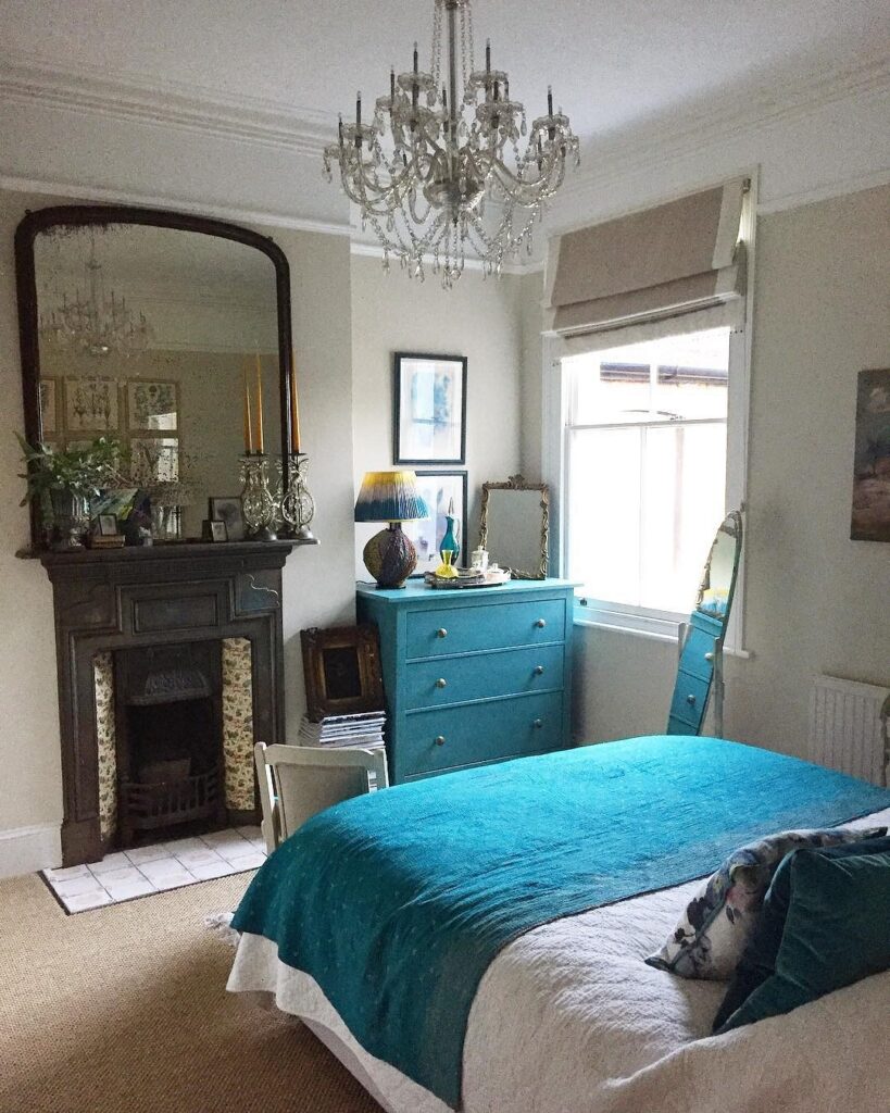
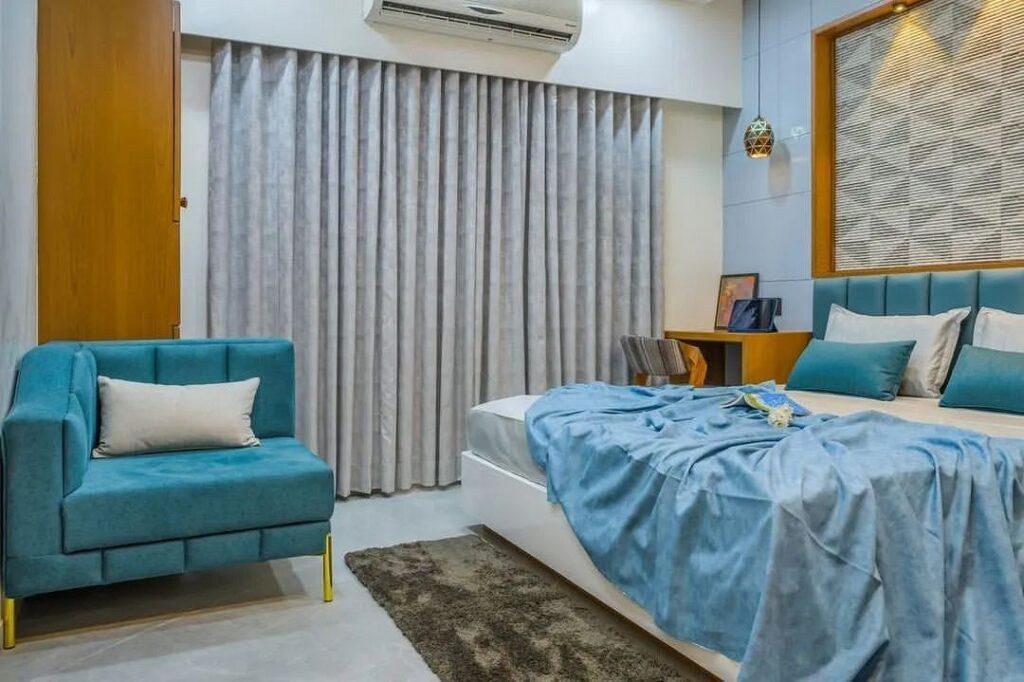
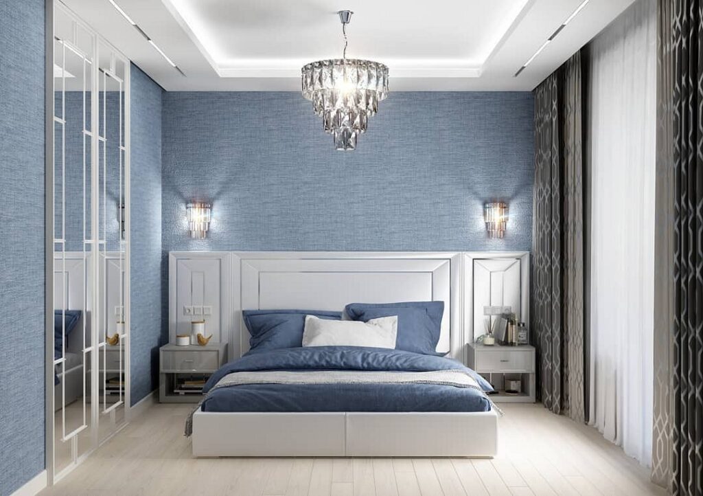
With Blue
Light blue walls in the bedroom will harmonize with a cornflower blue bedspread or an indigo carpet. Ultramarine curtains and similar textiles beautifully complement a summer sky-colored decor.
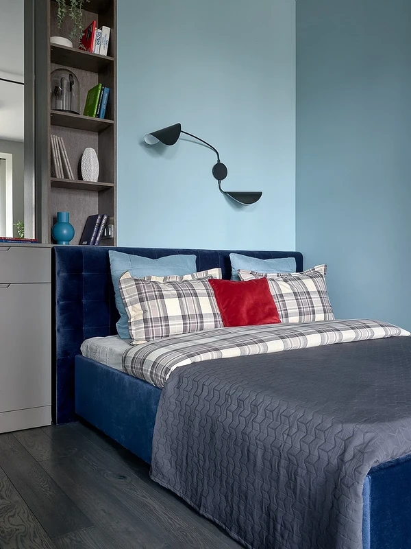
It’s preferable for the lighter palette to dominate, as dark colors in large amounts can be tiring. Additionally, remember that these shades, being neighbors on the color spectrum, can overwhelm when used together. Therefore, soften them with gentle contrasting accents – these could be bright tones or classics: white, gray, beige.
These color combinations are self-sufficient and do not require any additions. At most, you can add white or gray accessories, but avoid striking contrasting touches.
The Best Style for a Blue Bedroom
Sky blue shades are versatile, found in any style. Yet, some directions gravitate towards them a bit more, especially when it comes to a place for sleep and rest, where this palette is more than appropriate.

- Classic. Beige, white, and gray are the basis of classic interiors, but often they look boring and trivial. By adding light blue, you can make the space more romantic and whimsical.
- Provence. It’s impossible to imagine this style without azure gleams. Although these tones do not dominate here, they play an important role. They perfectly match the floral motifs and pastel colors of the direction.
- Scandinavian Style. The harsh northern climate doesn’t offer bright colors, so the interior features not the joyous shades of shining summer sky, but softer, blurred colors with gray or slate undertones.
- Country. In this direction, the blue palette is meant to highlight and shade the soft beige of wooden floors and furniture or the grayness of stone walls. Gray or beige combined with light blue acquire new color nuances, making the decor more interesting and profound.
- Minimalism. This is precisely where the blue color will be apt. The strict style, devoid of any frills, often looks bland and unexpressive. Light tones of cloudless sky or the lilac-tinged hyacinth shade will decorate the space and give it individuality.


Leave feedback about this