Color combinations of walls, floors, and ceilings can transform any room beyond recognition. By choosing the right shades, you can easily make a space visually brighter, more spacious, and cozier. Change the mood and atmosphere with finishes. Create a festive living room, a strict and concise office, or a warm and gentle bedroom. We’ll tell you how!
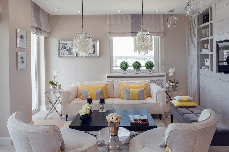
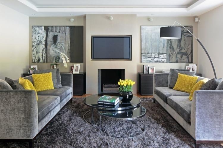
Monochrome and Shades
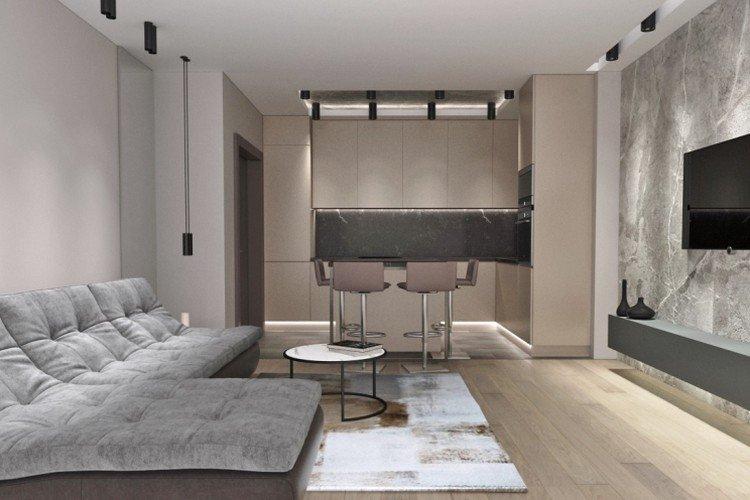
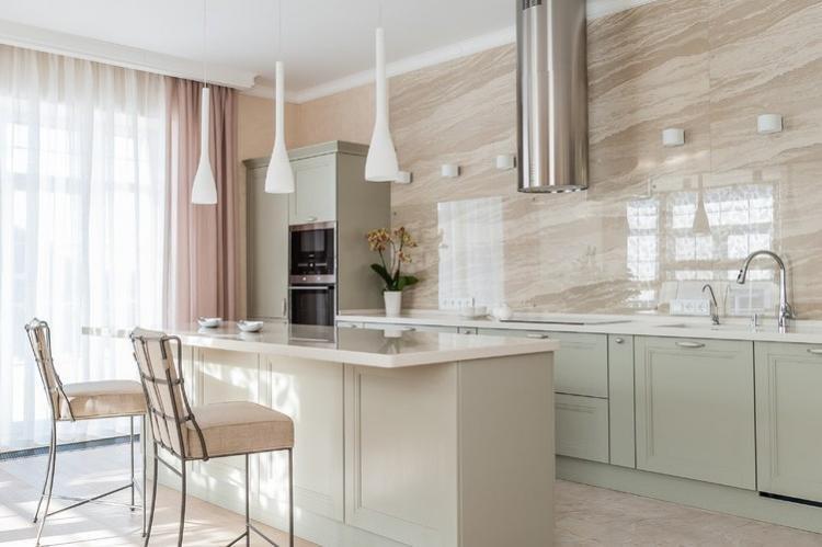
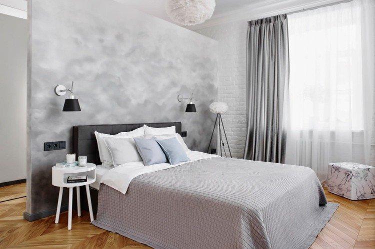
For several years, interior design in one color scheme but different shades has been in vogue. For example, combine a white ceiling with creamy walls and beige laminate flooring. Or whitewashed gray parquet with gray walls and a tin-colored stretch ceiling – if you like unconventional solutions.
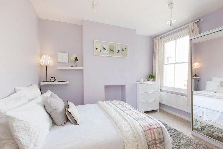
This technique visually blurs the boundaries in the room and makes it appear larger. Pale monochromatic interiors are an excellent choice for rooms that are constantly lacking in light. However, make the transition as smooth as possible and only use light adjacent shades. Avoid bulky furniture, too heavy textiles, or bright massive details.
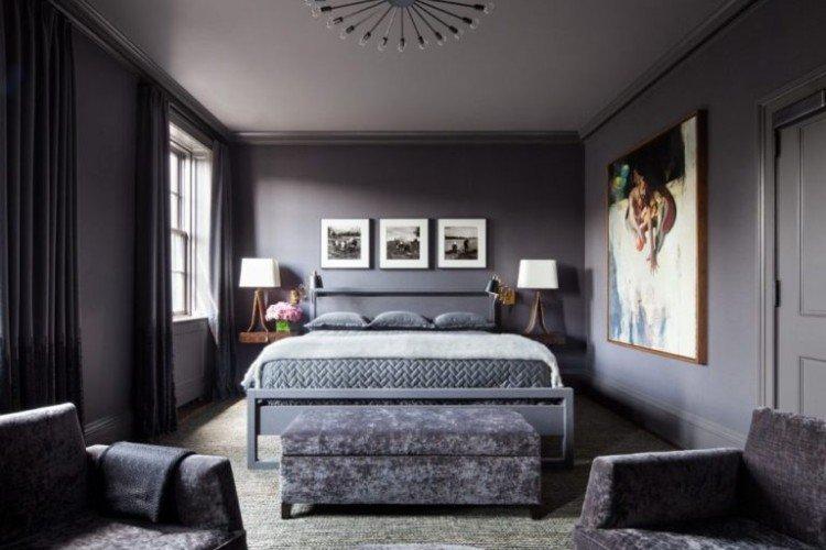
If you have a large spacious room and you want to visually lower the ceiling, boldly make it dark and the walls lighter. Cold gray shades on the floor and ceiling visually repel them, but warm brown shades attract them even more.
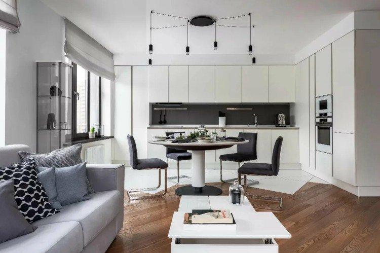
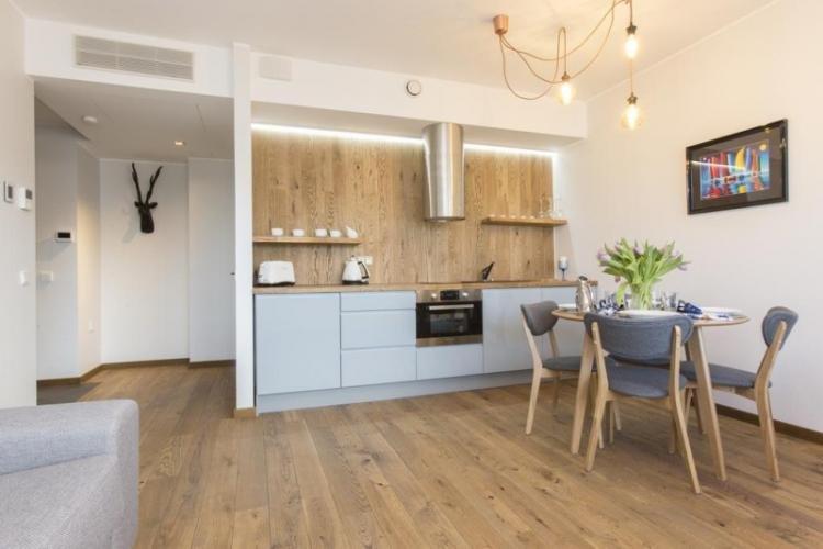
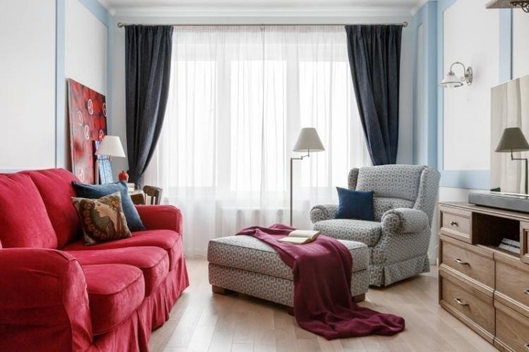
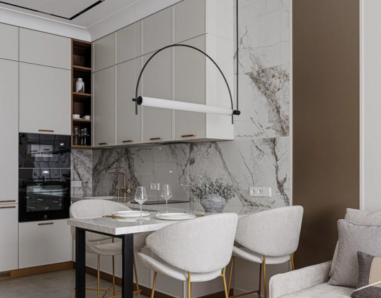
Light color schemes with shades of gray are very popular in the trendy Scandinavian style. This is a rare example where darker walls don’t make a room feel smaller, but instead emphasize its geometry. Light wooden furniture and bright colorful textiles look great against this background.
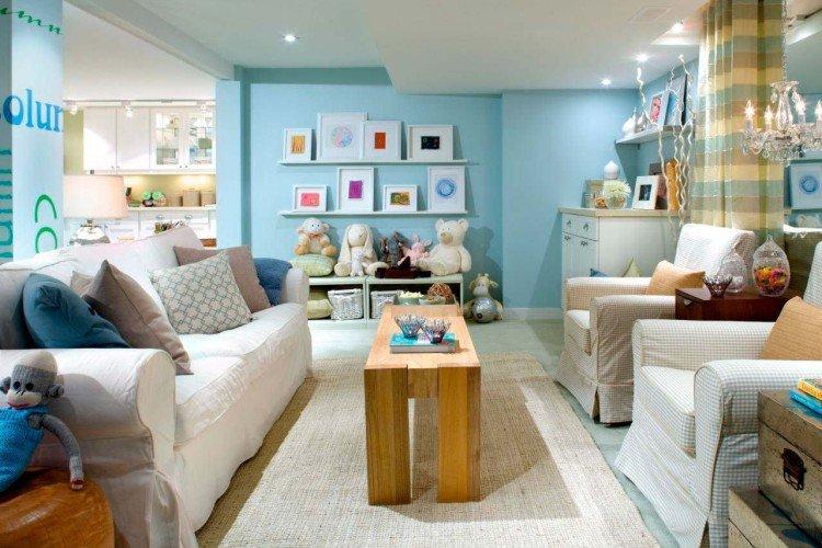
Pastel Colors
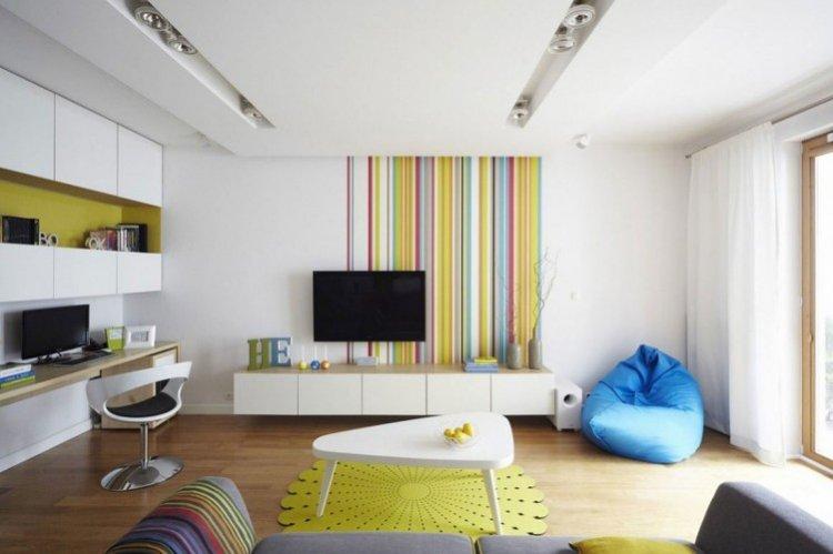
The absolute compatibility of everything with everything is the main advantage of a pastel color scheme. This is the rare case where you can harmoniously combine 3-5 different colors. Because they are muted, the decor does not seem loud and overloaded.
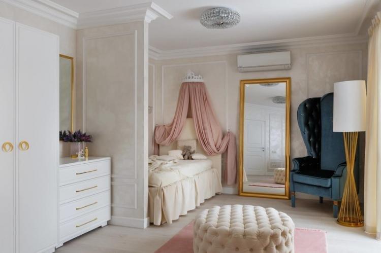
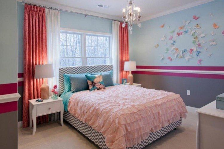
Pastel interiors create an atmosphere of French Provence and a perpetual celebration of spring. They make the room visually lighter, easier, and airier without any pretentious seriousness. This is a good choice for a bedroom, kitchen, or girls’ children’s room.
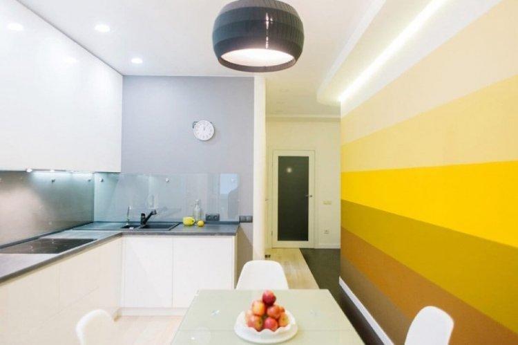
Choose laminate flooring in bleached wood or warm sandy and nutty shades. The ceiling should be slightly lighter than the other surfaces – this makes the room appear larger and more spacious.
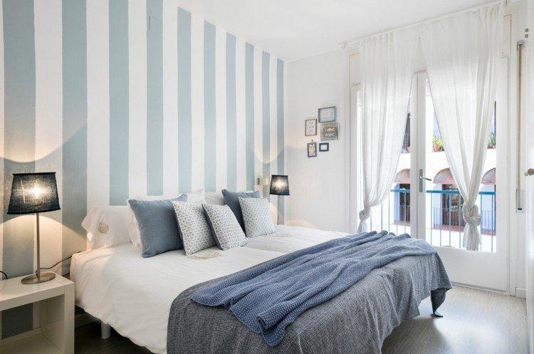
On the walls, you can combine several colors: pink with lilac, blue with beige, or lavender with turquoise. Use paint or coordinating wallpaper, alternate stripes, divide the surface in half, or create accent walls. But in this case, it’s better to choose neutral and solid-colored furniture without extra decor.
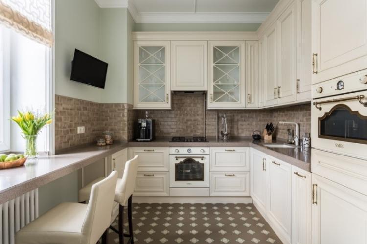
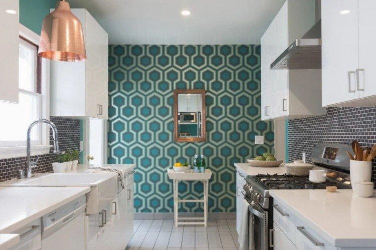
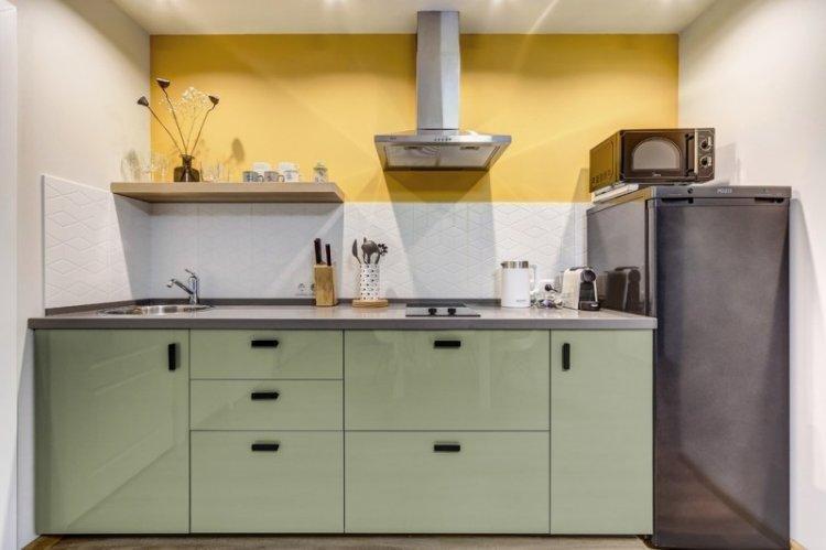
In the kitchen, a mosaic of colorful small tiles on the floor looks interesting. You can mirror this on the backsplash above the work surface. The other walls should be painted in a neutral beige or milky shade.
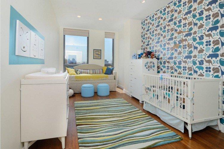
In fairy-tale children’s rooms, multi-level ceilings that combine several colors look interesting. Combine whimsical shapes with glossy surfaces.
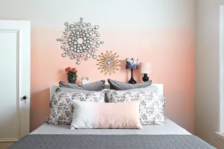
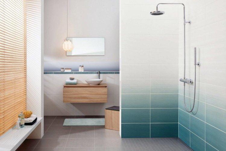
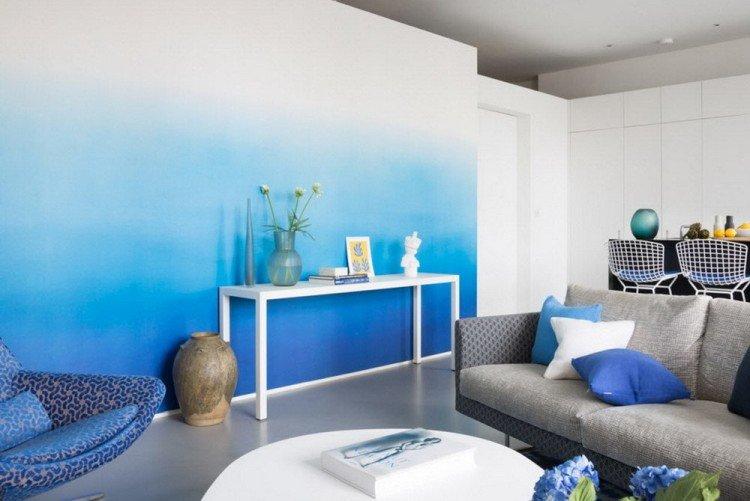
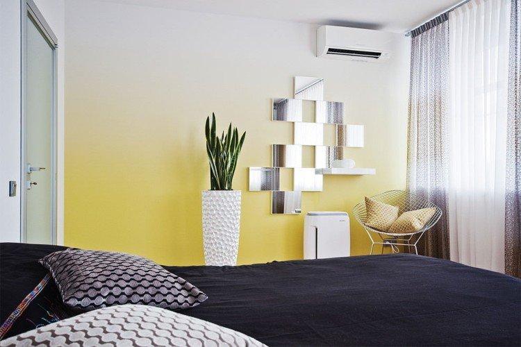
Gradients
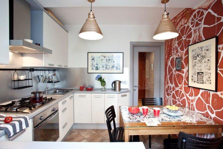
The smooth transition from shade to shade, which is used in monochrome interiors, is called a gradient. But if monochrome interiors by and large look like solid colors, gradients can be rich and vibrant. For example, from white tiles to a glossy red ceiling via salmon-colored walls. Or from a cream ceiling through wallpaper to dark walnut laminate.
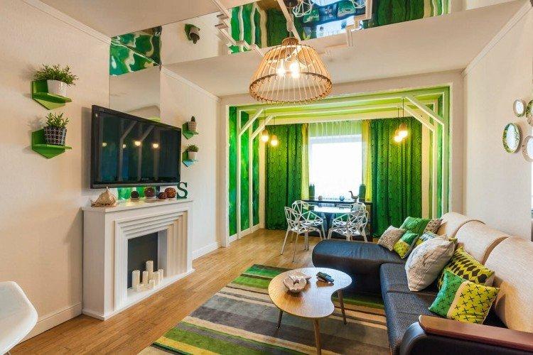
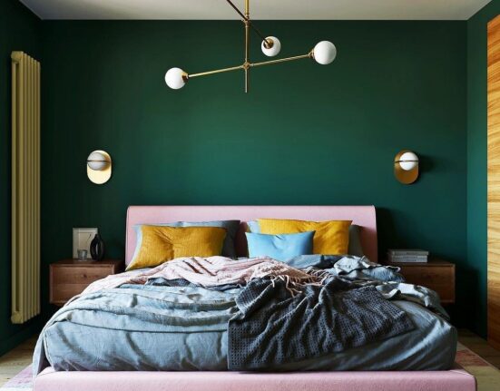
Combining two bright colors can work if you find an intermediate tone. Transitions from pink to turquoise, orange to blue, and green to purple can look great on the walls. For a fresh touch in modern interiors, try gradients from warm beige to graphite gray.
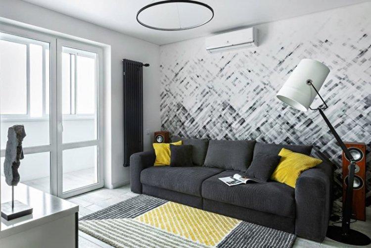
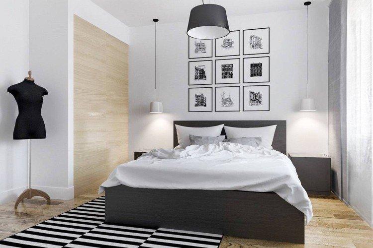
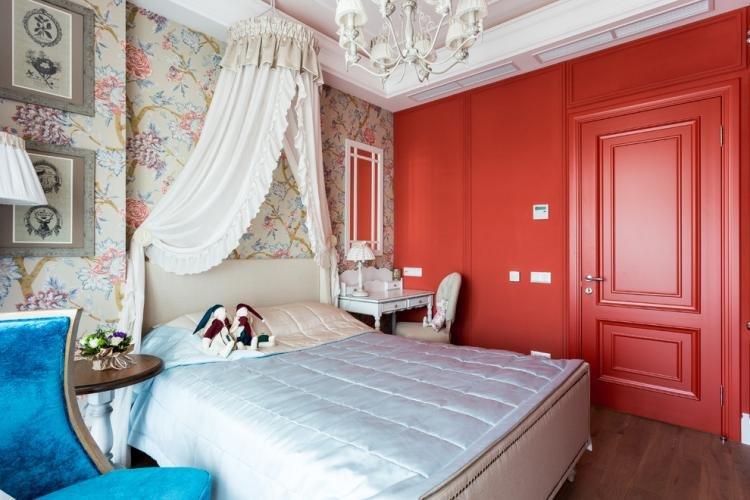
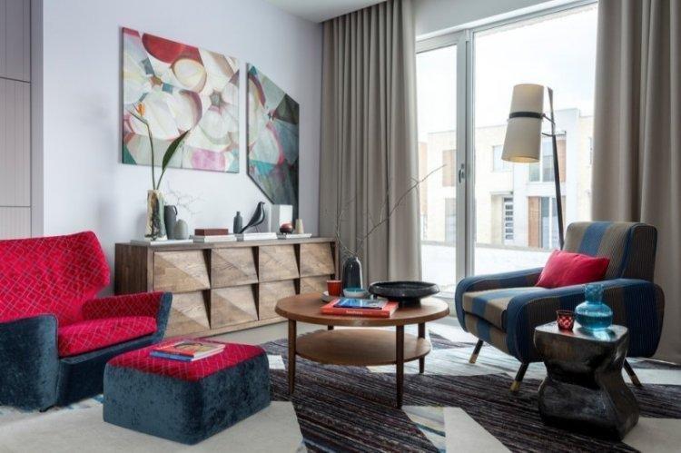
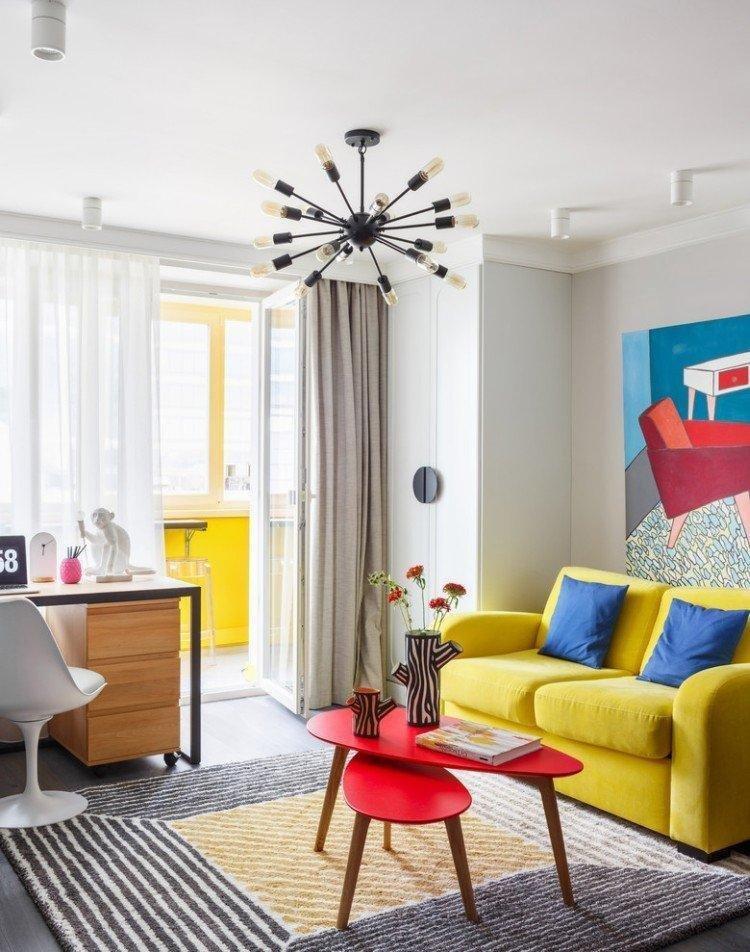
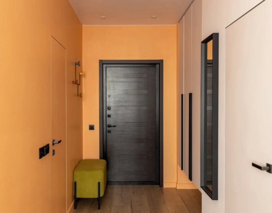
Contrasts in Interior Design
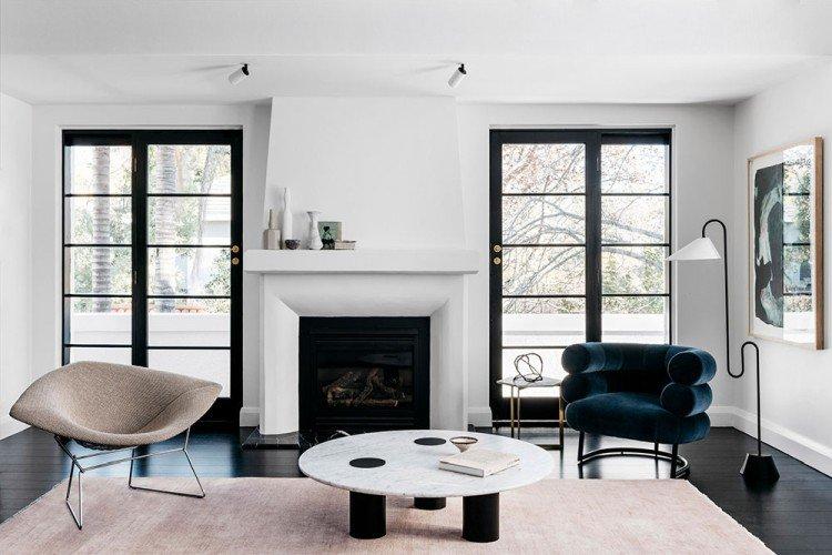
When it comes to visually changing a room’s geometry, contrasts are your go-to tool. Both classic and modern interiors often use white and black, but any light or dark shades will work.
For a room with a low ceiling, paint it in a light color and opt for a dark floor. Consider using wallpaper with an elongated pattern, vertical stripes, or one accent wall. Avoid any wide horizontal elements in the finish and interior.
To visually balance a narrow room, make long walls light and short walls dark and contrasting. This technique seems to compress the room in the right direction. Make the floor and ceiling neutral, the furniture light, and add bright accessories.
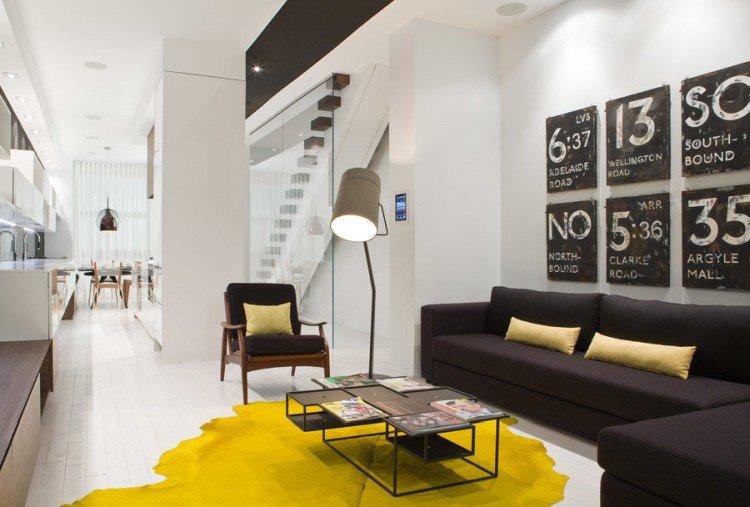
One of the classic combinations is a dark wooden floor with white ceiling, walls, and bright furniture. In modern interiors, light finishes look good with colorful details. And black and white classic is universal everywhere: from minimalism to fancy modernism.
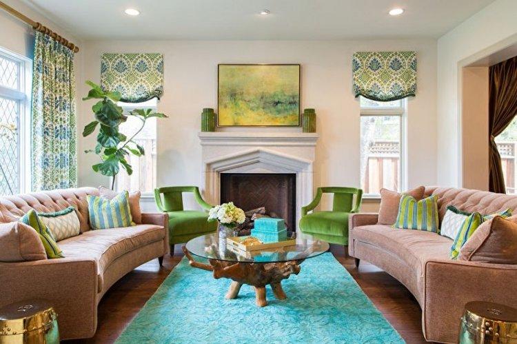
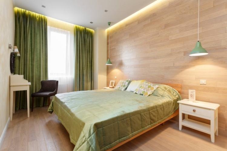
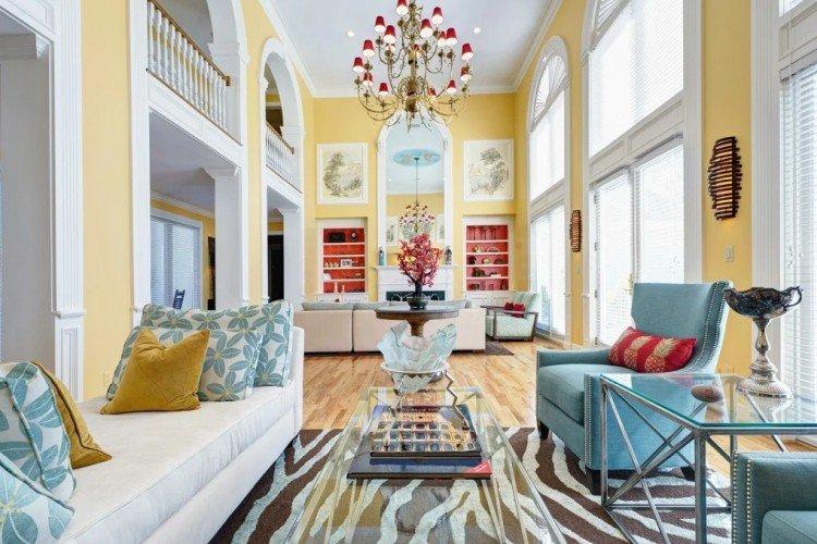
Natural Colors
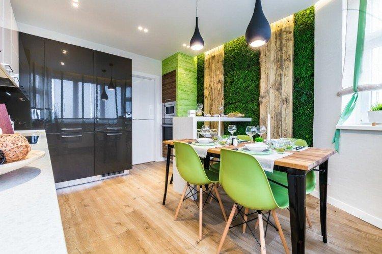
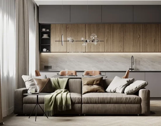
Nowadays, naturalness is in trend in all its manifestations: in materials, shapes, and color schemes. Eco-style interiors combine all shades of wood and green. Other natural colors are used less frequently: yellow, red, blue, sea wave. Add black if you need contrasts or white if you need to add light.
A dark wooden floor looks good with beige walls and a white ceiling. They combine with gray furniture and bright green textiles. And an angle with your favorite geranium or succulents in colorful clay pots will add freshness and life.
Wooden wall panels in the same tone as the laminate will help create the atmosphere of a country cottage. The Mediterranean style with rattan, woven rugs on the floor, and turquoise walls also fits into the natural palette.
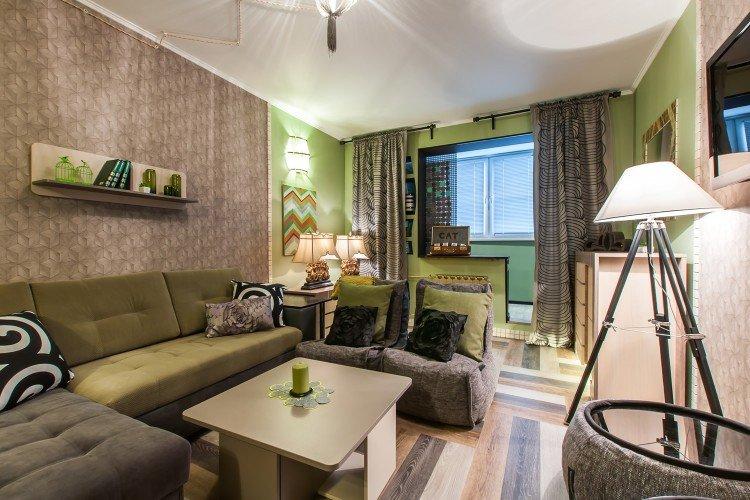
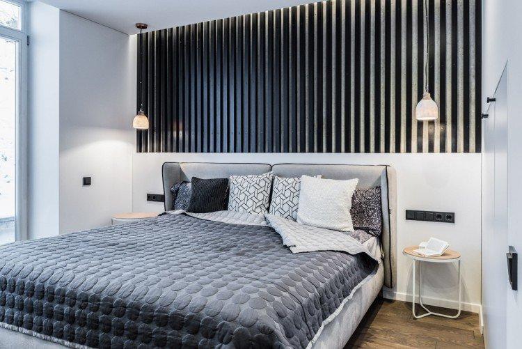
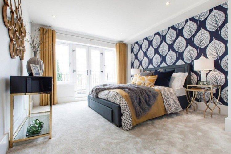
Cold and Warm Colors
Traditionally, we perceive warm colors as lighter and cozier, and cold ones as fresher and stricter. In northern rooms, a warm color scheme will be very helpful in maintaining the mood. But in southern ones, a cold finish for walls and ceilings will save you during summer heat.
In the office or workshop, it is recommended to use cold shades – they improve concentration and help you focus. But warm shades are needed to relax in the bedroom or feel that homely feeling in the living room.
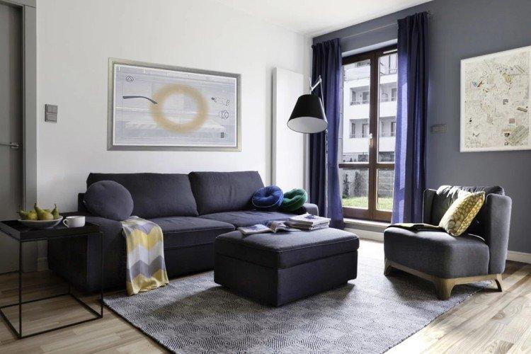
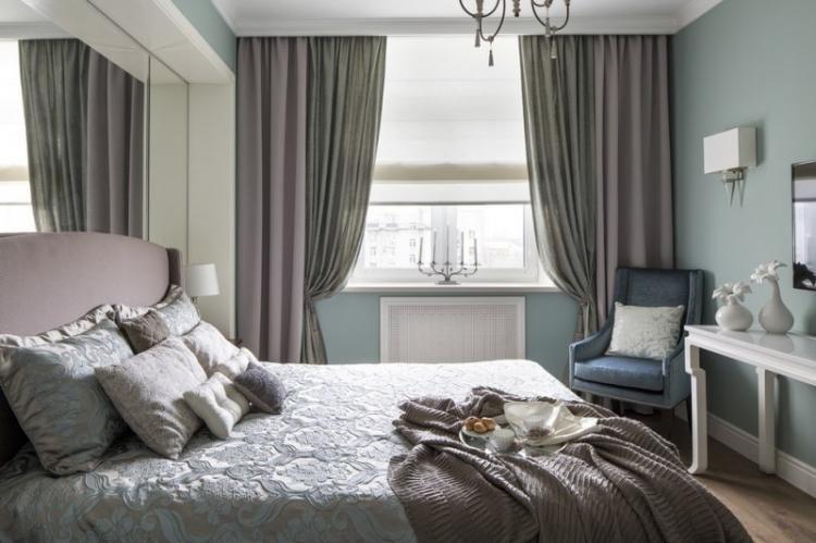
It used to be thought that the interior must necessarily be in the same tone. But now, cold and warm contrasts fit perfectly into eclectic fashion. For example, a restrained combination of gray with beige or an extravagant combination of red with blue. The main thing is that both shades are approximately the same brightness and saturation.

Leave feedback about this