You can see straight kitchens in tiny Khrushchyovka apartments and huge cottages. Owners of small studios choose a linear layout because there’s no space for another. And in spacious apartments, a long kitchen unit allows moving storage and cooking areas to the wall, so they are not too conspicuous. We share successful examples of linear layout in different sizes and explain the principles of creating one.
Pros and Cons of Linear Layout
Modern designers often place furniture and appliances in a row. This solution has many advantages.
Pros
- Looks trendy. A room with such a setup seems stylish and modern.
- Doesn’t feel bulky. A set with high cabinets up to the ceiling will be less conspicuous if placed along one wall.
- Suits any room. Even in a space with complex shape, you can find a straight wall for furniture.
- Saves money. There’s no need to design corners and think about what to place there. Therefore, this kind of unit is usually cheaper than a corner one.
Cons
- In spacious rooms, the cook will have to walk a lot along the long row of furniture and appliances.
- In a small space, you’ll have to choose between extra storage area and installing built-in appliances.
We explain how to deal with these issues and get the most out of such a layout.
Linear Kitchen Layout in a Single Row: Solutions for Small and Large Apartments
When planning the kitchen unit, first choose a place for the work triangle – refrigerator, stove, sink. The comfort of the main home cook depends on their arrangement. Ergonomics allows aligning the triangle’s vertices in a line. But it’s important to consider the distances between them. Too large, and the cook will quickly tire. Too small may lead to fire or short circuit. We explain how to calculate everything.
Small Straight Kitchen 3 meters (about 9.8 feet) or Less: Overcoming Limitations
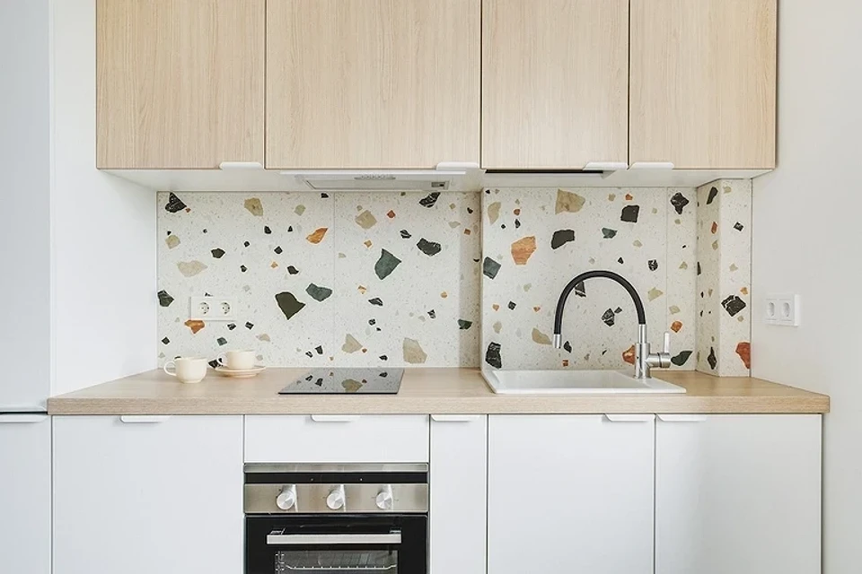
It seems impossible to fit everything necessary in studios up to 30 square meters (about 323 square feet). But modern designers manage it. The first space-saving measure is foregoing full-sized appliances.
- Instead of a standard 60 cm (about 23.6 inches) wide cooktop, choose a narrow 40 cm (about 15.7 inches) two-burner. It’s sufficient for a single person or a couple who rarely hosts formal dinners.
- Sinks also come in narrow sizes – up to 40 cm (about 15.7 inches) or even 30 cm (about 11.8 inches). But they are not as convenient to use as full-sized ones.
- Compact refrigerators are only slightly smaller than standard ones: 45-50 cm (about 17.7-19.7 inches) versus 60 cm (about 23.6 inches). But sometimes even 5 cm (about 2 inches) can save the situation and allow not to give up necessary appliances.
- If you don’t make large food stocks, choose a low built-in refrigerator under the countertop. This frees up space for an additional cabinet in the upper tier.
Leave free countertop sections between the three vertices of the work triangle. It’s a safety rule that shouldn’t be ignored even when planning a tiny straight kitchen of 2 meters (about 6.6 feet).
- Keep at least 40 cm (about 15.7 inches) of free space separating the refrigerator from the stove, oven, or other heating elements. You can leave a bit less – 15-20 cm (about 5.9-7.9 inches) – from an induction cooktop. If this rule is not followed, the compressor will quickly fail.
- Ideally, leave 40-60 cm (about 15.7-23.6 inches) between the stove and sink. This ensures that water droplets won’t get into hot oil and cause a fire, and you won’t accidentally drop dish soap into the cooking soup. Modern designers sometimes break this rule. If you rarely fry and only wash dishes after cooking, you can leave about 15-20 cm (about 5.9-7.9 inches) between the cooktop and sink.
- It’s also risky to place a refrigerator right
next to the sink. Water near electrical appliances poses a significant risk of electric shock. And splashes will eventually damage the side wall. Leave at least 40 cm (about 15.7 inches) between them.
Before ordering the unit, measure the length of the wall, find out the exact dimensions of the chosen appliances and sink. In a straight kitchen of 3 meters (about 9.8 feet), there’s room for full-sized vertices of the work triangle.
- Place a tall refrigerator at the edge. Choose a corner where there are no hot heating pipes and gas lines needing regular inspection. If the model is not built-in, leave about 5-8 cm (about 2-3.1 inches) from the wall.
- The sink is more convenient in the center, but it can also be near the wall. Just extend the backsplash to protect against splashes.
- The stove will be in the other corner. But even for an induction panel, it’s not recommended to place it right next to the wall. Allow a gap of 10-15 cm (about 3.9-5.9 inches).
Considering all the gaps, you have about a meter (about 3.3 feet) of countertop left. Divide it in half and create a comfortable workspace between the main points of the triangle. Look at the diagram to understand the principle.
Such a straight kitchen with a refrigerator is very convenient from an ergonomic point of view. The cook won’t have to move much between points, holding heavy or hot pots for long. The main downside is a lack of storage areas. Only two full-size cabinets remain in the lower tier. The solution is upper cabinets with an attic up to the ceiling.
Another disadvantage is no space for a dishwasher. Appliance manufacturers strongly advise against installing it next to the refrigerator and stove. And there’s nowhere else to place it. However, some owners of tiny apartments choose to ignore the recommendations. But in such an arrangement, either the refrigerator or dishwasher may quickly fail. Are you ready to sacrifice expensive appliances? Or is it better to wash dishes by hand?
Planning a straight kitchen unit in a small kitchen of up to 2 meters (about 6.6 feet) is more challenging. Even if you choose narrow solutions instead of full-size ones, the gaps will be less than recommended. How to solve this problem? For example, move the refrigerator out of the row. It can be placed on another wall or even in the corridor.
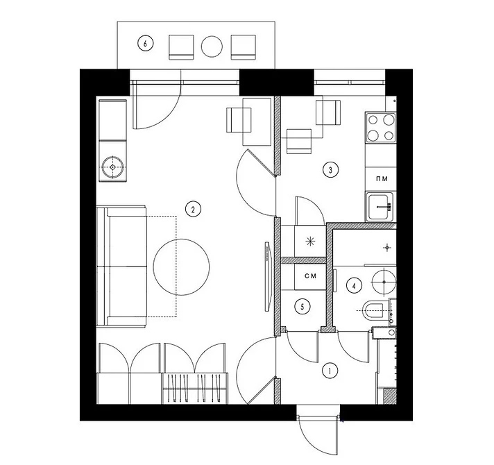
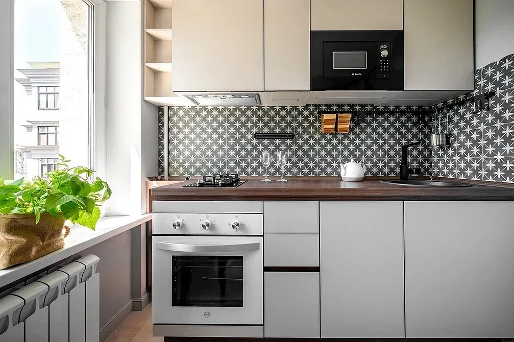
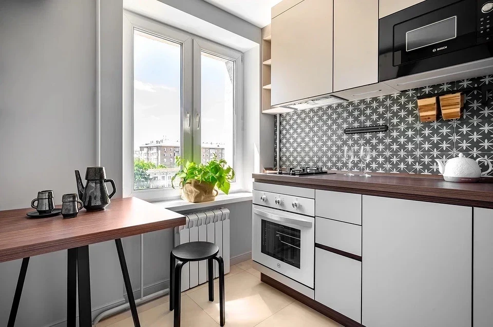
Installing a dishwasher in a straight kitchen unit in a kitchen up to 2 meters (about 6.6 feet) long is impossible if you follow safety rules. But you can look for compact countertop models starting from 45 cm (about 17.7 inches) wide. However, you’ll have to sacrifice part of the working surface.
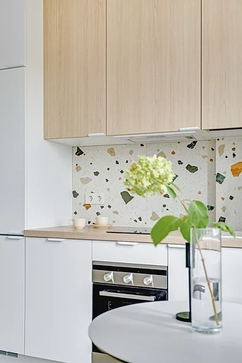
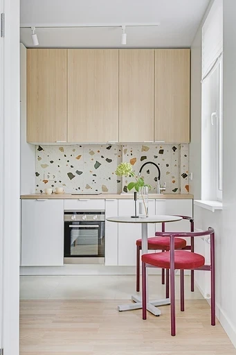
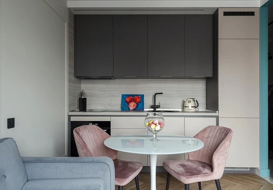
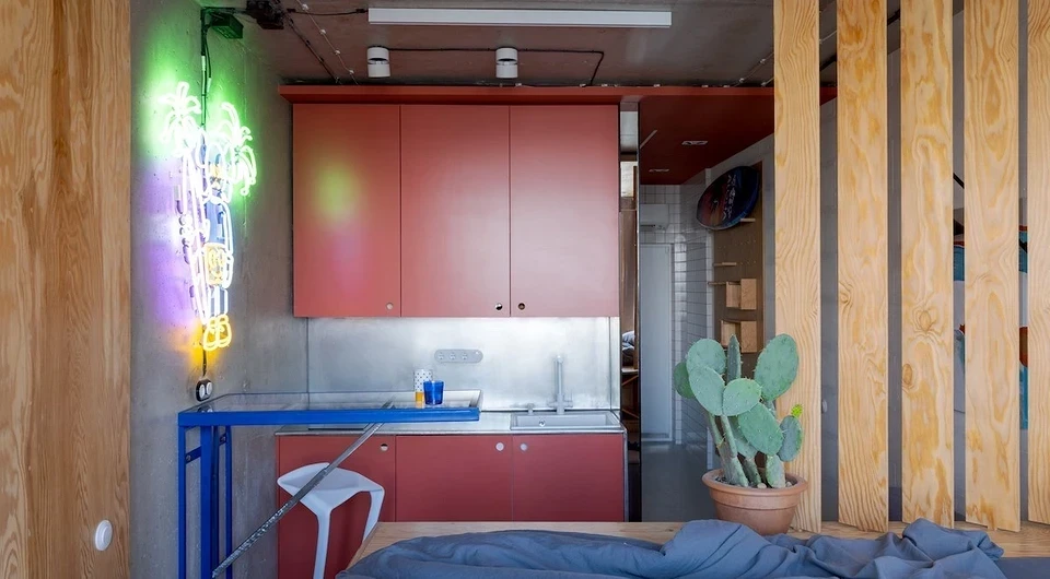
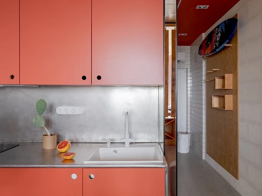
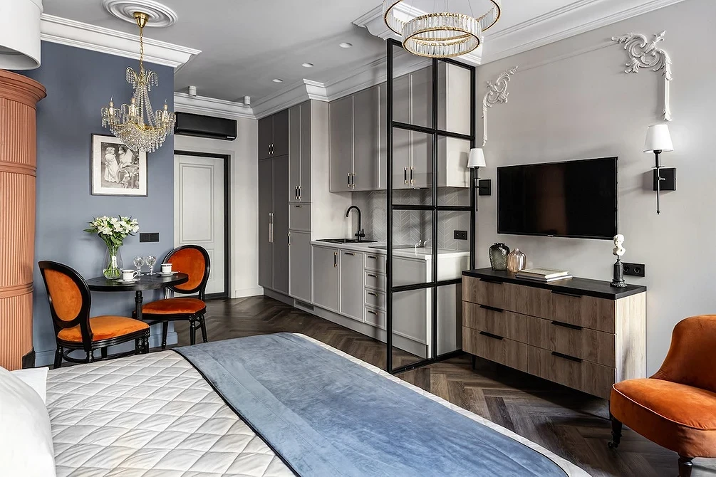
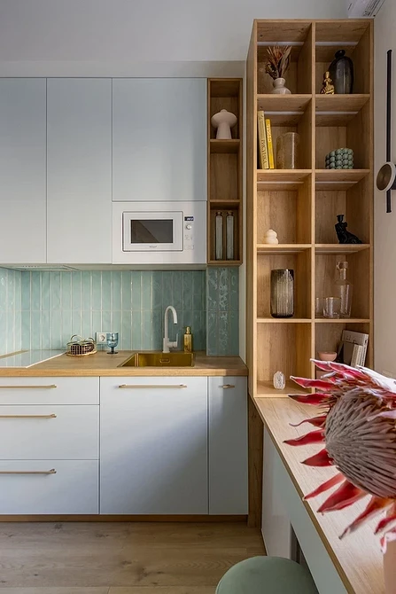
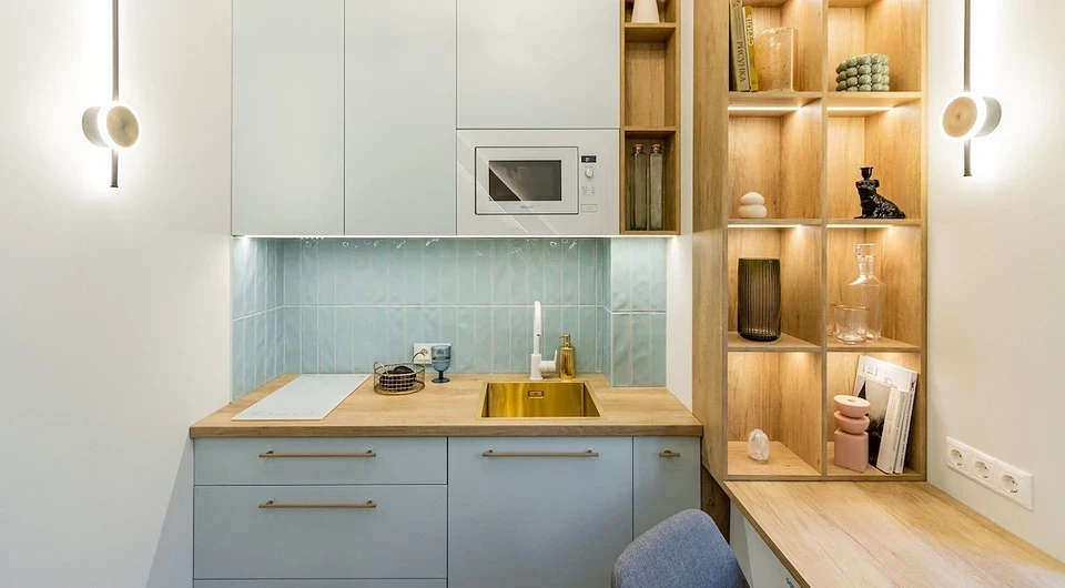
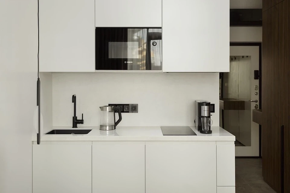
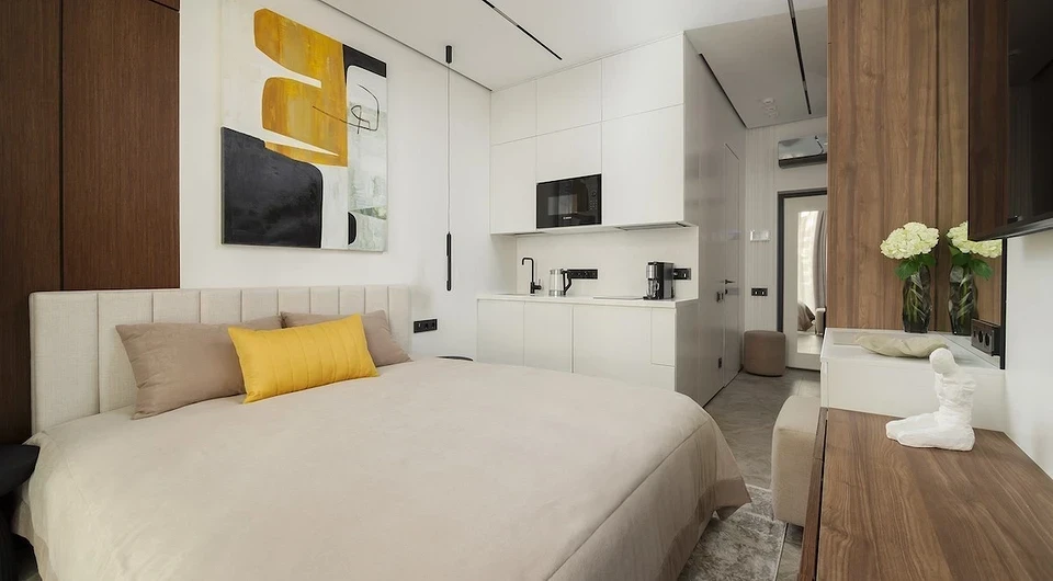
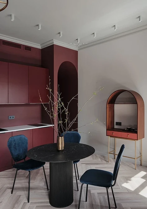
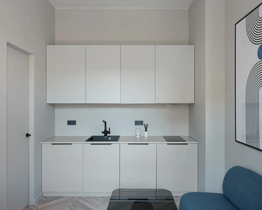
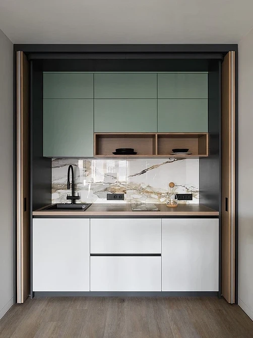
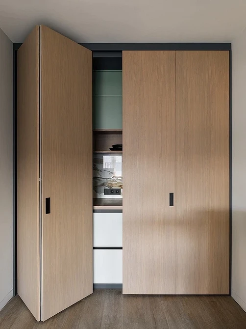
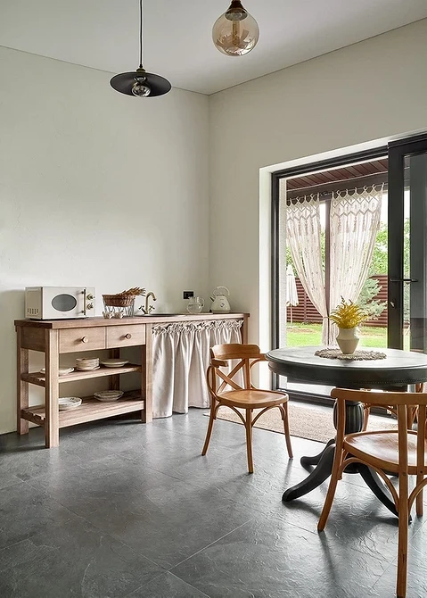
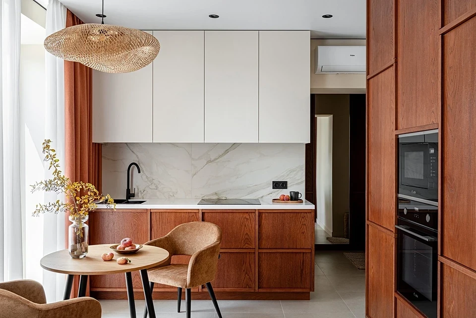
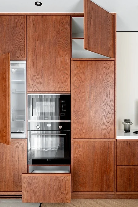
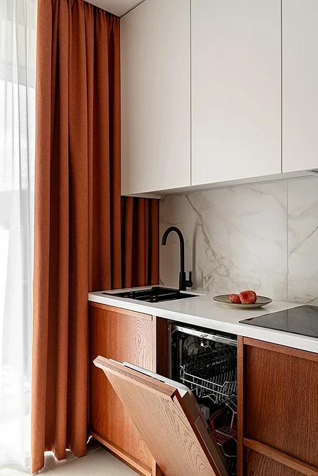
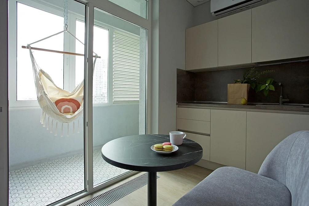
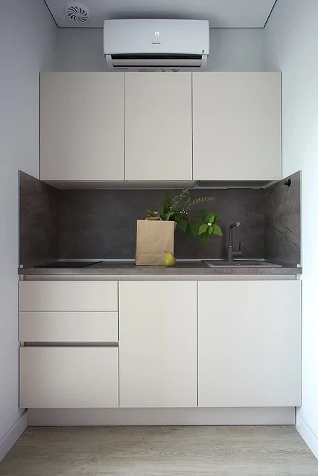
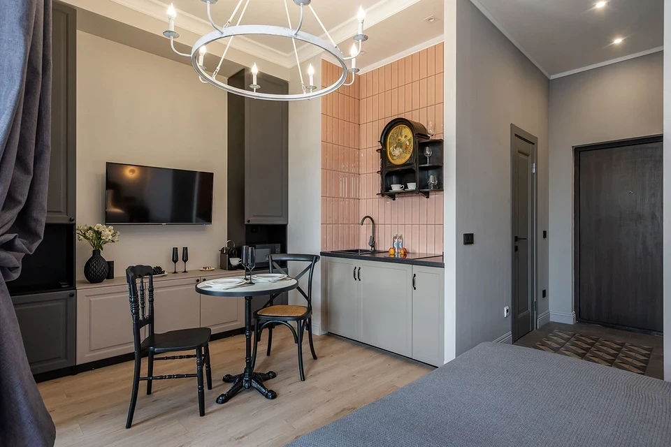
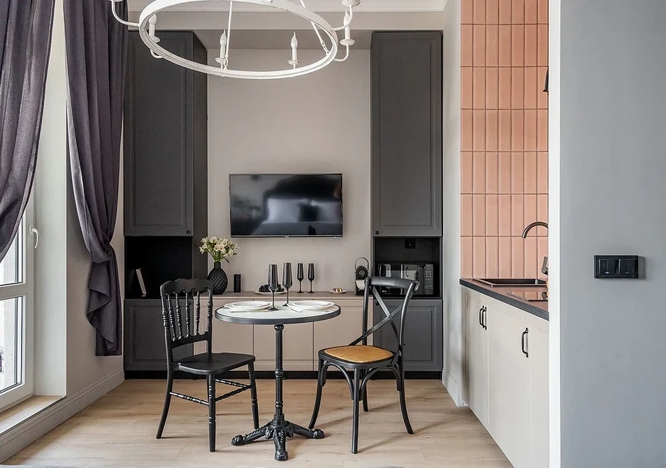
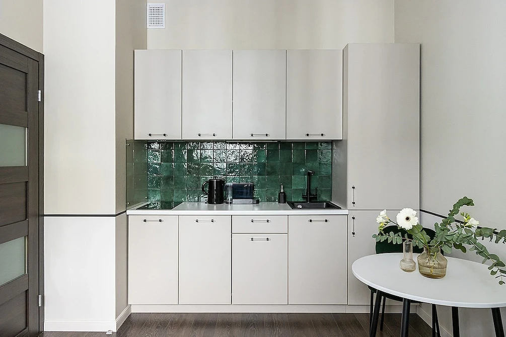
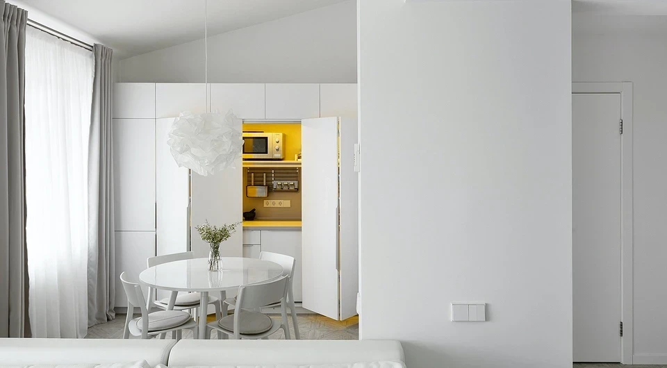
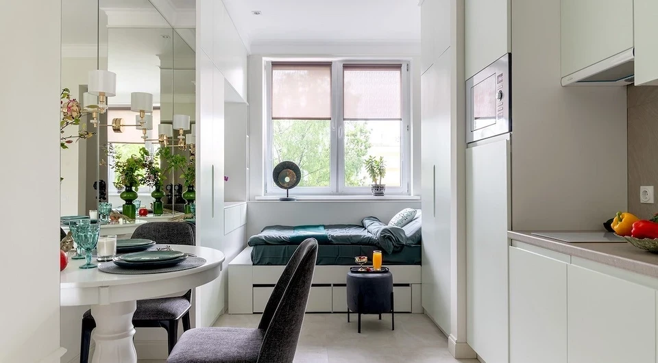
To understand how ergonomic layout can look in reality, study the design of straight kitchens in the photos in the gallery below. We’ve collected examples of successful planning solutions in a small space.


Straight Kitchen 4 Meters (About 13.1 Feet) and More: Ideas for Spacious Rooms
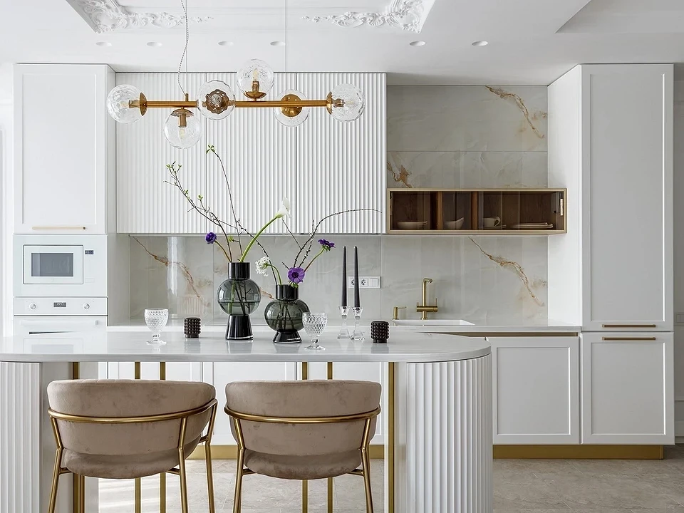
In a large area, it’s easy to fit everything. But there’s a risk of stretching the work triangle too much. Extra meters in it will turn into kilometers of steps during daily long cooking.
According to ergonomic rules:
- The area of the triangle should not be more than 7 meters (about 23 feet);
- The longest side should not exceed 3 meters (about 9.8 feet).
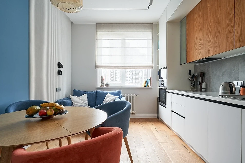
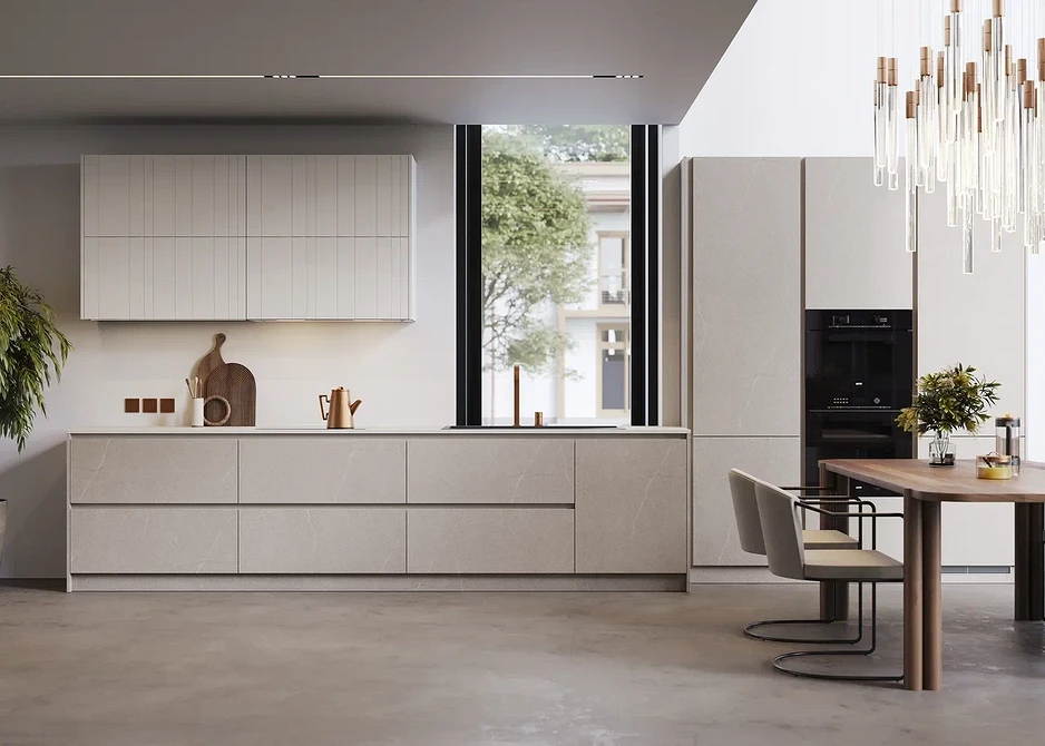
A long unit fills the space from wall to wall. On one side, a tall column with a microwave and oven, on the other, a refrigerator. Tall cabinets are added to them, so as not to cut the countertop. It’s better to place cabinets against the wall, and next to the food storage area and appliance column, leave free countertop sections. This way, you can immediately put a heavy pot or baking tray on them. Symmetry is not mandatory: you can build an oven under the cooktop and skip the column.
When planning a long unit, consider whether you need upper cabinets. Without them, the room looks more spacious and brighter. And everything necessary can easily fit in the lower cabinets.
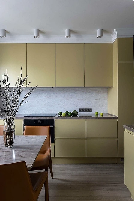
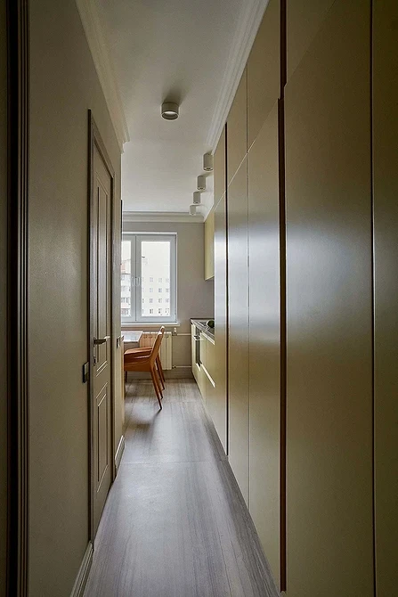
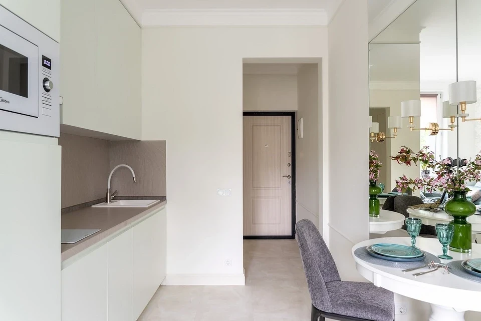
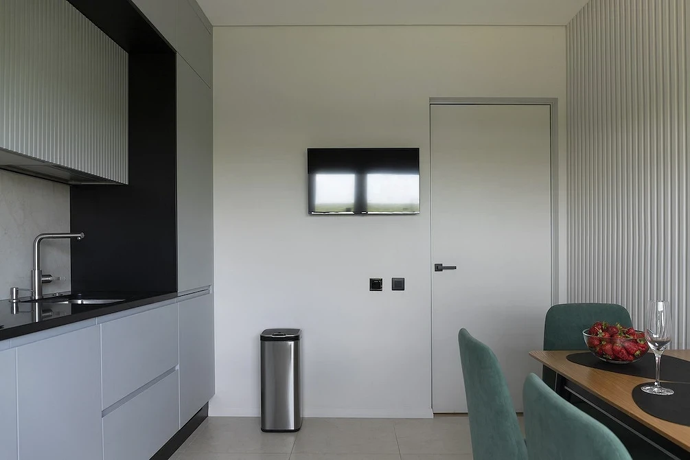
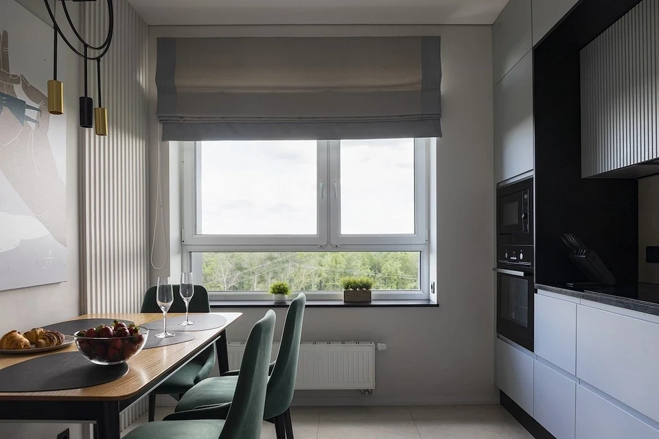
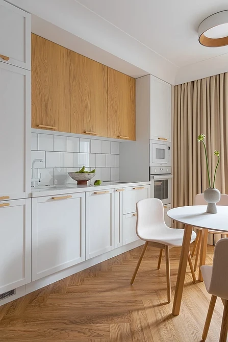
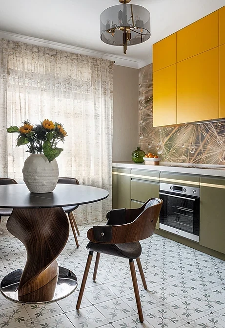
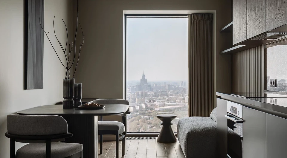
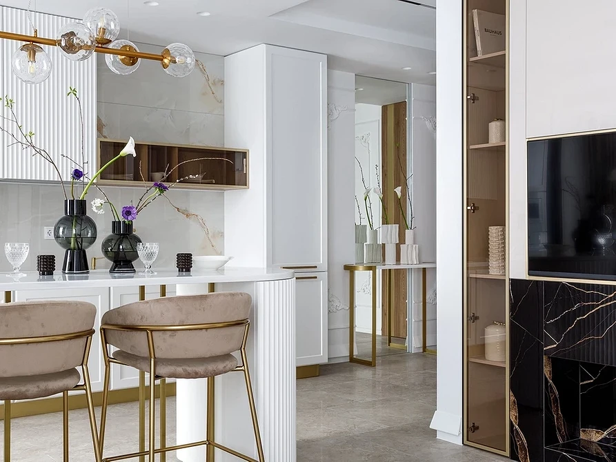
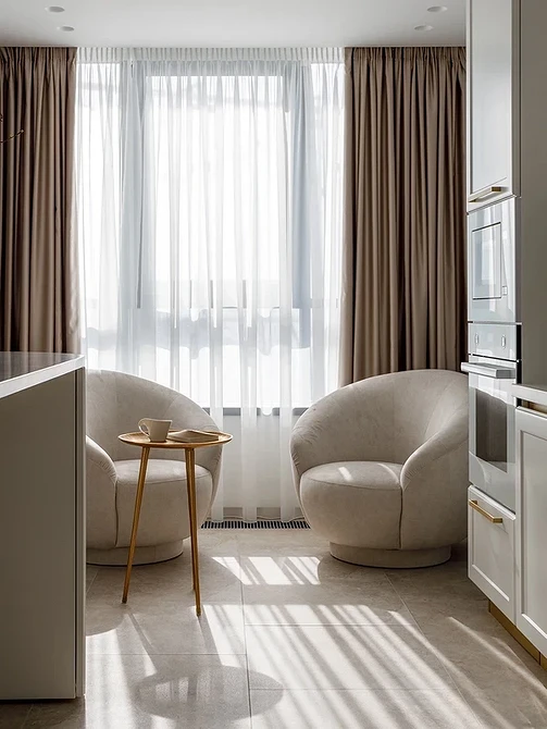
See how designers create ergonomic work triangles when there’s no need to save square meters.
Linear Layout with an Island: Not Just for Spacious Apartments
For a long, narrow “railcar” room, the ideal layout is a double-row, as shown in the diagram. However, only one person can comfortably cook in a straight narrow kitchen simultaneously.
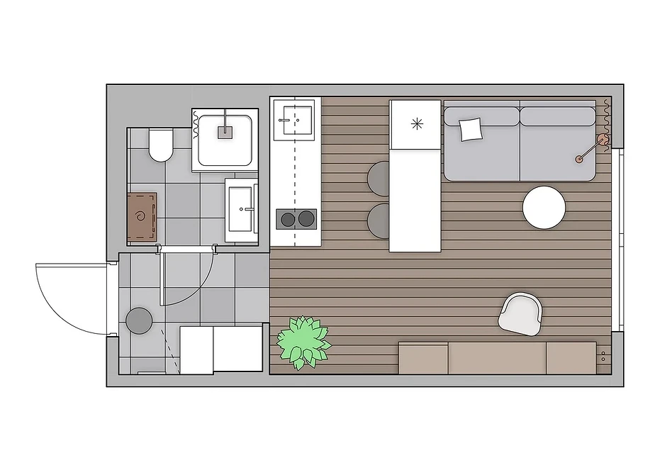
One of the rows is entirely or partially occupied by a bar counter or just a narrow table. If possible, the dining area is moved to the living room or dining room. And in the room, two parallel rows are used for the kitchen unit. This allows moving the sink or cooktop to the opposite wall and transforming the straight row into a full-fledged work triangle. If a double-row layout is impossible, consider installing an island, as shown in the diagram.
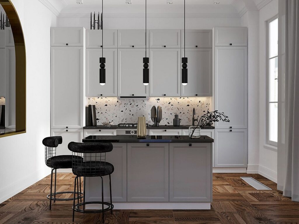
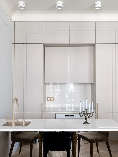
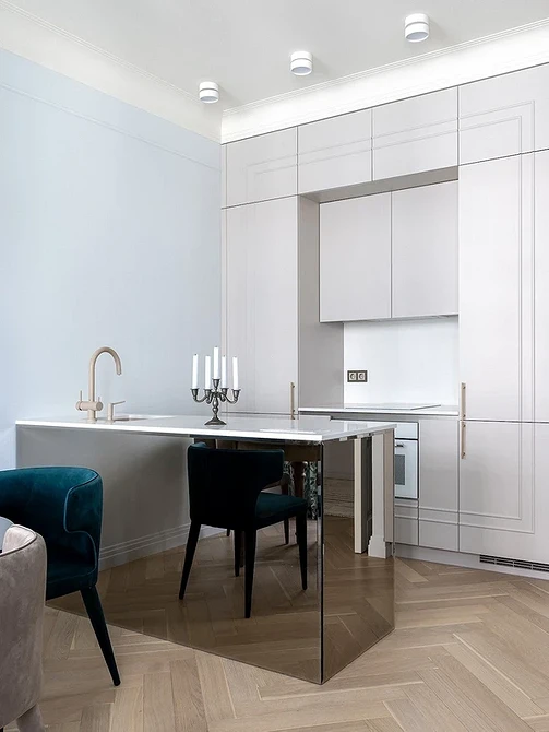
It can be placed not only in a huge room but also in a tiny studio where the kitchen unit has to fit into a niche. The island can be used as a dining or working area. In limited space, you can combine them. This is what was done in this project. The straight white kitchen includes a sink and a full stove with an oven, separated by a wide cabinet. Opposite, there are a built-in refrigerator and a bar counter with cabinets inside. It serves both as a dining table and a storage area. Thanks to this solution, it was possible to install a model with a freezer and an oven in a studio less than 20 square meters (about 215 square feet).
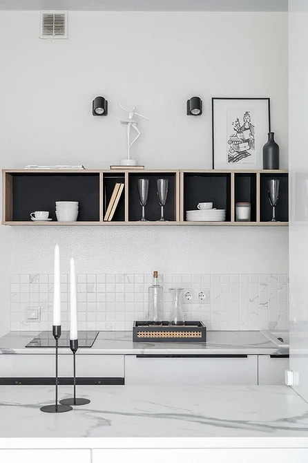
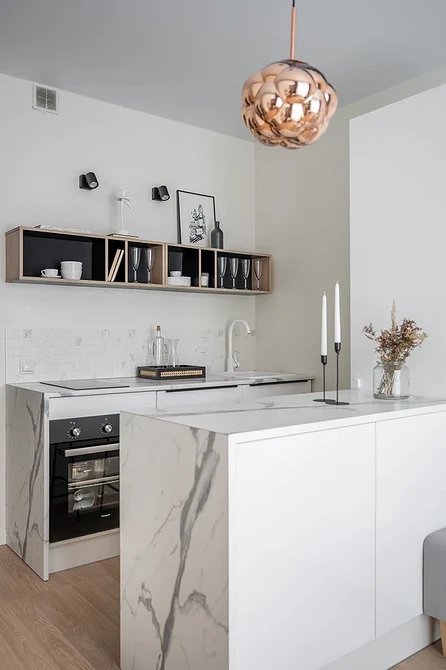
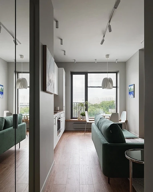
In the project, the tall refrigerator stands against the wall, so it doesn’t violate ergonomic rules. But usually, it’s not the refrigerator that’s moved to the island, but the sink or cooktop. A tall column in the middle of the room is a bad idea. It disrupts the view, blocks light, and simply doesn’t look good. A linear kitchen with an island sink or stove is more convenient. However, you’ll need to provide electricity or water supply to them and install a powerful ceiling extractor hood. Think about whether you’re ready for these additional expenses. If yes, look at the gallery below and take inspiration from successful ideas.
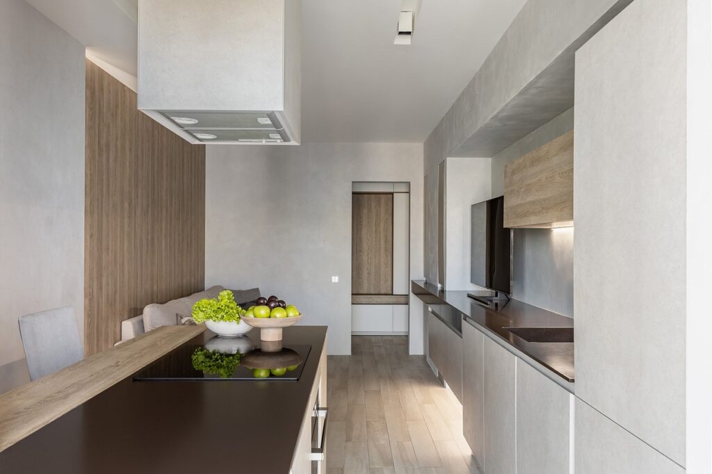
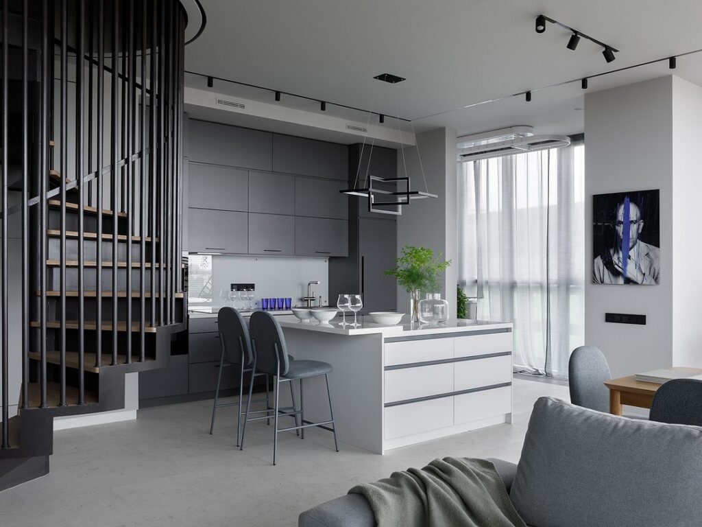
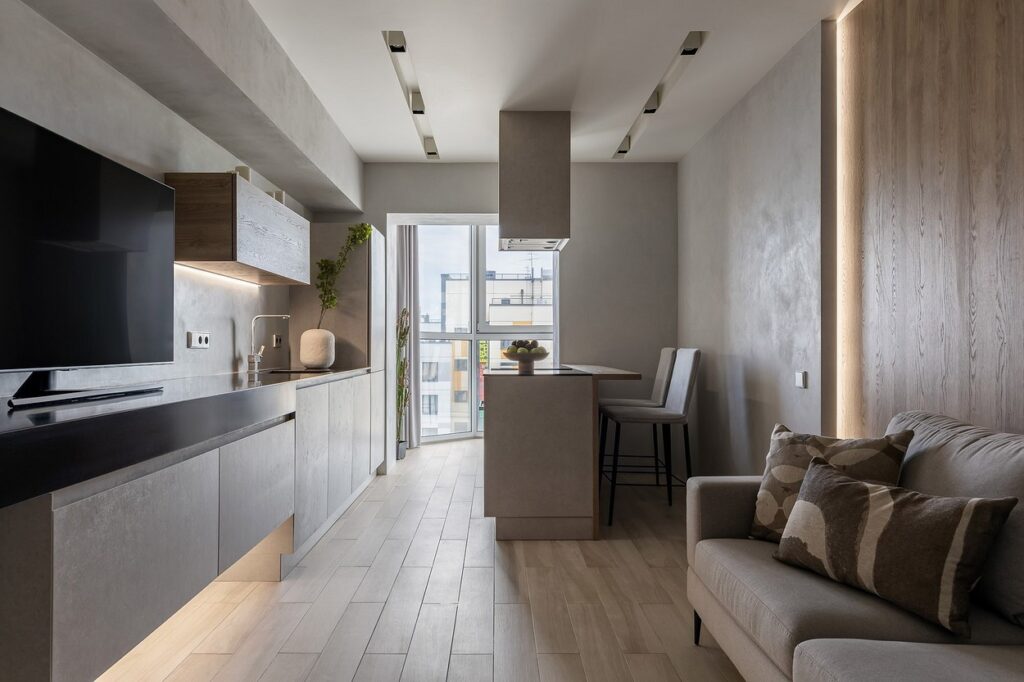
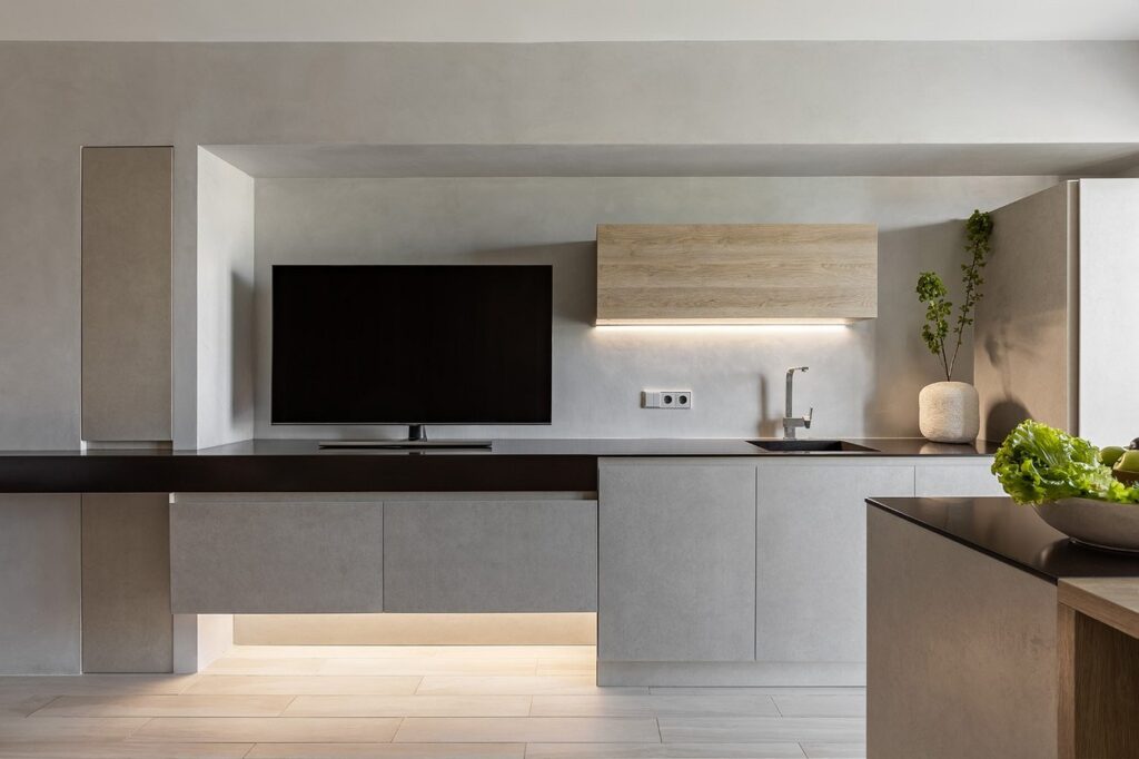
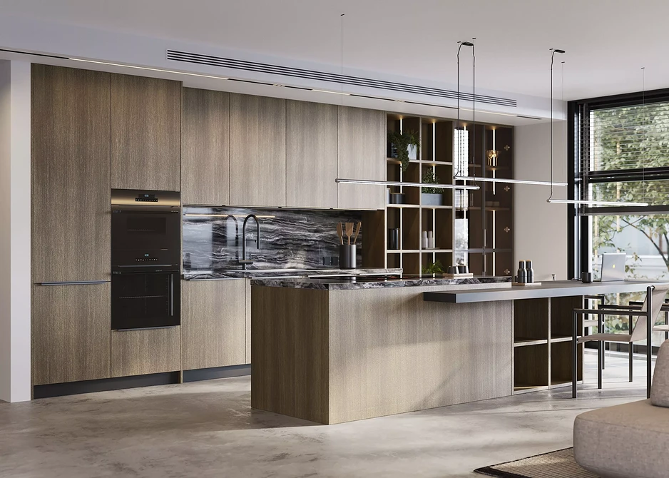
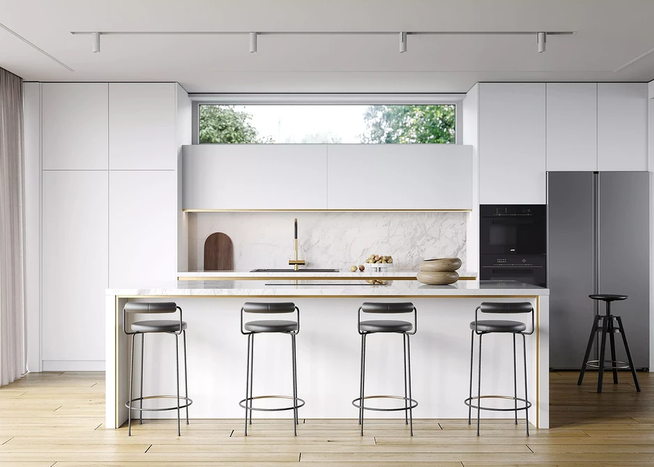
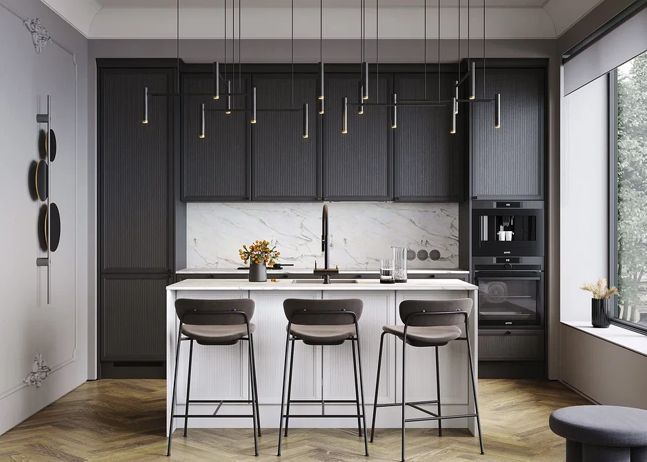

Design of Linear Kitchens: Photos of Beautiful Units
Having decided on the layout, move on to choosing the design. Consider current trends and the size of the room.
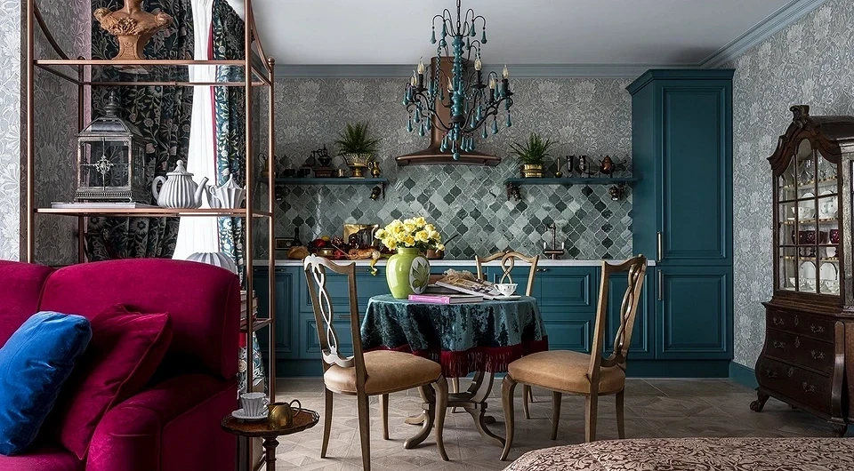
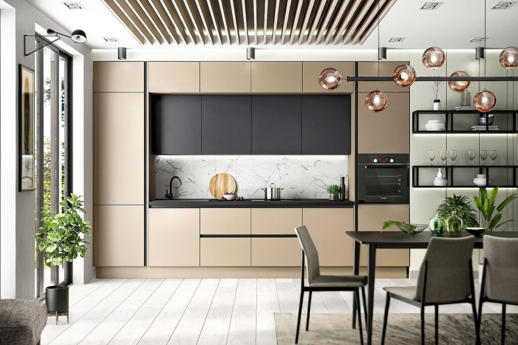
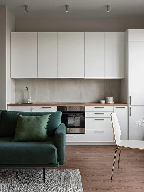
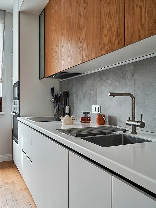
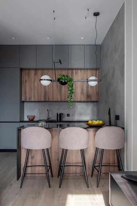
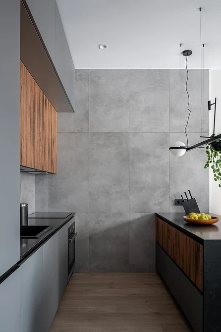
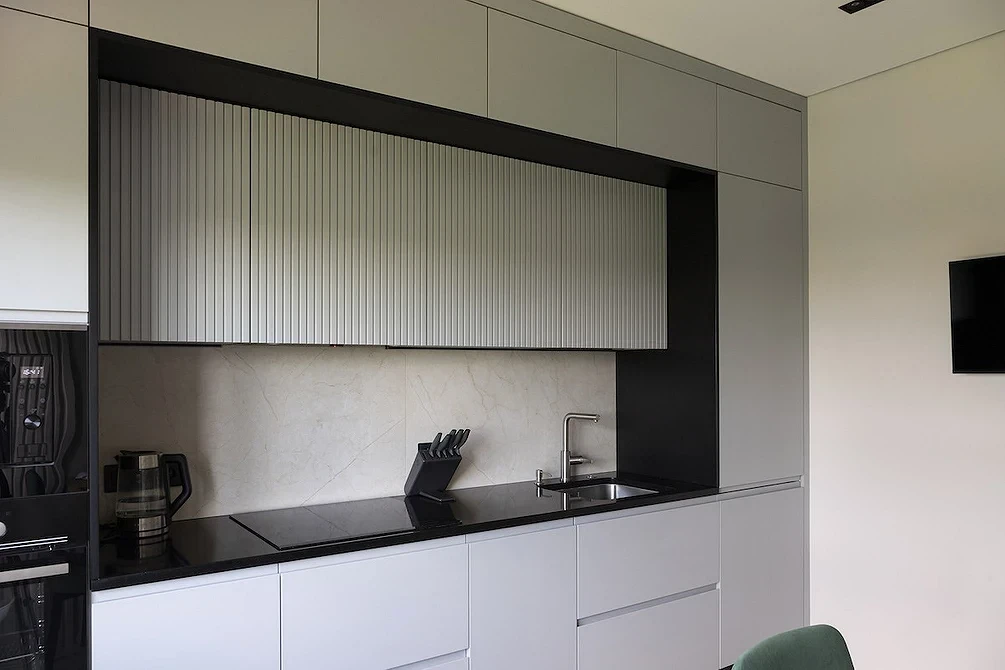
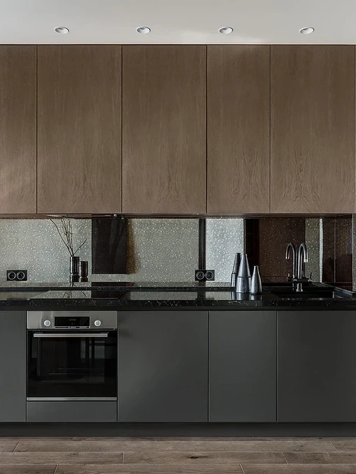
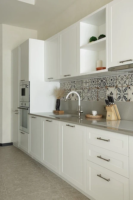
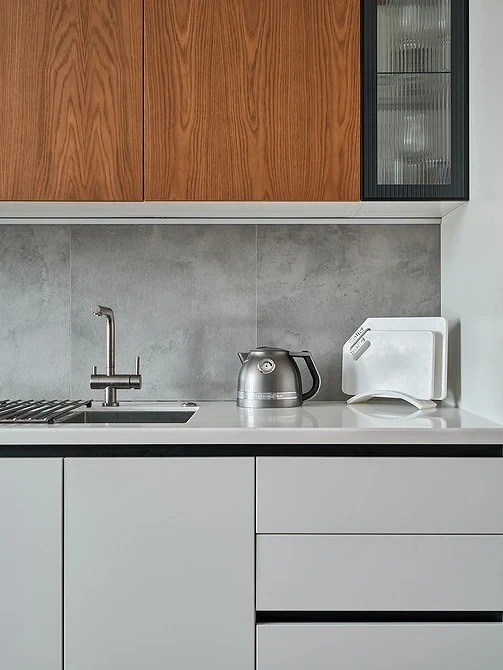
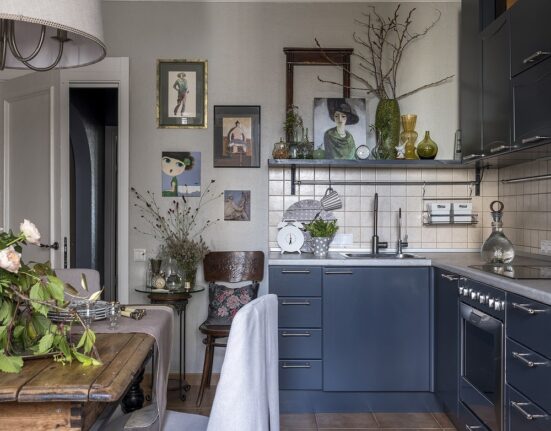
- Modern straight kitchens are simple and concise. Complex milling and stained glass are things of the past. Choose smooth matte facades with hidden handles or almost invisible brackets. Such units are suitable not only in minimalist or Scandinavian interiors. They also look good in combination with vintage furniture and decor, as they don’t draw too much attention to themselves.
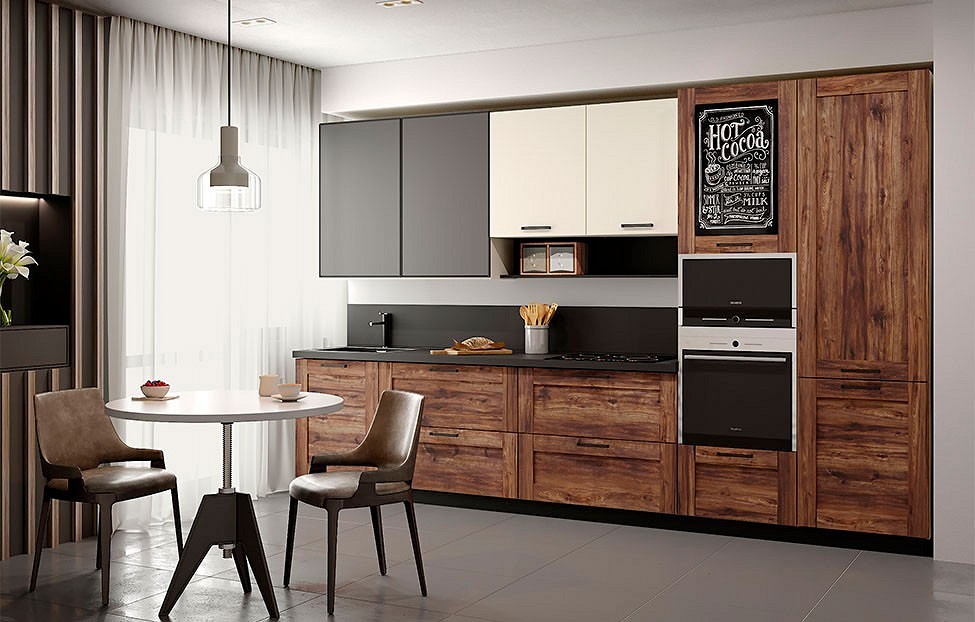
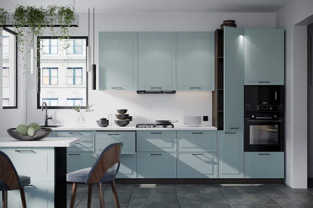
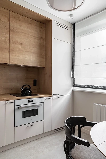
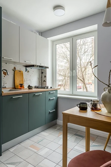
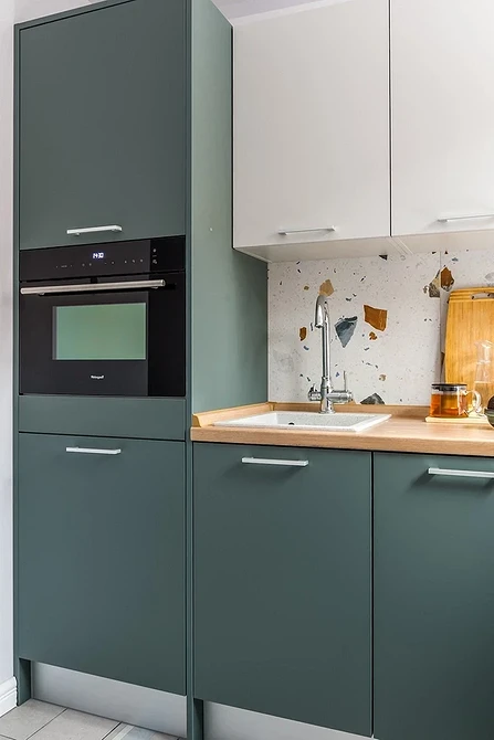
- Suitable shades for the facade are neutral white, gray, black, or deep natural colors like emerald and sea wave. Light and dark wood remain popular. In a small room, make the unit white or at least light-colored. Leave saturated and dark colors for spacious rooms.
- A symmetrical linear unit up to the ceiling, blending in color with the walls and backsplash, will visually increase the space.
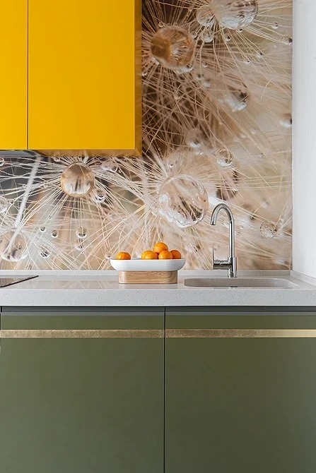
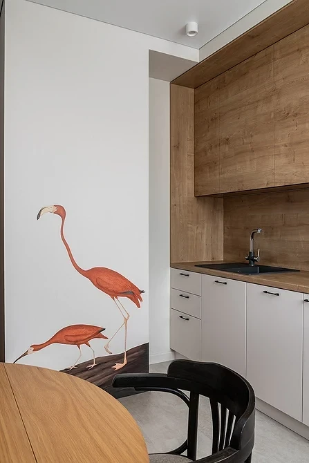
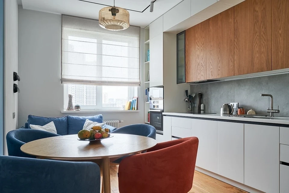
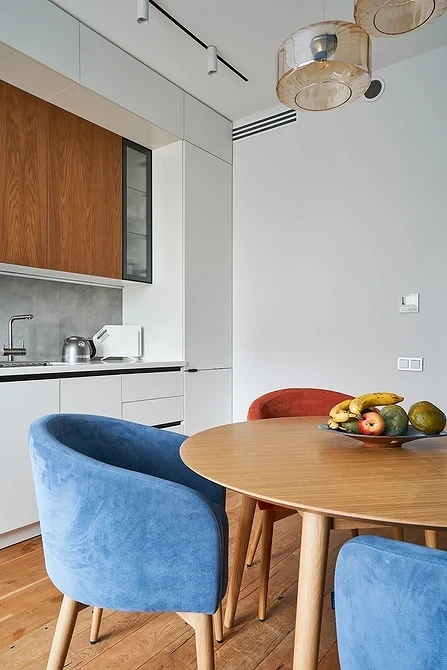
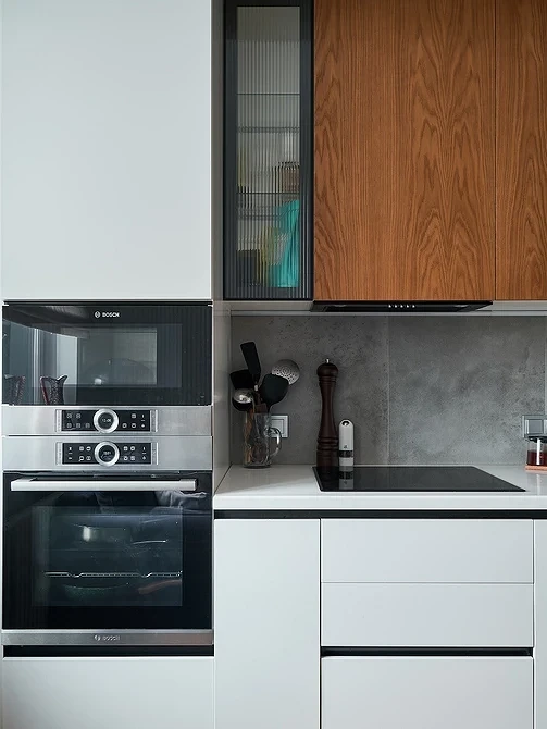
- It’s not necessary to make the upper and lower tiers the same color. Make the lower cabinets bright or black, and the upper ones white or wood-like. The contrast of shades will enliven the long monotonous surface.
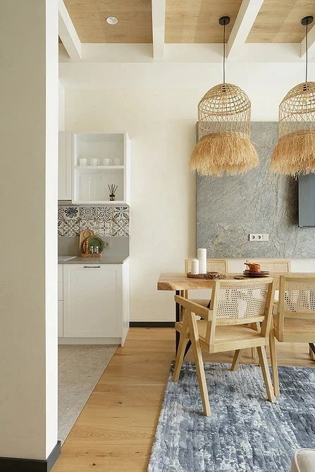
See how designers combine different shades and textures in both large and small spaces.
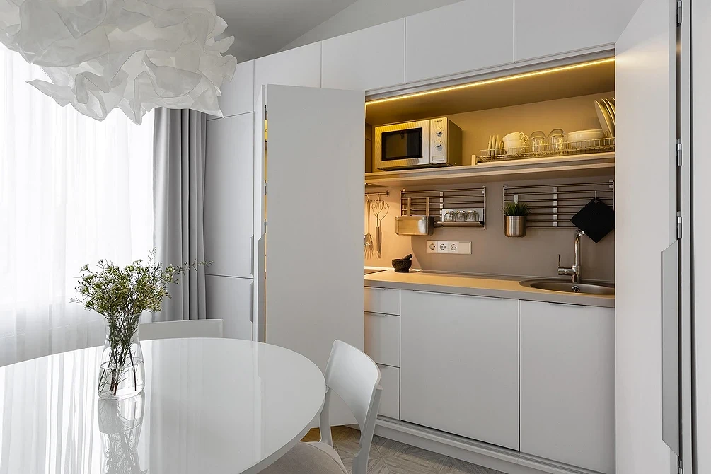
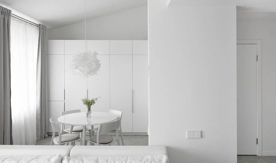
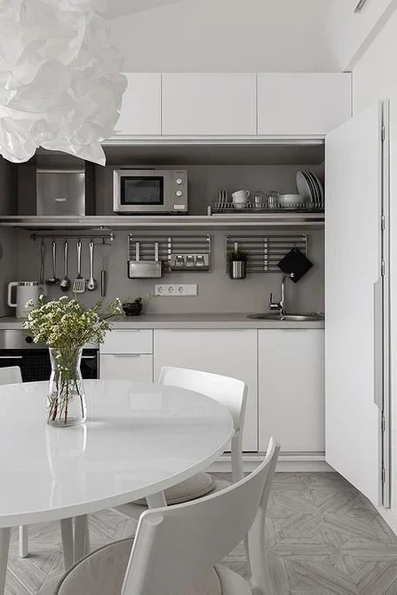
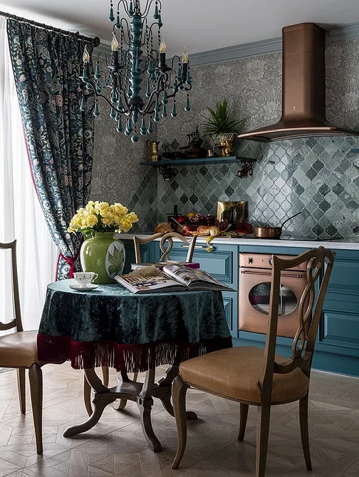
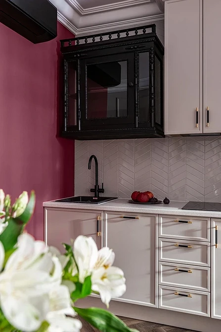
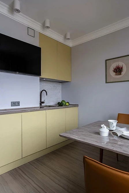
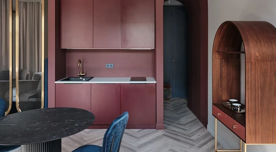
Planning a comfortable and stylish interior is possible even without a professional designer. Follow safety and ergonomics rules when placing appliances and choose neutral shades for the facades. Such a kitchen unit will remain relevant for a long time.
Leave feedback about this