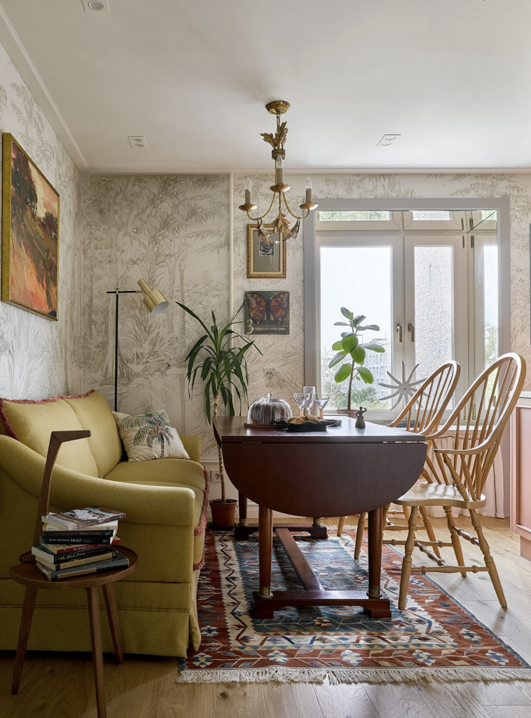
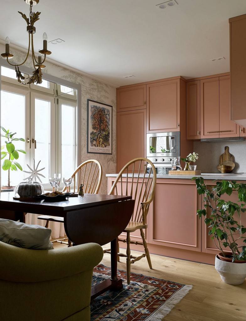
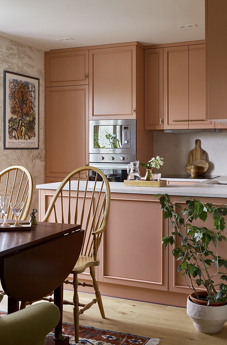
With an Interesting Color Combination
Since the designer decided to create two separate bedrooms in this two-bedroom apartment, the kitchen also took on the role of a living room. As a result, traditional elements of a relaxation area appeared: a carpet, a soft sofa, and paintings on the wall. The olive-green sofa upholstery forms a perfect color pair with the kitchen cabinetry in an unusual subdued shade of pink. The colorful and artistic interior is complemented by custom wallpapers with a black-and-white jungle and raccoon pattern.
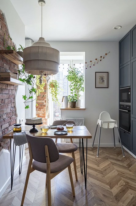
With Exposed Brick Finish
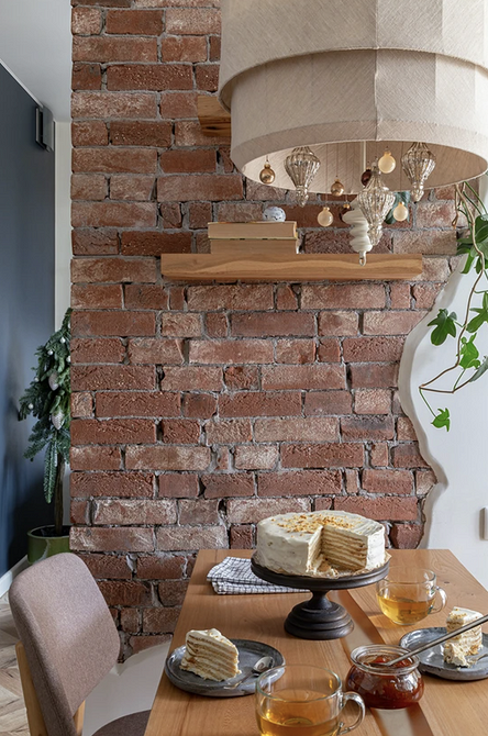
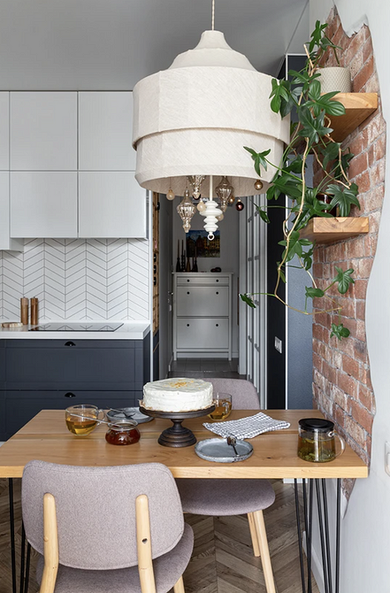
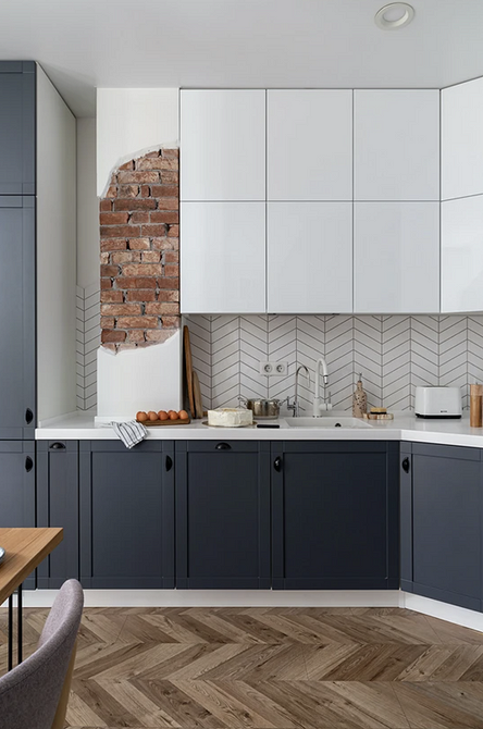
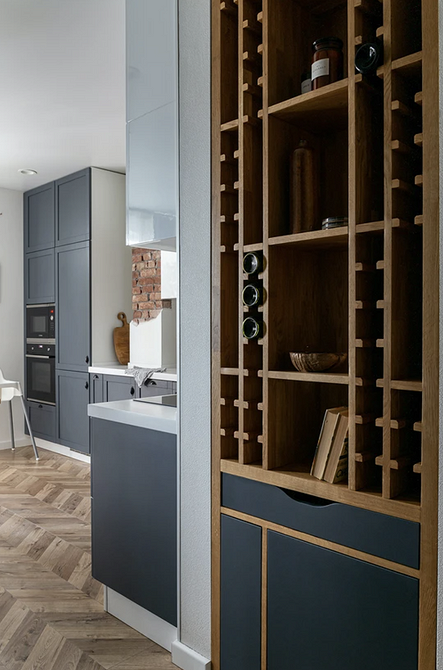
The highlight of this kitchen in a one-bedroom apartment is the real brick wall peeking through the white paint. This feature helped make the cozy space bolder and more creative. As a small family with a child lives in this small apartment, the cabinetry extends up to the ceiling. This makes the storage system more spacious. Another interesting detail is the built-in shelf in the hallway wall at the kitchen exit. It includes sections for wine storage and open shelves for decor.
With a Concrete Cabinetry
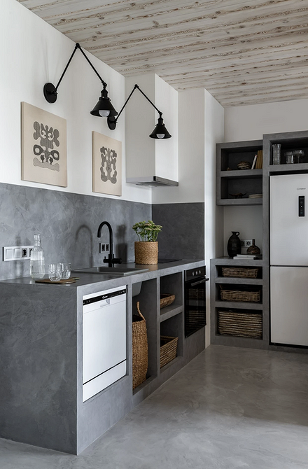
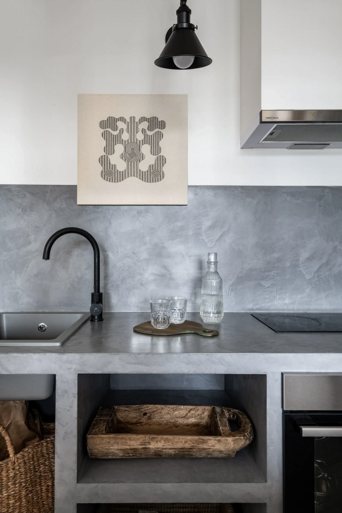
Designer Katerina Karavaeva designed her kitchen uniquely: instead of a monolithic cabinetry, she assembled a storage system from concrete blocks. To visually lighten the space, she opted out of upper cabinets on one side and chose all elements in clean, straight lines. This was important to prevent the open-plan apartment from feeling cluttered and to maintain a relaxed and restful atmosphere. The cooking area’s floor, made of micro-concrete, seems like a logical continuation of the cabinetry and kitchen backsplash. And the abundance of woven baskets and trays adds a vacation vibe to the space.
With a Unique Layout
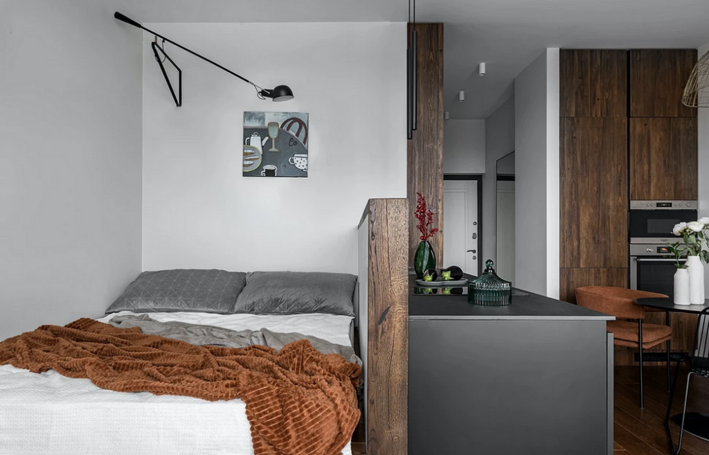
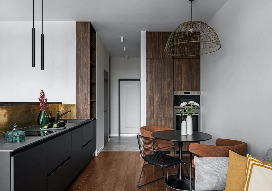
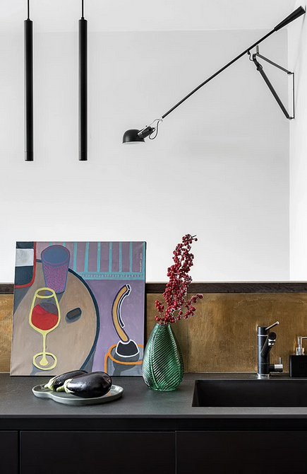
This kitchen is in a small studio with an open floor plan. Here, the relaxation area smoothly transitions into the cooking space, with the sleeping area located on a podium right behind the cooking panel and ceramic countertop. The kitchen area’s highlight is an unusual backsplash made of a brass sheet. However, the designer notes that this solution turned out to be more beautiful than practical: without polishing and treatment, the material changes its appearance under the influence of water droplets and regular cleaning. Otherwise, the space turned out to be very functional and stylish.
With Paneling on the Walls
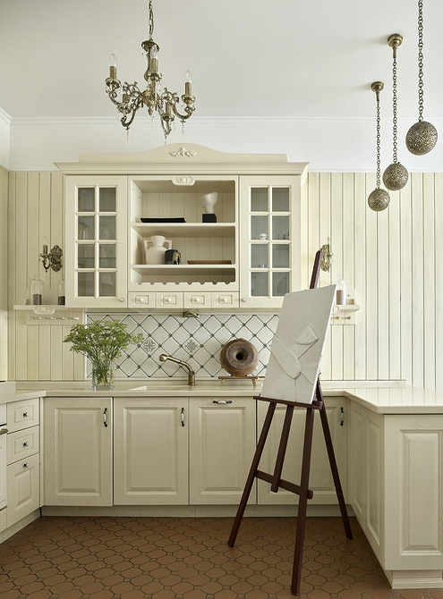
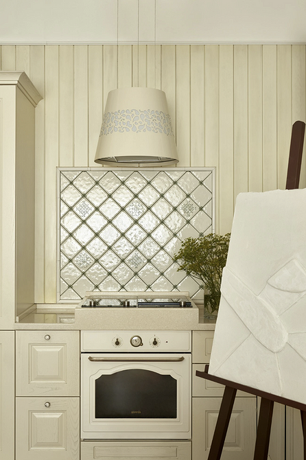
Architect Ekaterina Vorotnikova decorated her apartment in the style of a country house. There are many natural materials, cozy decorations, and natural colors. One of the project author’s favorite materials is wood, used here in an unconventional way. Thus, the kitchen walls are clad with paneling, whose shade matches the cabinetry color: this way, the abundance of textures does not overload the interior. The space turned out to be light and airy, and open shelves filled with the owner’s favorite decor make it individual.
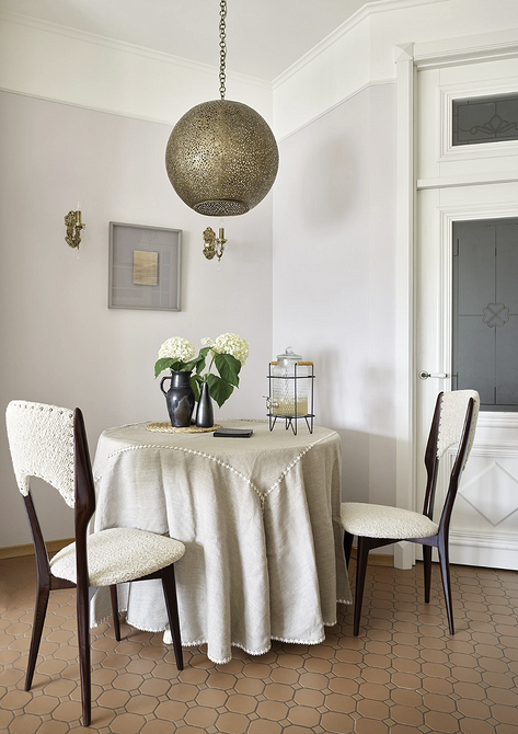
With Rustic Window Casings
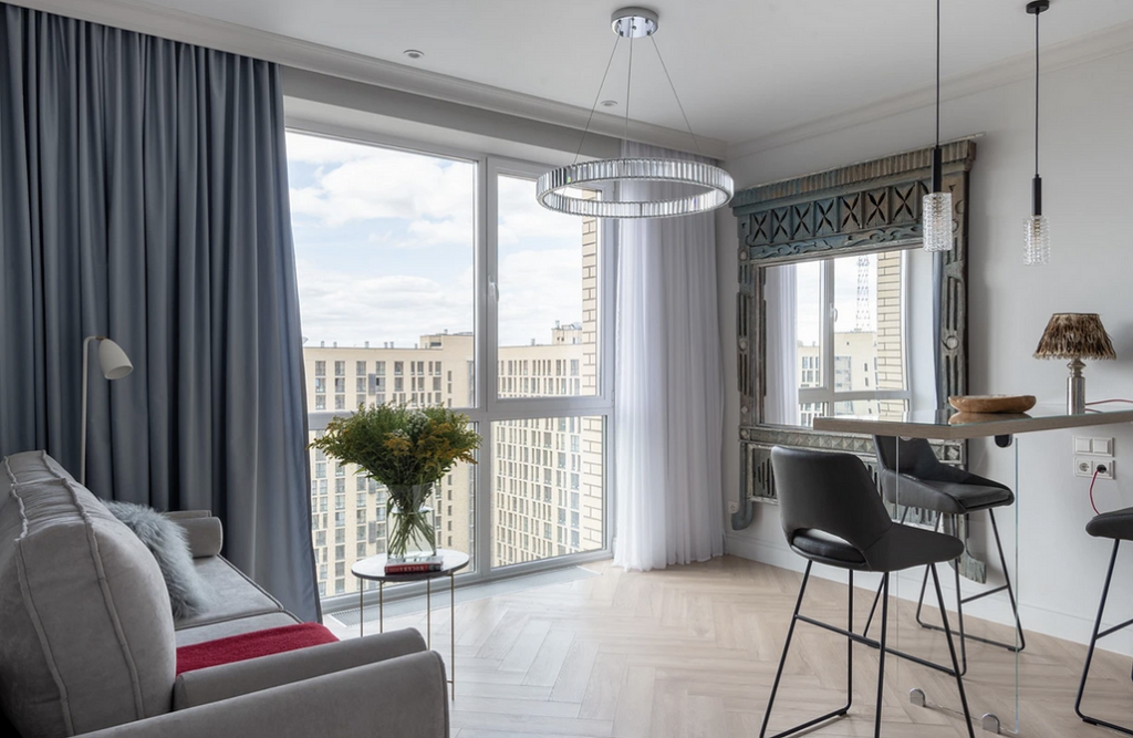
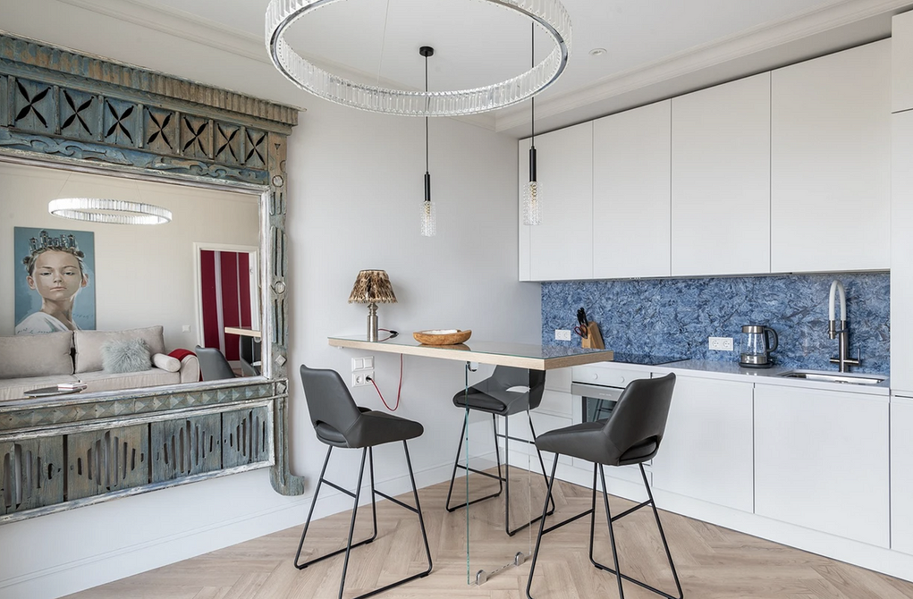
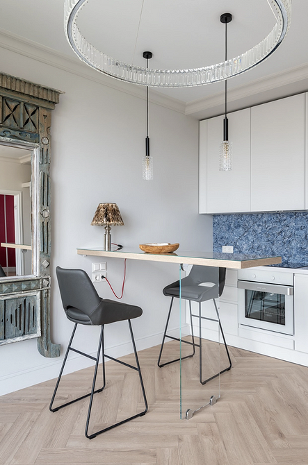
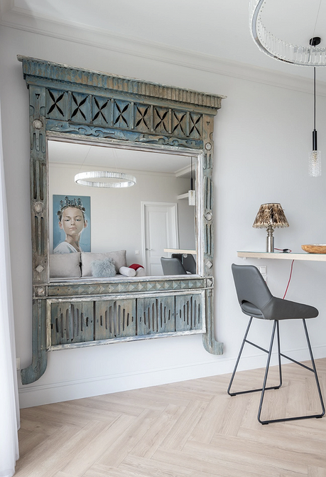
The most striking and unusual accent in this kitchen is the large mirror located next to the dining area, framed with wooden casings found by the designer in a village. They fit perfectly into the Scandinavian style of the interior, which involves the use of natural materials and ethnic motifs. Another interesting feature is the bar counter on a transparent support, replacing the traditional dining table to avoid overcrowding the space.
With a Hidden Cabinetry
Architects living in this apartment in Minsk aimed to achieve the perfect minimalist atmosphere by completely hiding the cooking area. To do this, all kitchen appliances, the sink, and the countertop are concealed behind sliding doors. When closed, the structure resembles a regular cupboard blending with the wall. Meanwhile, access to the kitchen remains quick and easy, and this solution does not complicate everyday life. A monochromatic snow-white palette enhances the sense of cleanliness and succinctness of the space.
With Beautiful Wallpapers and a Cylinder Hood
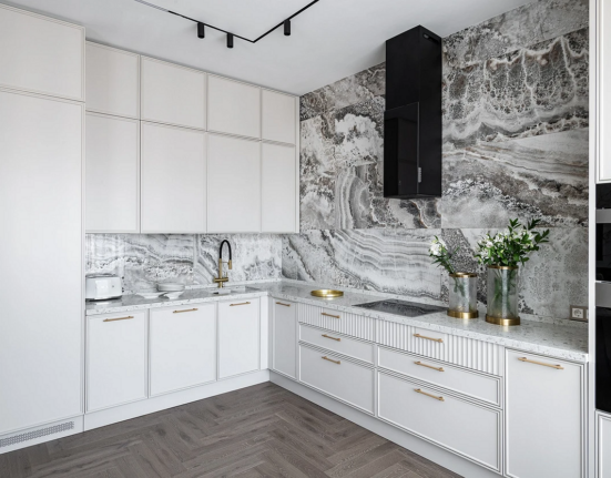
An interesting approach used by the designer in her kitchen is the neutral-colored wallpapers with a pronounced texture. They make the interior more expensive and interesting but are less costly than real stone or marble — one of the walls behind the cabinetry is tiled with it. Against this natural texture, the accentuated cylinder-shaped hood stands out particularly brightly.
Leave feedback about this