Ceiling-High Cabinets
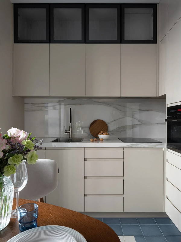
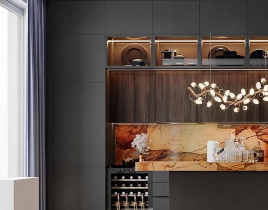
There’s usually a gap between standard-height upper cabinets and the ceiling. This is not only impractical (dust gathers on top, and it’s very inconvenient to clean), but it also visually cheapens the kitchen. Firstly, any such voids spoil the overall sleek picture. Secondly, the room seems tighter and lower. If you want a set with an upper tier, it’s better to make cabinets that reach the ceiling. This can be either an extended form or just an additional mezzanine tier. This way, the kitchen will appear more spacious and elegant.
Quality Hardware
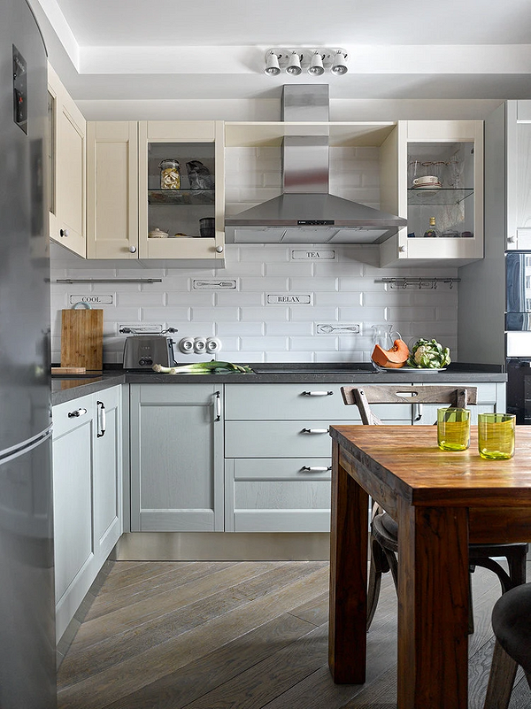
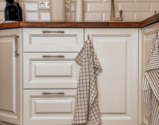
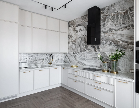
This tip is relevant both for those setting up a new kitchen and those wanting to refresh an existing one. A typical kitchen set often looks cheap due to standard hardware of odd shapes or with chrome shine. Replacing handles (or initially buying good ones) is inexpensive and easy, and such a small action can completely transform a budget interior. Choose them depending on the concept: if the design is minimalist, handles should be sleek, while in eclectic or neoclassical styles, they can become an interesting accent.
Textiles in a Single Style
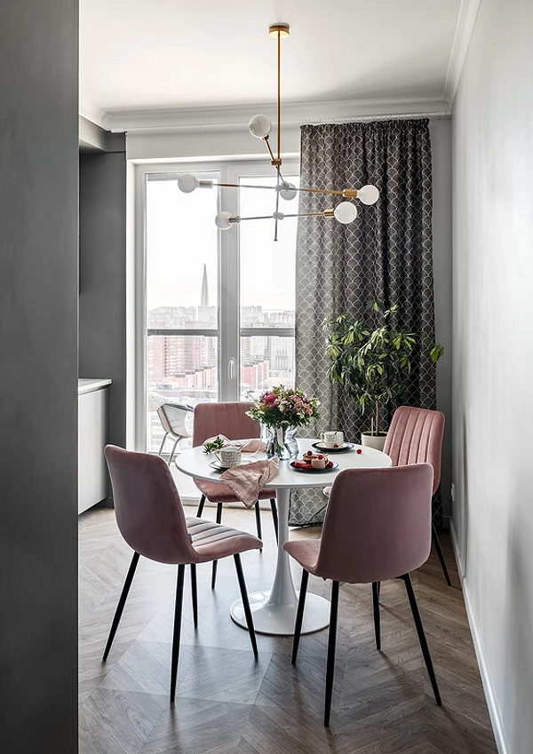
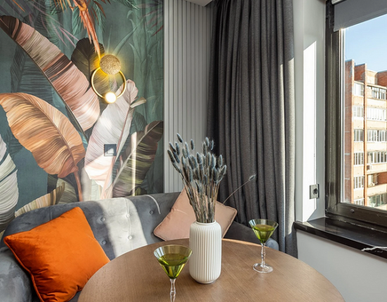
Some may prefer a floral tablecloth and colorful towels, but if your goal is to make the kitchen look more expensive, you should forget about the riot of colors and patterns. Gather one or several sets of kitchen textiles in one palette and style. It’s better if these are calm, noble shades: gray, coffee, blue, beige, olive. It’s good if the curtains on the windows also support the overall concept.
Correct Shades
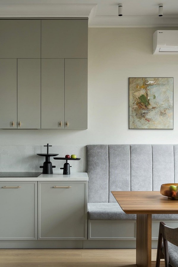
The color palette of the kitchen not only affects the mood but also the overall perception of the interior. Overly bright, open shades on glossy surfaces can ruin even expensive furniture. Choose noble, complex shades for the kitchen set, dining group, and finishing. It’s best to stick with the basics (beige, gray, brown). If you want to use white, opt for a diluted version, with a light gray, pinkish, or cream undertone.
Absence of Visual Noise
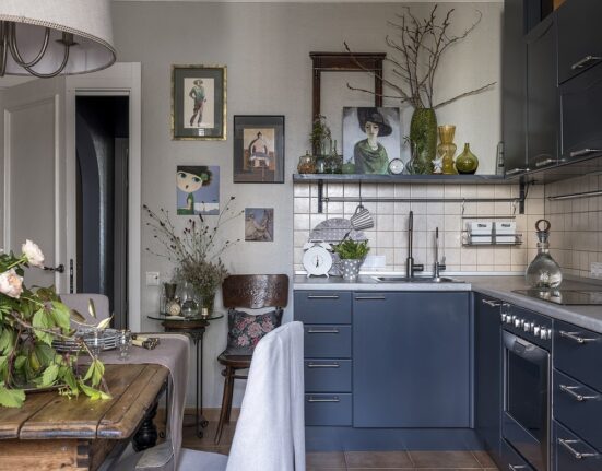
Visual “silence” transforms even the simplest kitchen. Yes, maintaining perfect order in everyday life is almost impossible, but it makes sense to make the task easier for yourself. Plan sufficient and convenient storage, try to make it closed. Free up the countertop — keep only the essentials there. If you like open shelves, buy identical containers for the products that will be stored there. Cooking accessories, cutting boards, potholders should also be chosen in a single style to avoid cheap clutter.
Thoughtful Lighting
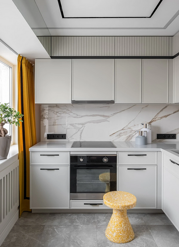
Beautiful light fixtures are good, but it’s important to properly plan the entire lighting system as a whole. First, let in as much natural light as possible: you can completely forego curtains or hang light drapes. Second, ensure that each area is sufficiently lit. The absence of dark corners and looming shadows will positively affect the perception of the interior, and colors that might look dull or simply unattractive in half-shadow won’t be distorted.
Uniform Color Appliances
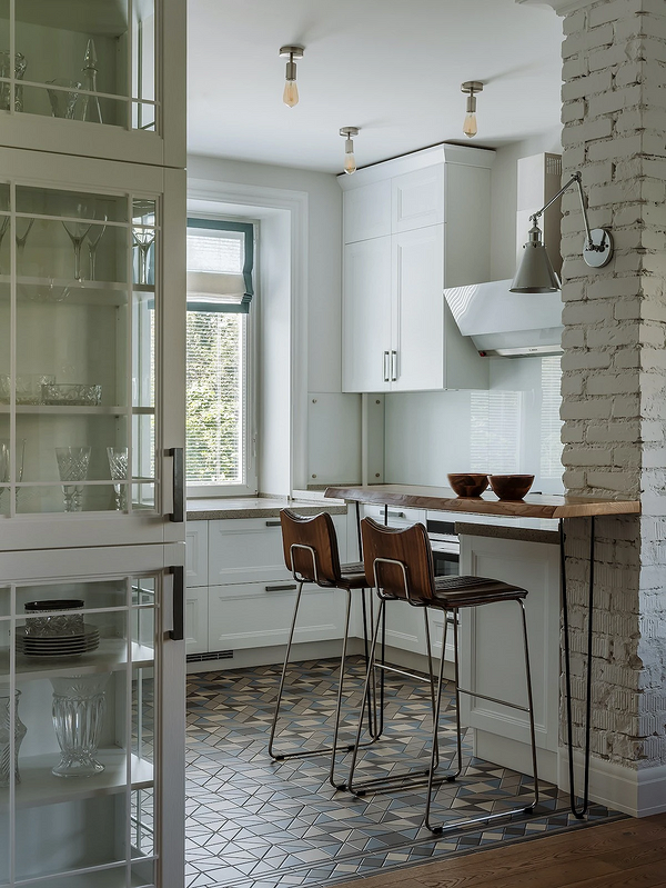
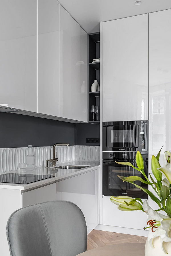
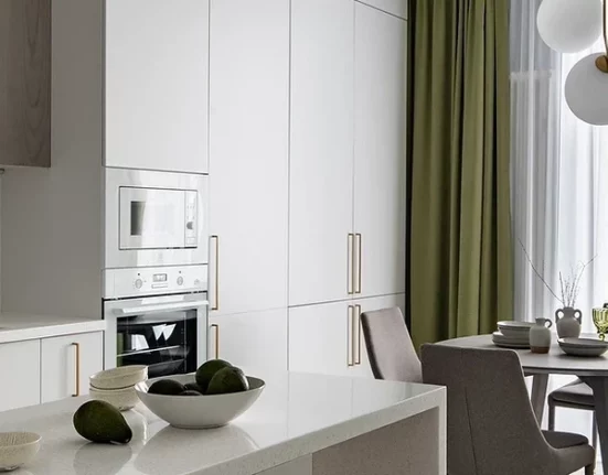
Decide right away what color appliances you want in your kitchen: contrasting with the kitchen set or matching it. Classic colors are black and white, which most models come in, and there’s no problem matching shades when you buy something new. Chrome models are not the best choice as they often look outdated. Colored appliances are an interesting approach, but if you go for it, try to choose at least several items in the same shade (usually from one manufacturer).
Leave feedback about this