Rectangular rooms are a common feature of typical apartments. If the difference between the length of the walls is not too great, then there are hardly any problems. The situation is more difficult with narrow elongated rooms. Now let’s take a look at what to do in each case!
Features of Layout and Design
A fail-safe layout for a rectangular room is one that visually brings its shape closer to a square while efficiently using every inch of space. This is achieved through design techniques applied during the finishing stage, which we will discuss later.
Another option is to divide the room into several distinct zones and then bring each of them closer to a square shape. This requires an island layout and color and lighting zoning. If the overall square footage allows it, even partitions or drywall constructions can be used. Minimalistic interiors work best here. Check out the contemporary style, which is entirely based on practicality and functionality. However, there may be issues with classic designs that lean towards symmetry and pronounced centers.
How to Arrange Furniture?
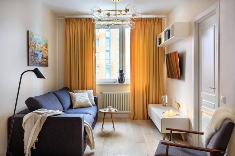
If the rectangular room is not too narrow, you can concentrate all the main furniture along one wall. Such a linear arrangement is often used in the kitchen, leaving more space for rest and hobbies.
For clear room zoning, choose an island layout. Mentally divide the room into squares and decorate each of them as a separate room within a room. Turn the sofa perpendicular to the long wall, use light through shelving instead of partitions, and set up a bar counter.
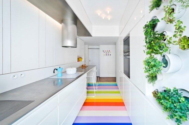
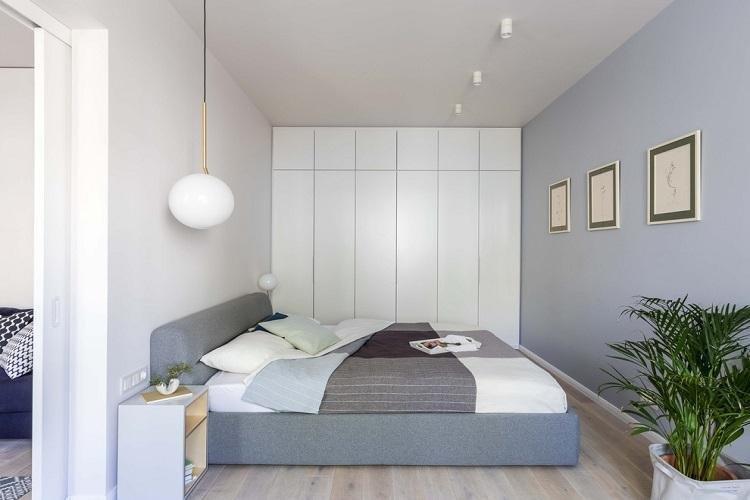
Instead of a lot of furniture, try installing one built-in wardrobe along the entire narrow wall from floor to ceiling. It will accommodate all your belongings, cut the long wall, and eliminate the need to look for places to put dressers and shelves. But if it cannot be placed there, it is better to abandon it altogether.
Unusual broken arrangements look great in spacious rectangular rooms. For example, a sofa or bed angled to the wall attracts all attention to itself. The problem with such layouts is that furniture often needs to be custom-made to fit your measurements.
Zoning a Rectangular Room
Zoning with partitions is the simplest and most obvious technique. These can be low drywall constructions, sliding partitions in Japanese style, modern glass blocks, or even curtains – it all depends on your layout.
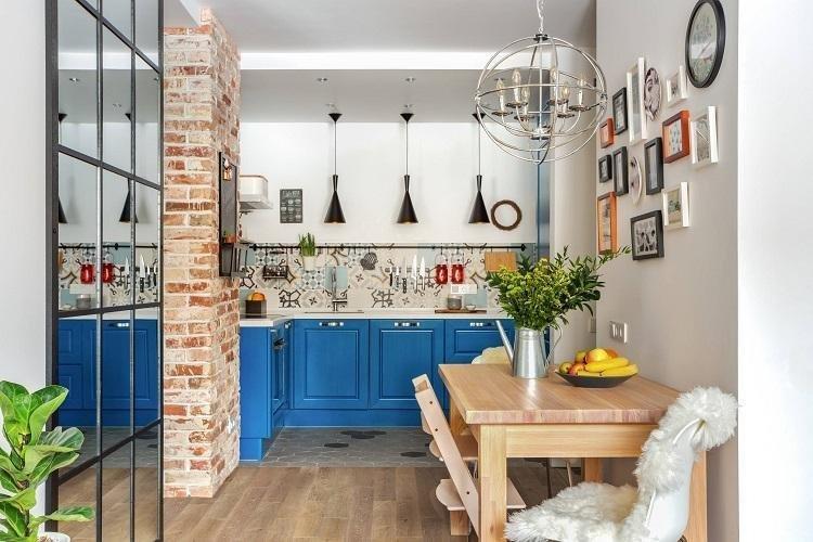
The primary visual technique is a combination of different finishing materials. This can be different collections of companion wallpapers, or a combination of laminate with ceramic tiles. To make the border less contrasting, use one main color for painting the walls, but in several adjacent shades. Alternatively, make one of the zones a bright accent – with a brick finish or photo wallpapers.
Drywall constructions do not necessarily have to be vertical. Multi-level ceilings with complex lighting for each separate zone are also a working option. On the floor, you can have podiums, which also help to use different coatings without seams or thresholds. In a high podium, you can embed drawers for things or even a pull-out bed.
Finishing: How to Change the Room’s Shape?
Two of the most powerful visual techniques can help you correct the shape of a rectangular room. Firstly, you need to break symmetry, erase clear boundaries, and shift centers. Secondly, use bright accents that shift the focus to themselves.
Floor
The best option for the floor in a rectangular room is a covering with the same elongated rectangular pattern. For example, parquet, laminate, or tiles stylized to look like them, which are laid along the long walls. Use small decorative rugs of different shapes and textures for zoning.
Walls
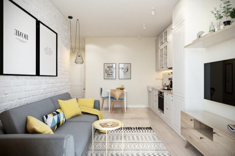
A short accent wall opposite the entrance immediately attracts attention. Use textured plaster, bright paint, brick finish, stone cladding, contrast wallpapers, or a whole composition of bright panels for this purpose. To add dynamics, shift the active zone to this part: a coffee table with chairs, an armchair with a bookcase, a small green corner.
If you are zoning the room with different finishing materials, shift their transitions. The point is that the joint should not be at a sharp angle or in the middle, but in some more unexpected place. This breaks symmetry and immediately transforms the geometry of the room.
Remember that vertical stripes visually elongate the outlines and raise the ceiling. Horizontal stripes expand the walls, but they need to be periodically broken by perpendicular verticals. For example, with furniture arrangements or compositions of paintings and photographs.
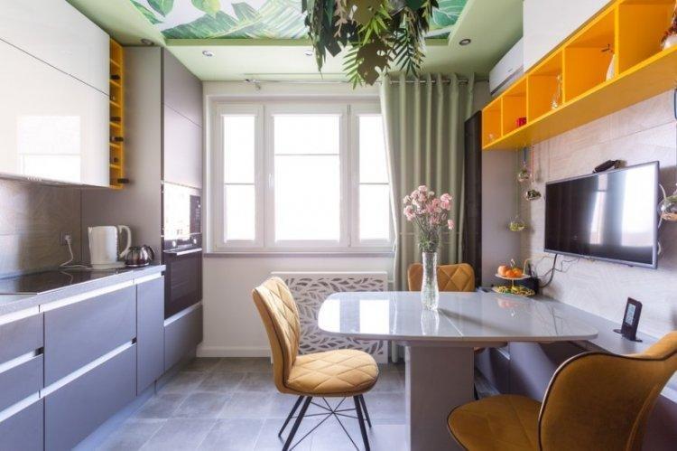
A strong technique is to blur the expressive boundaries between walls and ceilings. Paint them tone-on-tone or choose a matte stretch fabric of the same shade. This also creates a feeling of space, airiness, and height.
Do not use a one-level glossy ceiling throughout the room if it is very narrow. Reflection gives volume, but it gives it upward – which exacerbates the situation even more. In this case, it is better to make a multi-level construction and install glossy inserts zone-wise.
Lighting and backlighting
Lighting allows you to correct all those shortcomings that remain after choosing finishing and layout. It provides both a visual and functional effect, so do not neglect this aspect.
Chandelier and Light Fixtures
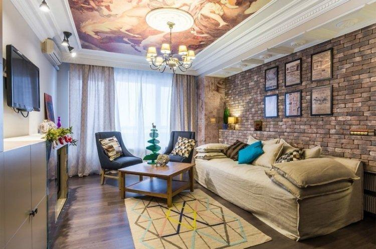
A large central chandelier in a rectangular room is simply not effective because the light is not evenly distributed. If you want, use a series of pendant light fixtures zonally: over the table, sofa, or bar counter. You can complement them with wall sconces with upward streams of light – this visually raises the ceiling.
The most comfortable light is provided by spot light fixtures along the perimeter, especially with a brightness regulator. You can also arrange them in two rows along the short walls to visually enlarge them. They are also perfect for complementing multi-level ceiling structures, both stretch and drywall.
Decorative Lighting
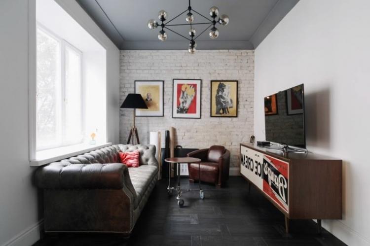
Decorative lighting helps both zoning and creating atmosphere. With the help of LED strips, you can emphasize podiums, niches, and drywall structures. An asymmetric floating ceiling, which is made precisely with LEDs, looks interesting. The same strips are suitable for decorating shelves, work areas, cabinets, or racks.
Rectangular Room – Interior Ideas
As we have already found out, rectangular rooms are not uncommon. And some rooms, like hallways or kitchens, almost always look like that. Let’s take a closer look at what you might encounter in real life!
Design of a Rectangular Kitchen
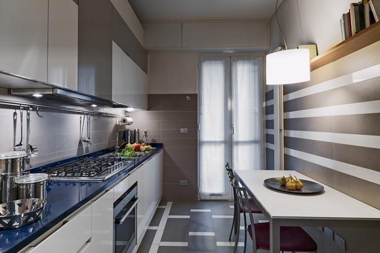
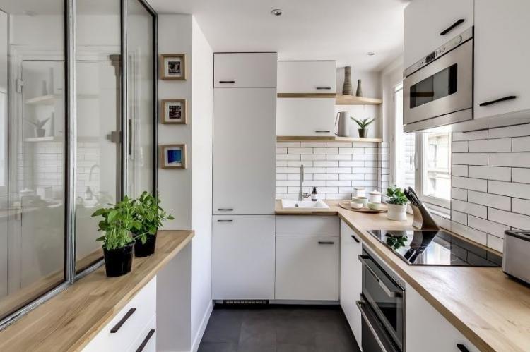
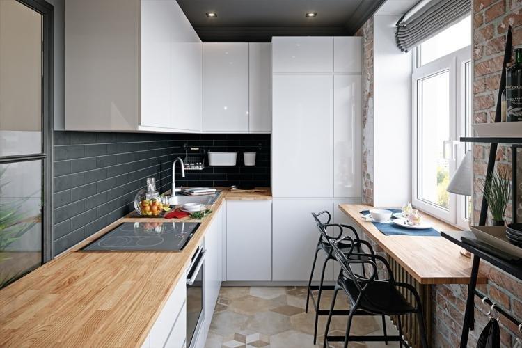
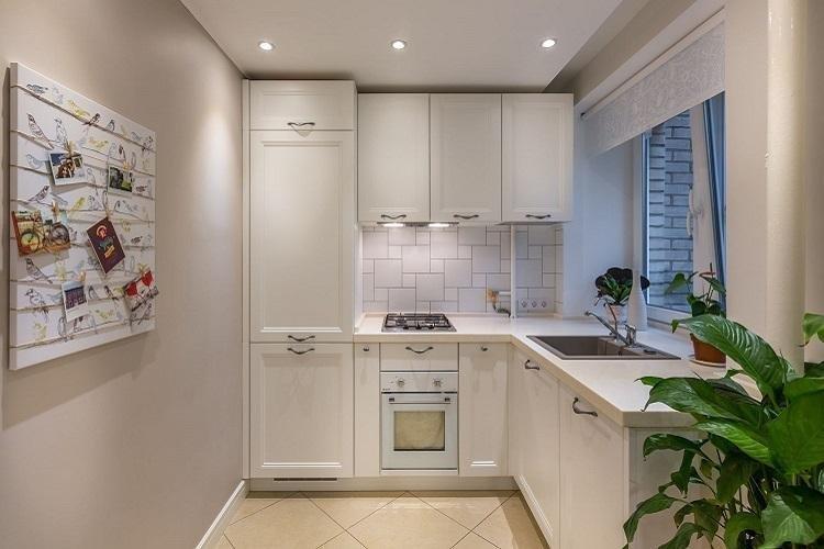
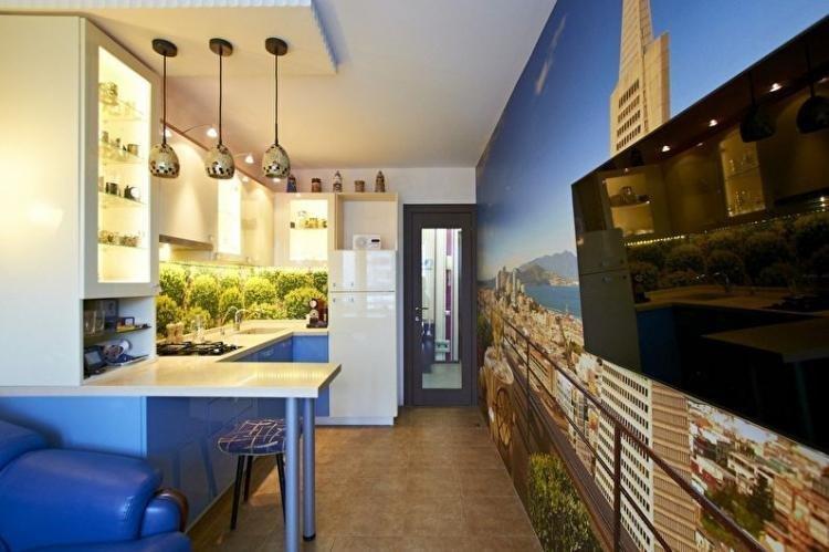
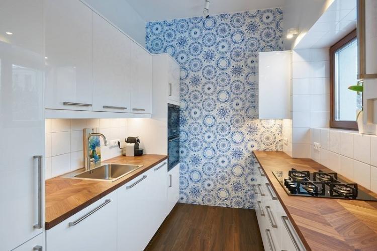
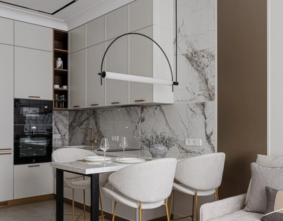
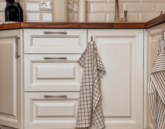
The main difficulty of a rectangular kitchen is not turning it into a compartment carriage. Move the active dining area to an accent narrow wall, use the windowsill as a countertop, and divide the room with a bar counter. If the cabinet is near the short wall, a linear one will do, but in other cases, choose a corner or island one to conveniently arrange the work triangle.
Design of a Rectangular Living Room
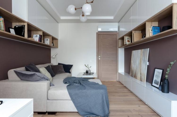
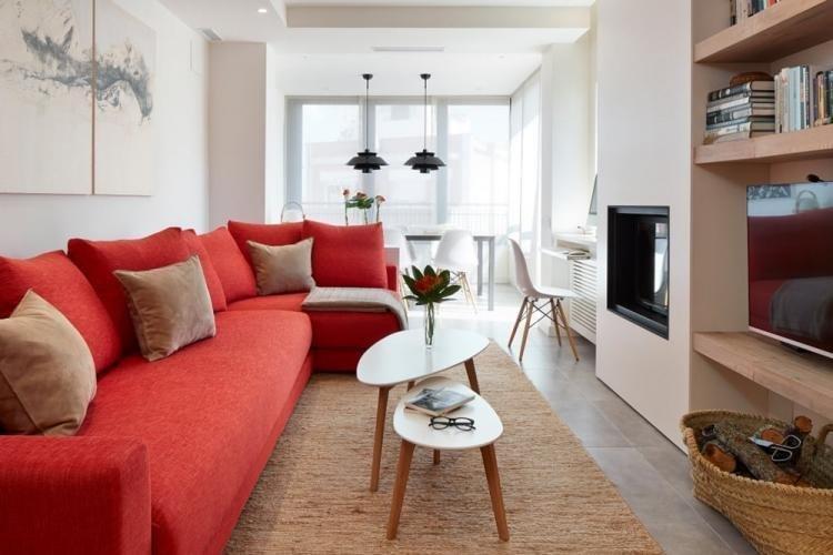
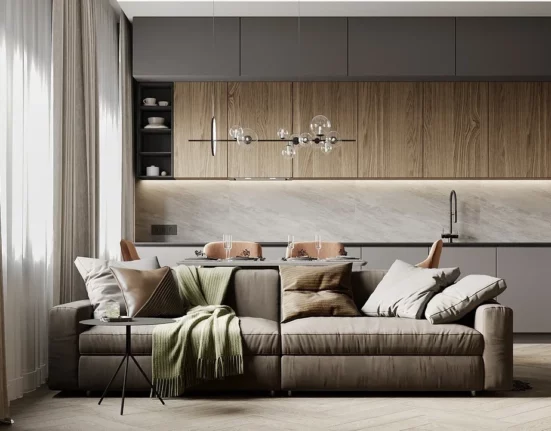
Start with where the seating area will be and how the sofa will be placed. In spacious rectangular rooms, it will fit nicely and can be placed along the long wall opposite the TV. But in too small and narrow rooms, pay attention to corner models, place it perpendicular, or replace it with several randomly placed armchairs.
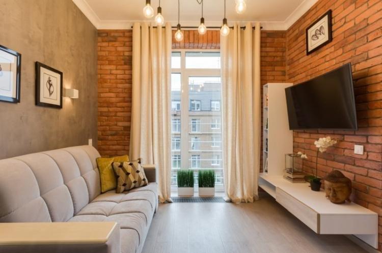
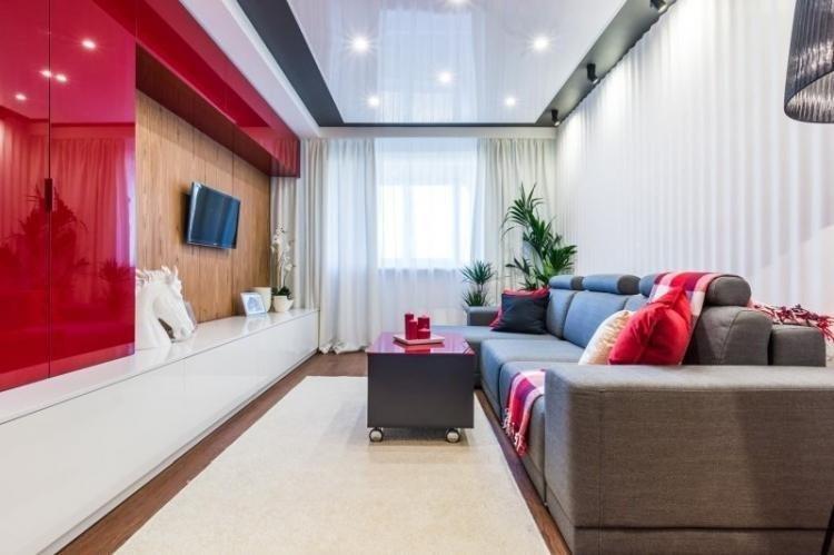
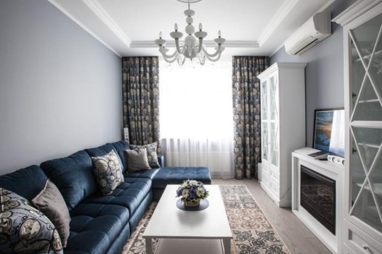
Design of a Rectangular Bedroom
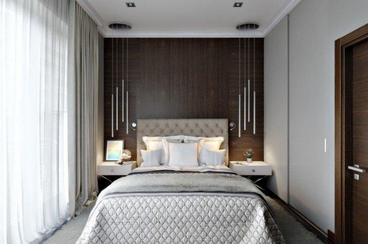
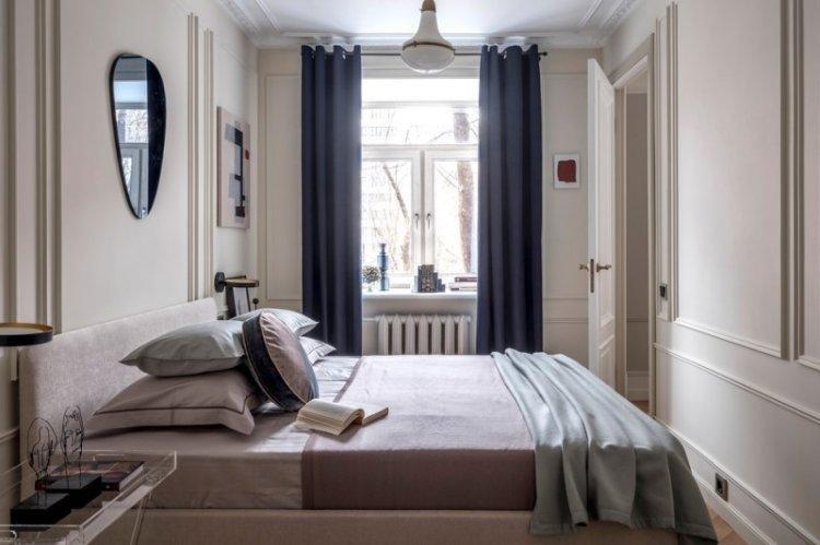
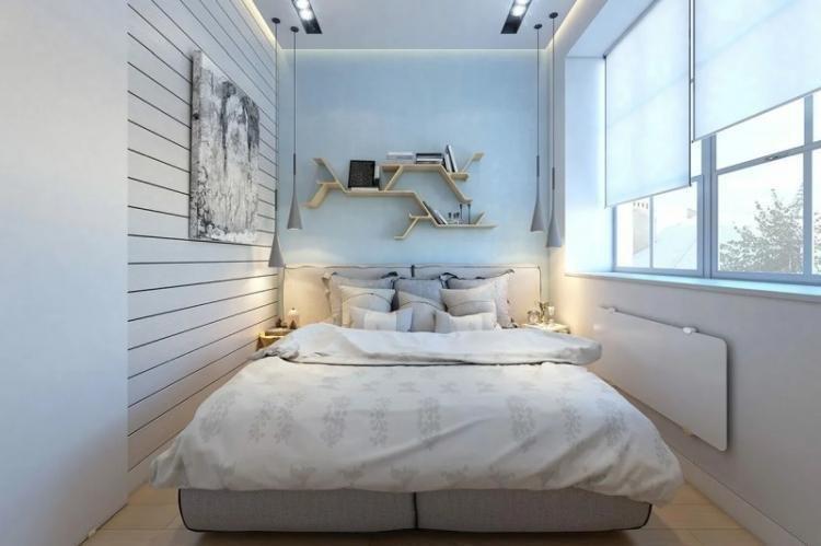
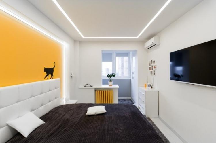
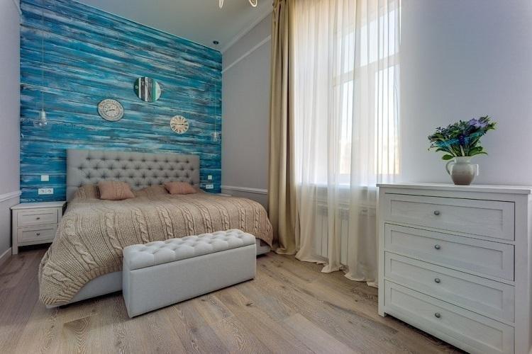
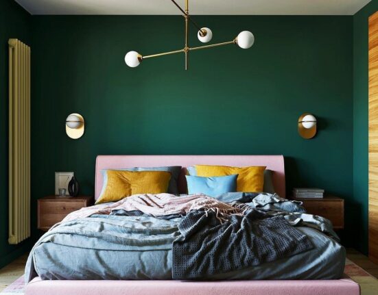
A rectangular bedroom looks best with a minimum of furniture or with one large wardrobe against a narrow wall. The main thing is to consider the placement of the bed in relation to the width of the room, so that there is a comfortable passage on all sides. Move all other details to the opposite side of the room – and you’ll have that expressive zoning.
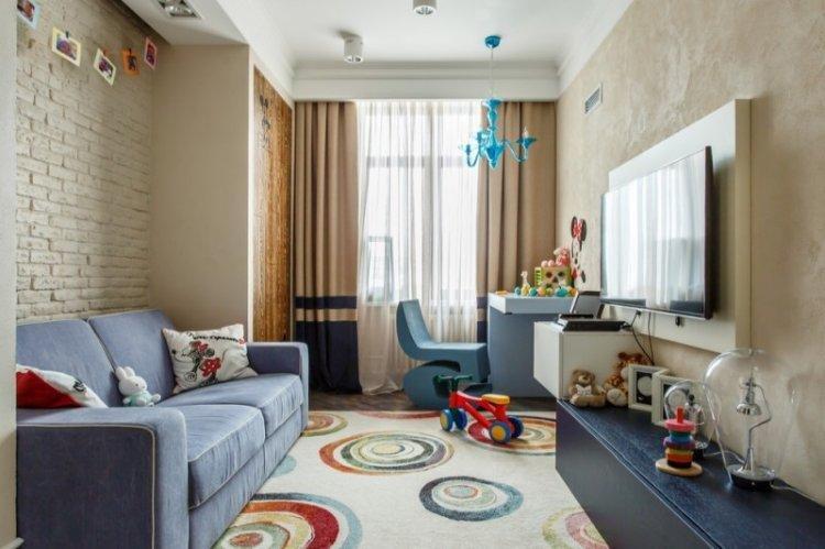
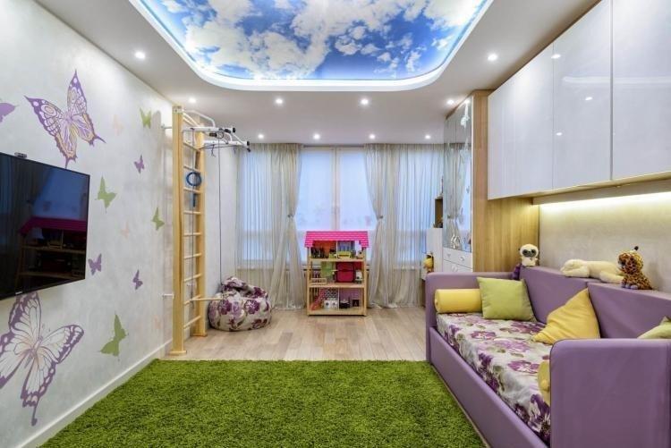
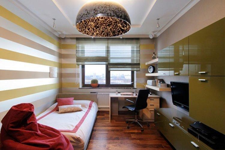
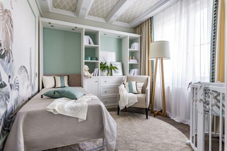
Design of a Rectangular Kids’ Room
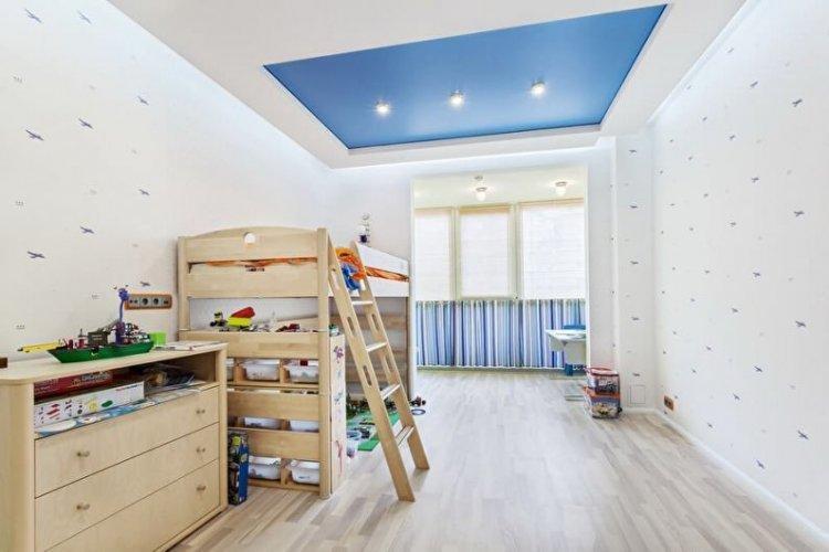
In a kids’ room, it’s important to have at least three zones – for sleeping, studying/hobbies, and play/leisure. In this case, a rectangular room is more of a plus because you can simply arrange them one after the other. And if you don’t have enough space, use corner transformer sets, where the bed is already combined with shelves, a wardrobe, and a desk in one multi-level construction.
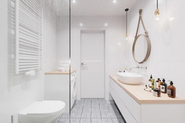
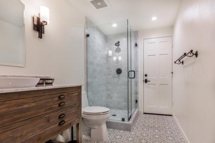
Design of a Rectangular Bathroom
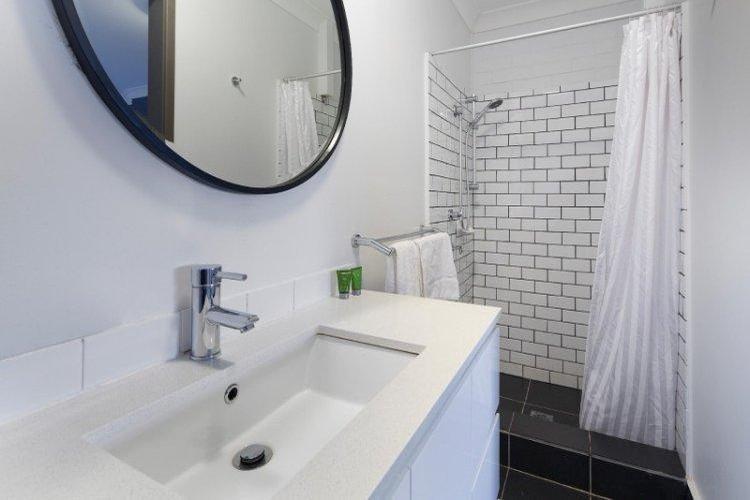
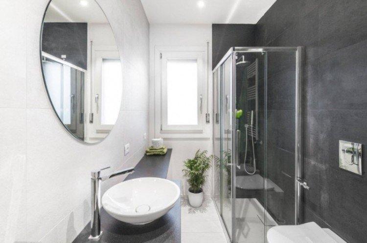
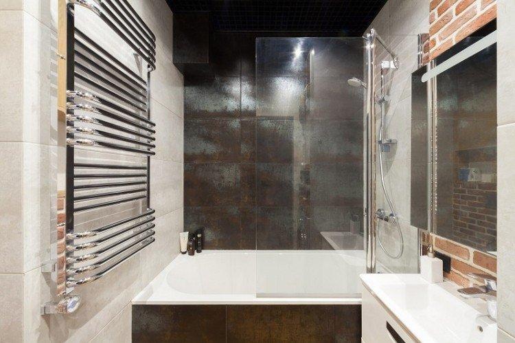
In the bathroom, the technique of shifting active centers works again: for this, install the bathtub against the short accent wall. Furniture is better placed either in the corners by the door, or in the form of a small linear set. But choose the most narrow and compact models, ideally with sliding doors instead of swing doors.
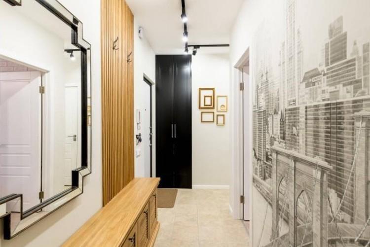
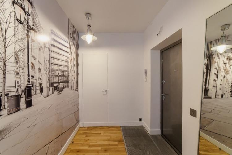
Design of a Rectangular Entryway
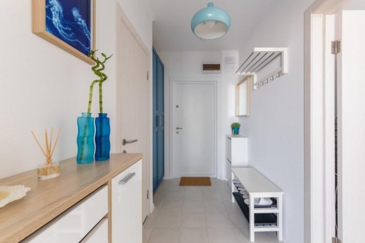
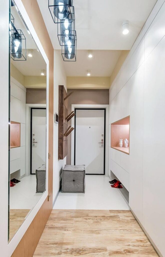
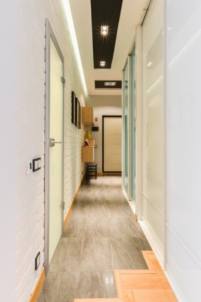
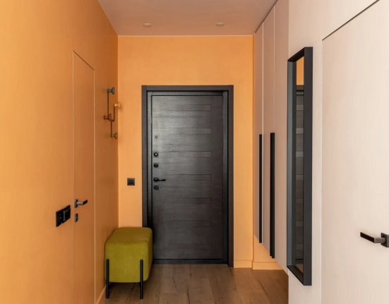
A rectangular entryway that smoothly transitions into a corridor is a classic. And this is probably the only case where a large wardrobe or set can be left near the long wall. Here, it’s more important not to turn the room into a square, but to make it as practical and functional as possible, with all passages and doors.

Leave feedback about this