This shade has earned a reputation for being both noble, suitable for a refined interior, and positively warm, perfect for a country setting or eco-style. It complements color accents well: it softens overly bold strokes but does not draw attention away from them. It also stands out well on its own — a room done in creamy-sandy tones looks sophisticated and succinct. From our article, you will learn which colors beige goes best with and how to make it beautify your home, not make it boring and dreary.
Features of the Shade
The cream-chocolate palette evokes the most pleasant feelings, as these are natural, everyday colors we constantly see around us. This spectrum of nature (sand, soil, tree bark, natural wool) and food (coffee, tea, bread, nuts) is associated with stability and comfort. People who value comfort and confidence in the future choose beige.
This shade calms, reduces excitement in active people, decreases anxiety, and minimizes aggression. However, it also saps energy and makes a person more passive, so it is not advisable to use it to decorate an office, creative workshop, or fitness room. But for a bedroom, living room, or kitchen, this palette is just right.
With beige, one must be careful: the wrong choice of companion can turn it from aristocratic to plain and tasteless. What colors does beige go best with? Primarily with neutral achromatic ones. In addition to these, a duo with pastels — any part of the spectrum will look appropriate if you choose its more faded, less bright variant: lavender, salmon, mint, etc. It also looks good with a natural palette: grassy, terracotta, chestnut, and other tones. If you prefer bold, contrasting colors, choose dark and saturated colors, and avoid neon shades.
Pros and Cons
The beige-brown palette can either enhance your home or irreversibly spoil the interior.
Pros
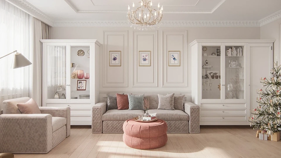
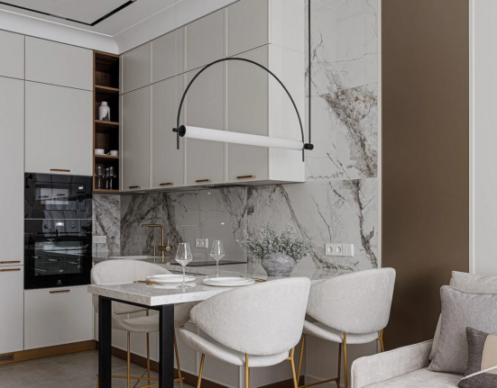
- Beige is the preferred choice when decorating a traditional classic interior: it’s strict enough, yet cozy and not as striking as dazzling white finish. By the way, if you like this option, answering which colors go well with beige walls in this setting is easy: all natural understated tones fit, as well as gold and silver.
- Beige also suits if you’re tired of garishness and crave a gentle, calming environment. Its unobtrusive shades relax you, enveloping you with their gentleness and warmth. It’s made for leisurely relaxation, reading your favorite book, and conversing with loved
ones.
- If you like bright colors but are unsure how to harmonize yellow, turquoise, and orange in your living room or dining room, think about which colors go well with light beige. It becomes clear that it can be the unifying factor: against its background, bright tones do not look screaming.
- If you’re proud of the antique furniture in your living room? Does your bedroom offer a magnificent view from the window? Do you have a unique collection you want to admire every day? The light-brown palette provides a fitting frame for all these items, as it doesn’t distract from them.
Cons
- The color is quite banal and can cause boredom if used too much. It has been used so widely and for so long that it’s hard to imagine an apartment without a room in beige tones. With this shade, your home can’t look fresh and original. On the other hand, such a palette exists beyond fashion and time: it’s unlikely that creamy-sandy tones will suddenly be considered tasteless and kitschy, meaning your renovation will still look appropriate even after 10 years.
- Furthermore, beige can be called featureless — it’s unlikely to add individuality to your home. However, this problem is easily solved by adding striking contrasts: a bright rug, pillows, or curtains — and the room will already have character.
- If a beige palette dominates the interior, you’ll need to carefully select lighting. On the south side, this range may turn yellow, with weak light sources it sometimes looks dirty, and bright cold LED lights negate the coziness it creates.
What Colors Go Well with Beige
Light brown may seem simple and unassuming, but its tones are deep and multifaceted. To fully appreciate this, you need to select the right colors to complement it. When decorating rooms, first find out which colors match beige (photos and tips in our article will help you quickly understand the nuances of this palette) to avoid having to redo the decor later. So, which shades pair well with this palette?
With the Beige-Brown Palette
You can design an entire space in related tones. This is quite justified — what color goes best with light beige if not with its own spectrum in darker versions (nut, cappuccino, caramel)? Highlight the light finish with contrasting coffee-chocolate colors.
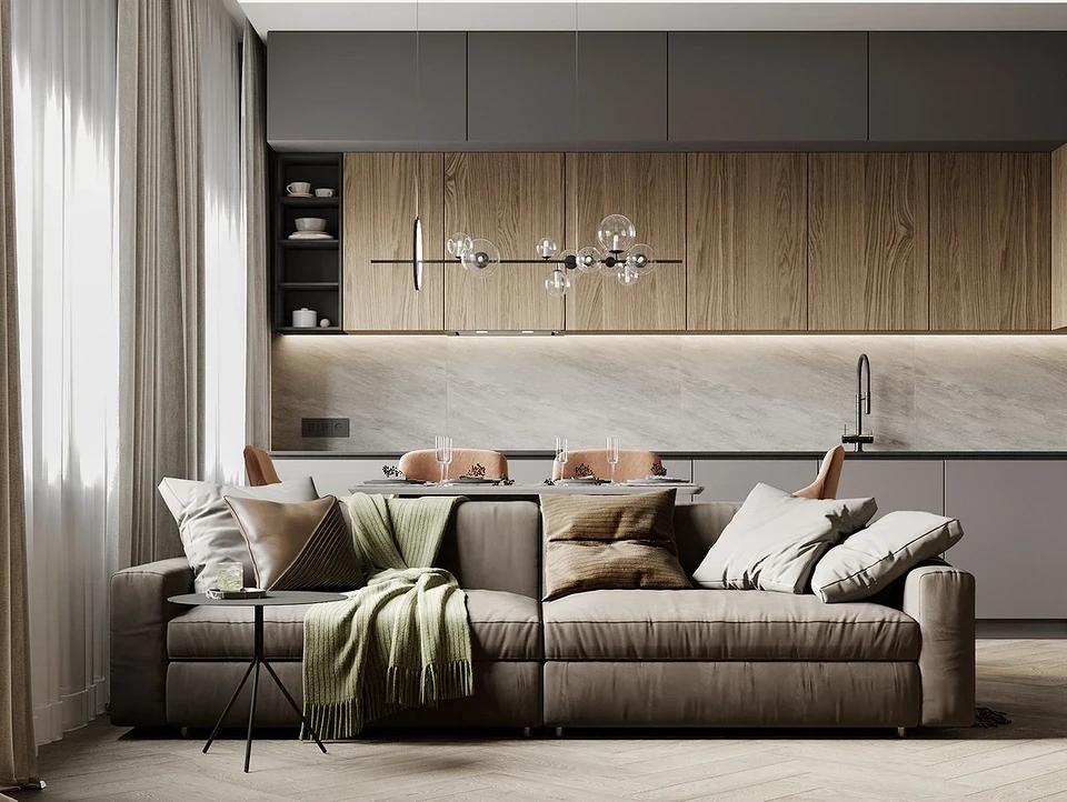
To avoid a dreary look, just add bright accents — interior textiles, unusual lamps, or a striking carpet in rich shades. If it’s a bathroom or bedroom where contrasts are unnecessary, you can use a play of textures: smooth and textured, soft and hard, glossy and matte.
These are the most practical, stylish, and timeless combinations. Meanwhile, with pure white, you get a light, elegant, and somewhat ceremonial interior. With black — imposing and pretentious. With gray, the look of the home is strict and neutral, but the room can turn out boring and forgettable. To avoid this, use more shades: transitions between them will give the room volume and make it more interesting.
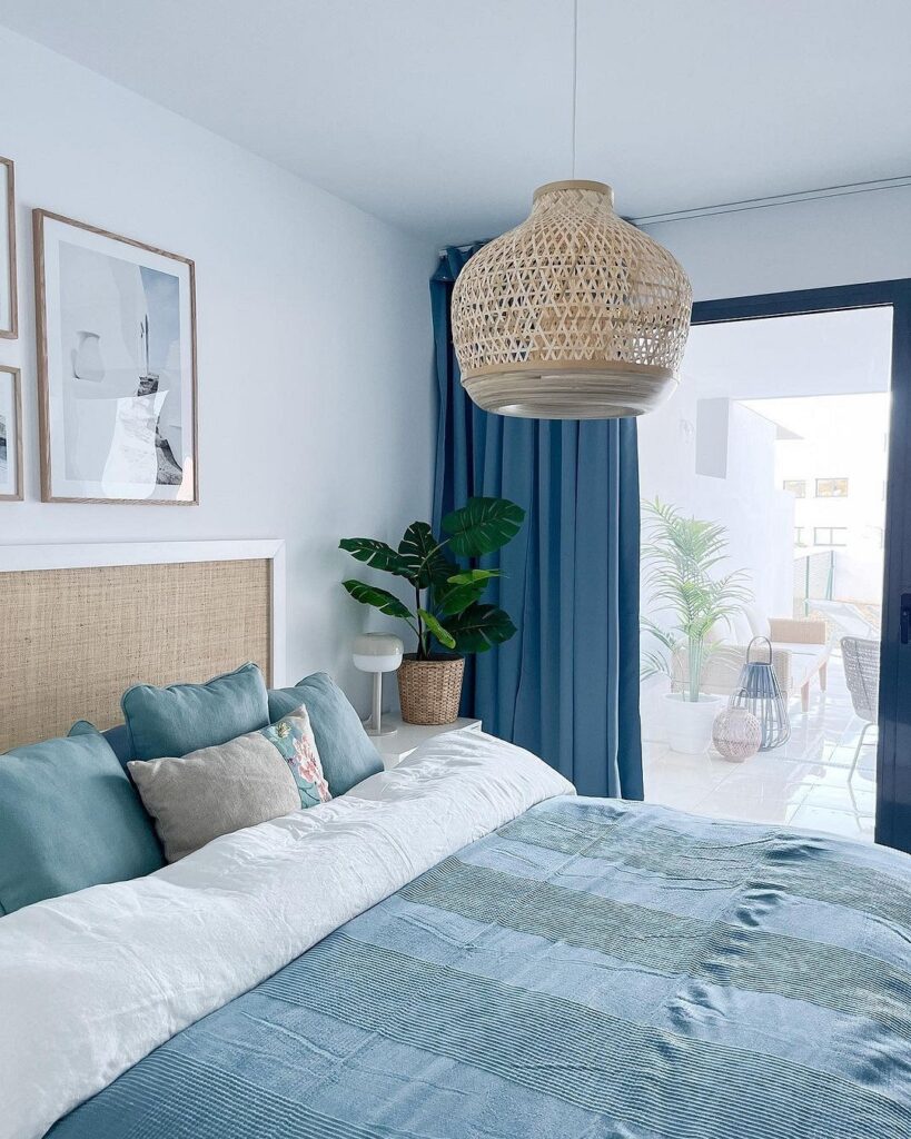
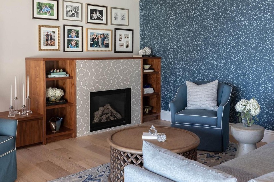
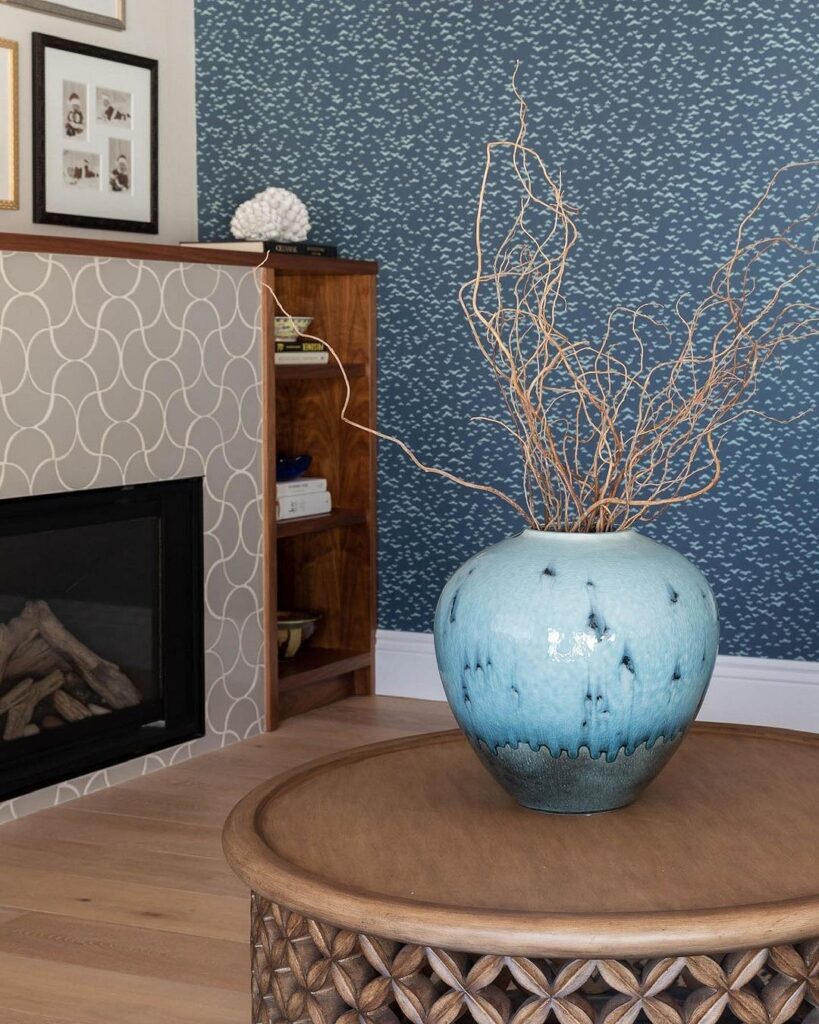
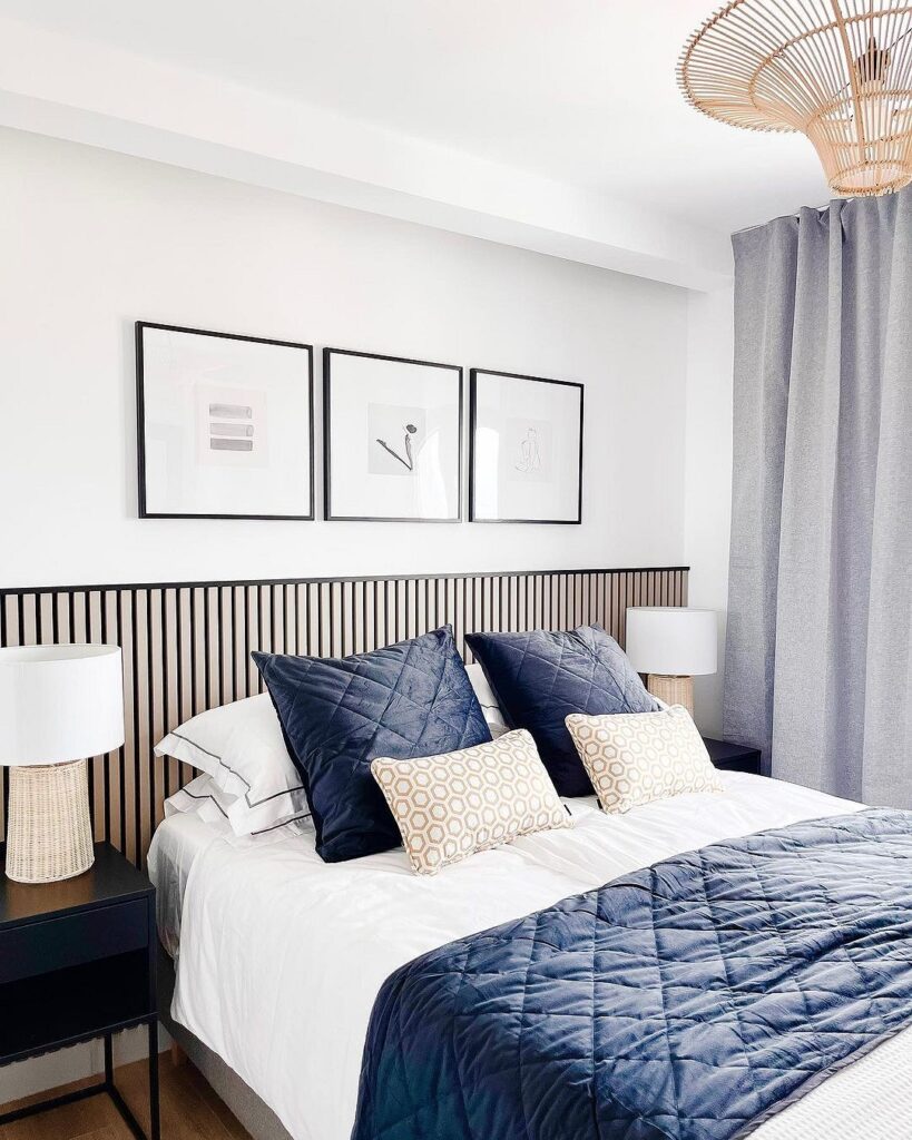
With Blue and Light Blue
Beige in company with the sky spectrum transports you to a hot beach by the sea. Sand, waves, and sky — a combination that reminds you of vacation and relaxation.
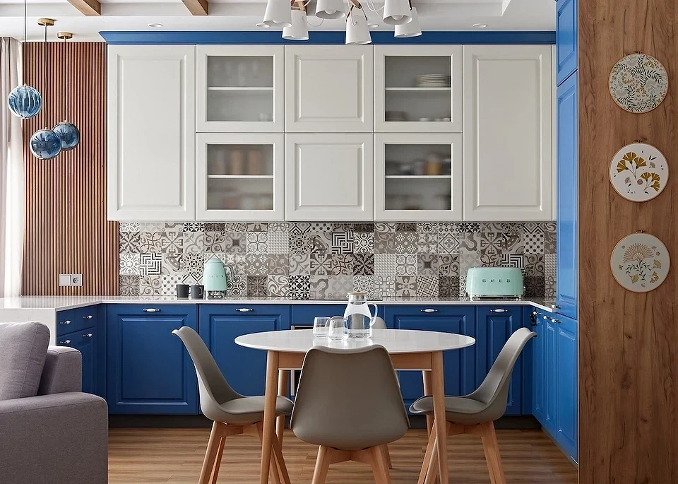
What colors go with beige in the interior if we’re talking about the blue spectrum? Almost any: suitable are rich cornflower or “electric” blue, as well as deep “indigo” and “ultramarine,” subdued denim and slate tones, and just as good — bright light blue and turquoise.
Notice the unusual effect: light brown lends an aristocratic sheen to the most provocative shades of blue, and together these colors always look restrained and luxurious.
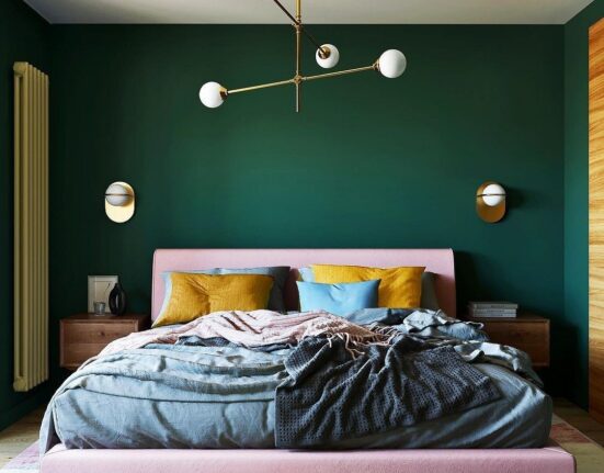
With Pink
This combination turns out moderately romantic and sensuous without excessive expressiveness. A great idea would be to design a girl’s bedroom or her mother’s bedroom in these tones.
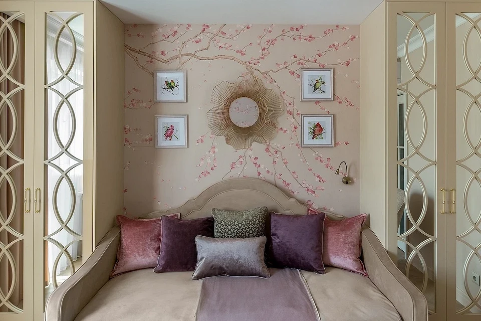
The pink palette also answers the question of what colors match a beige kitchen. Both shades are warm, “homely,” and definitely suitable for a place where the whole family gathers in the evenings. Another advantage of such a duo for the kitchen is that it improves appetite, making all food seem more attractive and tasty.
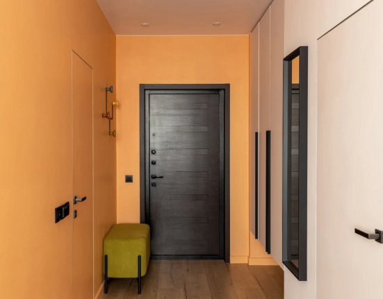
With Orange and Terracotta
If you’re looking at caramel walls and wondering what to pair with a beige kitchen to make it bright, the answer is orange. This part of the spectrum is usually hard to match. But these two palettes complement and enhance each other perfectly.
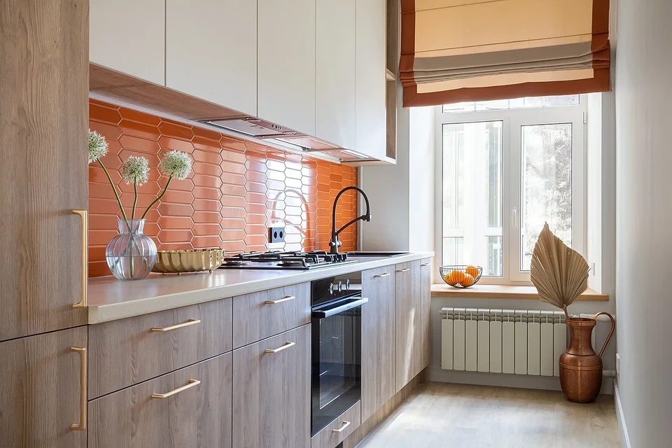
However, terracotta in large spaces is so captivating that it must be used very carefully: often, there’s just too much of it. It’s too bold for a bedroom, too plain for a living room, and not always appropriate for a hallway or bathroom. But for a kitchen space, it’s simply magnificent.
This color embodies the cheerfulness of yellow and the confidence of red. It lifts the mood and makes the home environment comfortable. But at the same time, it contains too much energy and even aggression, which is why it should be used sparingly and combined with calming, grounding creamy tones.
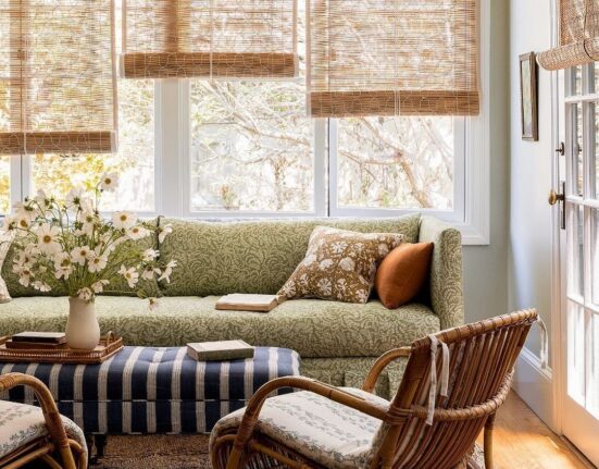
Together with grassy hues, it creates a combination that’s as natural and pleasing to the eye as possible. Moreover, the more complex the tone of green, the deeper and more multifaceted their union will be.
Khaki, olive, and malachite in combination with gentle creamy and dark chocolate hues will be appropriate in a living room, bedroom, or home office. A brighter and more vibrant interior is suitable for a kitchen or child’s room.
With Yellow
One of the warmest colors in the spectrum fills any room with light and coziness. With the yellow palette, it seems like the room is bathed in sunlight even on a cloudy day. But at the same time, this shade is very imposing and quickly becomes tiresome. Neutral and calming beige can tame it.
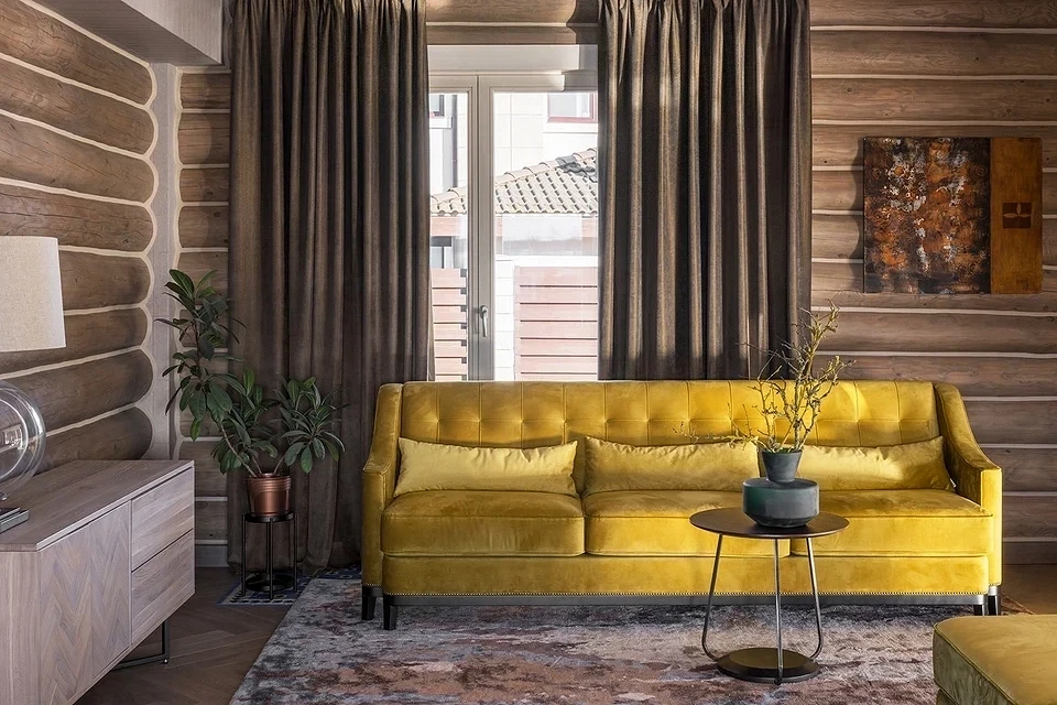
You can combine any variations of yellow and beige — from light to rich and dark, from bright to subdued: due to their related base tones, they resonate, enhancing and complementing each other. To make the setting more noble and luxurious, you can add accessories or hardware in gold or bronze.
Interior Styles Using Beige
Beige is most commonly used in styles connected with nature, such as eco-style and country, but not limited to these.
Eco-Style
Eco-style emphasizes the use of natural materials and colors.
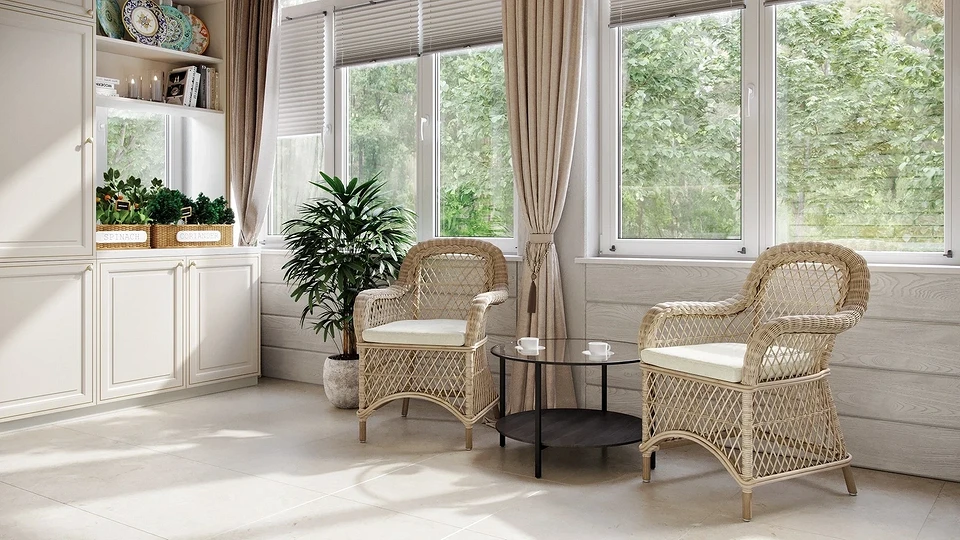
A light brown palette is perfect for this style: a sand-colored carpet, ivory-shaded walls, and textiles made from undyed wool are quite appropriate.
Country
The country style home also features much of the beige spectrum, as its foundation includes wood.
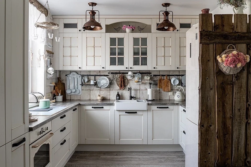
Floors, walls, furniture, and other interior items are often made from practically untreated wood, which is only lacquered or oiled but not painted.
Provence
Provence, which emulates life in a French village, also confidently uses beige.
Alongside white, it acts as a background for delicate accents—light yellow, pastel orange, blue, lettuce green, and lavender.
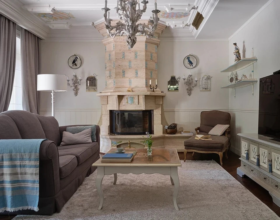
Classical
The classical style is one of the main users of cream-coffee shades. It’s hard to imagine this interior without them.
Here, beige usually acts as a base (only painting walls or floors), but it can also become the absolute dominant—adding beige furniture, carpets, and draperies. A more severe, cooler shade might also be used. What color does gray-beige go well with in the classics? The answer is simple: it always looks good with black, white, and gray tones.
Mediterranean
The Mediterranean style incorporates influences from three parts of the world—Europe, Africa, and Asia.
It is characterized by a combination of marine themes and warm tones of sand and sun, hence, it also includes the blue and the full spectrum of beige shades in its design.

Leave feedback about this