- 1. Advantages and disadvantages of light colors in the interior
- 2. Features of a light interior
- 3. General rules for interior design in light colors
- 4. Many shades and ideas for combining in a light interior
- 5. White in a light interior
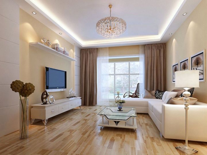
- 6. Cream color in a light interior
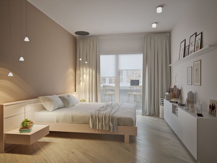
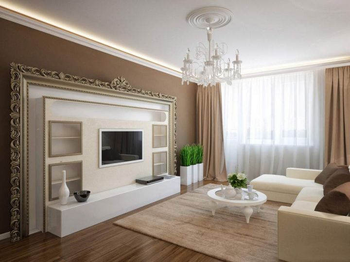
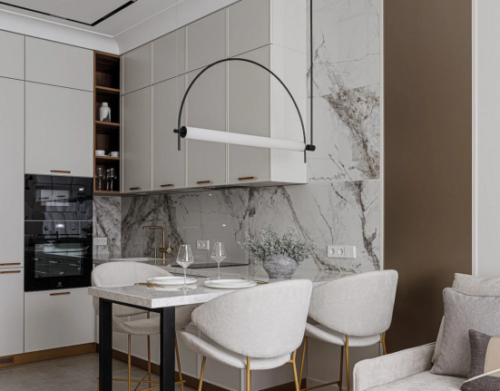
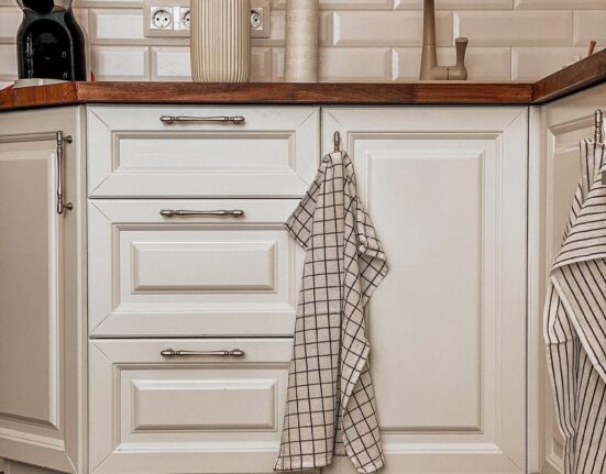
- 7. Beige in light interior
- 8. Sandy in a light interior
- 9. Milky Light Interior
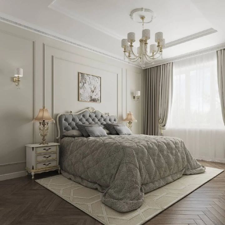
- 10. Gray in a light interior
- 11. Adding patterns to a bright interior design
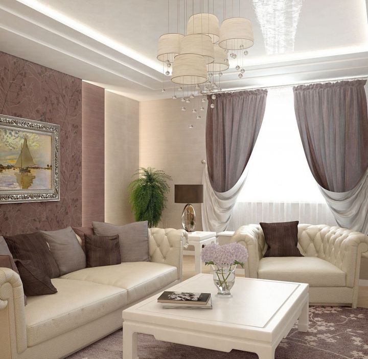
- 12. Bright options for interior decoration
The first step in planning the future furnishing of the room is the selection of the right color palette. The interior in light colors will make the room stylish, modern and comfortable. In large rooms, it will give a sense of space and freedom, and will help to visually enlarge small rooms, make them more comfortable and fill them with light.
This color scheme is suitable for any style and size of home and looks great with a wide variety of furniture.
Advantages and disadvantages of light colors in the interior
The advantages of using such shades include:
- A visual extension of the room.
- Since white colors reflect the sun’s rays, rooms that are too bright do not become too hot.
- Combine with any color and decor.
- You can add curtains, cushions and other textiles without harming the interior.
- Actual basic palette.
- The dust will be unnoticeable.
Disadvantages:
- Impracticality. The white color is easy to stain, it will be visible to any dirt. If there are children in the house, it is better to refuse such a solution;
- Uncomfortable. If used improperly, the color white can make a room look like a hospital;
- Negative effect on emotional people.
Of course, in the hands of a skillful designer, white shades will make the most of themselves and show themselves only from the positive side. Let’s take a look at the features of light colors.
Features of a light interior
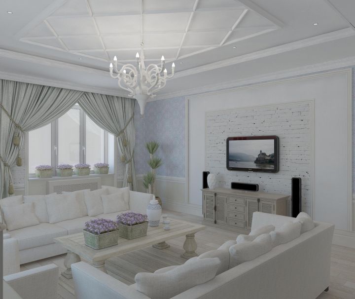
Light interior is rightly considered a classic, because it is always relevant and will never go out of fashion. Homes decorated in neutral pastel shades could be found centuries ago.
This is no coincidence, because it is the easiest and quietest option for coloring a room. It is ideal for small houses and studios. Thanks to its good ability to reflect the sun’s rays, white will expand the space and help to visually increase the area of the dwelling.
In addition to the modest space, many owners also face a lack of natural light in the apartment. There are many reasons for this: small windows, trees outside the window, the northern location of the housing, and so on. In this case, a light interior will also come to the rescue.
If you do not like a monochrome interior, you can add unusual colorful decor or furniture. Bright accents look great on a white and beige background. This is a universal base color that can be combined with any tone.
It will help to dilute the austere and languid environment, made in dark gloomy tones. And a bright palette of white will make it less flashy and irritating, adding a note of calmness to the interior.
The influence of white on the human psyche also plays a big role in the choice of interior colors. Psychologists have noted its two influences: positive and negative.
On the one hand, a white room looks clean, free and calm. It seems that in such a room it becomes even easier to breathe. A person can feel a rush of energy, but in the bedroom, on the contrary, relaxation and peace. Waking up in such an atmosphere is much more pleasant and easier than in a dark bedroom. Black shades are very undesirable for rooms designed for relaxation.
On the other hand, an excess of white can have a negative effect on people with depression. A completely white room is associated with a hospital and lowers mood.
This is influenced by the temperature of the shade. There are cold and warm shades of white, and the proportions in which they are present in the room determine their effect on the human psyche. Therefore, it is important not to go overboard in the use of light shades and dilute them with other colors, accent decor and plants.
At the beginning of the last century, many aristocrats preferred crystal white apartments, as they were considered a sign of luxury and wealth. This color will really emphasize good taste of the owner, because it is discreet, modest, but at the same time status and solid.
To get a nice and beautiful light interior, it is important to follow the advice of experienced designers. They will help even an inexperienced person to turn a boring apartment into a fashionable and modern dwelling, in which it will be pleasant to return every day.
General rules for interior design in light colors
Experts do not recommend using cooling crystal-white colors for living spaces. The blue cast will not add coziness, on the contrary, it will create a cold repulsive atmosphere. It is better to give preference to warm tones that are “not quite white”.
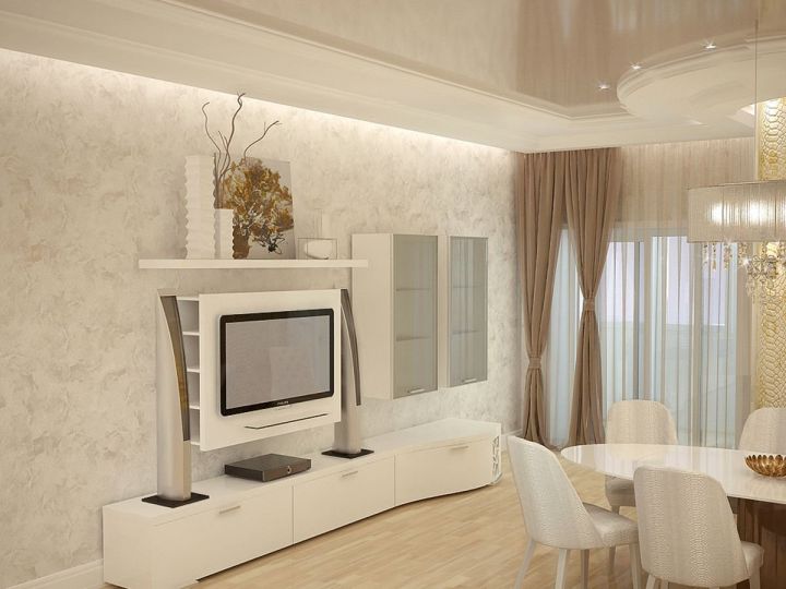
In the language of designers, they have their own specific names: white dove, ivory white, acadia white, swicc coffe, white chocolate, linen white and others. Also very nice look beige color and its varieties. Such a room will be maximum cozy and comfortable.
However, the colors above do not always look good. In a room with insufficient lighting, they can look dirty and cheap, and the increase in space is out of the question. In this case, you need to choose the right lighting and intelligently arrange it around the room, and replace the colors with more saturated.
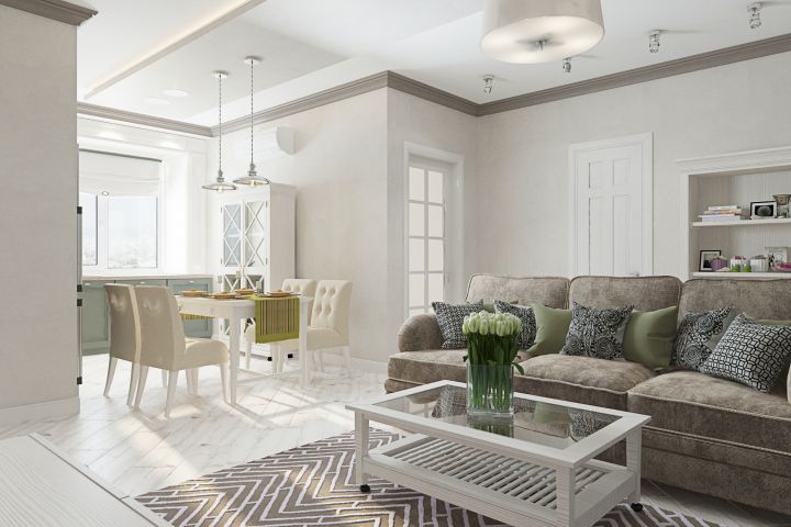
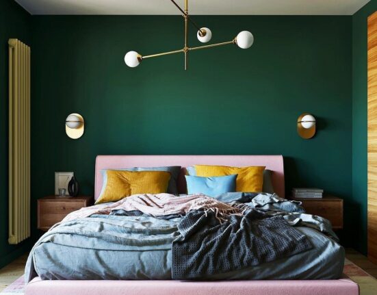
If we talk about the compatibility of white with other colors, the most preferable are “home” shades – brown, beige and others. Cold and grayish tones, on the contrary, will add to the costliness and status of the interior. Pastel colors such as lilac, lavender, lettuce, sky blue, pink in combination with light shades will make the situation gentle and sweet. This solution is perfect for decorating a bedroom or children’s room.
There are many more light colors than it may seem. Let’s take a closer look at the rich palette and find out what colors they pair most favorably with.
Many shades and ideas for combining in a light interior
As already mentioned, light shades are quite universal and are friendly with almost all colors.
But we also found out that certain pairs can affect the perception of the interior both positively and negatively. Designers have highlighted the most successful combinations.
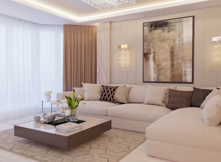
White in a light interior
A refreshing and clean color beloved by many designers. It can be combined with any color. In combination with warm shades gives sunny and soft interior, and in tandem with cold shades it refreshes.
Only white is rarely used, it is usually diluted with gray, black, brown or bright colors.
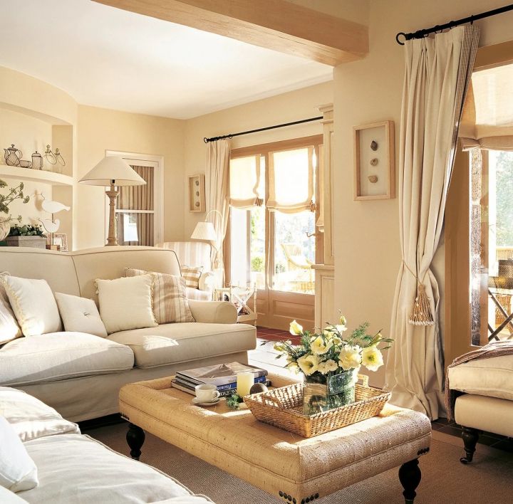
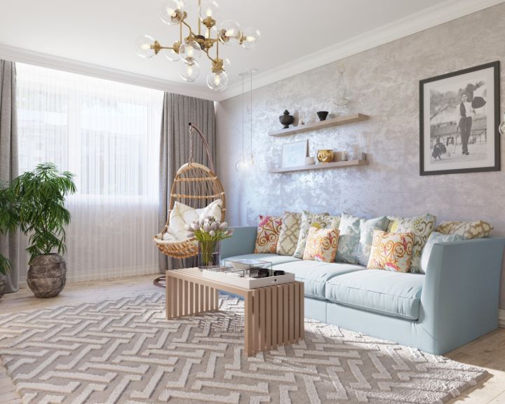
Cream color in a light interior
It is very similar to beige, but a little lighter and muted. The best pair are chocolate shades, as well as purple, violet, pistachio and yellow.
Many designers note the success of the combination of blue and cream – it is one of the most classic combinations. It is great for living rooms and bedrooms located on the sunny south side.
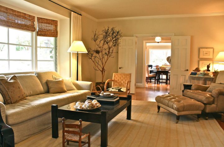
Beige in light interior
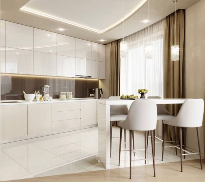
It can be used to create a tranquil home environment. Like white, this color is versatile and combines with both cool and warm tones. It can be both dominant and complementary, serving as a background for brighter objects and details.
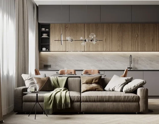
It combines well with natural hues such as brown, earthy, lettuce, blue and white. Such color schemes are often used in the style of Provence, the main feature of which is a gravitation towards nature. It is also acceptable to combine beige with rich purple, black, bright pink and burgundy colors.
Sandy in a light interior
Another color combined with natural shades. You can be inspired by nature itself, because everything in it is harmonious and natural. Pay attention to seascapes – sand color looks great with beige, lettuce and sky.
Wheat fields combine many shades, one of which is sand. It can be used with pastel blue, cherry, light and dark brown, burgundy and other similar colors. The result is a calm, comfortable home environment.
Milky Light Interior
It can be described as a dark brown, diluted with white. A room decorated in this way looks solid and expensive, and being in it relaxes the nervous system and gives a sense of calm. Coffee is often considered a classic, so it is preferred by people who do not like to change the furnishings in the room often.
However, it should be used carefully: the abundance of this shade can make the room boring and languid. It is important to add properly selected decorative elements, such as vases or paintings, as well as the right lighting. Great for zoning: with the help of coffee and milk color you can highlight a zone in the room.
Gray in a light interior
If you think that there are only 50 shades of gray, you are wrong. There are many more colors in its palette, and many of them are light and calm. They will be the perfect neutral backdrop for rich, bright details.
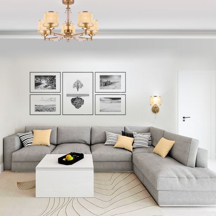
Light gray shades look very stylish in combination with black, yellow and darker grays. The main thing is not to go overboard: being in a room that is too gray without additional colors is detrimental to the psyche and can worsen the emotional state.
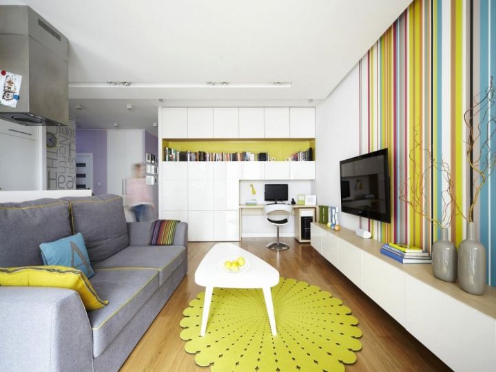
Adding patterns to a bright interior design
If the room, decorated in light colors, seems too simple and boring to you, you can dilute it with original prints. Their location can be absolutely any.
Simple but stylish designs – stripes, plaid, rings or spots – are very popular now. It can be placed on walls, chairs, cushions, carpets or bedding. Also a fabric with such a design will be suitable for upholstery of upholstered furniture.
When combining two designs, it is important to pay attention to the fact that they have a common leading element. For example, if a daisy or teardrop pattern is used on the walls, the additional print should have circular elements.
Drawings can also affect the visual perception of space: small ornaments expand it, and large, on the contrary, narrow it. Make the ceiling visually higher with the help of vertical stripes on the wallpaper. The opposite effect is produced by horizontal ornaments, but they lengthen the room. Striped wallpaper looks great with lace decorations.
Bright options for interior decoration
No room interior is without decorative elements. Even strict minimalism, which does not tolerate a large number of items, necessarily has a couple of decorations. Without them, the room looks dull, empty and boring.
When arranging the decor and accents, it is important to adhere to the following rules:
- There should be a color balance: most of it, about 60 percent, is the main background, 30 percent is additional, and only 10 is a bright accent tone. If an additional color is missing, you can increase the content of the accents.
- Avoid an overabundance of small details.
- Add a cheerful note to the bright calm interior will help bright accents of saturated colors, and any tone will do.
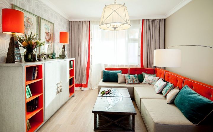
The decor can be chosen absolutely anything: it can be colorful cushions, bright curtains, unusual pictures or even photo wallpaper.
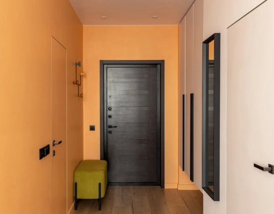
The light interior would be a great choice for any living room. It is suitable for the living room, bedroom, hallway, children’s room, kitchen and bathroom. If you want your favorite color in the environment, but don’t know what to combine it with, feel free to choose white – it will definitely work and will be the perfect base!

Leave feedback about this