Natural colors are a trend that will remain relevant for a long time. Whether it’s the depth of the sea, fresh lush greenery, or a scatter of precious stones, emerald in interiors evokes various associations but consistently serves to create an atmosphere of luxury, stability, and tranquility. In this article, we will discuss how to apply this complex shade in different rooms and which colors it pairs best with.
Color Features
It is a rather dark and cool shade of green, with a slight lean towards blue. Its uniqueness lies in the fact that depending on the intensity, it looks both vibrant and calm, does not irritate the eyes, yet never feels boring. Its closest “relatives” are ultramarine, pine shade, and bottle glass.
Emerald color (photos below) in interiors plays various roles. Depending on the surroundings and the overall styling of the space, it can emphasize status, make the setting luxurious and elegant; create a cozy and calming atmosphere in the room; bring a touch of mystery to the interior.
The perception of this variation of green depends on how much is used, the combination with other palettes, and the surrounding textures. Stone and marble surfaces enhance associations with gemstones, while soft natural fabrics, clay, wood, and rattan emphasize the connection with nature.
Best Color Combinations with Emerald
Emerald is not a basic color, so it should be paired carefully with other hues. It’s best used as an accent element, as its abundance can negatively impact the psyche and mood. Let’s consider the most successful combinations for the emerald color.
With Basic Colors
White serves as a wonderful base that not only highlights the nobility of malachite green but also adds spacious
ness and airiness to the space. This is important as the combination includes a rather dark tone, and it is desirable to dilute it, especially in a small room. A white-green combination can be enhanced with a few contrasting black details.
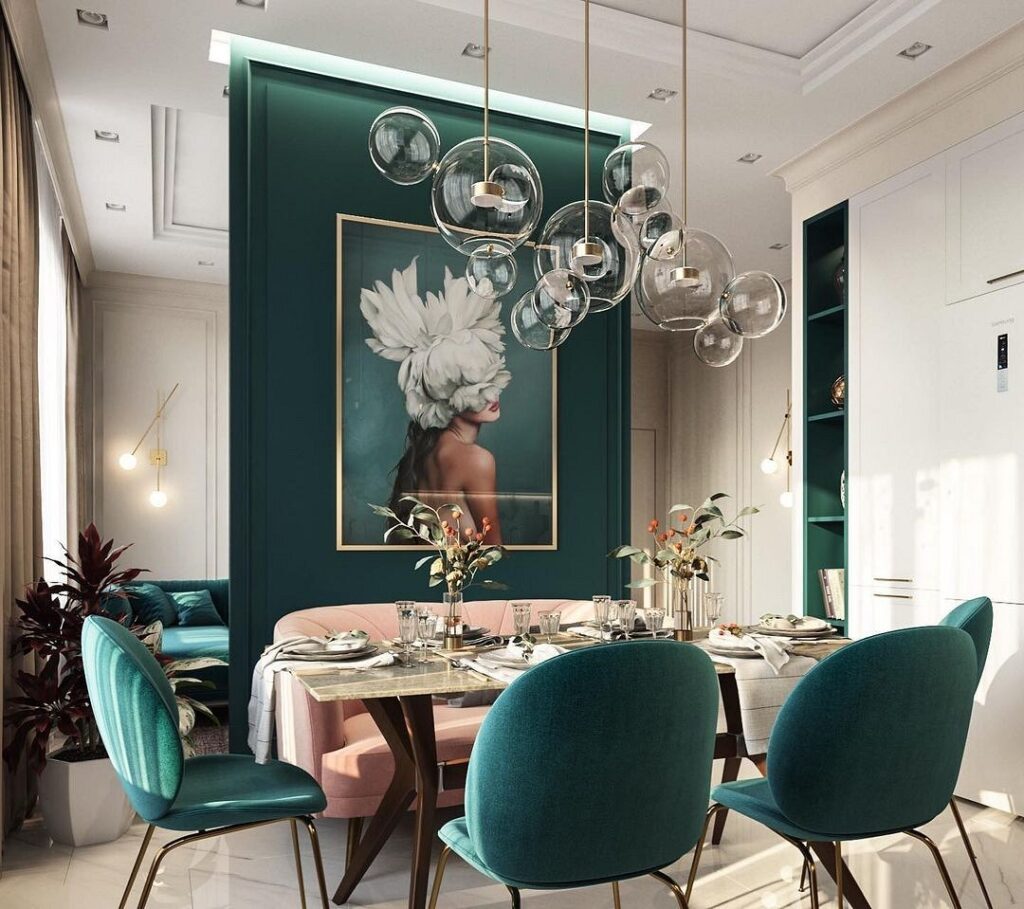
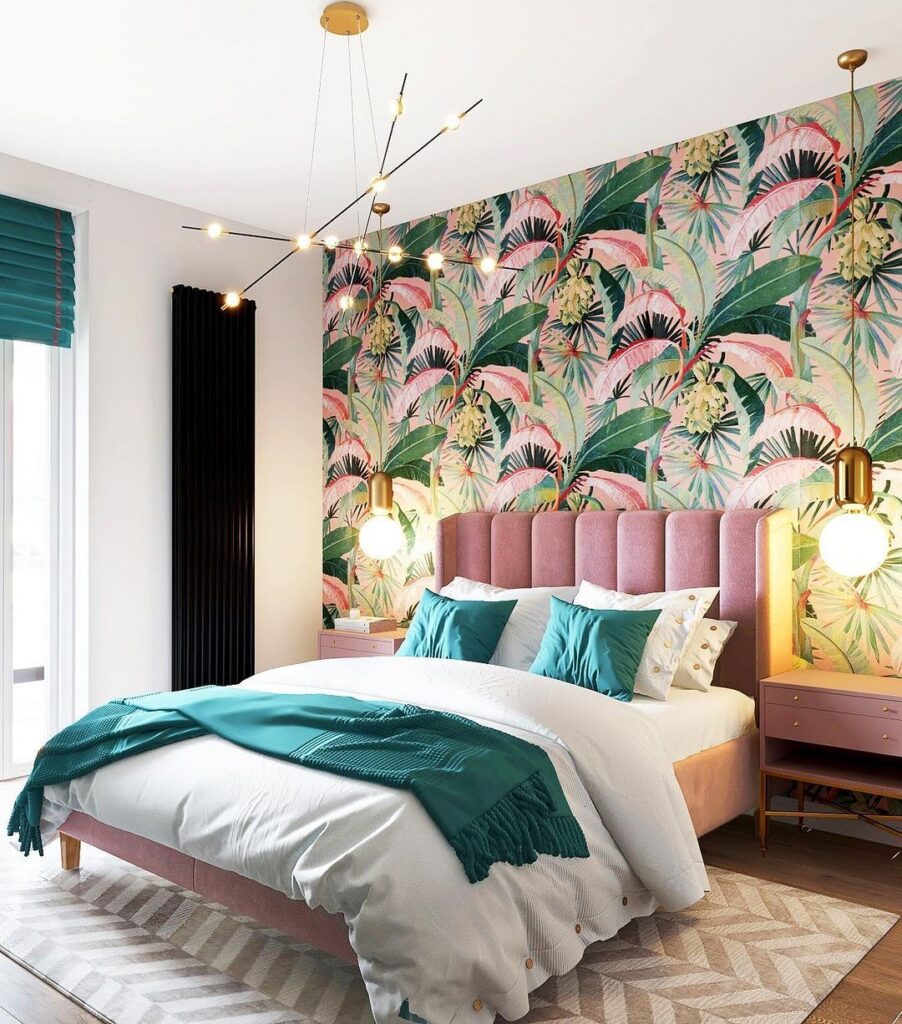
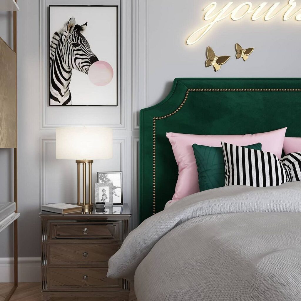
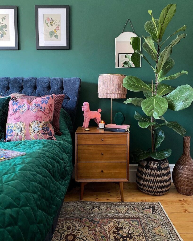
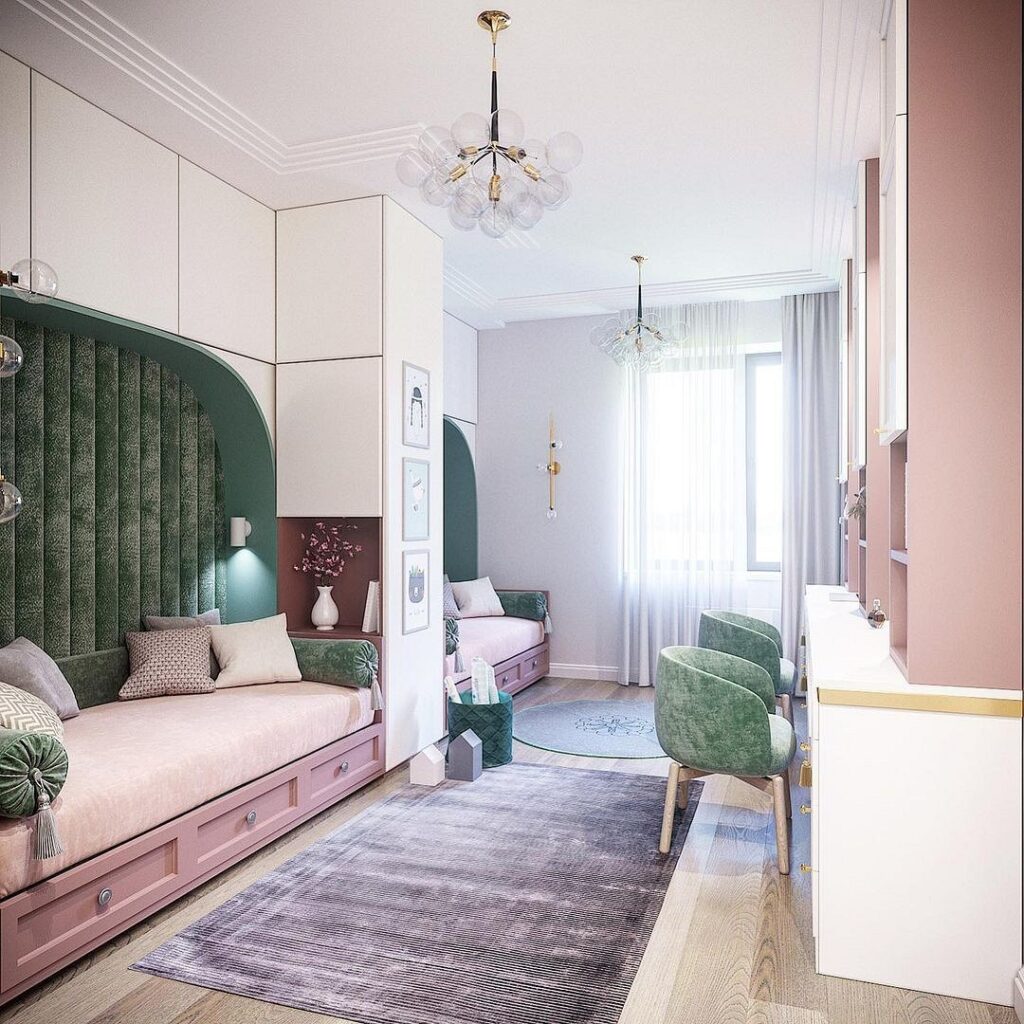
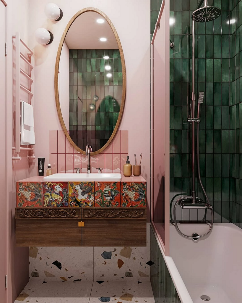
With Pink
The pink and green combination in the interior is now considered a classic of the genre. This pairing works with any shade of green, but it’s best to choose pink that’s not acid-bright, but rather muted shades like powder, peach, dawn, tea rose, etc. The color temperature doesn’t matter: blue-green will harmonize both with a cool, lilac-leaning tone and with a warm pink-orange hue.
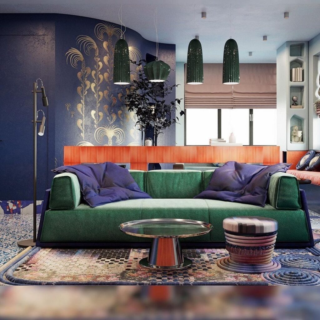
With Blue and Purple
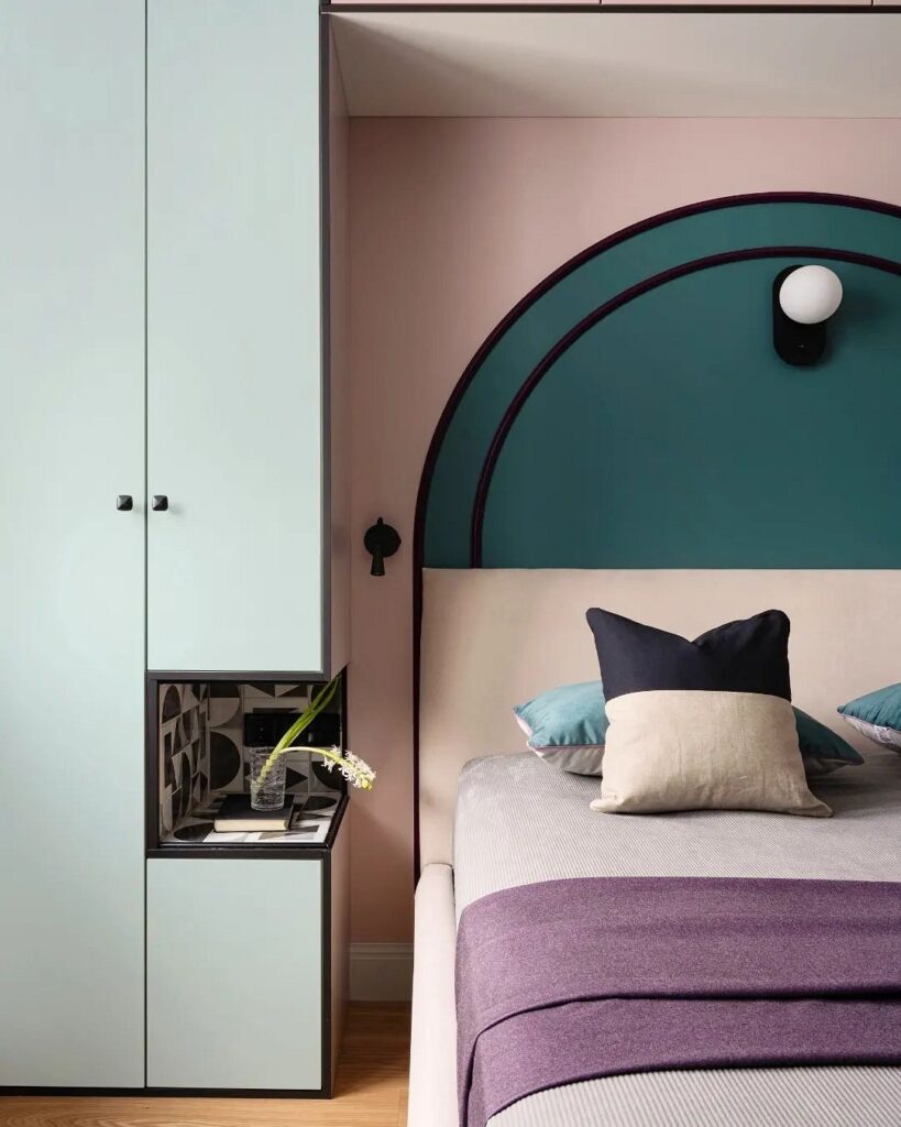
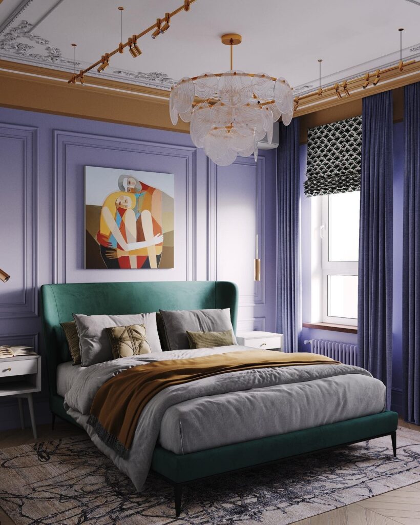
A very beautiful combination comes from two or three colors close in temperature. Such companions can be blue, light blue, purple.
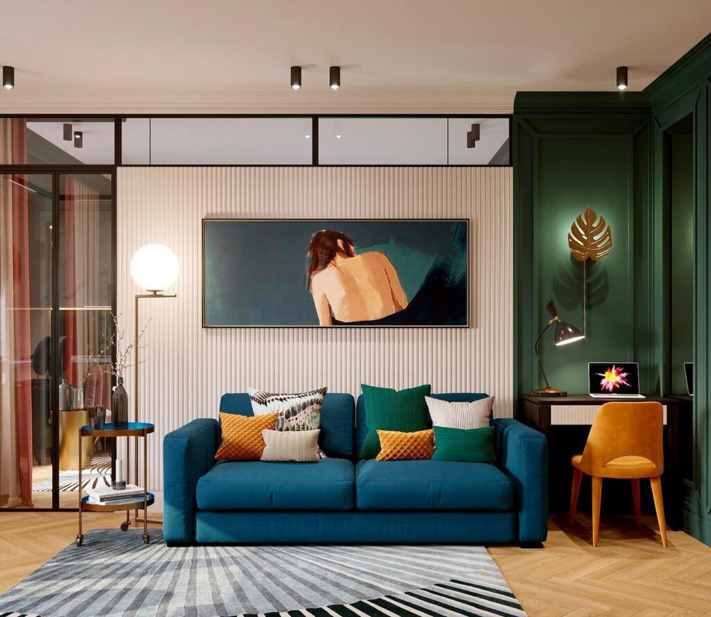
Since blue is a component of green, this related pairing is always a winner — in such a variation, emerald becomes deeper and cooler, evoking associations with water and nature. Dark green matches well with any shade of blue: from sky blue to rich cobalt. To prevent such a combination from feeling oppressive, like with purple, it’s best to dilute it with neutral colors: white, gray, cool beige. Use them for decor or accent furniture.
Purple is also a dark and vibrant hue that can quite significantly affect the psyche. Therefore, both lilac and emerald in this combination should be accent colors, always set against a neutral background.
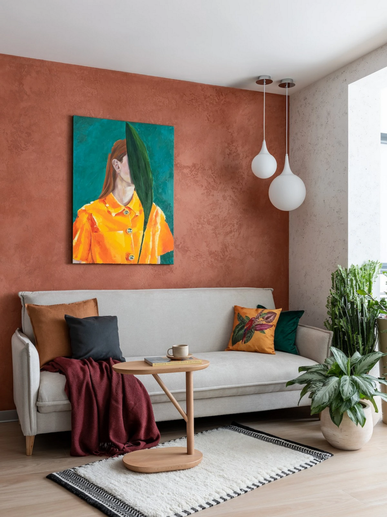
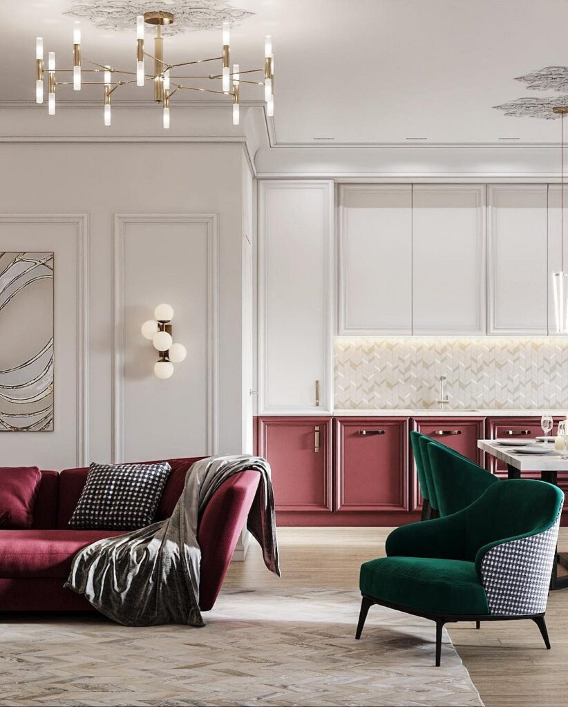
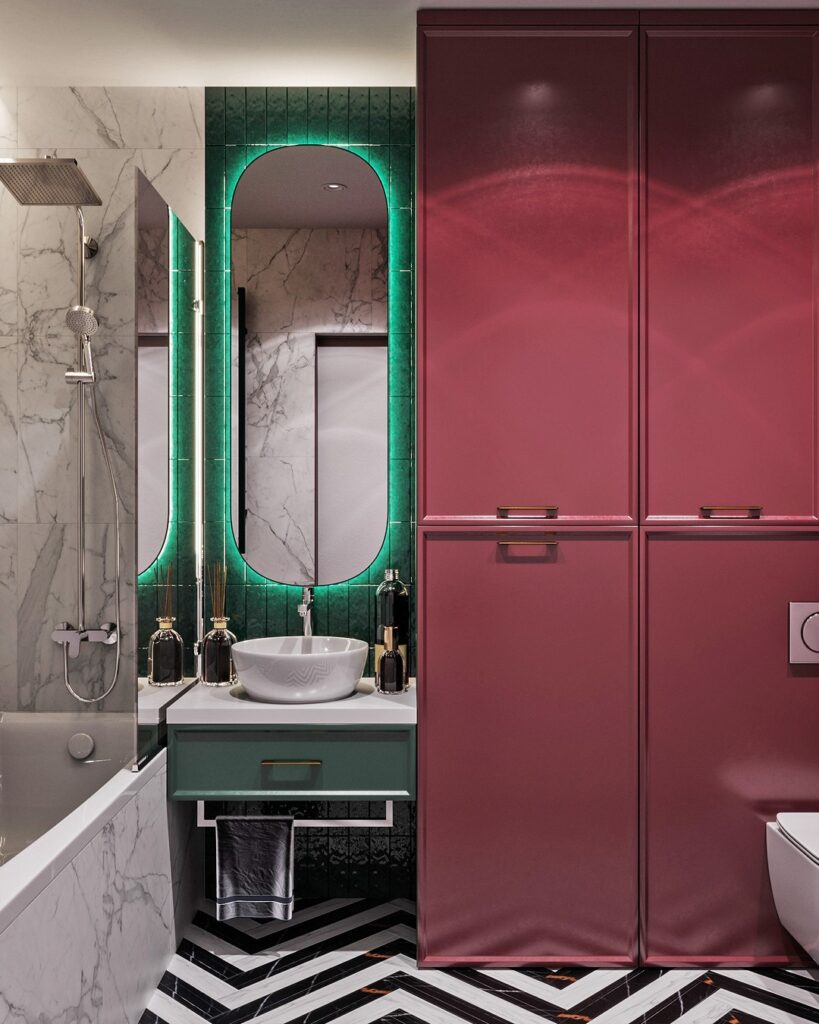
With Red
Red is a very vibrant, active element of the palette. Together with green, it forms an impressive pair.
Both shades are best used as accents, and the base of the palette should be as neutral as possible, based on white, gray, or cool beige. The red-emerald ensemble will look great in furniture, textiles, and decor. Thus, these two bright colors will harmoniously complement each other, rather than competing for attention. And, of course, such an interior won’t tire you, as the abundance of vivid colors won’t feel oppressive or overwhelming.
How to Use in Different Rooms
Let’s explore how to apply emerald green in the interiors of various rooms.
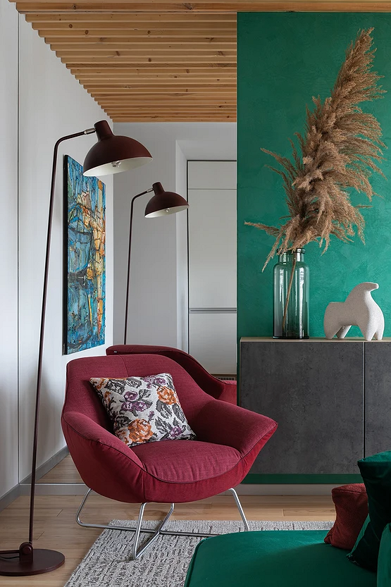
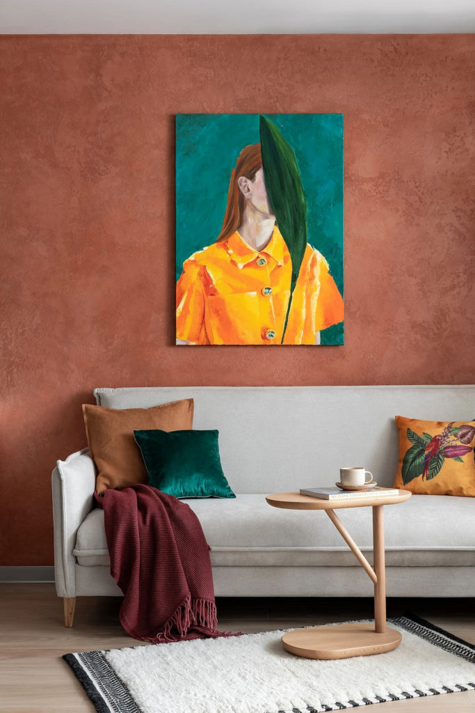
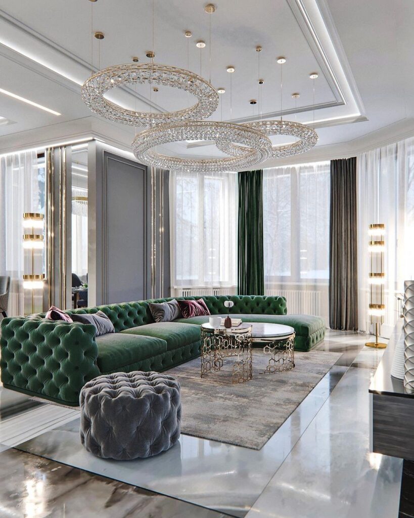
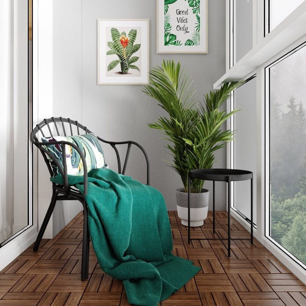
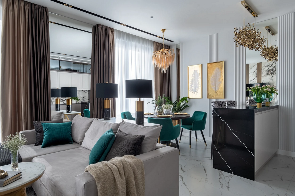
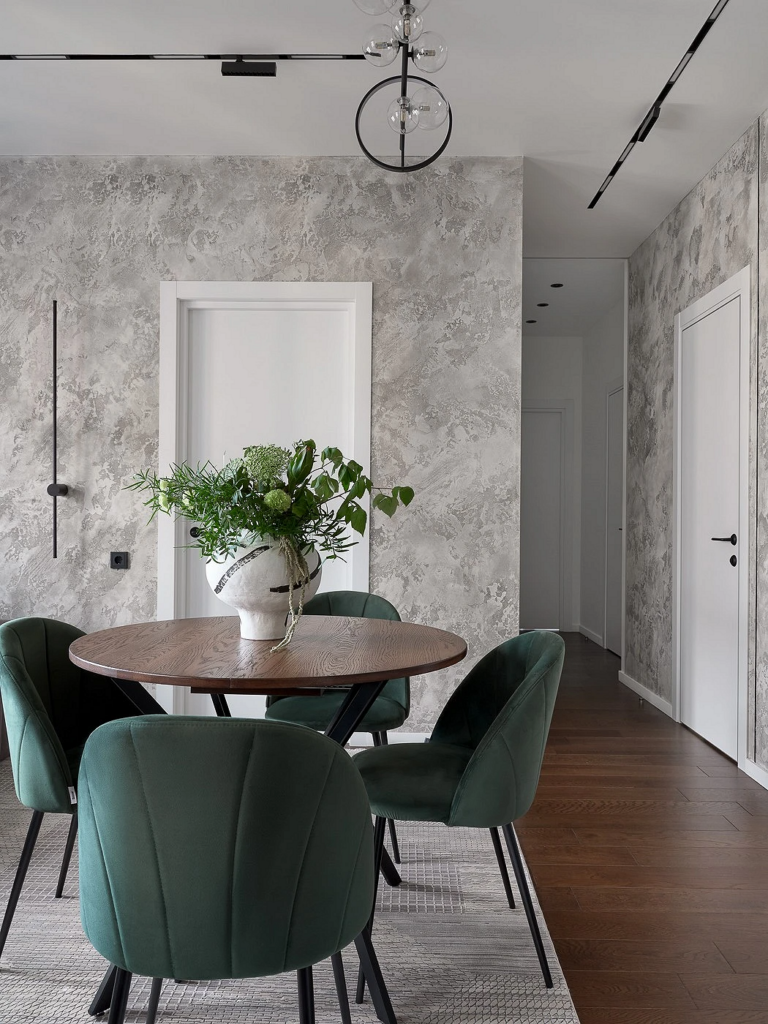
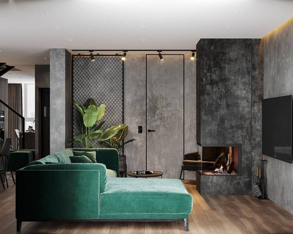
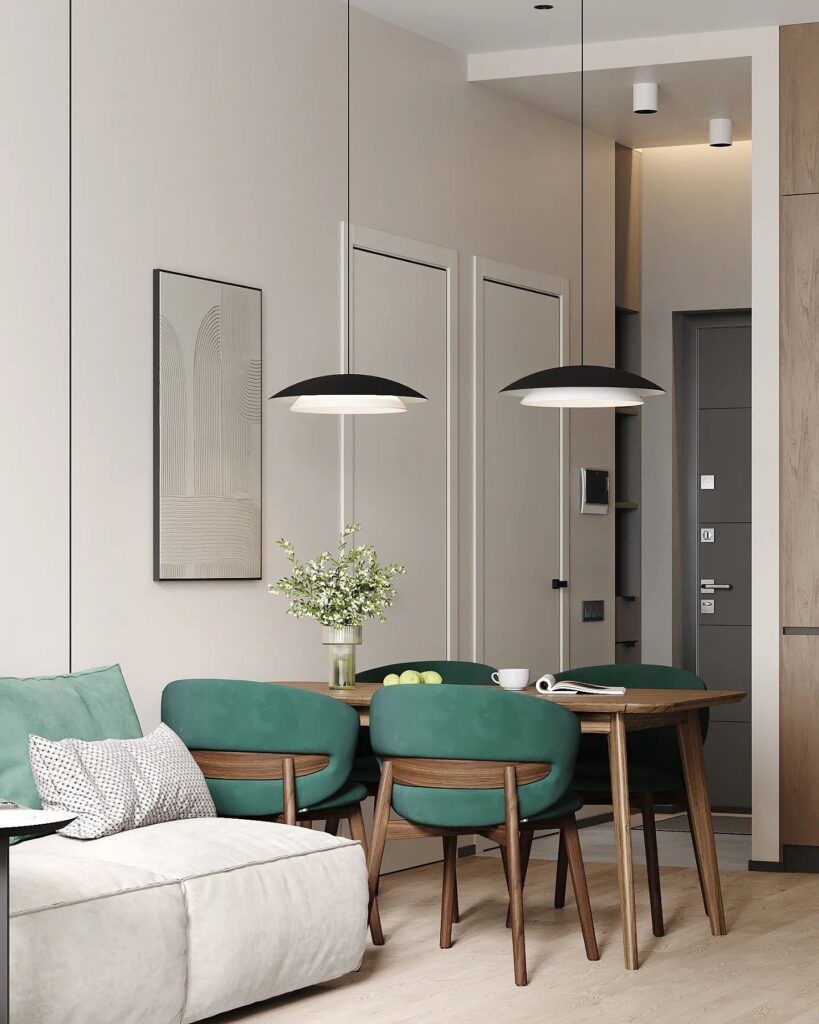
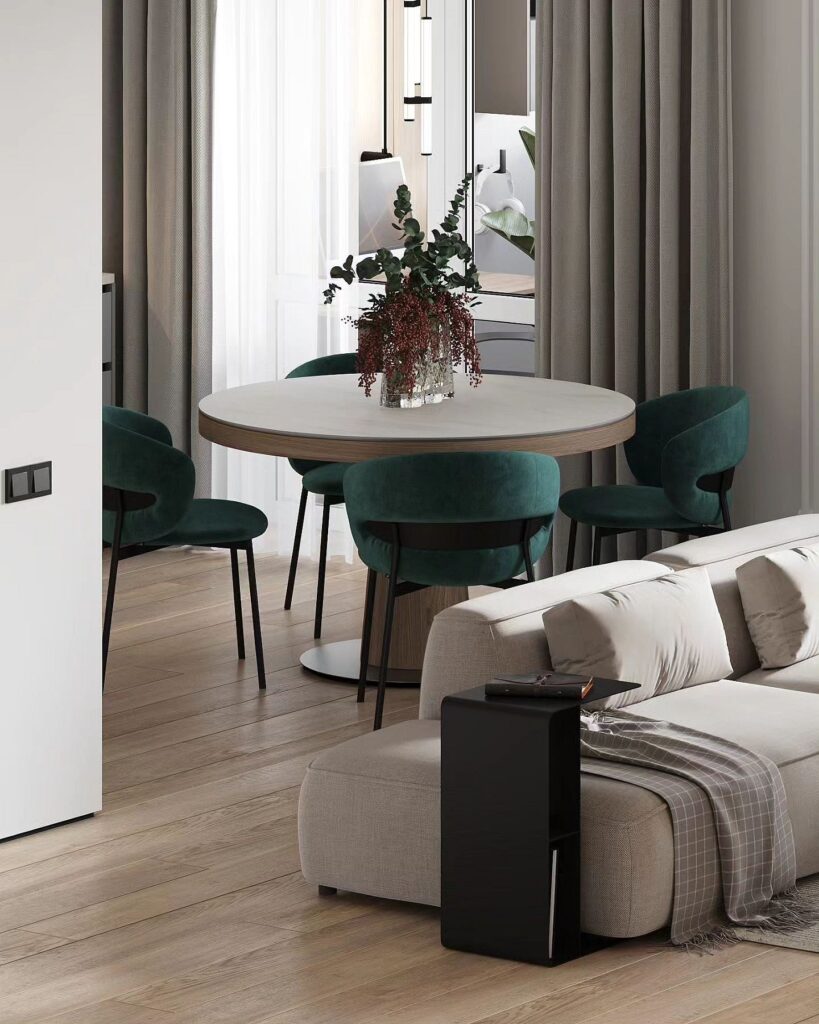
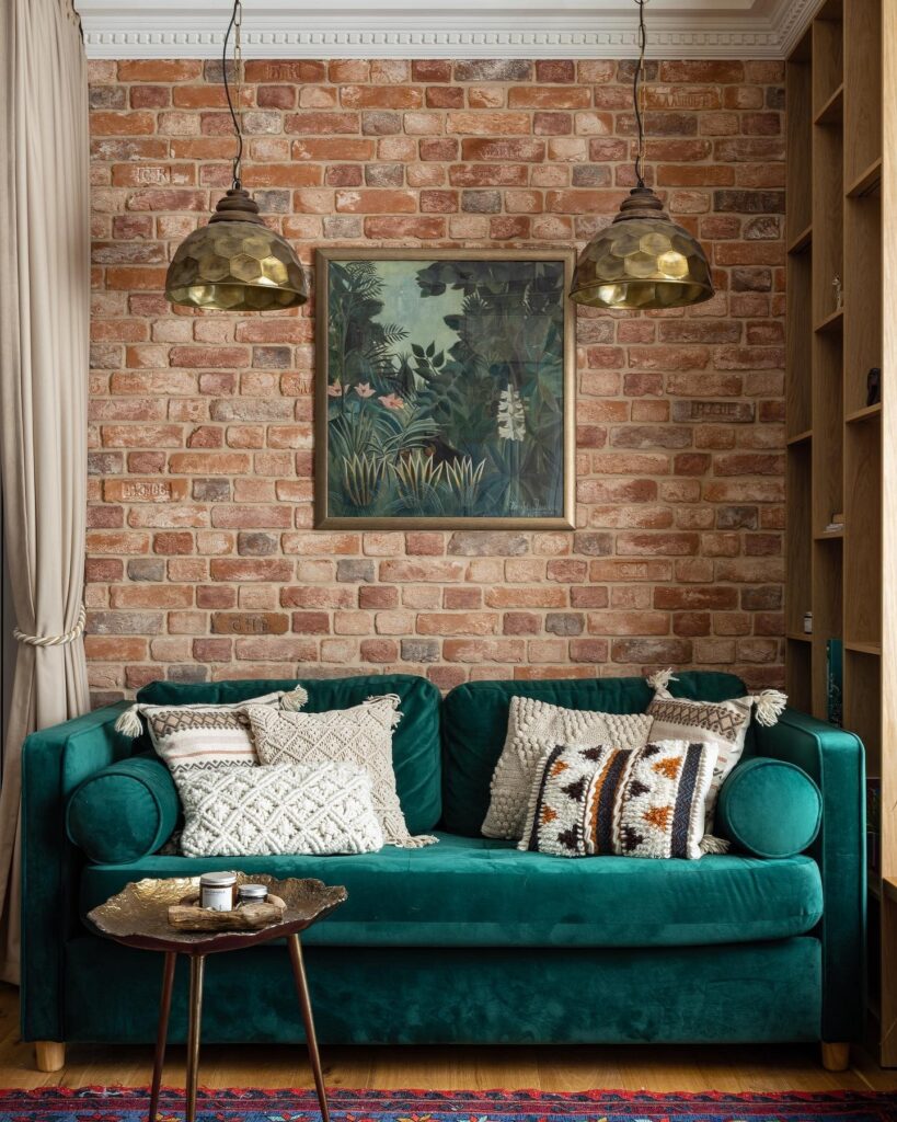
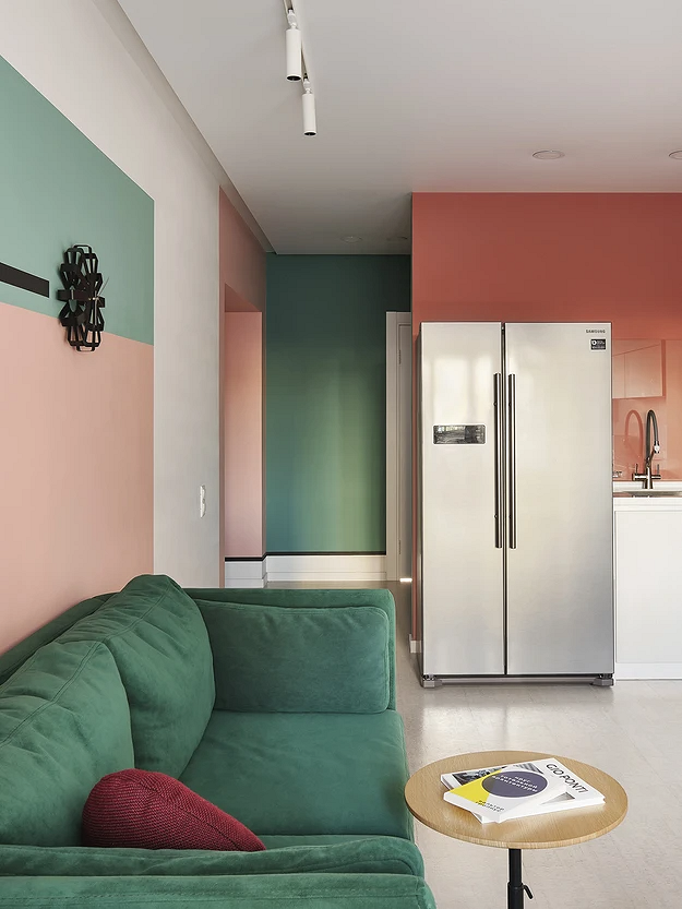
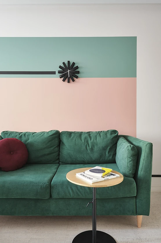
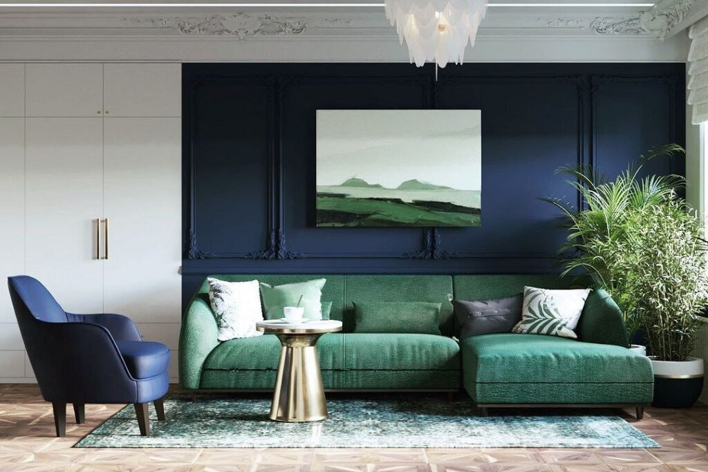
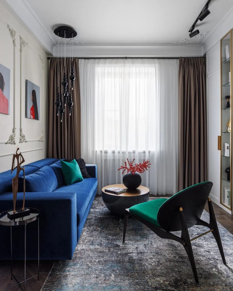
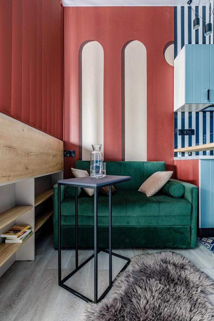
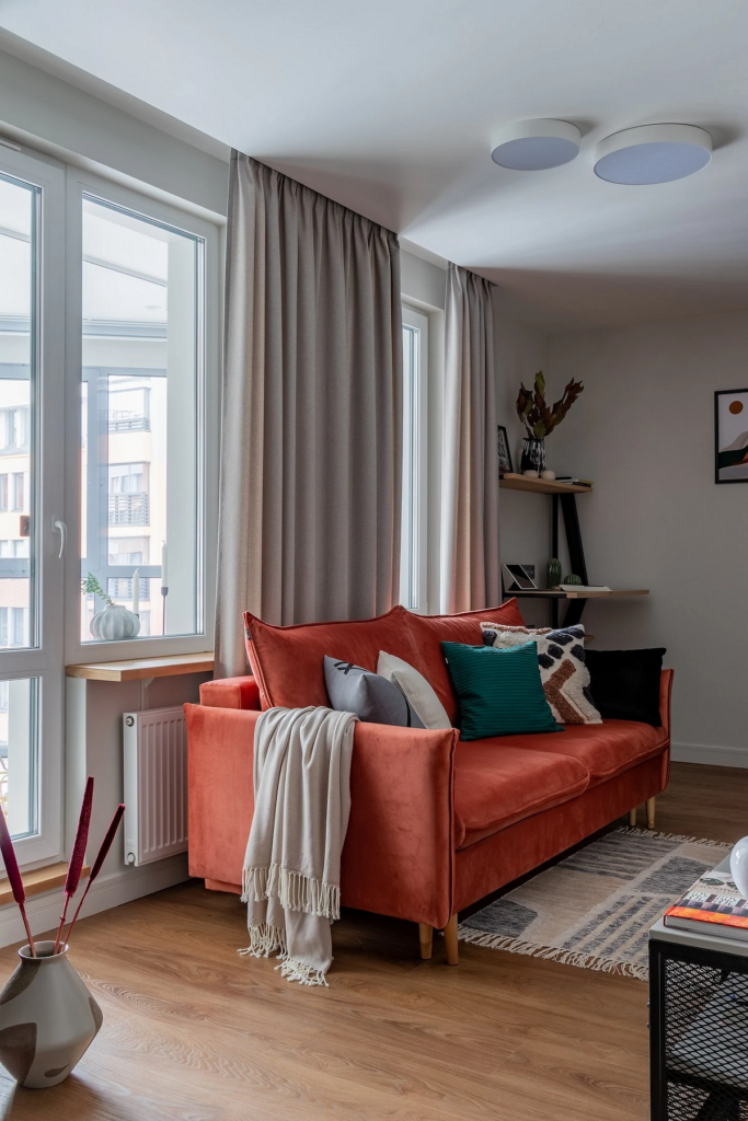
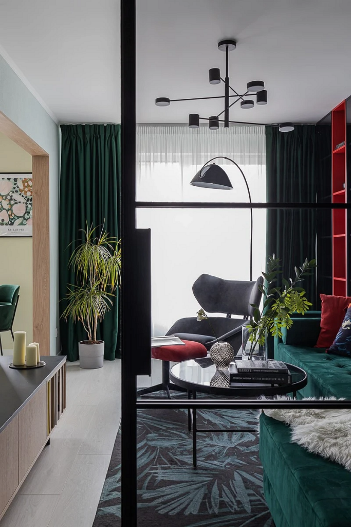
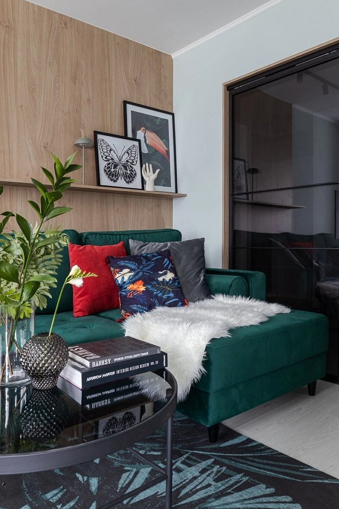
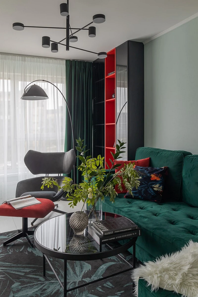
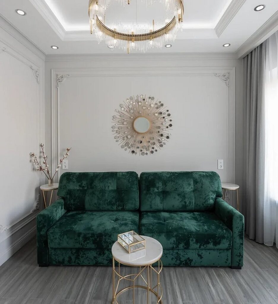
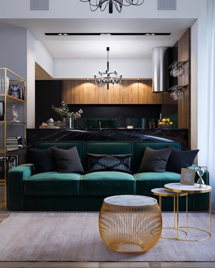
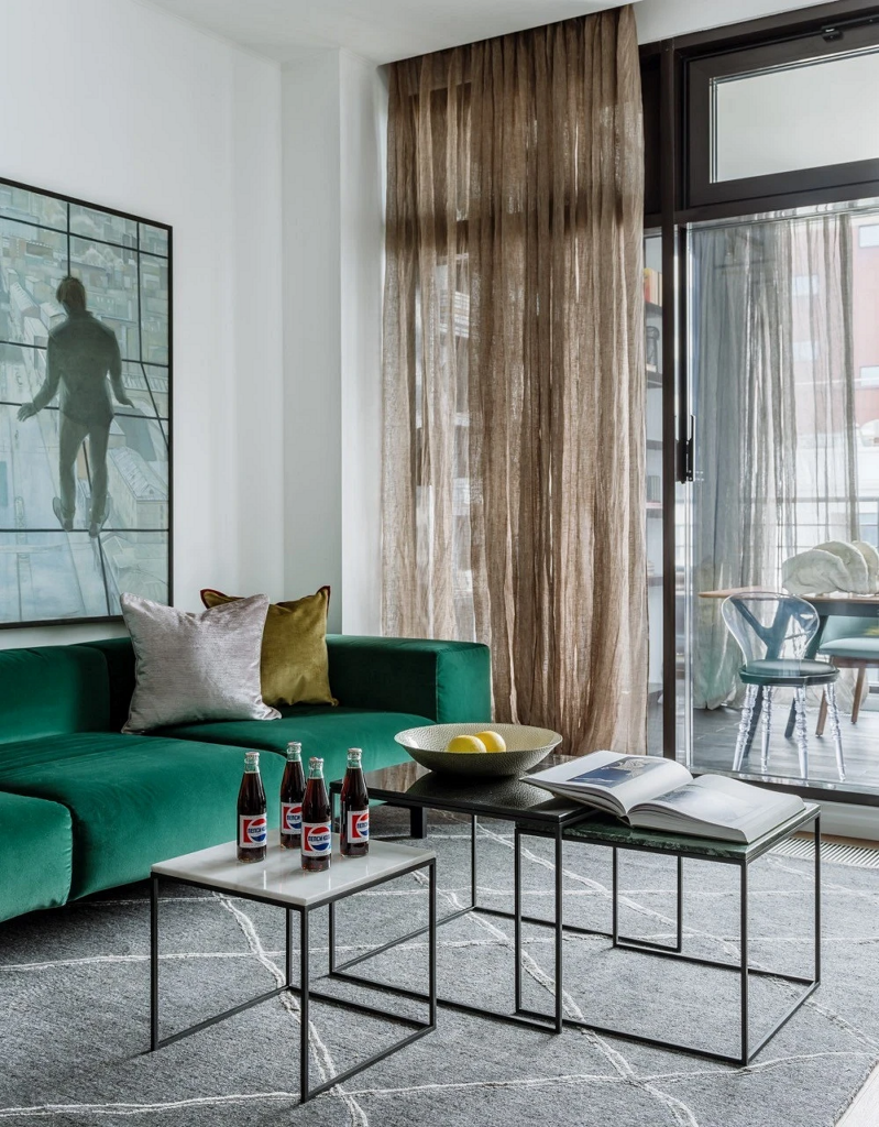
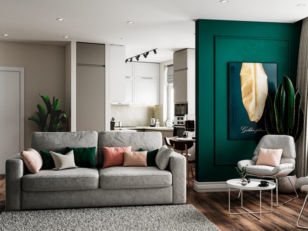
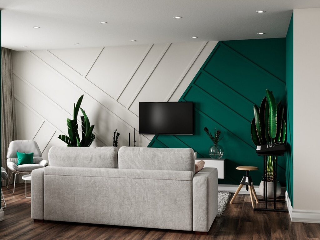
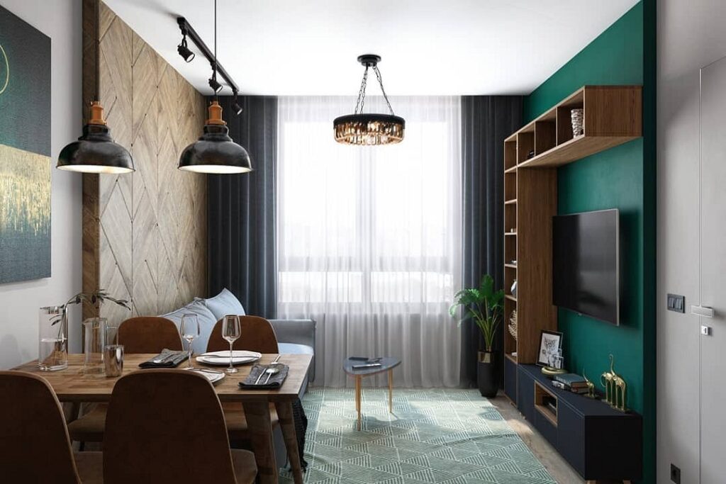
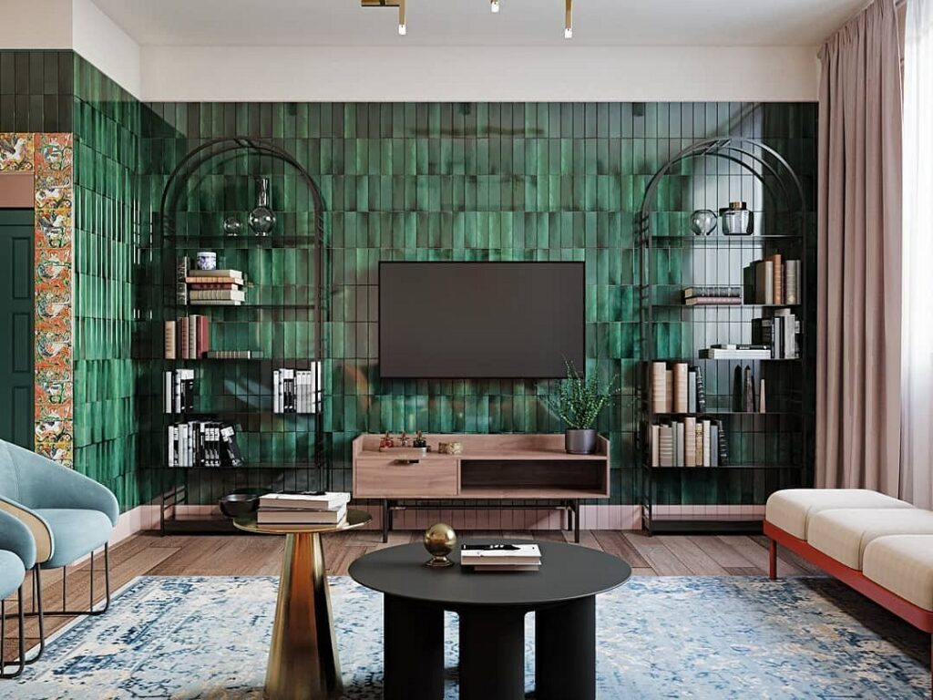
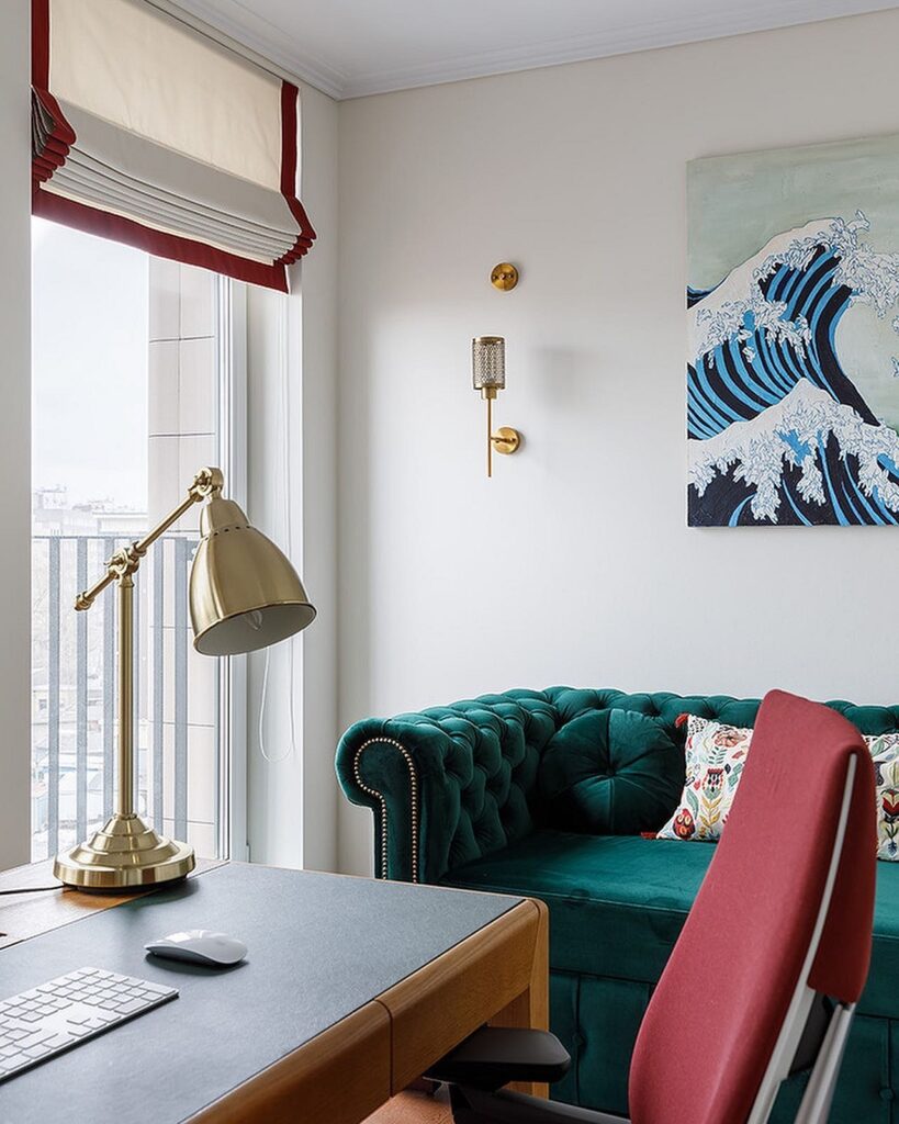
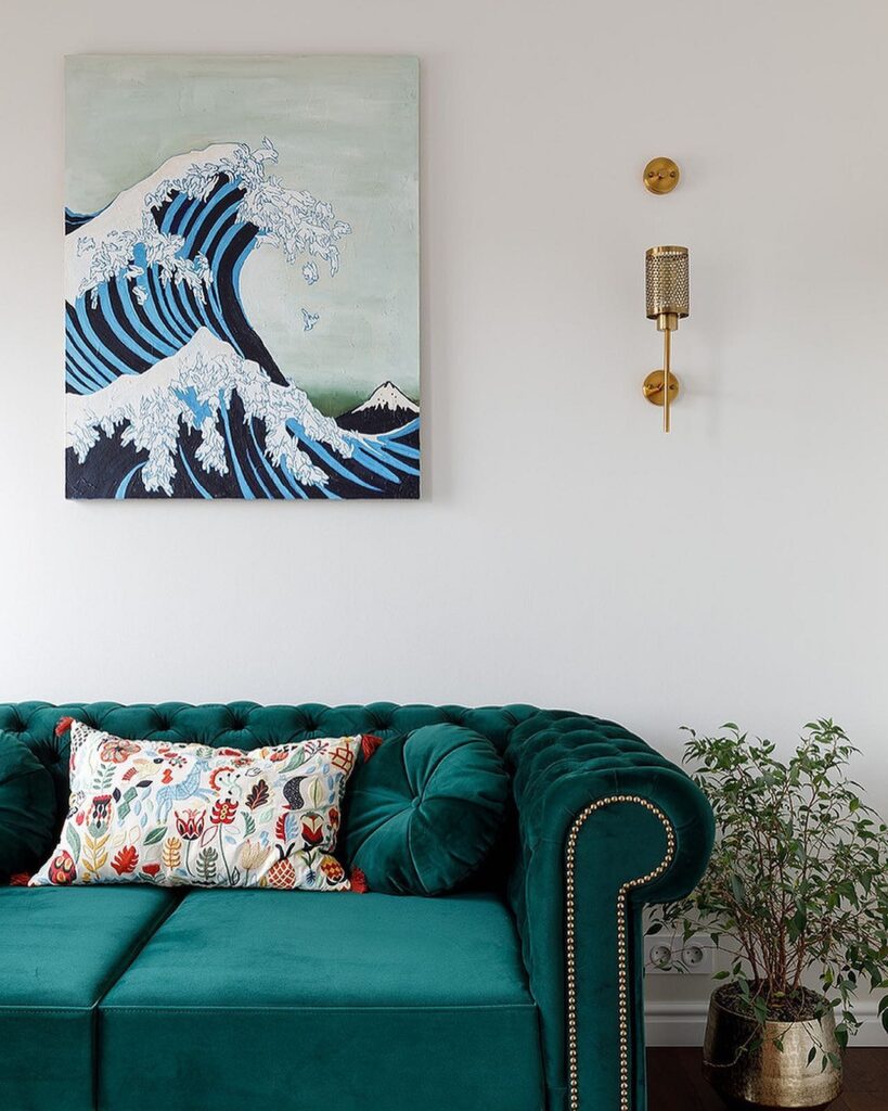
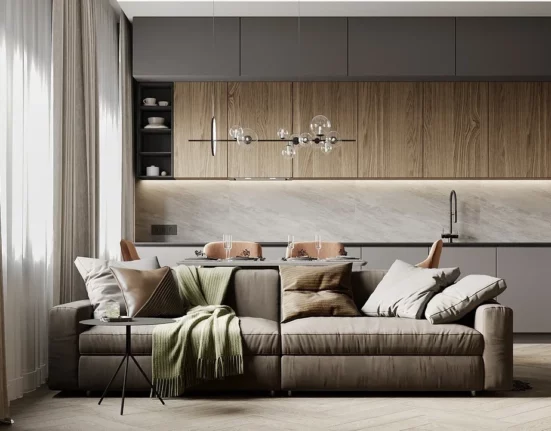
In the Living Room
Green evokes energy, creativity, and vitality — these qualities are perfect for a formal room where family members and guests gather for lively conversations. To maintain such a vibrant mood in the palette, it’s best to use malachite sparingly and combine it with lighter, calmer colors.
The most popular choice is a sofa as an accent piece. Not only will it be a bright spot and focal point of the room, but the hue of the precious stone is further revealed through textured fabrics and materials: velvet, velour, leather, etc. Complement it with other shades of green or blue, as well as gold-plated elements.
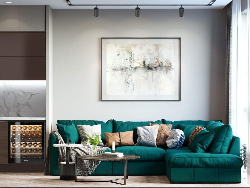
If you’re feeling adventurous and want to try dark green on your walls, it’s best to use it sparingly—for one accent area. This method can highlight the area behind the television or the sofa and visually zone the space.
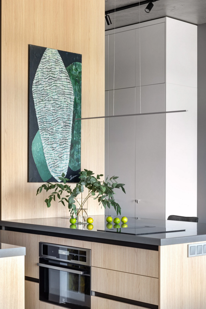
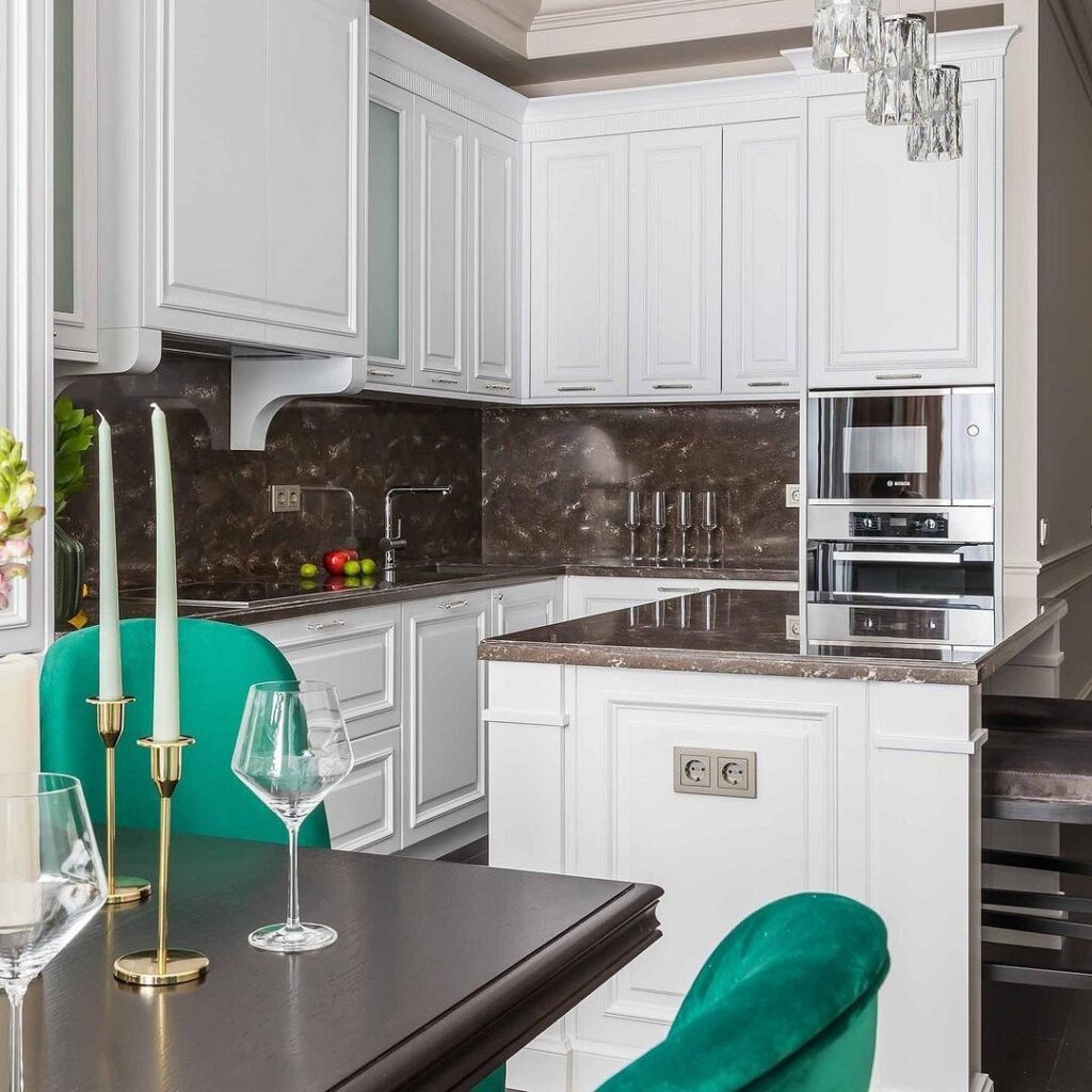
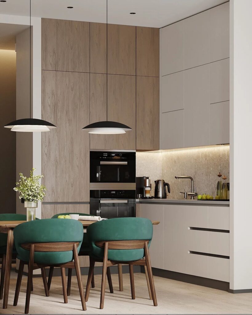
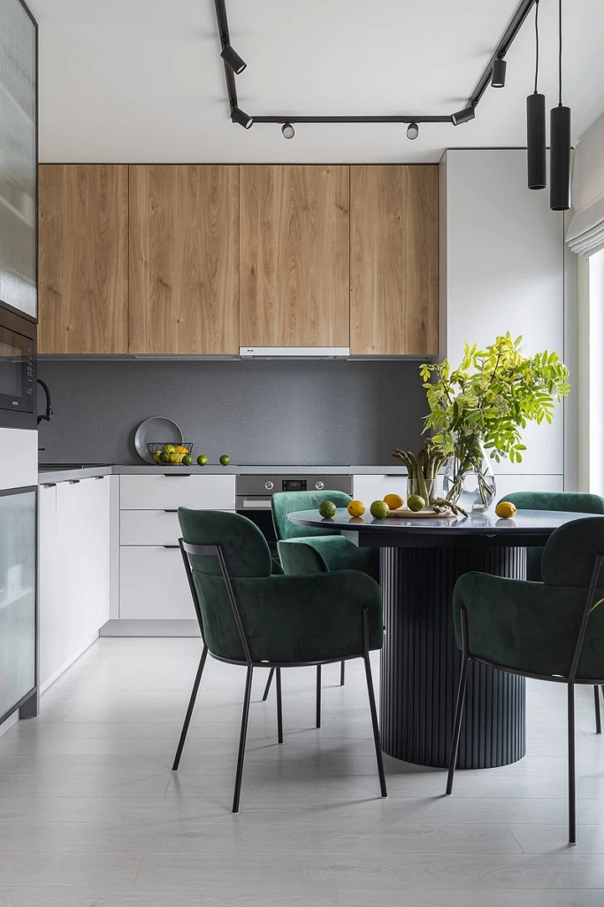
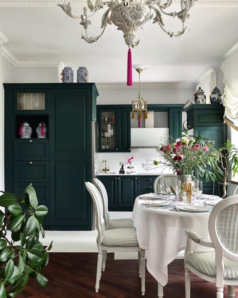
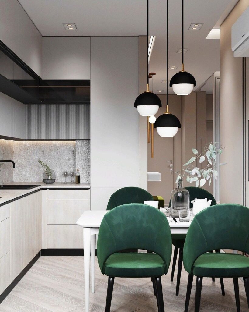
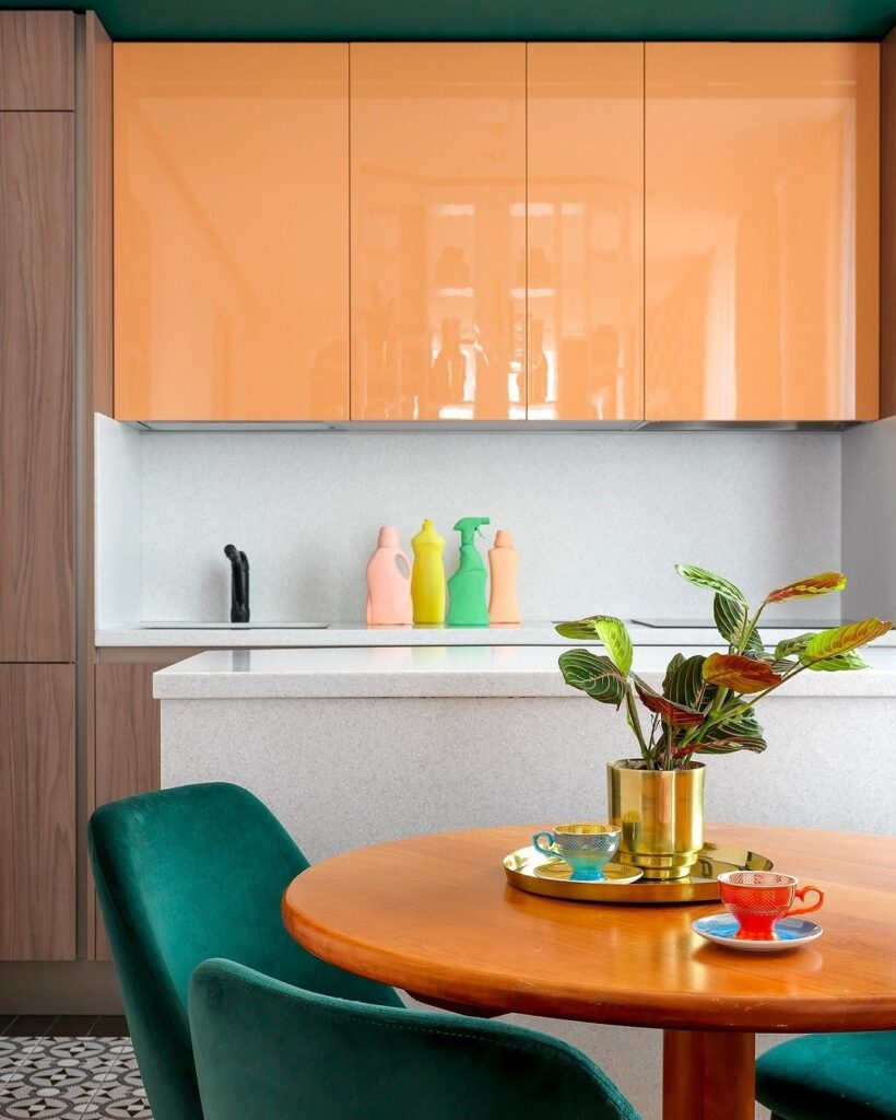
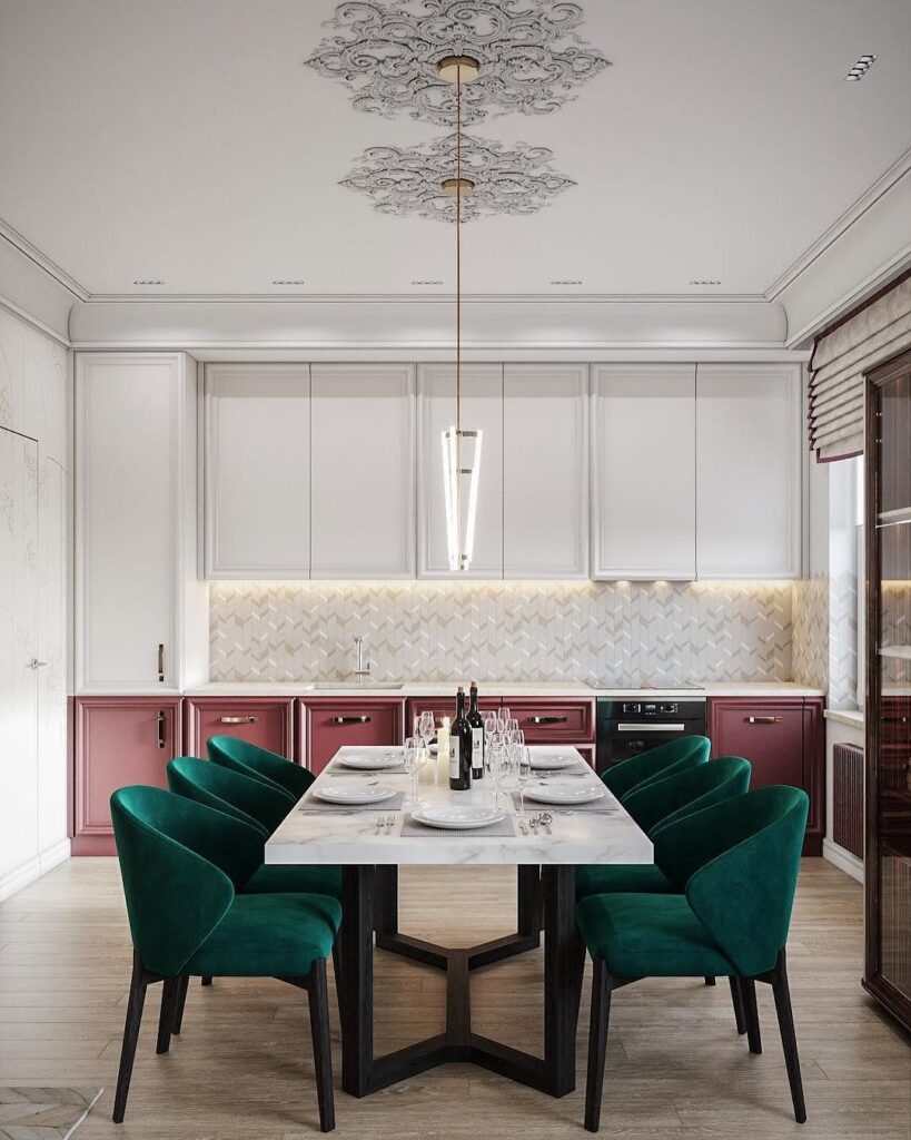
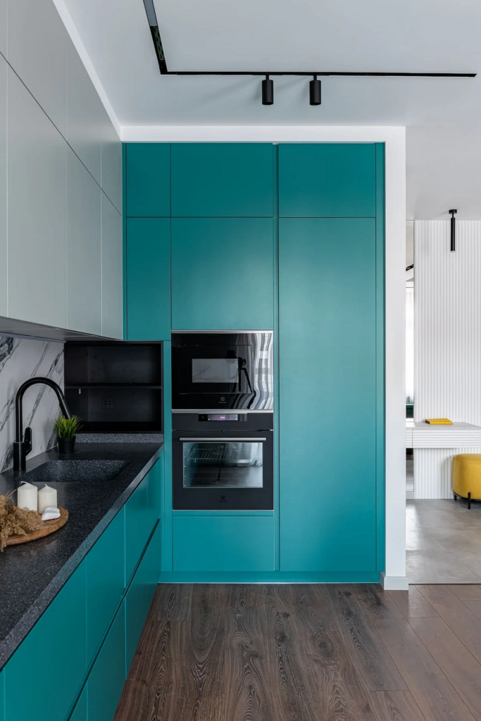
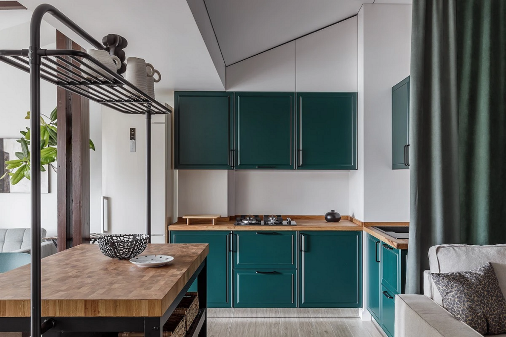
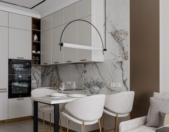
In the Kitchen
In the kitchen, the palette plays a special role: some colors stimulate appetite, others, on the contrary, subdue it.
The prevalence of one over the other depends on specific requirements for the space. Emerald green in kitchen interiors belongs to the cool, but energetic hues, thus it can be used as both a main and an additional element of the palette.
- As a base — in wall finishes, kitchen cabinetry.
- As an accent — on the backsplash, in the form of chairs in a dining set, an armchair or a small sofa, decor.
If the kitchen has a neutral color scheme, malachite is used as a bright, sometimes the only colorful spot. But it also combines well with other vibrant “edible” shades: burgundy, chocolate, berry, peach, mint, etc.
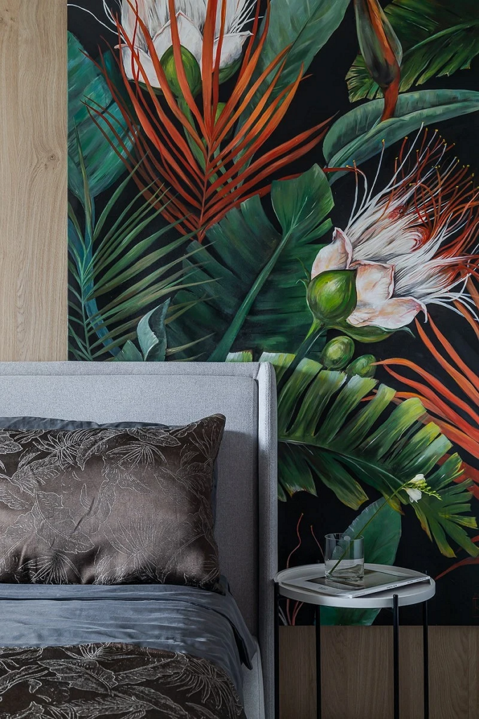
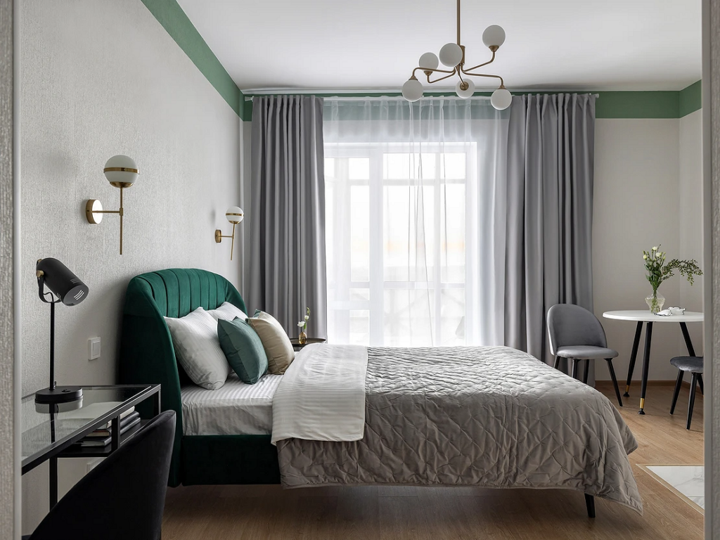
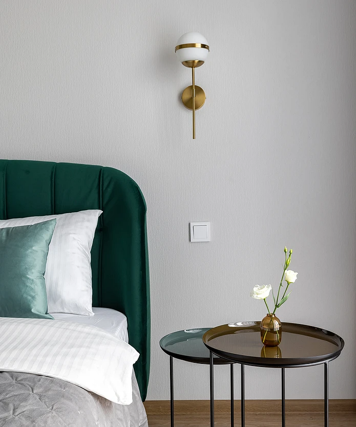
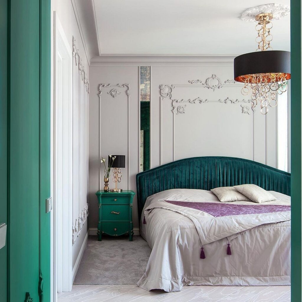
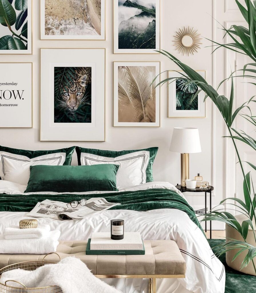
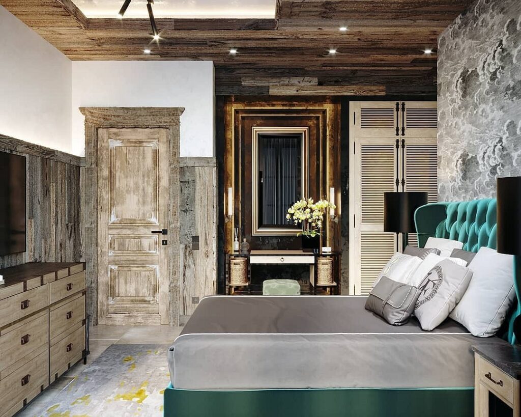
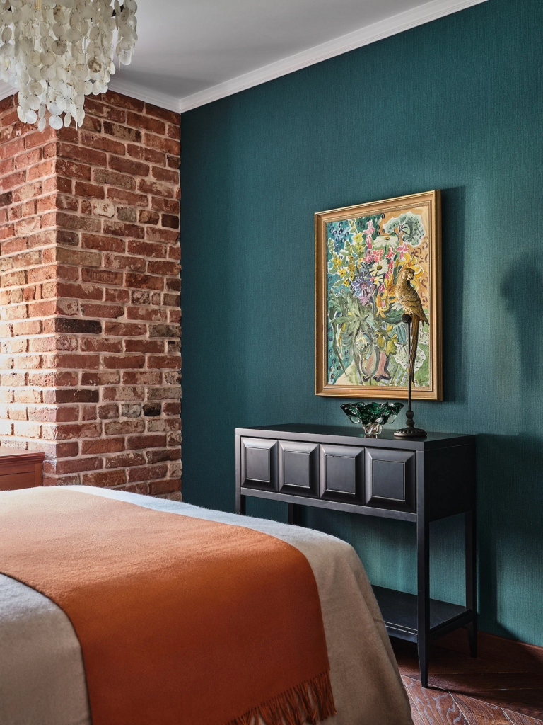
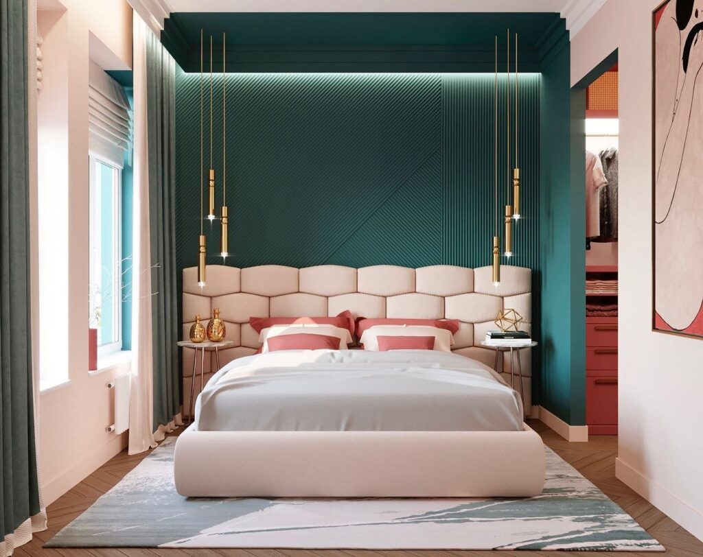
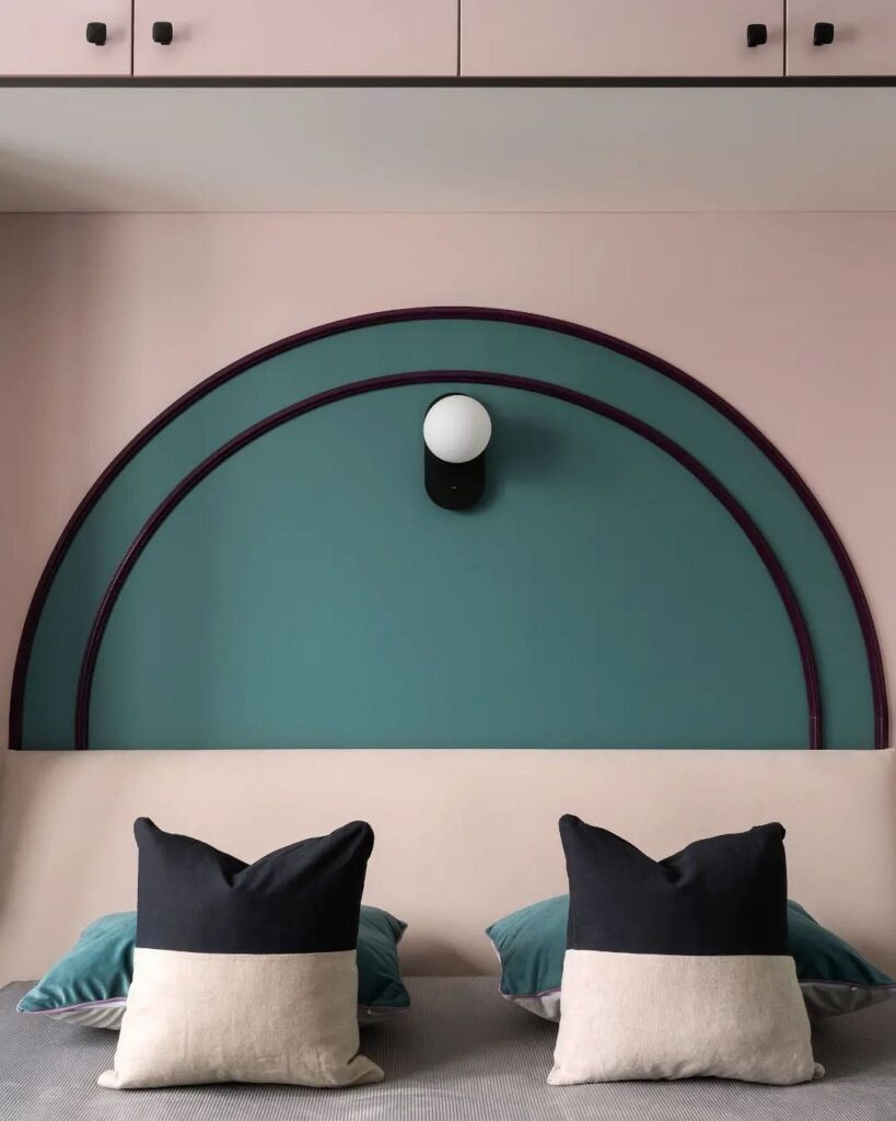
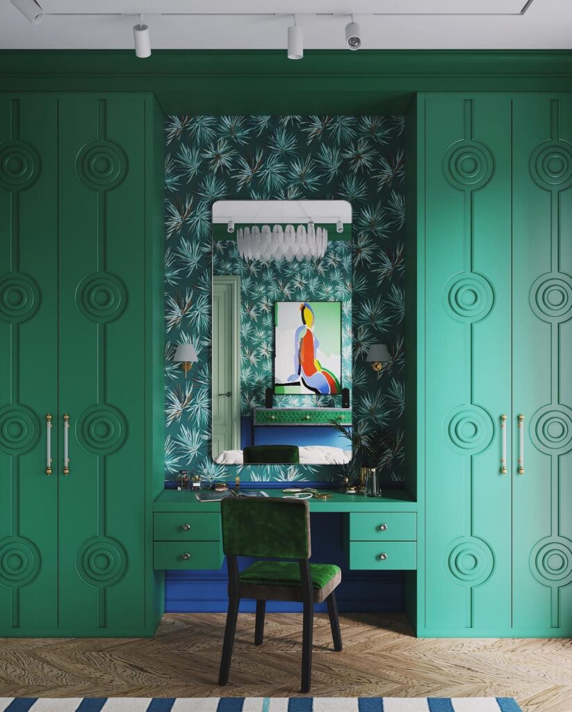
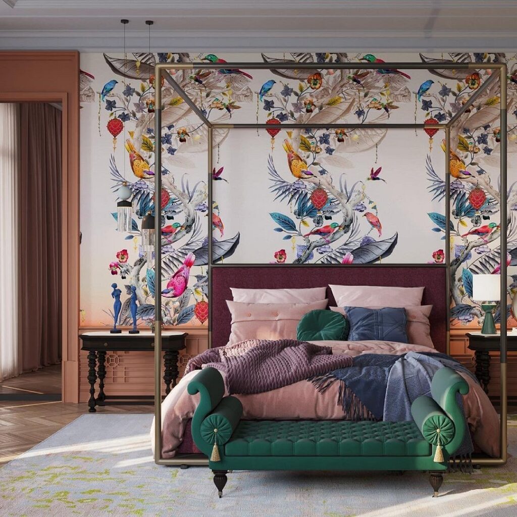
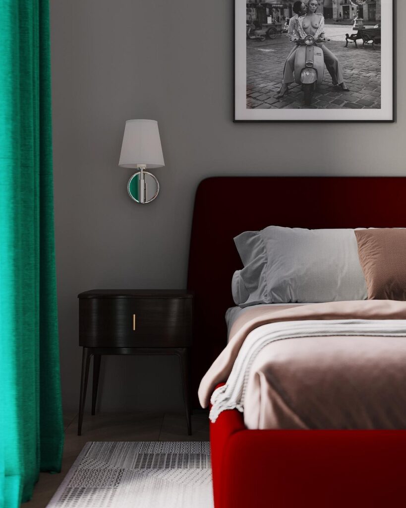
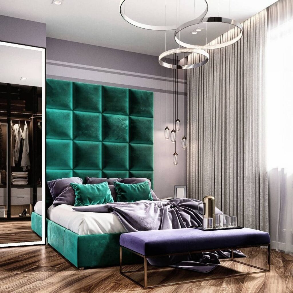
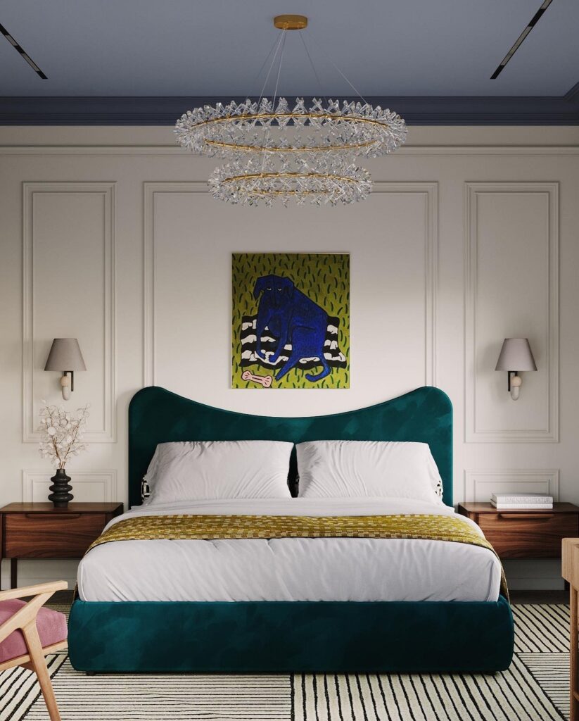
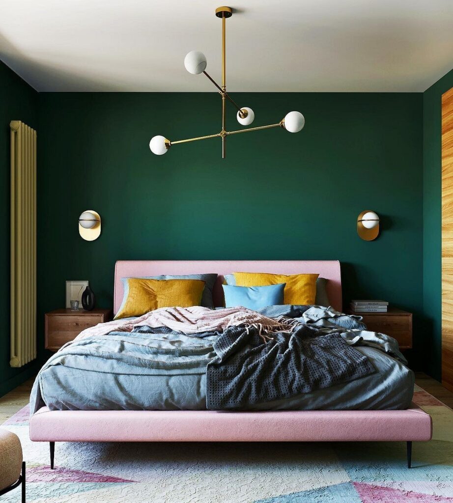
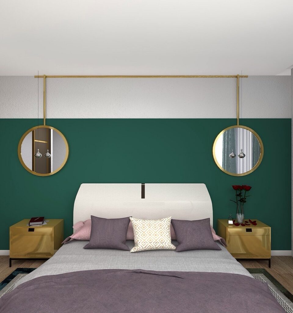
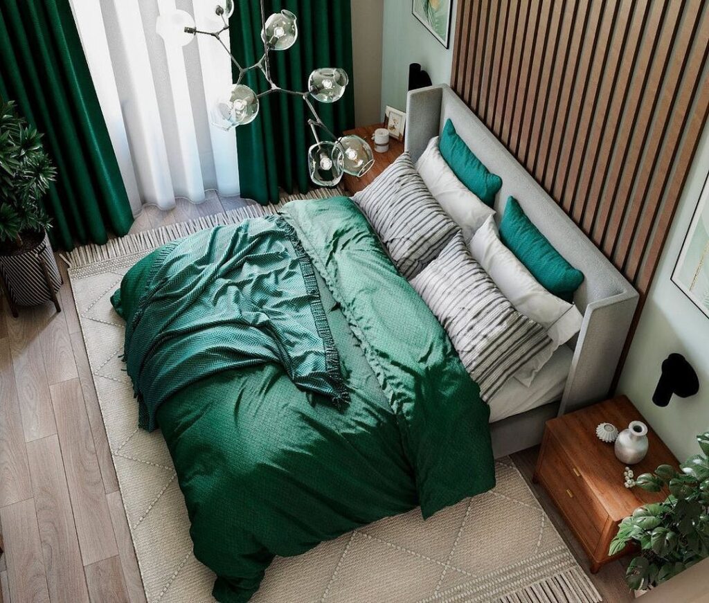
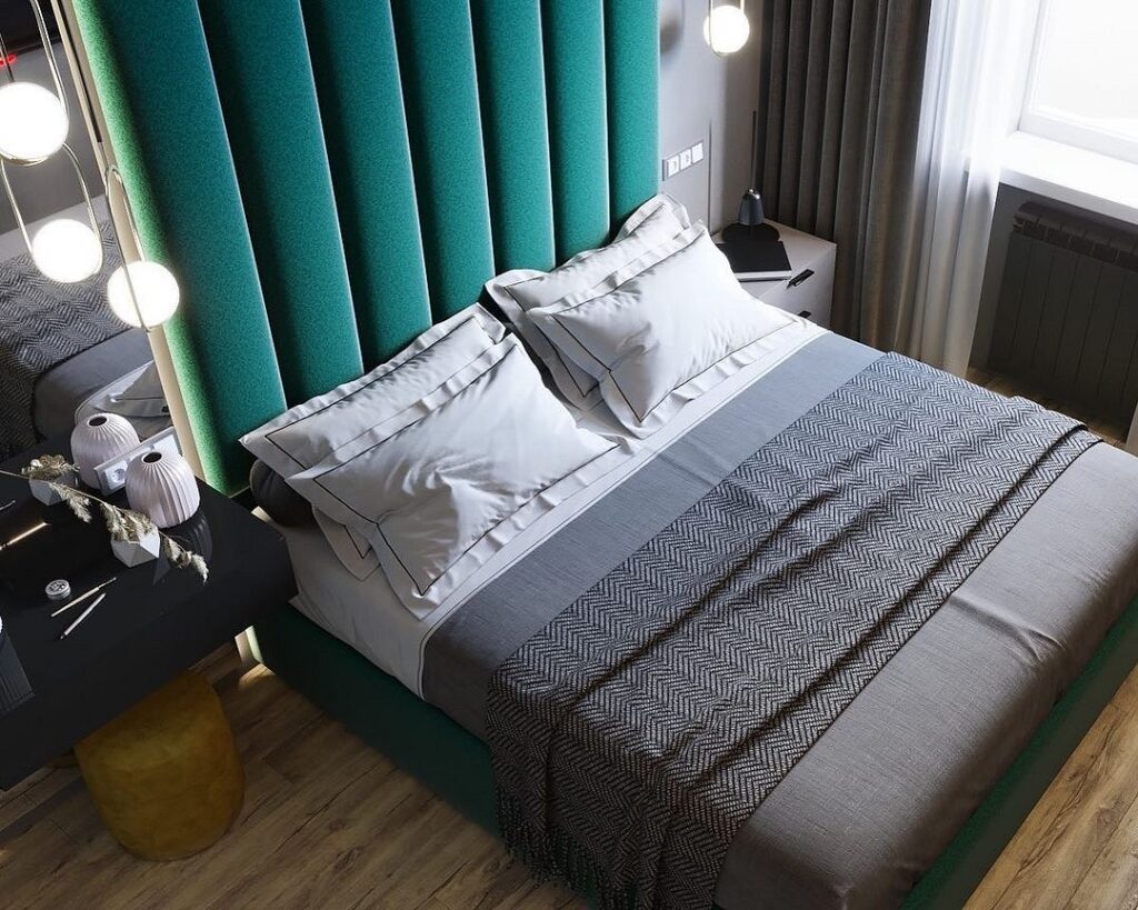
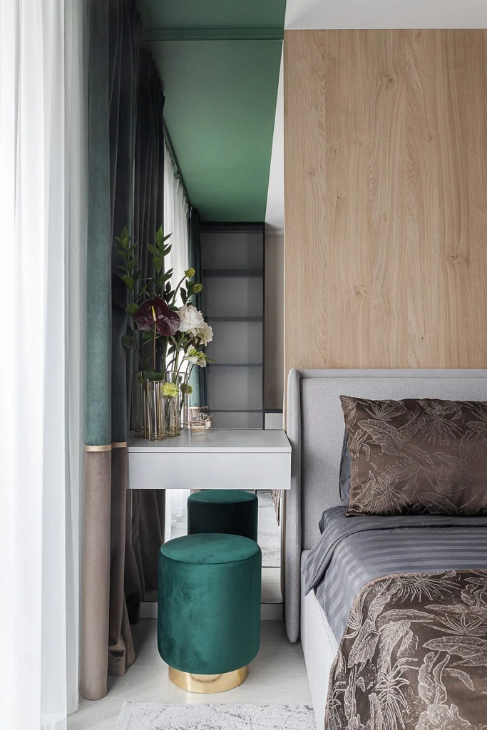
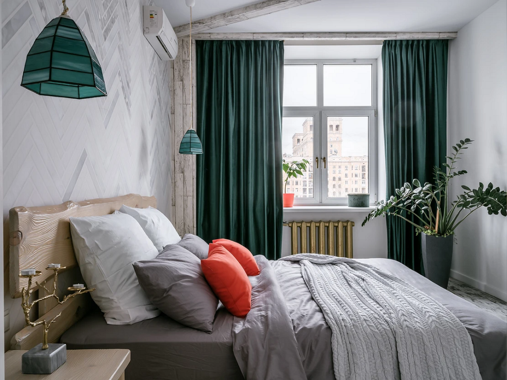
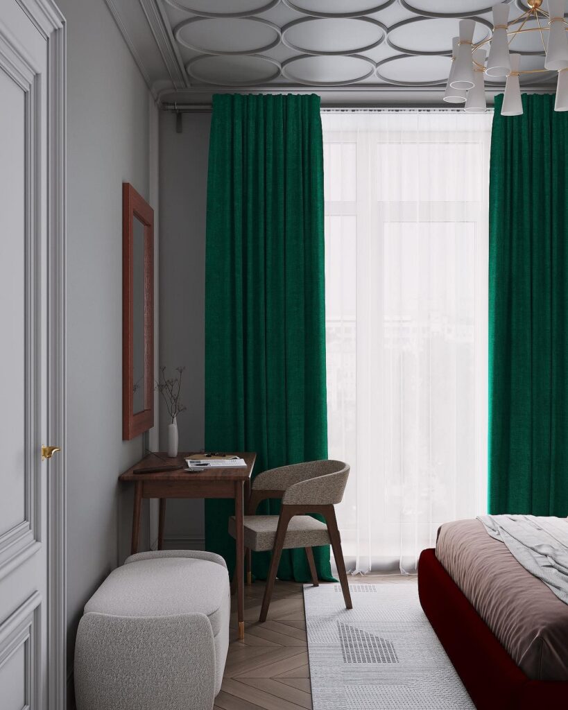
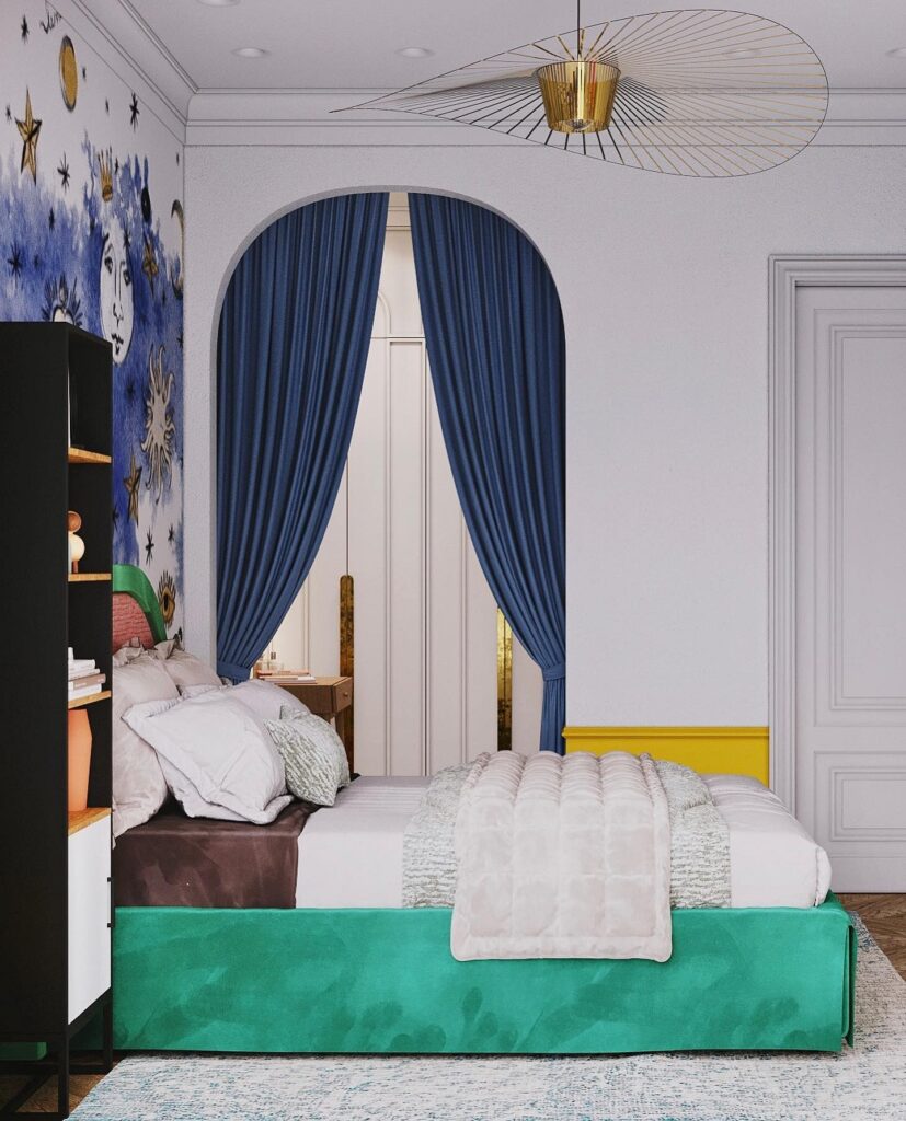
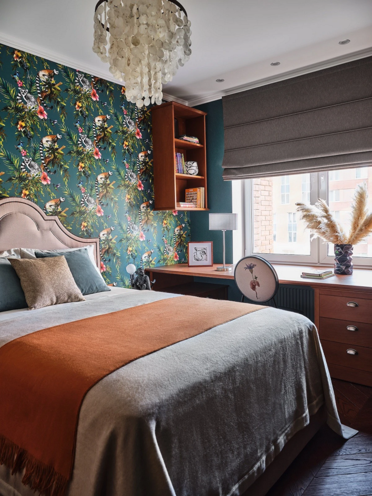
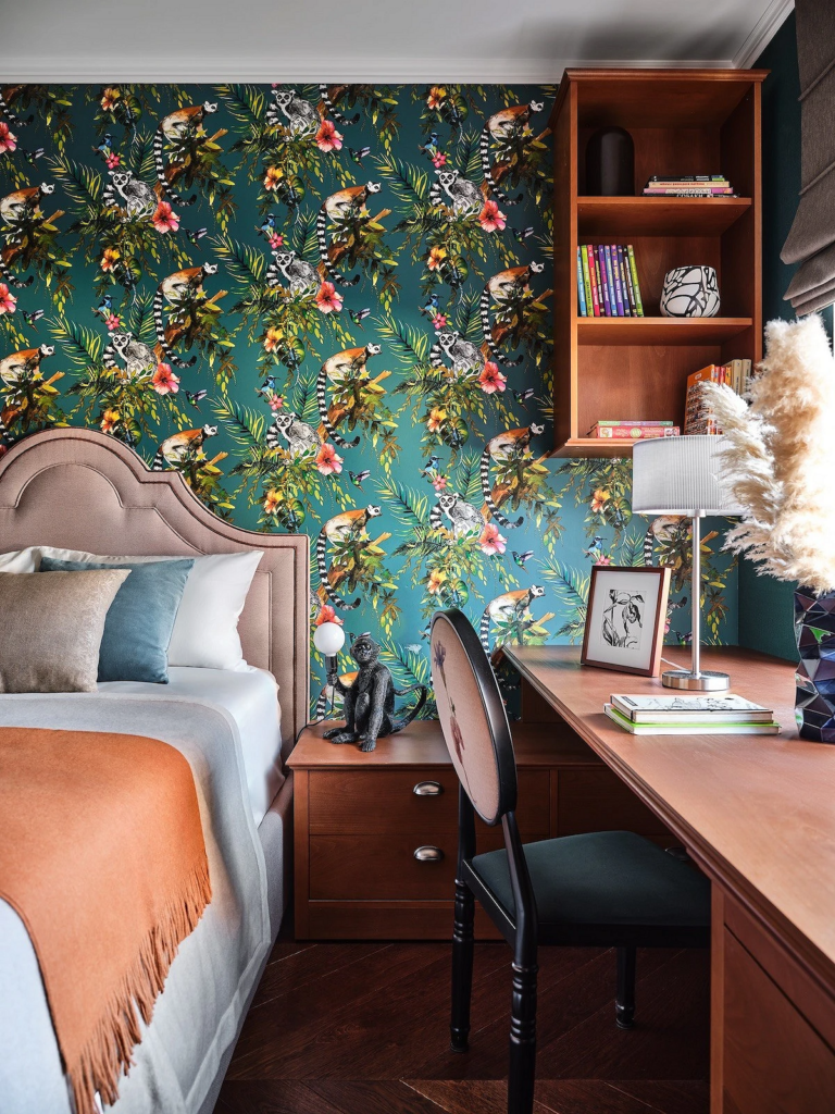
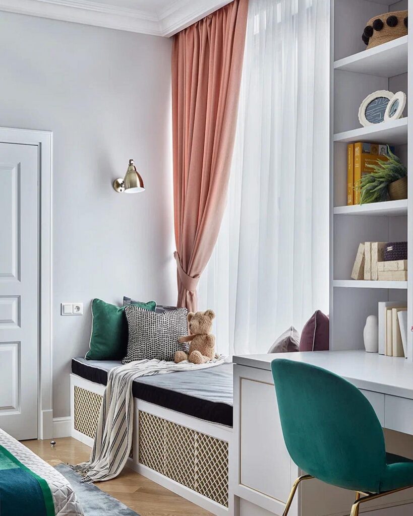
In the Bedroom
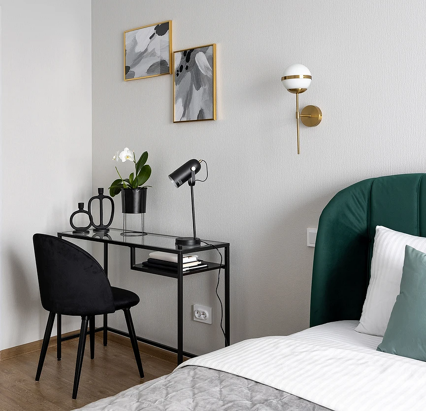
Emerald green in bedroom interiors appears in any form: in finishes, furniture, decor.
Since the rest area is a personal and very secluded space, the dark palette helps create an intimate atmosphere and sets the mood for relaxation. You can paint all the walls or just one or two as an accent. The finish can be complemented with textiles and decor in matching tones.
If emerald walls are too bold and you prefer a lighter bedroom, you can use this hue for individual elements: a pouffe at the makeup table, an armchair, curtains, bedding, lamps, etc. A dark green headboard or the entire bed frame looks striking.

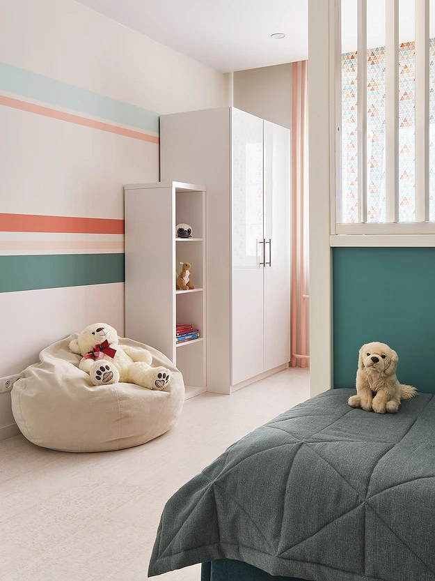
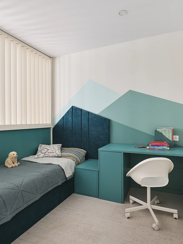
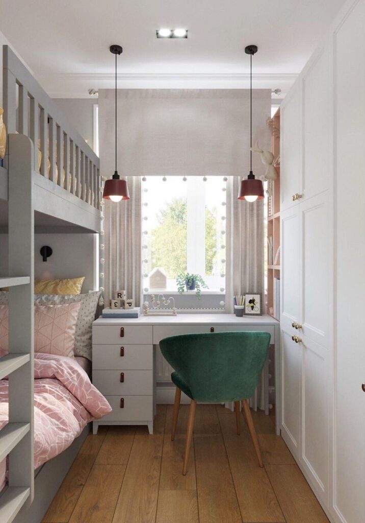
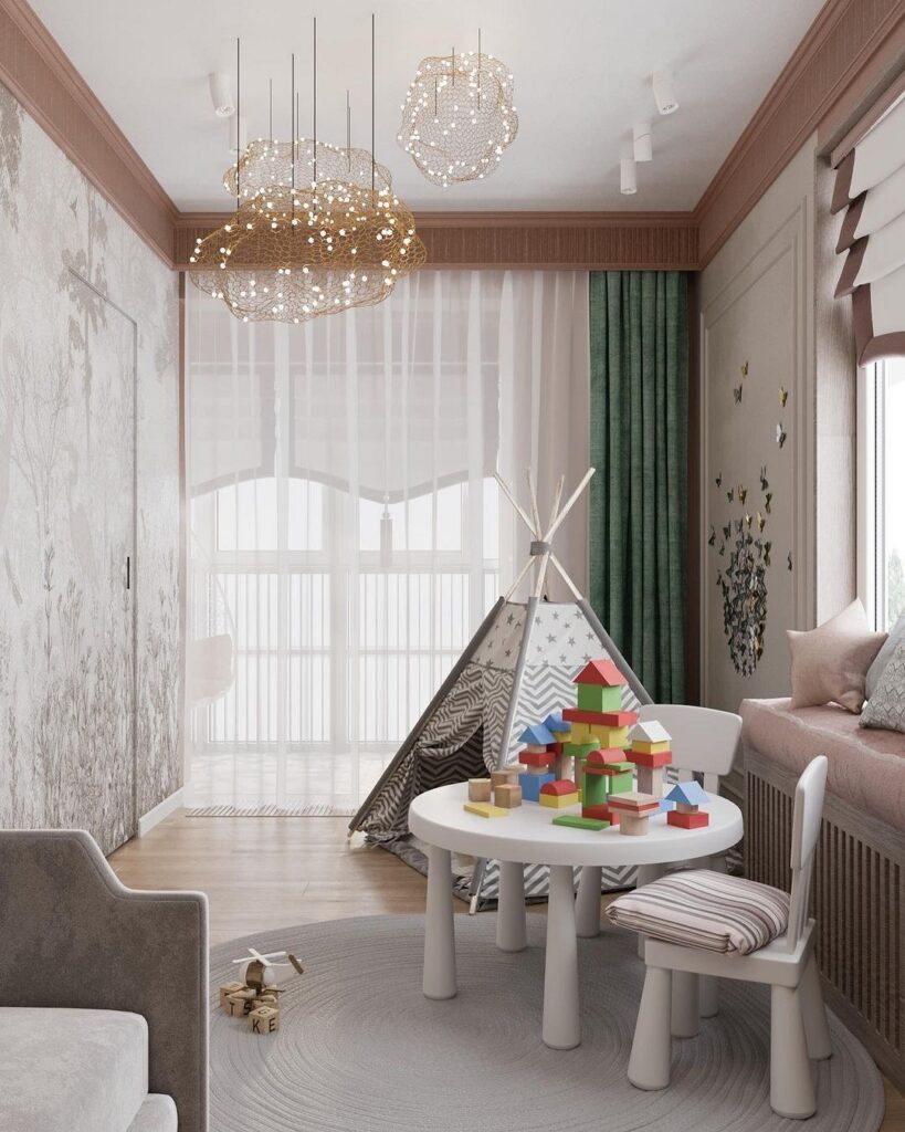
In the Nursery
Unlike the energetic lime green, blue-green instead calms and contains excessive childhood activity.
It also aids concentration on developmental games or lessons, making it excellent for designing a work area. To prevent the room from becoming too gloomy, it’s best to use lighter and calmer variations of malachite and definitely as an accent. Combine with other bright elements: pink, blue, yellow. The general palette of the nursery should be dominated by neutral base colors that will balance the active color accents.
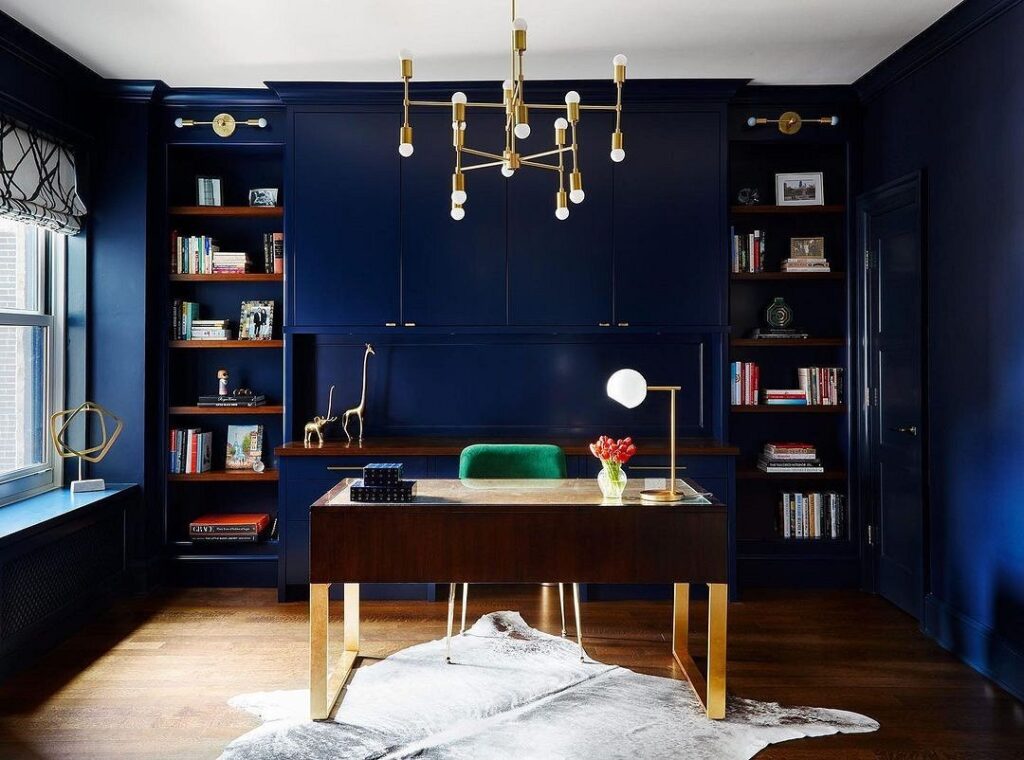
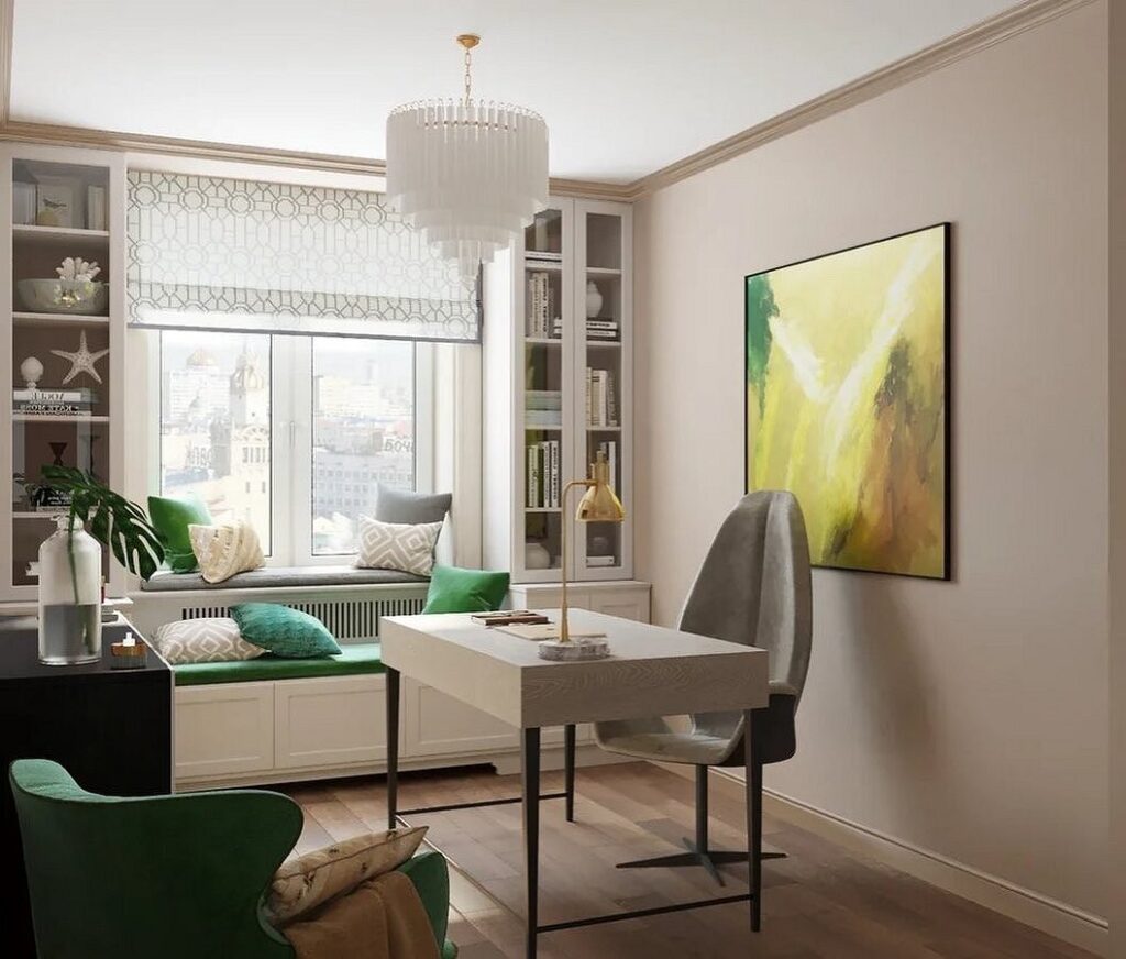
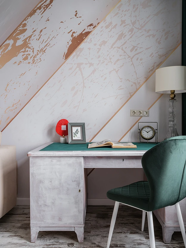
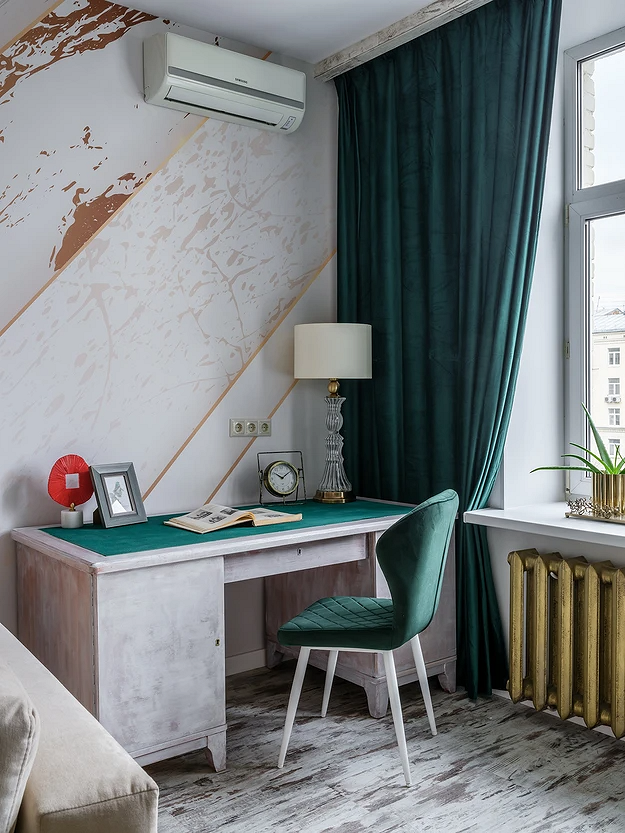
In the Office
Shades of gemstone and bottle glass fit beautifully into the design of a home office.
Firstly, they add luxury to the interior and make it more distinguished; secondly, they help focus and set a work-oriented mood. Noble green pairs excellently with wood, stone textures, and natural fabrics. It can be a bright accent on a neutral light background or part of a rich dark palette.
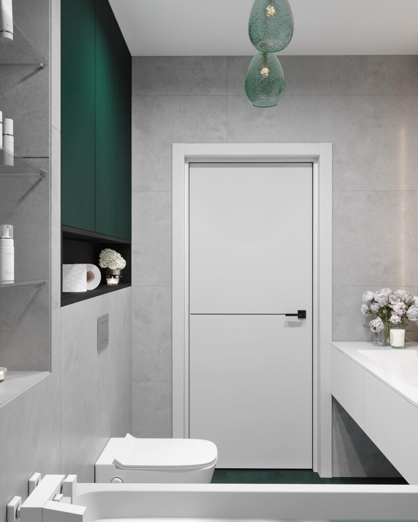
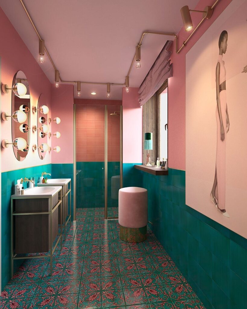
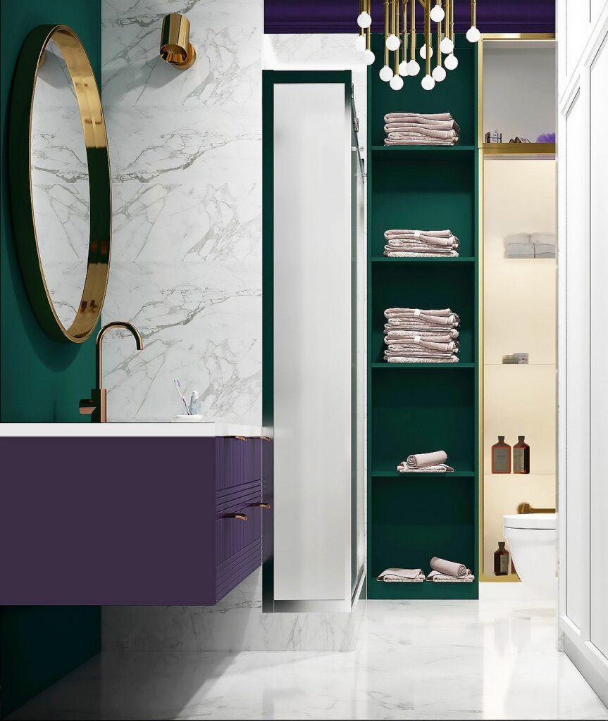
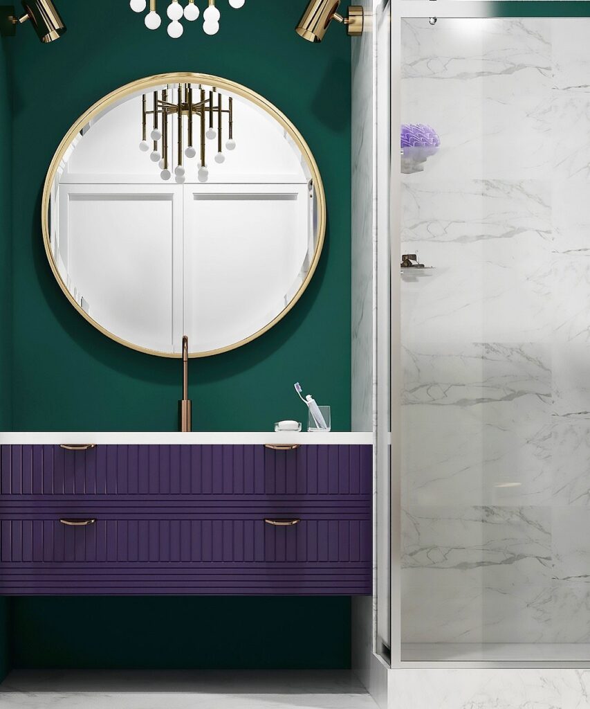
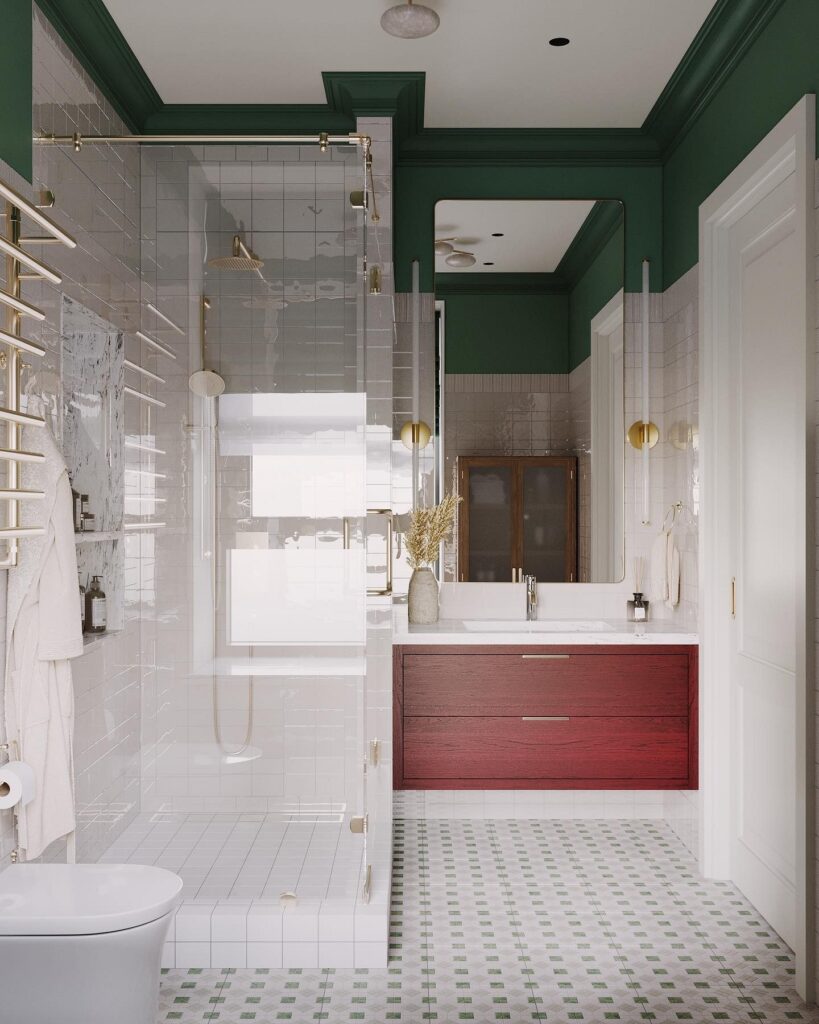
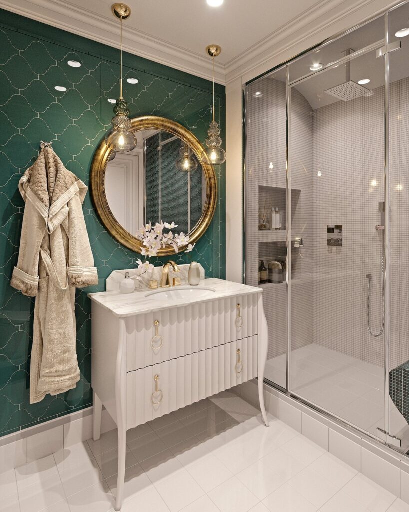
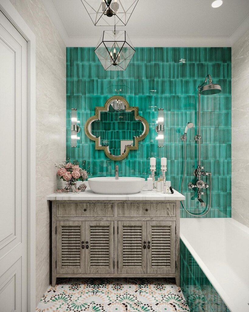
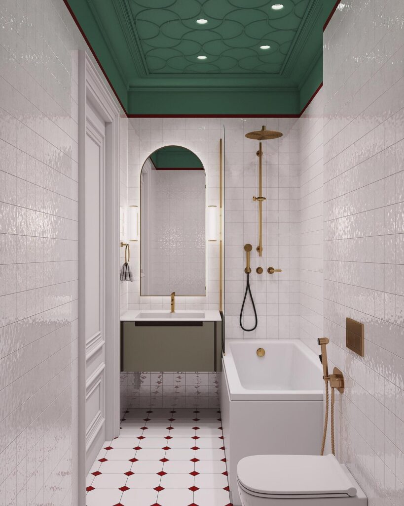
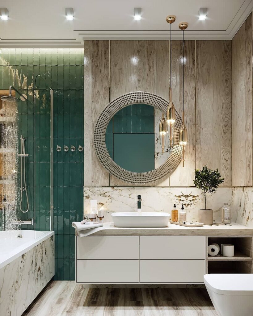
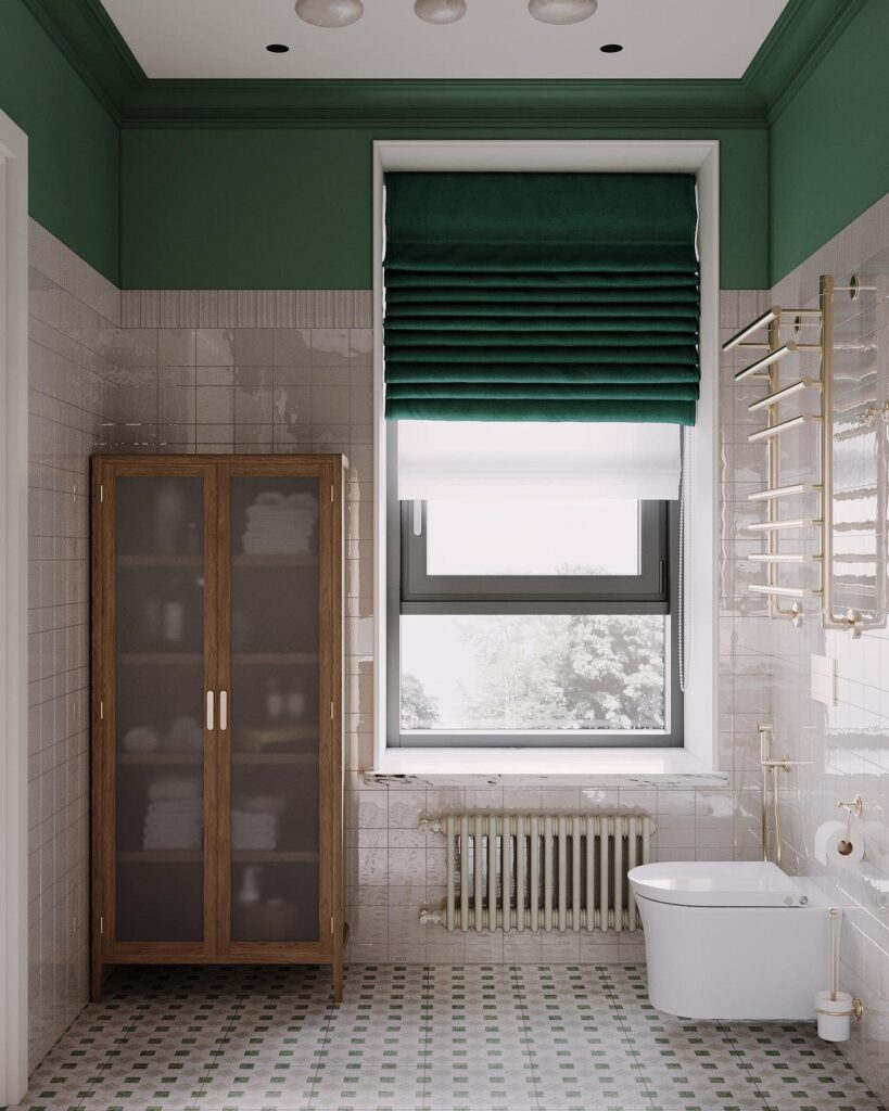
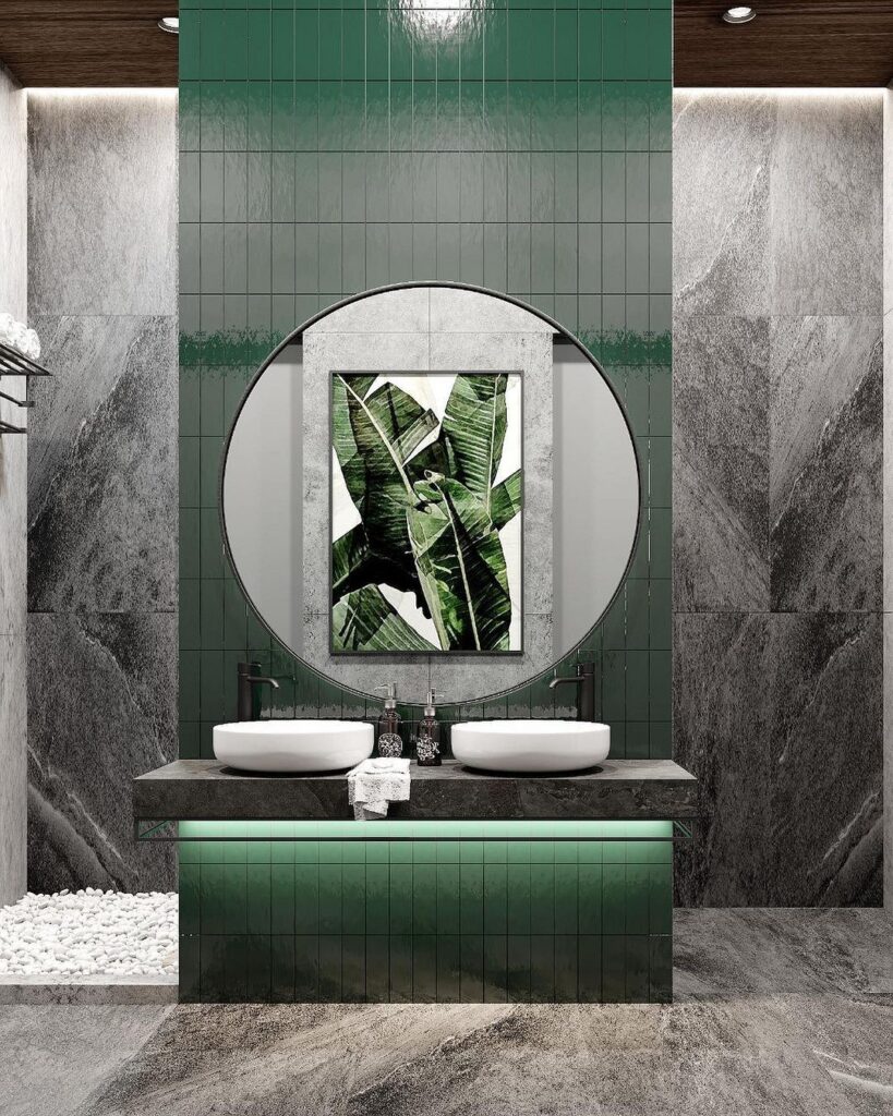
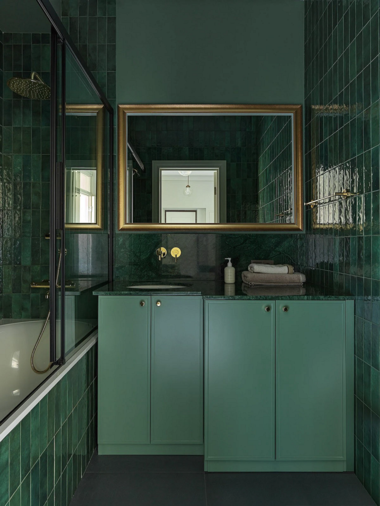
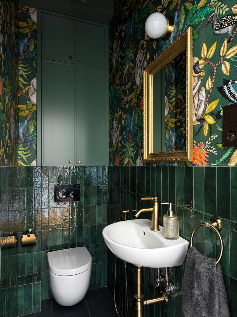
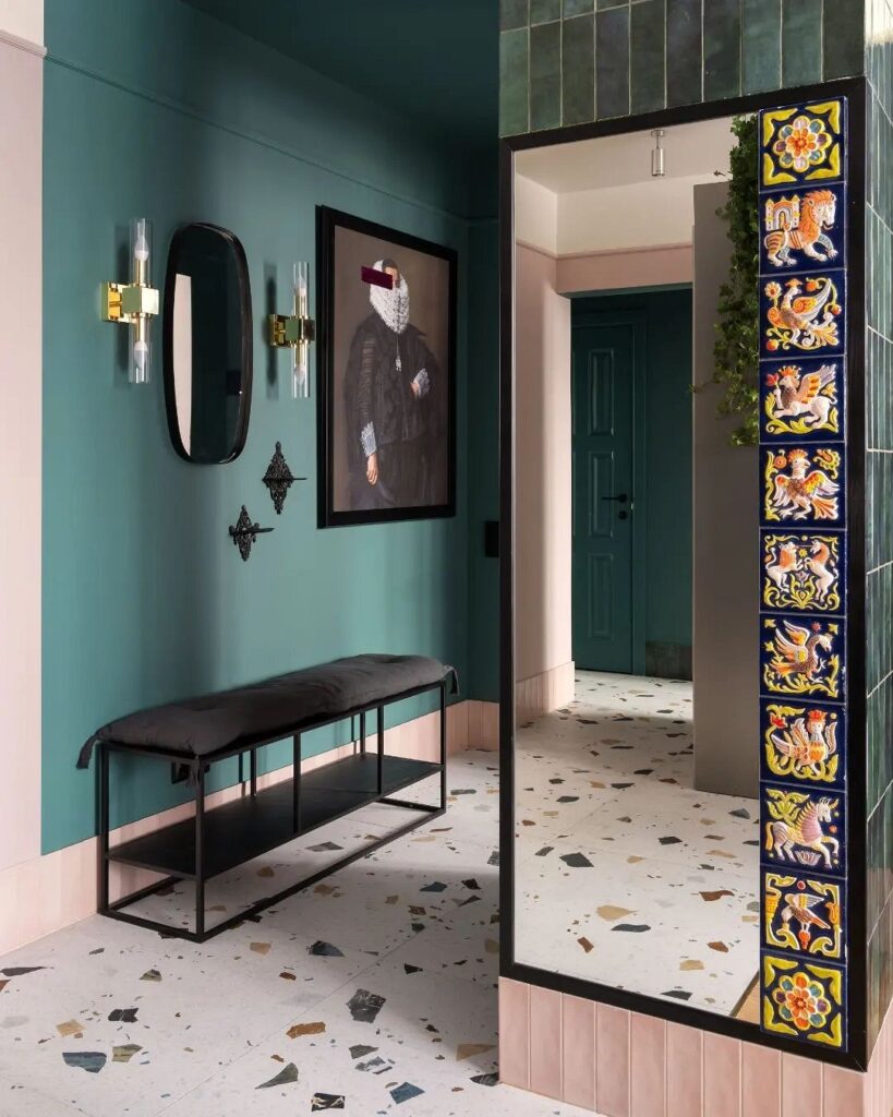
In the Bathroom
In the bathroom, any shade of blue and green looks natural as they are directly associated with water.
This is also the space where you can experiment and play with shades of gemstone. It looks great in vertical and shaped tile coverings, as well as in stone and marble finishes. Gilded elements and elegant glass light fixtures help create the effect of a jewelry box.
This active shade can be used selectively: for example, to highlight the area around the sink, shower, or bathtub. If the bathroom is small, combine dark finishes with light elements, definitely using mirrors, complex lighting, and glossy surfaces.
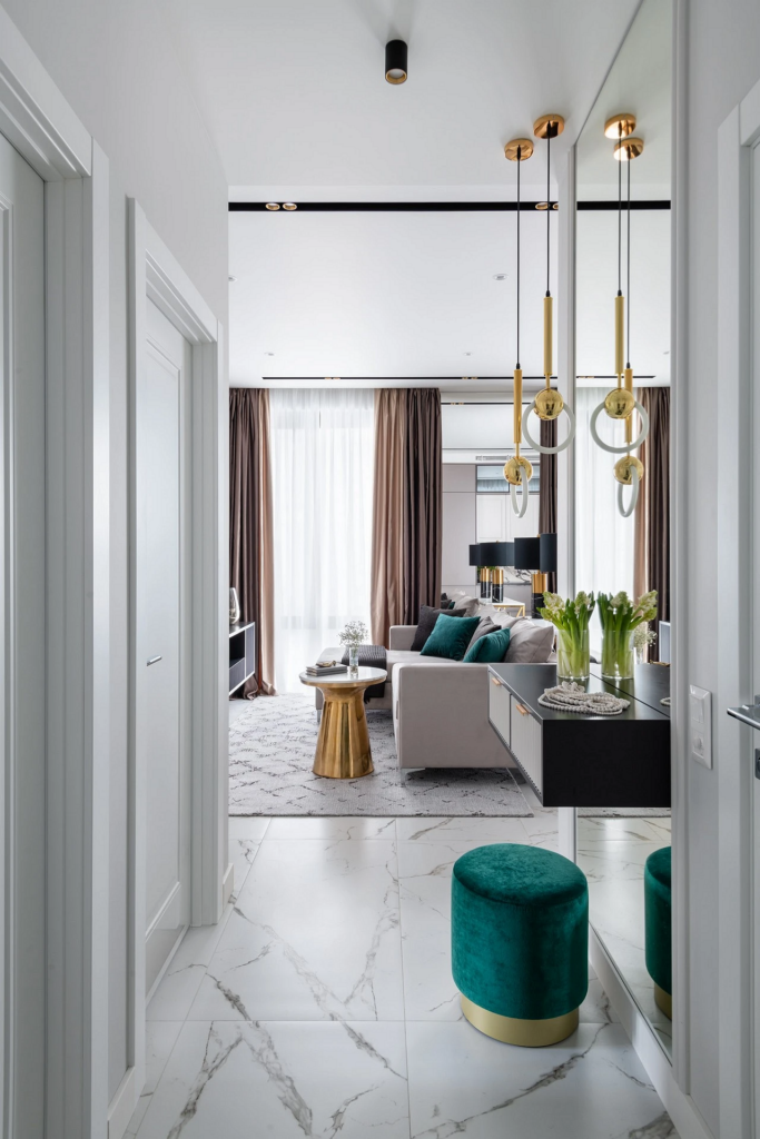
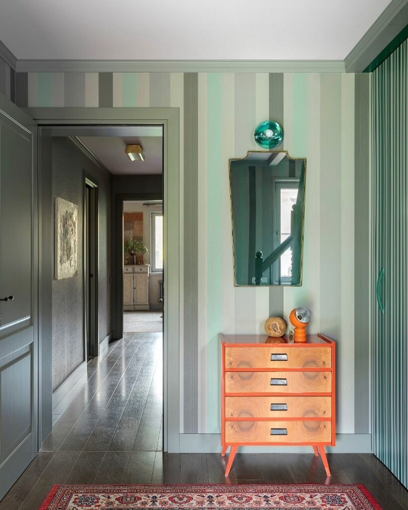
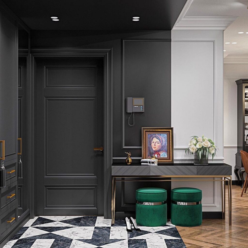
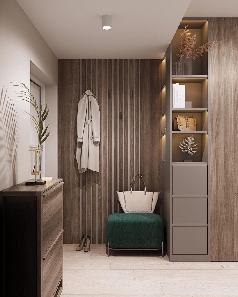
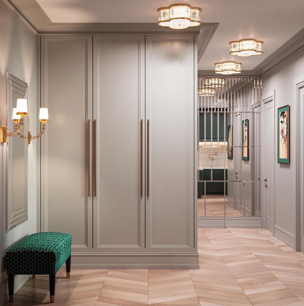
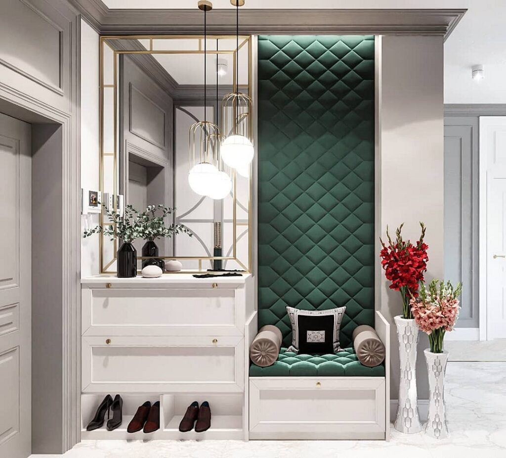
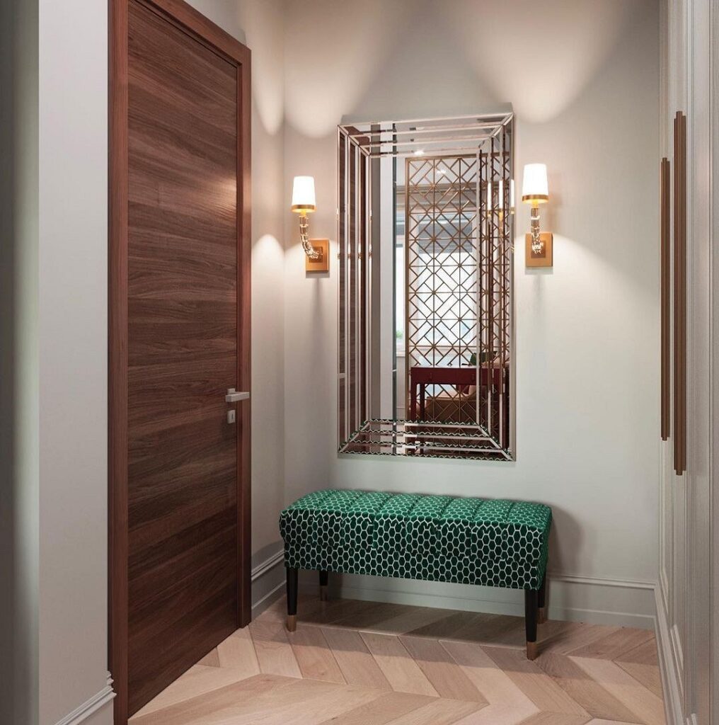
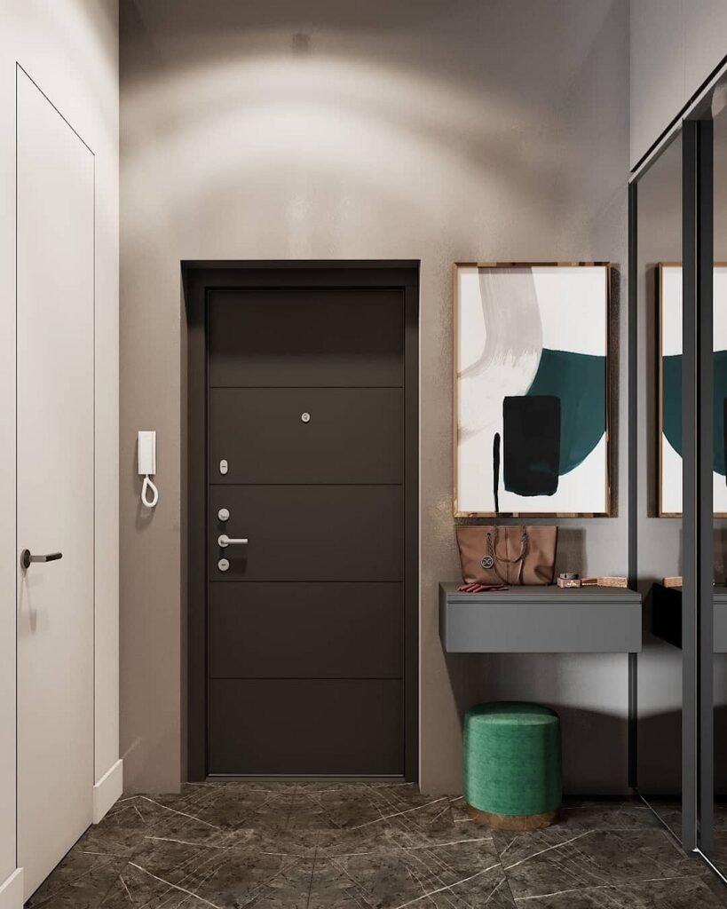
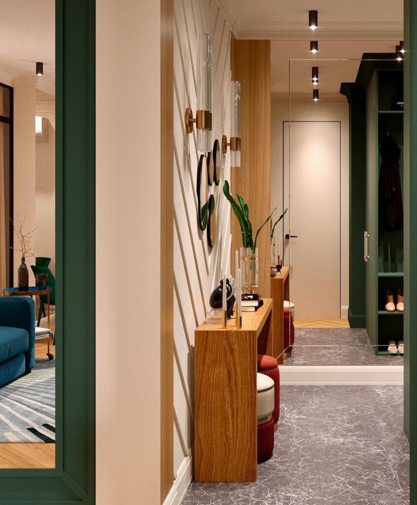
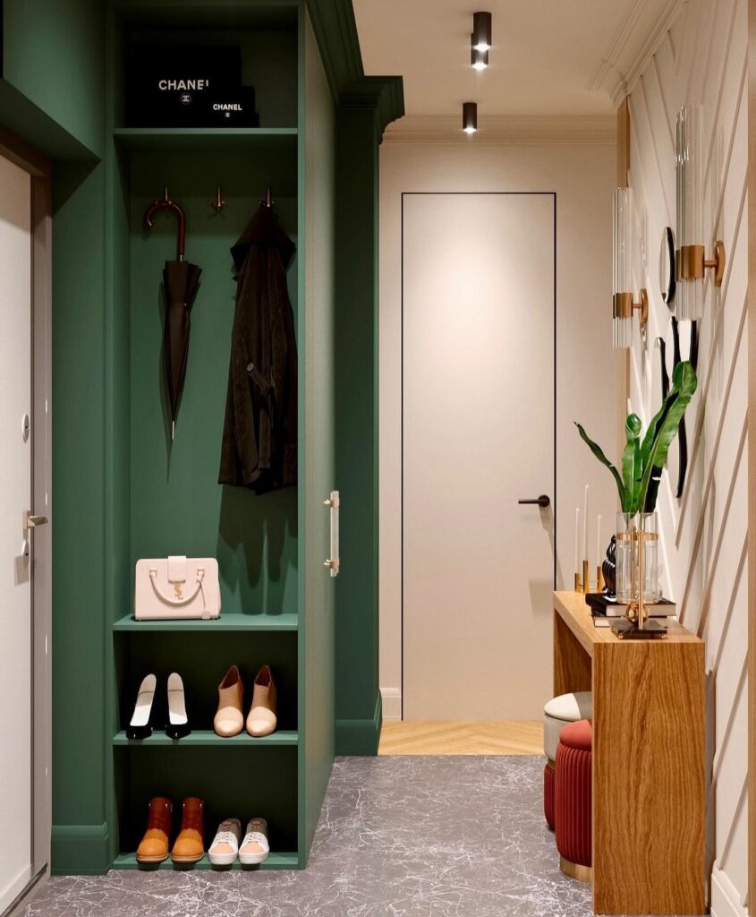
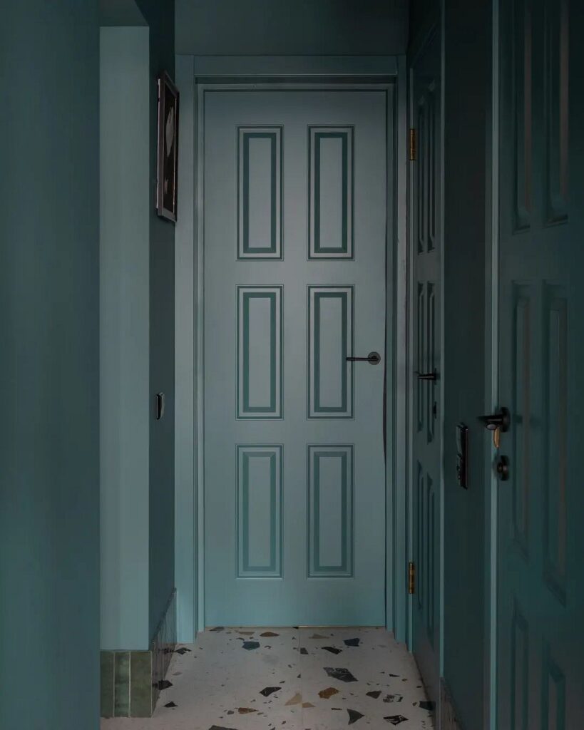
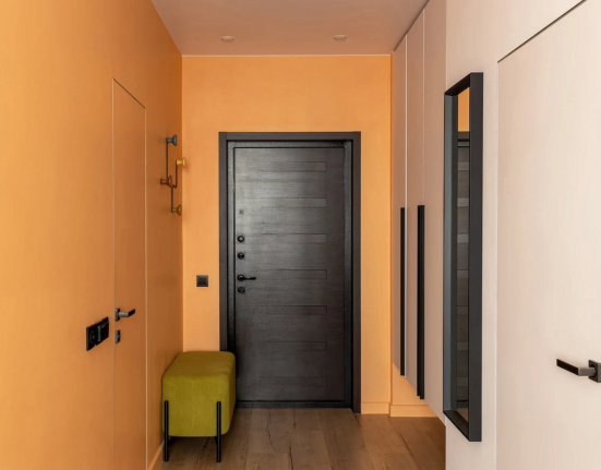
In the Hallway
The hallway in an apartment is typically designed primarily for practical considerations.
A small area and high traffic mean that a light palette and simple finishes are optimal for the entry area. Natural emerald
hues can diversify a neutral interior and make it elegant. The simplest method is to use deep malachite as a bright accent: for example, for a small piece of furniture like an ottoman or decor. Also, part of the wall can be painted dark green to also zone a small space.

Leave feedback about this