Are you considering a kitchen-living room but not sure how to organize the space? You’ll need smart zoning to comfortably accommodate both the cooking area and the relaxation area. And what if you need a full-sized dining table and a workspace? However, with proper use of partitions and furniture layout, all of this can be accomplished without any issue. We will now explain how to achieve this!
Methods of Zoning
The most challenging aspect of zoning a kitchen-living room is to differentiate the two areas without interfering with each other. It is essential to consider the specifics of the kitchen work area when selecting materials and finishes while conveniently accommodating not only the cabinets but also the entire work triangle with the sink, stove, and refrigerator.
Static Partitions
If you don’t like open-plan spaces, full-sized static partitions are a great option. A lightweight frame or drywall construction can replace an entire brick or block wall. The thermal and sound insulation may be lower without additional layers of mineral wool, but you can save on space.
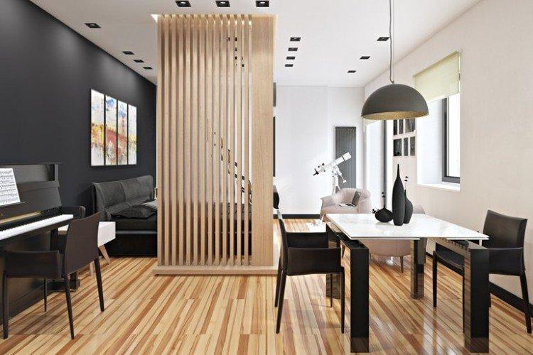
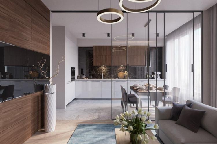
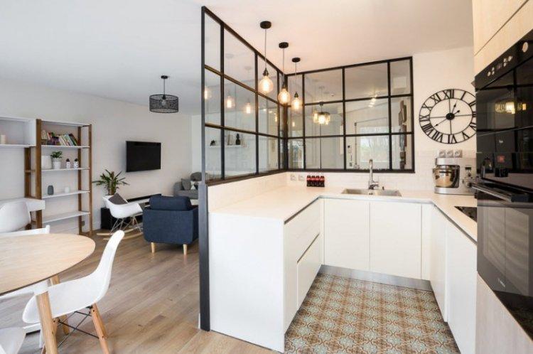
In spacious modern living rooms, static glass partitions look fascinating. The glass doesn’t have to be transparent; it can be frosted, tinted, or patterned. Pay attention to constructions made of glass blocks: they are bulkier but more original. Wood, concrete, leftover bricks, and any other materials can also be suitable for partitions.
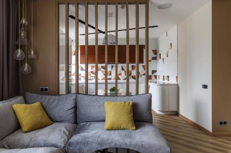
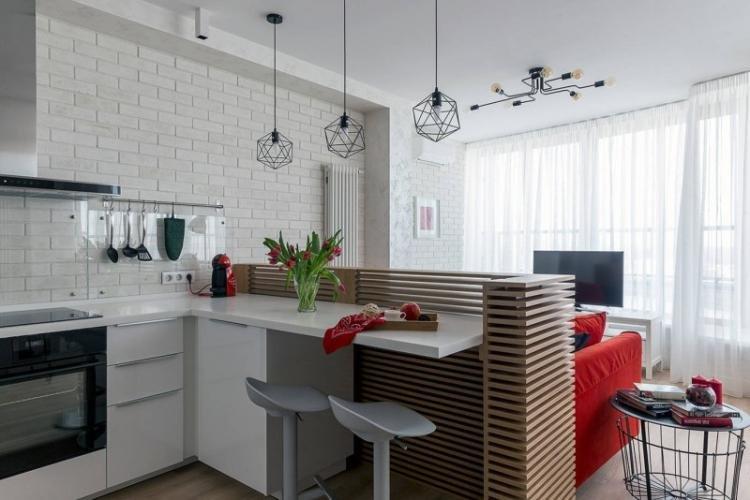
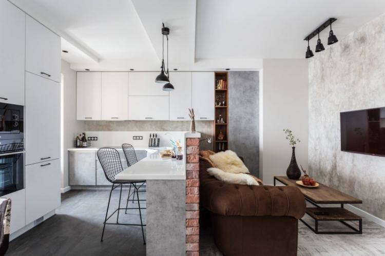
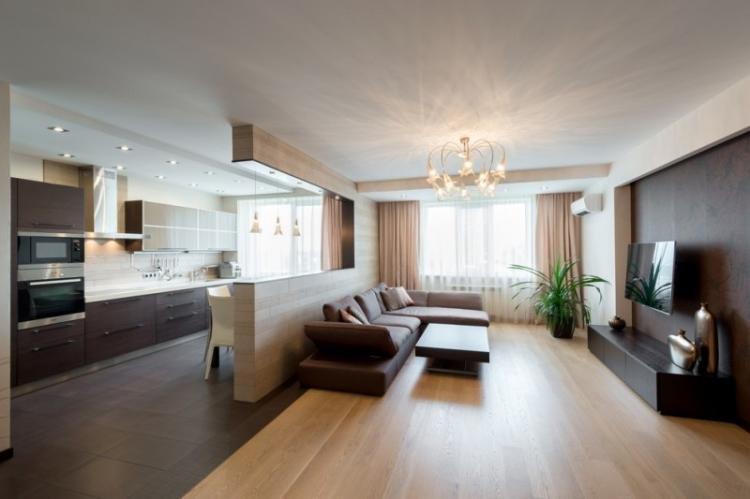
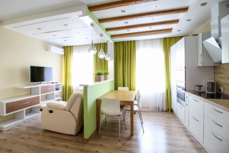
Low partitions at the level of the countertop or bar counter are commonly used to zone kitchen-living rooms. This way, you can use a ready-made design and do without extra furniture. And if you leave niches at the bottom, they can easily replace several wall shelves or a small bookcase.
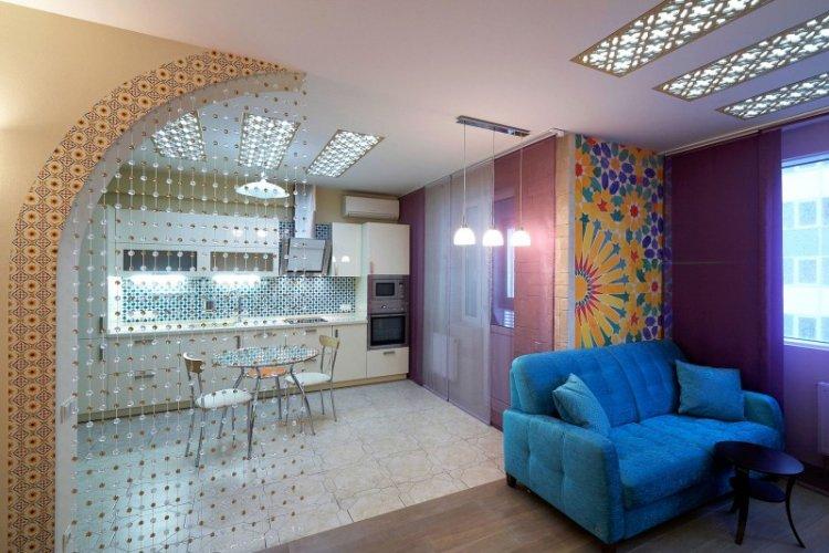
An elegant option is arches of any size and shape, from classical to wide and barely defined. Rectangular or rounded arches are timeless classics, while circular, trapezoidal, or any other shape looks good in creative author interiors. Niches, lighting, decorative cutouts, or inserts can also be incorporated into them.
Screens and Movable Partitions
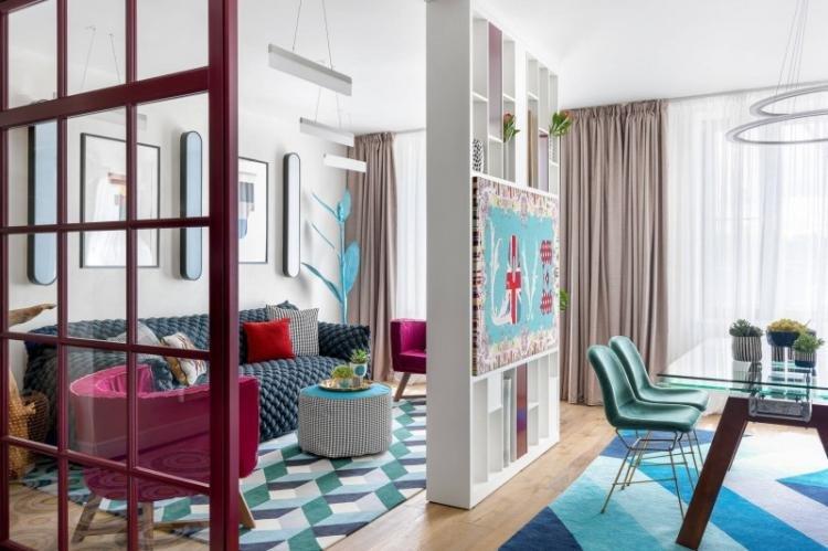
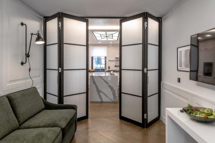
If there’s not much space in your kitchen-living room, or you don’t want to clutter the space unnecessarily, use movable partitions. You can put them up as needed to separate the work area, guest area, or writing desk.
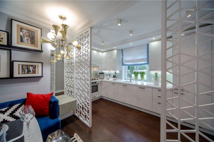
Screens and partitions can be folding, sliding, or movable, fully enclosed or translucent. These can be impressive wooden structures, tempered glass, or airy lattice classic screens.
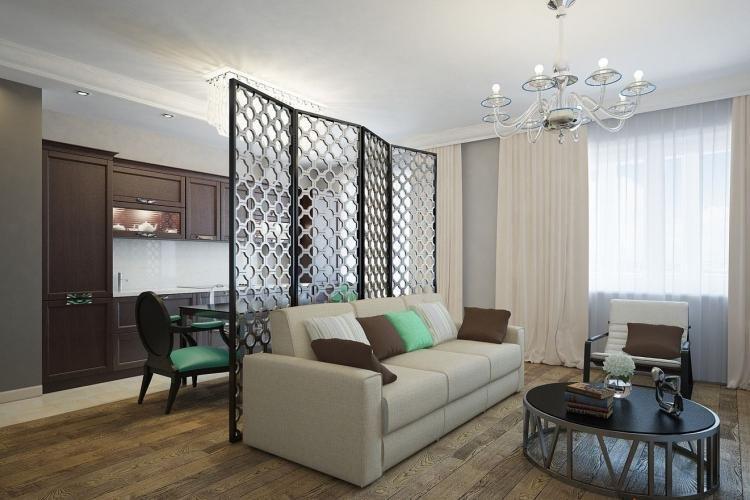
The simplest option is a sturdy folding frame with fabric or textile filling. For example, such partitions made of bamboo or dark wood with white thin fabric are popular in Japanese and Mediterranean interiors.
Carved models with gilding, patina, and forged hardware fit perfectly into classic interiors. Plywood or particleboard painted in pastel tones with floral ornaments or decoupage are popular in rustic interiors.
Podium
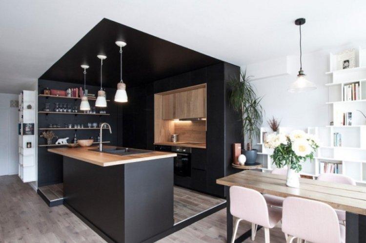
A good alternative to vertical partitions are multi-level horizontal structures, such as podiums that can accommodate both a seating area and a kitchen corner. A higher podium with soft decorative pillows can even replace a sofa and armchairs.
A low podium can smooth out the differences between floor coverings if you have tiles in the kitchen and laminate in the living room. A small elevation can effectively emphasize the separation without any partitions. An oval structure looks interesting, but it may be more challenging to create in practice.
Taller podiums have another significant advantage: you can build storage boxes and drawers into them. A sturdy wooden frame is covered with plywood and reinforced, depending on the intended use. You can create an elegant green corner on a small high podium.
Curtains and Drapes
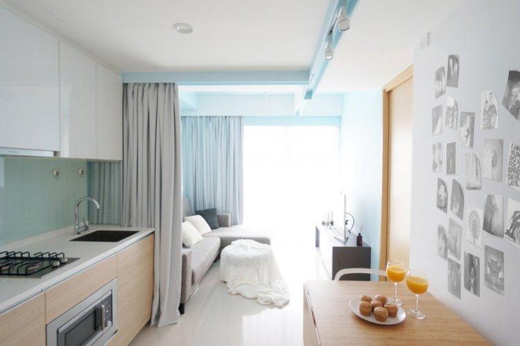
Instead of partitions and screens, you can use textiles for zoning the kitchen and living room, but there are nuances to consider. This option is suitable for the Provence or classic style but is rarely appropriate for minimalism or modern style. You’ll need to carefully select fabric that doesn’t accumulate dust or absorb cooking odors.
Divider curtains still hang on a rod or string, which can be hidden in a multi-level drywall ceiling. If you want to separate the relaxation area or workspace, choose denser fabrics. However, they are not very practical or safe near the kitchen area.
An interesting method for classic and romantic interiors is to enclose the sofa or podium with a canopy of pillows. The most important thing is to choose a structure that you can easily disassemble for cleaning. And keep in mind that this option is suitable for spacious studios because it is quite bulky.
For zoning, choose drapes that will match the window curtains. They don’t necessarily have to be identical, but it’s desirable that their textures and colors complement each other. However, the configuration is not so crucial. For example, you can have roller blinds on the windows and regular curtains with tiebacks in the room. Dividing curtains don’t have to be made of fabric. In eclectic styles, boho, ethnic, and other creative directions, handmade items are actively used. For instance, wide dense fringes, bead strings, and various suspensions.
Furniture
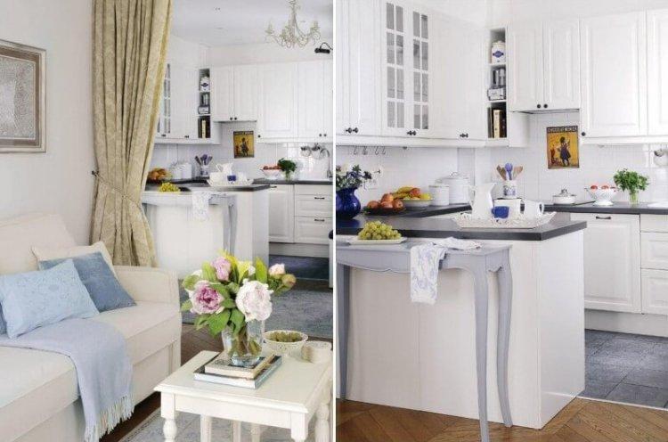
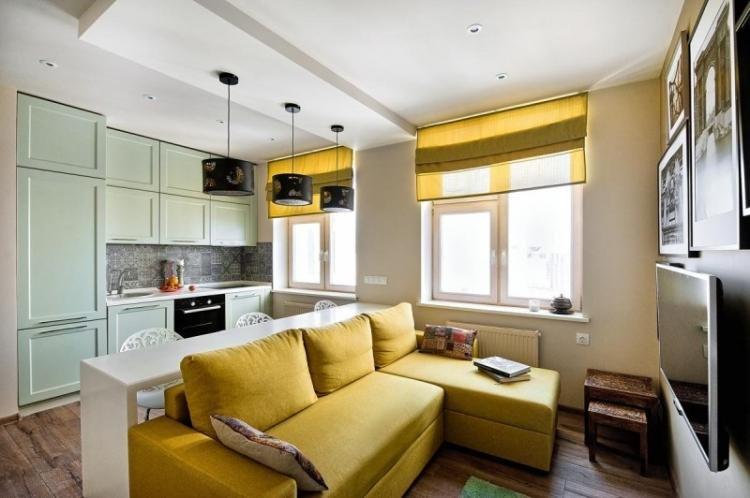
If you don’t want to build unnecessary partitions or hang curtains, use furniture for zoning. The simplest option for a kitchen and living room is an L-shaped kitchen unit set up to separate the working area. But when installing the sink and stove, don’t forget about water splashes and grease during cooking.
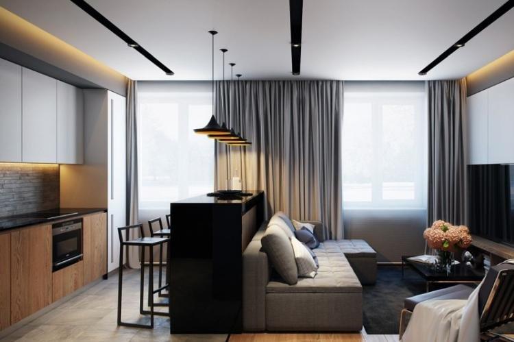
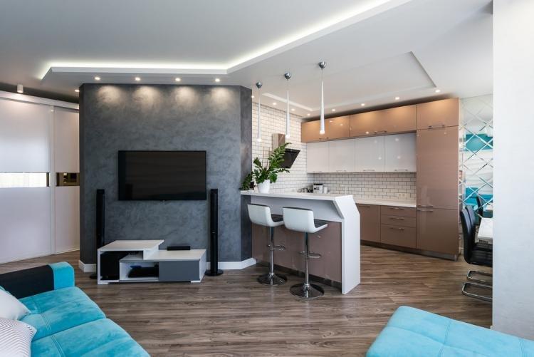
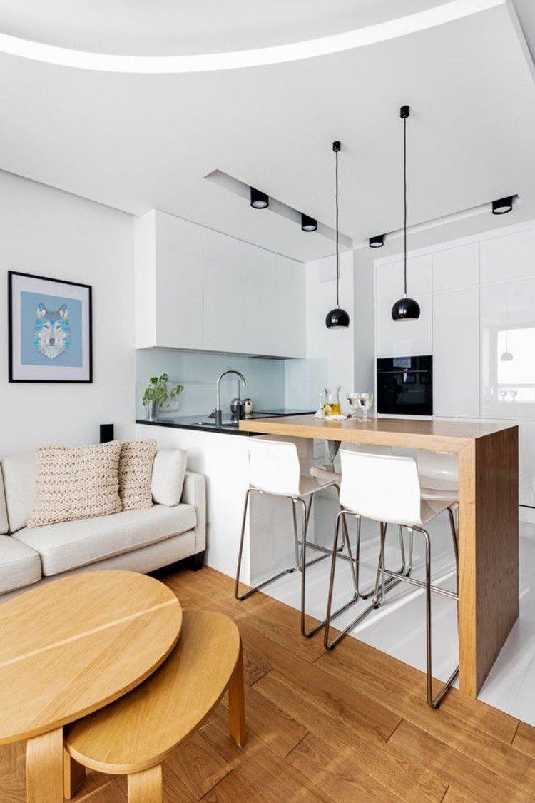
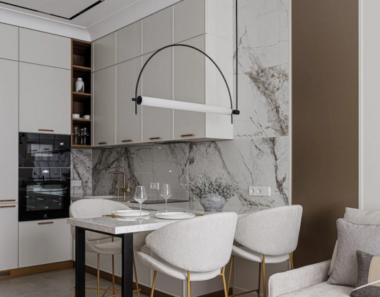
Another classic option for spacious studios is to use a bar counter for division. It will complement the unit on one side and brighten up family gatherings and friendly parties on the other. If you don’t need a large dining table, the counter with a few stools can replace it.
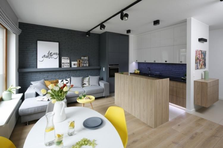
A full-fledged dining area with a table and chairs will fit in a spacious living room. To emphasize the division even more, hang several separate lamps above it. And in small studios, pay attention to folding tables that can be removed as needed, just like folding partitions.
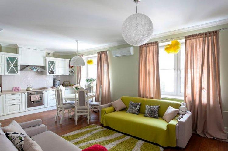
An alternative option is to allocate not a kitchen area, but a relaxation area. A classic island layout comes in handy, where furniture is arranged not along the perimeter, but by function. Divide the areas with a wide, but not too massive sofa with a pair of armchairs and a coffee table.
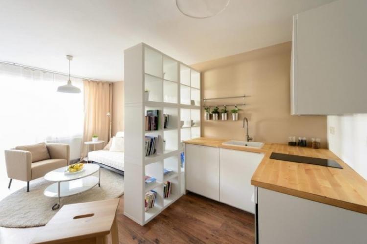
Lightweight pass-through shelving is a good option for zoning, replacing massive shelves and cabinets. You can store not only books and collections, but also kitchen utensils, jars with cereals and spices, or beautiful tableware in them.
Zoning with Color and Materials
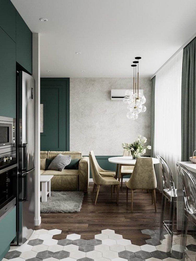
Colors and textures are one of the strongest and most universal tools for zoning a space. In a kitchen-living room, this could mean using laminate or tile on the floor, companion wallpapers, paint, textured plaster, or even exposed brick on the walls, and multi-level gypsum or stretch ceiling constructions to hide wiring and lighting fixtures.
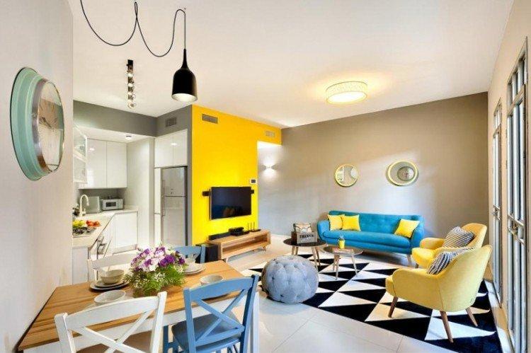
Color accents can completely transform a space. You can fully contrast the two main zones or leave one bright wall to visually expand the space. A monochromatic interior with colorful unifying accessories can also be visually appealing.
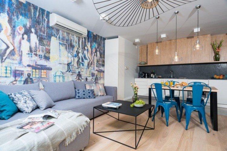
Dark vertical lines can visually elevate the ceiling, while horizontal lines can expand the walls. If you don’t like accents but want to emphasize the difference, you can play with textures. For example, combine smooth painted walls with decorative plaster, glass wallpaper, or brickwork.
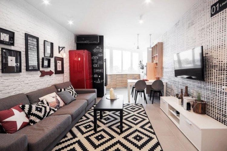
A mosaic backsplash above the kitchen countertop can be combined with decorative panels with similar motifs. Furniture in the same style visually unifies the space. A bold and bright sofa or refrigerator can become a standalone accessory in a kitchen-living room.
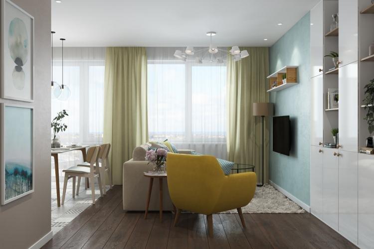
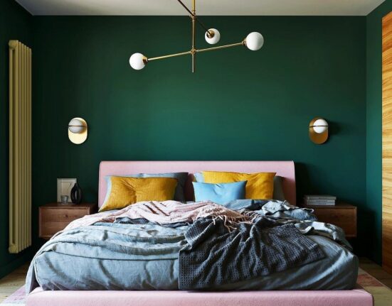
Zoning a kitchen and living room – real interior photos
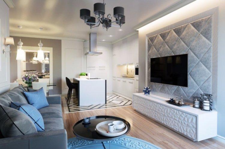
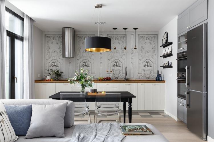
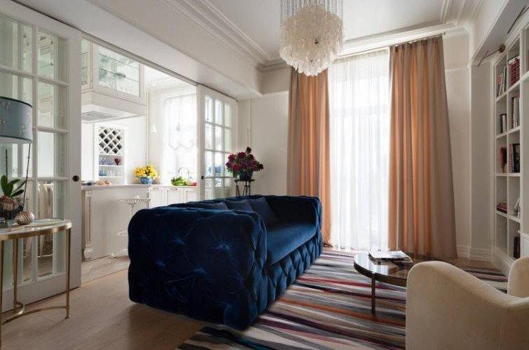
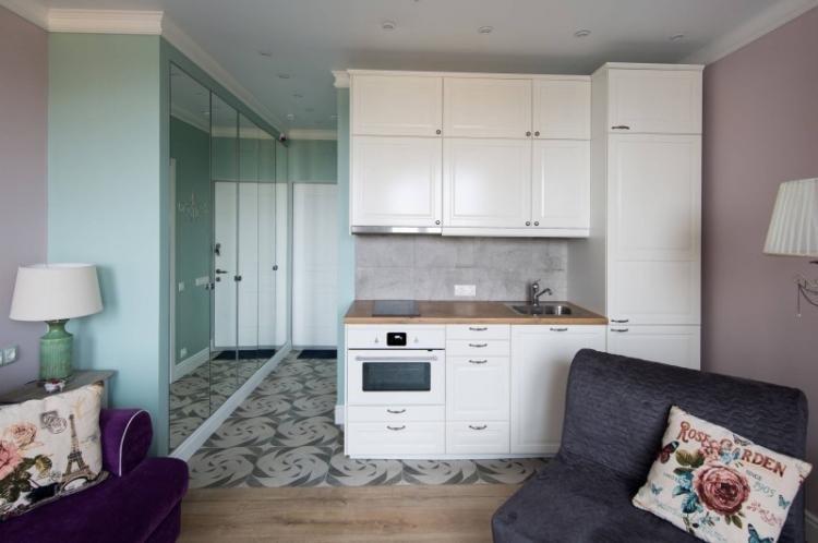
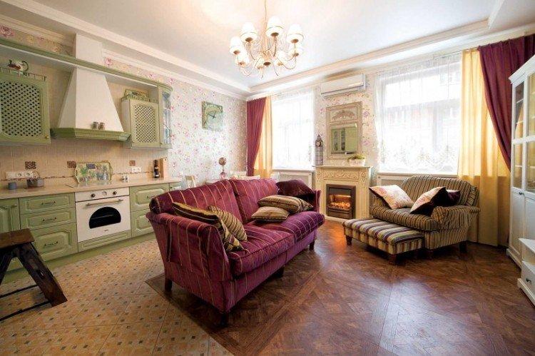
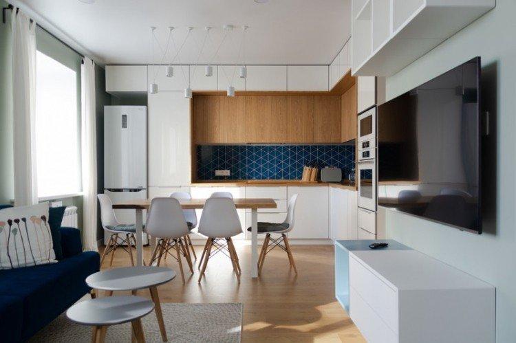
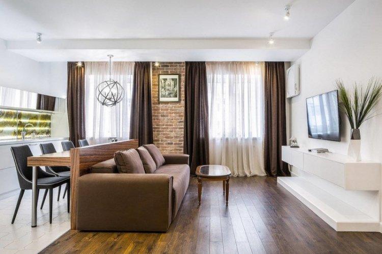
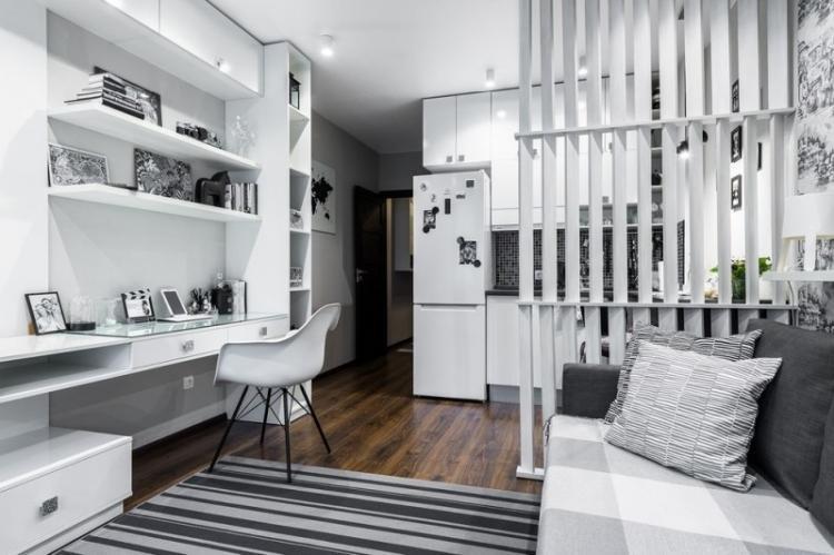
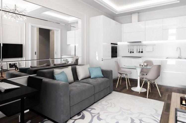
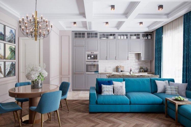
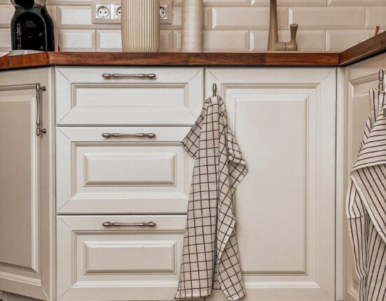
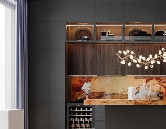
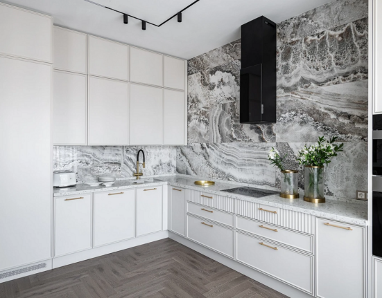
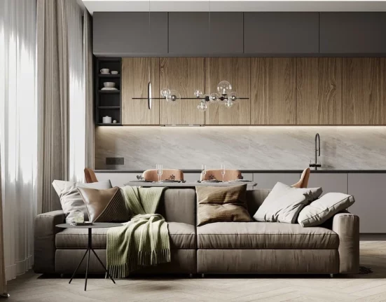
There are still many convenient ways to organize a kitchen-living room space. Individual layouts and author interiors are currently in vogue, so don’t limit your imagination. For inspiration, check out this selection of photos!
Leave feedback about this