Blue living rooms offer a beautiful alternative to the usual beige, gray, or white interiors. Sky colors make the space more friendly and add volume. This palette allows for a fairly strict room design, yet gives it a light touch of romance and carefreeness. Moreover, such coloring looks fresh and original. We discuss how to properly decorate a living room in blue tones in this article.
The Impact on People
Each part of the color spectrum affects people in a specific way. Talking about sky-blue and azure tones, people become calmer in their presence. Light blue shades soothe thoughts, relieve muscle tension, and even lower blood pressure. In the presence of forget-me-not and aquamarine colors, stress fades and problems recede.
A living room in blue tones sets a peaceful mood: it’s easy to discuss any sensitive topics without descending into disputes and conflicts. This palette creates a trusting atmosphere conducive to heartfelt communication. Furthermore, since the celestial range associates with innocence and purity, you can expect your interlocutor to be open and honest with you.
However, too much blue can have negative effects. In large amounts, it causes sleepiness, makes a person passive and melancholic. To prevent this, it’s advisable to mix it with other colors. Another feature of this part of the spectrum is that most of its hues are cool. For rooms where the sun shines from morning to evening, this is a plus. But in spaces where sunlight hardly enters, such decoration can make it feel even colder. This problem can be solved by choosing colors with a green undertone (turquoise, aquamarine), which are perceived as warmer.


How to Choose a Shade
The blue color of the living room is pleasing to the eyes, but it requires careful selection, otherwise, it turns from interesting and deep to flat and mundane. The sky palette consists of many different tones that differ significantly from each other, and each has its own application features.
To make the room look luxurious and elegant, it’s enough to consider some rules:
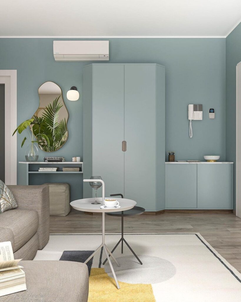
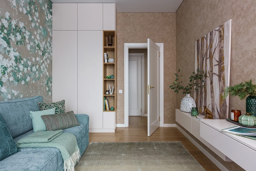
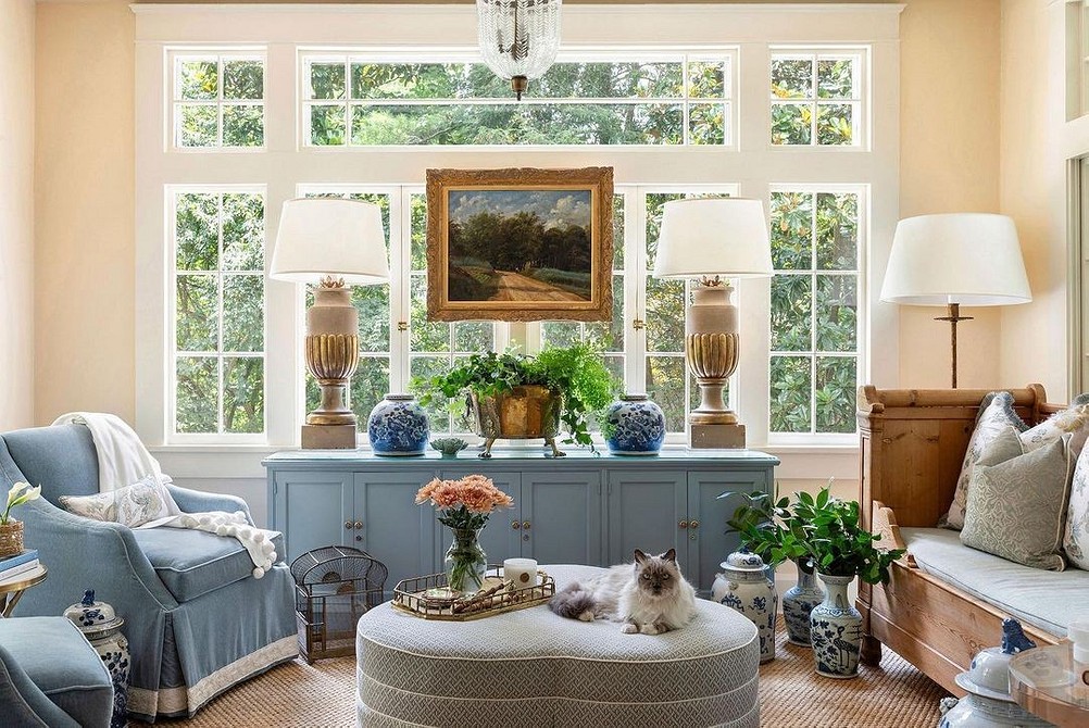
- Avoid simple and unsophisticated paints on large areas: with them, the space looks unskillful and bland. It’s better to choose composite tones — aquamarine, turquoise, hyacinth, etc. They are interesting in themselves and don’t require additional decor. Even a seemingly simple gray-blue living room looks impressive and dignified due to the combination of three undertones — blue, white, and black
- Warm tones suit cold rooms (spacious, with north-facing windows) and vice versa: cool colors are more appropriate where it’s too sunny and warm (south side of the house)
- The choice of color also depends on the size of the room: the smaller it is, the lighter the color should be (it visually enlarges the space)
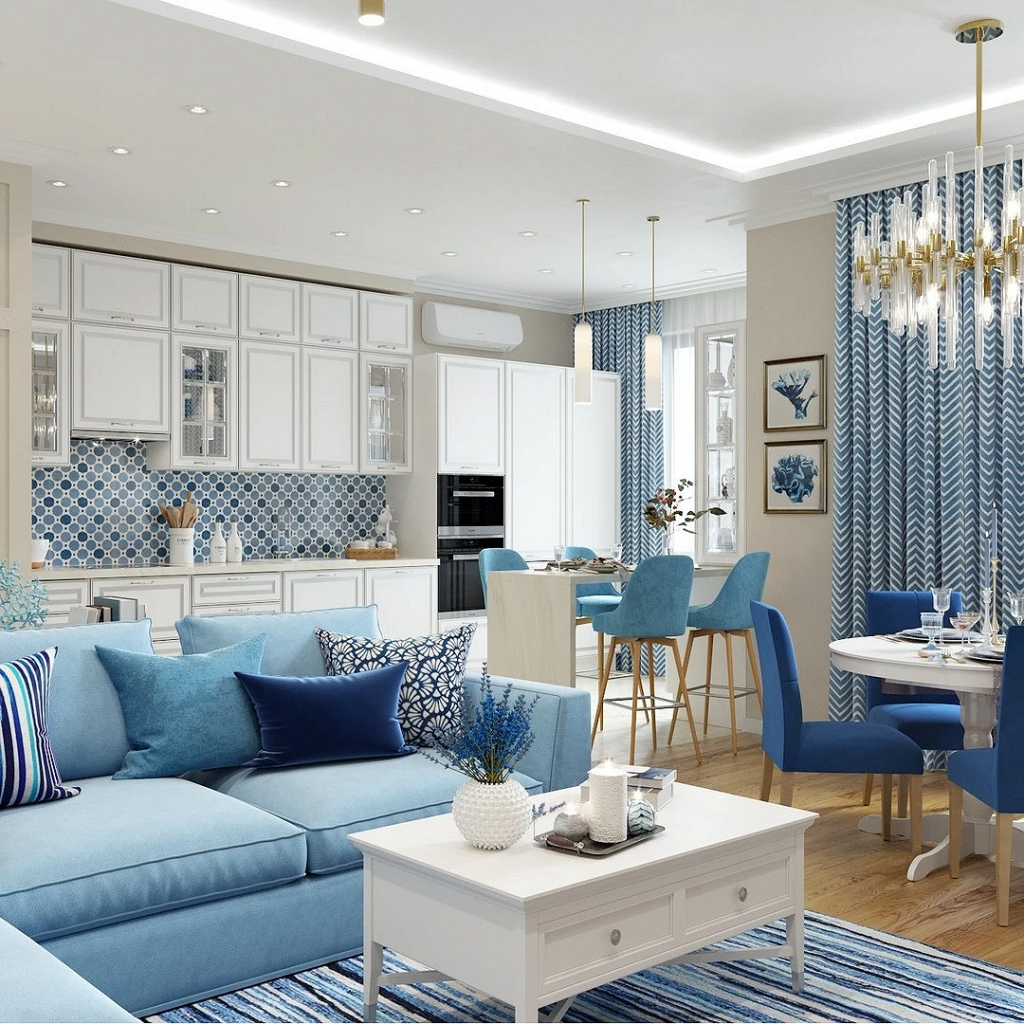
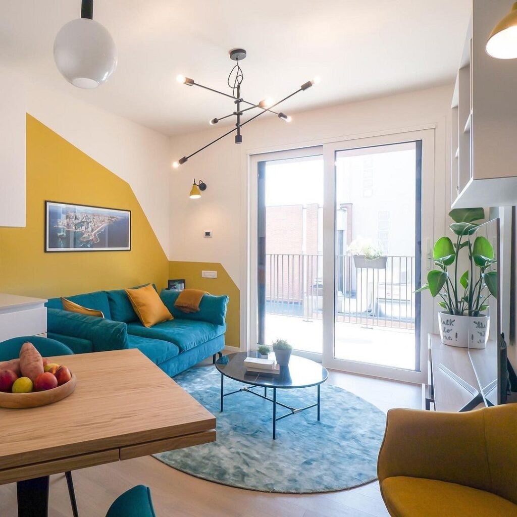
- If you plan to host noisy groups of friends, you can paint the walls in bolder and more striking tones. For leisurely conversations with close ones, better settle on a neutral pastel palette. If it’s a blue kitchen-living room where you dine every evening with family, immediately rule out shades leaning towards gray as they dull the appetite. However, bright accent colors of the palette are suitable here, and they can be combined with other vibrant and saturated colors — yellow, orange, grass green, etc.

How to Use Blue in the Living Room Interior
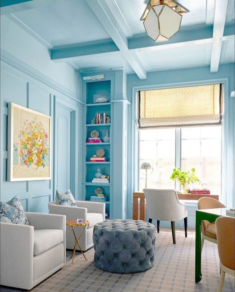
Decorating a living room entirely in a light blue palette is a bold move.
Therefore, it’s best to choose the most unobtrusive colors: light and not bright, and if you use several tones in the design, there should be no sharp contrasts between them. The ceiling is painted in the same tone as the walls, or in a lighter one. For the floor, a darker color is preferable.
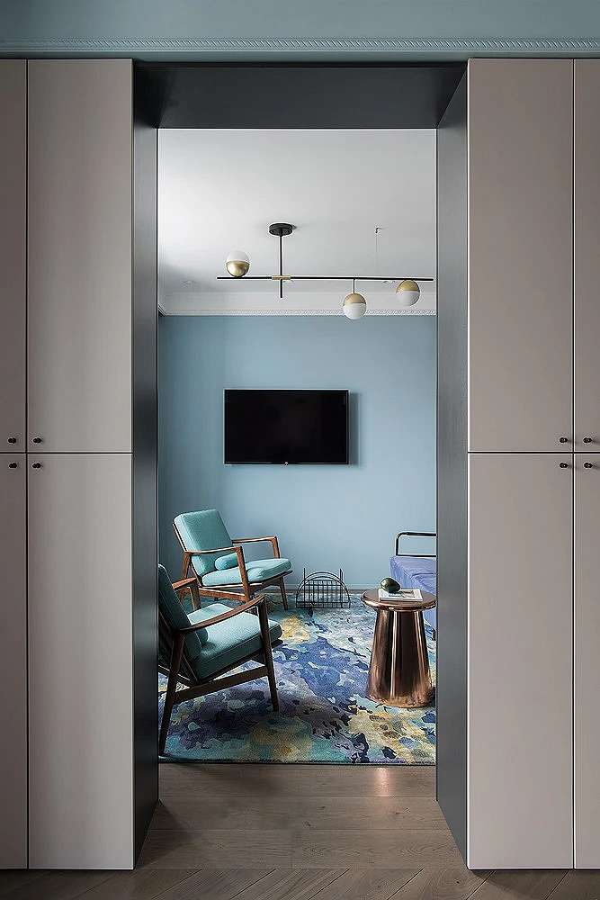
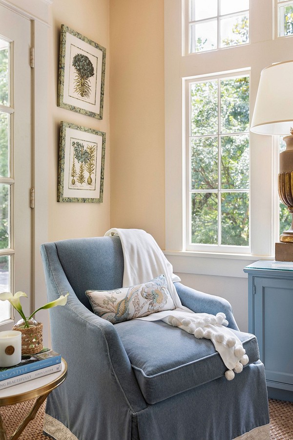
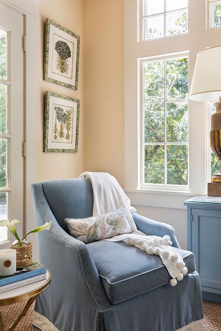
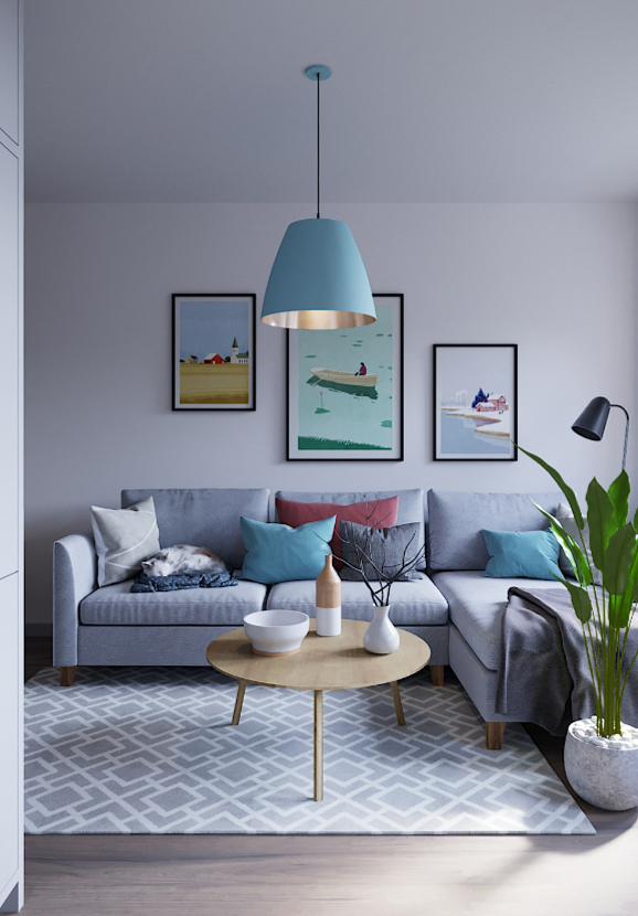
If fully blue living rooms, the photos of which you can see in the gallery, seem too extravagant for you, use this color in a focused manner: let only the carpet (or even just its pattern) be in azure shades, or it could be a designer chair or a pair of original lamps. Thus, gradually adding one or two items in celestial tones, you will fill the space with this palette just as much as you feel comfortable.
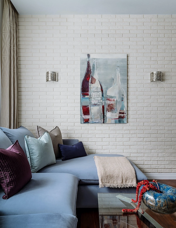
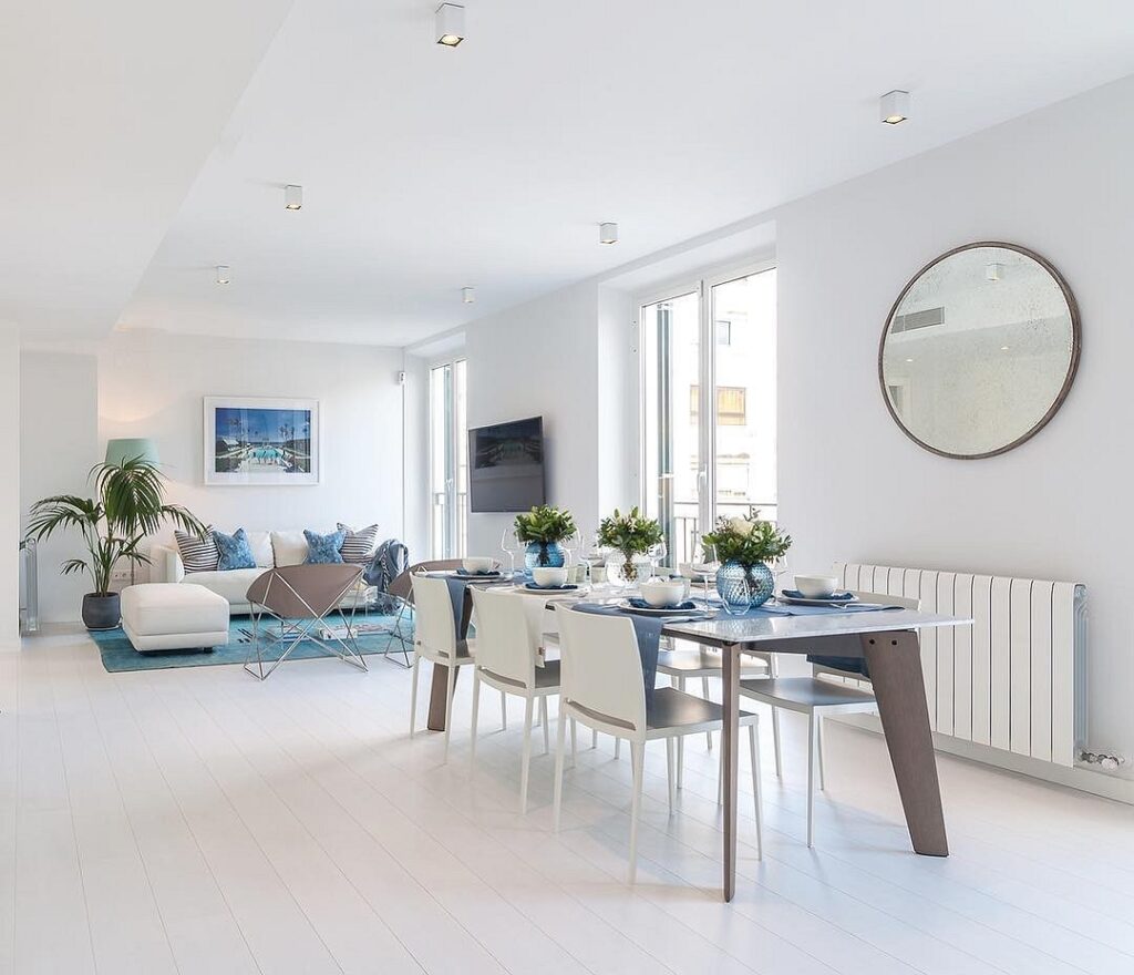
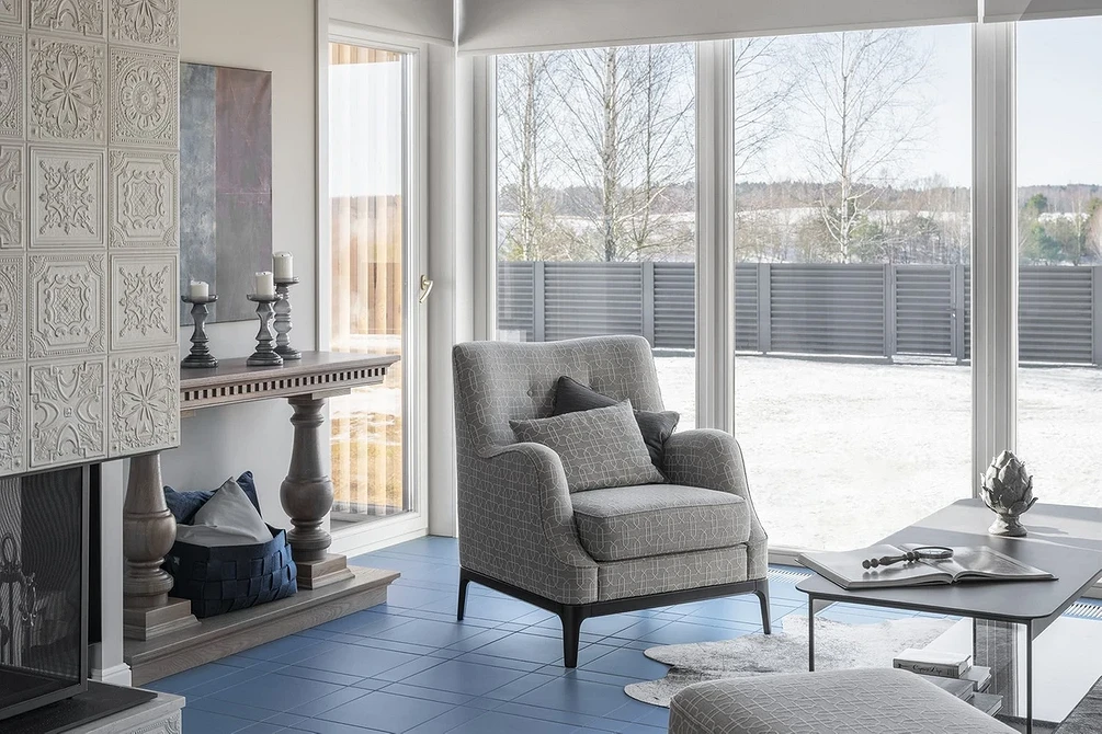
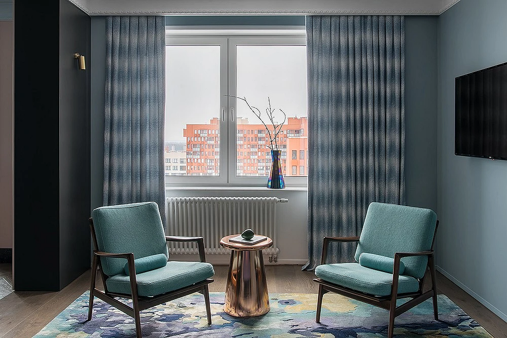
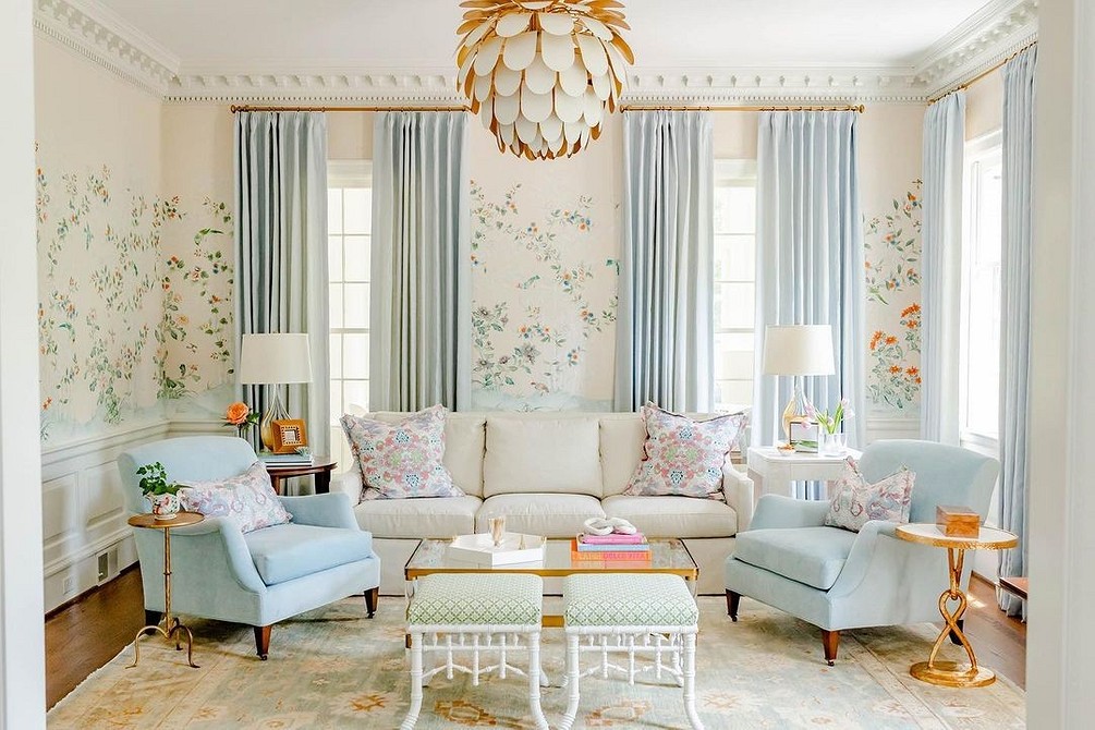
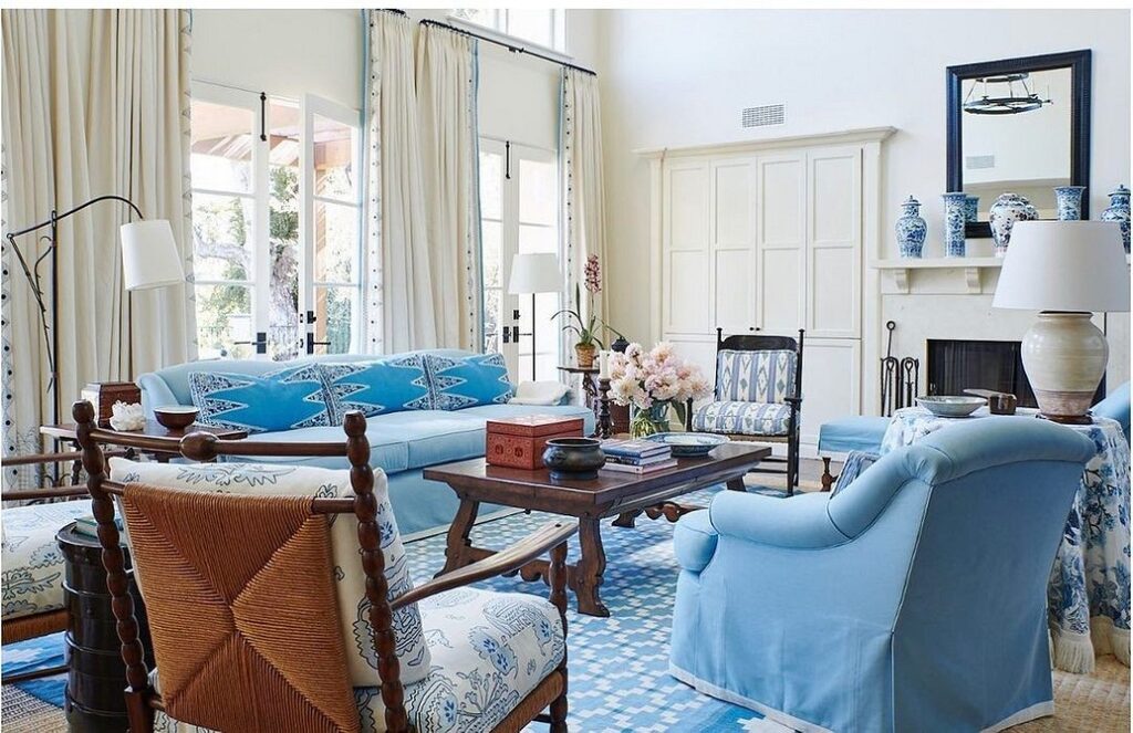
An intermediate decorating option involves using blue in combination with another (usually neutral) color in roughly equal amounts. For example, wallpaper, carpet, and sofa in forget-me-not and azure tones, and the floor and the rest of the furniture in white or beige; or slate curtains and upholstery, cornflower blue carpet, and walls, floor, and ceiling in achromatic colors. Avoid clustering items of the same color next to each other, try to distribute them evenly in the space: don’t lay a light blue carpet directly under curtains of the same color, and don’t hang a painting of sea waves on a turquoise wall, otherwise, they will blend into one color spot.
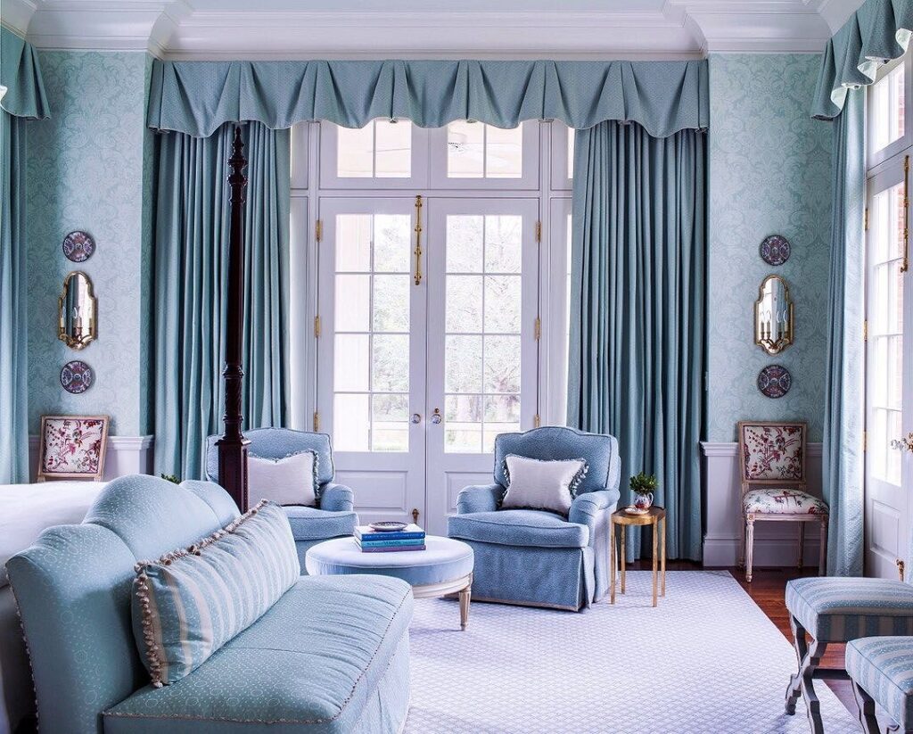
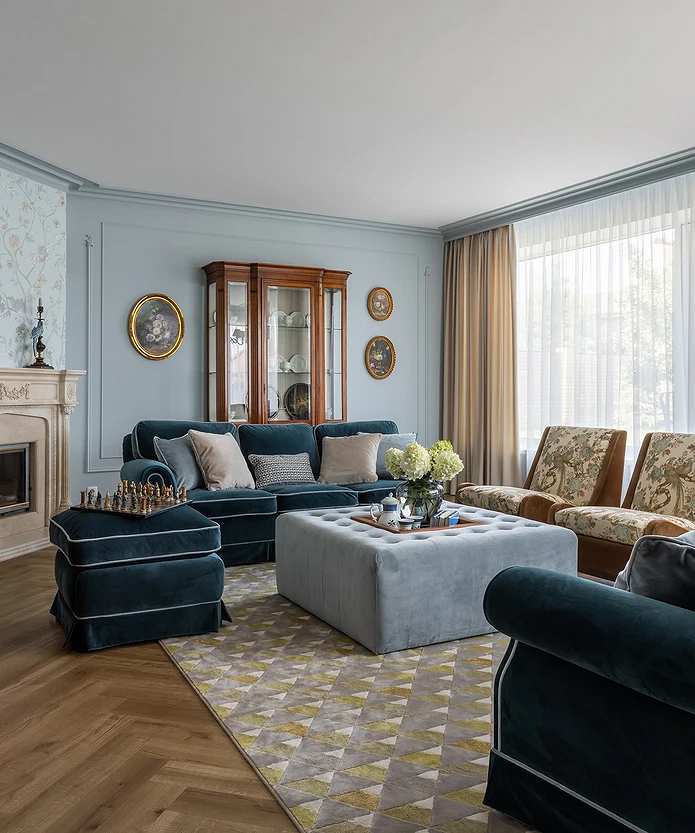
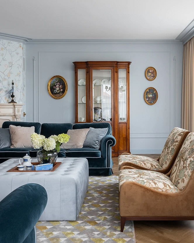
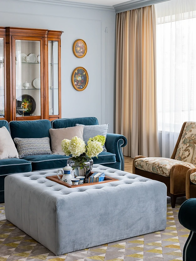
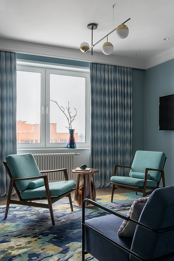
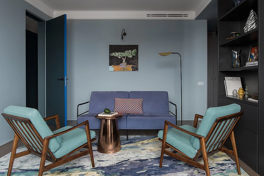
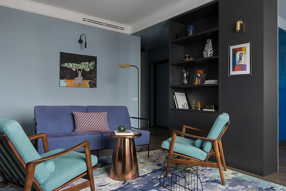
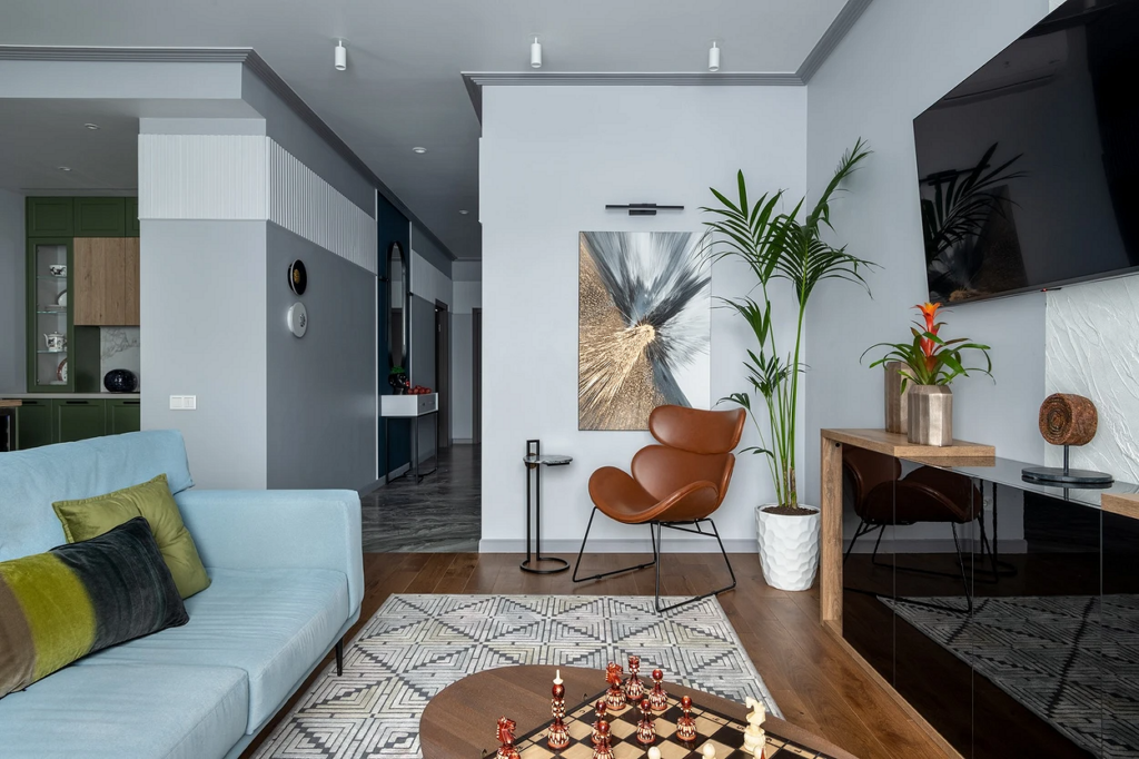
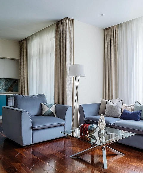
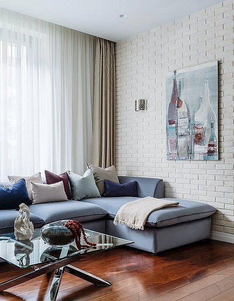
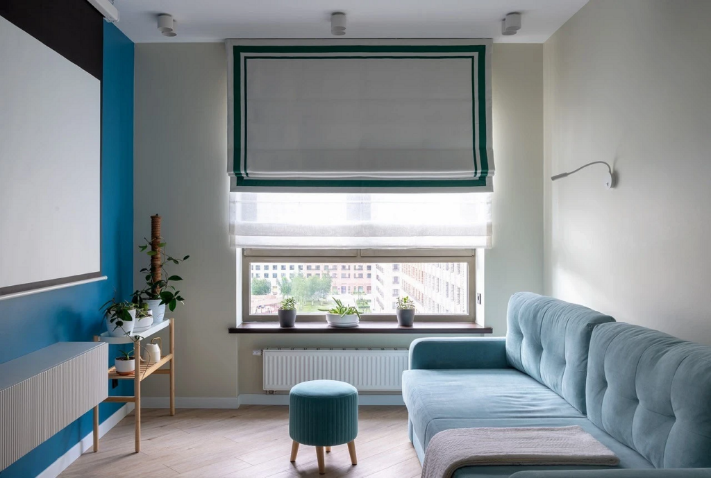
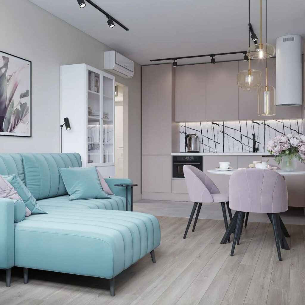
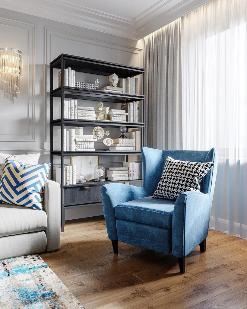
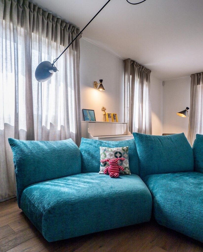
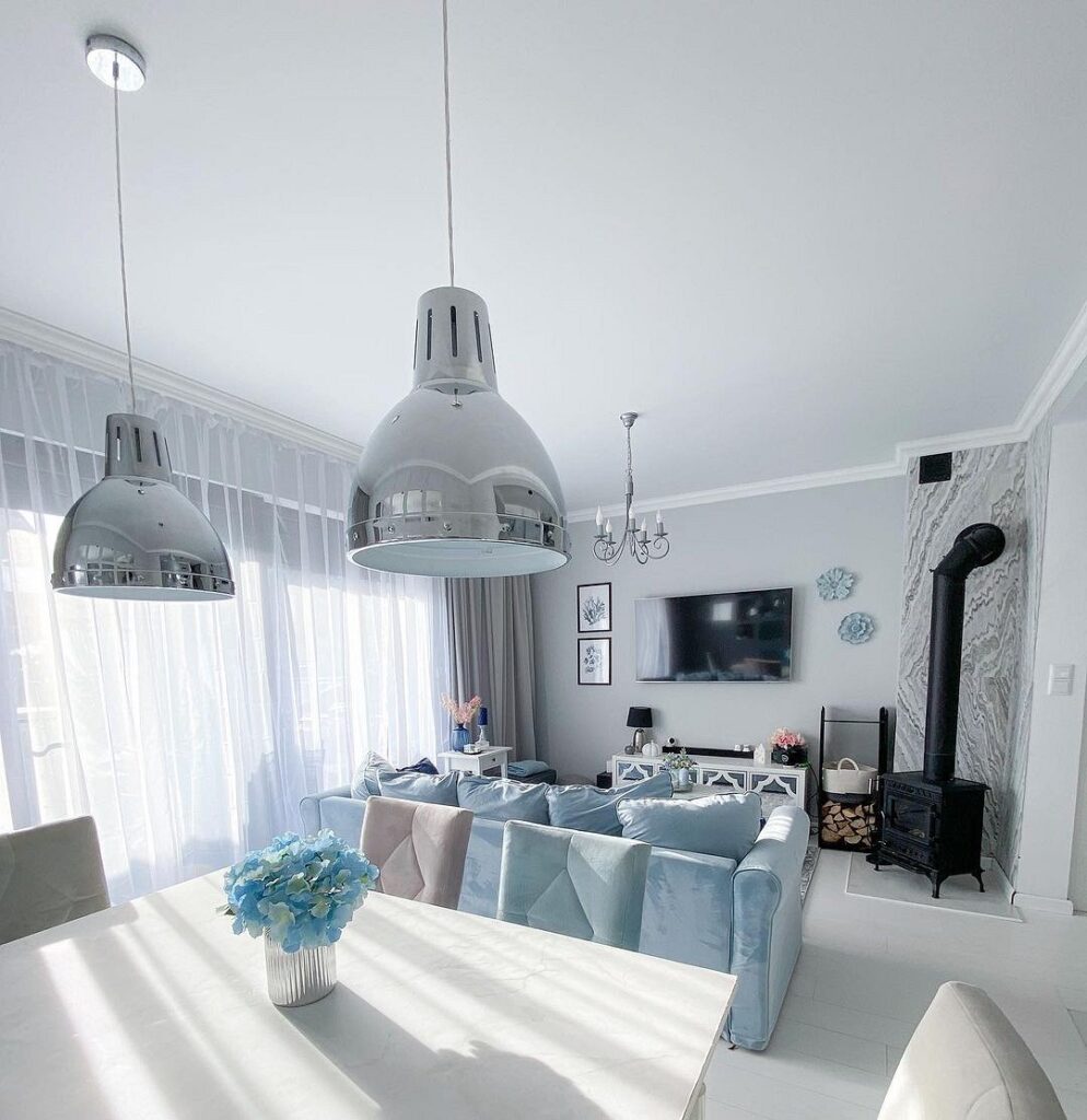
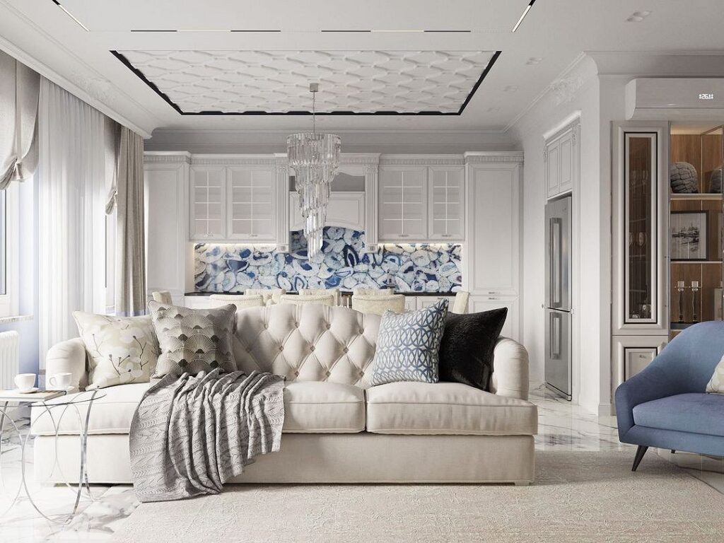
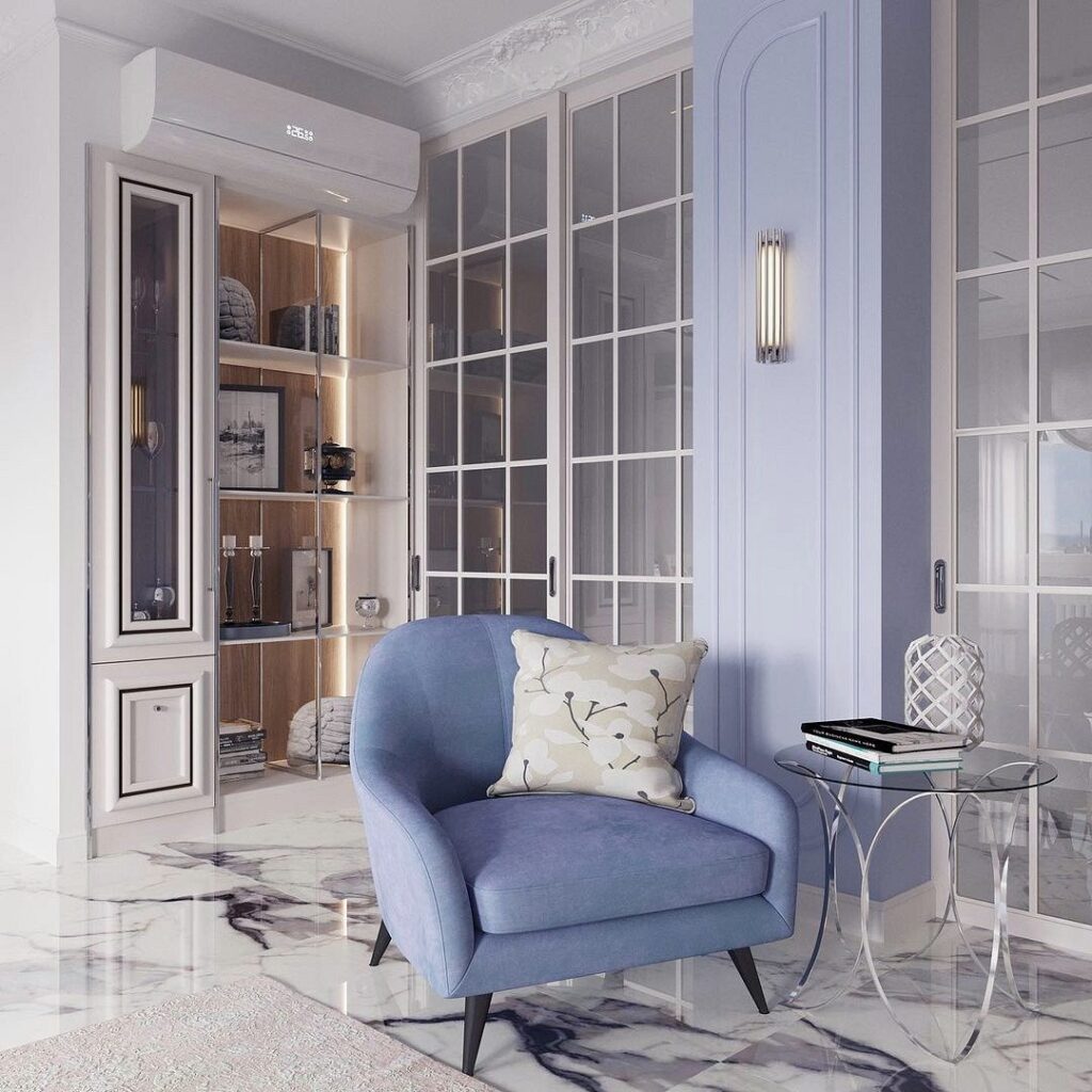
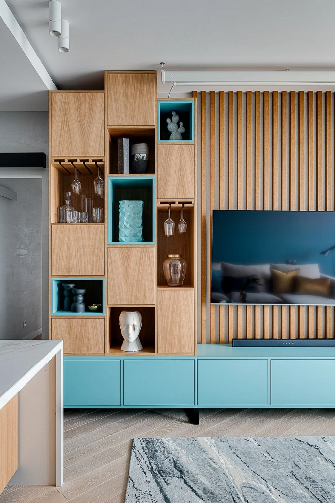
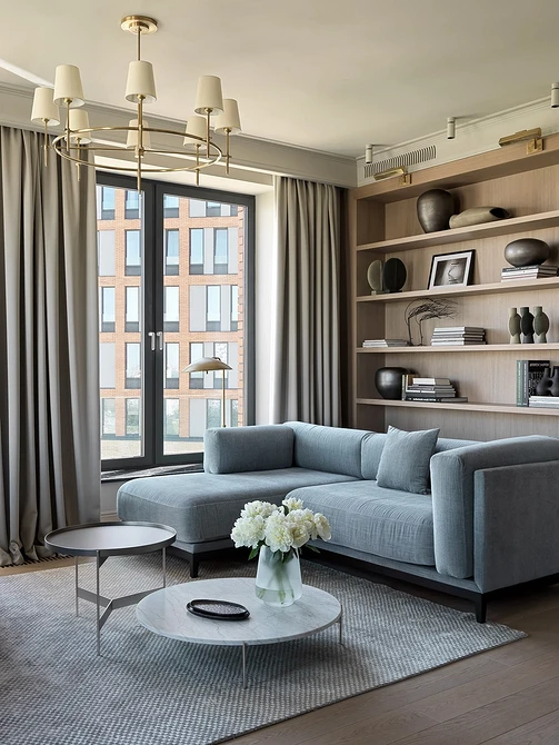
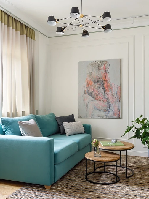
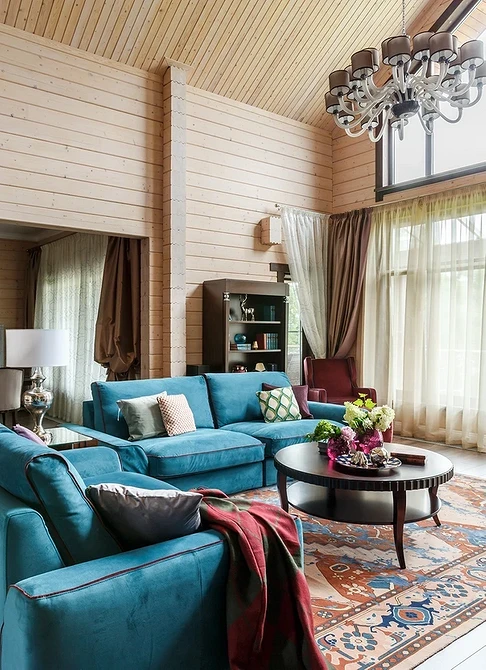
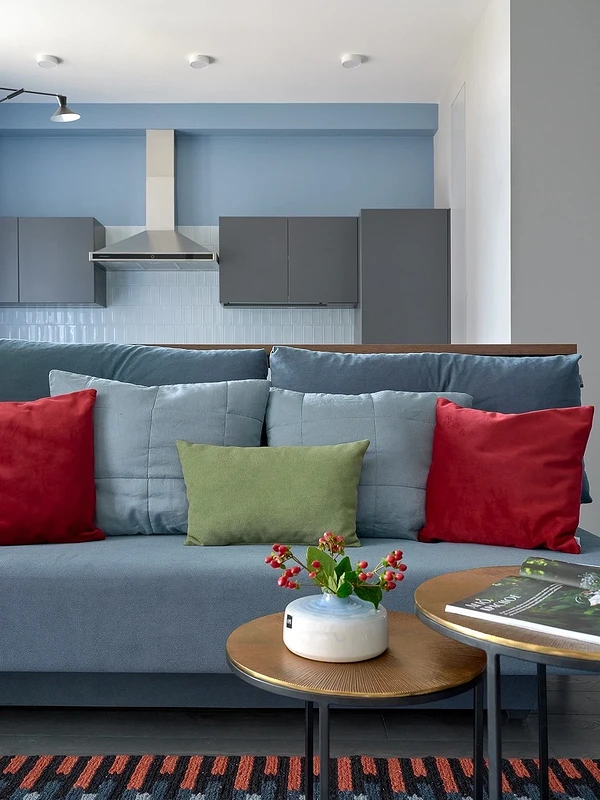
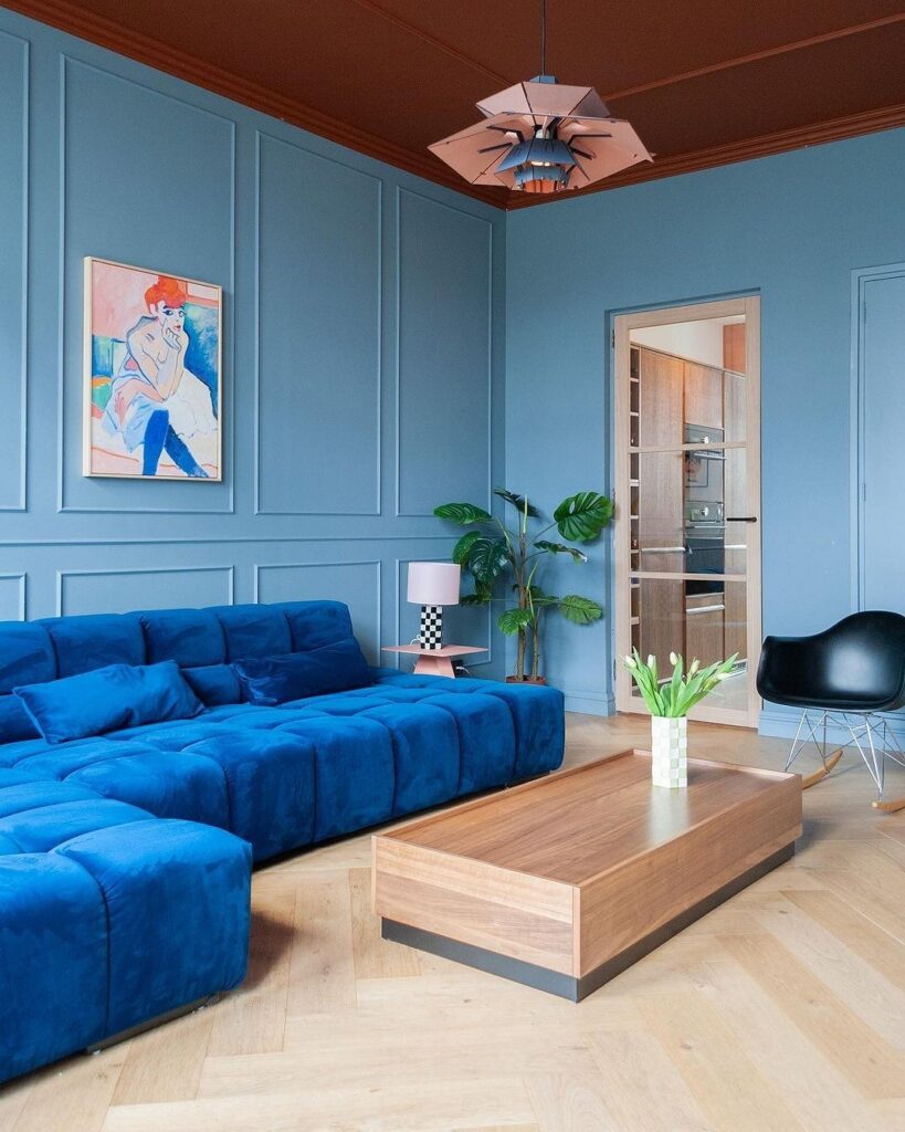
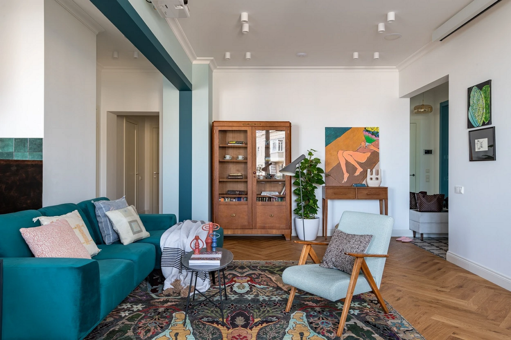
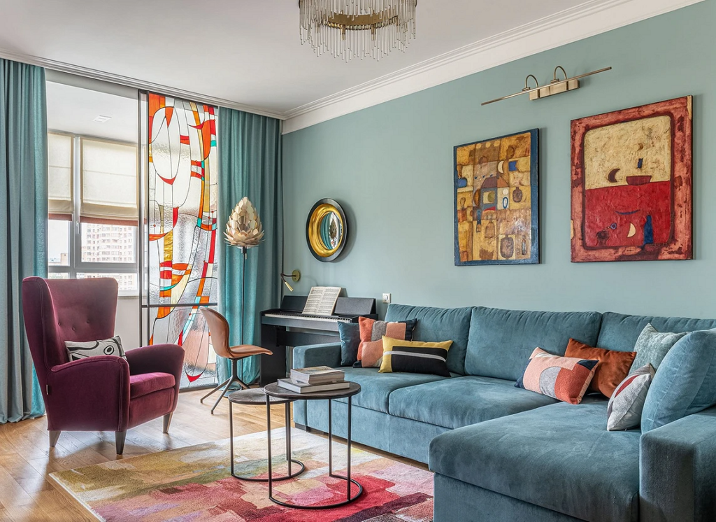
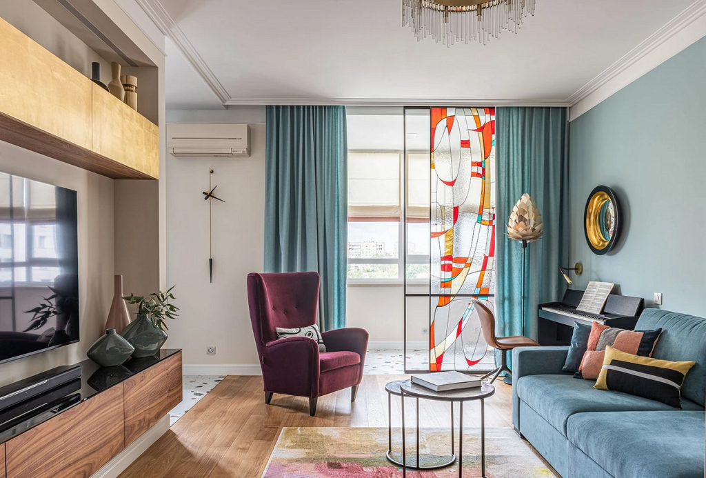
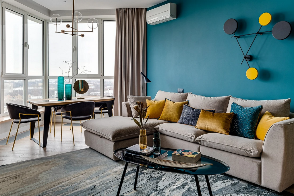
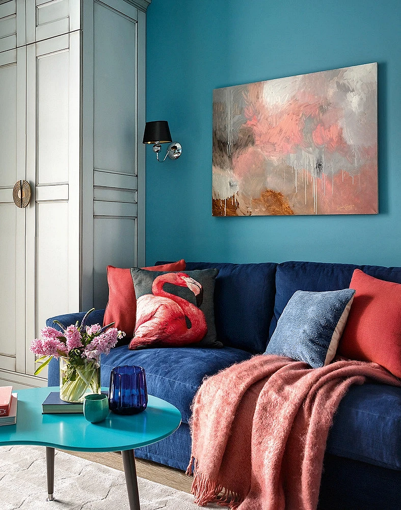
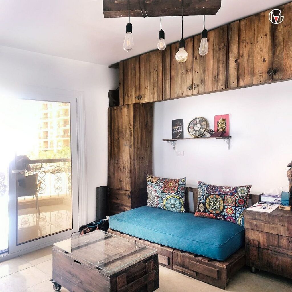
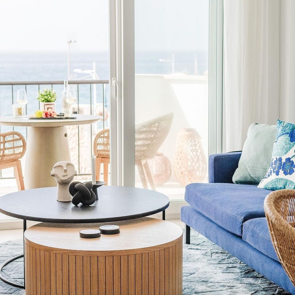
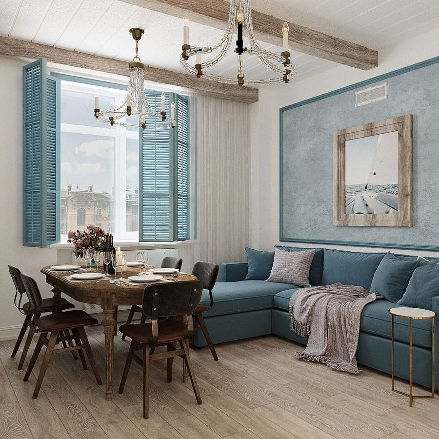
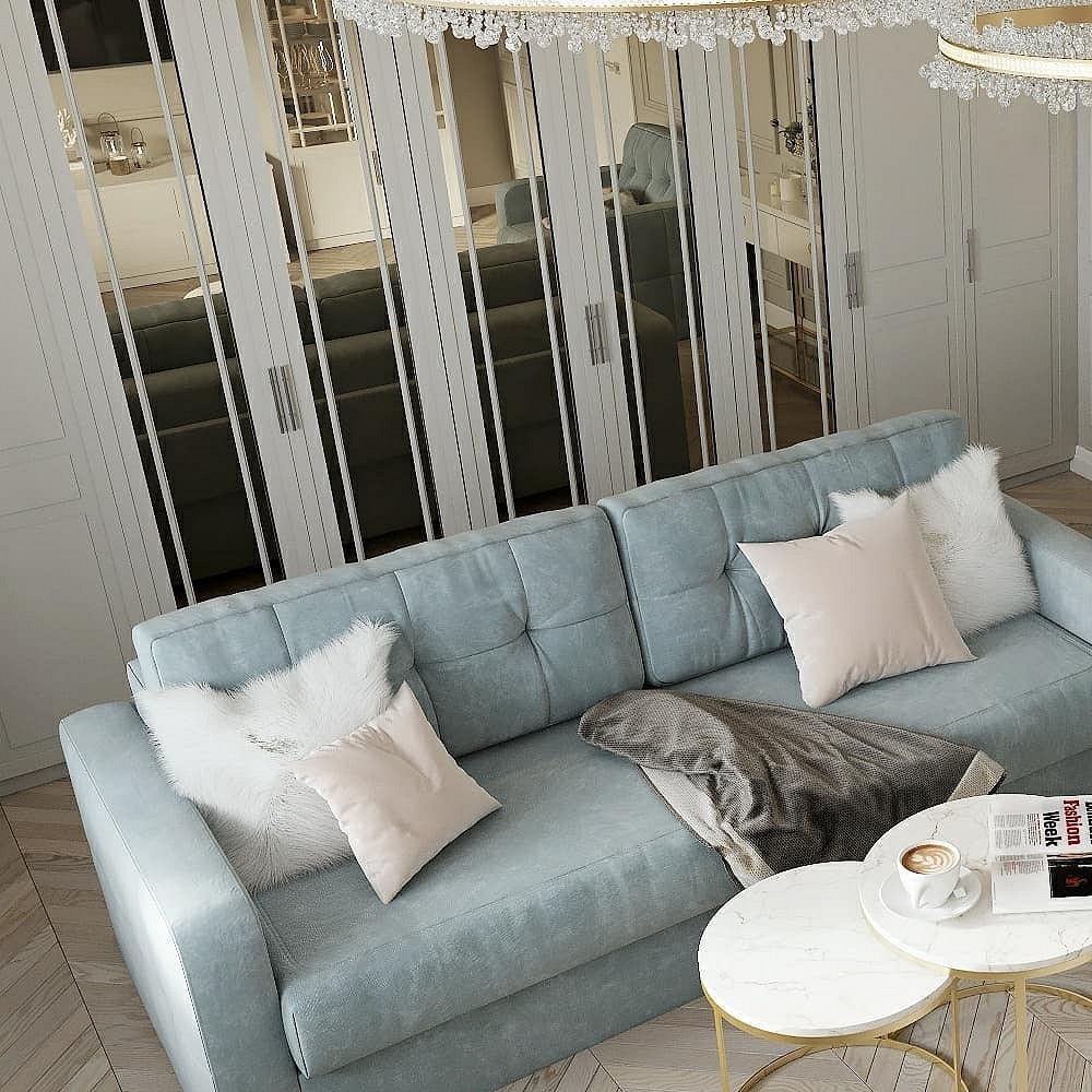
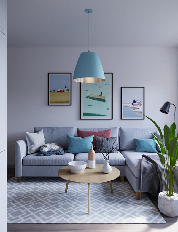
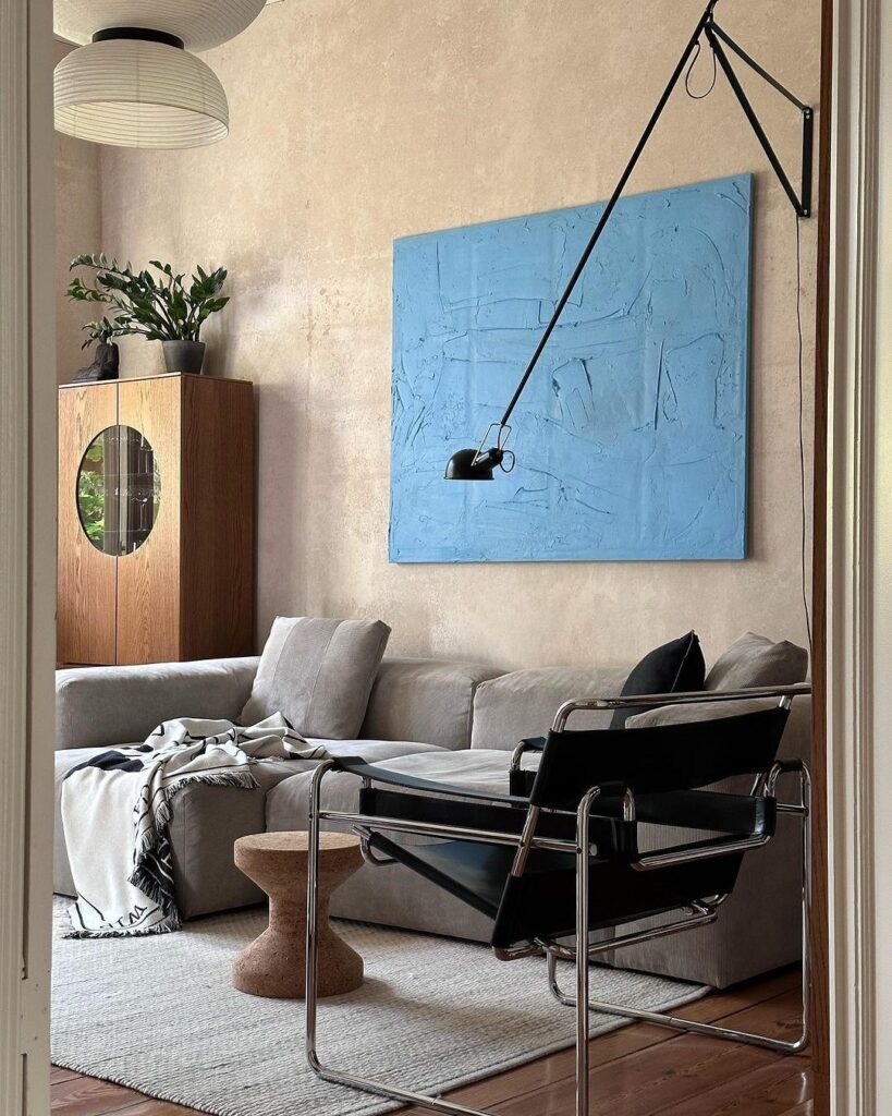
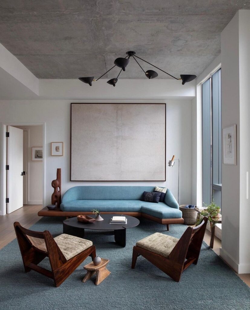
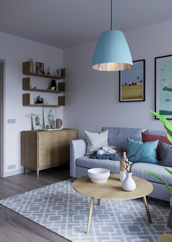
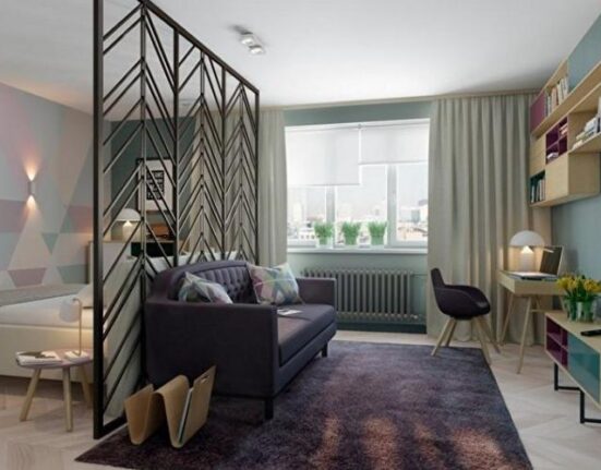
A striking solution is a bright celestial accent against a neutral background. A blue sofa in a room’s interior looks very appealing. It’s large enough to immediately attract attention but not so big as to dominate. It’s completely self-sufficient: even if there’s nothing else around in the same tones, it still looks appropriate and elegant. Moreover, a sofa is a must in every living room, and it usually becomes the center around which the rest of the room’s composition is built, so it makes sense to make it the main accent.
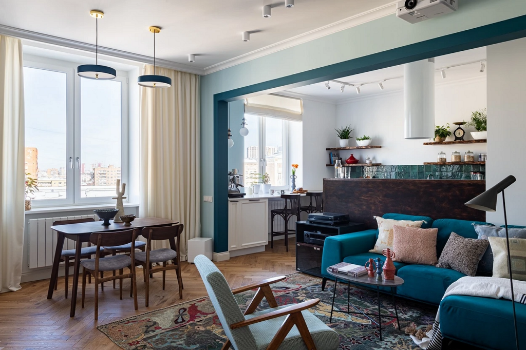
Furniture in blue tones is also a successful solution for a living room combined with a kitchen: cool light blue shades refine the space and turn it into an elegant dining area, rather than a mundane food preparation place.
Successful Color Combinations
With Achromatics
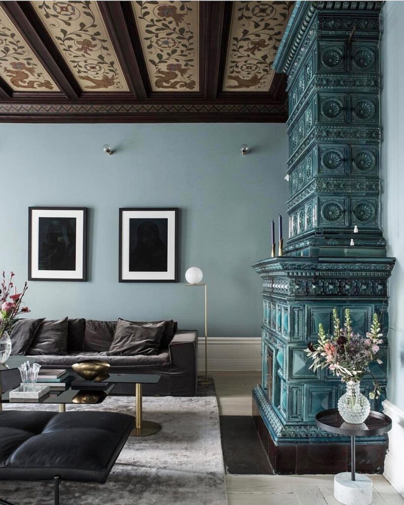
Black, white, and gray are a trio that gets along with all colors, and blue is no exception.
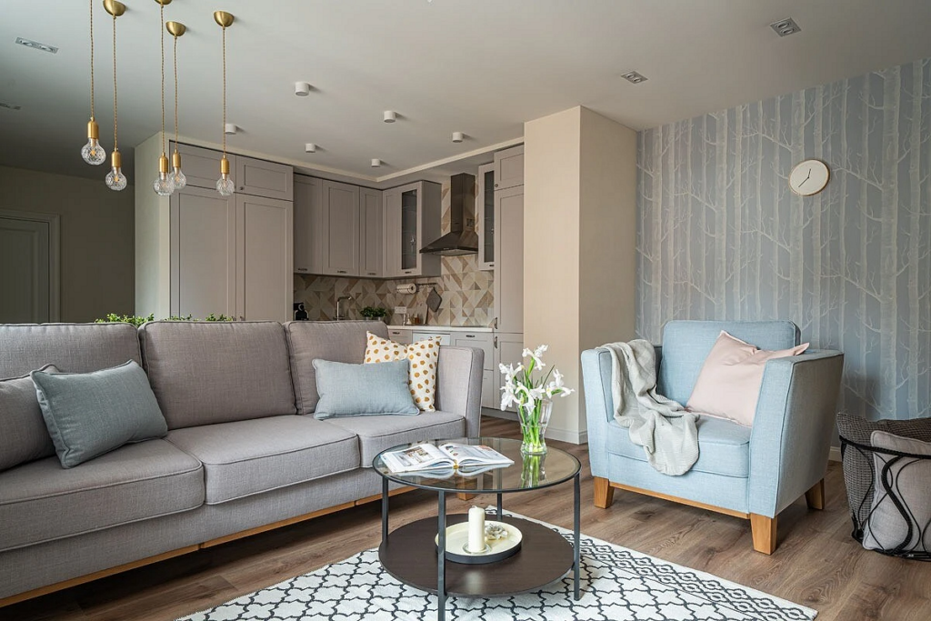
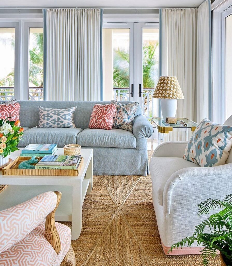
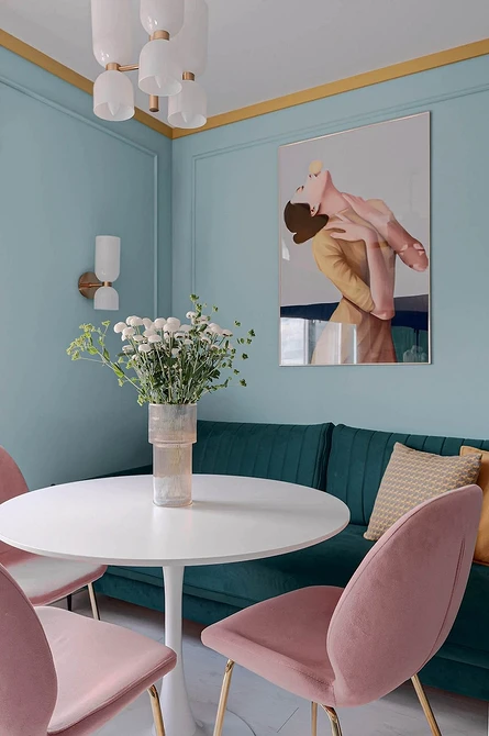
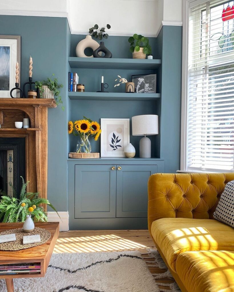
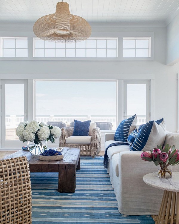
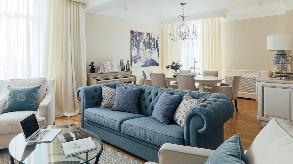
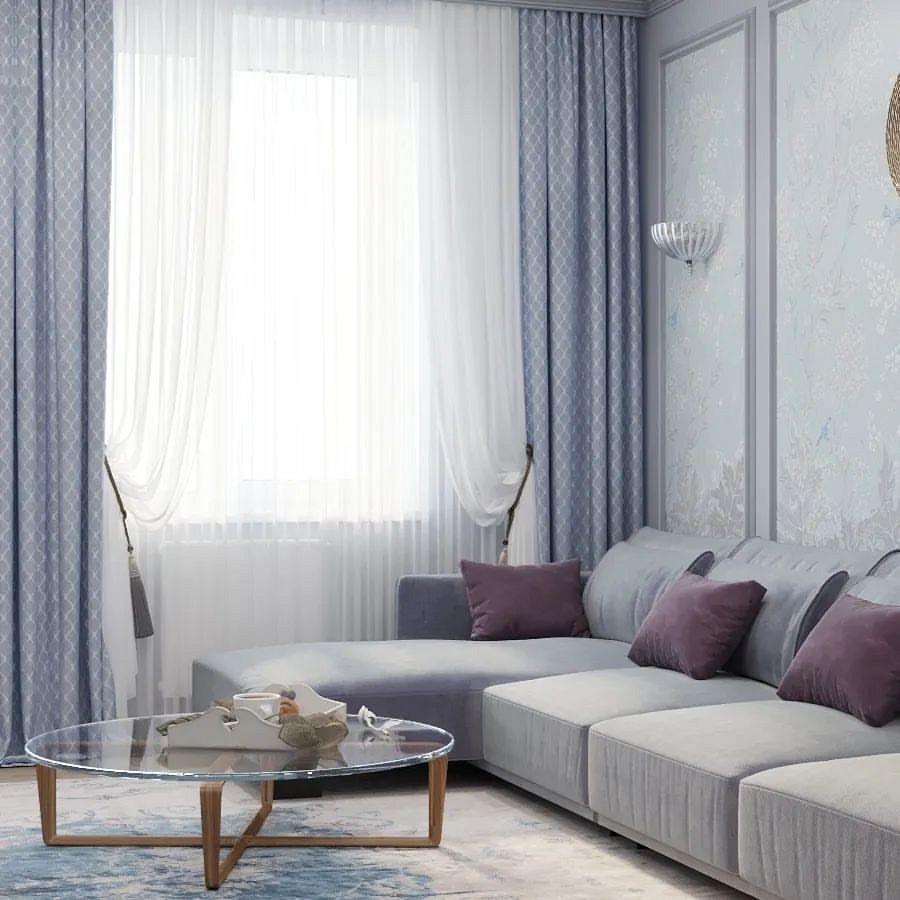
With BeigeA beige-and-blue living room evokes pleasant feelings.
In the minds of most people, these two colors are inseparably linked, as they represent one of the most pleasant natural scenes — a sandy beach by the sea.
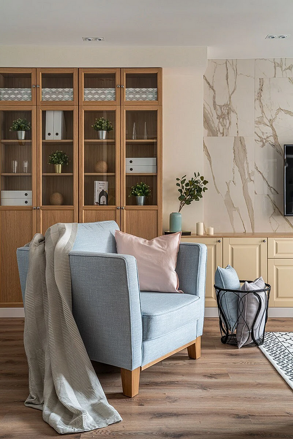
They can be complemented with chocolate-coffee touches. Since both palettes are balanced and neutral, they are easy to experiment with. Unusual but very appealing are cream walls with a blue ceiling. Also unconventional yet unobtrusive is a combination of sky-shade wallpaper on one wall and sandy ones on the others. When you want a touch of extravagance without going overboard, you can add a narrow strip of beige at the top of light topaz wallpapers (or vice versa — an azure ribbon along a cream wall).
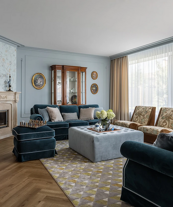
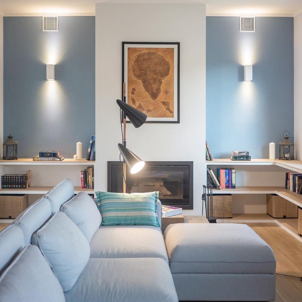
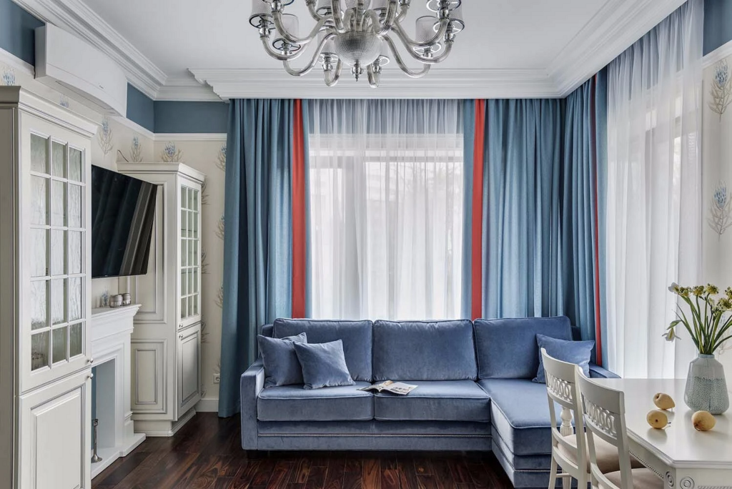
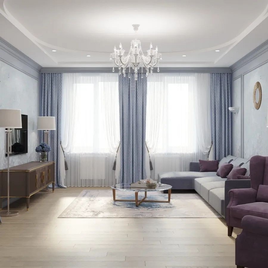
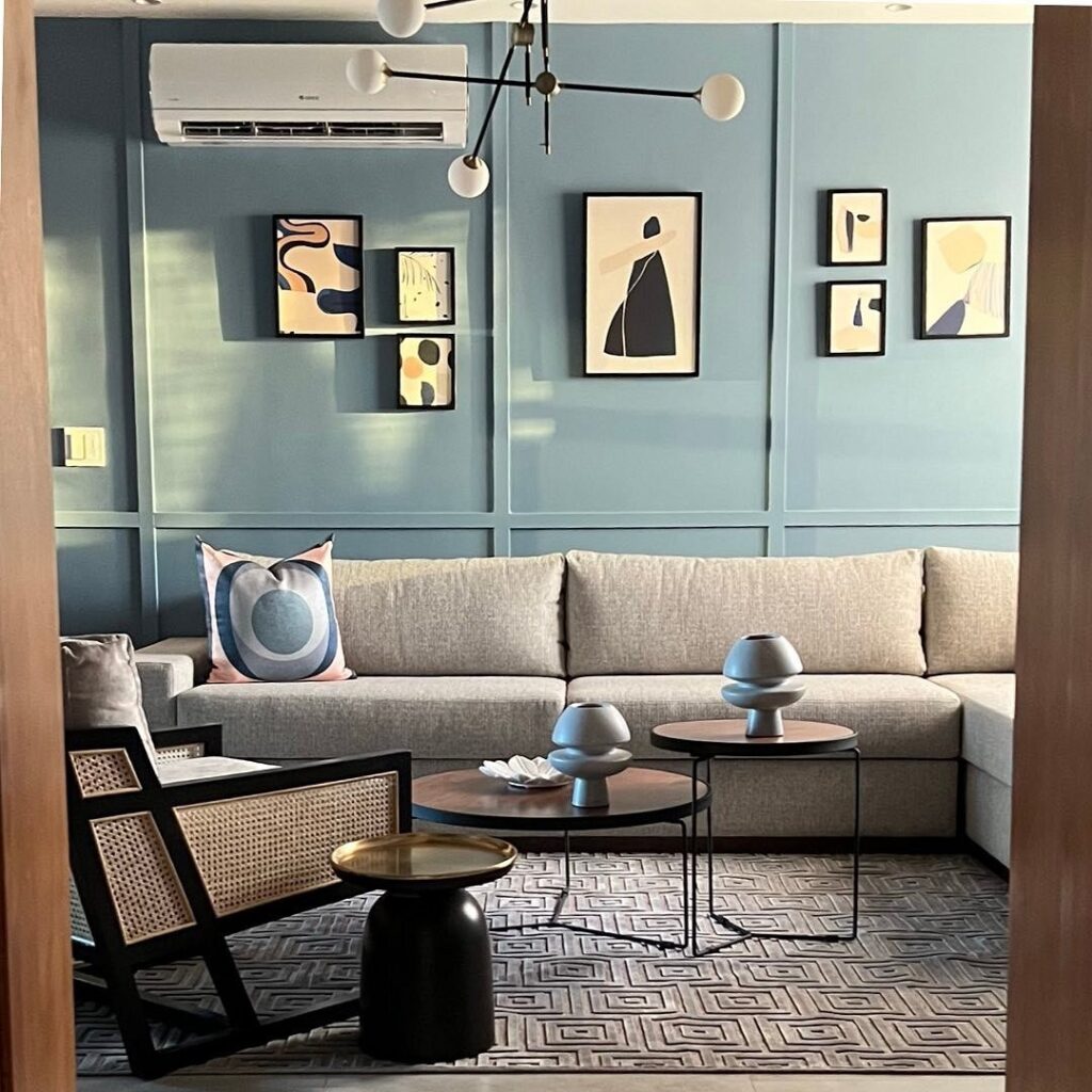
With BlueTransitions from light blue tones to more saturated and darker shades are also suitable for decorating a room where you entertain guests.
Sharp contrasts are perfectly acceptable in this scenario: they won’t look provocative because both color ranges inherently have a relaxing and soothing effect.However, it’s important to remember that such a combination can induce indifference and apathy, especially when executed in cold shades and it’s gloomy and gray outside. Therefore, it’s advisable to include warmer, richer colors in the interior, which will invigorate and prevent a slide into depression. These can be striking and noticeable chromatic colors, or simply white — with it, the setting becomes brighter and more life-affirming.

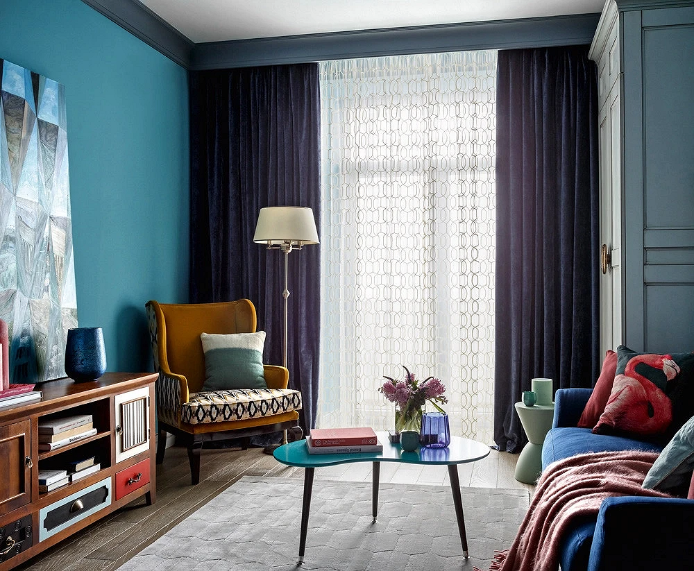
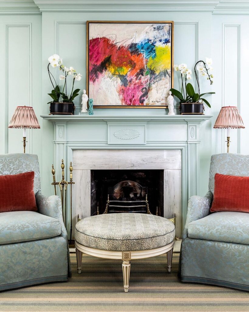
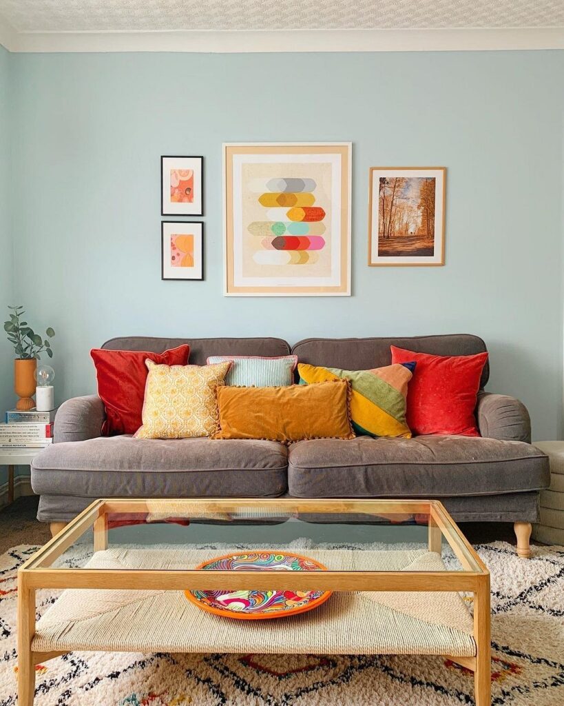
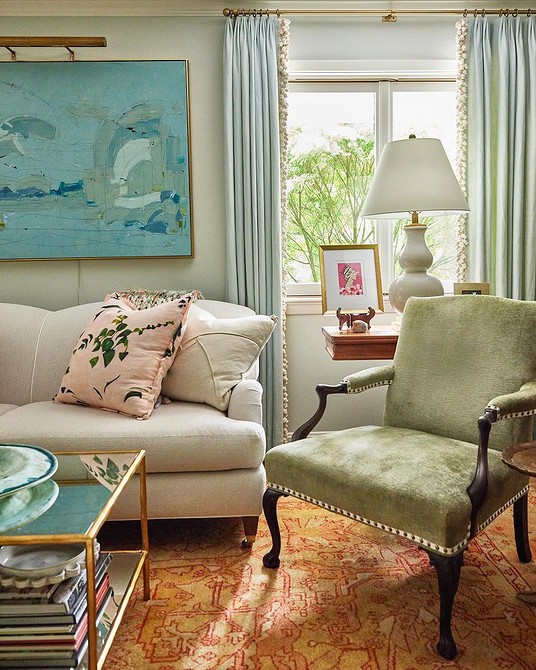
With Bright Colors
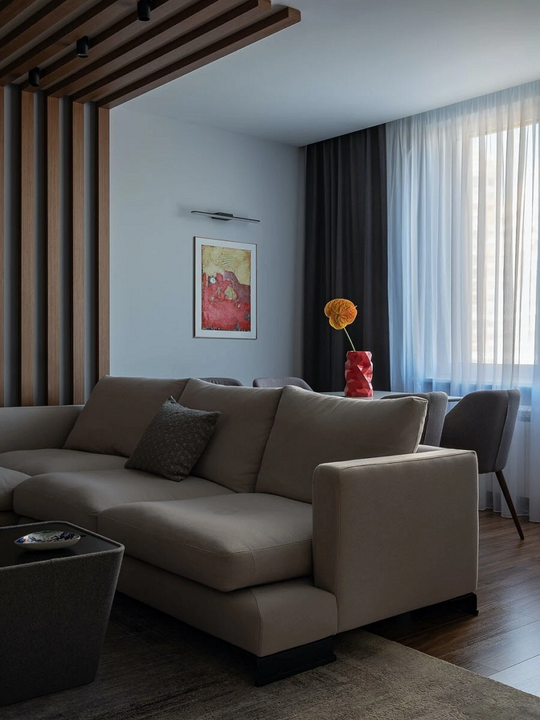
Often, a living room in blue style evokes a sense of incompleteness, as if something is missing.
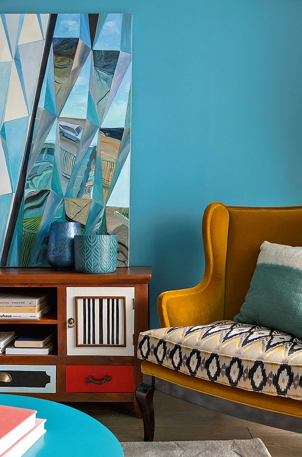
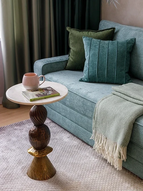
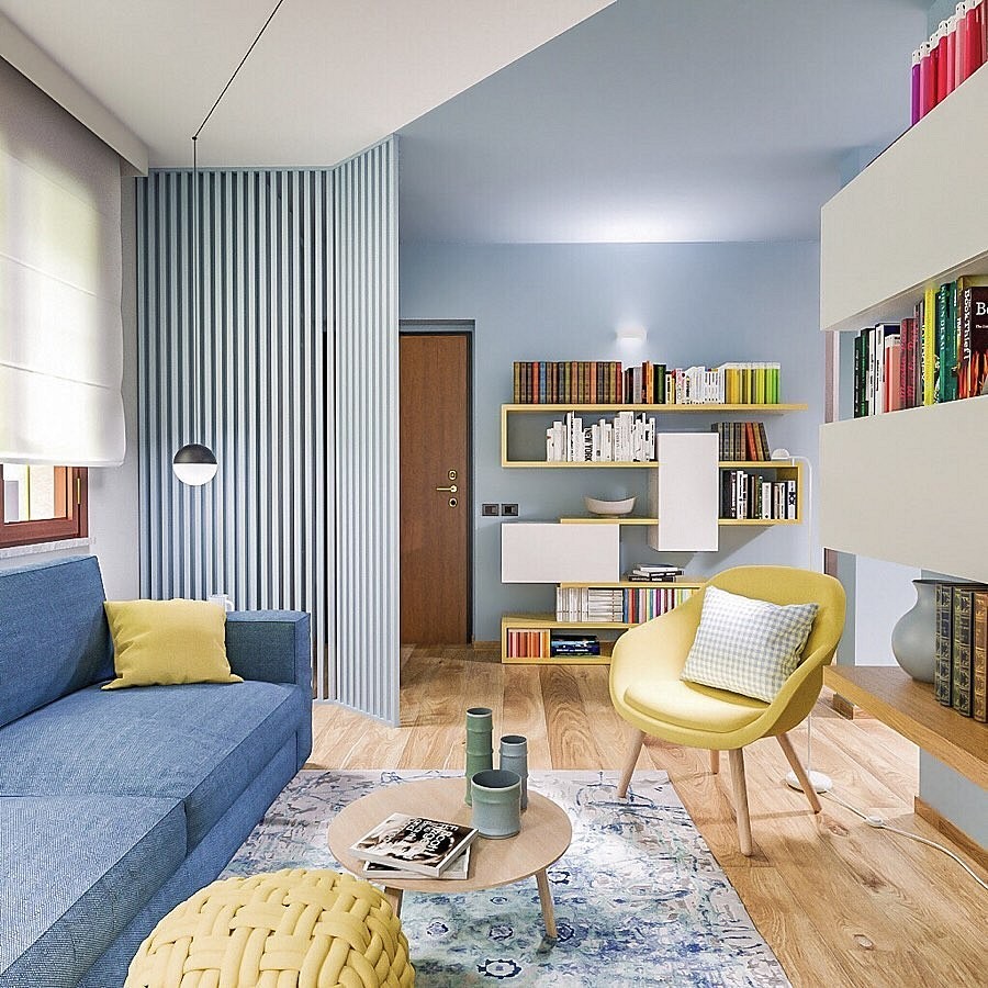
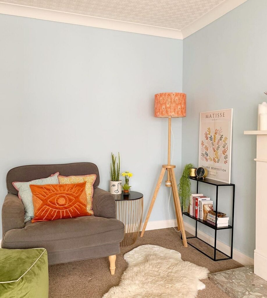
Usually, what’s missing is a bright accent that would break the monotony of the light blue tones and reveal their depth and multifaceted nature. Saturated shades of cornflower blue, forget-me-not, and turquoise in accessories don’t always need additions – on the contrary, often contrasting tones will contradict and overpower them. However, their paler, less noticeable counterparts, when paired with lemon, orange, or lime green, only stand to gain. Gray-blue living rooms require a more complex palette: not just yellow, but ochre; not scarlet, but burgundy; not purple, but lavender, and so on.
Such shades of light blue as cyan or aquamarine can themselves become an effective complement to light and unobtrusive hues like hyacinth, topaz, slate, and others.
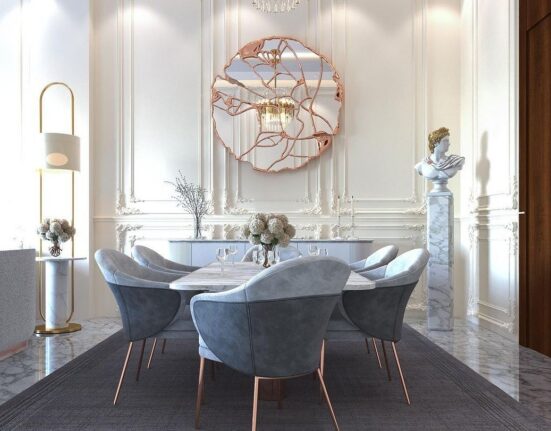
With Metal
If your living room lacks luster and gloss, consider metallic accessories, decor, and hardware.
The noble shine of steel, silver, gold, and bronze beautifully complements the softness and lightness of celestial tones. Warm variations of the color harmonize with yellow metals, while cool ones match well with grays.
Notice that in the photo, the blue living room, enhanced with metallic shine, looks more refined. If you add mirrors or crystal to this, the setting becomes even more festive. Also, materials with a metallic effect — soft furniture, curtains, or even a stretch ceiling with a gentle glow — add luxury to the space. However, they should only be used in very large halls, otherwise, they can appear overly ornate.
Suitable Style
Nautical
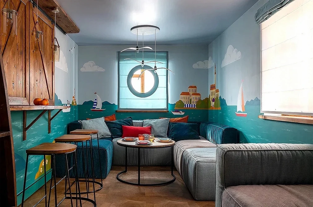
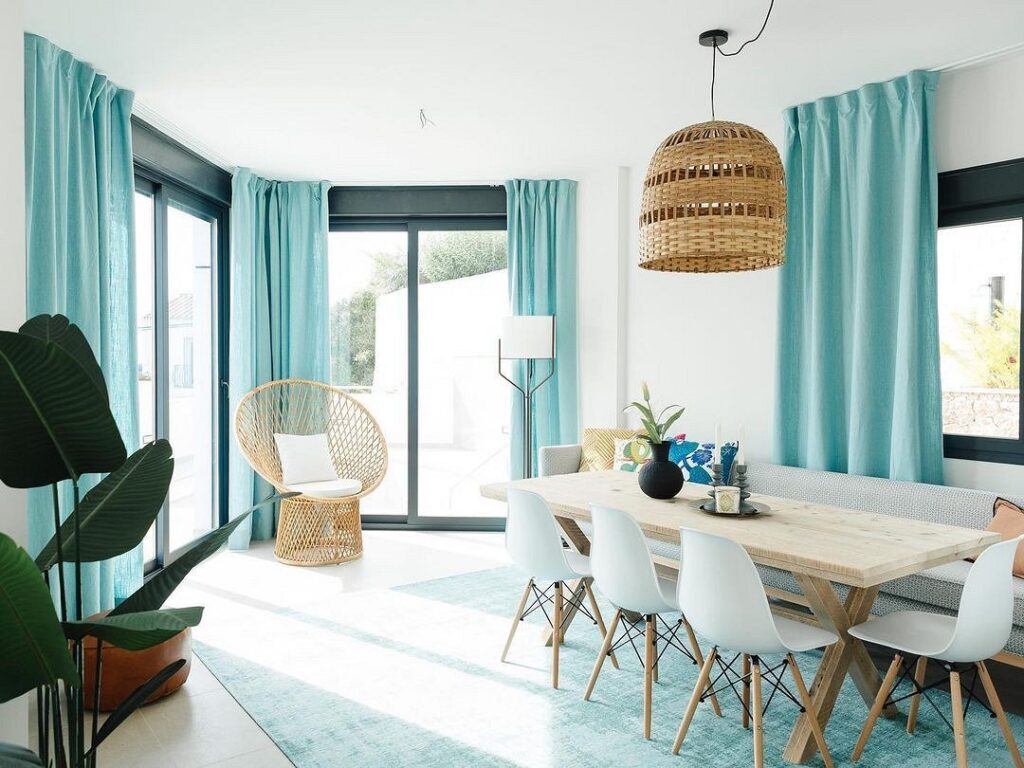
The nautical theme naturally suggests itself when mentioning this color. The endless water surface and the blue of the tropical sky inspire the creation of interiors in an azure palette.
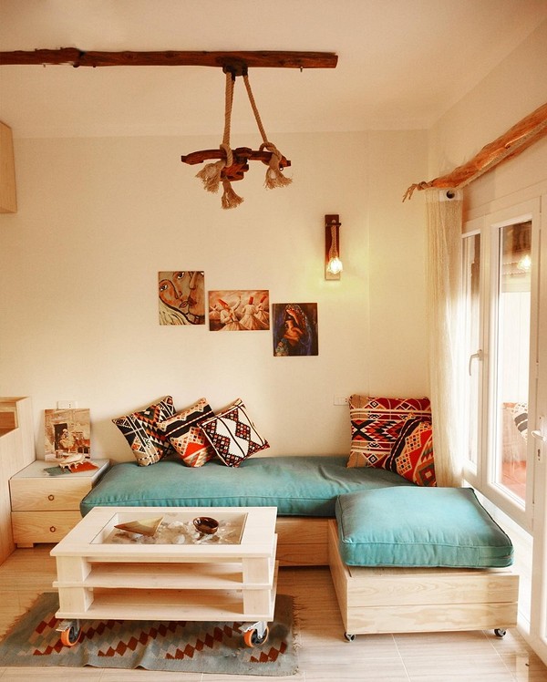
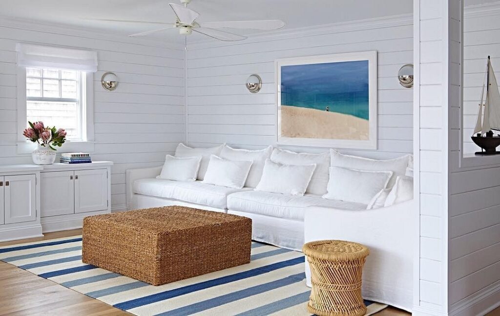
In this style, shades of the sea combine beautifully: a turquoise carpet, aquamarine curtains, and pastel forget-me-not walls make you feel the salty scent of the sea breeze. To avoid overdoing it with light blue, add some wood: a beige living room with a blue sofa and cobalt curtains subtly resembles a captain’s cabin. And if you find suitable accessories — a ship’s wheel, a barometer, a panel with shells — the resemblance will be even more striking.
Mediterranean
This style somewhat resembles the nautical theme, as it also features blue and white colors.
But unlike the nautical theme, here, the focus is on cool tones, which are often found in the hot countries of Africa and Southern Europe. They are complemented by the light-brown palette of wooden furniture and woven mats on the floor.
Walls are often left simply plastered: against such a backdrop, the celestial palette looks particularly expressive. Note that in this style, turquoise-azure paints serve only as accents to the white-and-blue color scheme, not as the main shade of the interior.
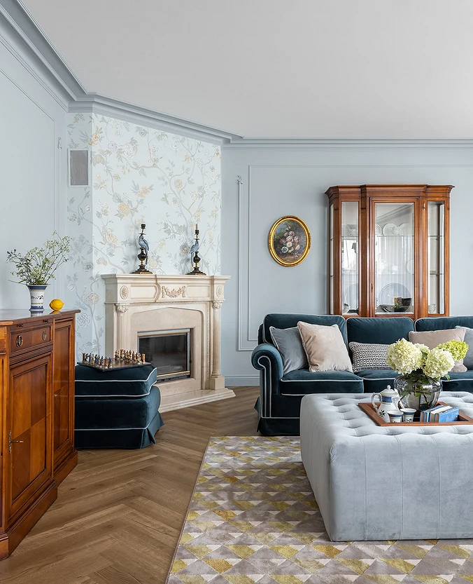
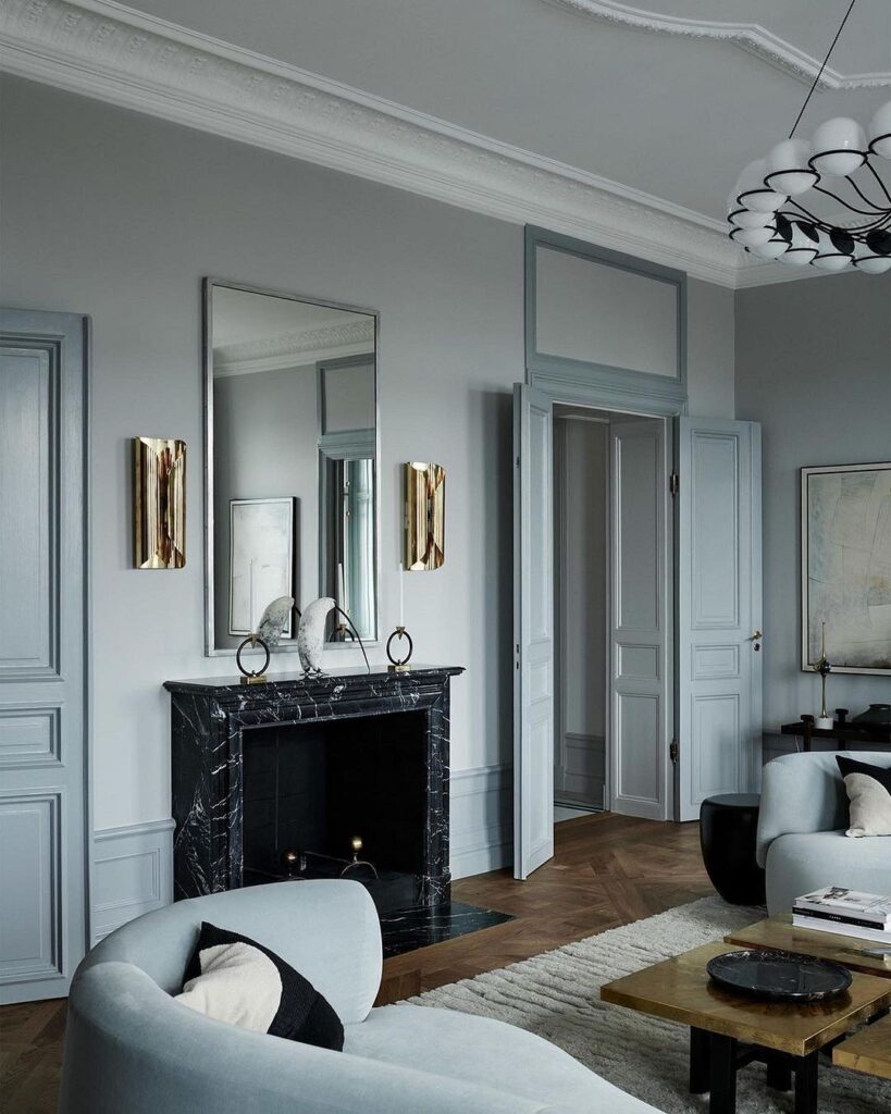
Classic
Despite the fact that the basis of classic style is a triad of achromatics plus beige, celestial shades are also actively used in this direction.<
Mainly, these are cool and quite light tones that do not disrupt the strict and exalted style. A white-and-blue living room, designed according to classical principles, looks spacious and filled with air. With gray tones, the room gains a touch of seriousness, and with black, it becomes truly imposing. However, dark colors visually reduce space, so they are better used in larger rooms.
Provence
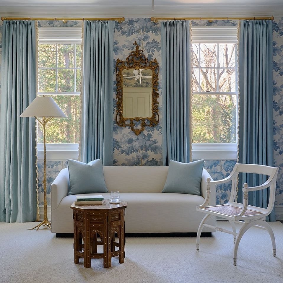
This gentle and cheerful style actively uses the lightest and purest shades of blue.
They are often combined with white, as well as with pastel green, turquoise, and pink, making the atmosphere invariably light and festive. A good idea would be to paint the walls in pale azure and lay a carpet of the same color on the floor. However, if you’re not ready for major changes, bedspreads, pillows, and curtains in the sky palette will suffice, as a large amount of home textiles is a characteristic feature of this direction.
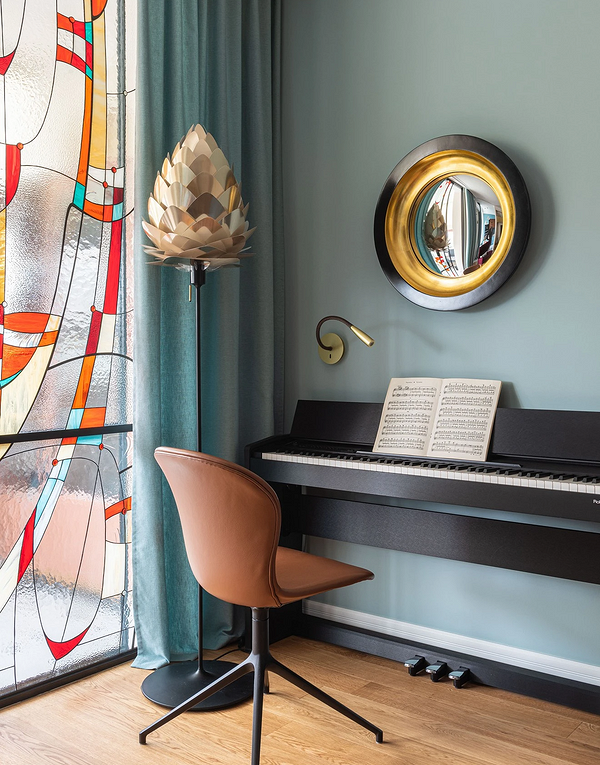
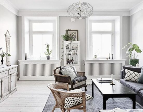
A gray-blue interior in the living room and other spaces is the hallmark of Scandinavian style.
Calm, understated, and even inconspicuous tones best characterize this design direction. They are complemented by beige shades: milky, cream, sandy, and others. If a room in such colors seems cold and soulless, add typical Scandinavian interior items — a fluffy fur on the floor, soft pillows, or candles in holders. With them, the setting becomes more intimate and cozy.

Leave feedback about this